illustrations and infographics for digital storytelling
TRANSCRIPT
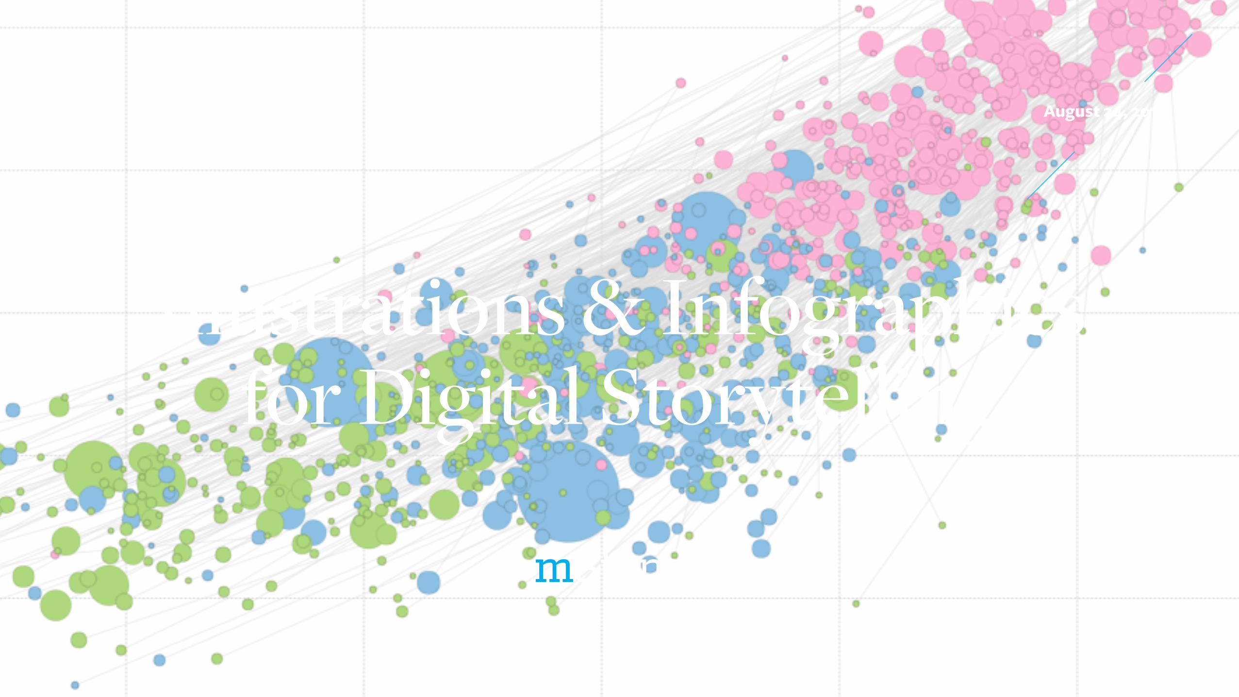
Illustrations & Infographics for Digital Storytelling
August 24, 2016
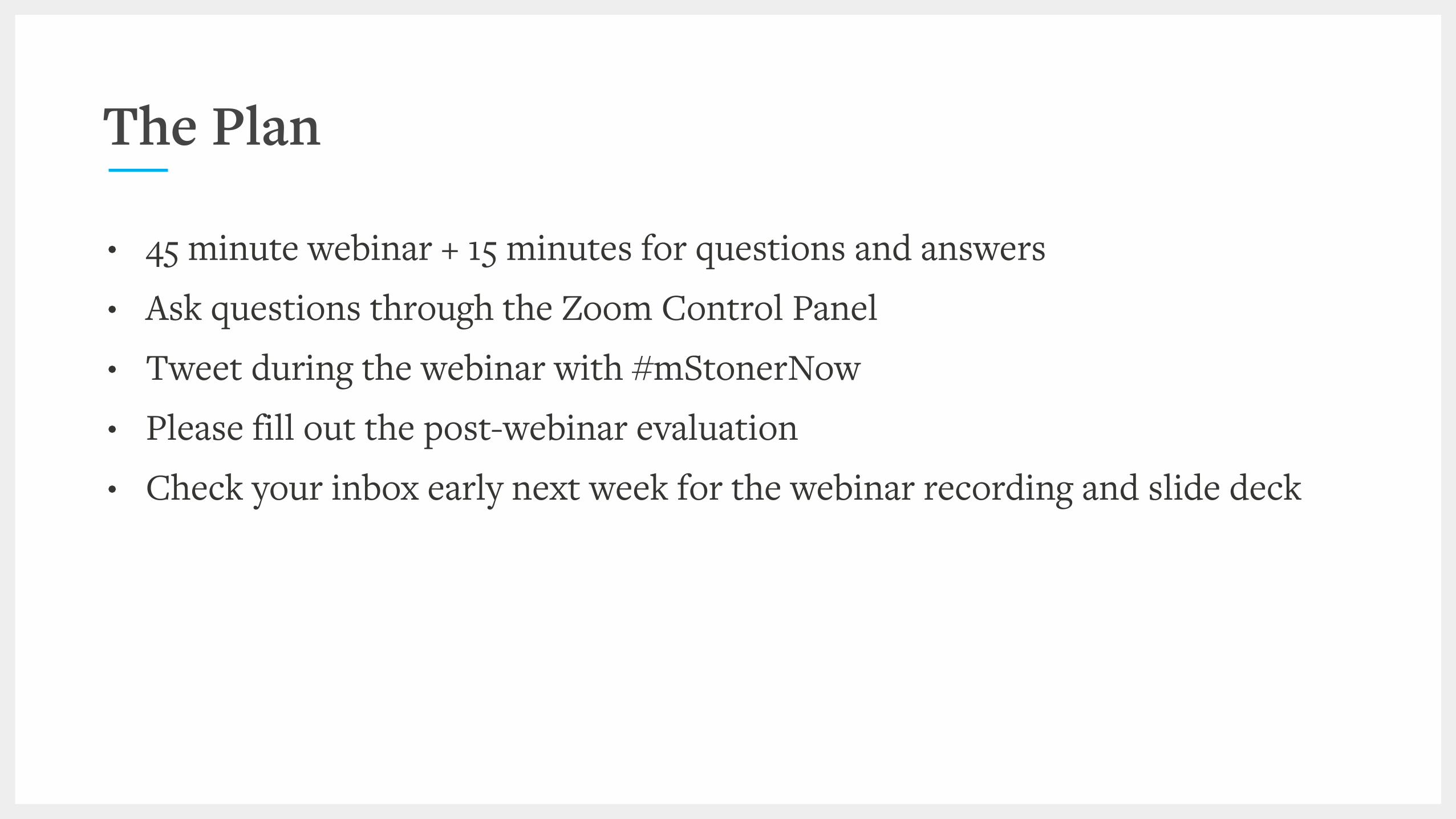
• 45 minute webinar + 15 minutes for questions and answers • Ask questions through the Zoom Control Panel • Tweet during the webinar with #mStonerNow • Please fill out the post-webinar evaluation • Check your inbox early next week for the webinar recording and slide deck
The Plan

Voltaire Santos Miran Co-Founder and CEO
@vsantosmiran
Ben Bilow Senior Creative Director
Meaningful graphicsfortwo books,please.
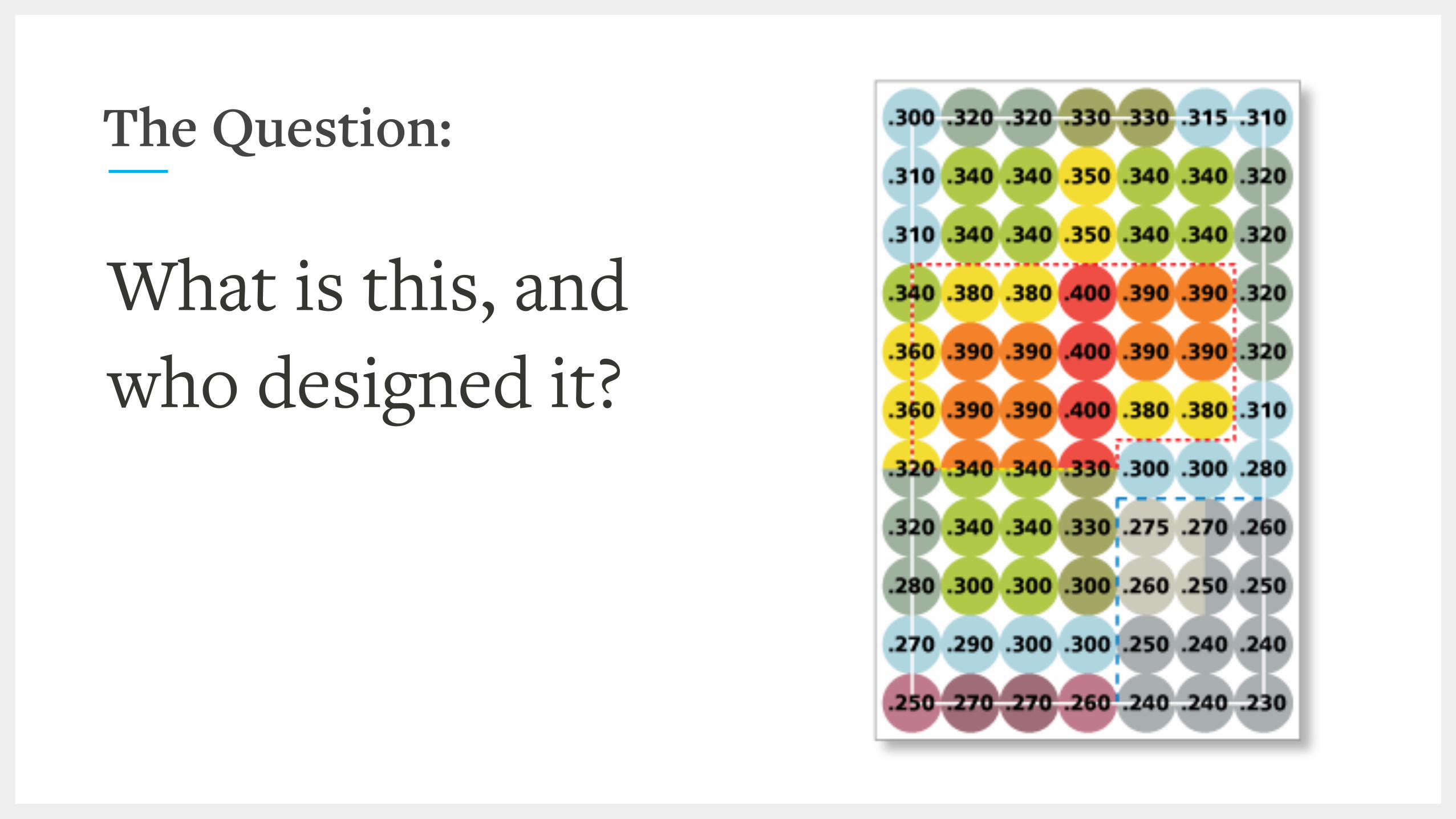
The Question:
What is this, and who designed it?
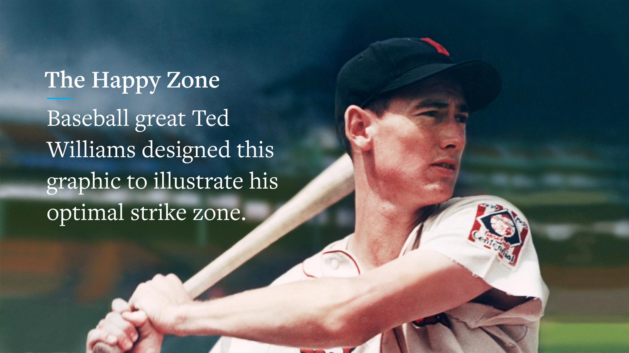
The Happy ZoneBaseball great Ted Williams designed this graphic to illustrate his optimal strike zone.
The Goal
We want to equip to be better visual storytellers through a solid foundation in the principles of visual storytelling, compelling examples, and highly usable tools and approaches.
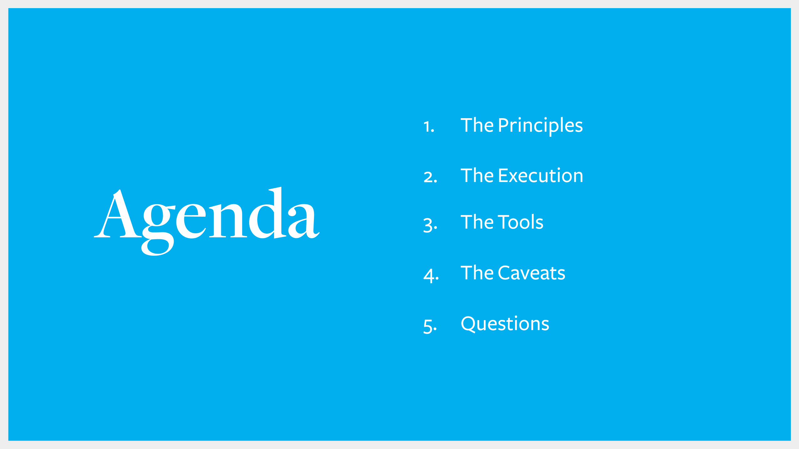
Agenda1. The Principles
2. The Execution
3. The Tools
4. The Caveats
5. Questions

The Principles

“Modern information design is equal parts art and science, form and function, architecture and engineering. It combines the best of at least three fields of achievement:
aesthetics, technology, and journalism.”
NATE SILVER, “The Signal and the Noise”
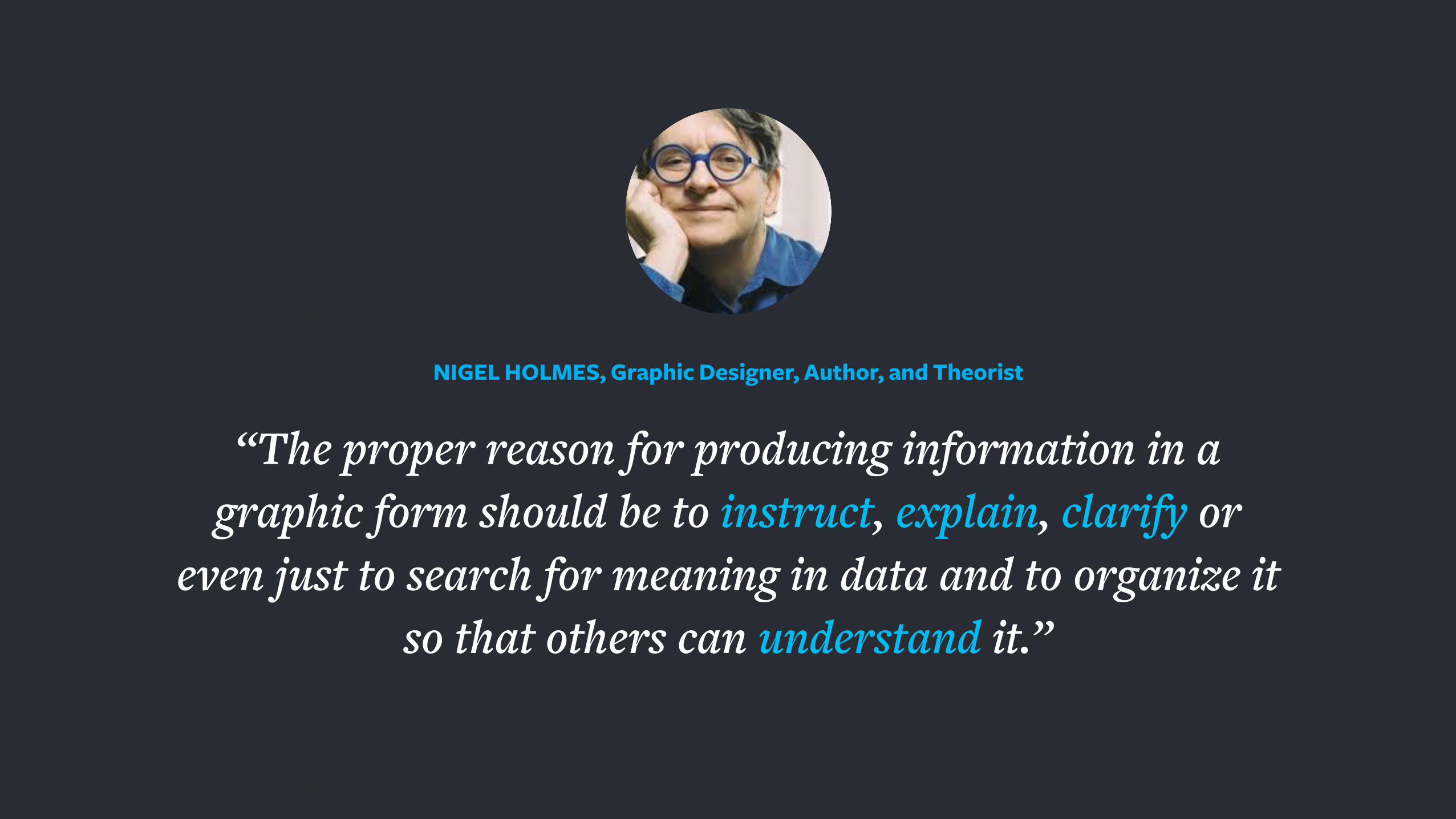
“The proper reason for producing information in a graphic form should be to instruct, explain, clarify or
even just to search for meaning in data and to organize it so that others can understand it.”
NIGEL HOLMES, Graphic Designer, Author, and Theorist

1. Simplify the complex
2. Impact through visualization
3. Aid analysis
4. Motivate to action
Representing Data: Purpose
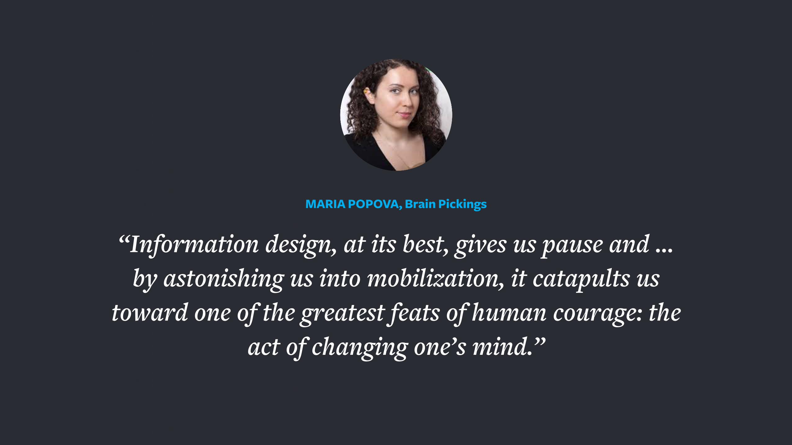
“Information design, at its best, gives us pause and … by astonishing us into mobilization, it catapults us
toward one of the greatest feats of human courage: the act of changing one’s mind.”
MARIA POPOVA, Brain Pickings
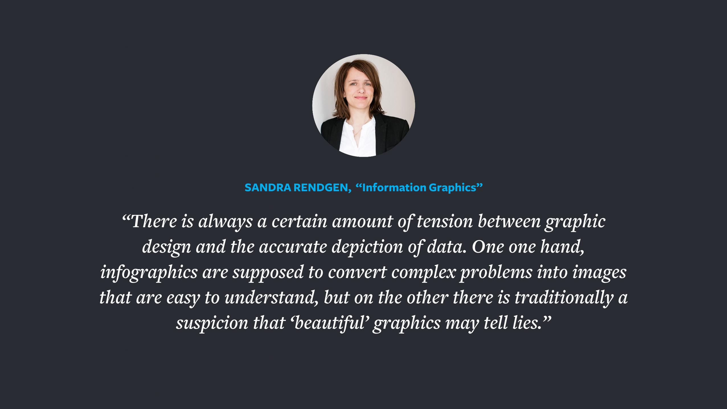
“There is always a certain amount of tension between graphic design and the accurate depiction of data. One one hand,
infographics are supposed to convert complex problems into images that are easy to understand, but on the other there is traditionally a
suspicion that ‘beautiful’ graphics may tell lies.”
SANDRA RENDGEN, “Information Graphics”
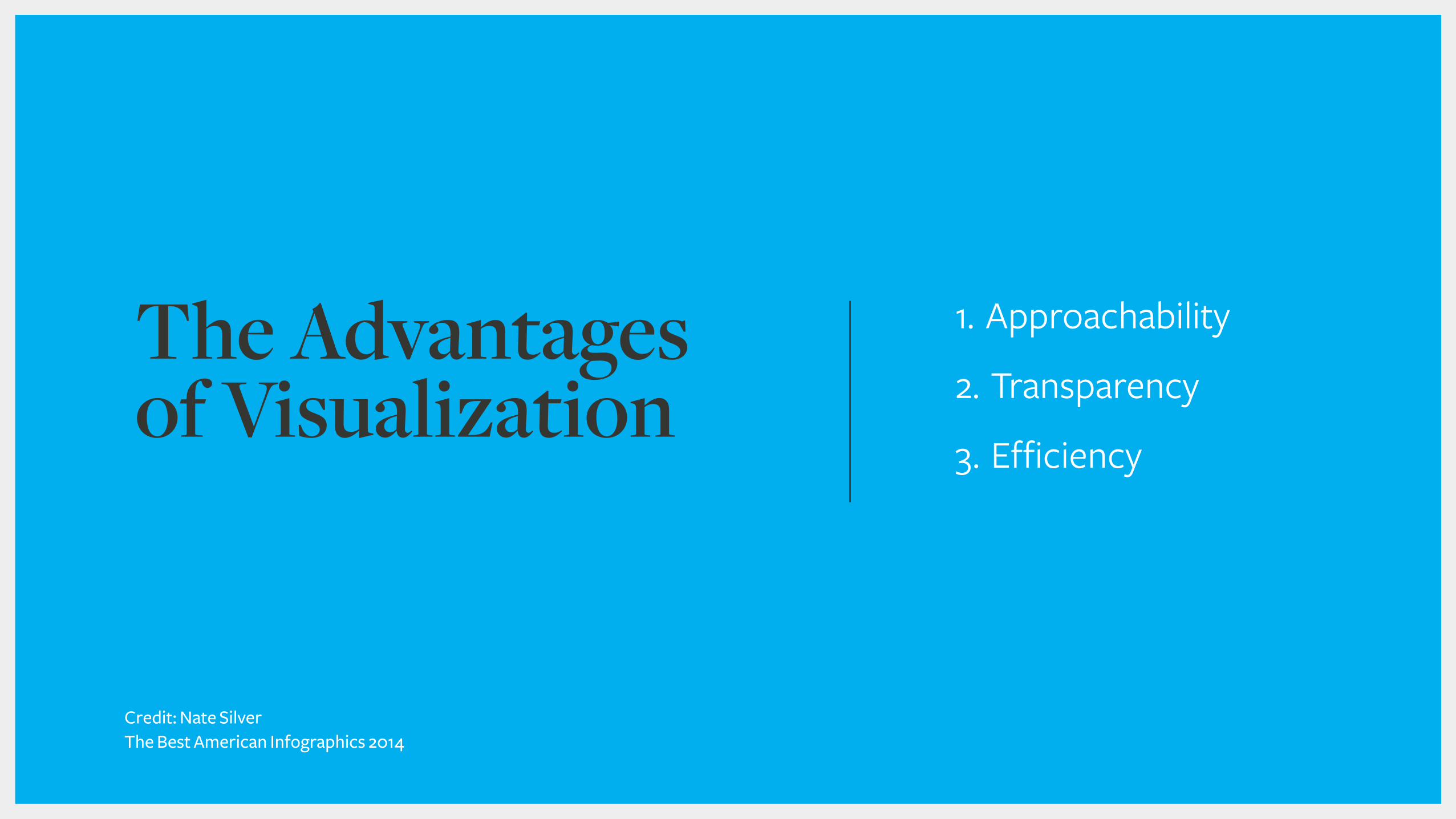
1. Approachability
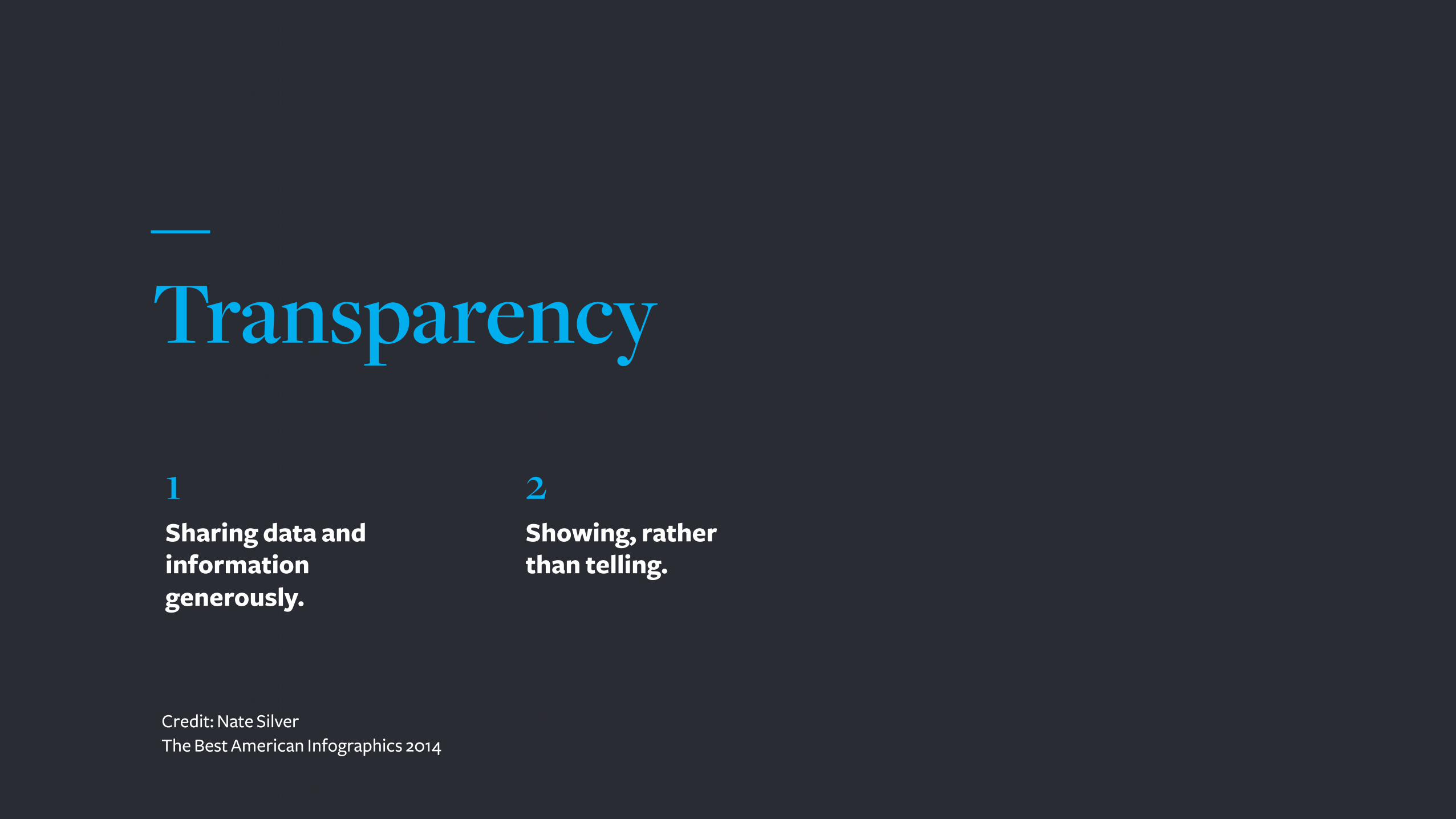
2. Transparency
3. Efficiency
The Advantages of Visualization
Credit: Nate SilverThe Best American Infographics 2014
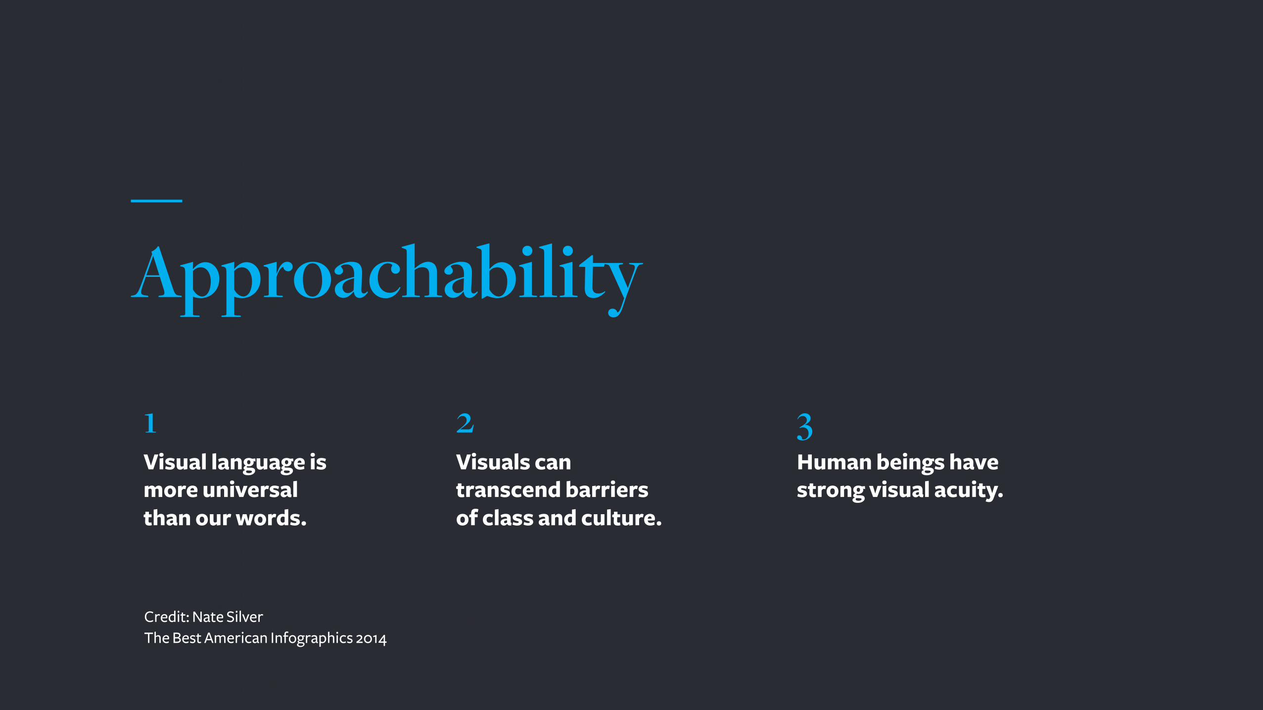
Approachability
Visual language is more universal than our words.
Visuals can transcend barriers of class and culture.
Human beings have strong visual acuity.
1 2 3
Credit: Nate SilverThe Best American Infographics 2014
Transparency
Sharing data and information generously.
Showing, rather than telling.
1 2
Credit: Nate SilverThe Best American Infographics 2014
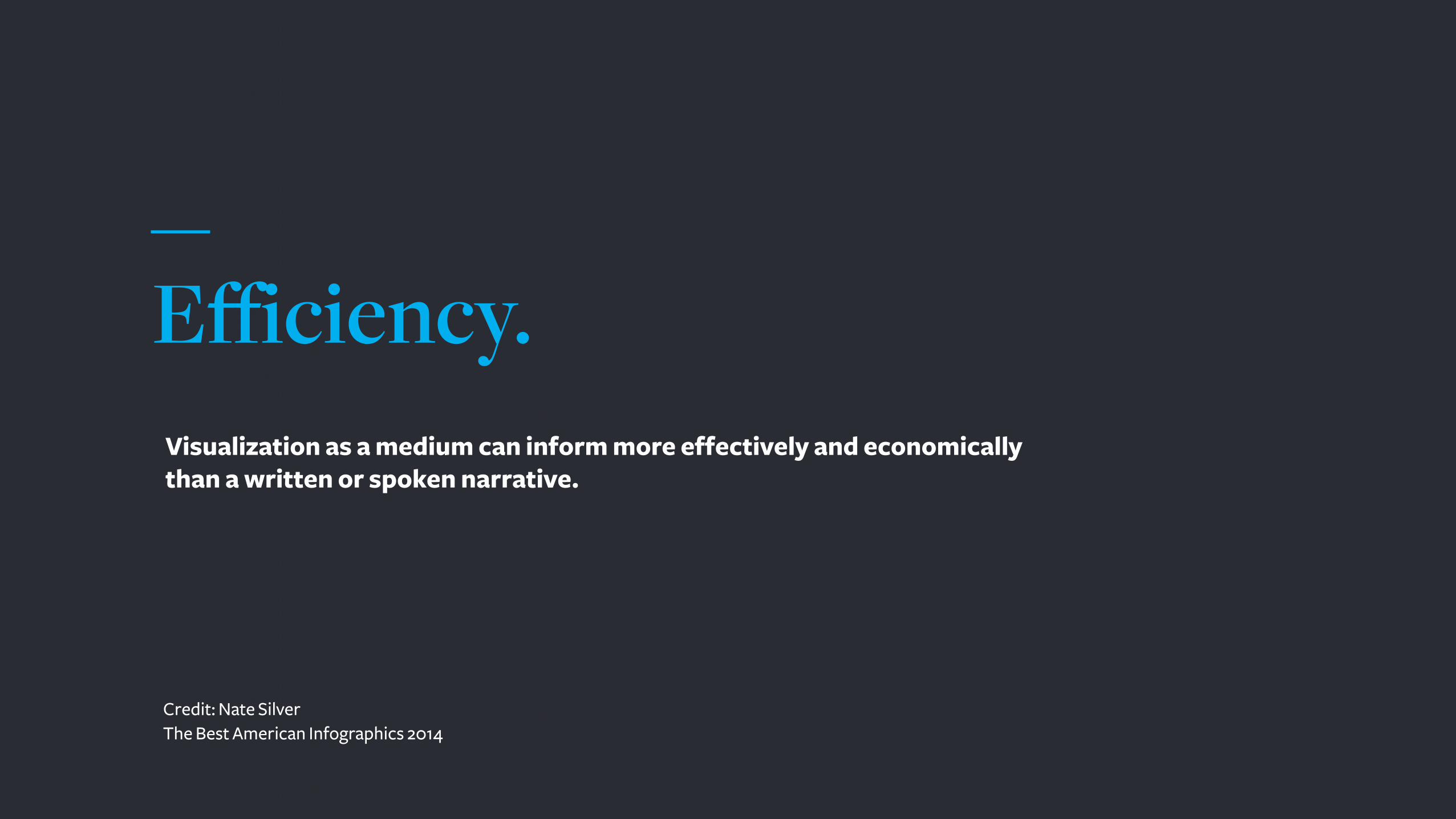
Efficiency. Visualization as a medium can inform more effectively and economically than a written or spoken narrative.
Credit: Nate SilverThe Best American Infographics 2014
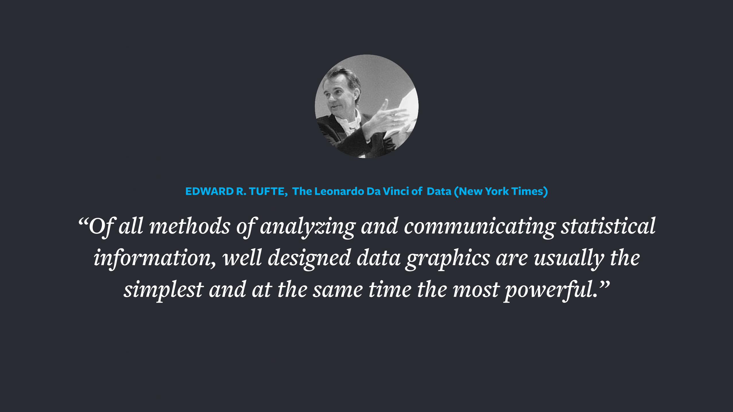
“Of all methods of analyzing and communicating statistical information, well designed data graphics are usually the
simplest and at the same time the most powerful.”
EDWARD R. TUFTE, The Leonardo Da Vinci of Data (New York Times)
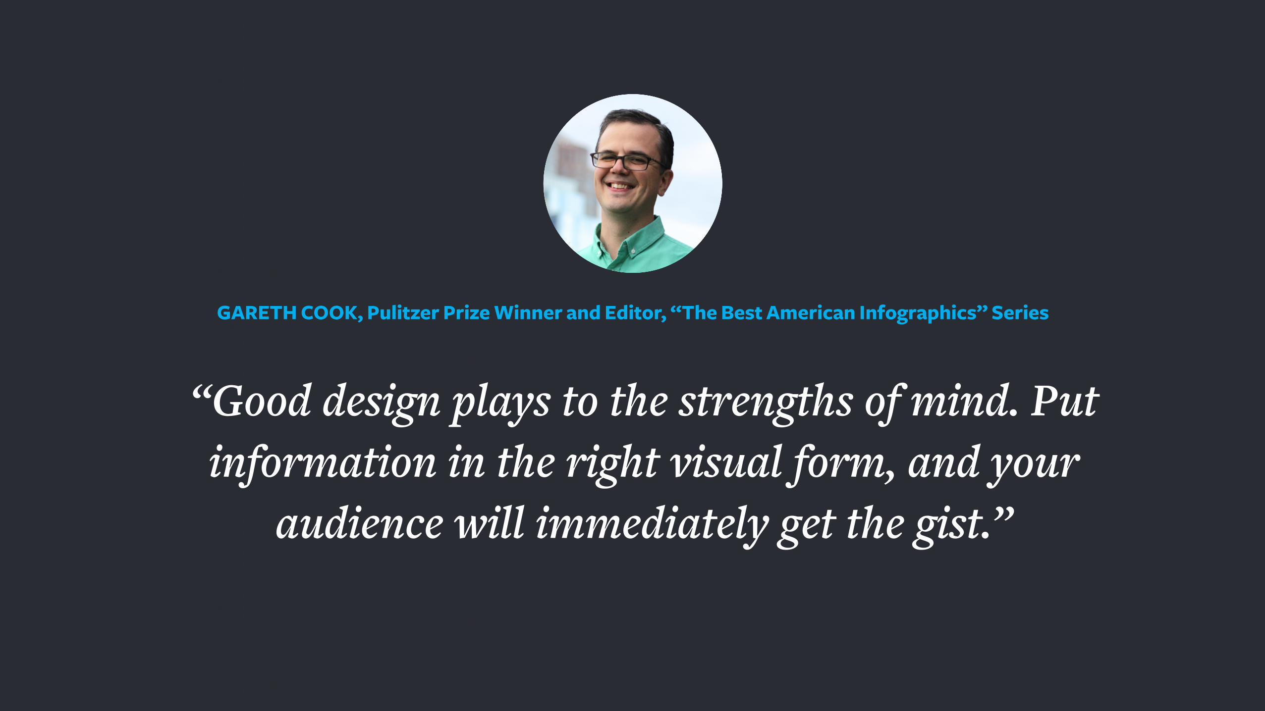
“Good design plays to the strengths of mind. Put information in the right visual form, and your
audience will immediately get the gist.”
GARETH COOK, Pulitzer Prize Winner and Editor, “The Best American Infographics” Series

1. Show the data
2. Encourage the viewer to think about substance rather
than methodology, graphic design, or technology
3. Avoid distorting what the data have to say
4. Present many numbers in a small space
5. Make large data sets coherent
6. Encourage the eye to compare different pieces of data
7. Reveal the data at several levels of detail
8. Serve a clear purpose
Representing Data: Ideals
Credit: Edward R. Tufte The Visual Display of Quantitative Information
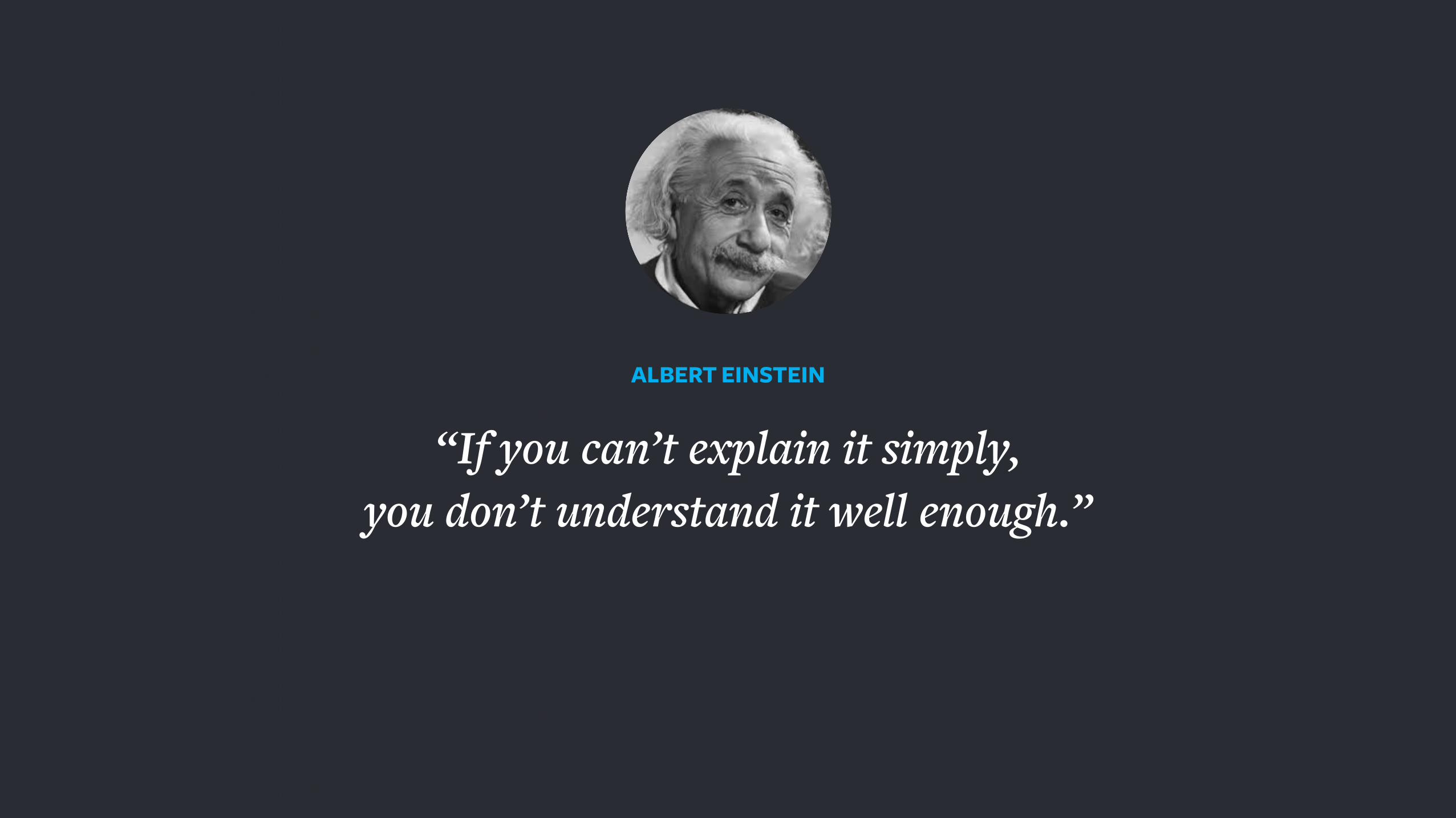
“If you can’t explain it simply, you don’t understand it well enough.”
ALBERT EINSTEIN
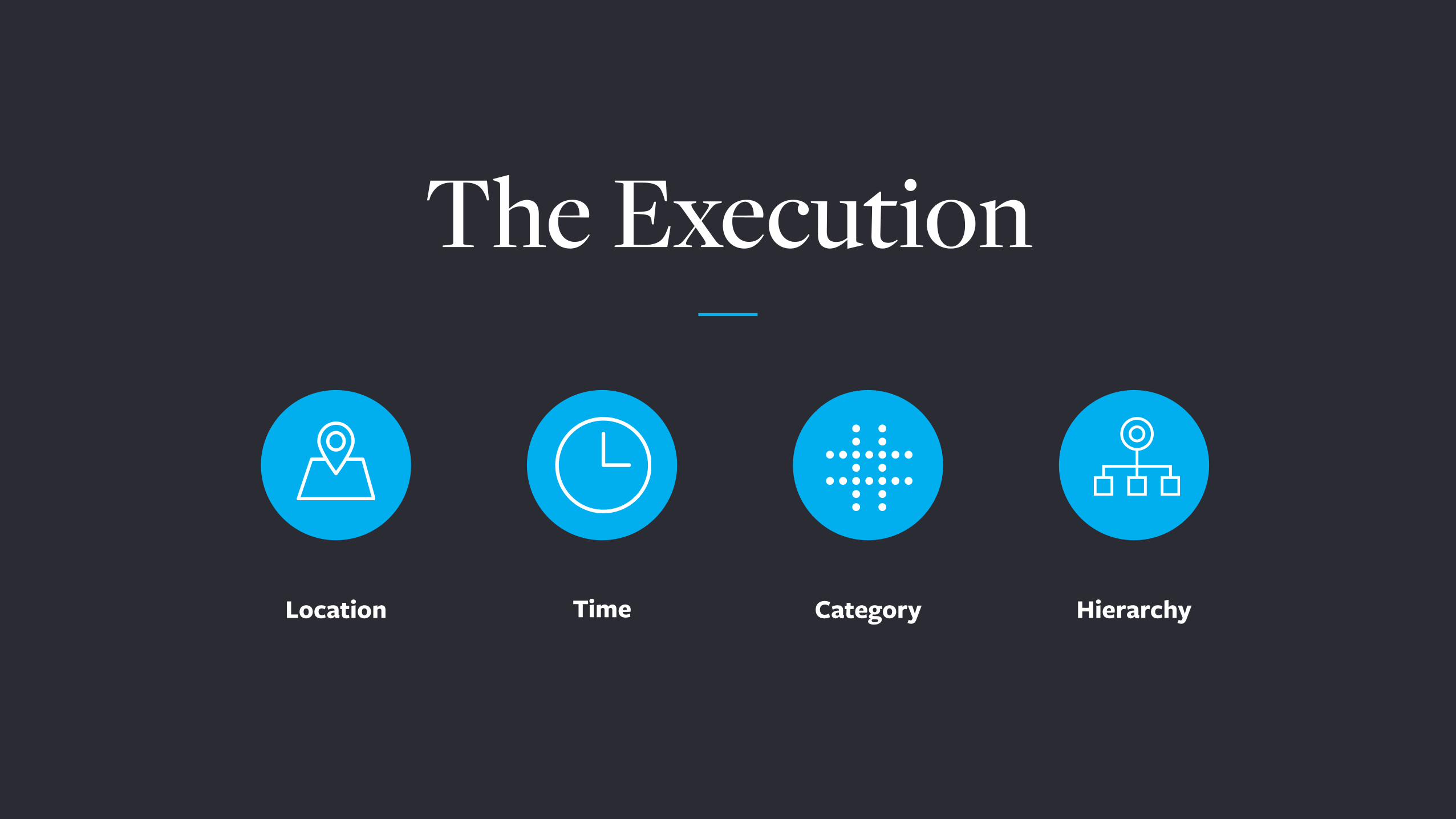
The Execution
TimeLocation Hierarchy Category

Elements Organized Spatially
Location
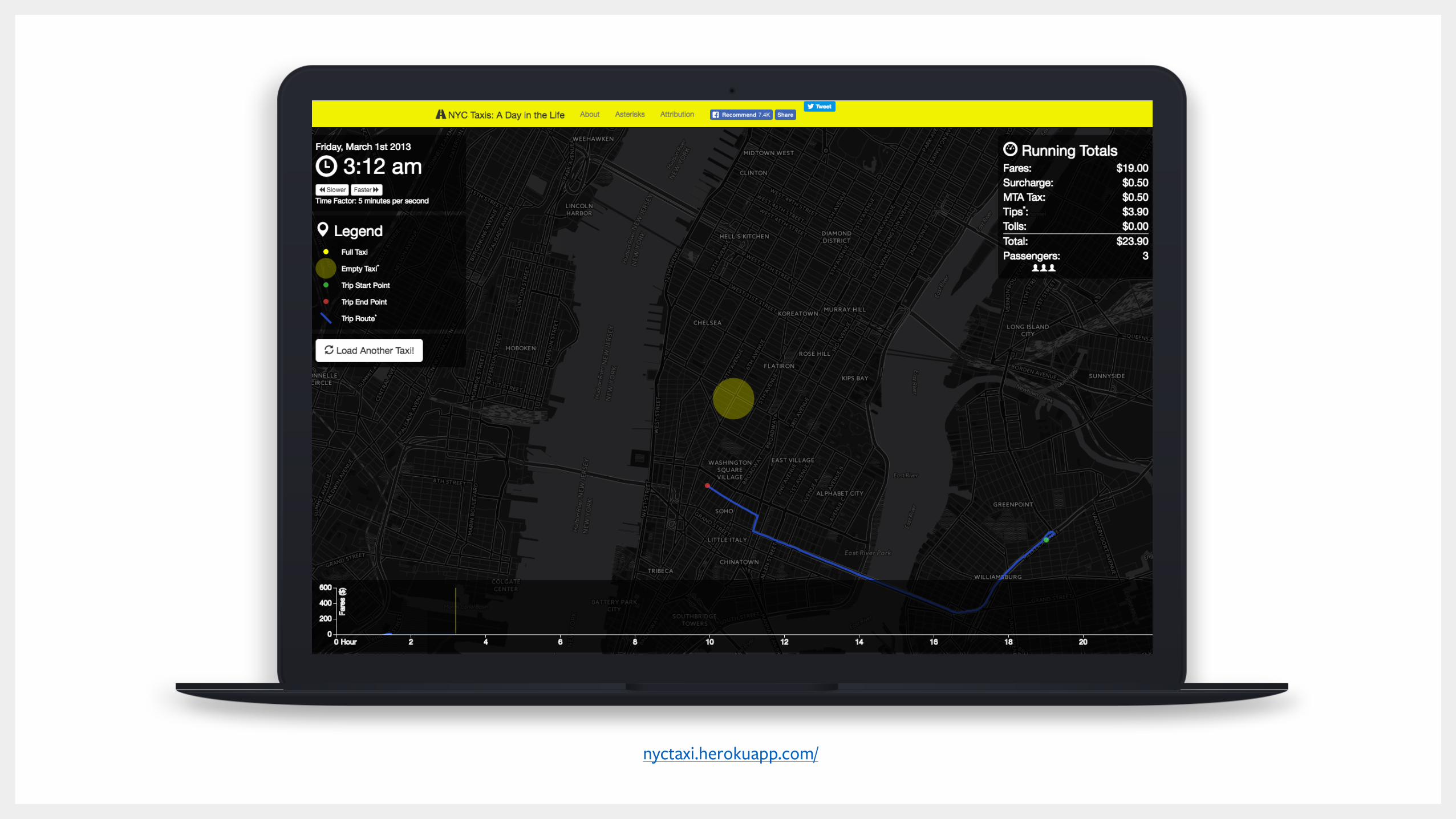
26
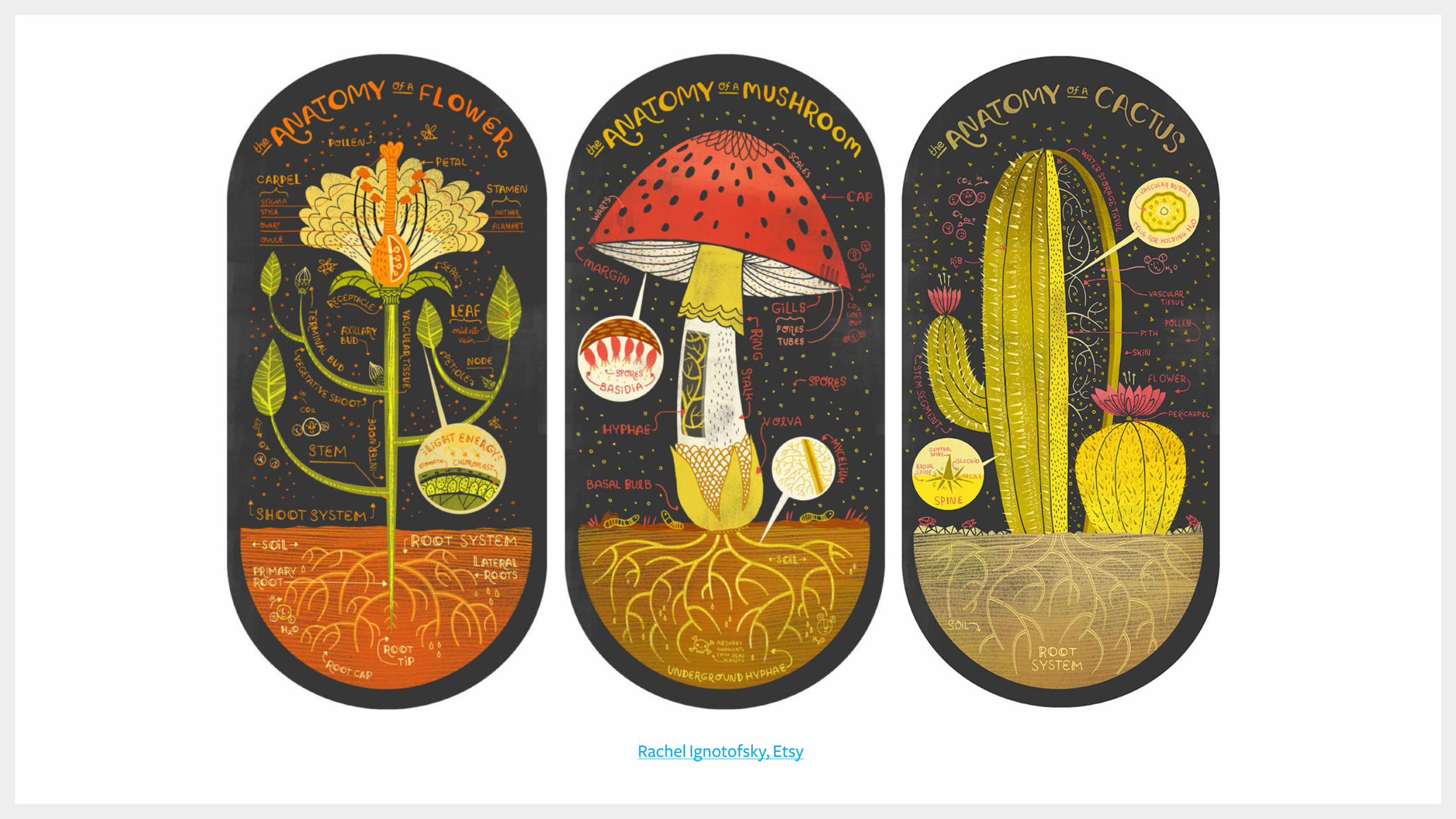
Rachel Ignotofsky, Etsy
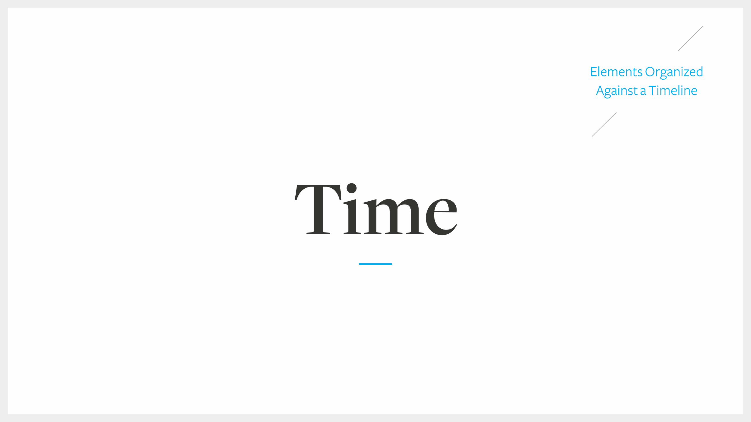
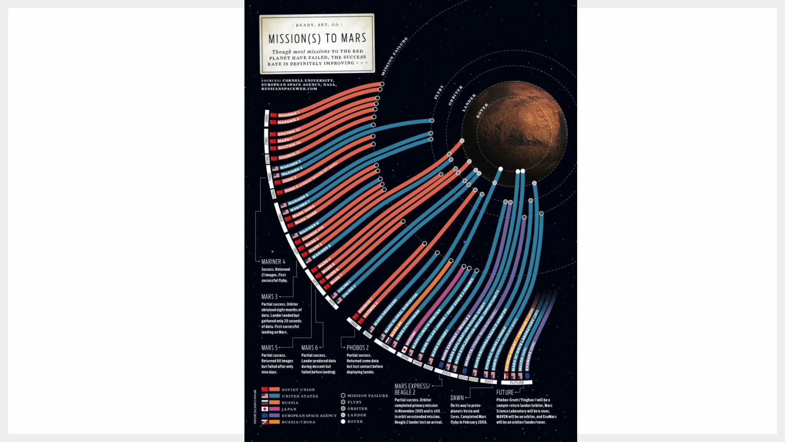
Elements Organized Against a Timeline
Time

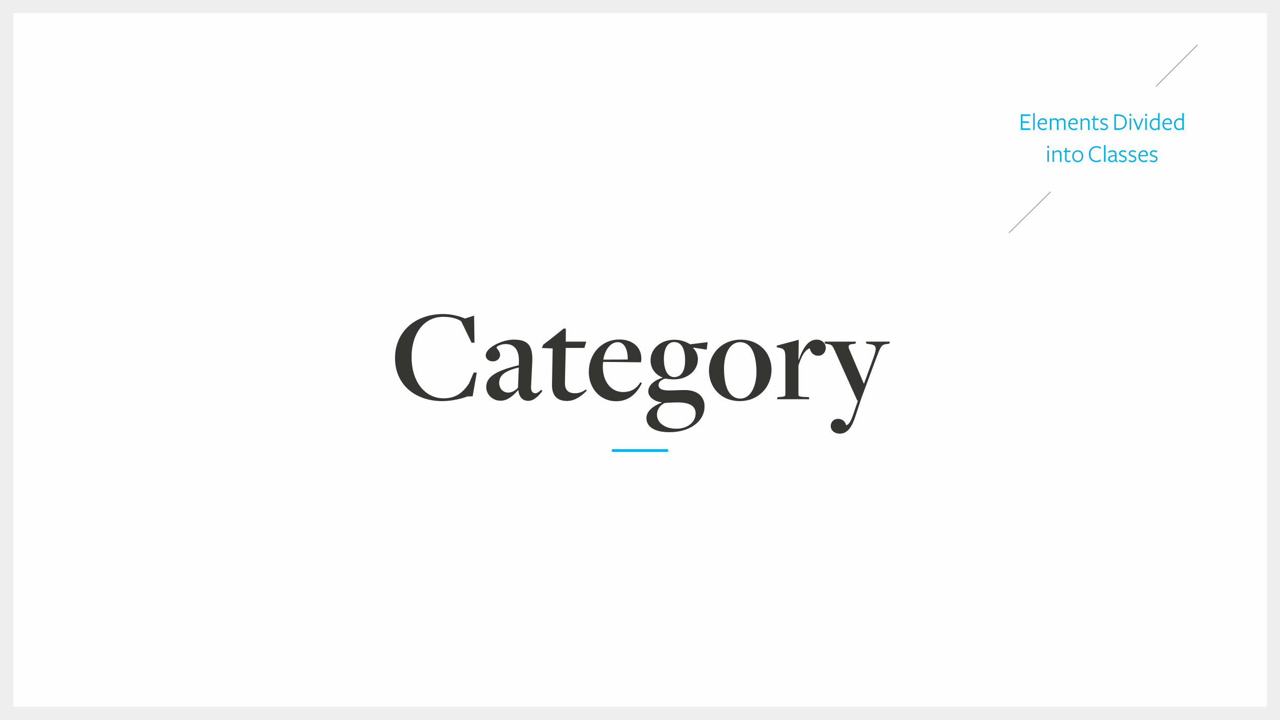
Elements Divided into Classes
Category
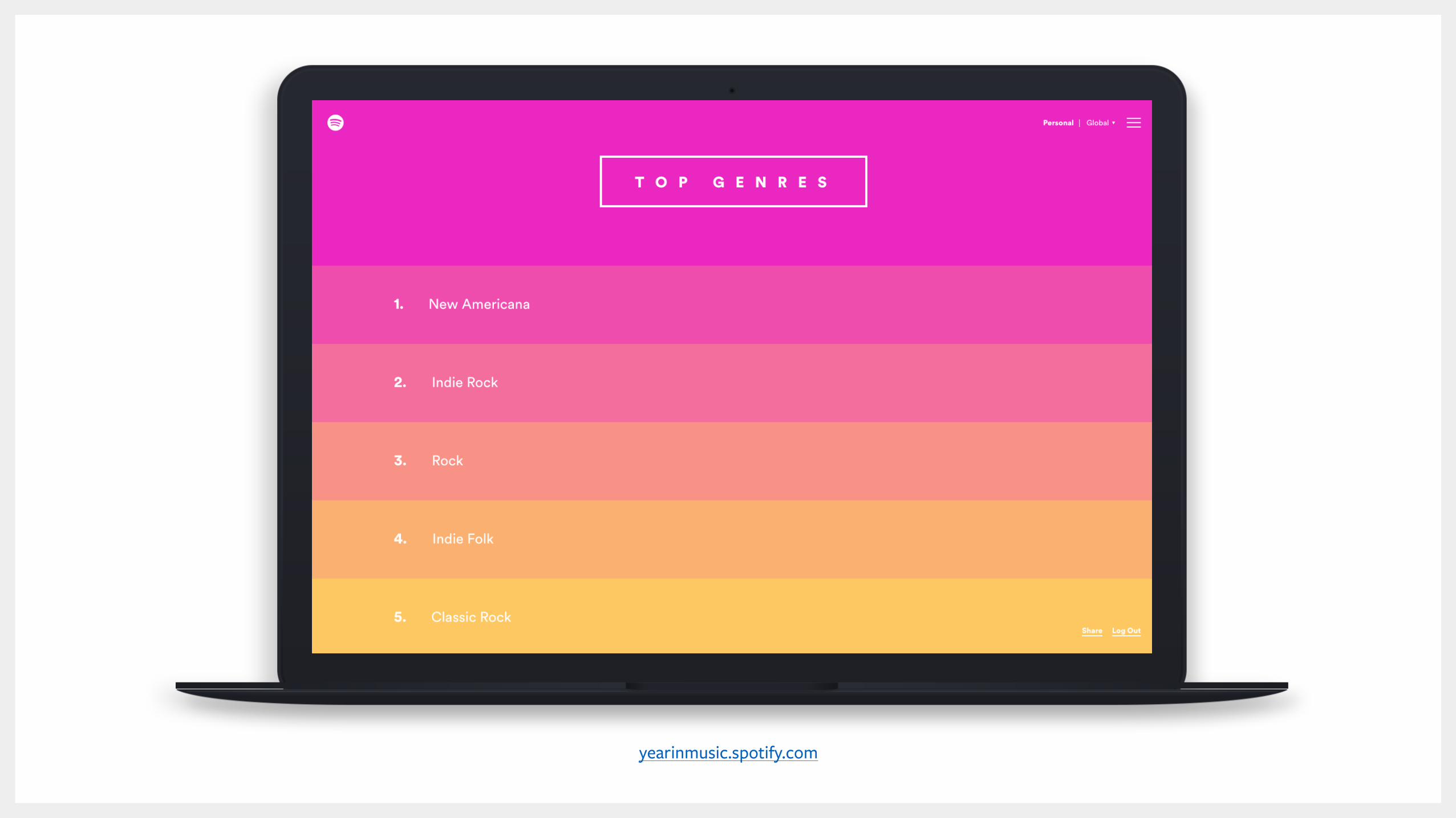
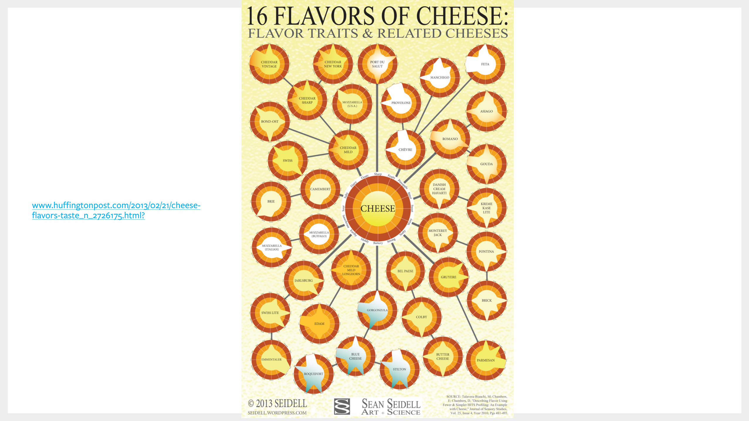
www.huffingtonpost.com/2013/02/21/cheese-flavors-taste_n_2726175.html?
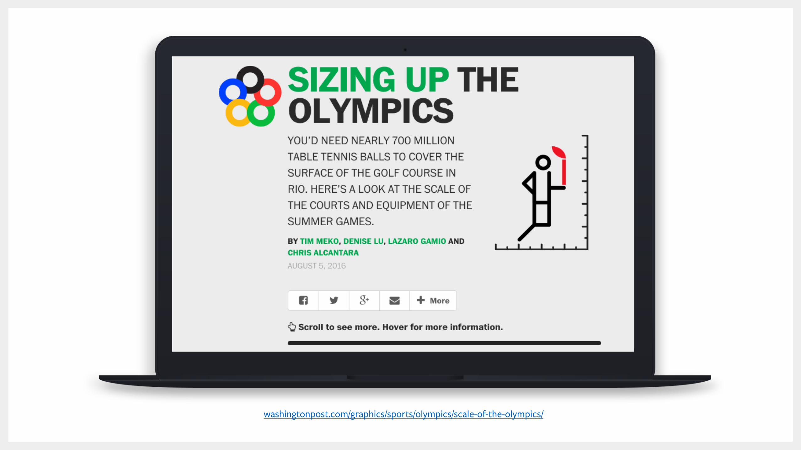
Elements Ranked in Order of Priority
Hierarchy
34
washingtonpost.com/graphics/sports/olympics/scale-of-the-olympics/
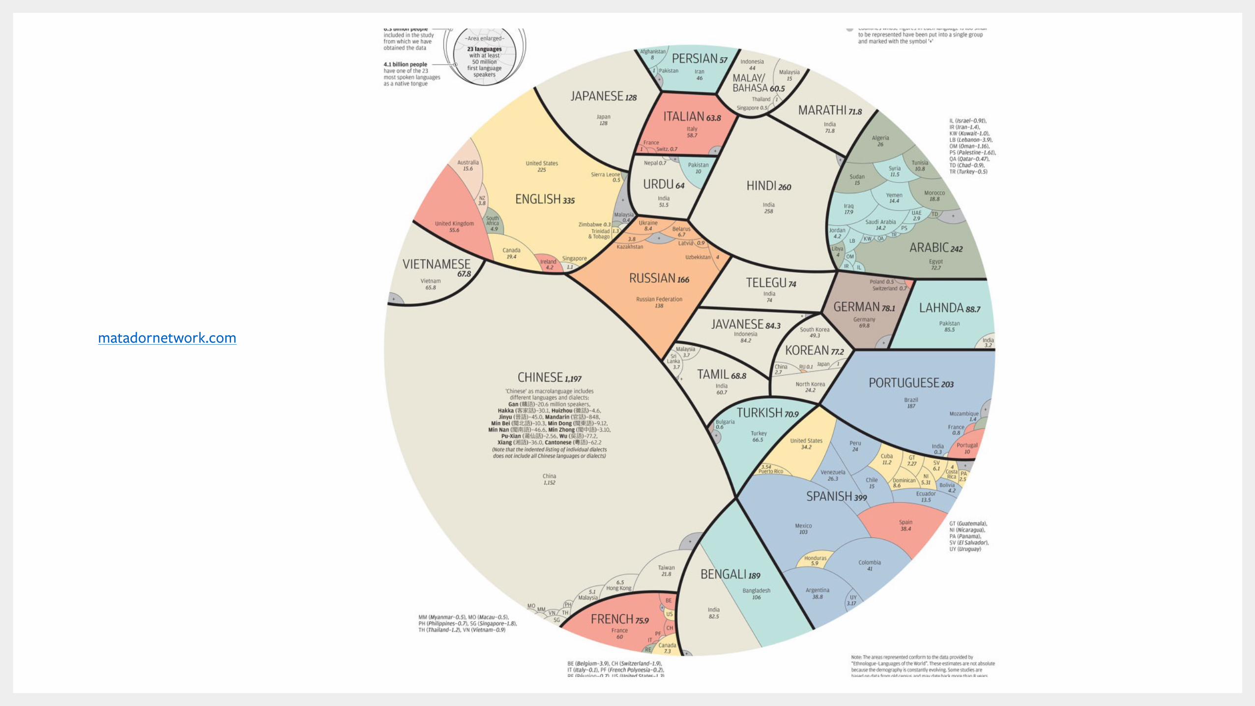
matadornetwork.com

The Tools
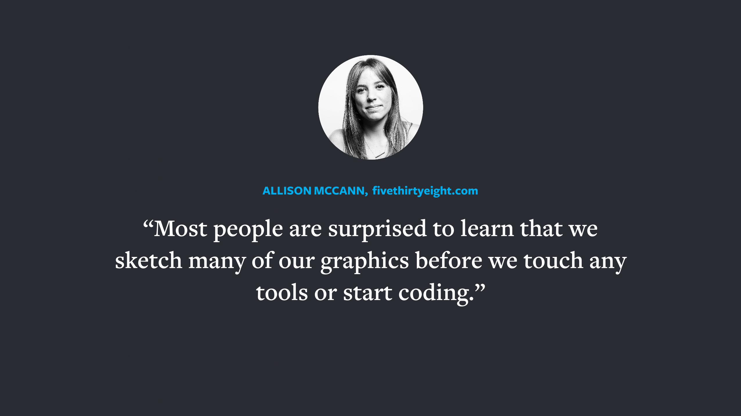
“Most people are surprised to learn that we sketch many of our graphics before we touch any
tools or start coding.”
ALLISON MCCANN, fivethirtyeight.com
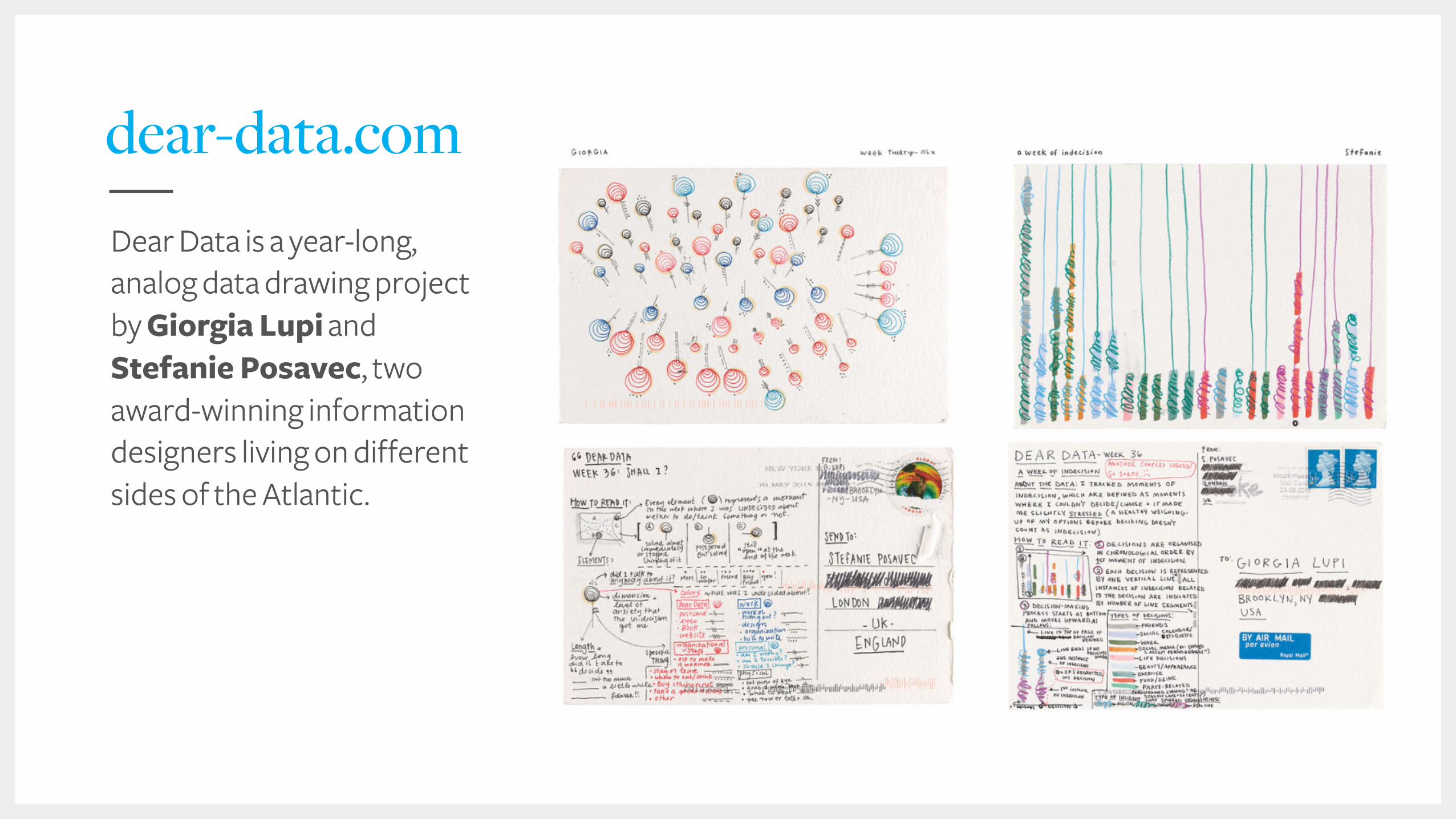
dear-data.comDear Data is a year-long, analog data drawing project by Giorgia Lupi and Stefanie Posavec, two award-winning information designers living on different sides of the Atlantic.
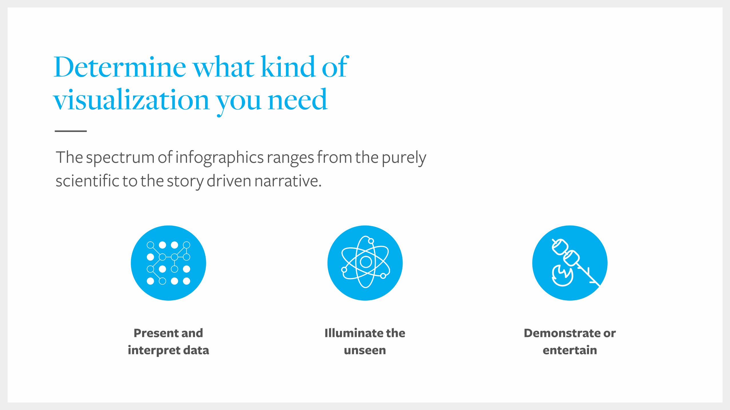
Determine what kind of visualization you need
Present and interpret data
Demonstrate or entertain
The spectrum of infographics ranges from the purely scientific to the story driven narrative.
Illuminate the unseen
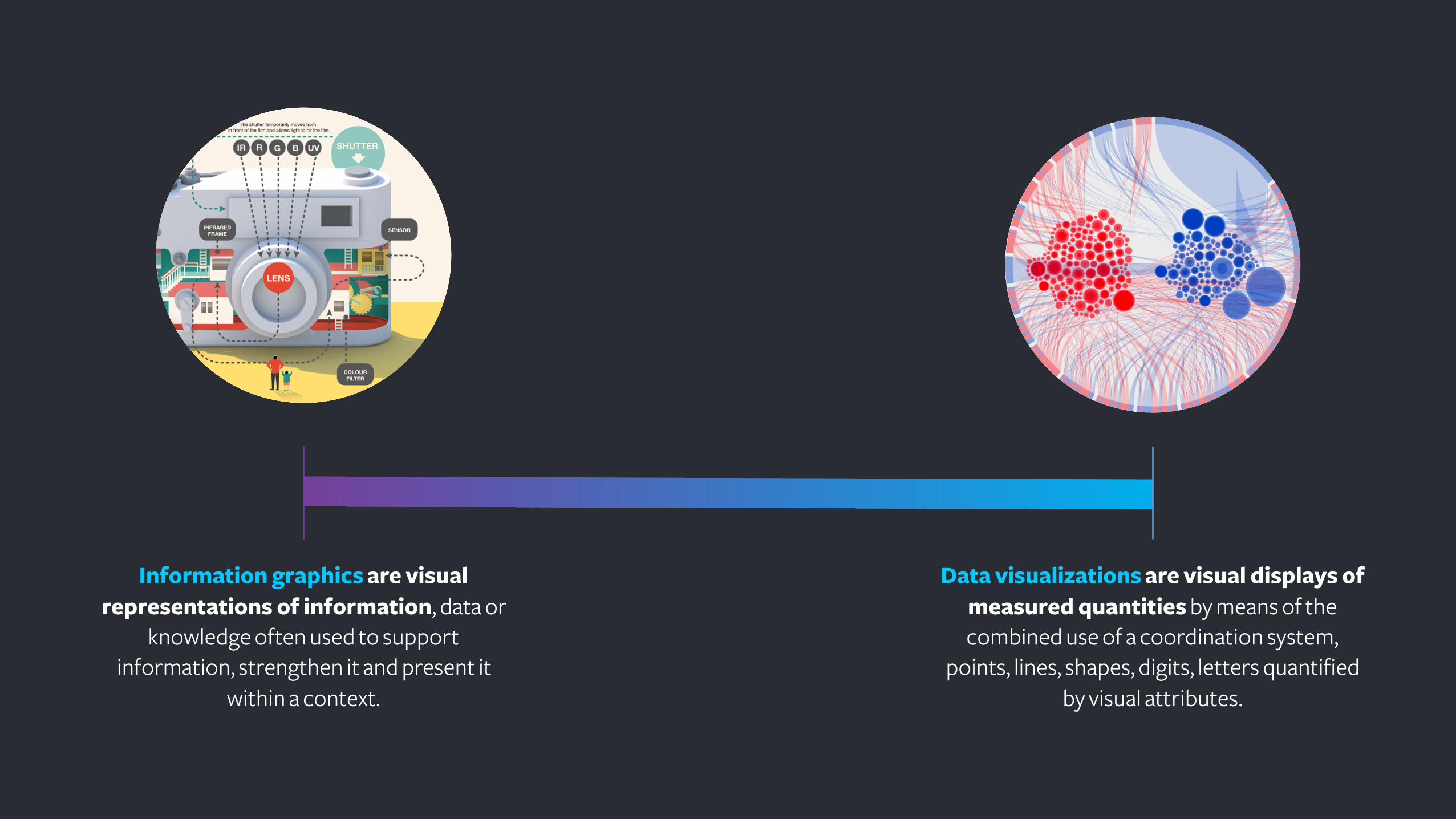
Information graphics are visual representations of information, data or
knowledge often used to support information, strengthen it and present it
within a context.
Data visualizations are visual displays of measured quantities by means of the combined use of a coordination system,
points, lines, shapes, digits, letters quantified by visual attributes.
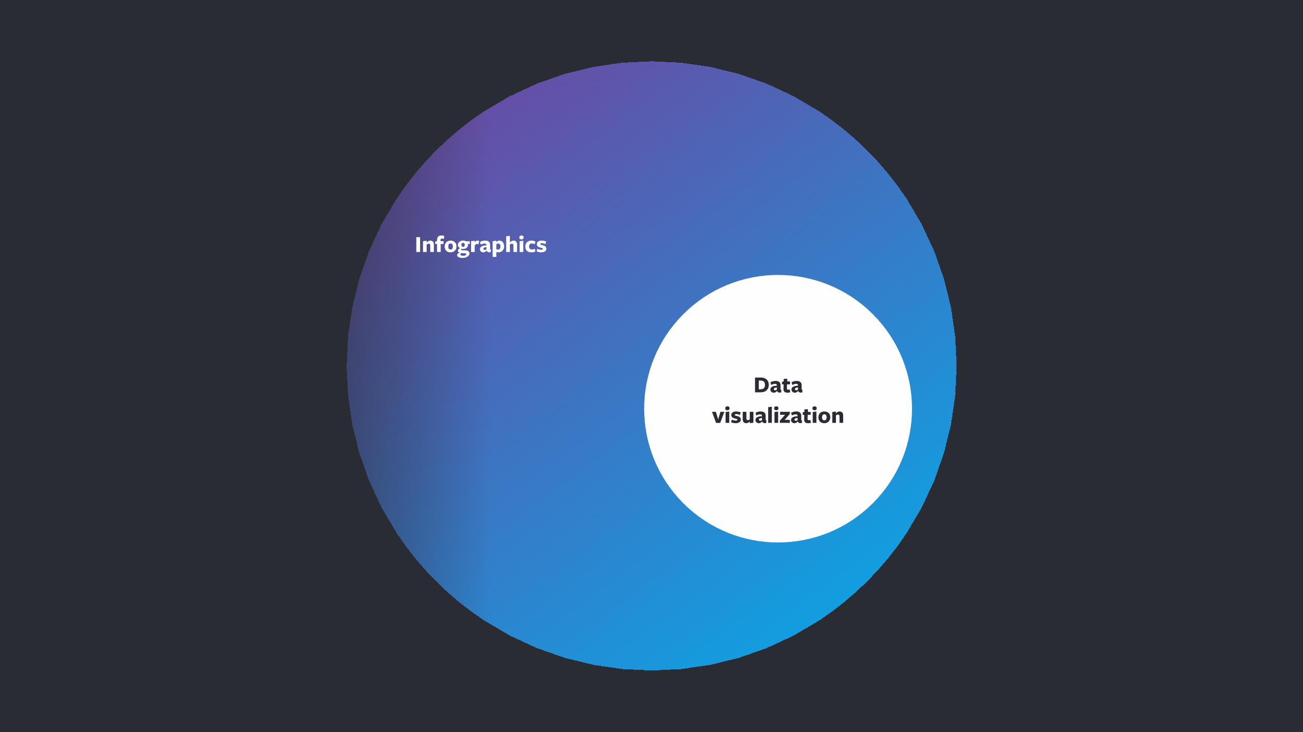
Data visualization
Infographics
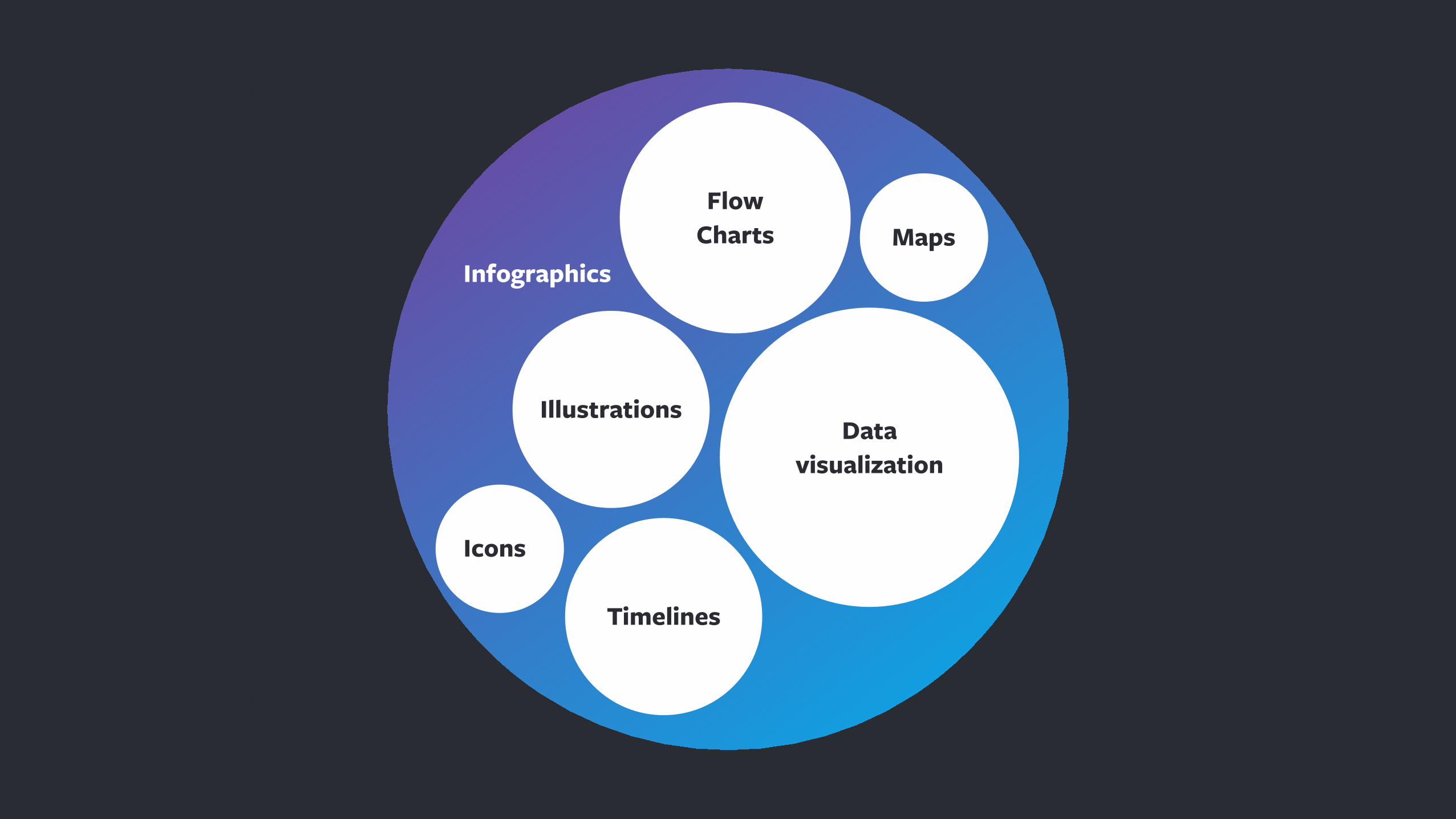
Data visualization
Infographics
Illustrations
Timelines
MapsFlow
Charts
Icons
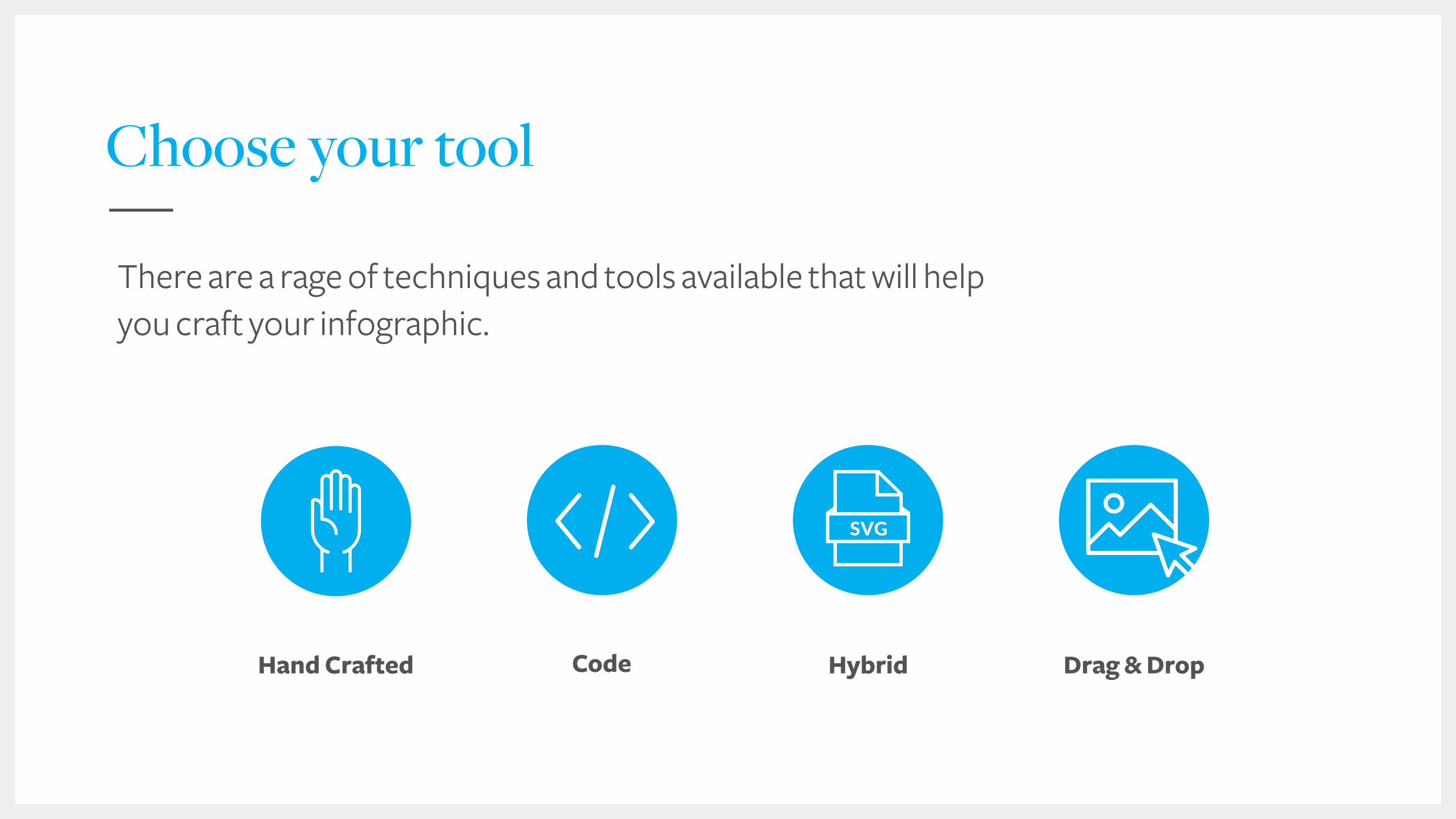
Choose your tool
Code Hand Crafted Drag & DropHybrid
There are a rage of techniques and tools available that will help you craft your infographic.
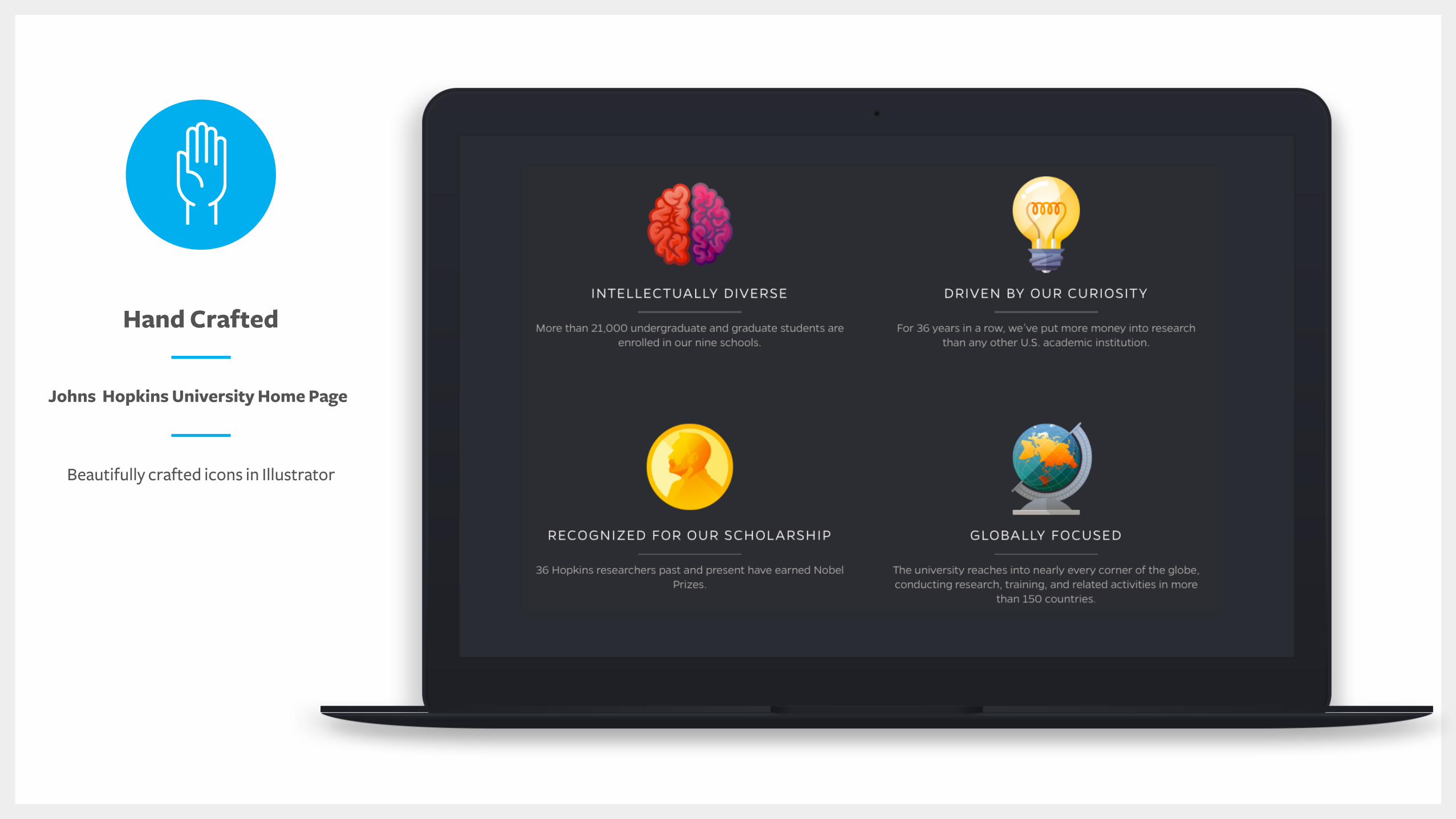
Johns Hopkins University Home Page
Hand Crafted
Beautifully crafted icons in Illustrator
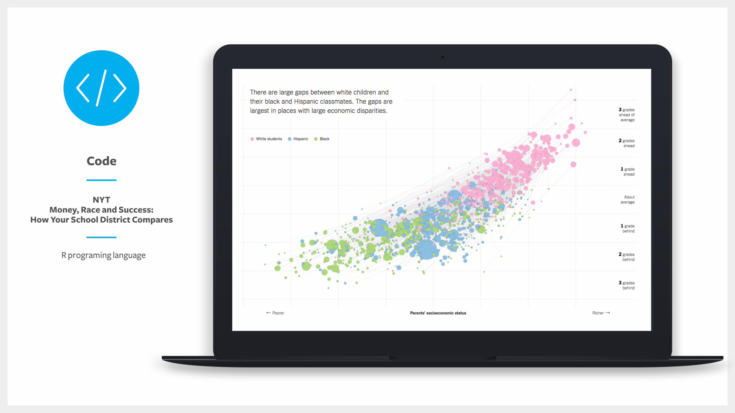
NYT Money, Race and Success:
How Your School District Compares
Code
R programing language
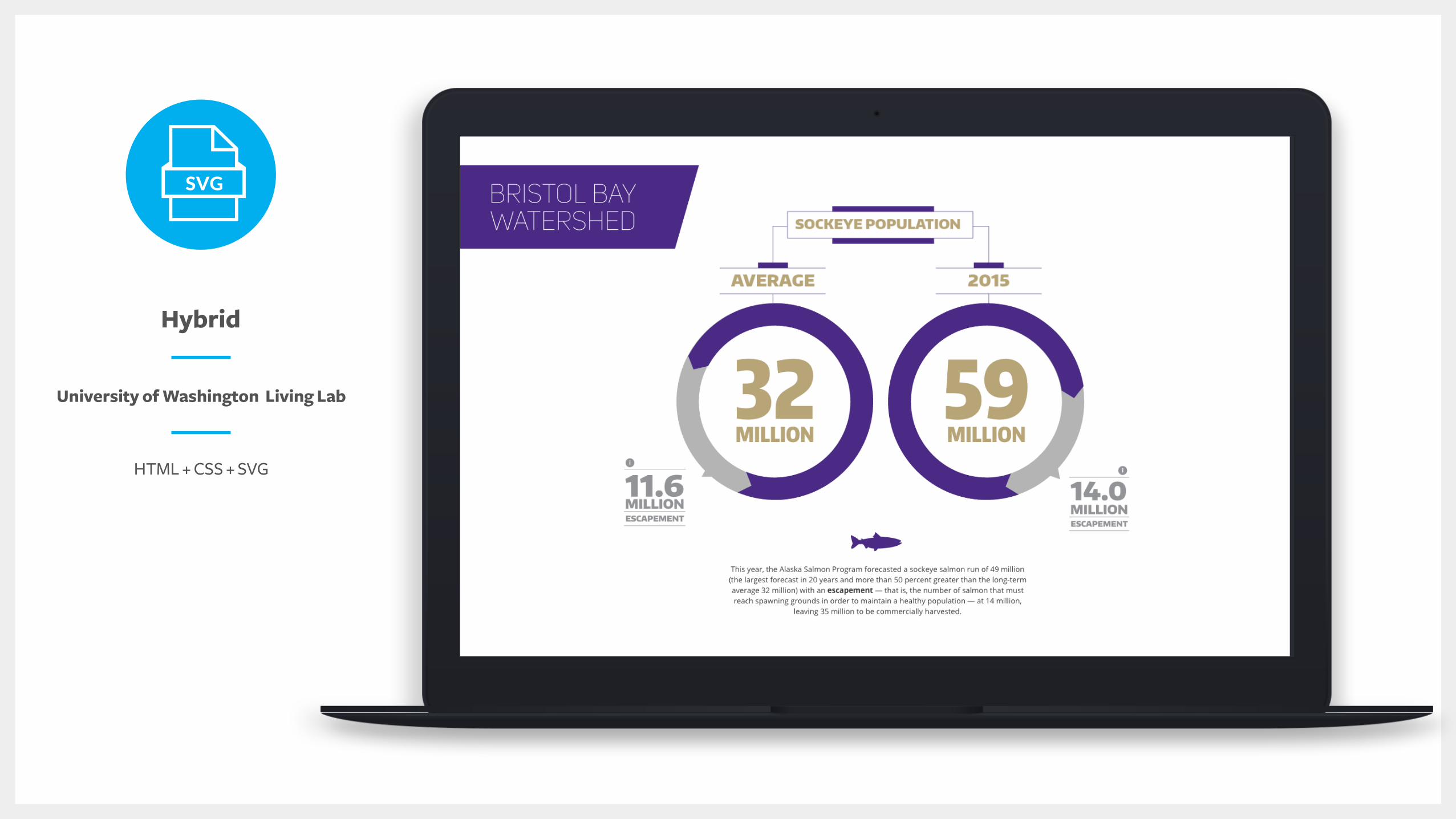
University of Washington Living Lab
Hybrid
HTML + CSS + SVG
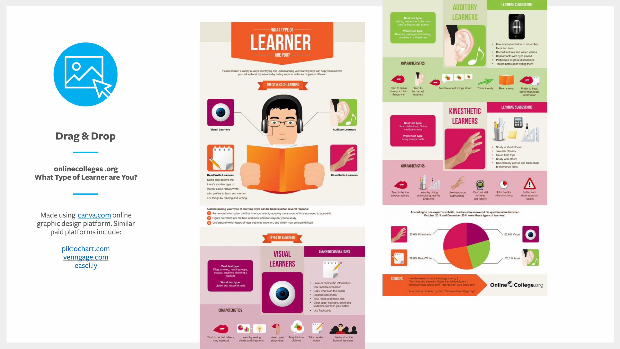
onlinecolleges .org What Type of Learner are You?
Drag & Drop
Made using canva.com online graphic design platform. Similar
paid platforms include:
piktochart.comvenngage.com
easel.ly
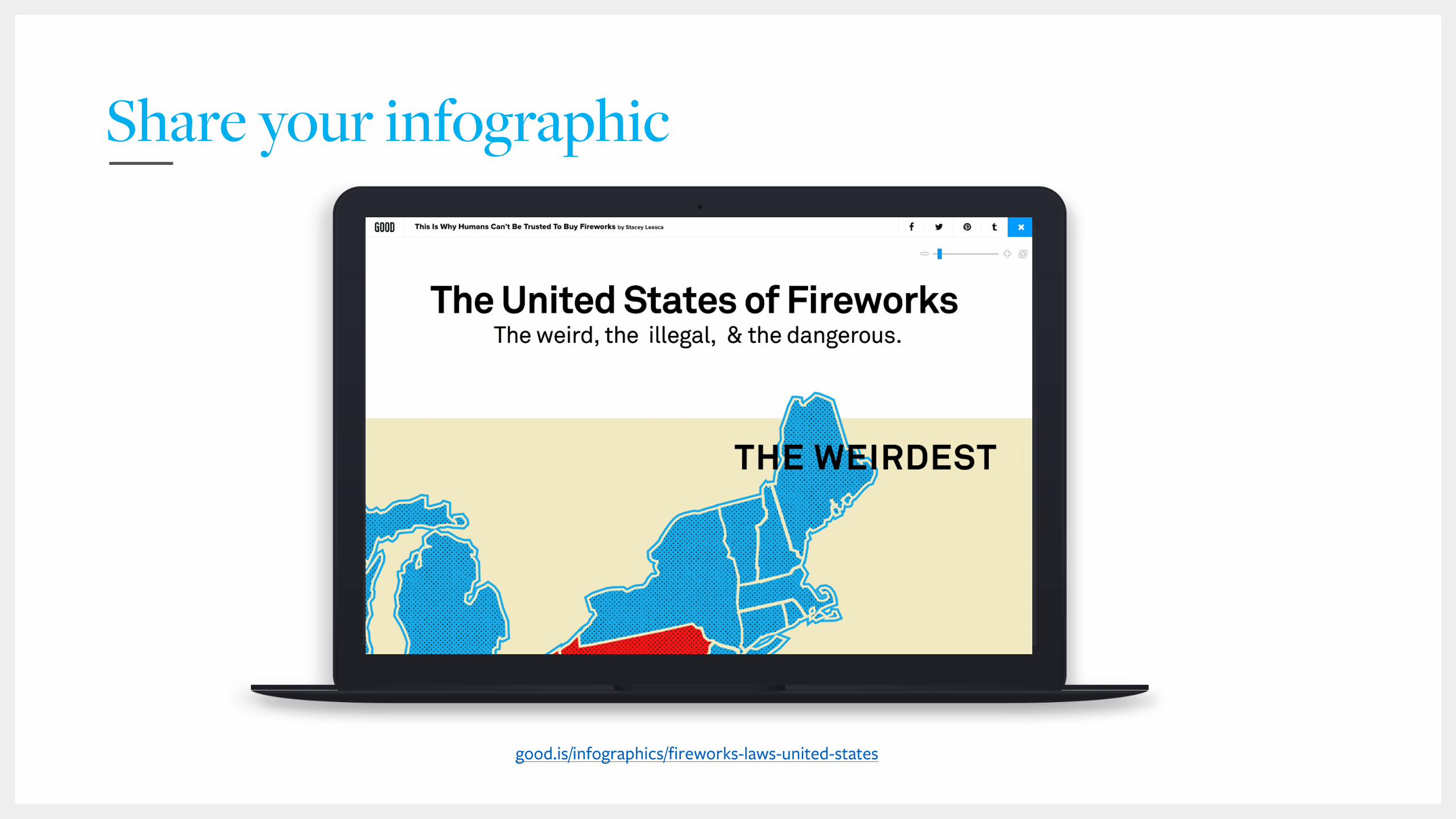
good.is/infographics/fireworks-laws-united-states
Share your infographic
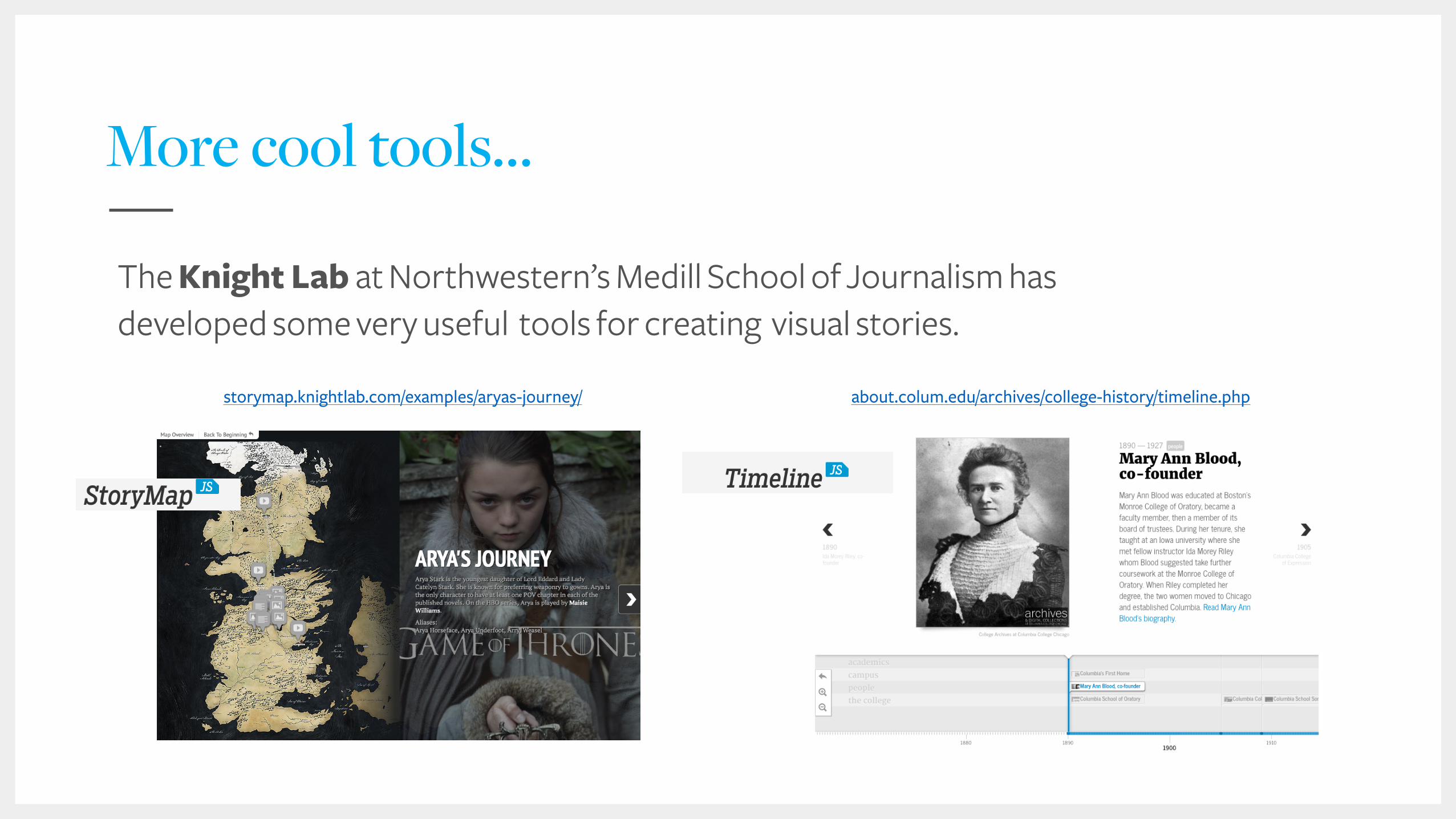
More cool tools…
The Knight Lab at Northwestern’s Medill School of Journalism has developed some very useful tools for creating visual stories.
storymap.knightlab.com/examples/aryas-journey/ about.colum.edu/archives/college-history/timeline.php
Considerations
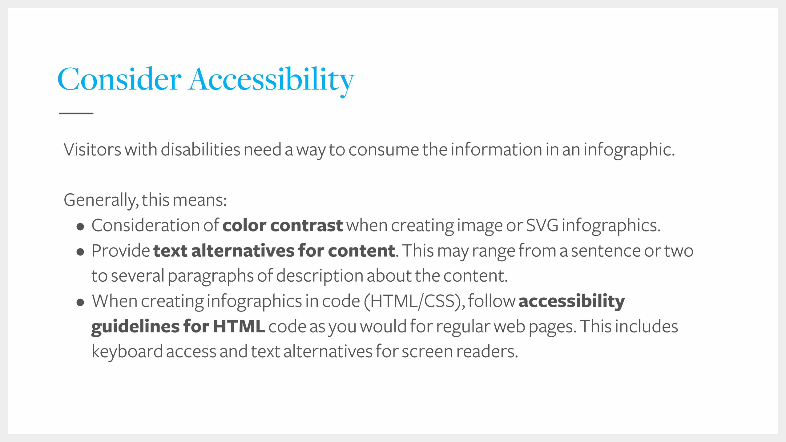
Consider Accessibility
Visitors with disabilities need a way to consume the information in an infographic.
Generally, this means: • Consideration of color contrast when creating image or SVG infographics. • Provide text alternatives for content. This may range from a sentence or two
to several paragraphs of description about the content. • When creating infographics in code (HTML/CSS), follow accessibility
guidelines for HTML code as you would for regular web pages. This includes keyboard access and text alternatives for screen readers.
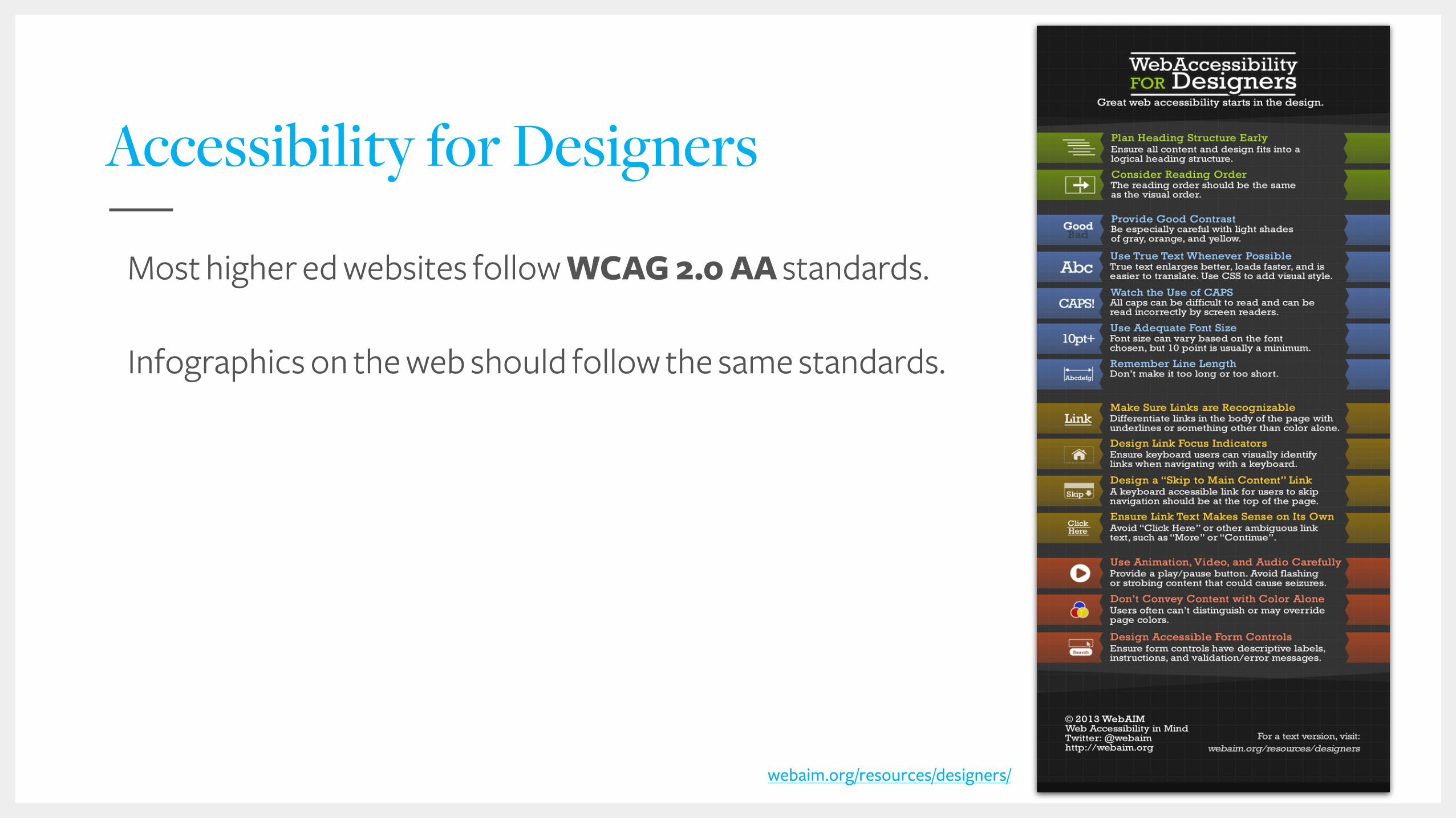
Accessibility for Designers
Most higher ed websites follow WCAG 2.0 AA standards.
Infographics on the web should follow the same standards.
webaim.org/resources/designers/
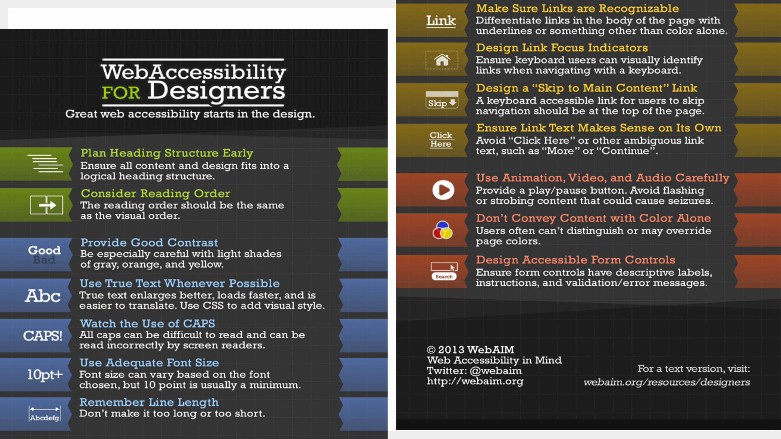
Accessibility

Our Storytelling Series Team
Ben Conley Visual/UX Designer
Abby McLean Visual/UX Designer
Fran Zablocki Information Architect
Soni Oliver Visual/UX Designer
Joel Pattison Director of Strategy
Greg Zguta Technologist
Voltaire Santos Miran
Chief Executive Officer
@vsantosmiran
312.420.6778 [email protected]
Mallory Wood Director of Marketing
@mallorywood
802.457.9234 [email protected]
Resources
• Download: Higher Ed Design Best Practices http://mstnr.me/HEDesignResources
• Register: Analytics for Digital Storytelling http://mstnr.me/SeptemberDigStorytelling
Ben Bilow Senior Creative Director
773.620.5655 [email protected]

Questions & Answers