image analysis
TRANSCRIPT
Images Analysis
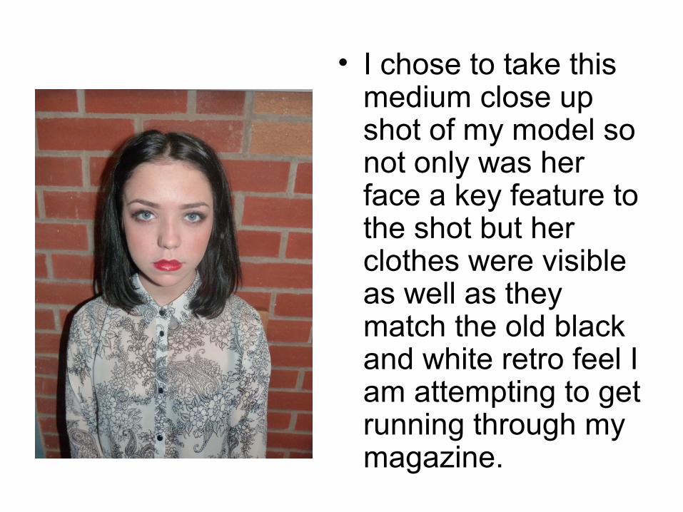
• I chose to take this medium close up shot of my model so not only was her face a key feature to the shot but her clothes were visible as well as they match the old black and white retro feel I am attempting to get running through my magazine.
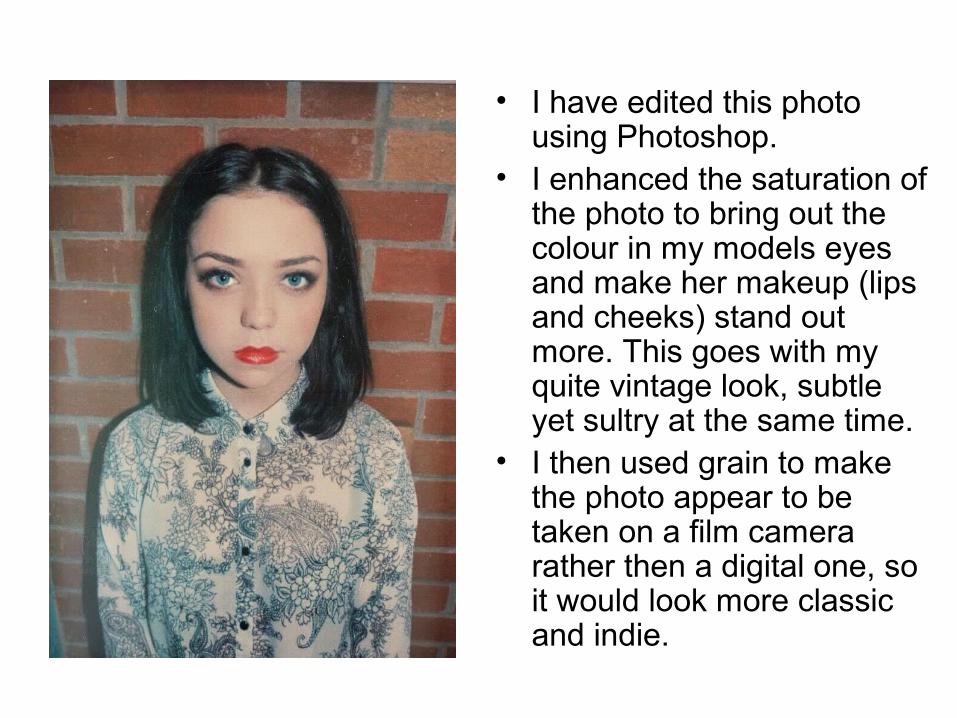
• I have edited this photo using Photoshop.
• I enhanced the saturation of the photo to bring out the colour in my models eyes and make her makeup (lips and cheeks) stand out more. This goes with my quite vintage look, subtle yet sultry at the same time.
• I then used grain to make the photo appear to be taken on a film camera rather then a digital one, so it would look more classic and indie.

• I made my model pose in this way so she came across very secretive and mysterious, as if she wasn’t letting anyone have the opportunity to look into her eyes to figure out her thoughts. I chose this time to make her wear the head band as it matched the colours of the paisley shirt and as my model and style icon I got inspiration from was Lana Del Rey, she is famous for wearing and pulling of big flower garland headbands.
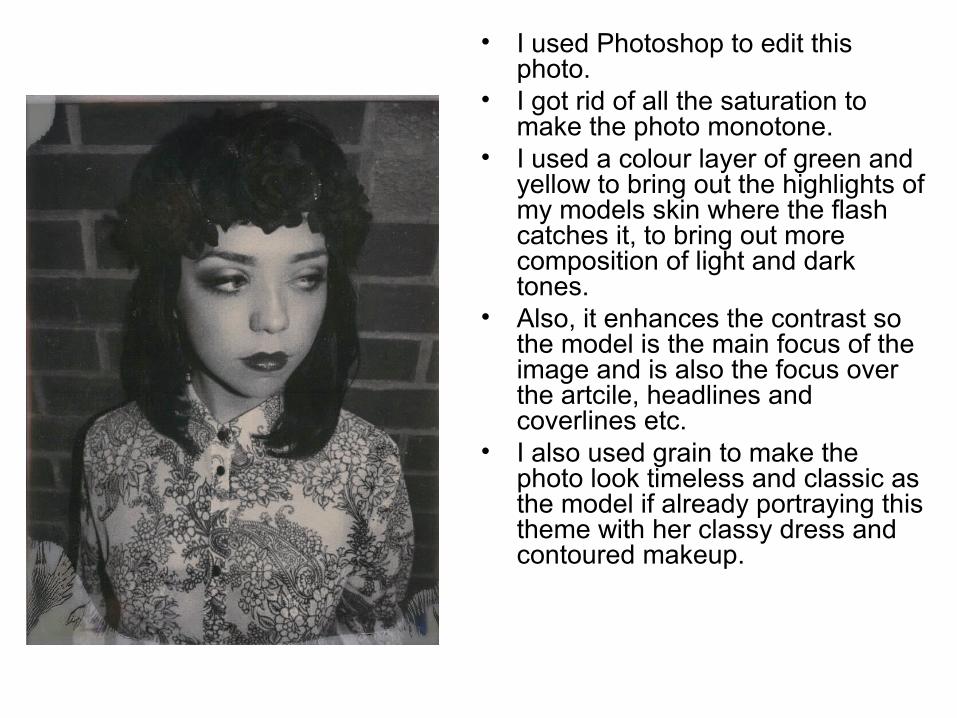
• I used Photoshop to edit this photo.
• I got rid of all the saturation to make the photo monotone.
• I used a colour layer of green and yellow to bring out the highlights of my models skin where the flash catches it, to bring out more composition of light and dark tones.
• Also, it enhances the contrast so the model is the main focus of the image and is also the focus over the artcile, headlines and coverlines etc.
• I also used grain to make the photo look timeless and classic as the model if already portraying this theme with her classy dress and contoured makeup.
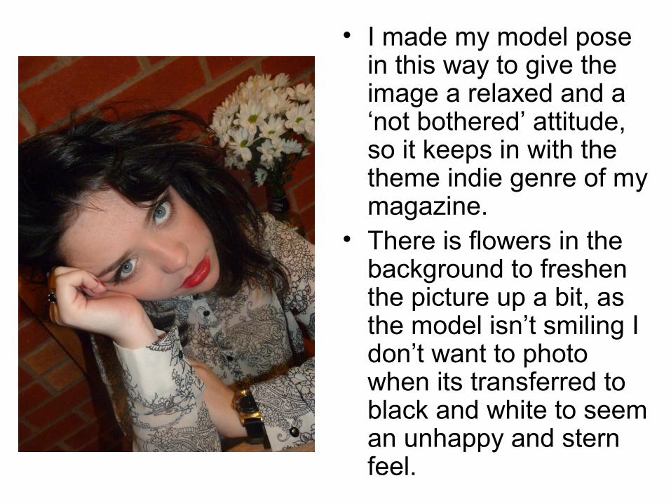
• I made my model pose in this way to give the image a relaxed and a ‘not bothered’ attitude, so it keeps in with the theme indie genre of my magazine.
• There is flowers in the background to freshen the picture up a bit, as the model isn’t smiling I don’t want to photo when its transferred to black and white to seem an unhappy and stern feel.
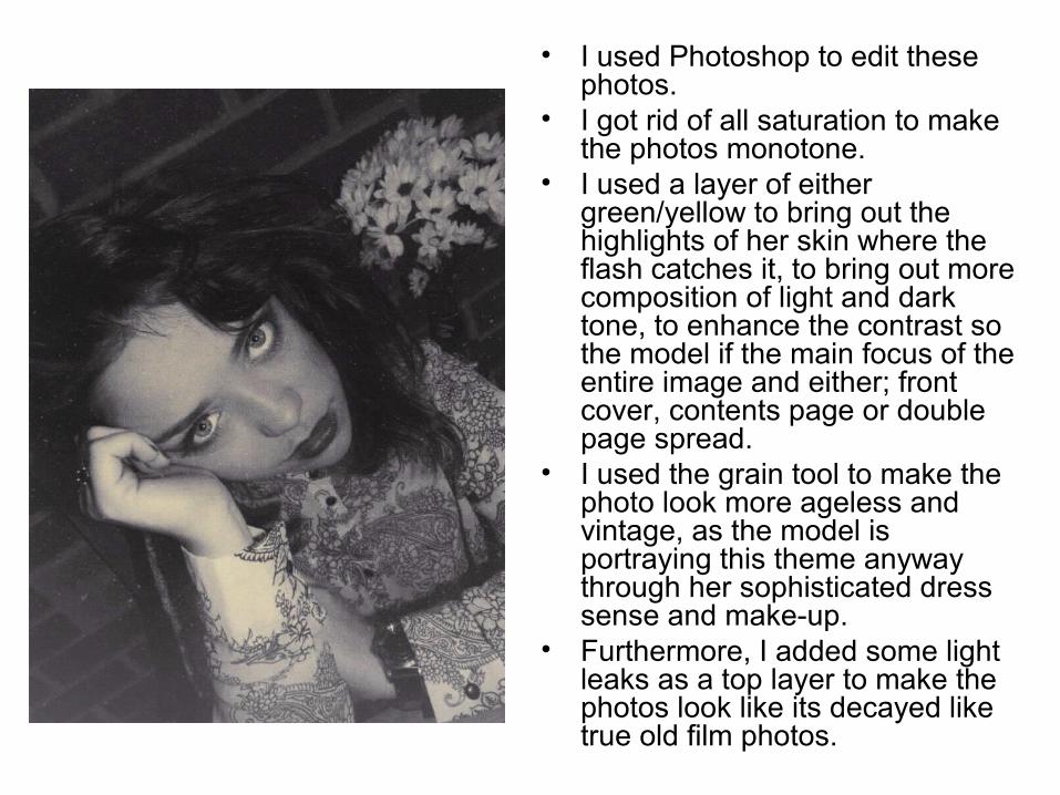
• I used Photoshop to edit these photos.
• I got rid of all saturation to make the photos monotone.
• I used a layer of either green/yellow to bring out the highlights of her skin where the flash catches it, to bring out more composition of light and dark tone, to enhance the contrast so the model if the main focus of the entire image and either; front cover, contents page or double page spread.
• I used the grain tool to make the photo look more ageless and vintage, as the model is portraying this theme anyway through her sophisticated dress sense and make-up.
• Furthermore, I added some light leaks as a top layer to make the photos look like its decayed like true old film photos.

• I got my model to pose in this way to show that although she isn’t creating eye contact with the camera and then henceforth with the readers, she is still dominating this photo and looks in control due to the stance and position of her hands. The way she is grabbing her shirt and the fact that her collar is up proposes the idea that she is a force to be reckoned with and is a young person of a subculture characterized by her smart stylish appearance.
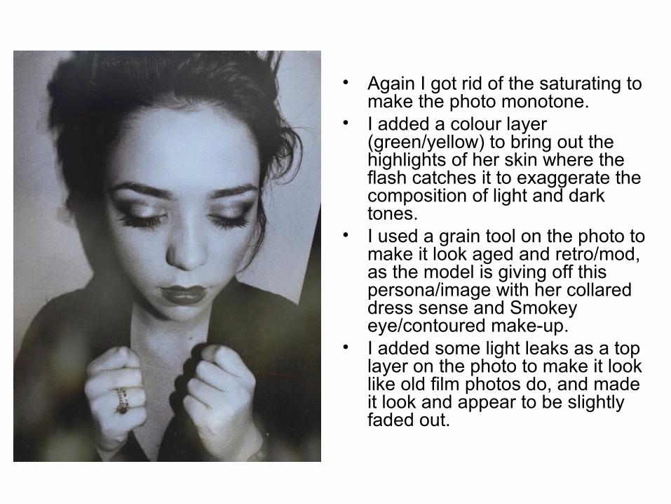
• Again I got rid of the saturating to make the photo monotone.
• I added a colour layer (green/yellow) to bring out the highlights of her skin where the flash catches it to exaggerate the composition of light and dark tones.
• I used a grain tool on the photo to make it look aged and retro/mod, as the model is giving off this persona/image with her collared dress sense and Smokey eye/contoured make-up.
• I added some light leaks as a top layer on the photo to make it look like old film photos do, and made it look and appear to be slightly faded out.

• In this image, I made my model stand in the way so her head is aligned with her shoulders so her collar bones her right hand cheek bone is extremely visible. Hence the reason I made her move her hair (parting/fringe) to the left hand side to enhance them.
• In terms of her cheek bones I applied bronzer to them to make them stand out even more, and to contour her face.
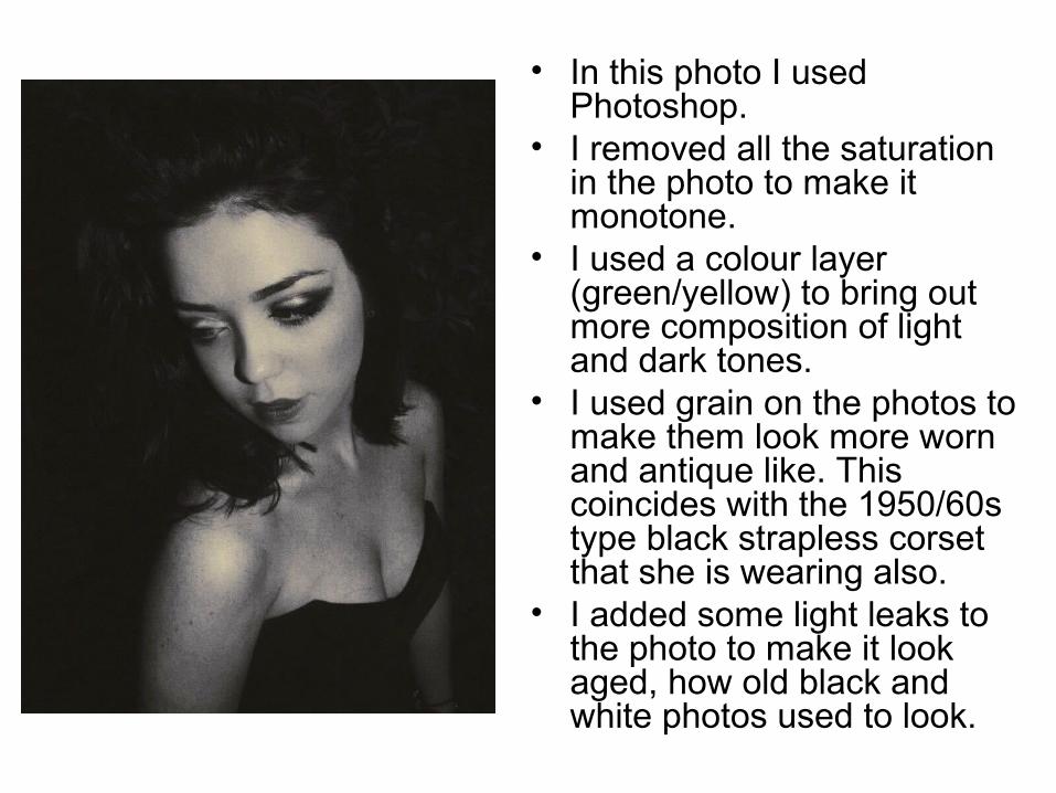
• In this photo I used Photoshop.
• I removed all the saturation in the photo to make it monotone.
• I used a colour layer (green/yellow) to bring out more composition of light and dark tones.
• I used grain on the photos to make them look more worn and antique like. This coincides with the 1950/60s type black strapless corset that she is wearing also.
• I added some light leaks to the photo to make it look aged, how old black and white photos used to look.
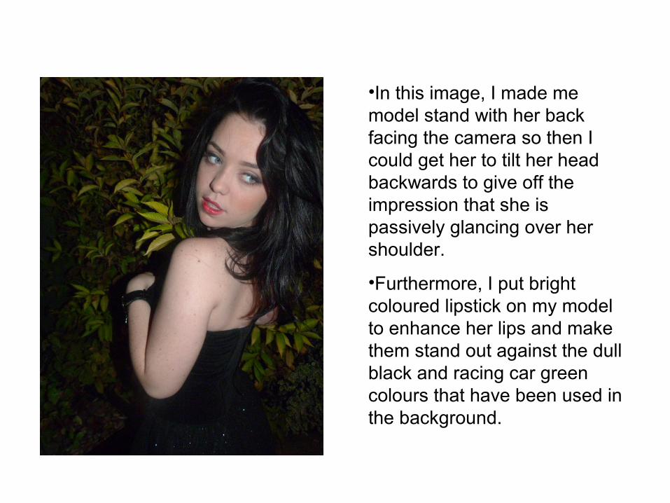
•In this image, I made me model stand with her back facing the camera so then I could get her to tilt her head backwards to give off the impression that she is passively glancing over her shoulder.
•Furthermore, I put bright coloured lipstick on my model to enhance her lips and make them stand out against the dull black and racing car green colours that have been used in the background.

• In this photo I used Photoshop.• I removed all the saturation in
the photo to make it monotone.• I used a colour layer
(green/yellow) to bring out more composition of light and dark tones.
• I used grain on the photos to make them look aged. This coincides with the 1950/60s type black strapless corset that she is wearing also.
• I added some light leaks to the photo to make it look aged, how old black and white photos used to look.

•I used a high shot of my model so her whole body from head to toe could be seen in the shot.
•Her effortless festival chic dress sense is portrayed clearly through the use of the head band, dungarees and trainers.
•I got my model to pose in this way to look adhering to readers, and entice them into want to read my magazine, and also her positioning and hand positioning makes her look powerful and in control of the photo, situation and surroundings.
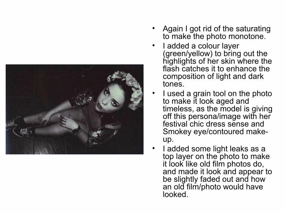
• Again I got rid of the saturating to make the photo monotone.
• I added a colour layer (green/yellow) to bring out the highlights of her skin where the flash catches it to enhance the composition of light and dark tones.
• I used a grain tool on the photo to make it look aged and timeless, as the model is giving off this persona/image with her festival chic dress sense and Smokey eye/contoured make-up.
• I added some light leaks as a top layer on the photo to make it look like old film photos do, and made it look and appear to be slightly faded out and how an old film/photo would have looked.
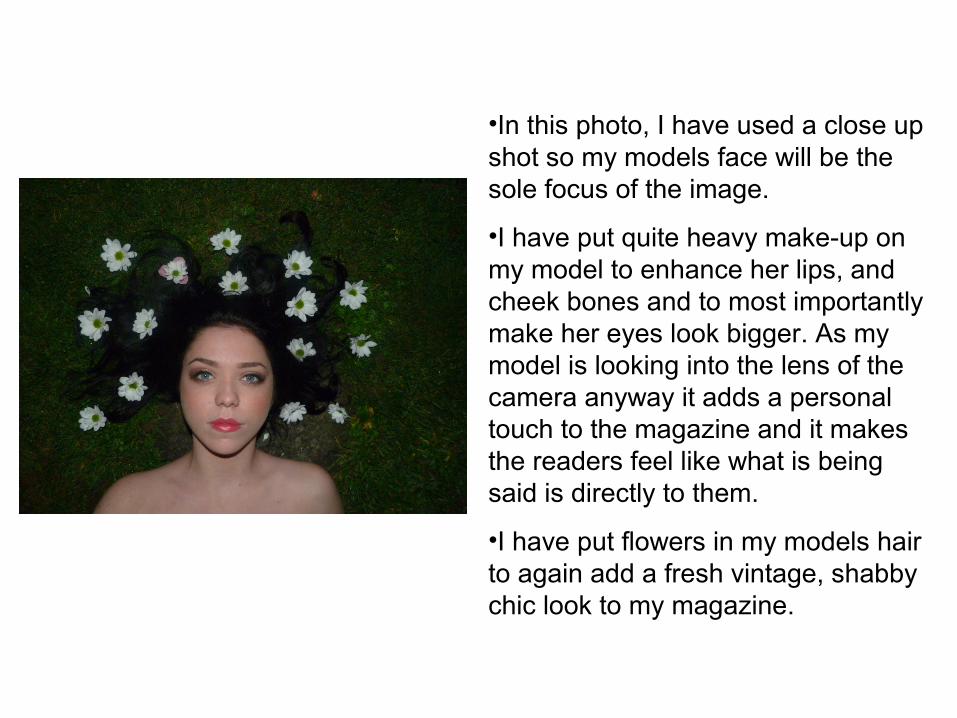
•In this photo, I have used a close up shot so my models face will be the sole focus of the image.
•I have put quite heavy make-up on my model to enhance her lips, and cheek bones and to most importantly make her eyes look bigger. As my model is looking into the lens of the camera anyway it adds a personal touch to the magazine and it makes the readers feel like what is being said is directly to them.
•I have put flowers in my models hair to again add a fresh vintage, shabby chic look to my magazine.
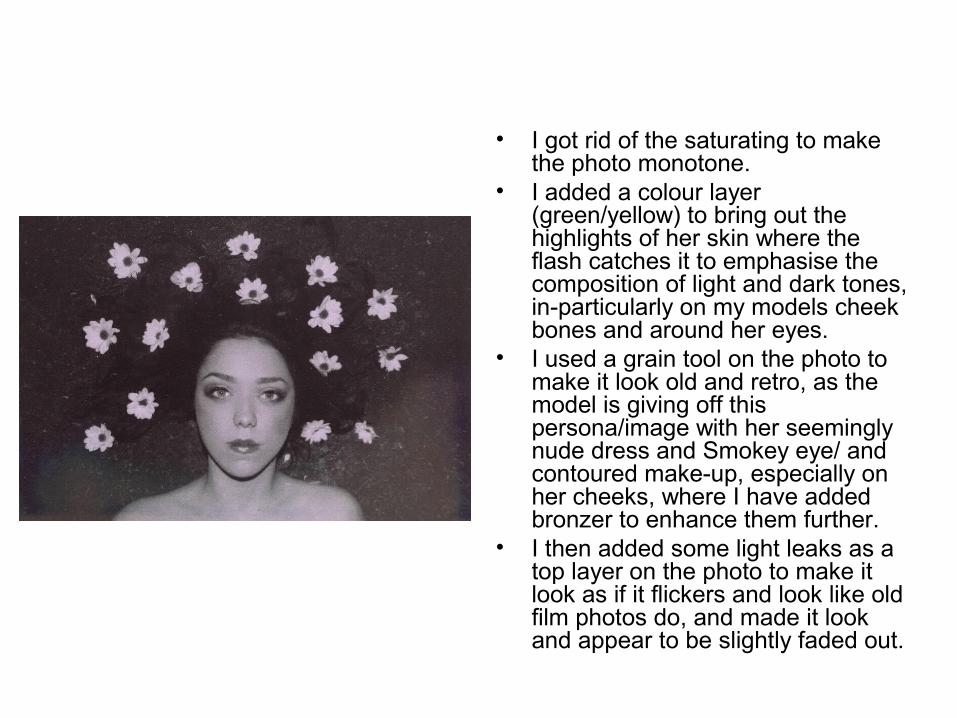
• I got rid of the saturating to make the photo monotone.
• I added a colour layer (green/yellow) to bring out the highlights of her skin where the flash catches it to emphasise the composition of light and dark tones, in-particularly on my models cheek bones and around her eyes.
• I used a grain tool on the photo to make it look old and retro, as the model is giving off this persona/image with her seemingly nude dress and Smokey eye/ and contoured make-up, especially on her cheeks, where I have added bronzer to enhance them further.
• I then added some light leaks as a top layer on the photo to make it look as if it flickers and look like old film photos do, and made it look and appear to be slightly faded out.

In this ‘John Newman’ gig picture I took, I used a Noir edit to change the image from colour to black and white.
In this ‘Peace’ gig picture I took, I used a Mono edit to change the image from colour to black and white.

In this ‘Kodaline’ gig picture I took, I used a Mono edit to change the picture from colour to black and white.
In this ‘The Fratellis’ gig picture I took, I used a Noir edit to change the image from colour to black and white.

In the ‘Bastille’ gig picture I took, I used a Tonal edit to change the photo from colour to black and white.
In this ‘Two Door Cinema Club’ gig picture I took, I used a Noir edit to change the picture from colour to black and white.
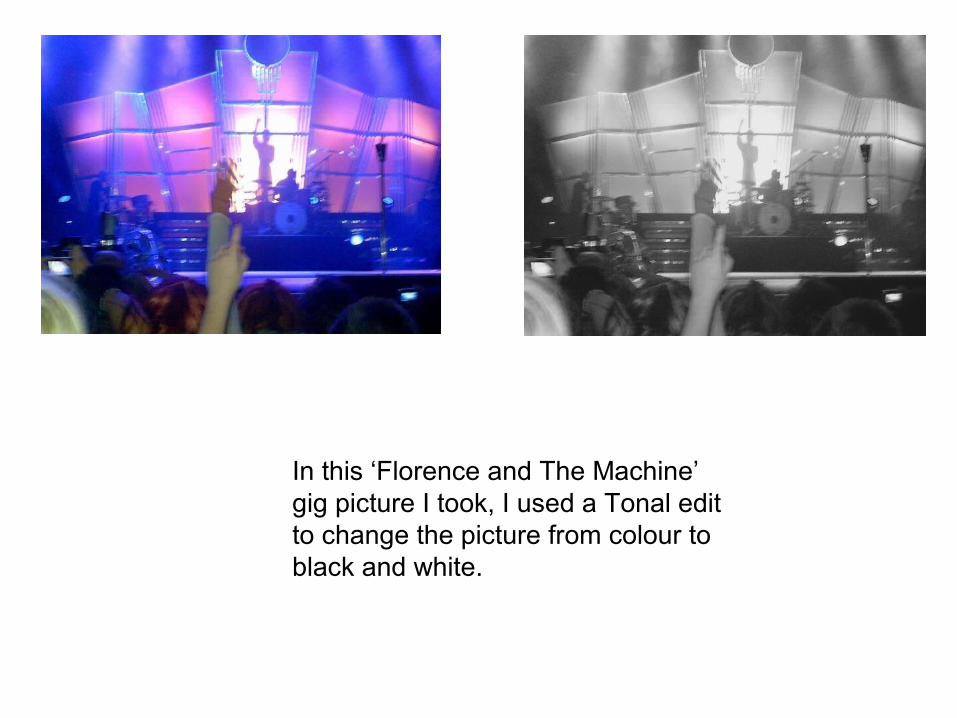
In this ‘Florence and The Machine’ gig picture I took, I used a Tonal edit to change the picture from colour to black and white.