imd07101 intro to hci week 7 bridging the gulfs in hci tom mcewan with material from david benyon
TRANSCRIPT

IMD07101 Intro to HCI week 7 Bridging the Gulfs in HCI
Tom McEwan
With material from David Benyon

Gulfs• Bridging the last few weeks
– Usability and Accessibility– People-Technology System
• Gulfs of Execution and Evaluation• Building upon the Principles

To recap: Design for all
• To a large extent, design for all is just good design. • The aim is to design to cater for the widest range of
human abilities. • By considering access issues early in the design process,
the overall design will be better for everyone. • Stephanidis (2001) provides a range of views on how this can be
accomplished, from new computer ‘architectures’ that can accommodate different interfaces for different users, to better requirements generation processes, consideration of alternative input and output devices and the adoption of international standards.

To recap: Usability
• A system with a high degree of usability will have the following characteristics:• It will be efficient, in that people will be able to do things using an
appropriate amount of effort.• It will be effective, in that it contains the appropriate functions and
information content, organized in an appropriate manner.• It will be easy to learn how to do things, and to remember how to
do them after a while.• It will be safe to operate in the variety of contexts in which it will be
used.• It will have high utility, in that it does the things that people want
to get done.

Original usability principles• Early focus on users and tasks. Designers must first understand who the users will be,
in part by studying the nature of the expected work to be accomplished, and in part by making users part of the design team through participative design or as consultants.
• Empirical measurement. Early in the development process, intended users’ reactions to printed scenarios and user manuals should be observed and measured. Later on they should actually use simulations and prototypes to carry out real work, and their performance and reactions should be observed, recorded, and analysed.
• Iterative design. When problems are found in user testing, as they will be, they must be fixed. This means design must be iterative: there must be a cycle of design, test and measure, and redesign, repeated as often as necessary. Empirical measurement and iterative design are necessary because designers, no matter how good they are, cannot get it right the first few times. (Gould et al., 1987, p. 758)
• As a result of their experiences with that project they added a fourth principle, integrated usability:
• ‘All usability factors must evolve together, and responsibility for all aspects of usability should be under one control’. (p. 766)

But…• However, these classic principles are not advocated by everyone. • Cockton (2008), for example, argues that designers need to
understand the values that their designs aim to uphold – and that the sort of advice offered by Gould and Lewis is dangerous and
out of date. • Whilst not going as far as that, we would certainly agree that
designers need to consider the worth that their designs bring to the world!
• Think about your parents’ generation and computers. Does the technology make their lives better?– http://www.youtube.com/watch?v=tq4a_NCrDxs&NR=1 and 2

Usability and PACT• One way to look at usability is to see it as concerned with
achieving a balance between the four principal factors of human-centred interactive systems design, PACT:
– People– Activities people want to undertake– Contexts in which the interaction takes place– Technologies (hardware and software).
• The combinations of these elements are very different in, for example,
• a public kiosk, • a shared diary system, • an airline cockpit or • a mobile phone;
• and it is this wide variety that makes achieving a balance so difficult.
• Designers must constantly evaluate different combinations in order to reach this balance.
PACT ACTP CPAT TPAC APTCPCATCAPTTACPPTACATPCCTAPTCAP

An important feature of human–computer interaction.
• There are two relationships that need to be optimized. • On the one hand there is the interaction between people and the
technologies that they are using. • This focuses on the user interface. • The other relationship is the interaction between the people and
technologies considered as a whole (the people–technology system), the activities being undertaken, and the contexts of those activities.
People–technology system • The idea of a people–technology system optimized for some activities is
nicely illustrated with an example from Erik Hollnagel (1997). • He discusses the difference between a person on a horse traveling across open
countryside and a person in a car traveling along a road.
• The combinations of technologies are balanced for the different contexts of traveling; neither is better in all circumstances.
• It is important to remember that the people–technology system may consist of many people and many devices working together to undertake some activities.
• The devices and information need by• a group of students need to prepare food for an impromptu party at 11pm for 20 friends, • are different from someone at 3pm trying to prepare the perfect romantic dinner for two, • and are different again from agreeing a flatmates’ collective supermarket home delivery
to last a week.

The Gulfs• Don Norman (Norman, 1988) focuses on the interface between a person
and the technology and on the difficulty of people having to translate their goals into the specific actions required by a user interface.
• People have goals – things they are trying to achieve in the world. But devices typically only deal with simple actions. This means that two ‘gulfs’ have to be bridged.
• The gulf of execution is concerned with translating goals into actions, • The gulf of evaluation is concerned with deciding whether the actions were
successful in moving the person towards his or her goal.
• These gulfs have to be bridged both • Semantically (does the person understand what to do and what has happened?)• Physically (can the person physically or perceptually find out what to do or what
has happened?).

The Gulfs of Execution and Evaluation

Technology in the way
• A key issue for usability is that very often the technology gets in the way of people and the activities they want to do.
• If we compare using an interactive device such as a remote control to using a hammer or driving a car, we can see the issue more clearly.
• Very often when using an interactive system we are conscious of the technology; we have to stop to press the buttons; we are conscious of bridging the gulfs.
• When hammering or driving we focus on the activity, not the technology.
• The technology is ‘present to hand’.

Technological breakdown• When using a hammer, driving or writing with a pen we will usually
focus on the activity itself: we are hammering, driving or writing.– It is only when something happens to interfere with the smooth operation of these
technologies that we become aware of them.
• If you hit your finger whilst hammering, if you have to swerve to avoid a hole in the road, or if the pen stops working, then the unconscious use of the technology turns into a conscious interaction with the technology. – Winograd and Flores (1986) refer to this as a ‘breakdown’.
• One aim of interactive systems design is to avoid such breakdowns, to provide people with a way of undertaking activities without really being aware of the technologies that enable them to do what they are doing.

Usability and mental models• Another important aspect of usability is to try to engender an accurate
mental model of the system. • A good design will have adopted a clear and well structured
conceptual design that can be easily communicated to people. • A complex design will make this process much more difficult.• Striving for a clear, simple and consistent conceptual model will
increase the usability of a system.
Image used under Creative Commons Attribution-ShareAlike Licence http://www.interaction-design.org/encyclopedia/mental_models_glossary.html

Acceptability
• Acceptability is about fitting technologies into people’s lives. For example:
• Some railway trains have ‘quiet’ carriages where it is unacceptable to use mobile phones, and cinemas remind people to turn their phones off before the film starts.
• Apple’s iMac computer was the first computer designed to look good in a living room.
• A computer playing loud music would generally be considered to be unacceptable in an office environment.
• An essential difference between usability and acceptability is that acceptability can only be understood in the context of use.
• Usability can be evaluated in a laboratory (though such evaluations will always be limited).
• Acceptability cannot.

The Technology Acceptance Model• The Technology Acceptance Model (TAM) is
a way of looking at technologies and whether they will be accepted by communities.
• It has its origins in business studies rather than in computing or psychology.
• TAM looks at technology acceptance from two perspectives; ease of use and effectiveness.
• Each of these is further broken down into more specific characteristics of the technology.
• There are many variants of TAM as it gets adapted to the particular characteristics of a technology.
• Some of our own work involved looking at the acceptance of biometrics. • We felt that a third aspect was important to the acceptance of biometric technology,
namely trust.
http://www.vvenkatesh.com/IT/organizations/Theoretical_Models.asp

Political acceptability
• Is the design politically acceptable? • Do people trust it? • In many organizations new technologies have been introduced for
simple economic reasons, irrespective of what people may feel about them and the ways that people’s jobs and lives might change.
• In the broader environment human rights might be threatened by changes in technologies.

Convenience.
• Designs that are awkward or that force people to do things may prove unacceptable.
• Designs should fit effortlessly in to the situation. • Many people send documents electronically nowadays, but many
people find reading on-line unacceptable. • They print out the document because it is more convenient to carry
and read.

Cultural and social habits.
• If political acceptability is concerned with power structures and principles, cultural and social habits are concerned with the way people like to live.
• It is rude to disturb other people, for example.
• ‘Spam’ e-mail has become such an unacceptable aspect of life that some companies have given up on e-mail altogether.
• Usefulness. • This goes beyond the notions of efficiency and effectiveness and concerns
usefulness in context. • For example, many people have found the diary function on their PDAs perfectly
usable, but not sufficiently useful in the context of everyday living.

Economic acceptability
• There are many economic issues that render some technology acceptable or not.
• Price is the obvious one and whether the technology offers value for money. Can you afford what it affords?!!
• But the economic issues go further than that, as the introduction of new technologies may completely change the way businesses work and how they make money.
• A new ‘business model’ is often a part of economic acceptability. • But this can result in large numbers of jobs disappearing
• Don Norman characterizes the situation for a successful technology as a stool with three legs: user experience (UX), marketing and technology
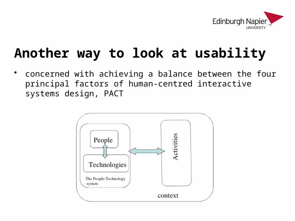
Another way to look at usability• concerned with achieving a balance between the four principal factors
of human-centred interactive systems design, PACT

Two relationships that need to be optimised
• The interaction between people and the technologies that they are using. This focuses on the user interface.
• The interaction between the people and technologies considered as a whole (the People-technology system), the activities being undertaken, and the contexts of those activities.

People-technology system • Optimised for some activities
– The difference between a person on a horse travelling across open countryside – A person in a car travelling along a road.
• The combinations of technologies are balanced for the different contexts of travelling; neither is best in all circumstances.
• The People-technology system may consist of many people and many devices working together to undertake some activities.
• Follow up: view more of the relatively PC videos from http://www.iden.org.uk/videoplayer.asp• Eg Around 3’40” of http://www.youtube.com/watch?v=8RVQ_IIkors&feature=related illustrates
gulf of execution – “how do I send an email?”

The User Interface• The interaction between people and technology• People have goals
– things they are trying to achieve in the world. • But devices typically only deal with simple actions. • This means that two ‘gulfs’ have to be bridged.
– The gulf of execution is concerned with translating goals into actions
– the gulf of evaluation is concerned with deciding whether the actions were successful in moving the person towards his or her goal.
• These gulfs have to be bridged – semantically – does the person understand what to do and what
has happened — – physically — can the person physically or perceptually find out what
to do or what has happened.

Challenge - entering videoplus codes. Where are the gulfs?
… of execution - working out which button to press.. Semantically (which one do I want), physically - where is it?… of evaluation - checking on TV to see which button was pressed (physical), checking against code in paper (semantic)

Another key issue for usability• Often the technology gets in the way of people and activities they
want to do. • If we compare using an interactive device such as a remote control to
using a hammer, driving a car or writing with a pen we can see the issue more clearly.
• Very often when using an interactive system we are conscious of the technology; we have to stop to press the buttons; we are conscious of bridging the gulfs.
• Designing to ensure a clear mental model also helps to bridge the gulfs
Break• Take a break for 10 minutes• After the break ….. The 12 Principles
Bridging the Gulfs• We need to make interaction more natural – using the knowledge we
have of our bodies and the environment.• Jeff Han’s original touch screen demo (2006)
– http://www.ted.com/talks/jeff_han_demos_his_breakthrough_touchscreen.html
• We can enable interaction through tangible and movable interaction objects.– http://www.ted.com/talks/lang/eng/david_merrill_demos_siftables_the_smart_blocks
.html

Bridging the Gulfs• We can mix the digital and the real. Tiny data projectors + camera =
any surface is an interactive device.– http://www.ted.com/talks/pattie_maes_demos_the_sixth_sense.html
• In Summary– The gulf of execution is about how to translate what you want to do into the actions
of the device– The gulf of evaluation is about how to understand what the device has done and
whether you wanted it to do it!

Design principles
• Over the years many principles of good interactive system design have been developed. Design principles can be very broad or they can be more specific.
• There are also good design principles that derive from psychology such as ‘minimize memory load’ (i.e. do not expect people to remember too much).
• The application of design principles has led to established design guidelines and patterns of interaction in certain circumstances such as the ‘undo’ command in a Windows application, the ‘back’ button on a website or the greying-out of inappropriate options on menus.
• Design principles can guide the designer during the design process and can be used to evaluate and critique prototype design ideas.

Our design principles
• All the principles interact in complex ways, affecting each other, sometimes
conflicting with each other and sometimes enhancing each other.
• But they help to orientate the designer to key features of good design and
sensitize the designer to important issues.
• For ease of memorizing and use we have grouped them into three main
categories – learnability, effectiveness and accommodation – but these
groupings are not rigid. Systems should be learnable, effective and
accommodating.
• Principles 1–4 are concerned with access, ease of learning and remembering
(learnability).
• Principles 5–7 are concerned with ease of use, and principles 8 and 9 are
concerned with safety (effectiveness).
• Principles 10–12 are concerned with accommodating differences between people
and respecting those differences (accommodation).

1 Visibility
• Try to ensure that things are visible so that people can see what functions are available and what the system is currently doing.
• This is an important part of the psychological principle that it is easier to recognize things than to have to recall them.
• If it is not possible to make it visible, make it observable. • Consider making things ‘visible’ through the use of sound and touch.

2 Consistency • Be consistent in the use of design features and be consistent with similar systems and standard
ways of working.
• Consistency can be something of a slippery concept.
• A design will be consistent with respect to some things but may be inconsistent with respect to
others.
• There are also times when to be inconsistent is a good thing because it draws people’s attention
to something that is important.
• The difference between conceptual consistency and physical consistency is important.
• Conceptual consistency is about ensuring the mappings are consistent, that the conceptual model
remains clear.
• This involves being consistent both internally to the system and externally as the system relates to
things outside it.
• Physical consistency is ensuring consistent behaviours and consistent use of colours, names,
layout and so on.
• Both conceptual and physical consistency are important.

3 Familiarity • Use language and symbols that the intended audience will be familiar
with. • Where this is not possible because the concepts are quite different
from those people know about, provide a suitable metaphor to help them transfer similar and related knowledge from a more familiar domain.

4 Affordance
• Design things so it is clear what they are for; for example, make buttons look like buttons so people will press them.
• Affordance refers to the properties that things have (or are perceived to have) and how these relate to how the things could be used.
• Buttons afford pressing, chairs afford sitting on, and Post-it notes afford writing a message on and sticking next to something else.
• Affordances are culturally determined.

5 Navigation • Provide support to enable people to move around the parts of the
system: maps, directional signs and information signs.

6 Control• Make it clear who or what is in control and allow people to take
control. • Control is enhanced if there is a clear, logical mapping between
controls and the effect that they have. • Also make clear the relationship between what the system does and
what will happen in the world outside the system.

7 Feedback• Rapidly feed back information from the system to people so that they
know what effect their actions have had. • Constant and consistent feedback will enhance the feeling of control.

8 Recovery • Enable recovery from actions, particularly mistakes and errors, quickly
and effectively.

9 Constraints • Provide constraints so that people do not try to do things that are
inappropriate. • In particular, people should be prevented from making serious errors
through properly constraining allowable actions and seeking confirmation of dangerous operations.
10 Flexibility • Allow multiple ways of doing things so as to accommodate people with
different levels of experience and interest in the systems. • Provide people with the opportunity to change the way things look or
behave so that they can personalize the system.
11 Style • Designs should be stylish and attractive.

12 Conviviality
• Interactive systems should be polite, friendly, and generally pleasant. • Nothing ruins the experience of using an interactive system more than
an aggressive message or an abrupt interruption. • Design for politeness. • Conviviality also suggests joining in and using interactive technologies
to connect and support people.

Polite software:• is interested in me is taciturn about its personal
problems• is deferential to me is well informed• is forthcoming is perceptive• has common sense is self-confident• anticipates my needs stays focused• is responsive is fudge-able• gives instant gratification is trustworthy

Design principles in action
• Designing for windows applications is still dominated primarily by issues of usability.
• In particular the key issue is consistency. • There are clear guidelines for issues such as menu layout, ordering,
dialogue boxes and use of the other ‘widgets’ associated with graphical user interfaces.
• There are standards for providing constraints such as greying out items on a menu that are not relevant at a particular point.
• A toolkit, or a design environment such as Visual Basic, will probably be used that will help to ensure the design confirms to an overall style.

Screen design
• Screen design is a key issue in such environments and attention needs to be paid to the layout of objects on a screen.
• Avoiding clutter will help to ensure visibility. • Attention needs to be paid to the use of appropriate, non-clashing
colours and the careful layout of information using tables, graphs or text as appropriate.
• However on mobile windows applications visibility is very difficult to achieve.
Working with people
• Often in the design of windows applications, the designer can talk to the actual future stakeholders of the system and find out what they want and how they refer to things.
• This will help the designer to ensure familiar language is used and that the design follows any organizational conventions.
• It can be fitted in with preferred ways of working. • Participatory design techniques – involving people closely in the
design process – can be used, and stakeholders can participate in the design process through workshops, meetings and evaluation of design ideas.
• Documentation and training can be given.

Affordances
• Affordances are provided by following windows design guidelines. • People will expect to see a menu at the top of the screen and will
expect the menu items to be displayed when the header is clicked on. Items that are not greyed out will afford selecting.
• The various ‘widgets’ such as check boxes, radio buttons and text entry boxes should afford selecting because people familiar with the standards will know what to expect.
• However, care needs to be taken to ensure that opportunities are easily and correctly perceived.
• On mobile devices the physical buttons afford pressing, but because of the limited screen space the same button has to do different things at different times.
• This leads to problems of consistency.

Navigation and control
• Menus are also the main form of navigation in windows applications. • People move around the application by selecting items from menus
and then by following dialogue structures. • Many windows applications make use of ‘wizards’. • These provide step-by-step instructions for undertaking a sequence of
operations, allowing users to go forward and backwards to ensure that all steps are completed.
• Control is usually left in the hands of the users. • They have to initiate actions, although some features that provide
security features are undertaken automatically. • Many applications, for example, automatically save people’s work to
help with recovery if mistakes are made.

Feedback • Feedback is provided in a variety of ways. • A ‘bee’ symbol or an ‘egg timer’ symbol is used to indicate that the system is
busy doing something. • Counters and progress bars are used to indicate how much of an operation
is complete. • Feedback can be provided through sound such as a beep when a message
is received on an e-mail system or a sound to indicate that a file has been safely saved.
• Flexibility is provided with things such as short-cut keys, allowing more expert users to use combinations of keyboard controls in place of using menus to initiate commands and navigate through the system.
• Many windows applications allow the user to set their own preferences, to configure features such as the navigation bars and menu items and to disable features that are not often used.

Style and conviviality
• In terms of style and conviviality, windows applications are rather limited as they should remain within the standard design guidelines.
• Error messages are one area where the designer can move towards a more convivial design by thinking hard about the words used on the messages.
• However, all too frequently messages appear very abruptly and interrupt people unnecessarily.

Usability in web design• Navigation is a central issue in web site design. • Even if a site is well focused, it will soon get large and so issues of how to
move around a website become important. • Designers need to provide support to enable people to discover the structure
and content of the site and to find their way to a particular part of the site. • Information architecture is an established area of study devoted to designing
websites.• A key feature of consistency is the use of standard Web features such as a
blue underline for showing a link. • Many sites confuse people by not making links sufficiently visible and
distinguishable from other text in the site. • Flexibility of navigation can be enabled by providing alternatives for people;
different routes though the site and having a variety of links. Having a site map will afford people getting oriented.

Usability in web design• Issues of recovery, feedback and control figure most highly in shopping sites. • There are often long pauses when processing things such as a payment
transaction. Fee• dback is critical here and statements such as ‘this action may take 45 seconds
to complete’ are used to persuade people not to do anything while the transaction is processed.
• However, there is no way of enforcing constraints in these circumstances. .• Conviviality can be provided by allowing people to join in, to support and
create communities. • Unlike windows applications, websites can easily connect people with other. • Style is also key to websites and offers the most opportunities for designers to
demonstrate their creative flair. • The use of animation, video and other design features can really develop a
whole sense of engagement with the site.

Conclusion
• Good design is about usability. • It is about ensuring that systems are accessible to all and that designs
are acceptable for the people and contexts in which they will be used. • Designers need to evaluate their designs with people and involve
people in the design process. • Paying attention to design principles can help sensitize the designer
to key aspects of good design.• Access to interactive systems for all people is an important right.• Usability is concerned with balancing the PACT elements in a domain.• Acceptability is concerned with ensuring designs are appropriate to
contexts of use.

IMD07101: Tutorial 5 – HTML Presentations

Structure• Tend towards Adult communication rather than
– Nurturing Parent– Controlling Parent– Free Child– Adapted Child
• In your existing groups– Each member present in 5 minutes to the others– Everyone note criticisms of usability and accessibility– Ask questions about People, Activities, Context, Technologies – eg who, what, where, and how– Decide which presentation has the best potential
• highlight usability and accessibility issues addressed– Refine those pages and prepare to present in second half
• One group (or individual) at a time – present to the class (5mins each). – Tell us
• for whom you are designing, • what their goals are, and • how your design helps
– Members of the class critique each presentation– Distinguish between their personal preferences, and objective criticisms that refer to some external benchmark
or principle

Criteria for criticising• Accessibility
– “This is for everybody” - when plainly it’s not
• PACT– Focus on features ... or benefits?– Focus on tasks/interactions ... or activities/goals
• Usability– Learnability– Effective
• Control/Feedback/Navigation• Safety
– Accomodating: Suitability/Style/Flexibility

Twelve Principles for good human-centred interactive systems design
• 1. Visibility• 2. Consistency• 3. Familiarity• 4. Affordance• 5. Navigation• 6. Control
• 7. Feedback• 8. Recovery• 9. Constraints• 10. Flexibility• 11. Style• 12. Conviviality