income changes in metro atlanta: meandering through the research
TRANSCRIPT

Atlanta Regional Commission
For more information, contact:
Income Changes in Metro Atlanta: Meandering Through The Research

The Highlights
• Per Capita Income in metro Atlanta has increased by 67 percent since 1970, which ranks as the 17th largest increase among the 25 largest metro areas.
• From 1970 to 2000, income growth in metro Atlanta outpaced national income growth each decade. The Great Recession, however, dramatically changed that trajectory. While the average metro area saw a slight increase of three percent in Per Capita Income between 2000 and 2010, metro Atlanta experienced a 12 percent decline. Incomes in Atlanta have rebounded somewhat since 2010.
• According to the latest data from the American Community Survey, of the 100 census tracts with the highest median household incomes, all but four are located north of I-20. • In 1970, the poorest 20 percent of neighborhoods in the eight-county region had roughly 17 percent of all family income in the region. Currently, the poorest 20 percent of neighborhoods have only six percent of all income.
• Many of the wealthiest neighborhoods in 1970 remain among the wealthiest today. In Clayton and south DeKalb, however, some of the neighborhoods that were among the wealthiest in 1970 are among the poorest today.
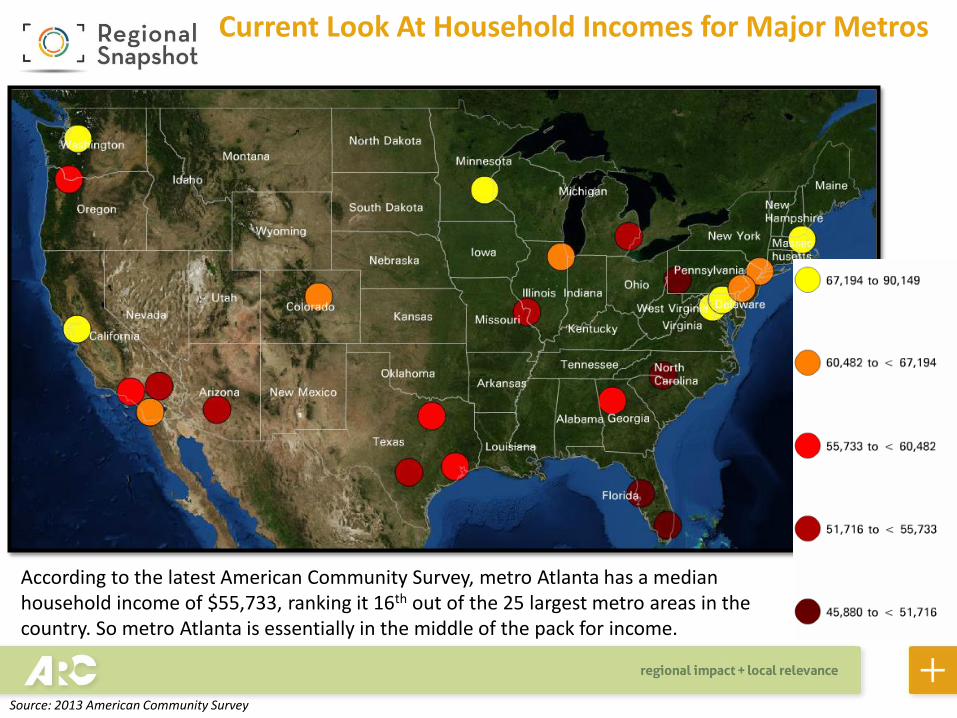
Current Look At Household Incomes for Major Metros
According to the latest American Community Survey, metro Atlanta has a median household income of $55,733, ranking it 16th out of the 25 largest metro areas in the country. So metro Atlanta is essentially in the middle of the pack for income.
Source: 2013 American Community Survey

Household Incomes Across the State
Across the state, counties in the Atlanta region have the highest median household incomes. Forsyth and Fayette rank first and second, respectively.
Source: 2009-2013 American Community Survey

$67,261
$40,606
$63,920
$50,856 $52,691
$79,977
$56,857 $60,445 $60,781
$52,579
$0
$10,000
$20,000
$30,000
$40,000
$50,000
$60,000
$70,000
$80,000
$90,000
Cherokee Clayton Cobb DeKalb Douglas Fayette Fulton Gwinnett Henry Rockdale
Household Incomes in the 10-County Atlanta Region
2
59
6
21 27
15 13 12
22
8
Source: 2009-2013 American Community Survey
Focusing on the Atlanta region, six of the 10 counties rank in the top 15 for median household income in the entire state.
Numbers above the bars are overall county ranking in entire state for
median household income

Household Incomes by Neighborhood
This map shows neighborhood median household income levels, where blues are the highest household incomes and reds are the lowest. As can be seen, neighborhoods north of the City of Atlanta have among the highest incomes in the region.
Source: 2009-2013 American Community Survey, via Neighborhood Nexus

Top 100 Neighborhoods by Household Income
In fact, of the top 100 neighborhoods by income in the region, almost all of them are located north of I-20, with just a couple located in the southern areas of the region (in Fayette County near Peachtree City). As such, the map shows the unequal distribution of income in the region.
Source: 2009-2013 American Community Survey, via Neighborhood Nexus

67.3%
0%
20%
40%
60%
80%
100%
120%
140%
Per Capita Income Up 67 Percent Since 1970 in Metro Atlanta
Since 1970, per capita income (in 2013 dollars) has increased by 67 percent in metro Atlanta, ranking 17th among the largest 25 metro areas. So, again, metro Atlanta ranks in the middle of the pack for income increase over the past 40-plus years.
Source: Bureau of Economic Analysis

$0
$5,000
$10,000
$15,000
$20,000
$25,000
$30,000
$35,000
$40,000
$45,000
$50,0001
970
19
71
19
72
19
73
1974
19
75
19
76
19
77
19
78
19
79
19
80
19
81
19
82
19
83
19
84
19
85
19
86
19
87
19
88
19
89
19
90
19
91
19
92
1993
19
94
19
95
19
96
19
97
19
98
19
99
20
00
20
01
20
02
20
03
20
04
20
05
20
06
20
07
20
08
20
09
20
10
20
11
20
12
20
13
Per Capita Income, ATL
Per Capita Income, US (Metro Portion)
Metro Atlanta’s Income Lagging Recently
Per Capita Income Change, 1970-2013 ($2013)
Source: Bureau of Economic Analysis
While incomes have increased steadily since 1970, metro Atlanta’s income has lagged behind recently, especially since the Great Recession. Over the past six years, or so, the gap between metro Atlanta’s income and that of the average metro area in the U.S. is as wide as it has been since 1970. Since this is per capita income, kids count against the bottom line. So, the more kids an area has typically means a lower per capita income, and metro Atlanta is one of the youngest places in the nation.

% Change in Per Capita Income, By Decade ($2013)
Income Changes by Decade
13.5%
22.2%
18.0%
2.9% 3.8%
14.8%
29.3%
23.9%
-11.6%
2.9%
-15%
-10%
-5%
0%
5%
10%
15%
20%
25%
30%
35%
1970-1980 1980-1990 1990-2000 2000-2010 2010-2013
U.S. (Metro Portion)
Atlanta
Source: Bureau of Economic Analysis
Up until 2000, metro Atlanta outpaced the national income growth rate each decade. But while things were tough all over in the 2000s, metro Atlanta experienced an almost 12 percent decline over the decade, compared to a three percent increase for the average metro area. Per capita incomes have since recovered, somewhat, but a deep hole was dug for Atlanta in the 2000s. Remember, however, that we are analyzing per capita income. Metro Atlanta is a very young place, and having a lot of kids drives down per capita incomes since kids typically don’t have incomes.

Average Family Income, 1970 ($2013)
Income changes over time in the Atlanta area vary greatly by neighborhood. Mapping data from the Neighborhood Change Database, we can view the income distribution of the eight-county area in 1970. Like today, some of the wealthiest neighborhoods in the region were located in the northern parts of the region…
Source: Neighborhood Change Database, Geolytics (analysis by ARC Research)

Average Family Income, 2009-2013 ($2013)
… but some of the wealthiest areas in 1970 are now some of the poorest areas, particularly Clayton County and south DeKalb. Click back and forth a few times to see how dramatically income levels have changed in these areas over the past 40 years, or so.
Source: Neighborhood Change Database, Geolytics (analysis by ARC Research)

Average Family Income: Then and Now (2009-2013)
Poorest 20% of Neighborhoods, Current (2009-2013)
Poorest 20% of Neighborhoods, 1970
To further illustrate income changes by neighborhood, we isolated the poorest 20 percent of neighborhoods in 1970 and today (an average of 2009-2013). Many neighborhoods were distinctly rural in 1970 and were among the poorest in the area. As development occurred in these areas, new investment pulled many of them out of poverty. Conversely, as new investment leapfrogged some closer-in neighborhoods, areas in Clayton and south DeKalb fell into decades-long decline.
Source: Neighborhood Change Database, Geolytics (analysis by ARC Research)

Top 20% for Average Family Income, 1970 Top 20% for Average Family Income, 2009-2013
Average Family Income: Then and Now (2009-2013)
Many of the wealthiest neighborhoods in 1970 remain among the wealthiest today, particularly in the Buckhead area. The most dramatic changes, however, occurred in south DeKalb. In 1970, large swaths of south DeKalb were among the wealthiest in the region. Today, these same swaths are among the poorest.
Source: Neighborhood Change Database, Geolytics (analysis by ARC Research)

Neighborhoods with Largest Declines in Average Family Income
Neighborhoods with Largest Increases in Average Family Income
Change in Family Income : 1970 – Current (2009-2013)
This slide summarizes the previous two slides by isolating which neighborhoods had the largest declines (left) and largest increases (right) in Average Family Income since 1970. Again, the largest declines in income occurred in southern DeKalb, Clayton, south Fulton and areas near Marietta and Norcross. The largest increases were in the northern parts of the region in the Buckhead and Sandy Springs areas, Milton, Alpharetta, west Cobb and northern Gwinnett.
Source: Neighborhood Change Database, Geolytics (analysis by ARC Research)

-$30,000
-$20,000
-$10,000
$0
$10,000
$20,000
$30,000
$40,000
$50,000
Clayton Cobb DeKalb Douglas Fulton Gwinnett Henry Rockdale
Average Family Income Change, 1970-Current (2009-2013) ($2013)
Income Change Varied Among Core Counties
Exploring county-level trends verifies the spatial picture painted by the maps of the previous slides. Clayton County has seen a dramatic decline in average family income since 1970, while DeKalb is at essentially the same level today as it was 40 years ago.
Source: Neighborhood Change Database, Geolytics (analysis by ARC Research)

17.3%
34.8%
6.2%
35.2%
0%
5%
10%
15%
20%
25%
30%
35%
40%
Total Income Going to Poorest 20% of Neighborhoods Total Income Going to Wealthiest 20% of Neighborhoods
1970
Current
Neighborhood Income Changes: Then and Now
In most of the research that explores income inequality, researchers will explore the percent of total income going to the wealthiest HOUSEHOLDS. This analysis DOES NOT look at the percent of income going to households. It looks at the percent of income going to NEIGHBORHOODS (specifically Census Tracts). Neighborhoods can have both rich and poor households, so it is important to remember that, here, we are analyzing the percent of income going to the bottom and top 20 percent of NEIGHBORHOODS by family income levels. For this, we isolated the top 20 percent and the bottom 20 percent of neighborhoods based on average family income in each time period. We then added up aggregate family income for each income band for each period. As you can see, roughly the same amount of aggregate income is going to the richest neighborhoods today as in 1970. The biggest change is the percentage of income going to the poorest neighborhoods, which is roughly three times lower today than in 1970.
Source: Neighborhood Change Database, Geolytics (analysis by ARC Research)

Now we shift our focus to exploring not just incomes, but income inequality. One measure of income inequality is the ratio of income at the 95th percentile to income at the 20th percentile, where the larger the ratio, the greater the level of inequality. Metro Atlanta has a 95/20 ratio of 8.9, ranking it, again, in the middle of the pack. Important note here, however: this is looking at METRO AREAS, not cities. This calculation was performed by Georgia State University last summer
Income Inequality for Major Metros: Metro Atlanta In “Middle of Pack”
Source: The Brookings Institution, Georgia State University

Income Inequality for the Main City in Major Metros: City of Atlanta Has Largest “Gap” Among Largest Cities
Source: The Brookings Institution, Georgia State University
When analyzing data for the main city in major metro areas, however, studies shows that the City of Atlanta has the highest 95/20 ratio in the nation, meaning it has the highest income inequality of any major city. This was recently reinforced by new data from the Brookings Institution, which shows that Atlanta’s gap actually increased over the past year, from 18.8 to 19.2.

Gini Index: Another Measure of Income Inequality
Perhaps the most widely-used measure of income inequality is the Gini Index, where a value of “1” means that all income in an area goes to one household, and a value of “0” means that income is spread evenly among all households in an area. Thus, the higher the value, the greater the income inequality. Fulton County (represented in brown on the color ramp), home to most of the City of Atlanta, has the highest Gini Index in the state. But several counties with the metro Atlanta area have among the lowest Gini Index values in the state (represented in blue).
(Here is a discussion about the Gini Index and income inequality in general from the World Bank)
Source: 2009-2013 American Community Survey
0.404 0.419 0.455
0.487
0.409 0.413
0.539
0.422 0.390
0.408
0
0.1
0.2
0.3
0.4
0.5
0.6
Cherokee Clayton Cobb DeKalb Douglas Fayette Fulton Gwinnett Henry Rockdale
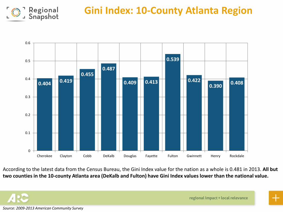
Gini Index: 10-County Atlanta Region
According to the latest data from the Census Bureau, the Gini Index value for the nation as a whole is 0.481 in 2013. All but two counties in the 10-county Atlanta area (DeKalb and Fulton) have Gini Index values lower than the national value.
Source: 2009-2013 American Community Survey

Gini Index: A Look At Neighborhoods
Finally, here is the Gini Index by neighborhood, where blues represent the highest values and reds represent the lowest. At the neighborhood level, high Gini Index values could indicate areas where it is possible for low income households to live in proximity to wealthy households.
Source: 2009-2013 American Community Survey, via Neighborhood Nexus

Top 100: Neighborhoods With Highest Gini Index Value
But, the distribution of the Gini Index values by neighborhood does confirm what the national research indicates: the City of Atlanta has high levels of income inequality. The areas around Lake Lanier in Hall County, where there are retirees living next to residents with lower-paying service-type jobs, also have higher levels of income inequality.
Source: 2009-2013 American Community Survey, via Neighborhood Nexus