inequality in the united states · · 2012-05-22download slides at: . ... the national income...
TRANSCRIPT

Understanding Inequality with Data
Inequality in the United States
Curated by Sharon Jank & Lindsay OwensInquiries to: [email protected] & [email protected]
download slides at: www.inequality.com/slides

Inequality in the United States
Table of Contents
Debt
Education
Employment
Family
Gender
Health
Immigration
Income
Mobility
Politics
Pover ty
Race
Violent Crime
Wealth
4
11
17
22
28
34
41
47
51
56
62
68
74
78
download slides at: www.inequality.com/slides

Inequality in the United States
ContributorsKendra Bischoff Anmol Chaddha
Erin CumberworthSharon JankCarly Knight
Bridget LavelleKrystale Littlejohn
Lindsay OwensDavid Pedulla
Kristin PerkinsSharon Jank
Ariela SchachterJordan SegallChris Wimer
EducationDebt
MobilityGenderPoliticsHealth
Race & EthnicityWealth
EmploymentPover tyIncome
ImmigrationViolent Crime
Family
[email protected] [email protected] [email protected]@[email protected] [email protected]@[email protected]@[email protected] [email protected]@[email protected]@stanford.edu
download slides at: www.inequality.com/slidesdownload slides at: www.inequality.com/slides

Debt
Inequality in the United States 4
download slides at: www.inequality.com/slides

Inequality in the United States
Debt
5
Rising Debt Burden
This slide shows the trend in the income and debt of American families in recent decades. While the median family income remained fairly stable from 1989 to 2007 (increasing 14%, after adjusting for inflation), the median amount of debt owed nearly tripled and is now considerably greater than the median family income.
download slides at: www.inequality.com/slides

Inequality in the United States 6
Rising Credit Card Debt
This slide shows the trend in the income and credit card debt of American families in recent decades. While the median family income remained fairly stable from 1989 to 2007 (increased 14%, after adjusting for inflation), the median amount of credit card debt owed by families more than doubled.
Debtdownload slides at: www.inequality.com/slides

Inequality in the United States 7
Rising Debt Burden for Middle and Low-income Families
This slide shows how the debt burden of families has changed over time, comparing low-income families (the bottom 20% of the income distribution), middle-income families (between the 40th and 60th percentile of the income distribution), and the highest-income families (the top 10% of the income distribution). While low-income and middle-income families have become increasingly reliant on debt (relative to their incomes), the debt burden of high-income families is much lower and has hardly changed since 1989.
Debtdownload slides at: www.inequality.com/slides

Inequality in the United States 8
Debt Burden for Whites and Non-Whites
This graph shows the difference in the debt burden between white and nonwhite families in recent decades. Families of color have consistently faced considerably higher debt burden -- roughly twice as high as a percentage of their total assets -- and this racial gap has widened since 1989.
Debtdownload slides at: www.inequality.com/slides

Inequality in the United States 9
Severe Debt Burden Across Income Groups
This image compares the likelihood of facing severe debt burdens (i.e. debt payments are more than 40% of income) for families across the income distribution. The incidence of severe debt burdens declines dramatically as family income increases. While more than a quarter (26.9%) of low-income families faced severe debt burdens, only 3.8 percent of the highest-income families had comparable debt burdens.
Debtdownload slides at: www.inequality.com/slides

Inequality in the United States 10
Past Due Debt Payments Across Income Groups
This image compares the difficulty of repaying outstanding debt for families across the income distribution. While 15.1 percent of low-income families had debts that were more than 60 days past due, only 0.2 percent of the highest-income families had any comparable outstanding debt.
Debtdownload slides at: www.inequality.com/slides

Education
Inequality in the United States 11
download slides at: www.inequality.com/slides

Inequality in the United States 12
Widening Achievement Gap Between Rich and Poor
Although the longstanding achievement gap in the U.S between black and white children remains, it has declined over the past 50 years in both math and reading. The national income achievement gap, however, has grown over the past 50 years and is now larger than the black-white achievement gap.
Education
Source: Sean F. Reardon, adapted from “The Widening Academic Achievement Gap between the Rich and the Poor: New Evidence and Possible Explanations,” in Whither Opportunity: Rising Inequality, Schools, and Children’s Life Chances, edited by Greg J. Duncan and Richard Murnane. New York: Russell Sage Foundation, 2011. Authors’ compilation based on data from Project Talent (Flanagan et al. n.d.); NLS, HS&B, NELS, ELS, ECLS-K, ECLS-B (U.S. Department of Education, Center for Education Statistics 1999, 2000, 2001, 2004, 2009, 2010); Prospects (U.S. Department of Education 1995); NLSY79, NLSY97 (U.S. Bureau of Labor Statistics 1980, 1999); and SECCYD (National Institute of Child Health and Human Development 2010).
download slides at: www.inequality.com/slides

Inequality in the United States 13
Engagement Gaps in First and Fifth Grade
This figure shows teacher-reported gaps in attention and engagement in first and fifth grade across four demographic characteristics.Children from low-income families are far less engaged than children from high-income families, and the gap grows slightly between first and fifth grade. The income gap in engagement is larger than it is by race or gender, though the gender gap grows the most between first and fifth grade.
Education
Source: Greg J. Duncan and Katherine Magnuson “The Nature and Impact of Early Achievement and Skills, Attention Skills, and Behavior Problems,” in Whither Opportunity: Rising Inequality, Schools, and Children’s Life Chances, edited by Greg J. Duncan and Richard Murnane, 56. New York: Russell Sage Foundation, 2011. Authors’ calculations based on Early Childhood Longitudinal Study, Kindergarten Cohort (National Center for Education Statistics n.d.)
download slides at: www.inequality.com/slides

Inequality in the United States 14
College Completion by Income and Year of Birth
The figure shows that there is a great deal of inequality in college completion by income group. In the most recent cohort, just 9% of students from the lowest income group finish college as compared to 54% from the highest income group. Moreover, the increase in college completion over time has not been equally distributed. Rates increased just 4 percentage points for the lowest income group (from 5% to 9%), but grew 18 percentage points for the highest income group (from 36% to 54%).
Education
Source: © 2011 by Martha J. Bailey and Susan M. Dynarski. Gains and Gaps: Changing Inequality in U.S. College Entry and Completion. NBER Working Paper 17633, December 2011. Author’s calculation based on data from the National Longitudinal Survey of Youth, 1979 and 1997 (U.S. Bureau of Labor Statistics, 2010a, 2010b).
download slides at: www.inequality.com/slides

Inequality in the United States 15
Enrichment Expenditures on Children, 1972-2006 (in 2008 dollars)
Parents are increasingly using personal resources to supplement their children¹s opportunities to learn and develop. This graph shows that the disparity between annual enrichment expenditures on children in families in the top and bottom income quintiles has increased rapidly since 1972.
Education
Source: Greg J. Duncan and Richard J Murnane, “Introduction: The American Dream, Then and Now,” in Whither Opportunity: Rising Inequality, Schools, and Children’s Life Chances, edited by Greg J. Duncan and Richard Murnane, 11. New York: Russell Sage Foundation, 2011. Authors’ calculations based on Consumer Expenditure Surveys, U.S. Bureau of Labor Statistics.
(in 2
008
dolla
rs)
download slides at: www.inequality.com/slides

Inequality in the United States 16
Staff Characteristics by School Poverty Level
Teachers and principals are two of the most important factors for student achievement. This figure shows that children in higher poverty schools are more likely to have teachers and principals with fewer years of experience and less education than are children in lower poverty schools. This pattern has been observed in many schools nationwide.
Education
Source: Demetra Kalogrides & Susanna Loeb Center for Education Policy Analysis, Stanford University, 2012. Data: Miami-Dade County School District Administrative Staff Data, 2003-2011.
download slides at: www.inequality.com/slides

Employment
Inequality in the United States 17
download slides at: www.inequality.com/slides

Inequality in the United States 18
Unemployment Rate by Race and Ethnicity, 1970-2010
This figure depicts the trends in unemployment between 1970 and 2010 for workers from different racial and ethnic groups. The unemployment rate for black workers generally hovers at approximately twice the unemployment rate for white workers. This pattern remains relatively stable over time, even in the midst of high unemployment for whites.
Source: figure is from Donald G. Freeman, 2011. “On (Not) Closing the Gaps: The Evolution of National and Regional Unemployment Rates by Race and Ethnicity,” The Review of Black Political Economy. Data from the Current Population Survey.
EmploymentU
nem
ploy
men
t R
ate
download slides at: www.inequality.com/slides

Inequality in the United States 19
The Decline of Unionization, 1973-2007
This figure presents the decline in unionization rates among full-time, private sector workers from 1973 to 2007. During that time period, the unionization rate for men fell from 35% to less than10%, and for women the unionization rate fell from about 15% to roughly 5%.
Source: graph from Bruce Western and Jake Rosenfeld, 2011. “Unions, Norms, and the Rise in U.S. Wage Inequality,” American Sociological Review. Data from the Current Population Survey.
Employmentdownload slides at: www.inequality.com/slides

Inequality in the United States 20
The Changing Industrial Composition of the U.S. Economy, 1980-2010
This graph shows the changing industrial composition of the U.S. economy from 1980 to 2010. While the service and manufacturing sectors have consistently accounted for about half of US jobs, the distribution of jobs between these two sectors has changed dramatically. The percent of jobs in manufacturing dropped by more than half, whereas the percent of jobs in the service sector increased by almost 50%.Source: figure from a report released by Demos in 2011, “The Great Unraveling:
A Portrait of the Middle Class.” Data from the Current Population Survey.
Employmentdownload slides at: www.inequality.com/slides

Inequality in the United States 21
Worker Productivity and Median Earnings by Gender, 2000-2007
This figure explores the relationship between changes in the average productivity of workers and changes in the median of weekly earnings. Although the average productivity of workers increased by nearly 20% between 2000 and 2007, workers' earnings remained relatively stagnant.
Source: graph from Jared Bernstein and Lawrence Mishel, 2007, “Economy’s Gains Fail to Reach Most Workers’ Paychecks.” Data from the Current Population Survey’s Outgoing Rotation Group and Bureau of Labor Statistics.
Average productivitycompared to 2000 levels
Men’s earnings
Women’s earnings
2000 2001 2002 2003 2004 2005 2006 2007
Employmentdownload slides at: www.inequality.com/slides

Family
Inequality in the United States 22
download slides at: www.inequality.com/slides

Inequality in the United States 23
Marriage Rates and Educational Attainment
The share of Americans 18 and older who were currently married stood at an all-time low of 51% in 2010. This share has been declining since the 1960s as more Americans delay getting married or never marry at all. This figure depicts the trend, showing that the decline in marriage is much steeper for those without a college degree.
Family
Percentage of Married Adultsby Level of Education
download slides at: www.inequality.com/slides

Inequality in the United States 24
Marriage Rates, Educational Attainment & Childbearing
The decline in marriage rates means more babies are now being born to single parents. While single-parent childbearing has been increasing for all groups, women without a college education are much more likely to be single parents compared to women with a college education.
Source: U.S. Census Bureau, Current Population Survey, June 2008. See detailed Table 8 at <http://www.census.gov/prod/2010pubs/p20-563.pdf
Family
Proportion of Mothers with a Birth in the Last Year in Different Living Arrangements by Educational Attainment and Age, 2008
download slides at: www.inequality.com/slides

Inequality in the United States 25
Divorce and Educational Attainment
This figure shows that in the 1960s and 1970s, divorce became more common for both highly educated individuals and for those with less education. But starting in the 1980s, there is evidence of a “divorce divide,” with declining divorce rates among those with a college degree and steady or increasing divorce rates for those without.
% W
omen
with
Mar
ital D
isso
lutio
n
Year of Marriage
Source: Steven P. Martin. Data: SIPP 1996/2001. Note: Marital Dissolution within 10 years of a first marriage.
Familydownload slides at: www.inequality.com/slides
Inequality in the United States 26
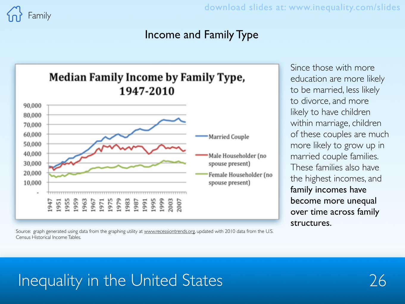
Income and Family Type
Since those with more education are more likely to be married, less likely to divorce, and more likely to have children within marriage, children of these couples are much more likely to grow up in married couple families. These families also have the highest incomes, and family incomes have become more unequal over time across family structures.
Family
Source: graph generated using data from the graphing utility at www.recessiontrends.org, updated with 2010 data from the U.S. Census Historical Income Tables.
download slides at: www.inequality.com/slides

Inequality in the United States 27
Teen Pregnancy
While out-of-wedlock childbearing has been increasing, the rate of births to teenagers has been declining steadily since the early 1990s. Since teenagers command the least earnings power in the labor force, and thus constitute some of the most disadvantaged potential single parents, most social scientists consider this decline a positive trend.
Source: Child Trends Data Bank, www.childtrendsdatabank.org
Familydownload slides at: www.inequality.com/slides

Gender
Inequality in the United States 28
download slides at: www.inequality.com/slides

Inequality in the United States 29
Congressional Representation
Since the start of Congress in1789, only 2% of representatives have been women. Women currently hold 17% of Congressional seats: 73 of 435 House of Representatives seats, and 17 of 100 Senate seats.
Gender
Men in Senate
Men in House
020101790
Women in House & Senate
Men & Women in Congress
1930
Source: image adapted from: http://timeplots.com/wp/wp-content/uploads/2010/03/women-in-congress.png. Data for text from, Women in Elective Office 2012 Fact Sheet, Center for American Women in Politics,
540
download slides at: www.inequality.com/slides

Inequality in the United States 30
Fortune 500 CEO’s
This figure shows the number of Fortune 500 companies that are run by women. Although women make up about half of the worlds population and 40% of the paid labor market, only 15 Fortune 500 companies - or 3% - have women CEOs.
Source: image by CXO. Data from World Economic Forum’s Corporate Gender Gap Report 2010.
Gender
FORTUNE 500 COMPANIES RUN BY WOMEN
download slides at: www.inequality.com/slides

Inequality in the United States 31
The Gender Earnings Gap
This figure shows women’s earnings, men’s earnings, and women’s earnings as a percentage of men’s. It shows that the gender earnings gap has narrowed, with women in the 1960‘s earning 60% of what men earned, and women in the 2000‘s earning roughly 77% of what men earned. If the gap continues to close at the pace it has for the last 50 years, it will take another fifty to close completely. However, the narrowing trend has slowed in the last 10 years, suggesting it may take much longer.
Source: figure from DeNavas-Walt, Carmen, Bernadette D. Proctor, and Jessica C. Smith, U.S. Census Bureau, Current Population Reports, Income, Poverty, and Health Insurance Coverage in the United States: 2010, U.S. Government Printing Office, Washington, D.C., 2011 Note: Data on earnings of full-time, year-round workers are not readily available before 1960. For information on recessions, see Appendix A of report.. Earnings in thousands (2010 dollars), ratio in percent. Data: U.S. Census Bureau, Current Population Survey, 1960-2011 Annual Social and Economic Supplements.
Genderdownload slides at: www.inequality.com/slides
Women’s Earnings as a Percentage of Men’s Earnings
Recession Women-to-men earnings ratio
Men’s earnings
Women’s earnings
77%
$47,715
$36,931
60%

Inequality in the United States 32
Parenthood: Penalty for Women, Premium for Men
This chart shows usual weekly earnings for full-time working men and women, parents and non-parents. This chart shows that in addition to the general gender earnings gap, mothers earn less than childless women and fathers earn more than childless men. In other words, women face an earnings penalty for having children while men receive an earnings boost.
Source: Data from “Highlights of Women’s Earnings in 2010,” report by US Department of Labor, US Bureau of Labor Statistics, Report 1031. July 2011. Notes: earnings are median usual weekly earnings for full-time wage and salary workers, by gender and presence of own children under 18 years of age.
Gender
Women Men
Dol
lars
Usual Weekly Earnings
0
250
500
750
1000
774
672
907
664
with childrenw/out children
download slides at: www.inequality.com/slides

Inequality in the United States 33
Age, Education & Earnings
Gender
This chart compares wages for men and women by age group and educational attainment. It shows that young women who do not graduate high school earn 85% of what similar men earn, while older women with advanced degrees make only 68% of what similar men earn. In other words, the gender wage gap widens as workers get older and also as educational attainment increases.
Source: figure adapted from Phillip Cohen’s website: familyinequality.wordpress.com. Data: 2010 Current Population Survey. Notes: data for full-time, year-round workers.
Women’s Earnings as a Proportion of Men’s
Age
25-34
35-44
45-54
.60 .65 .70 .75 .80 .85
download slides at: www.inequality.com/slides

Inequality in the United States
⤵
34
Gender and Patenting
Gender
This chart shows the percentage of men and women receiving patents in the US. While women receive only 7.5% of all patents, only 5.5% are commercialized patents, the most lucrative type. The most important factor contributing to this patent gender gap is men’s over-representation in patent-intensive fields such as electrical and mechanical engineering.
Source: figure generated from findings reported in National Bureau of Economic Research Working Paper 17888, March 2012. Data: 2003 National Survey of College Graduates, National Science Foundation.
download slides at: www.inequality.com/slides
82.5% Men
5.5%
7.5% Women}US Patents

Health
Inequality in the United States 35
download slides at: www.inequality.com/slides

Inequality in the United States 36
Higher Income, Better Health
Source: Centers for Disease Control and Prevention, Health, United States, 2010. Data: Centers for Disease Control and Prevention/National Center for Health Statistics, National Health Interview Survey. Notes: Income groups based on family income, size and composition, relative to the federal poverty line (FPL). In 2009, the federal poverty line for a two-adult, two-child family was $21,756. Poor defined as less than 100% FPL; low-income as 100% to less than 200% FPL; middle-income as 200% to less than 400% FPL; high-income as equal to or greater than 400% FPL. Estimates for adults 18 and over except for self-reported health, shown for all persons. Activity limitations include difficulty bathing or preparing meals, for example.
This chart shows the association between income level and health status. Americans with lower incomes tend to have poorer health compared to those with higher incomes. Poor Americans are four times more likely than those in the highest income category to report that their health is poor or fair (rather than good, very good or excellent). Lower income is also associated with higher rates of activity limitations, poor eyesight, heart disease, severe psychological distress, and other health problems.
Health
Self-r
epor
ted
poor
/fair
healt
h Activit
y
limita
tion
Difficu
lty
seein
g Heart
disea
se
Psyc
holog
ical
distre
ss
0%
7%
14%
21%
28%
35%
1.1
10.1
5.77.3
4.32.7
11.6
8.0
15.0
8.6
4.9
13.2
11.1
22.6
14.9
9.0
14.114.3
29.3
21.8
PoorLow-incomeMiddle-incomeHigh-income
download slides at: www.inequality.com/slides

Inequality in the United States 37
More Education, Better Health
Health
Sources: Centers for Disease Control and Prevention, Health, United States, 2010; Pratt LA, Dey AN, Cohen AJ. "Characteristics of adults with serious psychological distress as measured by the K6 scale: United States, 2001–04." Advance Data from Vital and Health Statistics; no 382. Hyattsville, MD: National Center for Health Statistics. 2007;Schiller JS, Lucas JW, Ward BW, Peregoy JA." Summary health statistics for U.S. adults: National Health Interview Survey, 2010." National Center for Health Statistics. Vital Health Stat 10(252). 2011; U.S. Census Bureau, Statistical Abstract of the United States, 2006, 2012. Data: Centers for Disease Control and Prevention/National Center for Health Statistics, National Health Interview Survey. Notes: Estimates for adults 25 and older except for self-reported health, shown for all persons.
People with the highest educational attainment tend to be the healthiest. For example, about one-quarter of Americans with less than high school education report having at least one physical difficulty, such as being unable to walk three city blocks or to carry a bag of groceries. This is almost double the rate of those who attended college. Difficulty seeing – even with glasses or contacts – is also most common among the least educated Americans, as are heart disease and severe psychological distress.
Self-r
epor
ted
poor
/fair
healt
h Phys
ical
diffic
ulty
Difficu
lty
seein
g Heart
disea
se
Psyc
holog
ical
distre
ss
0%
7%
14%
21%
28%
35%
2.0
12.4
7.6
13.2
10.6
3.3
12.7
9.2
19.8
16.1
6.2
14.512.6
24.9
27.6
Less than high schoolHigh schoolAny college
download slides at: www.inequality.com/slides

Inequality in the United States 38
Health Disparities by Race/Ethnicity
Health
Source: Centers for Disease Control and Prevention, Health, United States, 2010. Data: Centers for Disease Control and Prevention/National Center for Health Statistics, National Health Interview Survey. Note: Estimates for total U.S. population.
Self-reported poor or fair health
Health outcomes also vary across racial and ethnic groups; minorities tend to have poorer health outcomes. This chart shows that blacks and Hispanics are more likely to report their health status as poor or fair (rather than good, very good or excellent) than whites. Racial and ethnic differences in health are largely accounted for by the poorer socioeconomic position (e.g., lower education, lower income) of minorities relative to whites in the United States. But even comparing whites and minorities with similar education and income levels, minorities still tend to lag behind in health outcomes.
0%
3%
6%
9%
12%
15% 14.213.3
8.0
WhiteHispanicBlack
download slides at: www.inequality.com/slides

Inequality in the United States 39
Health Risk Factors and Education
Health
0%
10%
20%
30%
40%
26.9
14.513.7
9.5
4.1
33.3
26.1
17.016.1
5.8
31.6
25.1
21.2
27.1
8.4
Inade
quate
hous
ing
House
hold
food
insec
urity
Didn’t g
et
medica
l care
due t
o co
st Smok
ing
Obe
sity
Less educational attainment is associated with greater health risk factors. For example, compared to adults who attend college, adults with less than high school education are twice as likely to live in a housing unit without a functioning heating system or a working toilet. These adults have a 1in 4 chance of living in a household where at least one member lacked access to adequate food at times during the year, and a 1in 5 chance of forgoing medical care they need due to cost.
Sources: Author's unpublished analysis of Current Population Survey Food Insecurity Supplement, December 2009, with assistance from Mark Nord, USDA; Centers for Disease Control and Prevention, Health, United States, 2010; Centers for Disease Control and Prevention. "Inadequate and Unhealthy Housing, 2007 and 2009." MMWR 2011;60(Suppl):21-27; Schiller JS, Lucas JW, Ward BW, Peregoy JA. "Summary health statistics for U.S. adults: National Health Interview Survey, 2010." National Center for Health Statistics. Vital Health Stat 10(252). 2011; U.S. Census Bureau, Statistical Abstract of the United States, 2012. Data: Centers for Disease Control and Prevention/National Center for Health Statistics, National Health Interview Survey; U.S. Census Bureau, American Housing Survey and Current Population Survey. Notes: Food insecurity, smoking, and obesity estimates for adults ≥ 25; medical care estimate for adults 25-64; inadequate housing estimate for householders ≥ 18. Estimates from 2009 and 2010.
Less than high schoolHigh schoolAny college
download slides at: www.inequality.com/slides

Inequality in the United States 40
More Education, Longer LifeHealth
This chart describes the number of years that adults with different levels of education can expect to live beyond age 25. It shows that more education often means longer life. This is true for both men and women. For example, a 25-year-old man with less than 12 years of schooling can expect to live to the age of 73, whereas a 25-year-old man with 16 or more years of schooling can expect to live to the age of 80.
Source: Robert Wood Johnson Foundation Commission to Build a Healthier America. More Education, Longer Life. Princeton, NJ: 2008. Data: National Longitudinal Mortality Study, 1988-1998.
Men Women
Life
exp
ecta
ncy
at a
ge 2
5
35
40
45
50
55
6058.5
54.7
57.4
52.2
56.4
50.6
53.4
47.9
0-11 years12 Years13-15 years16 or more years
download slides at: www.inequality.com/slides

Inequality in the United States 41
The Growing Gap in Life Expectancy
Health
49
51
53
55
57
1990 2000
56.6
55.0
49.649.6
Multiple Cause of Death/Census Data
The gap in life expectancy between those with higher and lower levels of education has been growing over recent decades. These figures compare the life expectancy for a 25-year-old with high school or less education to a 25-year-old with at least some college education. The chart on the left shows that between the 1980s and the 1990s, the growth in life expectancy was almost three times as large for the higher-educated group. The chart on the right shows that the life expectancy of the higher-educated continued to increase during the 1990s while that of the lower-educated stagnated.
Source: Meara, Richards & Cutler. 2008. “The Gap Gets Bigger : Changes in Mortality and Life Expectancy, By Education, 1981-2000.” Health Affairs 27:350-360.
49
51
53
55
57
55.8
54.4
52.151.6
HS or lessAny College
National Longitudinal Mortality Study
1981-88 1991-98
Year
s of
Life
Rem
aini
ng a
t Age
25
download slides at: www.inequality.com/slides

Immigration
Inequality in the United States 42
download slides at: www.inequality.com/slides

Inequality in the United States 43
Percent of Families Below the Poverty Line by Child and Parent Nativity
Immigration
0
7.5
15.0
22.5
30.0
16.24
21.71
28.41
17.76
26.67
18.09
% o
f Fam
ilies
Bel
ow P
over
ty L
ine
All Chil
dren
in U
S
Child a
nd Pa
rent
Fore
ign-b
orn
Pare
nt Fo
reign
-bor
n
Child N
ative
-bor
n
Child a
nd Pa
rent
Native
-bor
n
Native
-bor
n Chil
dren
Fore
ign-b
orn C
hildr
en
This graph shows the differing poverty rates for families with members born in the US or elsewhere. It shows that families with foreign-born members are more likely to be living below the poverty line. Of all children in the US, 18% live in families below the poverty line. That number rises to almost 27% for families with children not born in the US. Similarly, over 28% of families—or about 668,000 families—where both parents and children were not born in the US live in poverty; the highest poverty rate of all groups listed in the graph.
Source: The Urban Institute Children of Immigrants Data Tool. Data from the Integrated Public Use Microdata Series datasets drawn from the 2009 American Communities Survey.
Family Type
download slides at: www.inequality.com/slides

Inequality in the United States 44
Percent of Households Receiving Food Stamps by Child and Parent Nativity
0
7.5
15.0
22.5
30.0
16.24
21.71
28.41
17.76
26.67
18.0919.50
17.5517.3319.25
16.01
19.13
Receive Food Stamps Below the Poverty Line
All Chil
dren
in U
S
Child a
nd Pa
rent
Fore
ign-b
orn
Pare
nt Fo
reign
-bor
n
Child N
ative
-bor
n
Child a
nd Pa
rent
Native
-bor
n
Native
-bor
n Chil
dren
Fore
ign-b
orn C
hildr
en
% F
amili
es R
ecei
ving
Foo
d St
amps
This figure shows that families where both parents and children are foreign-born are most likely to live below the poverty line, and are also the least likely to receive food stamps. While some foreign-born residents are not eligible for food stamps, research shows that sign-up rates among eligible families are lower than native-born families due to lack of information, fear of deportation, language barriers, and other issues, suggesting that anti-poverty programs do not help immigrant families as much as they could.Source: The Urban Institute Children of Immigrants Data Tool. Data from the Integrated Public Use Microdata Series datasets drawn from the 2009 American Communities Survey. Skinner, Curtis. 2011. “SNAP take-up among immigrant families with children.” National Center for Children in Poverty.
Immigration
Family Type
download slides at: www.inequality.com/slides
Inequality in the United States 45
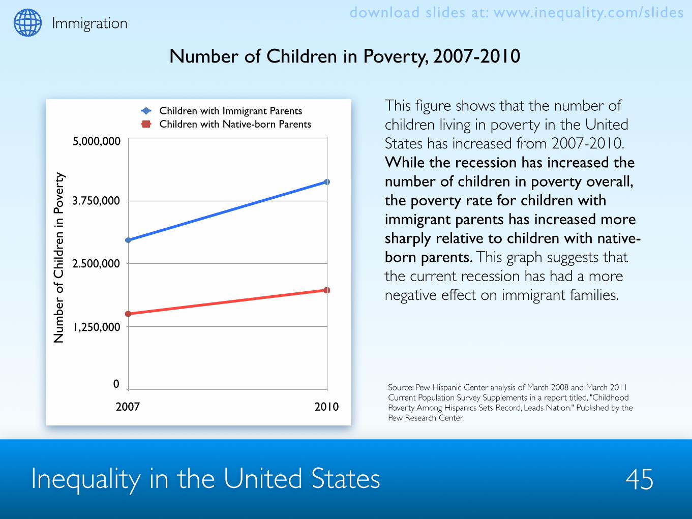
Number of Children in Poverty, 2007-2010
This figure shows that the number of children living in poverty in the United States has increased from 2007-2010. While the recession has increased the number of children in poverty overall, the poverty rate for children with immigrant parents has increased more sharply relative to children with native-born parents. This graph suggests that the current recession has had a more negative effect on immigrant families.
Source: Pew Hispanic Center analysis of March 2008 and March 2011 Current Population Survey Supplements in a report titled, "Childhood Poverty Among Hispanics Sets Record, Leads Nation." Published by the Pew Research Center.
0
1250000
2500000
3750000
5000000
2007 2010
Children with Immigrant ParentsChildren with Native-born Parents
1,250,000
2.500,000
3.750,000
5,000,000
0
Immigration
Num
ber
of C
hild
ren
in P
over
ty
download slides at: www.inequality.com/slides

Inequality in the United States 46
Percent of Children with Parents with Less than a High School Degree
This graph shows that compared to children born in the US, children in immigrant families are much more likely to have one or more parents with less than a high school degree. Combined with their high poverty rates and low rates of food-stamp receipts (from the previous slides), this shows that many children in immigrant families face a set of cumulative disadvantages that makes it more difficult for them to achieve upward social and economic mobility as they become adults.
Source: The Urban Institute Children of Immigrants Data Tool. Data from the Integrated Public Use Microdata Series datasets drawn from the 2009 American Communities Survey.
% C
hild
ren
w/ P
aren
ts w
/ Les
s th
an a
H.S
. Deg
ree
0
10
20
30
40
6.96
25.66
31.11
10.97
28.87
Child a
nd Pa
rent
Fore
ign-b
orn
Pare
nt Fo
reign
-bor
n
Child N
ative
-bor
n
Child a
nd Pa
rent
Native
-bor
n
Native
-bor
n Chil
dren
Fore
ign-b
orn C
hildr
en
Immigration
Family Type
download slides at: www.inequality.com/slides

Inequality in the United States 47
High School Drop-Out Rates Among Young Adults Ages 16-24
This graph shows that the overall high school drop-out rate is currently 8.1%, but that the rate is much higher for immigrant children—20.7%—and somewhat higher for the children of immigrants—13%. Overall, immigrant children are just 23% of the population ages 16-24 but account for 37.6% of all high school drop-outs, meaning that foreign-born students are over-represented among high school drop-outs.
Source: Child Trends' calculations of U.S. Census Bureau, School Enrollment--Social and Economic Characteristics of Students: October 2009 Detailed Tables: Table 1. http://www.census.gov/population/www/socdemo/school/cps20089html
0
7.5
15.0
22.5
30.0
13.0
20.7
8.1
All Child
ren in
US
Child Fo
reign-
born
Parent
Foreign-
born,
Child N
ative-b
orn
% H
.S. D
rop-
Out
Immigration
Family Type
download slides at: www.inequality.com/slides

Income
Inequality in the United States 48
download slides at: www.inequality.com/slides

Inequality in the United States 49
This graph compares incomes of the top 0.1% with the S&P 500 stock price index. It shows that the incomes of the top 0.1% more or less track the S&P prices. In other words, wealthy Americans benefit from gains in the market. The exception was during the post-WWII era (1950-1970), when the effects of the New Deal, and higher tax rates on top income earners in particular, stemmed growth in the incomes of the 0.1%.
Income Growth at the Top
Incomedownload slides at: www.inequality.com/slides
Source: figure and text adapted from Matthew O’Brien 2012, “The Rise and Rise of the Super Rich.” Published by The Atlantic Monthly Group, available online at: http://www.theatlantic.com/business/archive/2012/05/the-rise-and-rise-of-the-super-rich/257069/ Notes: Income and prices are inflation-adjusted, and indexed to 100 beginning in 1913. Income numbers for 0.1 percent come from Picketty and Saez. The S&P prices come from Robert Shiller.
Inco
mes
/Pri
ces
Top 0.1 percent
S&P 500

Inequality in the United States 50
This graph presents the share of income going to the top 10% from 1917 to 2010 in the United States. It shows that in 2007, the top 10% captured 49.7% of income, the highest level captured since 1917. This even surpassed the share going to the top 10% at the peak of the stock market bubble in the “roaring” 1920s, just prior to the market crash of 1929.
Income Share of the Top 10%
Incomedownload slides at: www.inequality.com/slides
25%
33%
42%
50%
1917
1927
1937
1947
1957
1967
1977
1987
1997
2007
Source: Saez, 2012 updated version of “Striking It Richer: The Evolution of Top Incomes in the United States.” Notes: Series based on pre-tax cash market income including realized capital gains and excluding government transfers. In 2010, top decile includes all families with annual income above $108,000.
Top 10% Income Share, 1917-2010
% In
com
e Sh
are

Inequality in the United States 51
This chart depicts the percentage of income growth claimed by each fifth of the income distribution between 1979-2007. It shows that the top 20% of earners (orange) claimed 75.5% of the gains in overall incomes, while the bottom 20% gained only 0.4% (blue).
Where Has Income Growth Gone?
Incomedownload slides at: www.inequality.com/slides
Source: Economic Policy Institute’s analysis of the Average Federal Rates and Income Report, Congressional Budget Office, 2010.
Bottom fifth, 0.4% Lower-middle fifth, 3.0%
Middle fifth
Upper-middle fifth
80 - 90%
90 - 95%95 - 99%
top 1%13.7%
11.5%
9.3%15.6%
38.7%
7.4%
Top fifth, 75.5%

Inequality in the United States 52
This graph shows the ratio of average CEO direct compensation to average production worker compensation from 1965-2009. In 2005, the average CEO in the United States earned 262 times the pay of the average worker, earning more in one workday than an average worker earned in an entire year.
CEO Compensation
Incomedownload slides at: www.inequality.com/slides
0
50
100
150
200
250
300
350
1965 1975 1985 1995 2005 2009
Rat
io
CEO versus Employee Compensation
Source: Economic Policy Institute’s The State of Working America analysis of Wall Street Journal/Mercer Survey. Notes: worker pay is the hourly wage of production and nonsupervisory workers, assuming full-time, year-round job with 260 workdays.

Inequality in the United States 53
In 2010, the incomes of the top 1% grew by 11.6% while the incomes of the bottom 99% grew only 0.2%. This means the top 1% captured 93% of the income gains in the first year of recovery after the 2007 recession.
Post-Recession Recovery at the Top
Incomedownload slides at: www.inequality.com/slides
Source: Saez, 2012 updated version of “Striking It Richer: The Evolution of Top Incomes in the United States.” Series updated to 2010 in March 2012 using IRS tax statistics.
-60%
-40%
-20%
0%
20%
40%
60%
80%
100%
Share of Total Growth (Or Loss) Collected by Bottom 99%Sharon of Total Growth (Or Loss) Collected by Top 1%
2001 Recession2000-02
Expansion2002-07
Recession2007-09
Recovery2009-10

Inequality in the United States 54
This figure shows the actual wealth distribution in the United States, along with results of a survey that asked Americans to estimate and report their ideal distributions. Respondents vastly underestimated the actual level of wealth inequality in the United States, and also constructed ideal distributions that were far more equitable than both the actual and estimated distributions.
Americans Underestimate Inequality
Incomedownload slides at: www.inequality.com/slides
0% 20% 40% 60% 80% 100%
Percent Wealth Owned
Actual
Estimated
Ideal
Top 20% 2nd 20% Middle 20% 4th 20% Bottom 20%
Source: Michael I. Norton and Dan Ariely,, “Building a Better America - One Wealth Quintile at a Time,” Perspectives on Psychological Science 2011, 6: 9. Available at: http://www.people.hbs.edu/mnorton/norton%20ariely.pdf. Notes: Because of their small percentage share of total wealth, both the ‘‘4th 20%’’ value (0.2%) and the ‘‘Bottom 20%’’ value (0.1%) are not visible in the ‘‘Actual’’ distribution.

Mobility
Inequality in the United States 55
download slides at: www.inequality.com/slides

Inequality in the United States
Mobility
Source:: This is a modified version of Figure 4 in Isaacs, Julia B. 2008. “Economic Mobility of Families Across Generations.” Getting Ahead or Losing Ground: Economic Mobility in America. Economic Mobility Project, http://www.economicmobility.org/reports_and_research/mobility_in_america. Data: Panel Study of Income Dynamics, a nationally representative sample of families tracked since 1968.
56
Parents’ Income Quintile
Children’s Mobility Linked to Parent’s Income
39%
19%6%
23%
17%
11%
14%
23%
19%
15%
24%
23%
9%17%
42%
Bottom quintileSecond quintileMiddle quintileFourth quintileTop quintile
Bottom Middle Top
% o
f Chi
ldre
n in
Eac
h In
com
e Q
uint
ile A
s Adu
lts This figure shows the adult incomes of children with parents in the bottom, middle, and top income quintiles. There’s a lot of mobility among kids born in the middle of the income distribution—roughly a fifth of those kids end up in each of the five quintiles as adults. However, there’s much more mobility “stickiness” at the top and bottom of the income distribution, with 42% of kids born into the bottom income quintile remaining there as adults, and 39% of kids born into the top quintile remaining there as adults.
download slides at: www.inequality.com/slides

Inequality in the United States 57
Upward Mobility Low Among African Americans
Born in Bottom Quintile
Born in Forth Quintile
Source:: This is a modified version of Figure 6 in Isaacs, Julia B. 2008. “Economic Mobility of Families Across Generations.” Getting Ahead or Losing Ground: Economic Mobility in America. Economic Mobility Project, http://www.economicmobility.org/reports_and_research/mobility_in_america. Data: Panel Study of Income Dynamics, a nationally representative sample of families tracked since 1968.
11%
26%
0%
4%8%
22%
33%
0%
9%12%
21%
19%
0%
13%
25%
40%
14%
0%
22%
24%
6%8%0%
53%
31%
Bottom quintileSecond quintileMiddle quintileFourth quintileTop quintile
White WhiteBlack Black
% o
f Chi
ldre
n in
Eac
h In
com
e Q
uint
ile A
s Adu
lts
This figure shows differences in social mobility between white and black children. Among children born to parents in the bottom income quintile, over half of black children remain there as adults while only 31% of white children remain there. White children also do better at the top of the income distribution. More than half of white children born into the fourth quintile stay in the top two quintiles as adults, compared to only about a third of black children born in the fourth quintile.
Mobilitydownload slides at: www.inequality.com/slides

Inequality in the United States 58
Social Mobility in Other Countries Compared to the United States
Source: This is a modified version of Figure 3 in Sawhill, Isabel and John E. Morton. 2007. “Economic Mobility: Is the American Dream Alive and Well?” Economic Mobility Project, http://www.economicmobility.org/reports_and_research/mobility_in_america. Data: Corak, Miles. 2006. “Do Poor Children Become Poor Adults? Lessons from a Cross Country Comparison of Generational Earnings Mobility.” Research on Economic Inequality 13:143-188.
0
1.0
2.0
3.0
4.0
UK
Ger
man
ySw
eden
Can
ada
Fran
ceUS
Finl
and
Nor
way
Den
mar
k
This figure shows how rates of mobility in the United States compare to rates in comparable nations. Despite its reputation as the “land of opportunity,” researchers who study mobility have consistently found that there is less mobility in the United States than in most other European and English-speaking countries. Among the nine countries shown here, all but one have more mobility than the U.S., and four have more than twice as much mobility.
Mob
ility
Rat
e as
a R
atio
of t
he U
.S. R
ate
Mobilitydownload slides at: www.inequality.com/slides

Inequality in the United States
Source: This figure is created using table 3.4 (page 123) of Harding, David J., Christopher Jencks, Leonard M. Lopoo, and Susan E. Mayer. 2005. “The changing effect of family background on the incomes of American adults.” Pages 100-144 in Unequal Changes: Family Background and Economic Success, edited by Samuel Bowles, Herbert Gintis, and Melissa Osborne Groves. New York: Russell Sage Foundation. Data: General Social Survey.
59
Social Mobility in the 1970’s, 1980’s, & 1990’s
Born in Bottom Quartile
Born in Top Quartile
0%
25%
50%
75%
100%
1970s 1980s 1990s 1970s 1980s 1990s
38%39%38%
0%
13%9%10%
29%29%30%
0%
21%21%20%
21%20%20%
0%
26%30%30%
12%12%12%0%
41%39%40%
Bottom quartileSecond quartileThird quartileTop quartile
% o
f Chi
ldre
n in
Eac
h In
com
e Q
uart
ile a
s Adu
lts
This figure shows the trend in social mobility from the 1970s to the 1990s. As this chart shows, the adult income destinations of children born into the bottom and top quartiles have remained remarkably stable, despite the income distribution of Americans becoming more unequal during those decades.
Mobilitydownload slides at: www.inequality.com/slides

Politics
Inequality in the United States 60
download slides at: www.inequality.com/slides

Inequality in the United States 61
Political Participation and Income
This figure contrasts six kinds of political activity across two income groups - families earning below $15,000 and those above $75,000. For the most part, the American poor participate much less in politics than do those with higher incomes, a difference that is especially stark when looking at who contributes to campaigns.
Source: This figure is adapted from Sidney Verba, Kay Schlozman and Henry Brady’s book, Voice and Equality: Civic Voluntarism in American Politics, pg. 190.
Politicsdownload slides at: www.inequality.com/slides
0
22.5
45.0
67.5
90.0
Perc
ent A
ctiv
e
under $15,000$75,000 and over
Voting CampaignWork
CampaignContribution
Contact Protest Affiliated w/Political Organization
Type of Political Participation

Inequality in the United States 62
Senator Responsiveness to Constituent Income
This chart displays senator responsiveness and constituent income. It shows that senators’ roll call votes are much more responsive to the political preferences of middle and high income constituents than they are to low-income constituents. In addition to participating less in politics, the poor are also less likely to have their preferences represented by their elected representatives.
Source: These graphs represent the result of a regression analysis by Bartels (2008) of constituency opinion on senator’s roll call votes across the 101st, 102nd, and 103rd congresses.
Politicsdownload slides at: www.inequality.com/slides
Sena
tor
Res
pons
iven
ess
-1
0
1
2
3
4
5
6
7
Low Middle High
101st Congress102nd Congress103rd Congress
Constituent Income

Inequality in the United States 63
Income and Political Influence
This chart depicts the relationship between the percentage of an income group that wants political change and whether or not that political change actually occurs. When policy preferences between income groups diverge, it is the preferences of the rich who get converted into actual policy. The more the wealthy (90th percentile in terms of income) desire change, the more likely it is for political change to occur.
Source: Gilens, Martin. 2005. Inequality and Democratic Responsiveness. Public Opinion Quartlerly 69 (5): 778-796.
Politicsdownload slides at: www.inequality.com/slides
Percent Favoring Change
Pred
icte
d Pr
obab
ility
of C
hang
e
90th percentile
10th percentile
0% 20% 40% 60% 80% 100%.00
.10
.20
.30
.40
.50
Questions where Preferences of the 10th and 90th Income Percentiles Diverge

Inequality in the United States 64
Political Awareness, Ideology, and Perceptions of Income Inequality
This chart illustrates the relationship between political ideology, general political awareness, and perceptions of income inequality. The more politically aware (horizontal axis) a Liberal is the more likely she is to recognize that income inequality has increased (vertical axis). By contrast, the more politically aware a Conservative is, the less likely she is to recognize that income inequality has increased.
Source: Bartels, L.M. 2008. Unequal democracy: The political economy of the new gilded age. Princeton University Press.
Politicsdownload slides at: www.inequality.com/slides
Liberals
Conservatives
0.0
0.1
0.2
0.3
0.4
0.5
0.6
0.7
0.8
0.9
1.0
Prob
abili
ty o
f Agr
eem
ent
Political Awareness Percentile
0 10 20 30 40 50 8060 70 90 100

Inequality in the United States 65
Income growth by Percentile under Democratic and Republican Presidents 1948-2005
Politics
This graph depicts income growth for the American population under Democratic and Republican administrations. Under Democratic presidents, poorer families’ incomes grew at a slightly higher rate than those of more wealthy families, producing a small net decrease in income inequality. Under Republican Administrations, the rich did significantly better than the poor, leading to a large increase in inequality.
Source: Bartels, L.M. 2008. Unequal democracy: The political economy of the new gilded age. Princeton University Press.
download slides at: www.inequality.com/slides
Income Percentile
0 10 20 30 40 50 8060 70 90 100
Democrats
Republicans
0.0
0.5
1.0
1.5
2.0
2.5
3.0
Ave
rage
ann
ual g
row
th in
rea
l inc
ome
(%)

Poverty
Inequality in the United States 66
download slides at: www.inequality.com/slides

Inequality in the United States
Poverty
Source: This figure comes from DeNavas-Walt, Carmen, Bernadette D. Proctor, and Jessica C. Smith, U.S. Census Bureau, Current Population Reports, P60-239, Income, Poverty, and Health Insurance Coverage in the United States: 2010, U.S. Government Printing Office, Washington, D.C., 2011 Notes: data points are placed at midpoints of the respective years.
67
Number in Poverty & Poverty Rate, 1959-2010
The top line in the figure shows the number of Americans in poverty from 1959 to 2010 while the bottom line shows the percent of Americans in poverty from 1959 to 2010. More than 46 million people were in poverty in 2010, the highest number since 1959, the first year for which poverty rates are available. The poverty rate in 2010, 15.1 percent, is at its highest point since 1993, but is lower than the 22 percent of people in poverty in 1959.
15.1%Poverty rate
Number in Poverty
46.2 million
download slides at: www.inequality.com/slides

Inequality in the United States 68
Poverty Rates by Age, 1959-2010
This figure shows poverty rates over time by age for children under 18 years old, people 18 to 64 years old, and adults over age 65. Poverty rates have fallen dramatically for adults over age 65, from 30% in 1967 to 9% in 2010. Over the same time, poverty rates among children have increased from 17% in 1967 to 22% in 2010. In 2010, children were 36% of people in poverty but only 24% of the total population.
Source: This figure comes from DeNavas-Walt, Carmen, Bernadette D. Proctor, and Jessica C. Smith, U.S. Census Bureau, Current Population Reports, P60-239, Income, Poverty, and Health Insurance Coverage in the United States: 2010, U.S. Government Printing Office, Washington, D.C., 2011 Notes: data points are placed at midpoints of the respective years. Data for people aged 18-64 and 65 and older are not available from 1960-65. Data: U.S. Census Bureau, Current Population Survey, 1960-2011 Annual Social and Economic Supplements.
22%
13.7%
9%
Povertydownload slides at: www.inequality.com/slides

Inequality in the United States
Source: This figure was created by the author using from DeNavas-Walt, Carmen, Bernadette D. Proctor, and Jessica C. Smith, U.S. Census Bureau, Current Population Reports, P60-239, Income, Poverty, and Health Insurance Coverage in the United States: 2010, U.S. Government Printing Office, Washington, D.C., 2011
69
Number of Families in Poverty by Family Type, 1973-2010
The poverty rate among married couple families has remained stable at around 5% since 1973 and the poverty rate among single-parent female-headed families has also remained stable at around 30%. The number of female-headed families in poverty increased from just over 2 million in 1973 to nearly 5 million in 2010. In every year since 1984 there have been more female-headed families in poverty than married couple families in poverty.
Povertydownload slides at: www.inequality.com/slides

Inequality in the United States
Source: This figure was created by the author using data from the U.S. Census Bureau’s 2011 Special Tabulation of Supplemental Poverty Measure Estimates. http://www.census.gov/hhes/povmeas/methodology/supplemental/research/SpecialTabulation.pdf (last accessed December 26, 2011)
70
A Quarter of Americans are in Poverty or Near Poverty
In addition to the 46 million people in poverty in 2010, there were 29 million “near poor” individuals – people with incomes between 100 and 150% of the poverty threshold. Together these groups represent a quarter of the population. In 2010, children accounted for 29% of the near poor and adults over age 65 accounted for 17%. Whites accounted for 75% of the near poor, blacks for 17% and Asians for 4%.
Age Race
White75%
29%Under 18
54%18-64
17%Black
4%Asian17%
65 and over
Povertydownload slides at: www.inequality.com/slides

Inequality in the United States
Source: This figure was created by the author using data from Ann Owens’s dissertation “The New Geography of Subsidized Housing: Implications for Urban Poverty”, Department of Sociology, Harvard University, 2012.
71
Number of Neighborhoods at 20% Poverty Increasing
The number of Americans in poverty has increased since 1959. The number of neighborhoods in which at least 20% of residents are poor has also increased. In 1979, there were 8,291 neighborhoods (13%) in which at least 20% of residents were poor. This number more than doubled to 16,634 neighborhoods (25%) by 2008.
8,291
14,488
13,751
16,634
1979 1989 1999 2004-2008
Number of U.S. Neighborhoods at 20% Poverty or Above
Povertydownload slides at: www.inequality.com/slides

Race & Ethnicity
Inequality in the United States 72
download slides at: www.inequality.com/slides

Inequality in the United States
Race & Ethnicity
Source: The data is from Centers for Disease Control and Prevention, and the National Center for Health Statistics, Health, United States, 2007.
73
Racial Differences in Mortality
This figure shows trends in race differences in mortality between males and females since 1970. Although the gap in mortality between whites and blacks has narrowed, whites continue to have a longer life-expectancy than blacks—both at birth and at 65 years of age. The race gap in mortality at birth has decreased from 8 years for black men and white men and 7 years for black women and white women in 1969-1971 to 6 years and 4.5 years, respectively, in 2004.
download slides at: www.inequality.com/slides

Inequality in the United States
Source: The figure is from America Becoming: Racial Trends and their Consequences, Vol. II, 2001 (p.60).
74
Race, Ethnicity & the Wage Gap
This figure shows the racial disparity in weekly wages between white, Hispanic, and black men from 1962-1997. It shows that whites have had the highest weekly wages, though the gap has increased and decreased sporadically throughout the period. The trend for women (not shown) is similar but the gap is not as large.
Race & Ethnicitydownload slides at: www.inequality.com/slides
Weekly Wages
Inequality in the United States
Source: The figure is from “Income, Poverty and Health Insurance Status: 2010,” published by the U.S. Census Bureau. Note: Median household income data are not available prior to 1967. For information on recessions, see Appendix A. Source: U.S. Census Bureau, Current Population Survey, 1968 to 2011 Annual Social and Economic Supplements.
75
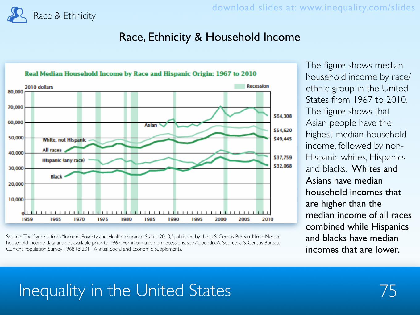
Race, Ethnicity & Household Income
The figure shows median household income by race/ethnic group in the United States from 1967 to 2010. The figure shows that Asian people have the highest median household income, followed by non-Hispanic whites, Hispanics and blacks. Whites and Asians have median household incomes that are higher than the median income of all races combined while Hispanics and blacks have median incomes that are lower.
Race & Ethnicitydownload slides at: www.inequality.com/slides

Inequality in the United States
Source: The figure is from “Child Poverty in the United States 2009 and 2010: Selected Race Groups and Hispanic Origin,” by Suzanne Macartney, published by the U.S. Census Bureau.
76
Race, Ethnicity & Child Poverty
The figure shows the racial/ethnic composition of the population of children and the population of children in poverty. It shows that among children in poverty, there are fewer Asian and white children than would be expected, and a greater percentage of Black and Hispanic children than would be expected (based on their percentages in the population).
Race & Ethnicitydownload slides at: www.inequality.com/slides

Inequality in the United States
Source: The figure is from the website of the National Center for Education Statistics at http://nces.ed.gov/pubs2010/2010015/figures/figure_23_2.asp and uses data from the Current Population Survey. Original source: U.S. Department of Commerce, Census Bureau, Current Population Survey (CPS), October 1980–2008. Notes: Race categories exclude persons of Hispanic ethnicity. Title of figure is ‘Figure 23.2 “Percentage of 18- to 24-year-olds enrolled in colleges and universities, by race/ethnicity: Selected years: 1980–2008.”’
77
Race, Ethnicity & Educational Attainment
This figure shows the percentages of 18- to 24-year-olds enrolled in colleges and universities between 1980 and 2008 for different race/ethnic groups. It shows that since 1990 (when data are first presented for Asians), Asian people, followed by whites, have attended college in larger percentages than have other race/ethnic groups.
Race & Ethnicitydownload slides at: www.inequality.com/slides

Violent Crime
Inequality in the United States 78
download slides at: www.inequality.com/slides
Inequality in the United States
Violent Crime
79
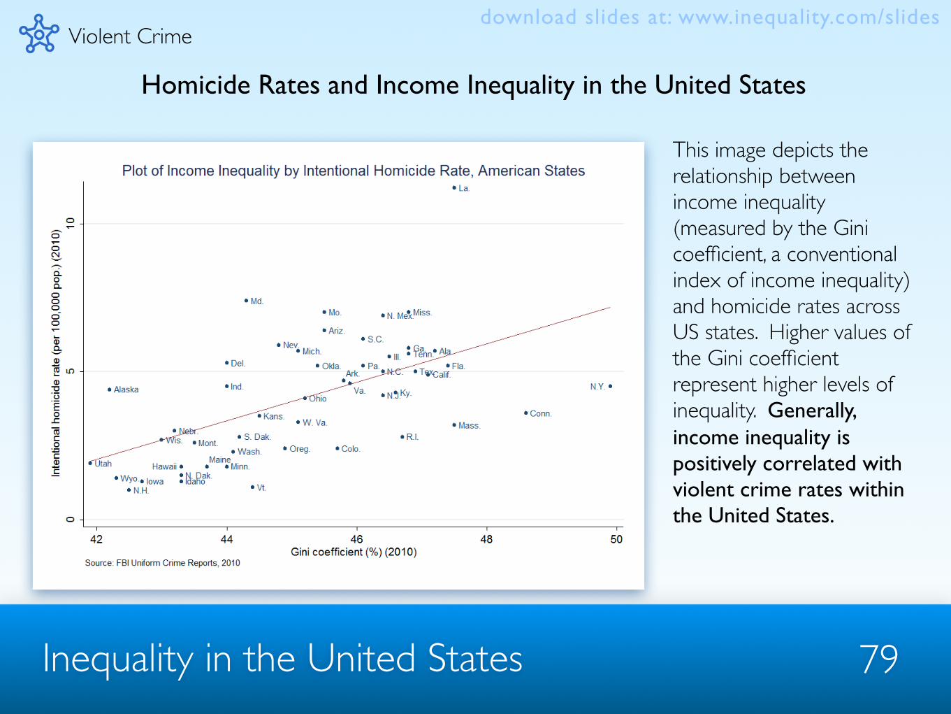
Homicide Rates and Income Inequality in the United States
This image depicts the relationship between income inequality (measured by the Gini coefficient, a conventional index of income inequality) and homicide rates across US states. Higher values of the Gini coefficient represent higher levels of inequality. Generally, income inequality is positively correlated with violent crime rates within the United States.
download slides at: www.inequality.com/slides

Inequality in the United States 80
Homicide Rates and Income Inequality in OECD Countries
Violent Crime
The relationship between violent crime and income inequality also holds outside of the United States. This figure shows the relationship between income inequality and homicide rates among OECD countries. As you can see, the United States has both the highest rate of inequality and the highest per capita homicide rate.
download slides at: www.inequality.com/slides

Inequality in the United States 81
Crime Rates, Unemployment and the Great Recession
US Unemployment Rates 1985-2010
Violent Crime
US Crime Rates 1985-2010
Evidence suggests that increasing inequality leads to increases in crime. Recently, however, crime rates within the United States have dropped despite rising inequality and unemployment. These graphs depict the unemployment rate (top) and violent crime rate (bottom) in the US, showing that although unemployment has increased in recent years, crime rates have continued to fall.
Source: Employment rates from the US Bureau of Labor Statistics, crime rates from, Uniform Crime Reports, Federal Bureau of Investigations.
download slides at: www.inequality.com/slides

Inequality in the United States 82
Incarceration is on the Rise
Violent Crime
The incarceration rate in the US has risen dramatically in the last 30 years. We now have the highest incarceration rate in the world and we also house the largest number of prisoners. In fact, we have more inmates than the top 35 European countries combined.
Source: International Center for Prison Studies at King’s College, London, “World Prison Brief,” available online at: http://www.prisonstudies.org/info/worldbrief/. Data downloaded June 2010.
download slides at: www.inequality.com/slides
Total Inmate Population
Top 35European Countries
UnitedStates
500,000
1,000,000
1,500,000
2,000,000
2,500,000
Inequality in the United States 83
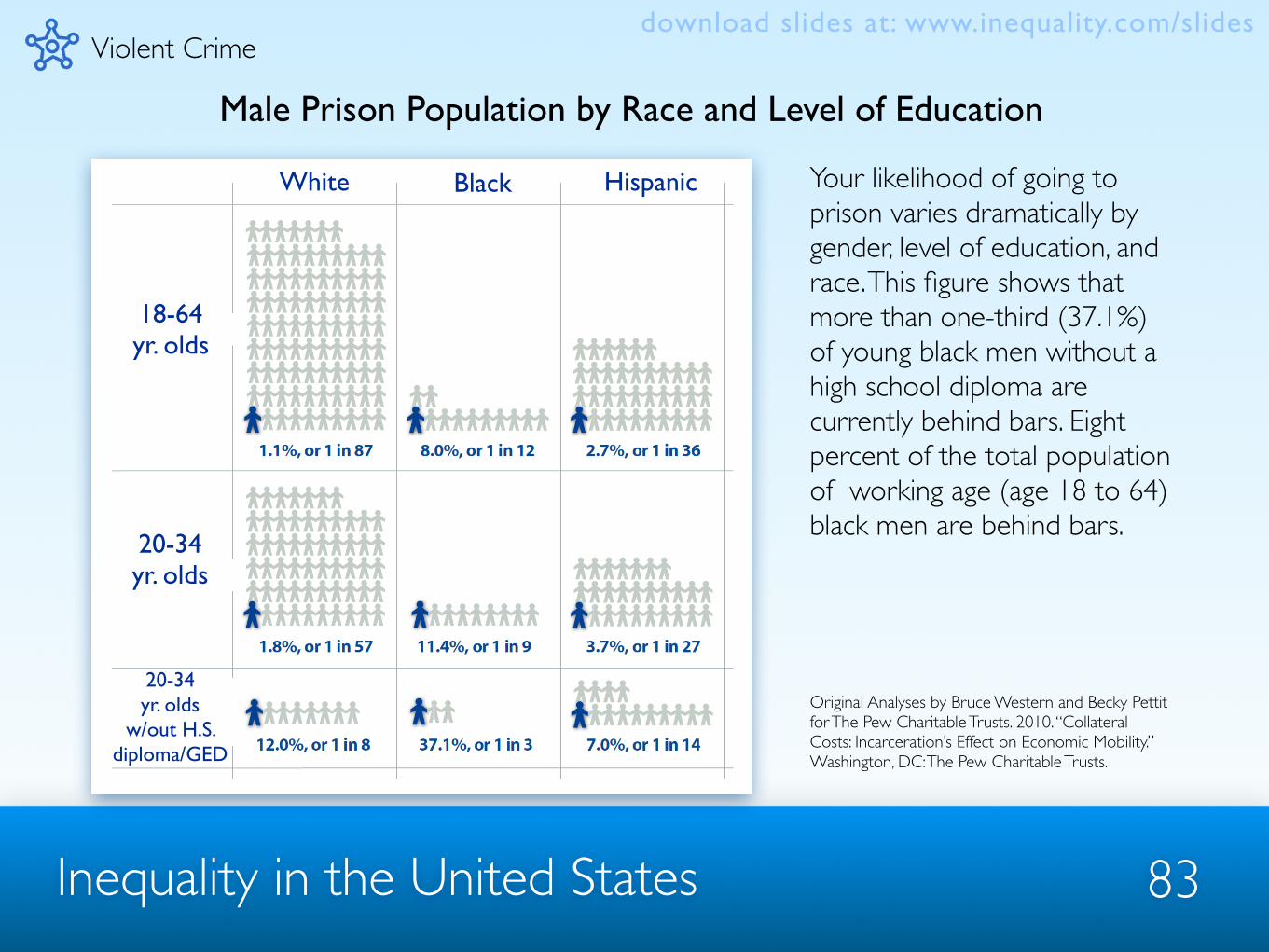
Male Prison Population by Race and Level of Education
Violent Crime
Your likelihood of going to prison varies dramatically by gender, level of education, and race. This figure shows that more than one-third (37.1%) of young black men without a high school diploma are currently behind bars. Eight percent of the total population of working age (age 18 to 64) black men are behind bars.
Original Analyses by Bruce Western and Becky Pettit for The Pew Charitable Trusts. 2010. “Collateral Costs: Incarceration’s Effect on Economic Mobility.” Washington, DC: The Pew Charitable Trusts.
download slides at: www.inequality.com/slides
White Black Hispanic
18-64yr. olds
20-34yr. olds
20-34yr. olds
w/out H.S. diploma/GED

Inequality in the United States 84
Children of Inmates Left Behind
Violent Crime
The rise in incarceration has led to many more children being exposed to the experience of having an incarcerated parent. For instance, by 2008, 11.4% of black children (or 1 in 9) had at least one parent behind bars. The figure was 1.8% for white children.
Original Analyses by Bruce Western and Becky Pettit for The Pew Charitable Trusts. 2010. “Collateral Costs: Incarceration’s Effect on Economic Mobility.” Washington, DC: The Pew Charitable Trusts.
download slides at: www.inequality.com/slides
Percent of Children w/ an Incarcerated Parent
1980 1985 1990 1995 2000 2005 2008
Black children
Hispanic children
White children
2%
4%
6%
8%
10%
12%

Wealth
Inequality in the United States 85
download slides at: www.inequality.com/slides

Inequality in the United States 86
Distribution of Wealth Across Wealth Strata
Wealth
This figure shows the share of Americans’ total household wealth held by each wealth group. In 1983 the wealthiest 20% of Americans held 81% of the wealth. By 2009, they held 87%. Currently, more than 25% of Americans have zero or negative wealth.
Source: Figure from Allegretto, Sylvia. 2011. “The State of Working America’s Wealth, 2011.” Economic Policy Institute Briefing Paper #292. Calculations based on Edward Wolff ’s 2010 unpublished analysis of Survey of Consumer Finances and Federal Reserve Flow of Funds. Note: Net Worth/Wealth defined as household assets minus debts. 2009 data based on changes in asset prices between 2007 and 2009 using Federal Reserve Flow of Funds data.
download slides at: www.inequality.com/slides

Inequality in the United States 87
Wealth of the Wealthiest 1% Compared to the Wealth of the Median Household, 1962-2009
This figure shows the ratio of the average wealth of the wealthiest 1% compared to the median American household’s wealth. In 1962, the top 1% had 125 times the wealth of the median household. By 2009 the top 1% had 225 times the median household’s wealth.
Source: Figure from Allegretto, Sylvia. 2011. “The State of Working America’s Wealth, 2011.” Economic Policy Institute Briefing Paper #292. Calculations based on Edward Wolff ’s 2010 unpublished analysis of Survey of Consumer Finances and Federal Reserve Flow of Funds. Note: Net Worth/Wealth defined as household assets minus debts. 2009 data based on changes in asset prices between 2007 and 2009 using Federal Reserve Flow of Funds data.
Wealthdownload slides at: www.inequality.com/slides

Inequality in the United States 88
Median Net Worth for Blacks and Whites, 1983-2009
0
37.5
75.0
112.5
150.0
1983 1989 1992 1995 1998 2001 2004 2007 2009
Tho
usan
ds o
f 200
9 D
olla
rs
White Net WorthBlack Net Worth
This figure depicts the differences in net worth between blacks and whites. Whites have always had more wealth than blacks, but this gap has grown over time. By 2009, the median white American had $98,000 in net worth while the median black American had just $2,200.
Source: Author’s compilation of data from Edward Wolff ’s 2010 unpublished analysis of Survey of Consumer Finances and Federal Reserve Flow of Funds. Note: Net Worth/Wealth defined as household assets minus debts. 2009 data based on changes in asset prices between 2007 and 2009 using Federal Reserve Flow of Funds data.
Wealthdownload slides at: www.inequality.com/slides

Inequality in the United States 89
Median Family Net Worth and Before-Tax Income by Income Percentile, 2007
This figure shows the median amount of wealth and income of families in each income percentile. In 2007, the bottom 20% earned about $8,000 and had about $12,000 in wealth. The top 10% earned over $200,000 and was worth $1.1 million. Wealth inequality is far greater than income inequality.
Source: Author’s calculations from Survey of Consumer Finances, Federal Reserve Bulletin. Note: Net Worth/Wealth defined as household assets minus debts.
0
375
750
1,125
1,500
Less than 20 20–39.9 40–59.9 60–79.9 80–89.9 90–100
Tho
usan
ds o
f Dol
lars
Pecentile of Income
2007 Median Family Net Worth2007 Median Family Before-tax Income
Wealthdownload slides at: www.inequality.com/slides