interaction, usability and aesthetics: what …s1000brains/rswork/dokuwiki/...in this paper we...
TRANSCRIPT
Permission to make digital or hard copies of all or part of this work for personal or classroom use is granted without fee provided that copies are not made or distributed for profit or commercial advantage and that copies bear this notice and the full citation on the first page. To copy otherwise, or republish, to post on servers or to redistribute to lists, requires prior specific permission and/or a fee. DIS 2006, June 26–28, 2006, University Park, Pennsylvania, USA. Copyright 2006 ACM 1-59593-341-7/06/0006...$5.00.
Interaction, Usability and Aesthetics: What Influences Users’ Preferences?
Antonella De Angeli, Alistair Sutcliffe & Jan Hartmann Centre for HCI Design, School of Informatics, University of Manchester
P.O. Box 88, Manchester M60 1QD, UK {antonella.de-angeli} {a.g.sutcliffe}@manchester.ac.uk; [email protected]
ABSTRACT In this paper we describe an evaluation of two websites with the same content but different interface styles (traditional menu-based and interactive metaphors). A formative usability evaluation was carried out with heuristic assessment of aesthetics, and questionnaire assessment of aesthetics, content, information quality, usability and post-test memory. The study revealed that perception of information quality is affected by the interaction style implemented in the interface, in a manner resembling the halo effect in person perception. Implications for website design and evaluation are discussed.
Author Keywords Design Evaluation, Engagement, Interaction, Metaphors, Aesthetics
ACM Classification Keywords H5.2. Information interfaces and presentation (e.g., HCI): User Interfaces.
INTRODUCTION Since its first beginning HCI has been concerned with the evaluation of interactive systems, and considerations of usability have had a great impact on the way interactive systems are designed and developed. With the recent shift from a functional vision (computers as tools for cognition) towards an experiential vision (interactive systems as a medium for emotions, sociability and pleasure) has come a realisation that usability may no longer be the only, or even the main, determinant of user satisfaction [3], [5], [20]. Increasing importance is now given to the interface “look and feel”, its capability to engage the users in fulfilling interaction, and generating affective responses.
In his recent book, Norman [12] claims that aesthetic design can be even more influential in affecting user preferences than traditional operational usability. This claim reflects well-established knowledge in marketing, product design, and even social psychology: namely, that beauty matters. The aesthetic quality of a product influences consumers’ attitudes, and is a major determinant of its marketplace
success [2]. Not only is beauty an important quality of a product but its effect seems to transcend the object and influence other judgements, in what is known as the halo effect. For example, not only do people associate positive personality traits with attractive individuals [4], but they also tend to attribute more positive dimensions to individuals in the company of a beautiful friend [8].
Consistent with the halo effect, initial research suggested a correlation between the aesthetic quality of an interface, its perceived usability, and the overall user satisfaction with that system [7], [20]. More recently, however, these findings were contradicted by experimental studies which found no or only a weak correlation between aesthetic quality of MP3-player skins and pragmatic attributes of the product, thus suggesting that aesthetic appreciation may not be strongly affected by experience [5]. This inconsistency indicates the need for a better conceptualisation of what constitutes the “user experience” and in particular what is beauty in interaction [13]. Lavie and Tracktinsky [6] proposed a model of website aesthetics which differentiated between classical aesthetics, referring to traditional aesthetic notions emphasising orderly and clear design, and expressive aesthetics, which the authors associate with the design’s creativity and originality. However, with a few exceptions [18], few studies have been undertaken on how different interaction styles and design features might influence aesthetics or users’ judgement of their interactive experience.
Our initial research has suggested that the use of interactive metaphors contributes to users’ attitudes and rating of website aesthetics, even when the usability of the system is worse. This effect can be explained by affective interpretation of user judgement [11], in that an interactive metaphor can induce curiosity and pleasure despite being more difficult to use. This paper builds upon our past research, attempting to define a model of user experience. We report an evaluation of two websites with identical content (in terms of quality and quantity of information provided) but very different interaction styles: one more traditional and menu-based, the other more interactive, exploiting metaphors and humour effects. In the study, we investigated the relationships between content, presentation, usability and memory, their relative importance to the user’s preferences, and the effect of different interaction styles.
271
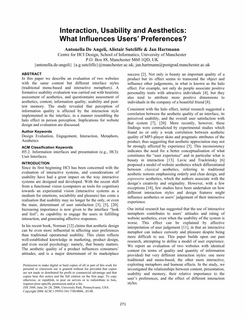
METHOD Two live websites (http://www.renaissanceconnection.org) were selected and adapted for the experiment. They presented exactly the same information on Renaissance culture and history but with different user interface styles. One was a traditional menu-based style; the other exploited animated metaphors and more aesthetic features (metaphor-based). The metaphor-based website adopted a playful and engaging interaction style, with animated picture characters providing information by speech bubbles, and generating other pictures and information from inside their head. The menu-based style adopted a more serious interaction style, displaying a static picture instead of the animated head, and with no humorous effects. Examples are shown in Figure 1.
Figure 1. Menu-based (upper), and metaphor-based (lower)
interfaces for the Renaissance Connection website.
The original websites were designed by Eduweb for the Allentown Art Museum in Pennsylvania for use by middle school students (10-14 years) and their teachers. These websites were subjected to a comparative usability evaluation, aimed at unveiling relative strengths and weaknesses of Flash and HTML [15]. The study addressed informal behavioural observations and the comments of middle school and college students. The major difference with the current study is that the HTML version (which we call the menu-based style) was a static equivalent of the Flash version (metaphor-based) and exploited the same level of playfulness without any animation effect. In the current study, we removed most of the fun features from the menu-based interface, and replaced them with pictures of a more serious content. Other important methodological differences also need to be stressed. The original study
reported a user-based evaluation run on small samples of pupils, concentrating on self-reports and observations to capture qualitative data. In contrast, in our study we report an expert-based comparative evaluation, which followed a much more structured approach, collecting and statistically comparing subjective and objective data.
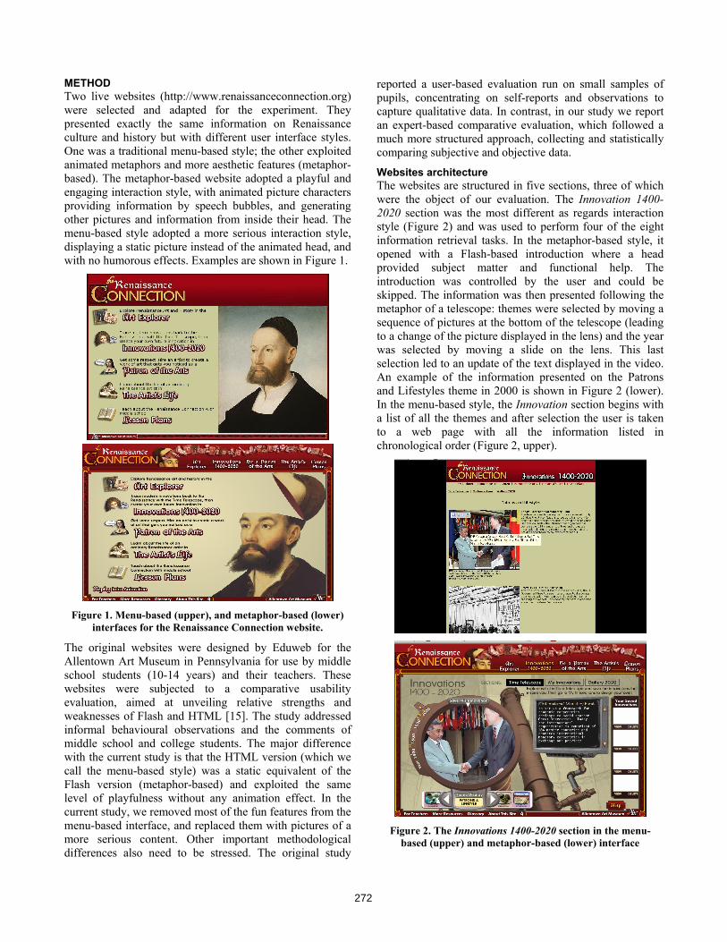
Websites architecture The websites are structured in five sections, three of which were the object of our evaluation. The Innovation 1400-2020 section was the most different as regards interaction style (Figure 2) and was used to perform four of the eight information retrieval tasks. In the metaphor-based style, it opened with a Flash-based introduction where a head provided subject matter and functional help. The introduction was controlled by the user and could be skipped. The information was then presented following the metaphor of a telescope: themes were selected by moving a sequence of pictures at the bottom of the telescope (leading to a change of the picture displayed in the lens) and the year was selected by moving a slide on the lens. This last selection led to an update of the text displayed in the video. An example of the information presented on the Patrons and Lifestyles theme in 2000 is shown in Figure 2 (lower). In the menu-based style, the Innovation section begins with a list of all the themes and after selection the user is taken to a web page with all the information listed in chronological order (Figure 2, upper).
Figure 2. The Innovations 1400-2020 section in the menu-
based (upper) and metaphor-based (lower) interface
272
The Be a Patron of the Arts section proposed an interactive game requiring the user to commission a painting to ‘glorify God, your city and yourself, and your family’. To play the game, the user had to make selections of alternatives in a form of interactive narratives. Different choices led to different outcomes, with only one correct path (one leading to the achievement of the desired painting). In the metaphor-based interface, the game consisted of vignettes, where comic-like characters talked to the users with timed speech bubbles in a vignette. In the menu-based interface, the same dialogue appeared as text associated to a character picture in a sequential fashion. One experimental task addressed this section.
The final section covered by the experiment was the The artist’s life. It reported basic knowledge on famous Renaissance painters. In the metaphor-based condition, this information was structured on individual web pages through which the user navigated clicking on the icon of a hand and/or selecting a menu at the top of the screen. In the menu-based interface, the same information was displayed on a web page through which the user had to scroll.
In an informal assessment of the aesthetic/user engagement differences between the two websites, we hypothesised that the variables that might influence users’ overall evaluation extended to the information quality assessment. Evaluation instruments The websites were evaluated for usability, memorability of content and interface features, aesthetics, information quality, engagement and overall preferences. Several techniques and instruments were used to gather evidence on these dimensions (Table 1).
Usability was assessed by objective measures (performance and self-report of usability problems) and subjective measures (questionnaire). Aesthetics was assessed by two distinct yet complementary approaches. A questionnaire collected holistic impressions on two apparently separate dimensions, namely classical aesthetics and expressive aesthetics. The first dimension includes items such as pleasant, clear, clean, symmetrical and aesthetic design. The dimension of expressive aesthetics is characterised by qualities that capture the user’s perception of creativity and originality of the site’s design. Relevant items in this dimension are “creative”, “fascinating”, “original”, “sophisticated design”, “use of special effects”. In addition, we asked participants to evaluate the site applying the heuristics for attractiveness, proposed by Sutcliffe [16]. These address the quality of individual design features linked to the perception of aesthetics (Table 3).
Information quality addressed the educational impact of the website. Two measures were used. The first one builds upon Lavie and Tractinksy’s [6] service quality construct (measured by the items “makes no mistakes”, “provides reliable information”, “reliable”), and localised to the evaluation of educational software by adding the following items: “provides enough details”, “informative”,
“educational”. The second measure builds on the Bernier Instructional Design Scale (BIDS), a psychometric instrument developed to assess the quality of printed education material. For our study we selected and adapted nine items, directly related to clarity of learning objectives, level of detail, quality of content, learning potential, delivery of up-to-date information. Engagement was measured by a short scale, previously used in [18].
Usability • Performance analysis • Self-report and severity rating of
usability problems (1=minor problem; 5=major problem)
• 5-item usability scale on a 7-point Likert scale [6]
Memorabilty • Free recall memory test and memory rating (1=very negative, 5=very positive)
Aesthetics • Heuristics for attractiveness [16], [17] • 10-item perceived website aesthetic
scale on a 7-point Likert scale [6]
Information quality • Scale A: six items on a 7-point Likert scale adapted from [6] as service quality measure
• Scale B: nine items on a 7-point Likert scale extracted and adapted from the Bernier Instructional Design Scale (BIDS) [1]
Engagement • 3 items on a 7-point Likert scale (engaging, entertaining, pleasant)
Overall preference • Dichotomous choice on the post-test questionnaire, including different scenarios
Table 1. Summary of the instruments and techniques used during the evaluation.
Overall preferences were assessed directly by a post-experimental questionnaire, asking users to express their choice on a dichotomous question, for overall preference and individual dimensions, in a number of different scenarios. Indirect measures of preference were obtained by questionnaire comparisons.
Participants Twenty-eight undergraduate and postgraduate students (23 male and 5 female) from the School of Informatics, University of Manchester participated in the experiment. They all had a basic knowledge of HCI, usability evaluation techniques and the aesthetic heuristics used in the experiment, from an advanced HCI course they had recently attended. All of the participants were expert web users but none of them had any prior knowledge of the two websites.
Procedure Data were collected in a group setting, with each participant working individually for almost 3 hours. At the beginning of the experimental session, participants received written and verbal instructions followed by a brief pre-test
273
questionnaire recording personal data. Then, they were assigned to one of the two websites and had to perform eight information-retrieval tasks (e.g. finding events which occurred in specific years, finding artists’ names and painting dates, engaging in on-line games, and reporting on specific picture details). Answers were written in an experiment booklet. Optimal task performance required visiting three sections of the websites in both conditions (Innovations, Artist’s Life, Be a patron of the arts). During task execution, participants recorded the usability errors they encountered and rated their severity. Once they had completed the tasks, they performed a free recall memory test, listing ten facts/ issues they could remember about the website, and rating the quality of these memories on a five-point scale (as favourable, neutral or adverse). Then, participants briefly revisited the site and completed the attractiveness heuristics and the questionnaires addressing the remaining measures. After a short break, the same evaluation procedure was repeated with the other website and a new set of tasks. Experimental tasks were designed to be very similar in terms of cognitive workload and navigation behaviour, but they addressed different topics to minimise learning effects (e.g. they had to retrieve information related to different themes, or to commission a painting for different targets). Finally, participants filled in a post-test questionnaire, which captured their overall preference and the reasons behind it. They were also invited to select the ideal interaction style for different target populations and environments (e.g. children aged 7-10 at home; children aged 7-10 at school). Interaction style (2) was manipulated within-subjects, so that each participant evaluated both the menu-based and the metaphor-based interfaces. Evaluation order and tasks were counter-balanced among experimental conditions.
RESULTS The results are summarised in six main sections according to the type of data analysed: the usability evaluation, aesthetic appreciation, information quality, engagement, the memorability test, and finally the participants’ overall preference; a model to predict overall preference is suggested. All scales showed high reliability (Cronbach alpha > .78), therefore comparisons are based on the average of individual items.
Usability evaluation In each condition, participants were given eight questions to answer, yielding a total of 224 tasks per condition. Overall, users were very accurate in information retrieval, with only 3% of 448 tasks resulting in wrong information. Accuracy was significantly affected by the interaction style of the website. Most of the errors occurred with the metaphor-based interface (N=10), whereas only 3 errors were observed in the menu-based interface, a significant difference according to a Wilcoxon Signed Rank test Z = -2.35 (N = 12) p < .05.
Several factors related to interaction design can be held responsible for the poorer performance of the metaphor-based interface. In this condition, the information was provided using an array of design elements, including speech bubbles and small pop-up windows, which could easily go unnoticed. Furthermore, information retrieval often required physical manipulation of interface objects. For instance, in the telescope metaphor, the year had to be selected by moving a slider, and paintings needed to be clicked to retrieve details. These design solutions may have disrupted participants’ performance by increasing the cognitive and physical load necessary for information retrieval. On the contrary, the linear interaction style supported by the menu-based interface was better suited to the experimental task. Consistently, the usability evaluation clearly favoured the menu-based interface. On average, participants reported significantly more problems when evaluating the metaphor-based website (mean= 3.68; standard error = .38) than when evaluating the menu-based site (mean = 1.68; standard error = .37), t(27) = - 4.49 p < .001. The problems associated with the metaphor-based site were also scored as more severe (mean/problem = 3.85 on a 5-point scale; standard error = .12) than those associated with the menu-based site (mean/problem = 2.95; standard error = .20). The difference is significant (t(132) = -3.94, p < .001). Usability problems were clustered into four categories according to their cause. Poor menu/navigation included critical incidents [10], i.e. usability problems which caused operational difficulties in finding the desired information. Poor graphical design covered adverse comments on aesthetic aspects of the site, including text layout and fonts, as well as animations and pictures. Poor information reflected negative comments on clarity and completeness of the information architecture and content. The category other included not understandable statements, in addition to comments reflecting unpredictable system behaviour and functionality failures. Table 2 reports frequencies and percentages of these categories in the two experimental conditions, along with their severity rating.
Menu-based Metaphor-based
Freq % Severity Freq % Severity
Poor menu/navigation
21 45 2.95 47 47 3.87
Poor graphical design
13 27 2.93 38 38 3.97
Poor information 7 15 2.50 9 9 3.67
Other 6 13 3.33 6 6 3.67
Total 47 100 2.94 100 100 3.87
Table 2. Statistics of usability problems classified by cause in the two experimental conditions.
Usability problems were homogeneously distributed in the four categories independent of experimental conditions
274
(χ2(3) = 3.84, p = n.s.). The most common cause of usability
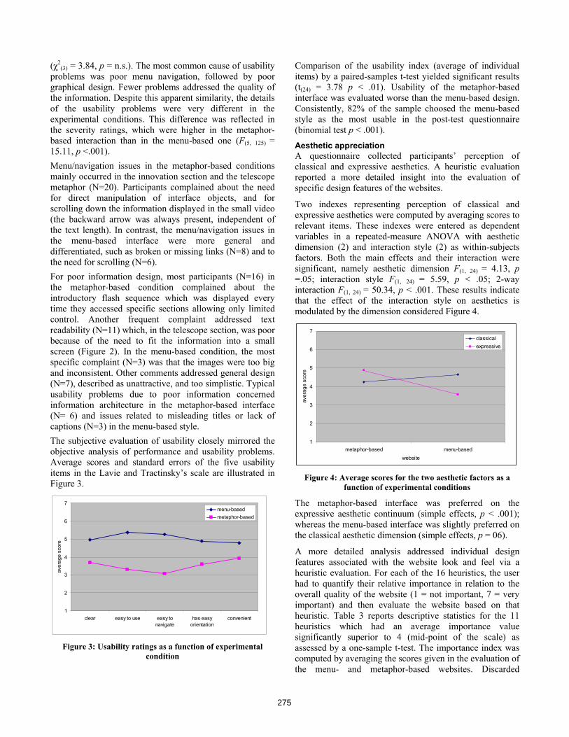
problems was poor menu navigation, followed by poor graphical design. Fewer problems addressed the quality of the information. Despite this apparent similarity, the details of the usability problems were very different in the experimental conditions. This difference was reflected in the severity ratings, which were higher in the metaphor-based interaction than in the menu-based one (F(5, 125) = 15.11, p <.001). Menu/navigation issues in the metaphor-based conditions mainly occurred in the innovation section and the telescope metaphor (N=20). Participants complained about the need for direct manipulation of interface objects, and for scrolling down the information displayed in the small video (the backward arrow was always present, independent of the text length). In contrast, the menu/navigation issues in the menu-based interface were more general and differentiated, such as broken or missing links (N=8) and to the need for scrolling (N=6). For poor information design, most participants (N=16) in the metaphor-based condition complained about the introductory flash sequence which was displayed every time they accessed specific sections allowing only limited control. Another frequent complaint addressed text readability (N=11) which, in the telescope section, was poor because of the need to fit the information into a small screen (Figure 2). In the menu-based condition, the most specific complaint (N=3) was that the images were too big and inconsistent. Other comments addressed general design (N=7), described as unattractive, and too simplistic. Typical usability problems due to poor information concerned information architecture in the metaphor-based interface (N= 6) and issues related to misleading titles or lack of captions (N=3) in the menu-based style. The subjective evaluation of usability closely mirrored the objective analysis of performance and usability problems. Average scores and standard errors of the five usability items in the Lavie and Tractinsky’s scale are illustrated in Figure 3.
1
2
3
4
5
6
7
clear easy to use easy tonavigate
has easyorientation
convenient
aver
age
scor
e
menu-basedmetaphor-based
Figure 3: Usability ratings as a function of experimental
condition
Comparison of the usability index (average of individual items) by a paired-samples t-test yielded significant results (t(24) = 3.78 p < .01). Usability of the metaphor-based interface was evaluated worse than the menu-based design. Consistently, 82% of the sample choosed the menu-based style as the most usable in the post-test questionnaire (binomial test p < .001).
Aesthetic appreciation A questionnaire collected participants’ perception of classical and expressive aesthetics. A heuristic evaluation reported a more detailed insight into the evaluation of specific design features of the websites.
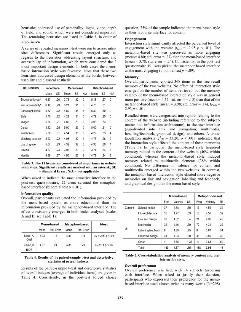
Two indexes representing perception of classical and expressive aesthetics were computed by averaging scores to relevant items. These indexes were entered as dependent variables in a repeated-measure ANOVA with aesthetic dimension (2) and interaction style (2) as within-subjects factors. Both the main effects and their interaction were significant, namely aesthetic dimension F(1, 24) = 4.13, p =.05; interaction style F(1, 24) = 5.59, p < .05; 2-way interaction F(1, 24) = 50.34, p < .001. These results indicate that the effect of the interaction style on aesthetics is modulated by the dimension considered Figure 4.
1
2
3
4
5
6
7
metaphor-based menu-basedwebsite
aver
age
scor
e
classicalexpressive
Figure 4: Average scores for the two aesthetic factors as a
function of experimental conditions
The metaphor-based interface was preferred on the expressive aesthetic continuum (simple effects, p < .001); whereas the menu-based interface was slightly preferred on the classical aesthetic dimension (simple effects, p = 06).
A more detailed analysis addressed individual design features associated with the website look and feel via a heuristic evaluation. For each of the 16 heuristics, the user had to quantify their relative importance in relation to the overall quality of the website (1 = not important, 7 = very important) and then evaluate the website based on that heuristic. Table 3 reports descriptive statistics for the 11 heuristics which had an average importance value significantly superior to 4 (mid-point of the scale) as assessed by a one-sample t-test. The importance index was computed by averaging the scores given in the evaluation of the menu- and metaphor-based websites. Discarded
275
heuristics addressed use of personality, logos, video, depth of field, and sound, which were not considered important. The remaining heuristics are listed in Table 3, in order of importance.
A series of repeated measures t-test were run to assess inter-sites differences. Significant results emerged only as regards to the heuristics addressing layout structure, and accessibility of information, which were considered the 2 most important design elements. In both cases the menu-based interaction style was favoured. Note that these two heuristics addressed design elements at the border between usability and classical aesthetic.
HEURISTICS Importance Menu-based Metaphor-based
Mean SE Mean SE N/A Mean SE N/A
Structured layout* 6.17 .20 3.75 .32 0 5.18 .27 0
Info. accessibility* 6.12 .23 3.21 .31 0 4.75 .31 0
Consistent layout 5.82 .22 4.89 .34 3 5.39 .30 0
Style 5.70 .22 4.29 .31 0 4.79 .25 0
Images 5.60 .21 4.89 .29 0 4.93 .33 0
Colour 5.42 .25 5.00 .27 0 5.00 .31 0
Interactivity 5.36 .31 4.54 .35 0 4.29 .33 4
Matching expectn 5.22 .22 4.08 .32 4 4.73 .26 2
Use of space 5.07 .23 4.32 .32 0 4.33 .30 1
Arousal 4.87 .24 3.93 .29 0 3.74 .34 1
Identity 4.58 .27 4.50 .22 2 4.73 .24 2
Table 3. The 11 heuristics considered of importance in website evaluation. Significant results are marked with an asterisk; SE
= Standard Error, N/A = not applicable
When asked to indicate the most attractive interface in the post-test questionnaire, 22 users selected the metaphor-based interface (binomial test p < .01).
Information quality Overall, participants evaluated the information provided by the menu-based system as more educational than the information provided by the metaphor-based interface. The effect consistently emerged in both scales analysed (scales A and B; see Table 1).
Menu-based Metaphor-based t-test
Mean Std. Error Mean Std. Error
Scale_A-Qual
5.03 .16 4.31 .18 t(24) = 2.99 p < .01
Scale_B BIDS
4.87 .21 4.35 .20 t(23) = 11 p < .05
Table 4. Results of the paired-sample t-test and descriptive statistics of overall indexes.
Results of the paired-sample t-test and descriptive statistics of overall indexes (average of individual items) are given in Table 4. Consistently, in the post-test forced choice
question, 75% of the sample indicated the menu-based style as their favourite interface for content.
Engagement Interaction style significantly affected the perceived level of engagement with the website (t(25) = -2.95 p < .01). The metaphor-based site was perceived as more engaging (mean= 4.80; std. error = .27) than the menu-based interface (mean = 3.78; std. error = .24). Consistently, in the post-test questionnaire 19 users picked the metaphor based interface as the most engaging (binomial test p = .09).
Memory Overall, participants reported 368 items in the free recall memory of the two websites. No effect of interaction style emerged on the number of items retrieved, but the memory valency of the menu-based interaction style was in general more positive (mean = 4.57; std. error = .15) than that of the metaphor-based style (mean = 3.98; std. error = .14), t(360) = 2.93 p < .01.
Recalled items were categorised into reports relating to the content of the website (including reference to the subject-matter and information architecture), to the user-interface (sub-divided into link and navigation, multimedia, labelling/feedback, graphical design), and others. A cross-tabulation analysis (χ2
(3) = 33.20, p < .001) indicated that the interaction style affected the content of these memories (Table 5). In particular, the menu-based style triggered memory related to the content of the website (40% within condition); whereas the metaphor-based style induced memory related to multimedia elements (38% within condition). No difference in valency for content and multimedia emerged within the two websites. In contrast, the metaphor based interaction style elicited more negative memories on link and navigation, labelling and feedback, and graphical design than the menu-based style.
Menu-based Metaphor-based
Freq Valency SE Freq Valency SE
Subject-matter 37 4.38 .35 17 4.59 .39 Content
Info Architecture 35 4.77 .39 18 4.56 .39
Link and Navign 32 4.62 .34 24 2.96 .43
Multimedia 32 4.16 .39 72 4.31 .22
Labelling/feedback 9 4.89 .75 8 3.87 .54
UI
Graphical design 31 4.93 .30 38 3.59 .30
Other 4 3.75 1.37 11 3.63 .59
Total 180 4.57 .15 188 3.98 .14
Table 5. Cross-tabulation analysis of memory content and user interaction style.
Overall preference Overall preference was tied, with 14 subjects favouring each interface. When asked to justify their decision, participants who expressed their preference for the menu-based interface used almost twice as many words (N=298)
276
as those who chose the metaphor-based interface (N=145). This seems to suggest that people choosing the less engaging website felt the need to better justify their decision. In doing so, they often (N=9) explicitly referred to negative features of the Flash website. In other words, their preference appeared to be the result of a general dislike for the metaphor-based version. In contrast, only two people explicitly referred to negative features of the menu-based website when stating their preference for the metaphor-based site.
The reasons driving participants’ preferences were very different according to the selected website. The most common reason for preferring the metaphor-based interface made explicit reference to a more engaging (N=8) and more interactive (N=7) style. Only two participants declared it was easier to use. On the other hand, all but one of the participants who preferred the menu-based style made explicit reference to usability issues.
Participants’ preferences of the website changed drastically according to the target population and the scenario of use. A clear majority agreed that the metaphor-based style was better for children interacting at home (leisure time), whereas less agreement was found when the system was meant to be used in a classroom environment (formal education). Similarly, the metaphor-based style was deemed inappropriate for more mature and knowledgeable target populations (see Table 6).
Scenario of use Menu-based %
Metaphor-based %
Binomial test p
Children (7-10), school 20 71 .05
Children (7-10), home 14 86 .001
Children (10-14), schl 32 68 n.s
Children (10-14), home 21 79 .01
Teenagers 43 57 n.s
University students 85 15 .001
Arts experts 82 18 .001
Elderly 89 11 .001
Table 6. Participants’ preferences for different target populations.
A model of participants’ preference The experimental results discussed so far are summarised in Table 7 (+ denotes better style, - worse style, = no difference between the styles). It appears that both styles had unique strengths and weaknesses.
The menu-based interface received more positive evaluation for usability and information quality (even though the two sites had exactly the same content). It also tended to elicit more positive memory. On the other hand, the metaphor-based interface was perceived as more engaging and better in the expressive aesthetic dimension. Despite these clear differences, no clear winner emerged as
exactly half of the sample preferred the metaphor-based version and the other half the menu-based one.
Menu-based Metaphor-based
Usability + -
Classical aesthetic = =
Expressive aesthetic - +
Information quality + -
Engagement - +
Memory valency + =
Overall preference = =
Table 7. Summary of the differences between the two interactive styles.
The correlations between the main dimensions for the two interaction styles are reported in Table 8. Correlation values for the metaphor-based styles are reported in the upper part of the matrix, and menu values are in the lower part. The overall correlation trends demonstrate the inter-relationships between the different evaluation dimensions. The most striking difference between the two interaction styles is the correlation between usability and expressive aesthetics, which is highly significant in the menu-based interaction styles but not in the metaphor-based style. Furthermore, memory valency tends to correlate with more dimensions in the menu-based interface than in the metaphor based one.
Metaphor measure combination
1 2 3 4 5 6
1. Memory valency * ** *
2. Usability ** ** *
3. Classical aesthetics ** * * * **
4. Expressive aesthetics ** * ** ** **
5. Information quality ** ** *
Menu measure
combination
6. Engagement ** ** ** ** *
Table 8. Correlation matrix of the evaluation measures. * = p < .05; ** = p < .001.
In order to understand what factors predict overall preference, a binary logistic regression was conducted, applying the forward stepwise method based on likelihood ratio. The analysis is similar to a linear regression but it is better suited to a model where the dependent variable is dichotomous. It predicts whether an event will or will not occur and identifies the variables useful in making that prediction. The dependent variable in our model is the overall preference of the user, as expressed by their choice in the post-test questionnaire (metaphor-based vs. menu-based). We selected three main covariates for the model, corresponding to the evaluation dimensions which strongly differentiated the two interaction styles (usability, expressive aesthetic and information quality). Engagement was discarded as it is highly correlated to expressive
277
aesthetics in both interaction styles (r = .89 and r = .71) and our sample is not large enough to reliably accommodate four factors. The model predictors corresponded to the within-subjects differences on the evaluation of the websites (e.g. usability_predictor=usability_menu-usability _metaphor). Usability was found to be an important predictor of final evaluation (Nagelkerke R Square = .50), and together with expressive aesthetic it explained 88% of the final preferences (total Nagelkerke R Square = .77). The model appears to fit well the data (χ2
(3) = 22.97, p < .001), and it becomes less reliable if information quality is added. From the analysis one could conclude that differences in evaluation of usability and expressive aesthetic were good predictors of the overall preference, whereas information quality is not. To further investigate these results we ran a series of mixed model Anovas with interaction style (2) as the within-subjects factor and preference (2) as the between-subjects one. The four dimensions differentiating the two styles (usability and information quality, on the one hand, and expressive aesthetics and engagement on the other) were entered as dependent variables. In all the analyses we found a significant preference for interaction style (p < .001) showing that participants tended to discount negative attributes in the favourite style. Examples of this effect are illustrated in Figure 5 and 6.
1
2
3
4
5
6
7
men
u
met
apho
r
men
u
met
apho
r
usability content
aver
age
scor
es
preferredmetaphorpreferred menu
Figure 5. Average values for content and usability as a
function of preferred interaction style
1
2
3
4
5
6
7
men
u
met
apho
r
men
u
met
apho
r
expressive aeshetic engagement
aver
age
scor
e
preferredmetaphorpreferred menu
Figure 6. Average values for expressive aesthetics and engagement as a function of preferred interaction style
Figure 5 reports average values for content and usability as a function of preferred interaction style. People who preferred the menu-based style were much more severe in evaluating usability and content of the metaphor-based style and more positive in evaluating these dimensions of their favourite style.
Similarly, people who preferred the metaphor-based style were much more negative in evaluating both expressive aesthetics and engagement of the menu-based style (Figure 6).
CONCLUSION The evaluation has revealed that the websites differed along several dimensions, as summarised in Table 7. The menu-based interface had better usability; it elicited more positive memories, and was perceived as providing better content, although the content was exactly the same in the two interaction styles. The metaphor-based interface was preferred on the expressive aesthetic dimension and rated as more engaging. Differences in evaluation of usability and expressive aesthetics were good predictors of overall preference, as participants appeared to discount negative attributes in their favourite style. The overall preference was context dependent, and changed dramatically according to the target population and the scenario of use.
DISCUSSION Our results show that the link between aesthetics and usability reported by Tractinsky’s studies [20], [6] is more complex that than the strong claim that “what is usable is beautiful” [20]. In the websites we studied the metaphor-based design was perceived as having better expressive aesthetics using Lavie and Tractinsky’s scale, yet it had worse objective and perceived usability. This is consistent with our findings on other live websites [18], that participants preferred an interface evaluated as more attractive on the expressive aesthetics dimension (a concept strongly related to engagement and fun) despite an acknowledged inferior usability.
Even though the metaphor design had superior expressive aesthetics there was evidence of poor graphical design in the usability measures and no difference was found on the interactivity heuristics, although the metaphor design clearly incorporated more interactive effects. In contrast, the metaphor design was rated better on engagement and was preferred when the framing question pointed to younger users and more playful applications.
Our explanation of these apparent contradictions in users’ judgement is that levels of attitudes are being formed from the experience. The more general attitude level reflects the overall design concept, in the metaphor case one of playfulness and engaging interaction. More detailed attitudes are based more directly on experience and design features, reflected in the adverse graphical design, usability and classical aesthetics ratings for the metaphor design. More general attitudes seem to have a halo effect in overriding the adverse influences of more detailed attitudes,
278
which supports Tractinsky’s findings [19, 20] on aesthetic preferences in mobile phone personalisation and that more aesthetic ATM designs are also perceived to be more usable. In Tractinsky’s experiments the usability effect was small (mainly response times), whereas our findings demonstrate the strength of the effect.
The metaphor site experienced severe problems and much worse usability ratings. The preference analysis provides more evidence for attitudes, since users suppressed adverse judgements for their preferred sites. Users’ memory also supports this interpretation; the metaphor site was remembered for its multimedia appeal and for its problems, while information content was remembered for the more serious menu design. While we interpret users’ judgements in terms of attitude (i.e. valenced memory), one could also view the levels as emotional reactions at the visceral (general) and reflective (detailed) level [12], although we had little evidence of affective reaction in our qualitative data.
We argue that judgements of aesthetics and engaging designs are highly contextually dependent [5, 9, 18] showing framing effects of the target user audience and application type. When the context is less serious, aesthetics can have a strong halo effect; however, this may not generalise to other more serious user/application contexts. The menu design in our study had better usability, was preferred for serious usage contexts, and had better rating for information quality, even though the content of both sites was equivalent. In this case it appears that usability can also have a halo effect on information content.
In their classic study, Dion, Berscheid and Walster [4] asked subjects to choose which personality traits applied to pictures of people, varying on the attractiveness dimensions. Results showed that more positive traits were ascribed to attractive individuals, as compared to less attractive ones. This halo effect was obtained consistently over a wide range of personal qualities and was also demonstrated in users’ perceptions of human images displayed on computers [14]. An interesting question for further research is the relative strength of halo effects from different variables. From the evidence in this study we speculate that the concept of interaction (via metaphors, animations, pop-ups etc.) makes the “feel-good factor” that might outweigh the “look” of visually aesthetic design.
However, interaction may only “feel good” when the context is less serious. We have made a small advance in measures of aesthetics by introducing related phenomena of interaction and engagement with a rigorous evaluation methodology. This exposed the conflicting opinions held by our users and indicates that expressive aesthetics [6] have to be assessed in general attitude, which in the metaphor site conflicts with opinion on more detailed aspects of aesthetics. The attractiveness heuristics we used in previous studies [18], [17] attempt to link more general impressions to assessment of specific aesthetics and interactive design
features. In our future work we intend to extend and refine the evaluation approach we have developed to further understand the relative strengths of different influences on users’ overall quality judgement, and investigate the interactions between them.
REFERENCES 1. Bernier, M. J. Establishing the psychometric properties
of a scale for evaluating quality in printed educational materials. Patient Education and Counselling 29,3 (1996), 283-299
2. Bloch, P. Seeking the ideal form: Product design and consumer response. Journal of Marketing 59 (1995) 16-29.
3. De Angeli, A., Lynch, P., and Johnson G.I. Pleasure versus efficiency in user interfaces: Towards an involvement framework. In W. S. Green, & P. W. Jordan (Eds.), Pleasure with products: Beyond usability London: Taylor & Francis, (2002), 97-111.
4. Dion, K., Berscheid, E., and Walster, E. What is beautiful is good. Journal of Personality and Social Psychology 24 (1972), 285-290.
5. Hassenzahl, M. The thing and I: understanding the relationship between user and product In M. Blythe, C. Overbeeke, A. Monk, and P.C. Wright (Eds), Funology: From usability to enjoyment, (2003), 31-42.
6. Lavie, T., and Tractinsky, N. Assessing dimensions of perceived visual aesthetics of web sites. International Journal of Human-Computer Studies 60, 3 (2004) 269-298.
7. Lindegaard, G., and Dudek, C. What is this evasive beast we call user satisfaction? Interacting with Computers 15, 3 (2003), 429-452.
8. Meiners, M.L., and Sheposh, J.P. Beauty or brains: Which image for your mate? Personality and Social Psychology 3 (1977), 262-265.
9. Monk, A. The product as a fixed effect fallacy. Human-Computer Interaction 19, 4 (2004), 371-375.
10. Monk, A., Wright, P., Haber, J., and Davenport, L. Improving Your Human-Computer Interface: A Practical Technique. Prentice Hall, London, 1993..
11. Norman, D.A. Beauty, goodness and usability: Introduction to the special section. Human-Computer Interaction 19, 4 (2004), 311-318.
12. Norman, D.A. Emotional Design: Why We Love (or Hate) Everyday Things. Basic Books, New York, 2004.
13. Overbeeke, K.C., Djajadiningrat, J.P., Hummels, C.C. M., and Wensveen, S.A.G.. Beauty in usability: forget about ease of use.In W. S. Green, & P. W. Jordan (Eds.), Pleasure with products: Beyond usability. London: Taylor & Francis, (2002), 97-111
279
14. Reeves, B., and Nass, C. The Media Equation: How People Treat Computers, Television and New Media Like Real People and Places. CLSI/Cambridge University Press, Stanford CA/Cambridge, 1996
15. Schaller, D.T., Allison-Bunnell, S., Chow, A., Marty, P., and Heo, M.,. To FlashFlash or not to FlashFlash? Usability and user engagement of HTML vs. FlashFlash. In Proceedings Museums and the Web 2004 International Conference. Available on-line at http://www.eduweb.com/ToFlashFlashornot.pdf.
16. Sutcliffe, A.G. Heuristic evaluation of website attractiveness and usability. In GIST technical report G2001/1: Proceedings 8th Workshop on Design, Specification and Verification of Interactive Systems (Glasgow) Dept of Computer Science, University of Glasgow, Glasgow, 2001, 188-199.
17. Sutcliffe, A. G. Assessing the reliability of heuristic evaluation for website attractiveness and usability. In Proceedings HICSS-35 Hawaii International
Conference on System Sciences (Hawaii). IEEE Computer Society Press, Los Alamitos, CA, 2002, 1838-1847.
18. Sutcliffe, A.G., and De Angeli, A. Assessing interaction styles in web user. In Proceedings of Human Computer Interaction - Interact 2005 (Rome) M. F. Costabile & F. Paterno, Eds. Springer-Verlag, Berlin, 405-417.
19. Tractinsky, N., and Zmiri, D. Exploring attributes of skins as potential antecedents of emotion in HCI. In P. Fishwick (Ed.), Aesthetic computing. Cambridge MA: MIT Press, in press
20. Tractinsky, N., Shoval-Katz, A., and Ikar, D. What is beautiful is usable. Interacting with Computers 13. 2, 127-145, 2000.
280