interactive data visualization using mondrian - core · this paper lists mondrian’s special...
TRANSCRIPT
Interactive Data Visualization using Mondrian
Martin TheusUniversity of Augsburg
Department of Computeroriented Statistics and Data AnalysisUniversitatsstr. 14, 86135 Augsburg, Germany
Abstract
This paper presents the Mondrian data visualizationsoftware. In addition to standard plots like histograms,barcharts, scatterplots or maps, Mondrian offers advancedplots for high dimensional categorical (mosaic plots) andcontinuous data (parallel coordinates). All plots are linkedand offer various interaction techniques. A special focus ison the seamless integration of categorical data. Unique isMondrian’s special selection technique, which allows ad-vanced selections in complex data sets.
Besides loading data from local (ASCII) files it can con-nect to databases, avoiding a local copy of the data on theclient machine.Mondrian is written in 100% pure JAVA.
1. Introduction
Data visualization has been acknowledged as an impor-tant tool in decision support. But usually visualizations arestatic and just used for presentation rather than exploration.Interactive statistical data visualization is a powerful toolwhich reaches beyond the limits of static graphs.
Although there was a big research effort in the mid 80sin interactive graphical statistics, this data analysis tool hasnot become widely used. One reason might be that the sys-tems designed by researchers 15 years ago (cf. [1]) neededextremely expensive hardware and a big effort in softwaredevelopment. Certainly times have changed since then, andany desktop computer is capable of graphics today. Fur-thermore compatibility issues have become less important.Open source projects as well as platform independent pro-gramming languages like JAVA have made software morewidely accessible.
Only few software packages are not only tailored to-wards one specific visualization task like e.g. network vi-sualization or 3d-imaging, but offer a variety of plots for ageneral analysis of data.
This paper lists Mondrian’s special features and novelimplementations. Concepts of how to utilize the interactivevisualization tools for an advanced data analysis are pre-sented as well.
Mondrian is freely available and as a JAVA applicationruns on almost any platform.
2. Smart Selections
The main task in interactive data visualization is theidentification of patterns and subgroups. Thus selecting andidentifying data is of major importance. This section intro-duces the special selection technique implemented in Mon-drian.
2.1. The Progress in Selection Techniques
The way how data are selected in interactive visualiza-tion software shows the steady advance of research results.
1. The standard way of selecting data is to select dataand by doing so replace any other selection that mighthave been present. There is no way of refining a selec-tion or selecting over different plots and/or variables.This standard selection technique is implemented e.g.in GGobi [7].
2. A more advanced way to handle selections is to al-low to combine the current selection with a new se-lection with boolean functions like and, or, Xor, not.This allows the analyst to refine a selection step bystep to drill down to a very specific subset of the data.DataDesk [11] implements this selection technique.
3. When dealing with a whole sequence of selections, it isoften desirable to change a selection at an earlier stage,without having to redefine all preceding and succes-sive selection steps. By storing the sequence of selec-tions it is possible to make changes to any step in the

sequence. Selection Sequences have been first imple-mented in MANET [9].
4. Although a selection is always performed on the com-puter screen in the first place, i.e. in terms of screencoordinates, the data selection must be stored in termsof data coordinates. The approach used by Mondriankeeps a list of any selection associated with a data set.For each entry in the list the
• selection area in screen coordinates and data co-ordinates,
• selection step,
• corresponding plot window and
• selection mode (e.g. and, or, not)
is stored. The currently selected subset of the data canthen be determined by processing all elements of thelist, no matter which kind of modification to the listwas the reason for an update of the selection subset.
2.2. Selection Rectangles
Allowing multiple selections in a single window as wellas across different windows makes a visual guide to the se-lections performed indispensable.
Figure 1. Selection Rectangles in Mondrian.
Mondrian introduces Selection Rectangles. Figure 1gives an example of a scatterplot containing two selectionrectangles. Selection rectangles indicate the area which wasselected. An existing selection rectangle can be used as abrush by simply dragging the selection rectangle. The eighthandles on the rectangle permit a flexible resizing of therectangles. This enables various slicing techniques.
The selection mode can be changed via a pop-up menu.The deletion of a selection can be performed via this pop-up, too. An active (i.e. selected) selection can be deleted bysimply pressing the backspace key. Only the active selec-tion is plotted in black. All other selections are plotted in alighter gray to make them less dominant in the plot.
Figure 2. Zooming in a map: the SelectionRectangle changes accordingly.
Since selections are stored in terms of the data coordi-nates they are invariant to any alterations of a plot. Typicalscenarios are things like interactive reordering of the axesin a parallel coordinate plot, flipping the axes in a scatter-plot or zooming. These operations automatically update theselection rectangles. The new screen coordinates of the se-lection rectangles are calculated from the data coordinates.Figure 2 shows how a selection rectangle reacts on a zoominside a map.
The ability to handle more than one selection in onewindow is indispensable when dealing with parallel coor-dinates.
The way Mondrian handles selections is particularly use-ful when working with databases, since the selection trans-late easily into SQL code. At this point it is important to besure about the precedence of boolean operators. Mondrianalways performs selections sequentially, which is in mostcases the way the user thinks. Thus an example selectionS1 OR S2 AND S3 reads as (S1 OR S2) AND S3,ignoring the usual precedence of boolean operators, whereAND has a higher precedence as OR. The WHERE-clause inan SQL-query thus is explicitly bracketed to ensure the se-quential order of the operators.
The use of JAVA 2D would make the implementationof arbitrary shapes of a selection area relatively simple.Whereas this would allow very flexible selections, it is notobvious how a resizing of such a selection would look like.A more structured approach to more general selection ar-eas could be to allow a rhombus shape of the selection area,which can be resized at the four corner handles. The re-maining four handles would then be used to enlarge or re-duce the size of the rhombus as needed.

3. Conventions
One of the keys to the success of a graphical user in-terface are conventions. Conventions enable the user toperform tasks without learning new, specific interactions.E.g. most graphical user interfaces allow for a change ofthe window size by dragging the lower right corner of thewindow. Once the user knows of this behavior he/she isable to resize a window no matter what application or op-erating system he/she uses. A brilliant collection of goodand many bad examples of user interface design is givenat http://www.iarchitects.com. A broader dis-cussion of user interface design for interactive visualizationsoftware can be found in [8].
High interaction graphics with direct manipulation inter-faces offer a lot of interactions. To ease the use of highinteraction graphics it is necessary to gather the various in-teractions into different groups like queries, zooming, selec-tion, reordering. Once these groups are identified, we canassign the various user interface interactions to them; e.g.shift-mouse-click, pop-up-trigger etc.
Inside Mondrian the following groups of interactionshave been identified to be crucial to perform steps in an in-teractive graphical data analysis.
• Selections
– Creating a selection rectangleClick and drag.
– BrushingClick inside a selection rectangle and drag.
– Resize a selection (Slice)Click-drag a handle of a selection rectangle
– Change the selection modeShift-click inside the selection rectangle
• Queries
– Popup trigger on an object(i.e. right mouse button on most systems).
• Alterations
– Zoom-out (-in)Meta-click (and drag).
– Change the plot settingsPopup trigger on the plot background.
– Reorder objects in the plotAlternate-click on the object and drag to new po-sition.
Obviously some of these interactions are identical in allplots (e.g. interactions with selections), and some dependon the plot-type. Whereas there is nothing to reorder in
a map, you can reorder the categories in a barchart or theaxes in a parallel coordinate plot. Given these conventionsit is very easy to get used to all the different functions insideMondrian.
4. Special Plots for High Dimensional Data
Although linking and highlighting across different plotscan already increase the number of dimensions to look atsimultaneously, it is very desirable to find visualizationswhich include many variables at a time. Mosaic plots forcategorical data and parallel coordinate plots for continu-ous data are ideal for gaining insight into high dimensionaldata.
4.1. Parallel Coordinates/Boxplots
Parallel Coordinates are a powerful tool to analyze a highdimensional data sets graphically. Since static representa-tions of parallel coordinates are usually not very revealingseveral interactive implementations arose very early. Theseimplementations are restricted to very special computingenvironments and thus not easily accessible for most peo-ple. The probably most advanced implementations are theones of Inselberg [6] and Wegman [13].
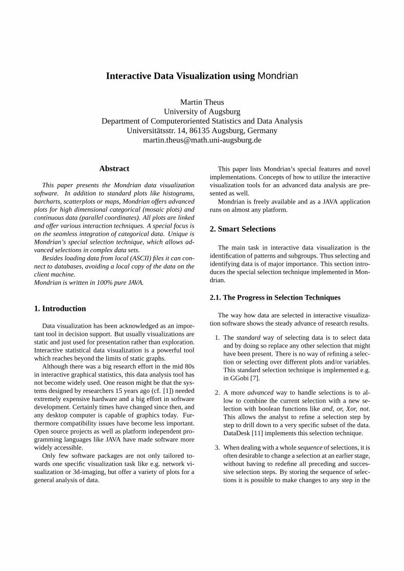
Figure 3 shows a parallel coordinate plot of the Midwestdata including not less than 14 variables, of which 13 arecontinuous and one categorical. In addition to the standardselection, highlighting and interrogation methods parallelcoordinates in Mondrian support the following features:
Coordinates can be rearranged manually to look at themost interesting adjacencies. Usually only a few adjacen-cies are of interest. 1
Zooming is implemented for each axis individually.Since parallel coordinates are cluttered very much with anincreasing number of observations displayed, zooming canfocus on a more detailed view of the variable. E.g. for thevariable ’% American-Indian-Eskimo-Aleut’ it would be de-sirable to simply zoom in, in order to get rid of the outliersand see the shape of the distribution, i.e. the box of the box-plot.
Mondrian offers a special feature to plot categorical vari-ables in parallel box/coordinate plots. Whereas most im-plementations only use the number coding of a categoricalvariable, Mondrian plots a stacked barchart, with left-to-right highlighting for each categorical variable. This displayis consistent with all other plots representing counts. Addi-tionally lines can be displayed for the highlighted points inboxplot mode.
In Figure 4 the same data as shown in figure 3 is dis-played. Whereas in Figure 3 one cannot really find out
1Only k+1
2permutations of the k variable-axis are needed to display
all possible adjacencies, cf. [13]
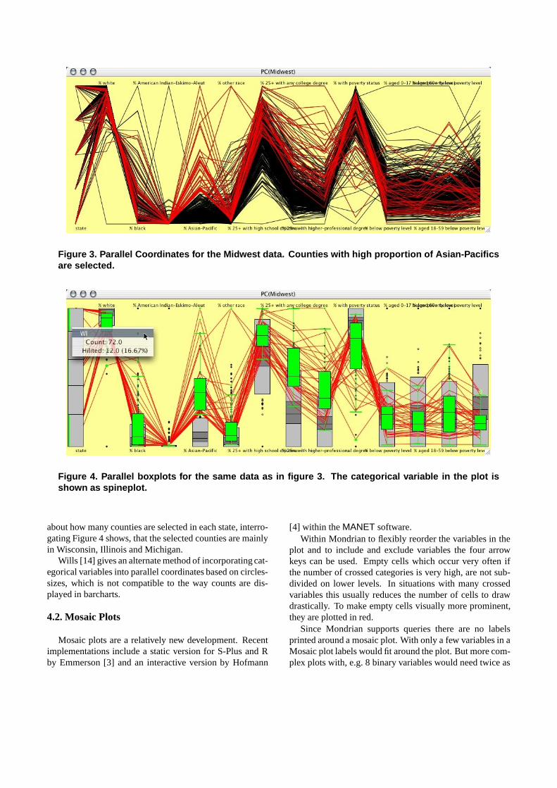
Figure 3. Parallel Coordinates for the Midwest data. Counties with high proportion of Asian-Pacificsare selected.
Figure 4. Parallel boxplots for the same data as in figure 3. The categorical variable in the plot isshown as spineplot.
about how many counties are selected in each state, interro-gating Figure 4 shows, that the selected counties are mainlyin Wisconsin, Illinois and Michigan.
Wills [14] gives an alternate method of incorporating cat-egorical variables into parallel coordinates based on circles-sizes, which is not compatible to the way counts are dis-played in barcharts.
4.2. Mosaic Plots
Mosaic plots are a relatively new development. Recentimplementations include a static version for S-Plus and Rby Emmerson [3] and an interactive version by Hofmann
[4] within the MANET software.Within Mondrian to flexibly reorder the variables in the
plot and to include and exclude variables the four arrowkeys can be used. Empty cells which occur very often ifthe number of crossed categories is very high, are not sub-divided on lower levels. In situations with many crossedvariables this usually reduces the number of cells to drawdrastically. To make empty cells visually more prominent,they are plotted in red.
Since Mondrian supports queries there are no labelsprinted around a mosaic plot. With only a few variables in aMosaic plot labels would fit around the plot. But more com-plex plots with, e.g. 8 binary variables would need twice as
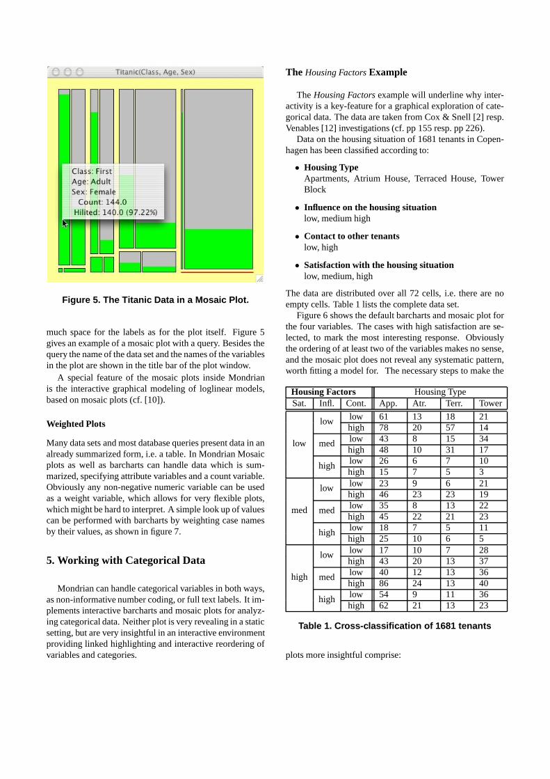
Figure 5. The Titanic Data in a Mosaic Plot.
much space for the labels as for the plot itself. Figure 5gives an example of a mosaic plot with a query. Besides thequery the name of the data set and the names of the variablesin the plot are shown in the title bar of the plot window.
A special feature of the mosaic plots inside Mondrianis the interactive graphical modeling of loglinear models,based on mosaic plots (cf. [10]).
Weighted Plots
Many data sets and most database queries present data in analready summarized form, i.e. a table. In Mondrian Mosaicplots as well as barcharts can handle data which is sum-marized, specifying attribute variables and a count variable.Obviously any non-negative numeric variable can be usedas a weight variable, which allows for very flexible plots,which might be hard to interpret. A simple look up of valuescan be performed with barcharts by weighting case namesby their values, as shown in figure 7.
5. Working with Categorical Data
Mondrian can handle categorical variables in both ways,as non-informative number coding, or full text labels. It im-plements interactive barcharts and mosaic plots for analyz-ing categorical data. Neither plot is very revealing in a staticsetting, but are very insightful in an interactive environmentproviding linked highlighting and interactive reordering ofvariables and categories.
The Housing Factors Example
The Housing Factors example will underline why inter-activity is a key-feature for a graphical exploration of cate-gorical data. The data are taken from Cox & Snell [2] resp.Venables [12] investigations (cf. pp 155 resp. pp 226).
Data on the housing situation of 1681 tenants in Copen-hagen has been classified according to:
• Housing TypeApartments, Atrium House, Terraced House, TowerBlock
• Influence on the housing situationlow, medium high
• Contact to other tenantslow, high
• Satisfaction with the housing situationlow, medium, high
The data are distributed over all 72 cells, i.e. there are noempty cells. Table 1 lists the complete data set.
Figure 6 shows the default barcharts and mosaic plot forthe four variables. The cases with high satisfaction are se-lected, to mark the most interesting response. Obviouslythe ordering of at least two of the variables makes no sense,and the mosaic plot does not reveal any systematic pattern,worth fitting a model for. The necessary steps to make the
Housing Factors Housing TypeSat. Infl. Cont. App. Atr. Terr. Tower
low 61 13 18 21lowhigh 78 20 57 14low 43 8 15 34medhigh 48 10 31 17
low
low 26 6 7 10highhigh 15 7 5 3low 23 9 6 21lowhigh 46 23 23 19low 35 8 13 22medhigh 45 22 21 23
med
low 18 7 5 11highhigh 25 10 6 5low 17 10 7 28lowhigh 43 20 13 37low 40 12 13 36medhigh 86 24 13 40
high
low 54 9 11 36highhigh 62 21 13 23
Table 1. Cross-classification of 1681 tenants
plots more insightful comprise:
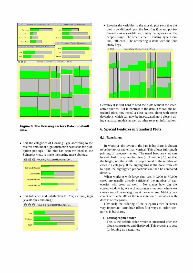
Figure 6. The Housing Factors Data in defaultview.
• Sort the categories of Housing Type according to therelative amount of high satisfaction cases (via the plot-option pop-up). The plot has been switched to theSpineplot view, to make the sorting more obvious.
• Sort Influence and Satisfaction to: low, medium, high(via alt-click and drag):
• Reorder the variables in the mosaic plot such that theplot is conditioned upon the Housing Type and put In-fluence - as a variable with many categories - at thedeepest stage. The order is then: Housing Type, Con-tact, Influence. The reordering is done with the fourarrow keys.
Certainly it is still hard to read the plots without the inter-active queries. But in contrast to the default views, the re-ordered plots now reveal a clear pattern along with somedeviations, which can now be investigated more closely us-ing statistical models as well as other relevant information.
6. Special Features in Standard Plots
6.1. Barcharts
In Mondrian the layout of the bars in barcharts is chosento be horizontal rather than vertical. This allows full-lengthprinting of category names. The usual barchart view canbe switched to a spine-plot view (cf. Hummel [5]), so thatthe height, not the width, is proportional to the number ofcases in a category. If the highlighting is still done from leftto right, the highlighted proportions can then be compareddirectly.
When working with large data sets (10,000 to 50,000cases are usually already sufficient) the number of cat-egories will grow as well. No matter how big thescreen/window is, we will encounter situations where wecan not see all bars/categories at the same time. Making bar-charts scrollable allows the investigation of variables withdozens of categories.
Obviously the ordering of the categories then becomesvery important. Mondrian offers four ways to order cate-gories in barcharts.
1. Lexicographic OrderThis is the default order, which is presented after theplot is constructed and displayed. This ordering is bestfor looking up categories.

Figure 7. An example of two linked barcharts.
2. Manual OrderAny current order can be changed by manually drag-ging a bar to its new position. This is useful if all au-tomated sortings fail.
3. Absolute Size of HighlightingThis option sorts the categories according to the abso-lute number of selected cases in a category. Selectingall data allows for a sorting according to the absolutesize of the categories.
4. Relative Size of HighlightingThis sorting option sorts corresponding to the relativeamount of highlighting in the categories. In the spine-plot view this option nicely shows the ordering of theselected proportions.
A change of the order of the categories of variables is au-tomatically propagated to any other plot which holds infor-mation based on this variable and updated instantaneously.
This could be a mosaic plot, a parallel barchart or a choro-pleth map, which is shaded according to the levels of thecategorical variable.
Figure 7 shows data of the fortune 400 private personsin the US taken from Forbes Magazine in 1996. The leftbarchart shows each individual weighted by its worth. Theright barchart, showing the 50 US states, has been sorted ac-cording to the number of individuals in this state. Californiahas been selected.
6.2. Histograms
The most crucial point in plotting a histograms is tochoose the ”right” origin of the first bin and the ”right” num-ber of bins. Since there exists a vast amount of rules andsuggestions what ”right” means under different assump-tions, the most important interactive manipulation insidehistograms is changing the origin and the width of the bins.
Figure 8. Histogram of the age distribution.Cases with more than 60K income are high-lighted
These parameters can be altered by using the four arrowkeys (left, right moves the origin; up, down changes the binwidth). Additionally a popup-menu offers two sliders to setbin width and origin to whole numbers. This is especiallyuseful when the user wants to set “pretty” ticks, i.e. multi-ples of 1, 2 or 5 to a power of 10.
In order to keep the visual distortion as small as possible,the scale of the histogram axis is not updated during theinteractive reparametrization.
As barcharts can be switched to spineplots, histograms inMondrian can be switched to the so called spinogram view.In a spinogram all bars of the histogram are scaled to be ofsame height and are plotted next to each other. Figures 8 and9 show a corresponding pair of histogram and spinogram.
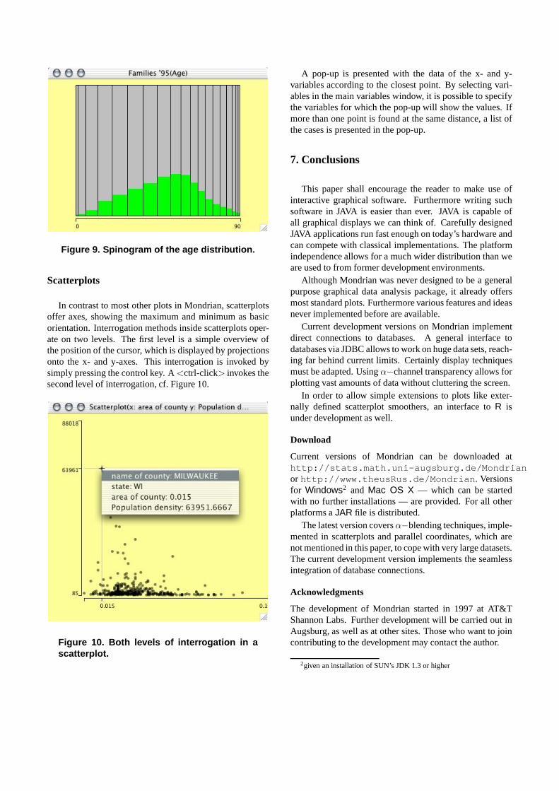
Figure 9. Spinogram of the age distribution.
Scatterplots
In contrast to most other plots in Mondrian, scatterplotsoffer axes, showing the maximum and minimum as basicorientation. Interrogation methods inside scatterplots oper-ate on two levels. The first level is a simple overview ofthe position of the cursor, which is displayed by projectionsonto the x- and y-axes. This interrogation is invoked bysimply pressing the control key. A <ctrl-click> invokes thesecond level of interrogation, cf. Figure 10.
Figure 10. Both levels of interrogation in ascatterplot.
A pop-up is presented with the data of the x- and y-variables according to the closest point. By selecting vari-ables in the main variables window, it is possible to specifythe variables for which the pop-up will show the values. Ifmore than one point is found at the same distance, a list ofthe cases is presented in the pop-up.
7. Conclusions
This paper shall encourage the reader to make use ofinteractive graphical software. Furthermore writing suchsoftware in JAVA is easier than ever. JAVA is capable ofall graphical displays we can think of. Carefully designedJAVA applications run fast enough on today’s hardware andcan compete with classical implementations. The platformindependence allows for a much wider distribution than weare used to from former development environments.
Although Mondrian was never designed to be a generalpurpose graphical data analysis package, it already offersmost standard plots. Furthermore various features and ideasnever implemented before are available.
Current development versions on Mondrian implementdirect connections to databases. A general interface todatabases via JDBC allows to work on huge data sets, reach-ing far behind current limits. Certainly display techniquesmust be adapted. Using α−channel transparency allows forplotting vast amounts of data without cluttering the screen.
In order to allow simple extensions to plots like exter-nally defined scatterplot smoothers, an interface to R isunder development as well.
Download
Current versions of Mondrian can be downloaded athttp://stats.math.uni-augsburg.de/Mondrianor http://www.theusRus.de/Mondrian. Versionsfor Windows2 and Mac OS X — which can be startedwith no further installations — are provided. For all otherplatforms a JAR file is distributed.
The latest version covers α−blending techniques, imple-mented in scatterplots and parallel coordinates, which arenot mentioned in this paper, to cope with very large datasets.The current development version implements the seamlessintegration of database connections.
Acknowledgments
The development of Mondrian started in 1997 at AT&TShannon Labs. Further development will be carried out inAugsburg, as well as at other sites. Those who want to joincontributing to the development may contact the author.
2given an installation of SUN’s JDK 1.3 or higher
References
[1] W. S. Cleveland and M. E. McGill. Dynamic Graphics forStatistics. Wadsworth & Brooks/Cole, Pacific Grove CA,1988.
[2] D. R. Cox and E. J. Snell. Applied Statistics — Principlesand Examples. Chapman & Hall, London, 1991.
[3] J. Emerson. Mosaic displays in s-plus: A general implemen-tation and case study. Statistical Computing & StatisticalGraphics Newsletter, 9(1):17–23, 1998.
[4] H. Hofmann. Simpson on board the titanic? interac-tive methods for dealing with multivariate categorical data.Statistical Computing & Statistical Graphics Newsletter,9(2):16–19, 1998.
[5] J. Hummel. Linked bar charts: Analysing categorical datagraphically. Computational Statistics, 11(1):23–33, 1996.
[6] A. Inselberg. Visual data mining with parallel coordinates.Computational Statistics, 13(1):47–63, 1998.
[7] D. Swayne, D. Temple, A. Buja, and D. Cook. Ggobi: Xgobiredesigned and extended. In Proceedings of the 33th Sym-posium on the Interface: Computing Science and Statistics,2001.
[8] M. Theus. User interfaces of interactive statistical graph-ics software. In Proceedings of the 31th Symposium on theInterface: Computing Science and Statistics, 1999.
[9] M. Theus, H. Hofmann, and W. A. Selection sequences —interactive analysis of massive data sets. In Proceedings ofthe 29th Symposium on the Interface: Computing Scienceand Statistics, 1998.
[10] M. Theus and S. Lauer. Visualizing loglinear models. Jour-nal of Computational and Graphical Statistics, 8(3):396–412, 1999.
[11] P. F. Velleman. DataDesk Version 6.0 — Statistics Guide.Data Description Inc., Ithaka, NY, 1997.
[12] W. Venables and B. Ripley. Modern Applied Statistics withS-PLUS, 3rd Ed. Springer, New York, NY, 1999.
[13] E. J. Wegman. Hyperdimensional data analysis using paral-lel coordinates. Journal of the American Statistical Associ-ation, 85:664–675, 1990.
[14] G. Wills. A good, simple axis. Statistical Computing &Statistical Graphics Newsletter, 11(1):20–25, 2000.