interactive visual self-service data classification
TRANSCRIPT
Central Washington University Central Washington University
ScholarWorks@CWU ScholarWorks@CWU
All Master's Theses Master's Theses
Spring 2021
Interactive Visual Self-service Data Classification Approach to Interactive Visual Self-service Data Classification Approach to
Democratize Machine Learning Democratize Machine Learning
Sridevi Narayana Wagle Central Washington University, [email protected]
Follow this and additional works at: https://digitalcommons.cwu.edu/etd
Part of the Computational Engineering Commons, Data Science Commons, and the Other Computer
Sciences Commons
Recommended Citation Recommended Citation Wagle, Sridevi Narayana, "Interactive Visual Self-service Data Classification Approach to Democratize Machine Learning" (2021). All Master's Theses. 1503. https://digitalcommons.cwu.edu/etd/1503
This Thesis is brought to you for free and open access by the Master's Theses at ScholarWorks@CWU. It has been accepted for inclusion in All Master's Theses by an authorized administrator of ScholarWorks@CWU. For more information, please contact [email protected].

INTERACTIVE VISUAL SELF-SERVICE DATA CLASSIFICATION
APPROACH TO DEMOCRATIZE MACHINE LEARNING
__________________________________
A Thesis
Presented to
The Graduate Faculty
Central Washington University
___________________________________
In Partial Fulfillment
of the Requirements for the Degree
Master of Science
Computational Science
___________________________________
by
Sridevi Narayana Wagle
June 2021

ii
CENTRAL WASHINGTON UNIVERSITY
Graduate Studies We hereby approve the thesis of
Sridevi Narayana Wagle
Candidate for the degree of Master of Science
APPROVED FOR THE GRADUATE FACULTY
______________ _________________________________________
Dr. Boris Kovalerchuk
______________ _________________________________________
Dr. Razvan Andonie
______________ _________________________________________
Dr. Szilard Vajda
______________ _________________________________________
Dean of Graduate Studies
iii
ABSTRACT
INTERACTIVE VISUAL SELF-SERVICE DATA CLASSIFICATION
APPROACH TO DEMOCRATIZE MACHINE LEARNING
by
Sridevi Narayana Wagle
June 2021
Machine learning algorithms often produce models considered as complex black-
box models by both end users and developers. Such algorithms fail to explain the model
in terms of the domain they are designed for. The proposed Iterative Visual Logical
Classifier (IVLC) is an interpretable machine learning algorithm that allows end users to
design a model and classify data with more confidence and without having to
compromise on the accuracy. Such technique is especially helpful when dealing with
sensitive and crucial data like cancer data in the medical domain with high cost of errors.
With the help of the proposed interactive and lossless multidimensional
visualization, end users can identify the pattern in the data based on which they can make
explainable decisions. Such options would not be possible in black box machine learning
methodologies. The interpretable IVLC algorithm is supported by the Interactive Shifted
Paired Coordinates Software System (SPCVis). It is a lossless multidimensional data
visualization system with interactive features. The interactive approach provides
flexibility to the end user to perform data classification as self-service without having to
rely on a machine learning expert.

iv
Interactive pattern discovery becomes challenging while dealing with large
datasets with hundreds of dimensions/features. To overcome this problem, an automated
classification approach combined with new Coordinate Order Optimizer (COO)
algorithm and a Genetic algorithm (GA) is proposed. The COO algorithm automatically
generates the coordinate pair sequences that best represent the data separation and GA
helps optimizing the proposed IVLC algorithm by automatically generating the areas for
data classification. The feasibility of the approach is shown by experiments on
benchmark datasets covering both interactive and automated processes used for data
classification.

v
ACKNOWLEDGMENTS
With deep gratitude and sincerity, I would like to thank my advisor Dr. Boris
Kovalerchuk for his continuous support and guidance throughout this thesis work. I
would also like to thank Drs. Razvan Andonie and Szilard Vajda for their valuable
feedback, as well as my colleagues for their help and assistance during the graduate
course. Finally, I would like to thank my family and friends for their unconditional
support.

vi
TABLE OF CONTENTS
Chapter Page
I INTRODUCTION ........................................................................................... 1
Related Work .......................................................................................... 4
II INTERACTIVE SHIFTED PAIRED COORDINATE SYSTEM .................. 8
III METHODS FOR INTERACTIVE DATA CLASSIFICATION .................. 14
Iterative Visual Logical Classifier Algorithm ....................................... 14
Model Evaluation with Worst-case k fold Validation Approach .......... 16
Experiments with Interactive Data Classification Approach ................ 17
IV METHODS FOR AUTOMATED DATA CLASSIFICATION ................... 22
Coordinate Order Optimizer (COO) Algorithm .................................... 23
Genetic Algorithm (GA) ....................................................................... 25
Experiments with Automated Data Classification Approach ............... 32
V EXPERIMENTAL RESULTS AND COMPARISON WITH
PUBLISHED RESULTS ............................................................................... 51
VI CONCLUSIONS ........................................................................................... 53
REFERENCES CITED ................................................................................................. 54
APPENDIX: SPCVIS MANUAL ................................................................................. 57

vii
LIST OF TABLES
Table Page
1 Coordinate labels for Serpent coordinate system for Figures 7a
and 7b. ......................................................................................................... 12
2 Parameters of the areas generated for Iris data classification ..................... 35
3 Parameters of the areas generated for WBC data classification. ................ 38
4 Parameters of the area generated for classification in Seeds data in
1st iteration .................................................................................................. 40
5 Parameters of the area generated for classification in Seeds data in
2nd iteration.................................................................................................. 43
6 Parameters of the areas generated for classification in APS failure
data……………. ......................................................................................... 50
7 Comparison of different classification models ........................................... 52

viii
LIST OF FIGURES
Figure Page
1 Representation of 8D data (8, 1, 3, 9, 8, 3, 2, 5) in SPC ............................... 4
2 Representation of 8D data (8, 1, 3, 9, 8, 3, 2, 5) in SPC with
different coordinate pair sequences .............................................................. 5
3 WBC data (9D) visualized in SPCVis .......................................................... 9
4 WBC data after non-linear scaling on all the vertical coordinates ............. 10
5 Non-orthogonal display of 2D data (Y=30°) .............................................. 11
6 Non-orthogonal display of WBC data (X8 and X5 inclined at -30°) ........... 11
7 APS failure at Scania trucks data (166D) visualized in SCS ...................... 13
8 Outputs of IVLC algorithm ......................................................................... 15
9 Visualization of rule for R՛1 on Iris data for class 1 separation ................... 18
10 Visualization of rule for R2 and R3 on Iris data for classes 2
and 3 separation .......................................................................................... 19
11 Visualization of rules for R5 and R6 on WBC data ..................................... 20
12 Visualization of rules for R1 and R2 on Seeds data (7D) for
class 1 separation with all the cases from class 2 ....................................... 21
13 Overview of automation for data classification in SPCVis ........................ 22
14 Visualization of WBC data before and after applying
COO Algorithm .......................................................................................... 24
15 GA flow chart used in SPCVis data classification...................................... 26
16 Random generation of areas in WBC data .................................................. 27
17 Representation of single parent AOIPg from generation g .......................... 29

ix
LIST OF FIGURES (CONTINUED)
Figure Page
18 Different types of crossovers of two parent AOIs to generate
Offspring AOI ............................................................................................. 31
19 Visualizations of consecutive generations of AOIs in WBC data .............. 32
20 Visualization of Iris data with class 1 separation rule ................................ 33
21 Visualization of Iris data with classes 2 and 3 after reordering
the coordinates ........................................................................................... 33
22 Visualization of rule r2 on Iris dataset for classes 2 and 3 separation ........ 35
23 Visualization of rule r on WBC dataset for class 1 separation ................... 37
24 Visualization of Seeds data with all the three classes in SPCVis ............... 38
25 Visualization of Seeds data with all the three classes in SPCVis
after coordinate order optimization ............................................................. 39
26 Visualization of Seeds dataset with classes 2 (red) and 3 (blue) after
performing non-linear scaling on optimized order of coordinates .............. 40
27 Visualization of rules r1 and r2 on Seeds dataset for classes 2 and 3
separation with all the cases ........................................................................ 42
28 Visualization of 12 best coordinates of APS failure data in SPCVis ......... 45
29 Visualization of APS failure data with areas generated by GA for
red class classification................................................................................. 46
30 Visualization of R31 area in the APS failure data with zooming
and averaging ............................................................................................. 47
31 Visualization of zoomed R31 area in the APS failure data with
averaged classes with the area (without the surrounding data) ................... 47

x
LIST OF FIGURES (CONTINUED)
Figure Page
32 Visualization of rule r1 for red class classification in the APS
failure data ................................................................................................. 48
33 Visualization of APS failure data in the second iteration ........................... 49
34 SPCVis software displaying WBC data ...................................................... 58
35 Implementation of non-linear scaling in SPCVis ....................................... 59
36 User interface for non-orthogonal coordinates ........................................... 59

1
CHAPTER I
INTRODUCTION
The exponential growth in machine learning has resulted in smart applications
making critical decisions without human intervention. However, people with no technical
background find it often difficult to rely on machine learning models, since many of them
are black-boxed [8].
Interpretability plays a crucial role in deciphering behind-the-scenes actions in a
machine learning algorithm. These interpretable machine learning techniques when
combined with data visualization and analytics unfold numerous ways to discover deep
hidden patterns in the data [11]. Interpretable machine learning models are transparent
clearly explaining the technique behind the model prediction. This gives more clarity to
the end user who can rely on the model with more confidence compared to black-box
machine learning models [9].
When it comes to data visualization, most of the visualization techniques used to
display multidimensional data like Principal Component Analysis (PCA), Heat maps,
Self-organizing maps etc. are lossy and irreversible [10]. With the help of new lossless
data visualization, it is now possible to maintain structural integrity of the data.
Moreover, these lossless techniques are completely reversible [10, 11].
In our proposed approach, we focus on interpretable data classification techniques
using a combination of interactive data visualization and analytical rules. The Shifted

2
Paired Coordinates (SPC) system [11] is a lossless and a more compact way to visualize
multidimensional data when compared to other lossless data visualization like Parallel
Coordinates [10]. SPC allows discovering patterns more efficiently since the number of
lines required to display the data is reduced by half [11].
However, as the size of the data increases, pattern discovery becomes challenging
due to occlusion. To reduce occlusion and expose hidden patterns, data representation
needs to be reorganized. This can be achieved by applying interactive techniques such as
changing the order of coordinates, swapping within the coordinate pair etc. These
interactive capabilities allow the end-users to intervene and optimize the classification
model generated by the machine thereby improving the overall model performance. To
further leverage the classification technique, areas within the coordinate pairs are
discovered either interactively or automatically, unravelling the deep hidden patterns in
the data. Analytical rules are then built on the areas discovered to classify the data.
The data classification approach using analytical rules is implemented using
IVLC algorithm [23] wherein the areas and analytical rules are generated in iterations
until all the data are covered. This implementation works for smaller datasets, the areas
and analytical rules can be generated interactively by the end users. We expand this work
on large datasets by adding automation and more visual operations.
For the classification of larger data with hundreds of dimensions, interactive
methods alone do not suffice. Due to high occlusion for such datasets, discovery of
patterns purely with interactive methods becomes challenging where deep hidden patterns

3
cannot be detected by humans, thereby leading to the necessity of automation. In our
work, automation for the classification approach is implemented in two stages:
First Stage: Order of coordinates are optimized using COO algorithm. It is used to
find the best coordinate orders for the Shifted Paired Coordinates System where the data
separation can be visually identified along the vertical axis of each coordinate pair.
Second Stage: This stage involves generating the areas within the coordinate pairs
with close Proximity and high Purity or fitness i.e., areas that are closer to each other
with high density of data belonging to same class are generated. GA is used for the
automatic generation of areas with high purity. It involves generation of random areas
and that are mutated and altered over generations to obtain the areas with high Purity or
fitness [1].
Several experiments are conducted on benchmark datasets like Wisconsin Brest
Cancer (WBC), Iris, Seeds and Air Pressure System (APS) in Scania Trucks. The
experiments are performed using both interactive and automated approach using 10-fold
cross validation with worst case heuristics [13] where the initial validation set contains
the data from one class overlapping with another class and vice versa. The results
obtained with both interactive and automated techniques were on par with the published
results in other studies.

4
Related Work
The Shifted Paired Coordinates (SPC) [11] visualize data losslessly using
coordinate pairs where each pair of data is represented on a two dimensional plane.
Figure 1 represents an 8D data (8, 1, 3, 9, 8, 3, 2, 5) using SPC, where pair (8,1) is
visualized in (X1, X2), the next pair (3, 9) is visualized in (X2, X4) and so on. Then these
points are connected to form a graph.
FIGURE 1: Representation of 8D data (8, 1, 3, 9, 8, 3, 2, 5) in SPC.
Same data can be displayed in multiple ways using different combinations of
coordinate pairs. Figures 2a and 2b represent the same data with (X8, X1), (X3, X7), (X5,
X2) and (X6, X4) sequence of coordinates and (X2, X6), (X3, X7), (X8, X1) and (X5, X4)
sequence of coordinates, respectively.
Although SPC provides lossless data visualization, discovering patterns in the
data becomes challenging due to occlusion. To overcome this challenge, IVLC algorithm
X2 X4
X6
X8
X1 X3
X5
X7
(8,1)
(3,9)
(8,3)
(2,5)

5
is used comprising of interactive controls to reorient the data by interactively changing
the coordinate order to make the pattern discovery easier along with analytical rules to
classify the data.
(a) 8D data with (X8, X1), (X3, X7), (X5, X2) and (X6, X4) coordinate pair sequence.
(b) 8D data with (X2, X6), (X3, X7), (X8, X1) and (X5, X4) coordinate pair sequence.
FIGURE 2: Representation of 8D data (8, 1, 3, 9, 8, 3, 2, 5) in SPC with different
coordinate pair sequences.
X1 X7
X2
X4
X8 X3
X5
X6
(5,8)
(2,3) (8,1)
(3,9)
X6 X7
X1
X4
X2 X3
X8
X5
(2,3)
(1,3)
(5,8) (8,9)

6
Data classification using a combination of Shifted Paired Coordinates and
analytical rules has already been implemented in [12]. The pattern discovery is simplified
using FSP (Filter Search Present) algorithm wherein the algorithm filters out less efficient
rules, searches for sequence of pairs of coordinates and presents the SPC visualizations.
The FSP algorithm generates random sequences of pairs of coordinates to represent n-D
data in SPC. Classification rules are discovered using high precision, recall and accuracy
and allowing the end user to manually control the output rectangles produced by the
algorithm.
In paper [12], the experiment was conducted on three datasets from UCI Machine
learning repository namely, 9D Wisconsin Breast Cancer (WBC) data, 34D Ionosphere
dataset and 8D Abalone dataset. The accuracies obtained were 93.60%, 98.78% and
98.60% respectively with 70%:30% of the data into training and test split. Although, the
techniques used in [12] are visual, interpretable, and explainable to the domain expert, it
lacks interactive controls like moving the graph, data reversing, non-linear scaling, non-
orthogonal coordinates etc. Also, the coverage of the data is not 100%. All these
shortcomings are addressed in our proposed data classification techniques.
In paper [2], GA is implemented in a radial visualization to optimize the
visualization quality. Here, the algorithm is used as a parallelized random search
procedure to generate set of POIs (Points of Interests). The overall algorithm is defined
by generating an initial population where each individual is evaluated by the cost
function based on Kruskal’s stress. The next step is random parent selection where the
best individual is selected out of the random selected individuals with advantage given to

7
the individuals with less POIs. Next step is applying a uniform crossover operator in such
a way that the offspring has equal probability of selecting a gene from either of its
parents. After crossover mutation operator is applied and cost evaluation is performed.
In our proposed approach, we use interactive and interpretable data classification
technique to overcome the shortcomings in [12]. Our proposed IVLC algorithm discovers
the classification rules with 100 % data coverage with interactive features. The proposed
COO algorithm generates the optimized order of coordinate pairs based on statistical
parameters rather than generating them randomly, as implemented in [12]. We use GA in
a similar manner as in [2] to optimize the area generation in automatic data classification
approach where we generate Areas of Interests (AOIs) rather than POIs. The best
individual is selected from the population based on high Purity and close Proximity. We
further build analytical rules on these selected AOIs for classifying the data.
This thesis offers a detailed explanation of the following:
• Interactive Shifted Paired Coordinate Visualization System (SPCVis) [23]
• Different interactive techniques used in SPCVis
• Iterative Visual Logical Classifier (IVLC) algorithm
• Automation of the classification technique using:
o Coordinate Order Optimizer (COO)
o Genetic Algorithm (GA)
• Experiments with benchmark datasets
• Comparing the results with published results
• Conclusions
8
CHAPTER II
INTERACTIVE SHIFTED PAIRED COORDINATE SYSTEM
The lossless n-D visualization is achieved by representing data in Interactive
Shifted Paired Coordinate System (SPCVis). Reordering the coordinates is one of the
interactive features provided by the SPCVis software system. Using this feature, the
coordinates are reordered in such a way that the class separation is prominent along the
vertical coordinates. The discovering of coordinates to get good separation of classes is
performed interactively by the user. The data used for SPCVis are normalized to [0, 1].
There are several interactive features provided to the end user like reversing data,
non-linear scaling etc. For instance, if x is an n-D point where x = (x1, x2, x3, … xn), the
reverse of x1 would display the data as (1 - x1, x2, x3, … xn). Also, SPCVis software
system provides the user ability to click and drag the whole (Xi, Xj) plot to a desired
location until occlusion is reduced. Another interactive control allows a user to display
the user selected class on top of another class. Figure 3a displays WBC breast cancer data
with red class on top and Figure 3b with green class on top. This helps the user to observe
the pattern of individual classes more clearly.

9
(a) WBC data with red class on top.
(b) WBC data with green class on top.
FIGURE 3: WBC data (9D) visualized in SPCVis.
X1 X2
X3
X2
X7
X9 X6
X4
X5
X8
X1 X2
X3
X2
X7
X9 X6
X4
X5
X8
10
Non-linear scaling is an interactive feature provided by the SPCVis software
where only a part of the user selected coordinates is scaled differently. The generalized
formula for an n-D point xj is given in Equation 2.1, where k is a constant and 0 < k < 1, r
is the resolution of the data i.e., the shortest distance between the data points. The value
of k is set by the user. Figure 4 displays the WBC data after applying the non-linear
scaling at r = 0.1, k = 0.6 on X1 and k = 0.3 on X2, X5 and X7 coordinates.
𝑥𝑗′ = {
𝑥𝑗 , if 𝑥𝑗 < 𝑘
𝑥𝑗 + 𝑟 × 𝑔𝑟𝑎𝑝ℎ𝑊𝑖𝑑𝑡ℎ, if 𝑘 ≤ 𝑥𝑗 < 1 (2.1)
FIGURE 4: WBC data after non-linear scaling on all the vertical coordinates.
Another interactive feature provided by SPCVis software is Non-orthogonal
coordinate system that has a coordinate inclined at an angle other than 90° with respect to
the other coordinate. Figure 5 displays a simple 2D graph with Y coordinate inclined at

11
an angle of 30° with respect to its previous Y coordinate. Figure 6 displays Non-
orthogonal coordinate representation with horizontal coordinates X6 and X5 inclined at
-30°.
FIGURE 5: Non-orthogonal display of 2D data (Y=30°).
FIGURE 6: Non-orthogonal display of WBC data (X6 and X5 inclined at -30°).

12
Interactive controls like non-linear scaling, non-orthogonal coordinates etc. allow
improving visual discrimination of classes. However, using interactive visualization
alone does not completely perform the data separation. It only provides a base for the
class separation in terms of visual discrimination.
This chapter uses the IVLC algorithm that generates analytical rules to perform
further class separation after reordering the coordinates. This algorithm generates these
rules mainly using the threshold values generated from non-linear scaling. The rules
belong to the class of rules proposed in [12].
Visualizing data with larger dimensions become challenging in SPC. To display
data of larger dimensions, a modified version of the SPC called as Serpent Coordinate
System (SCS) is proposed. It is visualized in a grid like structure to accommodate all the
dimensions on a single screen. Air Pressure System (APS) failure at Scania trucks [5]
consists of 2 classes and 170 dimensions wherein 4 dimensions we removed since all the
data points under those columns were 0 and were not informative. The data with 166
dimensions are displayed in Figure 7 and the coordinate labels corresponding each
coordinate pair are displayed in Table 1.
TABLE 1: Coordinate Labels for Serpent Coordinate System for Figures 7a and 7b. (X1, X2) (X3, X4) (X5, X6) …. (X15, X16) (X17, X18) (X19, X20)
(X21, X22) (X23, X24) (X25, X26) …. (X35, X36) (X37, X38) (X39, X40)
(X41, X42) (X43, X44) (X45, X46) …. (X55, X56) (X57, X58) (X59, X60)
(X61, X62) (X63, X64) (X65, X66) …. (X75, X76) (X77, X78) (X79, X80)
(X81, X82) (X83, X84) (X85, X86) …. (X95, X96) (X97, X98) (X99, X100)
(X101, X102) (X103, X104) (X105, X106) …. (X115, X116) (X117, X118) (X119, X120)
(X121, X122) (X123, X124) (X125, X126) …. (X135, X136) (X137, X138) (X139, X140)
(X141, X142) (X143, X144) (X145, X146) …. (X155, X156) (X157, X158) (X149, X160)
(X161, X162) (X163, X164) (X165, X166)

13
(a) APS data with green class on top.
(b) APS data with red class on top.
FIGURE 7: APS failure at Scania trucks data (166D) visualized in SCS.

14
CHAPTER III
METHODS FOR INTERACTIVE DATA CLASSIFICATION
Iterative Visual Logical Classifier (IVLC) Algorithm
Below we present the Iterative Visual Logical Classifier (IVLC) algorithm that
classifies data in iterations. It is different from other logical classifiers since it performs
classification in visual space. As discussed in Chapter II, once we reorder the coordinates
to find good vertical separation and obtain the vertical threshold values from non-linear
scaling, the analytical rules are generated interactively based on these threshold values.
This process of reordering and generating analytical rules are continued until we cover all
the data in given dataset. The algorithm generates set of interpretable analytical rules for
data classification. All steps can be conducted by the end user as a self-service. The
output of IVLC algorithm results in series of rectangular areas. Different outputs of IVLC
algorithm are displayed in Figure 8. The steps are listed below.
Step 1: Reorder the coordinates to find a good vertical separation for classes and
perform non-linear scaling to get the threshold values along the vertical coordinates.
Reordering of coordinates and non-linear scaling is performed interactively using SPCVis
software system.

15
(a) Example of area (R5) generated by IVLC for WBC data.
(b) Overgeneralized Area R1 generation (larger part of the area is empty) for Iris (4D) data [5].
(c) Optimized Area R՛
1 generation for Iris data.
FIGURE 8: Outputs of IVLC algorithm.

16
Step 2: Generate the analytical rules mainly based on the threshold values
obtained from non-linear scaling from the previous step. For example, if we denote the
set of areas generated as Rclass1 and Rclass2, then the classification rules for n-D point x =
(x1, x2, x3, …, xn) are defined in Equations 3.1 and 3.2.
If xi ∈ Rclass1, then x ∈ class 1 (3.1)
If xj ∈ Rclass2, then x ∈ class 2 (3.2)
Step 3: The data that do not follow the rules generated in step 2 are used as input
for next step. Also, in this step, the analytical rules can be tuned to avoid
overgeneralization [14]. Figure 8b displays the generation of R1 area where a large part of
the area is empty. The area can be reduced by generating the area R՛1 of smaller
dimension to avoid overgeneralization (see Figure 8c).
Step 4: The final step is to repeat the steps above until all the data are covered.
Model Evaluation with Worst-case k fold Validation Approach
Although Cross Validation is a common technique used for model evaluation, it
comes with its own challenges. Due to the random split of training and validation data,
we might observe a bias in the estimated average error rate. Also, if we consider all the
possible splits, it becomes computationally challenging to find all the combinations since
the number of splits grows exponential with the number of given data points [13].

17
In order to overcome this challenge, we use a worst case heuristics technique to
split the data into training and validation sets in k-fold cross validation. The worst case
fold contains the data of one class that are similar to cases of the opposing class [13]
making classification more challenging with higher number of misclassification than in
the traditional random k-fold cross validation. If the algorithm produces high accuracy in
the worst-case fold, then the average case accuracy produced by the traditional random k-
fold cross validation is expected to be greater.
In this chapter, the worst-case fold is extracted using visual representation of the
data in SPC system. As already mentioned, the data are displayed in such a way that they
tend to be separated along the vertical axes in the SPC. For instance, if the dataset
contains class A and class B with class B at the bottom and class A at the top in SPC
visualization, then the worst-case validation split contains the cases with class A
displayed on the bottom along with class B and vice versa. Since 10-fold cross validation
is used in our classification model, first validation fold contains the top 10% of the worst-
case data n-D points, next validation fold contains the next 10% of the worst-case data
and so on.
Experiments with Interactive Data Classification Approach
Iris Data (4D)
The first dataset is the Iris data [5]. It has 4 dimensions (sepal length, petal length,
sepal width and petal width) with a total of 150 cases. The data consists of three classes

18
namely setosa, versicolor and virginica, each class consisting of 50 cases. Figure 9
displays the data in SPCVis software system. The four dimensions are denoted as X1,
X2, X3 and X4 coordinates. Class 1 separation is defined by the rule in Equation 3.3.
FIGURE 9: Visualization of rule for R՛1 on Iris data for class 1 separation.
If (x4, x3) ∈ R՛1, then x ∈ class 1. (3.3)
The optimized coordinate order for separation of classes 1 and 3 are (X1, X3) and
(X2, X4) with X3 and X4 as vertical coordinates. Separation criteria for class 2 and class 3
is given in Equation 3.4.
If (x1, x2, x3, x4) ∈ R2 then x ∈ class 2, else x ∈ class 3. (3.4)

19
We can further refine rule defined by R՛2 = R21 & R22 by adding another area R3 to
form a new optimized rule in Equation 3.5.
If (x1, x2, x3, x4) ∈ R՛2 or R3, then x ∈ class 2, else x ∈ class 3. (3.5)
Figure 10 visualizes the above rule for separation classes 2 and 3. The accuracy
obtained in 10-fold cross validation with worst case split is 100%.
FIGURE 10: Visualization of rule for R2 and R3 on Iris data for classes 2 and 3
separation.
Wisconsin Breast Cancer (WBC) Data (9D)
The second dataset is Wisconsin Breast Cancer (WBC) dataset [5]. It contains 699
cases of data with 9 features. In this dataset, 16 cases were incomplete and hence were
removed. Remaining data with 683 cases consists of 444 benign cases and 239 malignant
20
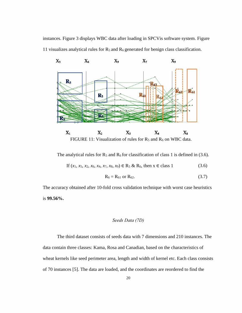
instances. Figure 3 displays WBC data after loading in SPCVis software system. Figure
11 visualizes analytical rules for R5 and R6 generated for benign class classification.
FIGURE 11: Visualization of rules for R5 and R6 on WBC data.
The analytical rules for R5 and R6 for classification of class 1 is defined in (3.6).
If (x1, x5, x2, x6, x4, x7, x8, x9) ∈ R5 & R6, then x ∈ class 1 (3.6)
R6 = R61 or R62. (3.7)
The accuracy obtained after 10-fold cross validation technique with worst case heuristics
is 99.56%.
Seeds Data (7D)
The third dataset consists of seeds data with 7 dimensions and 210 instances. The
data contain three classes: Kama, Rosa and Canadian, based on the characteristics of
wheat kernels like seed perimeter area, length and width of kernel etc. Each class consists
of 70 instances [5]. The data are loaded, and the coordinates are reordered to find the

21
prominent class separation along vertical coordinates. The analytical rules are generated
based on the vertical separation. Figure 12 displays seeds data with areas for analytical
rules R1 and R2 for class 2 (green) separation. Due to odd number of coordinates X2
coordinate is duplicated as the 8th coordinate since X2 coordinate provided good visual
discrimination between the classes. The rule for class 2 classification is defined in (3.8).
The accuracy obtained after 10-fold cross validation technique with worst case heuristics
is 100%.
If (x1, x7, x4, x2, x6) ∈ (R1 or R2), then x ∈ class 2 (3.8)
R2 = R21 or R22 (3.9)
FIGURE 12: Visualization of rules for R1 and R2 on Seeds data (7D) for class 1
separation with all the cases from class 2.
CHAPTER IV

22
METHODS FOR AUTOMATED DATA CLASSIFICATION
In most of the scenarios, interactive approach to data classification works well for
small dataset. When handling large data, this approach becomes tedious and time
consuming. Also, due to the display of large number of data instances within limited
space would lead to occlusion and becomes challenging for the end use to find the
patterns. To overcome this problem, automation is used where the patterns are discovered
automatically by the machine with minimal human intervention. Automation is
implemented using two algorithms below.
• Coordinate Order Optimizer (COO) algorithm
• Genetic Algorithm (GA)
These algorithms are used in combination with non-linear scaling, to enhance the
data interpretability. Figure 13 provides the overview of the automated data classification
approach.
FIGURE 13: Overview of automation for data classification in SPCVis.
Iterative
23
Coordinate Order Optimizer (COO) Algorithm
COO algorithm optimizes the order of coordinates by primarily using Coefficient
of Variation (CV) [7] parameter, also called as relative standard deviation (RSD) defined
as the ratio of the standard deviation σ to the mean µ of the given data sample.
𝐶𝑣 =σ
µ (4.1)
CV is a standardized measure of dispersion of data distribution. It is computed
individually per coordinate for each class. Next, the mean of all CVs of classes of each
coordinate is calculated. Lesser the mean of CV, lesser the data dispersion along the
coordinate. The coordinate with the least mean of CV is considered the best coordinate.
Hence, the coordinates are arranged in the descending order of the mean CV values. Figures
14a and 14b display Breast Cancer data before and after order of coordinates is optimized,
respectively. In the optimized order of coordinates (Figure 14b), the green class is settled
at the bottom and red class on the top whereas in the Figure 14a, more green lines are at
the top along with red class and more red lines in the bottom along with green lines.

24
(a) WBC data before optimization of order of coordinates.
(b) WBC data after optimization of order of coordinates (lesser green cases on top).
FIGURE 14: Visualization of WBC data before and after applying COO algorithm.
Non-Linear Scaling: The threshold for all the vertical coordinates is calculated
from the average of the bottom class taken from vertical coordinates. Non-linear scaling
is performed using Equation 2.1 for all the vertical coordinates. This improves data
X2 X4
X6 X8
X9
X1 X3
X5
X7
X9
X1 X7
X2
X6
X5
X5 X3
X4
X9
X8
25
interpretability and provides better visualization of separation of classes. The output of
non-linear scaling is displayed in Figure 4 that enhances the visual separation of classes.
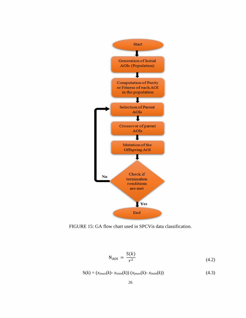
Genetic Algorithm (GA)
GA is used to generate the optimized areas of high fitness or purity [4] based on
which the analytical rules are created for further classification. An overview of the
implementation of GA in our approach is shown in Figure 15 for discovering the areas
for classification. In this context, areas are referred as Area of Interest (AOI).
Initial Population Selection: The initial population contains randomly generated
rectangles (see Figure 16) defined by the fixed ratio r of each coordinate. For instance, r
can be 0.1 of length of the coordinate. The data are normalized to [0,1] interval. The
generation of the AOI in the SPCVis using GA is an iterative process where each
iteration creates a generation [1] of a new set of AOIs. Before generating the AOIs, a
search space [2] is defined containing maximum cases belonging to the class on which
we build analytical rules. Consider a situation where analytical rules are being built to
classify class k. Let ximax(k) and ximin(k) be the maximum and minimum data points
respectively belonging to coordinate Xi and xjmax(k) and xjmin(k) be the maximum and
minimum data points respectively belonging to coordinate Xj. The number of Areas of
Interests NAOI generated to classify class k within a coordinate pair (Xi, Xj) is given in
Equations 4.2 and 4.3.
26
FIGURE 15: GA flow chart used in SPCVis data classification.
NAOI = S(𝑘)
𝑟2
(4.2)
S(k) = (ximax(k)- ximin(k)) (xjmax(k)- ximin(k)) (4.3)

27
FIGURE 16: Random generation of areas in WBC data.
Parents Selection: This stage involves selection of the AOIs or parents to generate
an AOI called the offspring, i.e., combining two areas to form a bigger area. The parents
are selected based on two criteria (1) Purity or fitness, and (2) Proximity.
Purity or fitness of an AOI with respect to class k for a given pair of coordinates (Xi,
Xj) is defined as the ratio of the number of data points belonging to class k to the total
number of data points within the AOI. Let AOIt be an AOI in the coordinate pair (Xi, Xj).
The purity Pk(AOIt) of a single AOIt with respect to class k is given in Equation (4.4).
Nk(AOIt) is the number of points (xi, xj) in AOIt in (Xi, Xj) that belong to lines from class
Ck and is defined in Equation 4.5. N(AOIt) is the total number of points (xi, xj) within a
given AOIt in (Xi, Xj) and is defined in Equation 4.6.
X1 X7
X2
X6
X5
X5 X3
X4
X9
X8

28
P𝑘(AOI𝑡) = N𝑘(AOI𝑡)
N(AOI𝑡) (4.4)
Nk(AOIt) = ||{(xi, xj): (xi, xj) AOIt &Ck}|| (4.5)
N(AOIt) = ||{(xi, xj): (xi, xj) AOIt}|| (4.6)
After computing the purity of the AOIs, the parents with closest Proximity
(nearest parents) are selected for the next stage, i.e., the crossover. While Proximity can
be defined in multiple ways, in our experiments we applied the Euclidean distance
between the mid-point of two areas within the given coordinate pair commonly used in
GA for similar tasks [2]. For instance, given the mid-point of two AOIs {(xim1, xjm1), (xim2,
xjm2)} within coordinate pair (Xi, Xj), the Proximity of two AOIs is given in Equation 4.7.
𝑃𝑟𝑜𝑥𝑖𝑚𝑖𝑡𝑦 = √(𝑥𝑖𝑚1 − 𝑥𝑖𝑚2)2 + (𝑥𝑗𝑚1 − 𝑥𝑗𝑚2)2 (4.7)
Crossover: Once the parents with highest Purity and closest Proximity (nearness)
are selected, the parent AOIs are combined to form a new AOI (offspring). A single
parent AOIPg is represented in Equation 4.8. Here x1, x2, y1, y2 are left, right, bottom ant
top coordinates of the rectangular AOIPg and is represented in the Figure 17.
AOIPg = Pg(x1, x2, y1, y2) (4.8)

29
FIGURE 17: Representation of single parent AOIPg from generation g.
A crossover of two parents AOIP1g and AOIP2g from generation g to produce an
offspring AOIO1g within a given coordinate pair (Xi, Xj) is represented in Equation 4.9.
The two parents are defined in Equations 4.10 and 4.11. The function F(AOIP1g, AOIP2g)
is defined in Equation 4.12 as an envelope around these two AOIs. Figure 18 displays
different types of crossovers of the parent AOIs (with and without overlapping, or
diagonally overlapping).
AOIO1g = F(AOIP1g, AOIP2g) (4.9)
AOIP1g = P1g(x11, x12, y11, y12) (4.10)
AOIP2g = P2g(x21, x22, y21, y22 (4.11)
F(AOIP1g, AOIP2g) = {min(x11, x21), max( x12, x22), min(y11, y21), max(y12, y22)} (4.12)
Mutation: In GA, certain characteristics of the offspring generated from the
previous generation are modified (mutated) in order to speed up the process of reaching
an optimized solution. This includes modifying the characteristics of the offspring either

30
by flipping, swapping or shuffling the properties that represent the offspring. For
instance, if the offspring is represented by bits, then the mutation by flipping would
include switching some of the bits from 0 to 1 or vice versa [18].
Since the objective of mutation is to generate an offspring with better
characteristics than its parents, in our proposed technique, we generate the mutated
offspring by interactively generating a new parent AOI with high Purity and close
Proximity with the automatically generated parent AOI. This results in an offspring with
better characteristics compared to its parents in terms of size and Purity. Figure 19a
represents the automatically generated parent AOI in purple (straight line) and
interactively generated parent AOI (dotted lines). The resulting mutated offspring AOI
has superior characteristics compared to its parents with high Purity and larger area
compared to its previous generation as displayed in Figure 19b.
Termination: Since GA process is iterative, there are several conditions based on
which the process can be terminated. In our proposed method, we use two techniques as
the termination criteria: (1) areas with highest Purity or fitness (100%) are generated, or
(2) manual inspection termination in SPCVis. If either of the two criteria is met, the
process is terminated.
Analytical Rule Generator: This is similar to the second step performed in IVLC
algorithm as discussed in Chapter III. The only change that the areas used here are
generated from GA whereas in Chapter III, the areas used are interactively generated.

31
(a) Crossover of two overlapping parent AOIs.
(b) Crossover of two non - overlapping parent AOIs.
(c) Crossover of two diagonally overlapping parent AOIs.
FIGURE 18: Different types of crossovers of two parent AOIs to generate offspring
AOI.

32
(a) Parent AOI (dotted lines) generated
automatically (straight lines) and interactively
(dotted lines) with high purity in generation g.
(b) Mutated Offspring in generation g + 1.
FIGURE 19: Visualizations of consecutive generations of AOIs in WBC data.
Experiments with Automated Data Classification Approach
Experiments are conducted with same datasets mentioned in Chapter III i.e.,
WBC, Iris and Seeds datasets. In addition to these datasets, experiment is also conducted
on Air Pressure System (APS) Failure at Scania trucks. This dataset consists of 60,000
instances with 170 features. Compared to interactive approach, the automated techniques
provided better results with smaller number of areas and less iterations.
Iris Data (4D)
Class 1 of Iris data is classified by running the COO algorithm and GA. The
optimized order of the coordinates for class 1 classification is (X4, X3) and (X1, X2). It is
displayed in Figure 20. The rule for class 1 (green) separation defined in Equation 4.13.

33
r1: If (x4, x3) ∈ R11, then x ∈ class 1 (4.13)
FIGURE 20: Visualization of Iris data with class 1 separation rule.
After class 1 separation, COO is run again for classifying the remaining classes.
The optimized order of coordinates for class 2 and class 3 separation are (X1, X3) and
(X2, X4). The visualization of classes 2 and 3 after reordering the coordinates is shown in
Figure 21.
FIGURE 21: Visualization of Iris data with classes 2 and 3 after reordering the
coordinates.
X3
X4
X1
X2
X3
X1
X2
X4

34
Figure 21 clearly displays separation of classes 2 and 3 along the vertical
coordinates. This visualization is further enhanced by applying the non-linear scaling
with following thresholds on coordinates: 0.7 on X3 and 0.71 on X4.
GA is run on class 2 and class 3 data to generate the areas. Visualization of non-
linear scaling along with the areas are displayed in Figure 22a with 10 cases. Figure 22b
displays the same visualization with all the cases from class 2 and class 3.
The areas R2 and R3 for classes 2 and 3 separation are defined in Equations 4.14
and 4.16 and their corresponding rules are defined in Equations 4.15 and 4.17.
R2 = R12 & R21 & (R13 & R23) & R22 (4.14)
r2: If (x1, x2, x3, x4) ∈ R2 , then x ∈ class 2 (4.15)
R3 = (R11 & R2) (4.16)
r3: If (x1, x2, x3, x4) ∈ R3 , then x ∈ class 3 (4.17)
The area parameters generated for Iris data classification is listed in Table 2. The
accuracy obtained for Iris data classification with 10-fold cross validation using worst-
case heuristics approach is 100%.

35
(a) Visualization of rule r2 on Iris dataset for classes 2 and 3 separation with 10 cases.
(b) Visualization of rule r2 on Iris dataset for classes 2 and 3 separation with all the cases.
FIGURE 22: Visualization of rule r2 on Iris dataset for classes 2 and 3 separation.
Table 2. Parameters of the areas generated for Iris data classification. Rectangle Parameters
Left Right Bottom Top Coordinate Pair
R11 0.0 0.3 0.0 0.2 (X1, X3)
R12 0.16 0.75 0.3 0.7 (X1, X3)
R13 0.45 0.56 0.55 0.7 (X1, X3)
R21 0.0 0.59 0.37 0.71 (X2, X4)
R22 0.0 0.45 0.67 0.71 (X2, X4)
R23 0.1 0.3 0.5 0.63 (X2, X4)
X1 X2
X3 X4
X3 X4
X1 X2

36
Wisconsin Breast Cancer (WBC) Data (9D)
The second dataset is WBC dataset, as discussed in Chapter III. Running the COO
algorithm produced the following order of coordinates: (X5, X1), (X3, X7), (X4, X2), (X9,
X6) and (X8, X5). Figure 23a displays WBC data visualized in SPCVis with 12 cases of
class 1 data along with the areas.
The rectangle Rkm is mth rectangle in the kth pair of coordinates. For instance, in
Figure 23a, rectangle R24 is a 4th rectangle in the second pair of coordinates that is
(X3,X7). Figure 23b displays all the cases from both classes of WBC data along with the
non-linear scaling with following thresholds on coordinates: 0.6 on X1, 0.25 on X7 and X2
and 0.3 on X6. The areas R1-R3 are defined in Equations 4.18 – 4.20. The rule r is defined
in Equation 4.21. The area coordinates are given in the Table 3. The accuracy obtained
after 10-fold cross validation technique with worst case heuristics is 99.71%.
R1 = R11& R15 & R41 & R42 & (R22 or R23) or (R31 or R32 ) (4.18)
R2 = R14 & R12 & (R21 or R24) or R33 (4.19)
R3= R13 & R24 (4.20)
r: If (x1, x2, x3, x4, x5, x6, x7, x9) ∈ R1 or R2 or R3 then
x ∈ Class 1, else x ∈ Class 2 (4.21)

37
(a) Visualization of rule r on WBC dataset with 12 cases.
(b) Visualization of rule r on WBC dataset with all the cases.
FIGURE 23: Visualization of rule r on WBC dataset for class 1 separation.
X1 X7
X2
X6
X5
X5 X3
X4
X9
X8
X5 X3
X4
X9
X8
X1 X7
X2
X6
X5
38
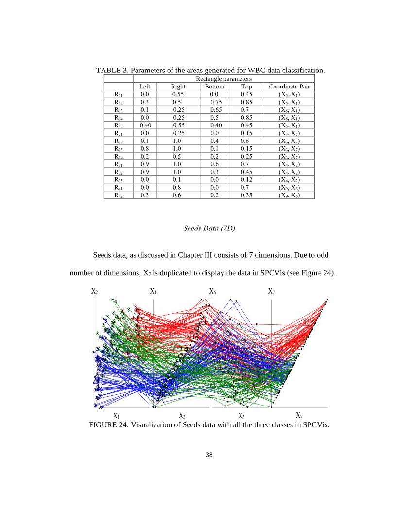
TABLE 3. Parameters of the areas generated for WBC data classification. Rectangle parameters
Left Right Bottom Top Coordinate Pair
R11 0.0 0.55 0.0 0.45 (X5, X1)
R12 0.3 0.5 0.75 0.85 (X5, X1)
R13 0.1 0.25 0.65 0.7 (X5, X1)
R14 0.0 0.25 0.5 0.85 (X5, X1)
R15 0.40 0.55 0.40 0.45 (X5, X1)
R21 0.0 0.25 0.0 0.15 (X3, X7)
R22 0.1 1.0 0.4 0.6 (X3, X7)
R23 0.8 1.0 0.1 0.15 (X3, X7)
R24 0.2 0.5 0.2 0.25 (X3, X7)
R31 0.9 1.0 0.6 0.7 (X4, X2)
R32 0.9 1.0 0.3 0.45 (X4, X2)
R33 0.0 0.1 0.0 0.12 (X4, X2)
R41 0.0 0.8 0.0 0.7 (X9, X6)
R42 0.3 0.6 0.2 0.35 (X9, X6)
Seeds Data (7D)
Seeds data, as discussed in Chapter III consists of 7 dimensions. Due to odd
number of dimensions, X7 is duplicated to display the data in SPCVis (see Figure 24).
FIGURE 24: Visualization of Seeds data with all the three classes in SPCVis.
X2 X4 X6 X7
X1 X3 X5 X7

39
Analytical rules for class 3 (blue) are generated after running the COO algorithm
and GA. The optimized order of the coordinates for class 1 classification is (X3, X1), (X7,
X5), (X6, X2), and (X3, X4). Figure 25 represents the optimized order of coordinates.
FIGURE 25: Visualization of Seeds data with all the three classes in SPCVis after
coordinate order optimization.
Non-linear scaling is then performed with following thresholds on coordinates:
0.4 on X1, 0.45 on X5, 0.4 on X2 and 0.4 on X4. The visualization of classes 2 and 3 after
reordering the coordinates and non-linear scaling is shown in Figure 26.
Areas are generated by running GA and analytical rules are built using these
generated areas. The visualization of all the three classes with non-linear scaling and the
areas for class 3 (blue) separation is displayed in Figure 27a. The area is defined in
Equation 4.22. The parameters of the areas generated by GA are listed in Table 4.
X1 X5 X2 X4
X3 X7 X6 X3

40
FIGURE 26: Visualization of Seeds dataset with classes 2 (red) and 3 (blue) after
performing non-linear scaling on optimized order of coordinates.
R1 = R11 & R21 & R41 & (R42 or R31) & (R12 & R22 & (R32 or R43)) (4.22)
The rule r1 for class 3 classification is given in Equation 4.23.
r1: If (x1, x2, x3, x4, x5, x6, x7) ∈ R1, then x ∈ class 3 (4.23)
TABLE 4. Parameters of the areas generated for classification in Seeds data in 1st
iteration. Rectangle Parameters
Left Right Bottom Top Coordinate Pair
R11 0.0 0.85 0.0 0.3 (X3, X1)
R12 0.5 0.85 0.12 0.26 (X3, X1)
R21 0.1 0.55 0.0 0.43 (X7, X5)
R22 0.27 0.55 0.2 0.43 (X7, X5)
R31 0.58 0.72 0.25 0.35 (X6, X2)
R32 0.0 0.45 0.21 0.3 (X6, X2)
R41 0.32 0.8 0.25 0.36 (X3, X4)
R42 0.32 0.4 0.25 0.3 (X3, X4)
R43 0.45 0.55 0.0 0.15 (X3, X4)
X1 X5 X2 X4
X3 X7 X6 X3

41
The cases that do not follow the rule generated for class 3 is sent to the next
iteration where rules are generated for other classes. Areas are generated again by
running GA and analytical rules are built using these generated areas. The visualization
with all the three cases along with non-linear scaling and the areas are displayed in Figure
27b. In this case the rule is generated for class 2 (red). The optimized order of the
coordinates remains the same. Non- linear scaling with the same threshold as in the
previous iteration is performed on the vertical coordinates. The areas R2 and R3 are
defined in Equations 4.24 and 4.25. The rules r2 and r3 for classes 2 and 3 separation is
given in Equations 4.26 and 4.27. The accuracy obtained for Seeds data classification
with this approach and applying 10-fold cross validation using worst-case heuristics
validation split is 100%. The parameters of the areas generated are listed in Table 5.
R2 = R13 & R23 & ((R14 & R24 & R33) & (R34 & R44)) (4.24)
R3 = (R1 & R2) (4.25)
r2: If (x1, x2, x3, x4, x5, x6, x7) ∈ R1 , then x ∈ class 2 (4.26)
r3: If (x1, x2, x3, x4, x5, x6, x7) ∈ R3, then x ∈ class 1 (4.27)

42
(a) Cases covered by rule r1 on Seeds dataset for class 3 (blue) separation.
(b). Cases covered by rule r2 on Seeds dataset for class 2 (red) separation.
FIGURE 27: Visualization of rules r1 and r2 on Seeds dataset for classes 2 and 3
separation with all the cases.
X3 X7 X6 X3
X1 X5 X2 X4
X1 X5 X2 X4
X3 X7 X6 X3

43
TABLE 5. Parameters of the areas generated for classification in Seeds data in 2nd
iteration. Rectangle Parameters
Left Right Bottom Top Coordinate Pair
R13 0.3 0.94 0.45 1.0 (X3, X1)
R14 0.58 0.91 0.45 0.62 (X3, X1)
R23 0.3 1.0 0.42 1.0 (X7, X5)
R24 0.3 0.67 0.52 0.76 (X7, X5)
R33 0.0 0.63 0.46 0.65 (X6, X2)
R34 0.27 0.55 0.51 0.65 (X6, X2)
R44 0.63 0.74 0.46 0.63 (X3, X4)
APS (Air Pressure System) Failure at Scania Trucks Data (170D)
APS failure at Scania Trucks from UCI Repository [5] consists of two classes.
Class 1 corresponds to the failure in Scania trucks that is not due to the air pressure
system and class 2 corresponds to the failure in Scania trucks that is due to the air
pressure system. This data consists of 60000 cases and 170 dimensions. However, the
dataset contains a large number of missing values. These missing values are replaced by
calculating 10% of the maximum value of the corresponding column and multiplying the
result by -1. In this type of imputation, all the missing data are replaced with 0 after
normalization and hence does not interfere with the main data. Also, there are 4 columns
of data with all 0 values. After imputation and removing the columns without any
information, the final data contains 60000 cases with 166 dimensions. As discussed in
Chapter II, visualizing 166 dimensions becomes very challenging. Hence, we use SCS to
visualize high dimension data as shown in Figure 7.
Data classification using interactive approach becomes very tedious due large

44
number of dimensions and instances. Hence, for this dataset, classification is performed
using automation technique. After running the COO algorithm, the result contains 166
coordinates arranged from the most to least optimized coordinates. Here, we start with
extracting top 4 coordinates and perform analysis on the data with 2 pairs of coordinates
displayed in SPCVis. The coordinates are gradually increased by pairs until we get the
desired results. In this case, 12 coordinates were selected for further analysis. They are
X7, X140, X70, X75, X145, X74, X141, X71, X143, X76, X122, and X69. APS failure data with top
12 coordinates with green class on top is displayed in Figure 28a and red class on top is
displayed in Figure 28b.
The visualizations in Figure 28 display high degree of occlusion even with the
best order coordinates. Although there is fair amount of separation observed in the first
pair of coordinates. Data in the remaining five pairs are highly occluded. Since there is no
clear vertical separation between red class and green class, non-linear scaling becomes
insignificant and hence not performed on this dataset. GA is run on this data to generate
areas with high purity. The resulting visualization after running GA is displayed in Figure
29.

45
(a) APS failure data with green class on top.
(b) APS failure data with red class on top.
FIGURE 28: Visualization of 12 best coordinates of APS failure data in SPCVis.
X140
X7
X69 X76 X71 X74 X75
X70 X145 X141 X143 X122
X7 X70 X145 X141 X143 X122
X140 X69 X76 X71 X74 X75

46
FIGURE 29: Visualization of APS failure data with areas generated by GA for red class
classification.
Due to two main reasons, the data pattern cannot be interpreted by the end users
in this situation: (1) high density of data within the areas generated and (2) small size of
the areas generated by GA. To address these issues, we use zooming and averaging.
Zoom is an interactive feature wherein the small areas can be zoomed to view the data
more clearly. Figure 30 displays the zoomed image of area R31.
The zoomed visualization in Figure 30a solves the problem partially. Although,
the data is distinctly visible, the pattern is still hidden. To view the overall distribution of
red and green class data, the average of individual class within the area is performed.
Figures 30b and 31 display the averaged red and green class with R31 area.
X140 X69 X76 X71 X74 X75
X7 X70 X145 X141 X143 X122

47
(a) Visualization of zoomed R31 area in
the APS failure data without averaging. (b) Visualization of zoomed R31 area in the APS
failure data after averaging.
FIGURE 30: Visualization of R31 area in the APS failure data with zooming and
averaging.
FIGURE 31: Visualization of zoomed R31 area in the APS failure data with averaged
classes with the area (without the surrounding data).
Averaging is performed on all the areas generated by the algorithm. Since the
areas are generated in the first, second and fifth pair of coordinates, we can disregard the
coordinate pairs in between second and fifth, resulting in only four pairs of coordinates.
The overall visualization of red class classification is displayed in Figure 32. The area R1

48
rule r1 generated for red class 2 (red) classification is defined in Equations 4.28 and 4.29,
respectively.
FIGURE 32: Visualization of rule r1 for red class classification in the APS failure data.
R1 = R11 & R21 & (R51 or R52 or R53) & (R54) (4.28)
r1: If (x7, x140, x70, x75, x143, x76) ∈ R1 , then x ∈ class 2
(4.29)
Data that do not follow R1 rule is sent to the next iteration. The COO algorithm is
run on all the 166 coordinates again to get the optimized order of coordinates for the
remaining data. The order of coordinates obtained are X61, X164, X103, X97, X9, X39, X1
and X26. The data is visualized in Figure 33a.
X140 X69 X76 X75
X7 X70 X143 X122

49
(a) Visualization of APS failure data with top 8 coordinates.
(b) Visualization of r2 in APS failure data with top 8 coordinates with non-linear scaling.
FIGURE 33: Visualization of APS failure data in the second iteration.
In the second iteration, the green class tends to be clustered at the bottom and red
towards the top. Since the separation along vertical coordinates is clearly visible, we
performed the non-linear scaling to get better data interpretation with thresholds 0.15 on
X164 X97 X39 X26
X61 X103 X9 X1
X164 X97 X39 X26
X61 X103 X9 X1

50
X164, 0.2 on X97, 0.25 on X39, and 0.25 on X26. Then the data is visualized with non-linear
scaling and analytical rules discovered (see Figure 33b). The area R2 and rule r2 for class
2 (red) classification is defined in Equations 4.30 and 4.31.
R2 = T1 & T2 & T3 & (T4 or R41) (4.30)
r2: If (x61, x164, x108, x97, x9, x39, x1, x26) ∈ R2, then x ∈ class 2 else class 1 (4.31)
(T1 & T2 & T3 & T4 are the threshold values of non-linear scaling)
The accuracy obtained for APS data classification with this approach and
applying 10-fold cross validation using worst-case heuristics validation split is 99.36%.
The area parameters used for APS data classification are listed in Table 6.
TABLE 6: Parameters of the areas generated for classification in APS failure data. Rectangle Parameters
Left Right Bottom Top Coordinate Pair
R11 0.0 0.2 0.0 0.1 (X7, X140)
R21 0.1 0.3 0.19 0.52 (X70, X75)
R31 0.18 0.3 0.36 0.4 (X143, X76)
R32 0.15 0.3 0.45 0.5 (X143, X76)
R33 0.16 0.28 0.22 0.28 (X143, X76)
R34 0.0 0.11 0.0 0.6 (X143, X76)
R41 0.0 0.6 0.0 0.1 (X1, X26)

51
CHAPTER V
EXPERIMENTAL RESULTS AND COMPARISON WITH PUBLISHED RESULTS
The results obtained are compared with the published results that uses both black-
box and interpretable techniques. From Table 7, we can see that the classification
accuracy obtained with the proposed method is on par with the published results and in
some cases, have performed better than the published results. Since the interactive
technique is more challenging for classifying data of larger size, we used only automated
classification for such dataset (APS failure data). The results produced using both
interactive and automated approach are listed in bold.
From the results in Table 7, we can clearly see that the accuracies obtained from
our proposed method is better than black box machine learning models [21, 6, 24] and on
par with interpretable models [11]. However, the accuracy for APS failure at Scania
Trucks is slightly lesser compared to the accuracy in [24] using Deep Neural Network,
which is a black box model. Despite of lesser accuracy, our proposed model is favorable
due to its transparency, the ability to use the model as self-service and the ability to
interpret the model by non-technical end users.

52
TABLE 7: Comparison of different classification models. Classification Algorithms Accuracy %
Breast Cancer data (9D)
Iterative Visual Logical Classifier (Automated) 99.71
Iterative Visual Logical Classifier (Interactive) 99.56
SVM [3] 96.99
DCP/RPPR [16] 99.3
SVM/C4.5/kNN/Bayesian [20] 97.28
Iris Data (4D)
Iterative Visual Logical Classifier (Automated) 100
Iterative Visual Logical Classifier (Interactive) 100
Multilayer Visual Knowledge discovery [11] 100
k-Means + J48 classifier [15] 98.67
Neural Network [21] 96.66
Seeds Data (7D)
Iterative Visual Logical Classifier (Automated) 100
Iterative Visual Logical Classifier (Interactive) 100
Deep Neural Network [6] 100
K- nearest neighbor [19] 95.71
APS Failure at Scania Trucks (170D)
Iterative Visual Logical Classifier (Automated) 99.36
Deep Neural Network (DNN) [24] 99.50
Random Forest [17] 99.02
Support Vector Machine (SVM) [17] 98.26

53
CHAPTER VI
CONCLUSIONS
With the help of lossless data visualization, we demonstrated the power of
interpretable data classification techniques that are implemented both interactively and
automatically. We observed that the interactive data classification technique works well
for data with lesser cases and dimensions but fail to perform well for data with higher
number of cases and dimensions. High degree of occlusion was observed and was
challenging to discover pattern interactively. This issue was successfully addressed by
our newly proposed automated interpretable technique using Coordinate Order Optimizer
(COO) algorithm and Genetic Algorithm (GA) where the areas were generated
automatically rather than interactively.
We also demonstrated the power of interactive features that improved the
visualization due to which discovering patterns in the data became much easier. With
non-linear scaling, zooming and averaging, the visualization was improved to increase
data interpretability. The SPCVis software successfully visualized the larger dataset using
SCS. Our proposed techniques can be further leveraged by incorporating more interactive
features like non-orthogonal coordinates, data reversing etc. SPC and SCS visualizations
help us to discover only specific patterns in the data and our future goal is to incorporate
more General line coordinate visualizations and also to provide a medium for visualizing
thousands of dimensions with millions of data cases.

54
REFERENCES CITED
[1] Banzhaf W, Nordin P, Keller RE, Francone FD. Genetic programming: an
introduction. San Francisco: Morgan Kaufmann Publishers; 1998 Jan.
[2] Bouali F, Serres B, Guinot C, Venturini G. Optimizing a radial visualization with a
genetic algorithm. In2020 24th International Conference Information Visualisation
(IV), 2020 Sep 7 , pp. 409-414. IEEE.
[3] Christobel, A. and Y. Sivaprakasam. An empirical comparison of data mining
classification methods. International Journal of Computer Information Systems 3.2,
2011: 24-28.
[4] Cowgill MC, Harvey RJ, Watson LT. A genetic algorithm approach to cluster
analysis. Computers & Mathematics with Applications. 1999 Apr 1;37(7):99-108.
[5] Dua, D. and Graff, C. UCI Machine Learning Repository
[http://archive.ics.uci.edu/ml]. Irvine, CA: University of California, School of
Information and Computer Science, 2019.
[6] Eldem A. An application of deep neural network for classification of wheat seeds.
European Journal of Science and Technology, No 19 (pp. 213-220), August 2020.
[7] Everitt B. The Cambridge Dictionary of Statistics. Cambridge University press.
Cambridge, UK Google Scholar, 1998.
[8] Feurer M, Klein A, Eggensperger K, Springenberg JT, Blum M, Hutter F. Auto-
sklearn: Efficient and robust automated machine learning. In Automated Machine
Learning, 2019 (pp. 113-134). Springer, Cham.
[9] Hutter F, Kotthoff L, Vanschoren J. Automated machine learning: methods, systems,
challenges. Springer Nature, 2019.
[10] Kovalerchuk, B., Ahmad, M.A., Teredesai A., Survey of explainable machine
learning with visual and granular methods beyond quasi-explanations, In:
Interpretable Artificial Intelligence: A Perspective of Granular Computing, W.
Pedrycz, S.M.Chen ((Eds.), pp. 217-267, 2021.
[11] Kovalerchuk B. Visual Knowledge Discovery and Machine Learning, Springer, 2018.
[12] Kovalerchuk B., Gharawi A., Decreasing occlusion and increasing explanation in
interactive visual knowledge discovery, In: Human Interface and the Management of

55
Information. Interaction, Visualization, and Analytics, Lecture Notes in Computer
Science series, Vol. 10904, 2018, pp. 505-526. Springer.
[13] Kovalerchuk B. Enhancement of cross validation using hybrid visual and analytical
means with Shannon function. In: Beyond Traditional Probabilistic Data Processing
Techniques: Interval, Fuzzy etc. Methods and Their Applications, 2020 (pp. 517-
543). Springer.
[14] Kovalerchuk, B., Grishin, V. Reversible data visualization to support machine
learning, In: Human Interface and the Management of Information. Interaction,
Visualization, and Analytics, Lecture Notes in Computer Science series, Vol. 10904,
2018, pp. 45-59, Springer.
[15] Kumar, V. and N. Rathee. Knowledge discovery from database using an integration
of clustering and classification. International Journal of Advanced Computer Science
and Applications 2.3 (2011): 29-33.
[16] Neuhaus, N., Kovalerchuk, B., Interpretable machine learning with boosting by
Boolean algorithm, Joint 2019 8th Intern. Conf. on Informatics, Electronics & Vision
(ICIEV) & 3rd Intern. Conf. on Imaging, Vision & Pattern Recognition (IVPR),
Spokane, WA, 2019, 307-311.
[17] Rafsunjani S, Safa RS, Al Imran A, Rahim MS, Nandi D. An empirical comparison
of missing value imputation techniques on APS failure prediction. IJ Inf. Technol.
Comput. Sci. 2019 Feb;2:21-9.
[18] Rifki O, Ono H. A survey of computational approaches to portfolio optimization by
genetic algorithms. In18th International Conference Computing in Economics and
Finance 2012 Jun. Society for Computational Economics.
[19] Sabanc K, Akkaya M. Classification of different wheat varieties by using data mining
algorithms. International Journal of Intelligent Systems and Applications in
Engineering. 2016 May 27;4(2):40-4.
[20] Salama GI, Abdelhalim M, Zeid MA. Breast cancer diagnosis on three different
datasets using multi-classifiers. International Journal of Computer and Information
Technology, Vol. 01– Issue 01, 2012.
[21] Swain M, Dash SK, Dash S, Mohapatra A. An approach for iris plant classification
using neural network. International Journal on Soft Computing. 2012 Feb 1;3(1):79.
[22] Wagle, S, SPCVis, Interactive Shifted Paired Coordinate Visualization Tool.
https://github.com/Wagle1/SPCVis.git, 2021. Accessed: 2021-05-30
56
[23] Wagle, S., Kovalerchuk, B., Interactive visual Self-Service data classification
approach to democratize machine learning , 24th International Conference
Information Visualisation IV-2020, Melbourne, Victoria, Australia, 7-11 Sept.2020,
IEEE, DOI 10.1109/IV51561.2020.00052.
[24] Zhou F, Yang S, Fujita H, Chen D, Wen C. Deep learning fault diagnosis method
based on global optimization GAN for unbalanced data. Knowledge-Based Systems.
2020 Jan 1;187:104837.

57
APPENDIX
SPCVIS MANUAL
SPCVis provides a medium for visualizing multidimensional (n-D) data in SPC
without losing any information. This system is developed on Windows Forms in C++
and OpenGL library. The user can load the data using ‘Upload Data’ option and
visualize the data in SPC without any loss of information. Apart from the lossless
representation of the n-D data, the SPCVis also provides user interactive controls like
clicking and dragging the user selected graphs on the screen and reversing the user
selected coordinates of the data to reorient the data representation according to user
convenience. These features help in better understanding of the data, especially when
the data contain two or more classes. Additional options like zooming and panning are
provided for user convenience for data exploration. Also, color selection functionality
is given where the user can customize the color of data classes. The SPCVis software
can be downloaded from the GitHub repository mentioned in [22]. The screenshot of
the SPCVis software with WBC data is shown in Figure 34.

58
FIGURE 34: SPCVis software displaying WBC data.
Figure 35a displays the implementation of non-linear scaling feature. It is
implemented using separate sliders for x axis and y axis. Figure 35b displays the user
interface to enter the k value for non-linear scaling (see Equation 2.1). The output of
non-linear scaling is displayed in Figure 4. Non-orthogonal coordinate system has a
coordinate inclined at an angle other than 90 degrees with respect to the other
coordinate. User interactive implementation of non-orthogonal coordinate is shown in
Figure 36. This interactive feature is implemented using a button and a text entry box
where the user can enter the angle at which the inclination is to be displayed. The
outputs of non-orthogonal coordinates are displayed in Figures 5 and 6.

59
(a) Sliders for performing non-linear scaling.
(b) User Interface for entering k value in non-linear Scaling.
FIGURE 35: Implementation of non-linear scaling in SPCVis.
FIGURE 36: User Interface for Non-Orthogonal Coordinates.

60
The rectangular areas drawn using the option ‘Draw Rectangle’ provided in the
SPCVis software. This allows the user to draw rectangles on any coordinate pair using
mouse (In order to draw the rectangles that follow OR logical rule, ensure to check the
checkbox below ‘Draw Rectangle (Or)’ button after all the rectangles are drawn). See
Figures 9 -12 for the outputs with rectangles drawn interactively. Use the ‘HD Display’
(High Dimension Display) to view the data with higher dimensions. This option can be
used if data contains more than 30 dimensions (see Figure 7).