introduction - esri · introduction it should be easier ... orient yourself with respect to the...
TRANSCRIPT

INTRODUCTIONMENTAL MAPSCARTOGRAPHIC MAPSTHE MAP TRANSFORMATION PROCESSWHAT MAKES MAPS POPULAR?FUNCTIONS OF MAPS
Reference mapsThematic mapsNavigation mapsStory and persuasive mapsMaps as art
MAP USESELECTED READINGS

Introduction
It should be easier to read a map than to read this book. After all, we know that a picture is worth a thousand words. Everyone, from poets to politicians, works from the assumption that maps are easy to understand and follow. The very term map is ingrained in our thinking. We use it to suggest clarification, as in “Map out your plan” or “Do I have to draw you a map?” How ironic, then, to write a book using lan-guage that is, supposedly, more complicated than the thing we are trying to explain!
The problem is that maps are not nearly as simple and straightforward as they seem. Using a map to rep-resent our detailed and complexly interrelated surroundings can be deceptive. This is not to say that maps themselves are unclear. But it is the environment, not the map, that you want to understand. A map lets you view the environment as if it was less complicated. There are advantages to such a simplified picture, but there is also the danger that you will end up with an unrealistic view of your surroundings. People who manage critical natural and human resources all too often make decisions based on maps that inherently are oversimplified views of the environment.
In this book, we define a map as a spatial representation of the environment that is presented graphically. By representation, we mean something that stands for the environment, portrays it, and is both a likeness and a simplified model of it. This definition encompasses such diverse maps as those on walls; those that appear ephemerally and then are gone, as on a computer screen or in the form of holograms or virtual reality; and those held solely in the mind’s eye, known as cognitive or mental maps. You may envision the environment by using cartographic maps, which are what most people think of as traditional maps drawn on paper or displayed on computer screens. Or you can use mental maps, which are often slighted although they are the ultimate maps that you use to make decisions about the environment. Now we will look more closely at mental and cartographic maps.

4 INTRODUCTION
MENTAL MAPS
As a child, your mental map was probably based on direct experience — for example, connected pathways such as the routes from your home to school or the park. You had a self-centered view of the world in which you related every-thing to your own position. The cartoon in figure I.1 graph-ically portrays this type of mental map. As an adult, you can appreciate this cartoon because you see how inefficient the child’s mental map is. But the truth is, you will often resort to this way of visualizing the environment when thrown into unfamiliar surroundings. If you go for a walk in a strange city, you will remember how to get back to your hotel by visualizing a pathway like that in the cartoon. Landmarks will be strung like beads along the mental path. Even if you might be able to guess at a more direct route back, you may feel more comfortable following the string of landmarks to make sure that you do not get lost.
Most of your mental maps are more detailed than this cartoon path, however. You take advantage of indirect as well as direct experience. You acquire information through TV, photographs, books and magazines, the Internet, and other secondary sources. You can transcend your physical surroundings and visualize distant environments, even those on the other side of the planet at different historical periods. Your mental maps become incredibly complex as they expand to encompass places and times that you have never seen and may never be able to visit.
As you grow older, your self-centered view of the world is replaced by a geocentric view. Rather than relating
everything to your own location, you learn to mentally orient yourself with respect to the external environment. Once you learn to separate yourself from your environment, you do not have to structure your mental map in terms of connected pathways and landmarks. You can visualize how to get from one place to another “as the crow flies” — the way you would go if you are not restricted to roads and other connected routes. It is your adult ability to visualize the “big picture” that makes the cartoon amusing.
Sharing your mental map with others, either in conver-sation or in maps that you draw, is much easier when you use a geometric reference framework, or a framework in which you can easily describe and determine locations, distances, directions, and other geographic relationships. The system of cardinal directions (north, south, east, and west) is such a framework. You can pinpoint the location of something by stating its cardinal direction and distance from a starting location. You can say, for example, that the store is two miles north of a particular road intersection, or the police station is 200 meters west of the courthouse.
This visualization of space is based on Euclidean geom-etry, the geometry you first learned in school. It is the geom-etry that says that parallel lines never cross, that the shortest distance is a straight line, that space is three-dimensional, and so on. The ability to visualize the environment in terms of Euclidean geometry is an essential part of developing a geocentric mental map. But even if you develop mental maps based on Euclidean geometry, they will only be cor-rect over small areas. This limitation is because the earth is spherical, and the spherical geometry of the earth’s surface
Figure I.1. The geometry of
a child’s mental map is based
on direct experience and
connected pathways. Courtesy of
the Register and Tribune Syndicate.

Cartographic maps 5
is inherently non-Euclidean. (You will see in chapter 1, for example, that north – south lines on the earth, called meridians, are not parallel but, rather, converge to common points at the poles.) Very few of us have well-developed spherical mental maps simply because the small portion of the environment that we experience daily appears flat from our ground perspective, unless we are astronauts.
Even if you are able to visualize the world geocentrically in terms of Euclidean or spherical geometry, it is hard for most people to transform their mental map to a cartographic map in a geometrically accurate manner. Try drawing, from memory, a map of the area in which you live. The hand-drawn map will tell you a great deal about the geometric accuracy of your mental map. Not only will you probably draw the places you know best with the greatest detail and spatial accuracy, you will probably draw the things that are important to your life and leave out the things you do not care about.
Few people’s mental maps correspond with cartographic maps. Figure I.2 shows the distorted visual image that a person from Michigan’s Upper Peninsula might have of the country. Tongue in cheek as this map may be, it captures the fact that people visualize their own region as far more important than the rest of the world. In the same way, your mental maps emphasize your own familiar neighborhood, with distant places less well visualized.
It is important to recognize these biases in your mental maps. The quality of your mental maps is crucial, because your behavior in the environment largely depends on them. You relate to your surroundings as you visualize them, not necessarily as they really are. If the discrepancy between
your mental maps and the real world is great, you may act in self-defeating or even disastrous ways. But you do not have to rely solely on mental maps, because cartographic maps are created for a multitude of places and features in the environment, and maps on mobile devices exist for nearly every place on earth.
CARTOGRAPHIC MAPS
A cartographic map is a graphic representation of the envi-ronment. By graphic, we mean that a cartographic map is something that you can see or touch. Cartographic data-bases or digital image files are not, in themselves, maps but are essential to current methods for the creation of maps. In a similar vein, an exposed piece of photographic film or paper does not become a photograph until it is developed into a slide, paper print, or computer screen.
Cartographic maps come in many forms. Globes, physi-cal landscape models, and Braille maps for the blind are truly three-dimensional objects, but most maps are two-dimensional representations that are cartographically enhanced. Cartographic maps have been carved, painted, or drawn on a variety of media for thousands of years, and print maps have been produced for the last five centuries. Today, maps displayed on a computer screen or mobile device are probably the most commonly seen and used maps. Maps are so intuitive and serve so many purposes that it is easy to forget that maps are one of our most sophisticated
Figure I.2. The United States
as seen through the eyes of a
resident of Michigan’s Upper
Peninsula. Courtesy of Eugene S.
Sinervo.

6 INTRODUCTION
conceptual creations. They tell you as much about how people think and communicate as they do about the envi-ronment that is mapped.
What gives a graphic representation of the environment its “mapness”? Many mapmakers say that cartographic maps have certain characteristics, with the four most important being:• Maps are vertical or oblique views of the environment,
not profile views such as a photograph of the front of your home taken from the street.
• Maps are created at a certain scale, meaning that there is a systematic reduction from ground distance to map distance, as you will see in chapter 2.
• Except for 3D globes and landscape models that faith-fully represent the earth’s curvature, maps are made using a map projection, which is a mathematically defined transformation of locations on the spherical earth to a map surface, as we explain in chapter 3.
• Maps are generalized and symbolized representations of the environment. Mapmakers select a limited number of features from the environment to display on the map, and then display these features in a simplified manner. Insig-nificant features are not shown, the sinuosity of linear
features and area boundaries is reduced, and several small ground features may be aggregated into a single feature on the map, as explained in chapter 6. The generalized features are then shown graphically using different map symbols. The mapmaker uses different point symbols, line widths, line patterns, gray tones, colors, and pattern fills to symbolize the features, as we describe in chapters 6 through 9. Names, labels, and numbers that annotate the map are also important map symbols.A cartographic map does not need all four characteristics
of maps, but it should have at least one. You can think of different types of maps as being at different places on a mapness continuum, defined by the degree to which they exhibit these four characteristics. This continuum is illus-trated in figure I.3 for a gradation of map types that depict part of Crater Lake National Park in Oregon.
The aspect-slope and topographic maps, which show elevations or landforms as well as a limited set of other features, in the left third of the illustration strongly reflect all four characteristics and are good examples of what most people think of as a map. The orthophotomap in the center of the illustration also has all four characteristics because topographic map symbols are printed over a geometrically
Figure I.3. Different types of maps lie along a mapness continuum. Their position on the continuum is defined by how many
characteristics of maps they possess. All the examples in the figure are vertical views. Courtesy of the US Geological Survey.

The map transformation process 7
corrected aerial photograph called an orthophoto, which you will learn more about in chapter 11. An orthophoto is corrected to a constant scale on a map projection surface and hence has three of the four characteristics. Finally, the aerial photograph from which the orthophoto is made is not on a map projection surface and varies in scale with elevation differences on the ground. The aerial photo has only the characteristic of being a vertical view of the environment but is still a form of cartographic map. All the other maps are also vertical views.
As you can see from this illustration, there are multitudes of cartographic maps, each somewhere along the mapness continuum. The variety is so great that from now on, we will shorten the term cartographic map to simply map, in accord with what you are used to hearing these products called.
THE MAP TRANSFORMATION PROCESS
Mapping, like architecture, is an example of functional design. Unlike an artist’s representation of the environ-ment in which geometric liberties are taken to convey an idea or emotion, a map is expected to be true to the loca-tion and nature of our surroundings. Indeed, our willing-ness to let maps stand for the environment is because of this expected adherence to reality. Figure I.4 illustrates the process that cartographers use to transform data collected about the geographic environment, through surveys, by the Global Positioning System, from remote sensing, and more, to a map. Maintaining the highest possible fidelity
in the map transformation process assures that the map is an accurate representation of reality. You, the map user, also play a part in the map transformation process through reading, analysis, and interpretation, and high fidelity must also be maintained in these activities. For example, you as a user are responsible for checking the map against reality, as features may change from the time the map is created.
WHAT MAKES MAPS POPULAR?
In scrutinizing the nature of maps, the obvious question is, what accounts for their widespread popularity? There are four main factors:• Maps are convenient to use. Paper maps are usually
small and flat for ease of storage and handling. Maps on computer screens and mobile devices are easily acces-sible and often integrated into other apps, such as an Internet search engine. Thus, maps bring reality into a less unwieldy proportion for study.
• Maps simplify our surroundings. Without them, our world often seems a chaos of unrelated phenomena that we must organize to understand our environment. The selection of information found on a map is clear at a glance. The world becomes intelligible. Web maps pro-vide varying levels of detail, revealing more features and information as you zoom in.
• Maps are credible. They claim to show how things really are. The coordination between symbol and reality seems so straightforward that we are comfortable letting maps
Figure I.4. The map transformation
process (after Tobler 1979) begins
with the collection of data
about our environment. This
data is transformed into a map
through selection, classification,
generalization, and symbolization.
The map user completes the
transformation process when he or
she reads, analyzes, or interprets the
information in the map.
8 INTRODUCTION
stand for the environment. When you manipulate maps, you expect the results to apply to your surroundings. Maps, even more than the printed word, impress people as authentic. We tend to accept the information on maps without question. This blind acceptance is poten-tially disastrous when using maps indiscriminately — for example, using GPS to navigate by car without checking other information such as road signs or even looking at your surroundings.
• Maps have strong visual impact. Maps create a direct, dra-matic, and lasting impression of the environment. Their graphic form appeals to our visual sense. It is axiomatic that “seeing is believing.” Web maps can dynamically show change over time and space, and they also allow you to interactively change the display to show the map you want to see.These factors combine to make a map appealing and
useful. Yet these same four factors, when viewed from a different perspective, can be seen as limitations.
Take convenience. It’s what makes fast food popular. When we buy processed foods, we trade quality for easy preparation. Few would argue that the result tastes like the real thing made from fresh ingredients. The same is true of maps. We gain ease of handling and storage by creating a prepared image of the environment. This rep-resentation of reality is bound to make maps imperfect in many ways.
Simplicity, too, can be seen as a liability as well as an asset. Simplification of the environment through mapping appeals to our limited ability to process information, while at the same time it reduces the complexity and — potentially — the intricacies that we need to understand. By using maps, you can reduce the overwhelming and confusing natural state of reality. But the environment remains unchanged. It’s just your view of it that lacks detail and complexity.
You should also question the credibility of maps. The mapmaker’s invisible (to you) hand isn’t always reliable or rational. Some map features are distortions, others are errors, and still others are omitted through oversight or design. So many perversions of reality are inherent in mapping that the result is best viewed as an intricate, controlled representation. Maps are like statistics — people can use them to show whatever they want, and maps reflect the capabilities of their maker. Once a map is made, it may last hundreds of years, although the world keeps changing. For all these reasons, a map’s credibility is open to debate.
Also, be careful not to confuse maps’ visual impact with proof or explanation. Just because a map leaves a powerful
visual impression doesn’t make it meaningful or insight-ful. A map is a snapshot of a portion of the environment at a point in time. From this single view, it is sometimes difficult or impossible to understand the processes that caused the patterns we can see on maps. For explanations, you must look beyond maps and confront the real world (as discussed in chapters 19 to 22).
FUNCTIONS OF MAPS
Maps function as media for the communication of geo-graphic information, and it is instructive to draw paral-lels between maps and other communication media. You can first think of maps as a reference library of geographic information. Maps that serve this function, called refer-ence maps, are more efficient as geographic references of the locations of different features than are maps with a certain theme. They catalog feature types and record their geographic locations. Reference maps allow you to instantly see the relative position of features and estimate directions and distances between them. Explaining these spatial relationships among features in writing could take hundreds of pages.
Maps can also function as an essay on a topic. Like a well-written theme, a map can focus on a specific subject and be organized to make the subject stand out above the geo-graphic setting. We call maps that function as geographic essays thematic maps. Some thematic maps are presented as online story maps that combine interactive maps and multimedia content to lead a reader through a story.
Maps are tools for navigation, equal in utility to a com-pass, GPS receiver, or mobile app. When you get into your car and drive across the city, you are navigating the roads. When you find your route on a subway or bus system, you are navigating a transit system. When you hike along a trail, you are navigating through a trail network. In the first case, you use a road map; in the second case, you use a transit map; and in the last case, you use a trail map.
When you step into an airplane and fly to a distant city, you must use air navigation (assuming you are the pilot). And when you motor or sail between two destinations on a body of water, you are marine navigating. In these two cases, you use navigational charts to plan your route in advance and guide you on your trip.
Maps are instruments of persuasion. Like a written advertisement or television endorsement, some maps persuade you to buy a particular product, make a certain

Functions of maps 9
business decision, or take a targeted political action. These maps are often more sales hype or propaganda than a graphic representation of the environment, and you should view such maps with caution. Although all maps incorporate elements of graphic design, these maps are often more artis-tic in nature, employing art for visual influence. Graphic embellishments are also placed on maps for pure visual entertainment. And, finally, maps can be used as media in the creation of fine art.
Now we will take a closer look at maps with each of these different functions.
Reference mapsThe earliest known maps, dating back several thousand years, are the reference type. On reference maps, symbols are used to locate and identify prominent landmarks and other pertinent features. An attempt is made to be as detailed and spatially truthful as possible so that the information on the map can be used with confidence. These maps have a basic “Here is found …” characteristic and are useful for looking up the location of specific geo-graphic features. On reference maps, no particular fea-ture is emphasized over the others. All features are given equal visual prominence as much as possible.
The topographic map and remote sensor images (orthophotomaps, orthophotos, and aerial photographs,
discussed in chapter 10) in figure I.3 are excellent examples of reference maps because they show a variety of phenom-ena, with about the same emphasis given to each one. Reference maps are often produced in national mapping series, such as the US Geological Survey topographic map series. The topographic map segment in figure I.3 is from such a series.
Topographic maps show and label natural features that are found in the physical environment, including moun-tains, valleys, plains, lakes, rivers, and vegetation. They also show cultural features that are created by humans, such as roads, boundaries, transmission lines, and buildings.
The geographic information on reference maps makes them useful to professional and recreational map users alike. These maps are used in engineering, energy exploration, natural resource conservation, environmental management, public works design, and commercial and residential plan-ning. Maps for outdoor activities such as biking, camping, and fishing are often variations of reference maps, in which additional features, such as bike trails, campsites, and fish-ing spots, are added.
Globes and atlases are reference maps that show natu-ral and cultural features in more generalized form than topographic maps. School wall maps are another form of reference map, as are the road maps and recreation guides that are produced for different states (figure I.5).
Figure I.5. Reference map examples
include (A) a world globe, (B) the
northwest section of a US road
and recreation atlas map, (C)
an Esri basemap on a handheld
mobile device, and (D) a section of
the Oregon State Highway map.
(B) Courtesy of Benchmark Maps, (C)
courtesy of the Map Shop and Esri, and
(D) courtesy of the Oregon Department
of Transportation.

10 INTRODUCTION
Thematic mapsUnlike reference maps, which show many types of fea-tures but emphasize none over the other, thematic maps focus on a single type of feature that is the theme of the map. Whereas reference maps focus on the loca-tions of different features, thematic maps emphasize the geographic distribution of the theme. A climate map (figure I.6A), which shows how average annual precipi-tation changes continuously across the state of Oregon, is a good example. A map that shows the areal extent of Oregon vegetation provinces (figure I.6B) likewise shows the geographic distribution of physical features.
Many thematic maps show the geographic distribution of concepts that don’t physically exist on the earth. One example is a map that shows Oregon’s rural population with dots and its urban population with variations in circle sizes (figure I.6C). Another example is the Oregon population density map in figure I.6D. Although you can’t actually see population density in the physical environment, maps that show the spatial distribution of such statistical themes are useful to experts in demographics and other fields.
Thematic maps ask, “What if you want to look at the spatial distribution of some aspect of the world in this
particular way?” Figure I.6D, for example, asks, “What if you want to look at population density by taking the 2010 population census totals for Oregon counties as truth, dividing each total by the area of the county to get a popula-tion density, and then generalizing the densities into seven arbitrarily defined categories?”
Take another look at each map in figure I.6 and note how the county outlines are superimposed on each theme. Most thematic maps have similar limited reference infor-mation to give a geographic context to the theme. Be careful not to use the contextual reference information to find specific locations or make precise measurements. Remember, that’s not the intent of thematic maps; that’s what reference maps are for. When using thematic maps, focus on their function of showing the geographic dis-tribution of the theme.
Navigation maps As you will see in chapter 14, several types of maps are specially designed to assist you in land, water, and air navigation. Many of these maps are called charts — maps created specifically to help the navigator plan voyages and follow the planned travel route.
Figure I.6. Thematic maps for Oregon
show (A) annual precipitation as colored
regions of a continuous surface, (B)
vegetation provinces as uniform areas,
(C) rural and urban population by dots
and graduated circles, and (D) population
density shown by uniform colors within
counties. Courtesy of the Spatial Climate
Service, Oregon State University.
Functions of maps 11
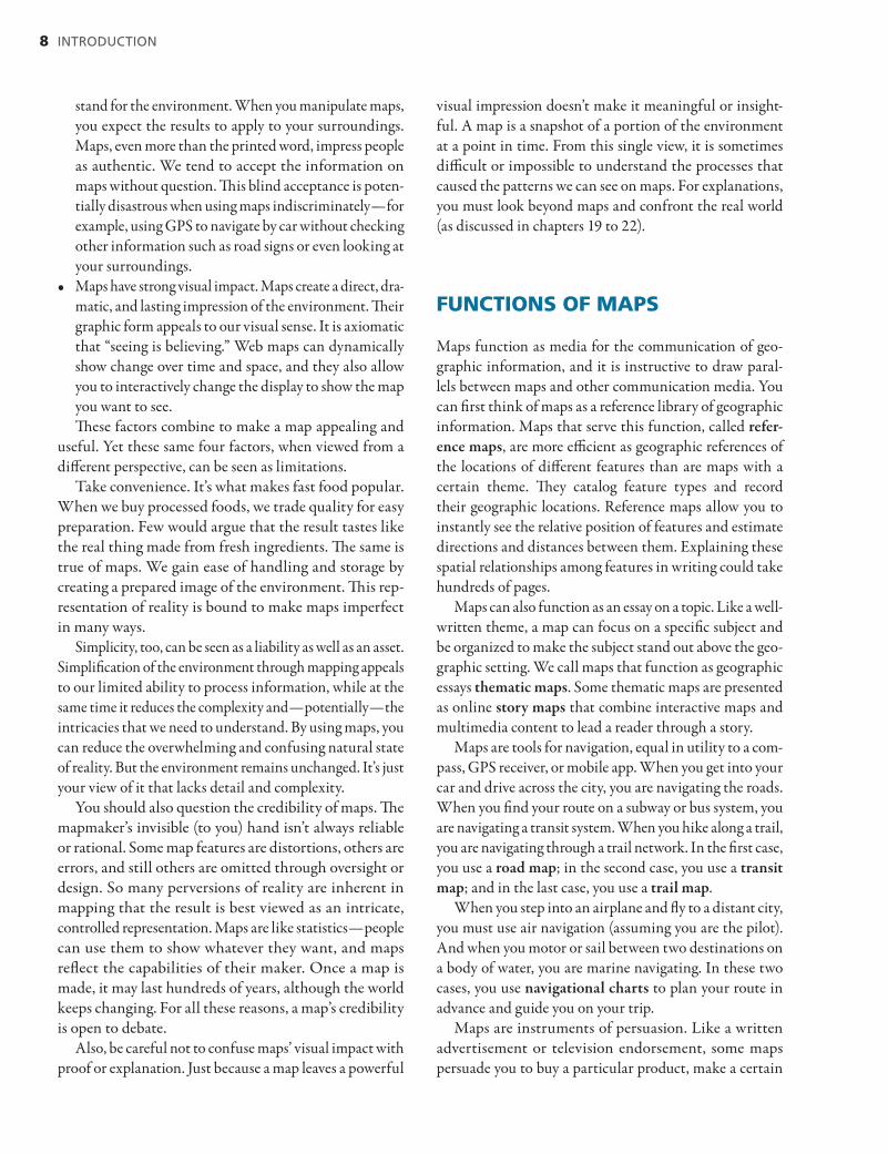
A topographic map, such as the segment in figure I.7A, is not only a valuable reference map but also one of the most important land navigation tools. Hikers, off-road vehicle enthusiasts, and land management professionals use topographic maps to find their way across the land. The topographic map shows ground features such as roads, trails, lakes, and streams that are both landmarks and obstacles. Contours on the maps are equally important. These con-tour lines connect points of equal elevation (we describe contours in chapter 9), allowing you to determine elevation changes and estimate the slopes that you’ll encounter along a route (as you’ll learn in chapter 12). This information will help you estimate the time and physical effort it will take to complete your trip. In addition, topographic maps are drawn on map projections that allow you to measure distances and directions between locations along your route (you’ll learn how to make these measurements in chapters 12 and 13).
Nautical charts, such as the southeastern corner of the San Juan Islands, Washington, chart in figure I.7B, are maps that are created specifically for water navigation. Recreational and commercial boat navigators use the detailed shoreline, navigation hazard, and water depth information on the chart to plan the “tracks” that they will follow between ports or anchorages. As you will see in chapter 14, each chart is made using a special map projection that allows you to quickly and easily measure the distance and direction of each track. Another type of nautical chart, found in a Current Atlas (see chapter 14 for an example), gives you information about the currents you must deal with on a particular day and hour. This information is of critical importance in planning your time of departure and estimating the time of arrival at your destination.
Aeronautical charts are maps designed for the air navi-gator. Figure I.7C is part of an aeronautical chart that covers the state of Washington, with detailed information for the Tri-Cities Airport. Air navigation involves planning and following safe routes between airfields, and the chart is filled with information that is important to safe flying. In chapter 14, you’ll learn what these map symbols mean, and you will see how pilots use the information on the chart to find distances, directions, and travel times between destinations. Air navigation also involves maintaining a safe altitude above the ground, and you’ll see that aeronautical charts show the heights of towers and other obstructions to navigation, as well as contours and special ground eleva-tion symbols that help navigators quickly determine the minimum safe in-flight altitude.
Story and persuasive maps Maps have probably played a role in one or more of your life stories, but story maps are specifically created to tell the story of a place, event, issue, trend, or pat-tern in a geographic context. Online story maps com-bine animated and interactive maps with text, photos, video, and audio to tell the story in a moving, compel-ling, and unforgettable fashion. Story maps such as the Decisive Moments in the Battle of Gettysburg Esri Story Map in figure I.8 deepen our understanding of key historical events in US history. Going to the website listed in the figure caption, or scanning the QR (quick response) code in the lower-right corner, leads you to the home page, where you can begin the animation or
Figure I.7. (A) Topographic maps, (B) nautical charts,
and (C) aeronautical charts are important tools of land,
water, and air navigation, respectively. (A) Courtesy of
the US Geological Survey, (B) reproduced with permission of the
Canadian Hydrographic Service, and (C) courtesy of the US National
Aeronautical Charting Office.

12 INTRODUCTION
interactively select a map that shows a particular time or event during the bloody three-day battle that left 51,000 Union and Confederate soldiers dead, maimed, or miss-ing. The story of this historic battle is described through a sequence of events represented chronologically along a three-day timeline. Each point in the timeline rep-resents a noteworthy event during the battle. Decisive events for the Confederates are shown in red; blue des-ignates decisive events for the Union Army. Narratives to the left of the map further describe each event. You can also see a panorama of the events marked with red and blue numbers. These panoramas help you analyze the visibility during the events of the battle. To better understand what was visible to soldiers from different vantage points on the battlefield, you can also explore viewshed maps that show areas that are visible from a particular vantage point or points.
Maps have always played a role in decision-making, and mapmakers can deliberately try to persuade you to choose a particular product or support a certain position. Some of these persuasive maps distort or misrepresent information to such an extent that they become propaganda maps. Such propaganda is common, especially in advertising, political, and religious maps. Because all maps distort reality, what is
easier than to make this distortion serve a special purpose or agenda? Unless you know enough to question every map, how would you suspect anything is wrong? Now we look at several examples of persuasive maps that either are, or border on, propaganda.
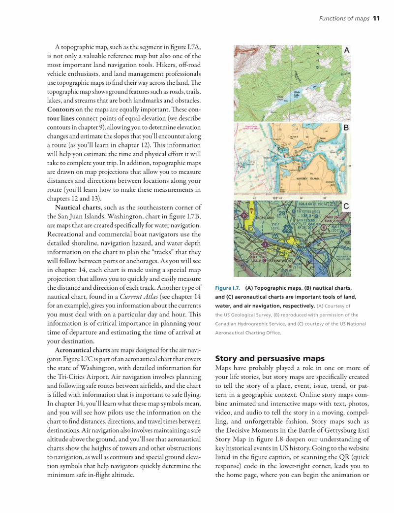
Nazi Germany was a source of blatant propaganda maps after the Third Reich created a Ministry of Propaganda in 1933, with the infamous Joseph Goebbels as its minister. Maps such as the one in figure I.9 were printed in news-papers to convince the German people that demilitarized post – World War I Germany was in a perilous state, ringed by threatening neighbors with huge (highly inflated num-bers on the map) armies, armor, and air forces, all aimed at the heart of a defenseless homeland. Maps like this were important to Nazi consolidation of public opinion, unifying the German people under Hitler through fear by showing such an impending threat to their homeland.
Another type of propaganda involves disproportionate-size symbols as a means of persuasion. Mapmakers must make symbols overly large in relation to the size of the feature on the ground, or the symbols won’t show up at reduced map scales. In propaganda mapping, mapmakers carry this normal aspect of cartographic symbolization to extremes.
Figure I.8. Still image from Decisive Moments in the Battle of Gettysburg Esri Story Map, at http://storymaps.esri.com
/stories/2013/gettysburg.
Functions of maps 13
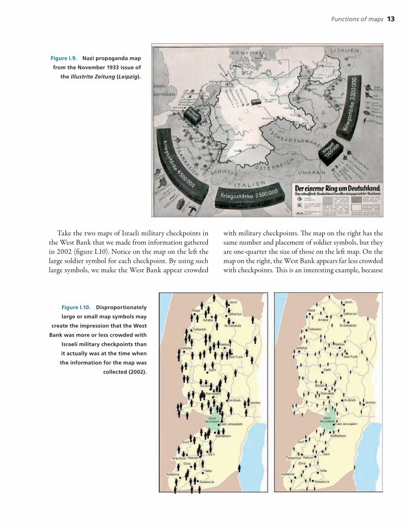
Take the two maps of Israeli military checkpoints in the West Bank that we made from information gathered in 2002 (figure I.10). Notice on the map on the left the large soldier symbol for each checkpoint. By using such large symbols, we make the West Bank appear crowded
with military checkpoints. The map on the right has the same number and placement of soldier symbols, but they are one-quarter the size of those on the left map. On the map on the right, the West Bank appears far less crowded with checkpoints. This is an interesting example, because
Figure I.9. Nazi propaganda map
from the November 1933 issue of
the Illustrite Zeitung (Leipzig).
Figure I.10. Disproportionately
large or small map symbols may
create the impression that the West
Bank was more or less crowded with
Israeli military checkpoints than
it actually was at the time when
the information for the map was
collected (2002).

14 INTRODUCTION
two maps that have the same information have opposite propagandizing effects — of increasing or decreasing the sense of safety for Israelis or intimidating Palestinians to a lesser or greater degree.
Presenting a misleading number of features on a map is another tool of persuasion that leans toward propaganda. Nineteenth-century railroad maps such as figure I.11 are classic examples. The map scale is selectively enlarged along the artificially straight main line from Sault Saint Marie, Michigan, to Duluth, Minnesota. The map shows several dozen stops along the main and feeder lines, some of which are towns. By mapping every stop, the railroad company is trying to persuade investors, settlers, and riders to choose it over a competing railroad. The following commentary from the Inland Printer shows how far this practice of planned map distortion went:
“This won’t do,” said the General Passenger Agent, in annoyed tones, to the mapmaker. “I want Chicago moved down here half an inch, so as to come on our direct route to New York. Then take Buffalo and put it a little farther from the lake.
“You’ve got Detroit and New York on different latitudes, and the impression that that is correct won’t help our road.
“And, man, take those two lines that compete with us and make ’em twice as crooked as that. Why, you’ve got one of ’em almost straight.
“Yank Boston over a little to the west and put New York a little to the west, so as to show passengers that our Buffalo division is the shortest route to Boston.
“When you’ve done all these things I’ve said, you may print 10,000 copies — but say, how long have you been in the railroad business, anyway?” (New York Herald 1895)
Map simplification can also be used for persuasive pur-poses. Figure I.12 shows two maps of illegal West Bank settlements in the mid-1980s. Both maps are redrawn from illustrations in the same weekly newsmagazine. The map on the left that shows Israel and the vicinity depicts 16 settlements, whereas the West Bank and vicinity map on the right shows 30 settlements. Which is correct? The truth, revealed deep in the magazine’s text, is that there were 45 illegal Israeli settlements in the West Bank region when these maps were made. The legend, at the least, should pro-vide this information. The makers of these maps, whether intentionally or not, present a picture that favors the Israeli cause by simplifying features even more when mapping a
Figure I.11. In this portion of the 19th-century Duluth South Shore & Atlantic railroad map, the area along Lake Superior is
deliberately enlarged to show all stops along the line.

Functions of maps 15
larger geographic area at a smaller map scale (a map design practice discussed in chapter 6). You should never overlook the possibility of such political bias in mapping.
Whether you realize it or not, mapmakers are constantly molding your attitude. Of course, they aren’t the only people guilty of persuasion and propaganda. But the effect of map propaganda is especially insidious because so many people believe that maps are neutral and unbiased. The consequences are sometimes dramatic: a year’s vacation is ruined, or a retirement nest egg is spent, on a land parcel in the middle of a swamp.
Maps as art Think about how you would describe the look of the Monterey Bay and Canyon perspective map in figure I.13. Does it have a certain beauty that makes it a work of art as well as a factual display of land elevations, ocean depths, and landform features such as moun-tains and underwater canyons? You can think of maps as having several characteristics and functions of art. To begin with, art, at its most basic, is a form of com-munication, and maps are an important form of visual communication, with the map as a graphic representa-tion of the environment. Mapmaking is closely tied to a subset of visual communication called graphic design. Maps are created using graphic design guidelines for the selection of colors, point symbols, line work, typogra-phy, page layout, and other components of the map. For example, the progression of colors on the Monterey Bay
map, from ocean depths to mountaintops, is based on accepted color design guidelines. We explain many of these graphic design guidelines for maps in chapters 6 through 9, knowing that you may be involved in cre-ating your own maps as well as using existing maps in your work and recreation.
Figure I.12. The need for map simplification can easily be
used to create a map that borders on propaganda. Here,
West Bank settlements on maps of different scales are
shown with differing numbers of dots. (These examples
were redrawn from a weekly newsmagazine from the
mid-1980s).
Figure I.13. Monterey Bay and
Canyon, California, perspective
map made in 2012 to support the
National Oceanic and Atmospheric
Administration’s tsunami program.
Courtesy of the US National Geophysical
Data Center.
16 INTRODUCTION
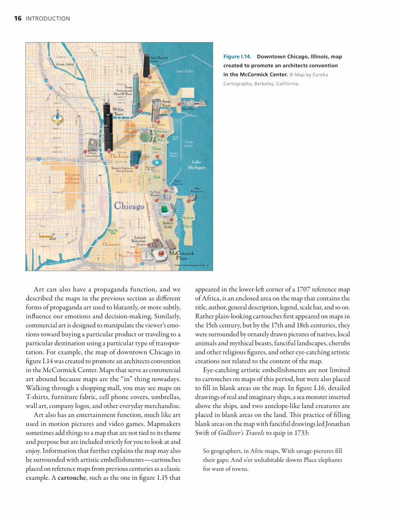
Art can also have a propaganda function, and we described the maps in the previous section as different forms of propaganda art used to blatantly, or more subtly, influence our emotions and decision-making. Similarly, commercial art is designed to manipulate the viewer’s emo-tions toward buying a particular product or traveling to a particular destination using a particular type of transpor-tation. For example, the map of downtown Chicago in figure I.14 was created to promote an architects convention in the McCormick Center. Maps that serve as commercial art abound because maps are the “in” thing nowadays. Walking through a shopping mall, you may see maps on T-shirts, furniture fabric, cell phone covers, umbrellas, wall art, company logos, and other everyday merchandise.
Art also has an entertainment function, much like art used in motion pictures and video games. Mapmakers sometimes add things to a map that are not tied to its theme and purpose but are included strictly for you to look at and enjoy. Information that further explains the map may also be surrounded with artistic embellishments — cartouches placed on reference maps from previous centuries as a classic example. A cartouche, such as the one in figure 1.15 that
appeared in the lower-left corner of a 1707 reference map of Africa, is an enclosed area on the map that contains the title, author, general description, legend, scale bar, and so on. Rather plain-looking cartouches first appeared on maps in the 15th century, but by the 17th and 18th centuries, they were surrounded by ornately drawn pictures of natives, local animals and mythical beasts, fanciful landscapes, cherubs and other religious figures, and other eye-catching artistic creations not related to the content of the map.
Eye-catching artistic embellishments are not limited to cartouches on maps of this period, but were also placed to fill in blank areas on the map. In figure I.16, detailed drawings of real and imaginary ships, a sea monster inserted above the ships, and two antelope-like land creatures are placed in blank areas on the land. This practice of filling blank areas on the map with fanciful drawings led Jonathan Swift of Gulliver’s Travels to quip in 1733:
So geographers, in Afric-maps, With savage-pictures fill their gaps; And o’er unhabitable downs Place elephants for want of towns.
Figure I.14. Downtown Chicago, Illinois, map
created to promote an architects convention
in the McCormick Center. © Map by Eureka
Cartography, Berkeley, California.

Functions of maps 17
Figure I.15. Ornately embellished cartouche from the 1707 reference map of Africa by J. B. Homanno.
Figure I.16. Artistic embellishments of real and fanciful ships, a sea monster in the ocean, and
antelope-like land creatures are drawn on this antique map of the California coastline and Coast Range.
18 INTRODUCTION
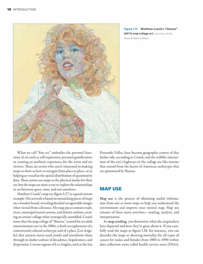
What we call “fine art” embodies the personal func-tions of art such as self-expression, personal gratification, or creating an aesthetic experience for the artist and art viewers. There are artists who aren’t interested in making maps to show us how to navigate from place to place, or in helping us visualize the spatial distribution of quantitative data. These artists use maps as the physical media for their art, but the maps are more a way to explore the relationships in art between space, time, and our emotions.
Matthew Cusick’s map art (figure I.17) is a good current example. His artwork is based on mosaicking pieces of maps on a wooden board, revealing detailed recognizable images when viewed from a distance. His map pieces contain roads, rivers, municipal transit systems, and district outlines, creat-ing an artistic collage when strategically assembled. Cusick notes that the map collage of “Shauna,” named for an adult entertainment star in the 1980s, is both an exploration of a controversial cultural archetype and of a place (Los Ange-les) that attracts starry-eyed youths and transforms them through its darker culture of decadence, hopelessness, and desperation. Certain regions of Los Angeles, such as the San
Fernando Valley, have become geographic centers of this darker side, according to Cusick, and the weblike intersec-tion of the city’s highways in the collage are like arteries that extend from the hearts of American archetypes that are epitomized by Shauna.
MAP USE
Map use is the process of obtaining useful informa-tion from one or more maps to help you understand the environment and improve your mental map. Map use consists of three main activities — reading, analysis, and interpretation.
In map reading, you determine what the mapmakers have depicted and how they’ve gone about it. If you care-fully read the maps in figure I.18, for instance, you can describe the maps as showing mortality for all types of cancer for males and females from 1980 to 1990 within data collection units called health service areas (HSAs).
Figure I.17. Matthew Cusick’s “Shauna”
(2011) map collage art. Courtesy of the
Pavel Zoubok Gallery.

Map use 19
Reading the main map legends, you learn that the mortal-ity rate is the number of deaths per 100,000 people, and that mortality rates are generalized into seven categories shown by a two-color sequence, with lighter to darker tones for each color. A dark-blue-green through dark-brown color progression represents low to high mortality on both maps, but the range for each category differs on the two maps. You must discover this range to understand that males have higher overall deaths from cancer. There is no explanation of how the category limits were selected, but the maps appear to have about the same number of health service areas in each category. Finally, the smaller legends tell you that areas with sparse mortality data are shown with a diagonal line pattern, and you can see a few patterned areas on both maps.
Part 1 of this book examines these and many other facets of map reading. You will become familiar with map scale, map projections and coordinate systems, land partitioning methods, different ways of portraying landforms, maps that show qualitative and quantitative information, and ways of expressing map accuracy. When you have a firm grasp
of these map reading principles, you are ready to make your own maps following the basic map design guidelines presented in chapter 6.
Learning to read the information in maps is only the first step. Your curiosity or work may lead you to go fur-ther and analyze the information in one or more maps. Part 2 of this book is devoted to map analysis. In this stage of map use, you make measurements and look for spatial patterns.
You have seen that topographic maps and navigational charts are tools for the measurement of distances, direc-tions, and surface areas. Thematic maps are tools used to understand spatial patterns. Analysis of the spatial patterns on the maps in figure I.18 is particularly thought provoking. Although it’s comforting to believe that cancer is unpre-dictable, analysis of these maps shows that this belief is not true. If you focus on the patterns on these maps, you find that cancer mortality rates are far from random across the country. Regional clustering of high and low rates occurs for both males and females. For example, you see a cluster of high mortality in Kentucky and western West Virginia
Figure I.18. White male and female
1980 – 1990 cancer mortality rates in the
United States by health service area, adapted
from maps of the same title in the Atlas of
United States Mortality. Courtesy of the National
Center for Health Statistics.

20 INTRODUCTION
(the brown counties to the right of the center) and low mortality in Utah and southeastern Idaho (the blue-green counties toward the upper left). It’s unlikely that this high and low clustering of deaths occurred by chance.
If you next focus on the spatial correspondence of mor-tality rates in the two maps, you find that eastern Kentucky and western West Virginia appear to have the highest cancer mortality for both men and women. The upper Midwest and Northeast, along with Northern California (the brown counties along the western coast), have the next highest overall male and female mortality. Some areas have high mortality rates for one sex but not the other. For instance, the Mississippi Delta region along the south-central coast has high mortality rates for males but not females.
You may see clusters of high and low mortality on the two maps, but another map reader may not see things the same way. Quantitative measures of spatial patterns on a map and spatial association among patterns on two or more maps add rigor and repeatability to your map analysis, and we have devoted two chapters (chapters 17 and 18) to these important aspects of map analysis.
After analyzing the maps in figure I.18 and finding spa-tial patterns of high and low cancer mortality, your curiosity may now be aroused still further. You may wonder how to explain the patterns and spatial correspondences between the two maps. Finding such explanations takes you into the realm of map interpretation, covered in part 3 of this book. To understand why things are related spatially, you must search beyond the maps. To do so, you may draw on your personal knowledge, fieldwork, written documents, interviews with experts, or other maps and images.
In your search, you’ll find that cancer deaths are asso-ciated with many factors, including industrialized work environments, mining activities, chemical plants, urban areas, ethnic backgrounds, and personal habits of eating, drinking, and smoking. You’ll find that people die from cancer because of contaminants in their air, water, food, clothing, and building materials. Some local concentrations of high or low cancer mortality, however, don’t seem to fit this pattern, suggesting that there must be other causes or that people have migrated in or out of the area.
Because maps reflect a variety of aspects of environ-mental knowledge, map use is intertwined with many disciplines. It is impossible to appreciate them in isola-tion. The more fields you study, the better you will be at using maps. Map interpretation grows naturally out of an appreciation of a variety of subjects. The reverse is also true. An appreciation of maps leads to a better understanding
of the world around you — for the subject of maps, after all, is the world itself.
This brings us to a final, important point. As you gain an understanding of map use, be careful not to confuse the mapped world with the real world. Remember, the reason you’re using maps is to understand the physical and human environment. The ultimate aim of map use is to stimulate you to interact with your environment and to experience more while you do.
SELECTED READINGS
Ames, G. P. 2003. “Forgetting St. Louis and Other Map Mischief.” Railroad History 188 (Spring – Summer): 28 – 41.
Arnheim, R. 1969. Visual Thinking. Berkeley, CA: University of California Press.
Balchin, W. G. V. 1976. “Graphicacy.” The American Cartographer 3 (1) (April): 33 – 38.
Castner, H. W. 1990. Seeking New Horizons: A Perceptual Approach to Geographic Education. Montreal: McGill-Queen’s University Press.
Dent, B. D. 1998. Cartography: Thematic Map Design, 5th ed. New York: McGraw-Hill.
Downs, R. M., and D. Stea 1977. Maps in Mind: Reflections on Cognitive Mapping. New York: Harper & Row.
Gershmehl, P. J., and S. K. Andrews. 1986. “Teaching the Language of Maps.” Journal of Geography 85 (6) (November – December): 267 – 70.
Head, C. G. 1984. “The Map as Natural Language: A Paradigm for Understanding.” Cartographica 21:1 – 32.
Keates, J. S. 1996. Understanding Maps, 2nd ed. Essex: Addison Wesley Longman.
Kitchin, R. M. 1994. “Cognitive Maps: What They Are and Why Study Them?” Journal of Environmental Psychology 14:1 – 19.
Lloyd, R. 1997. Spatial Cognition: Geographical Environments. Boston: Kluwer Academic.
Lynam, E. 1953. The Mapmaker’s Art. London: Patchwork Press.
MacEachren, A. M. 1995. How Maps Work: Representation, Visualization and Design. New York: Guilford.
Monmonier, M. 1991. How to Lie with Maps. Chicago: University of Chicago Press.
Monmonier, M., and G. A. Schnell. 1988. Map Appreciation. Englewood Cliffs, NJ: Prentice Hall.

Selected readings 21
New York Herald. 1895. “Some Railway Map-Making.” In Inland Printer 15:500.
Pickle, L. W. 1996. Atlas of United States Mortality. Hyattsville, Md.: US Department of Health and Human Services.
Robinson, A. H., and B. Bartz-Petchenik. 1976. The Nature of Maps: Essays toward Understanding Maps and Mapping. Chicago: University of Chicago Press.
Swift, Jonathan. 1733. On Poetry: A Rhapsody.Tobler, Waldo. 1979. “A Transformational View of
Cartography.” The American Cartographer 1 (2): 101 – 6. Tufte, E. R. 1997. Visual Explanations: Images and Quantities,
Evidence and Narrative. Cheshire, Conn.: Graphics Press.Wood, D. 2006. “Map Art.” Cartographic Perspectives
53:5 – 14.