introduction to graphical presentation andy wang cis 5930-03 computer systems performance analysis
TRANSCRIPT
Introduction toGraphical Presentation
Andy WangCIS 5930-03
Computer SystemsPerformance Analysis

2
The Art of Graphical Presentation
• Reference Works• Types of Variables• Guidelines for Good Graphics Charts• Common Mistakes in Graphics• Pictorial Games• Special-Purpose Charts
3
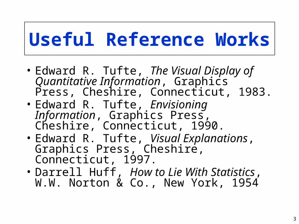
Useful Reference Works
• Edward R. Tufte, The Visual Display of Quantitative Information, Graphics Press, Cheshire, Connecticut, 1983.
• Edward R. Tufte, Envisioning Information, Graphics Press, Cheshire, Connecticut, 1990.
• Edward R. Tufte, Visual Explanations, Graphics Press, Cheshire, Connecticut, 1997.
• Darrell Huff, How to Lie With Statistics, W.W. Norton & Co., New York, 1954

4
Types of Variables
• Qualitative– Ordered (e.g., modem, Ethernet, satellite)– Unordered (e.g., CS, math, literature)
• Quantitative– Discrete (e.g., number of terminals)– Continuous (e.g., time)

5
Charting Basedon Variable Types
• Qualitative variables usually work best with bar charts or Kiviat graphs– If ordered, use bar charts to show order
• Quantitative variables work well in X-Y graphs– Use points if discrete, lines if continuous– Bar charts sometimes work well for
discrete

6
Guidelines for Good Graphics Charts
• Principles of graphical excellence• Principles of good graphics• Specific hints for specific situations• Aesthetics• Friendliness
7
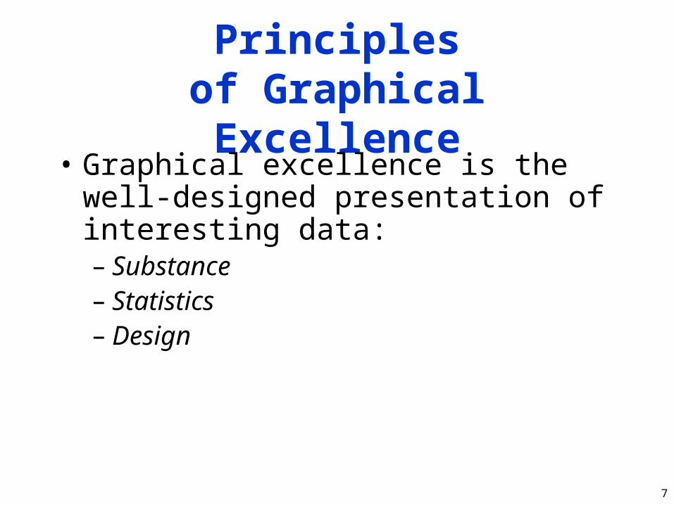
Principlesof Graphical Excellence
• Graphical excellence is the well-designed presentation of interesting data:– Substance– Statistics– Design

8
Graphical Excellence (2)
• Complex ideas get communicated with:– Clarity– Precision– Efficiency

9
Graphical Excellence (3)
• Viewer gets:– Greatest number of ideas– In the shortest time– With the least ink– In the smallest space

10
Graphical Excellence (4)
• Is nearly always multivariate• Requires telling truth about data

11
Principles of Good Graphics
• Above all else show the data• Maximize the data-ink ratio• Erase non-data ink• Erase redundant data ink• Revise and edit

12
Above All ElseShow the Data
y = 1E-05x + 1.3641
R2 = 0.0033
0
1
2
3
4
5
0 5000 10000 15000File size (bytes)
Time to fetch (seconds)
Linear model

13
Above All ElseShow the Data
y = 1E-05x + 1.3641
R2 = 0.0033
0
1
2
3
4
5
0 5000 10000 15000File size (bytes)
Time to fetch (seconds)
Linear model

14
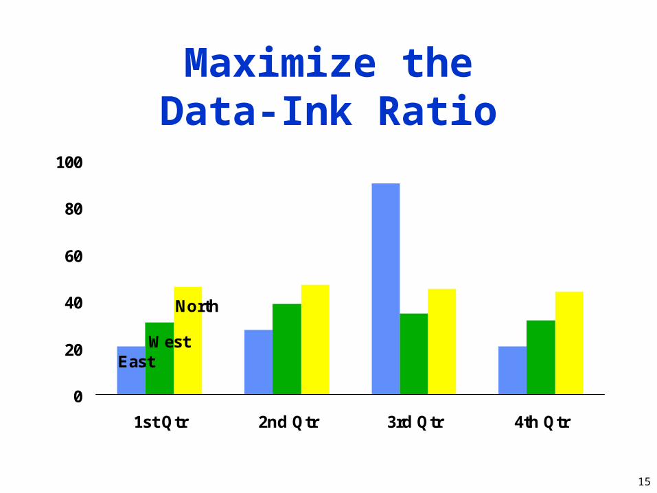
Maximize theData-Ink Ratio
1st Qtr
3rd Qtr
010203040506070
80
90
East
West
North
15
Maximize theData-Ink Ratio
0
20
40
60
80
100
1st Qtr 2nd Qtr 3rd Qtr 4th Qtr
East West
North
16
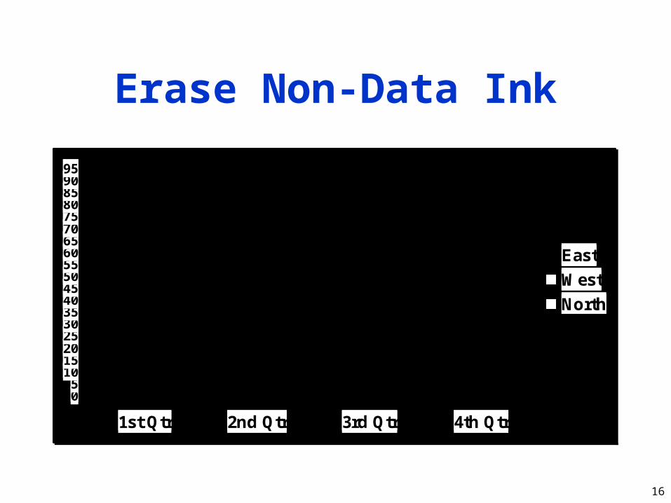
Erase Non-Data Ink
05
101520253035404550556065707580859095
1st Qtr 2nd Qtr 3rd Qtr 4th Qtr
East
West
North

17
Erase Non-Data Ink
0
20
40
60
80
1st Qtr 2nd Qtr 3rd Qtr 4th Qtr
Ea
st
We
st
No
rth
18
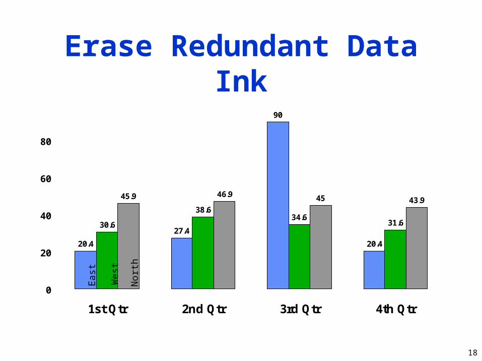
Erase Redundant Data Ink
20.4
27.4
90
20.4
38.634.6
31.6
46.9 45 43.9
30.6
45.9
0
20
40
60
80
1st Qtr 2nd Qtr 3rd Qtr 4th Qtr
Ea
st
We
st
No
rth
19
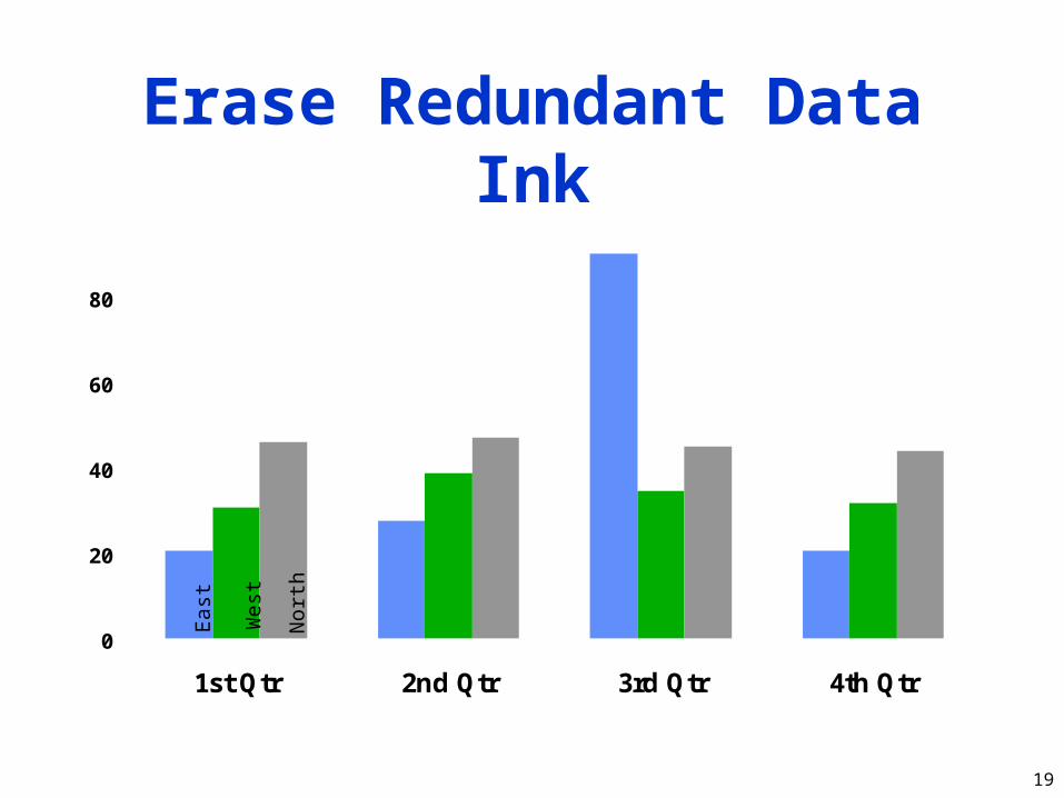
Erase Redundant Data Ink
0
20
40
60
80
1st Qtr 2nd Qtr 3rd Qtr 4th Qtr
Ea
st
We
st
No
rth

20
Revise and Edit
0102030405060708090
Qua
rter
ly S
ales
1st Qtr 2nd Qtr 3rd Qtr 4th Qtr
Default Microsoft Powerpoint Chart
EastWestNorth

21
Revise and Edit
Remove Decorative Effects
0102030405060708090
100
1st Qtr 2nd Qtr 3rd Qtr 4th Qtr
Qua
rter
ly S
ales
EastWestNorth

22
Revise and Edit
Remove Clutter
0102030405060708090
100
1st Qtr 2nd Qtr 3rd Qtr 4th Qtr
Qua
rter
ly S
ales
EastWestNorth
23
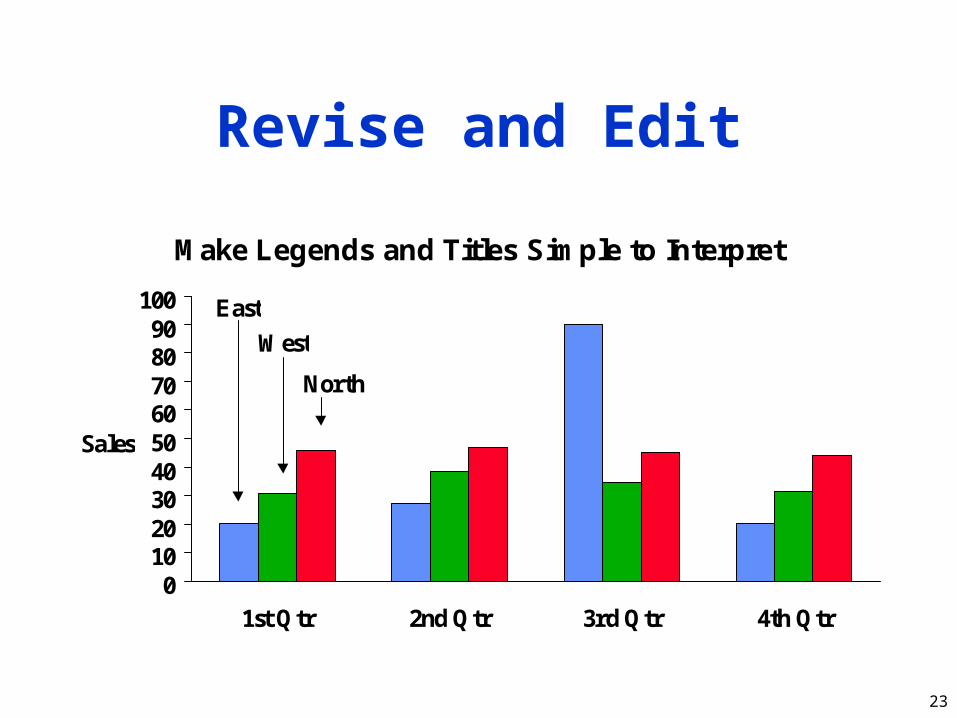
Revise and Edit
Make Legends and Titles Simple to Interpret
0102030405060708090
100
1st Qtr 2nd Qtr 3rd Qtr 4th Qtr
Sales
East
West
North

24
Revise and Edit
Eliminate Superfluous Ink
0102030405060708090
100
1st Qtr 2nd Qtr 3rd Qtr 4th Qtr
Sales
East
West
North
25
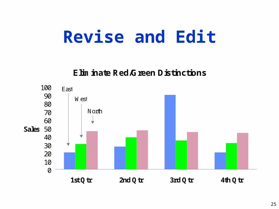
Revise and Edit
Eliminate Red/Green Distinctions
0102030405060708090
100
1st Qtr 2nd Qtr 3rd Qtr 4th Qtr
Sales
East
West
North
26
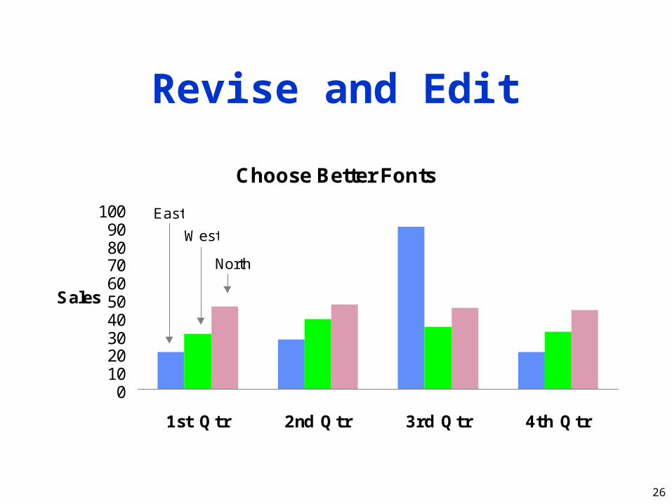
Revise and Edit
Choose Better Fonts
0102030405060708090
100
1st Qtr 2nd Qtr 3rd Qtr 4th Qtr
Sales
East
West
North

27
Specific Things to Do
• Give information the reader needs• Limit complexity and confusion• Have a point• Show statistics graphically• Don’t always use graphics• Discuss it in the text

28
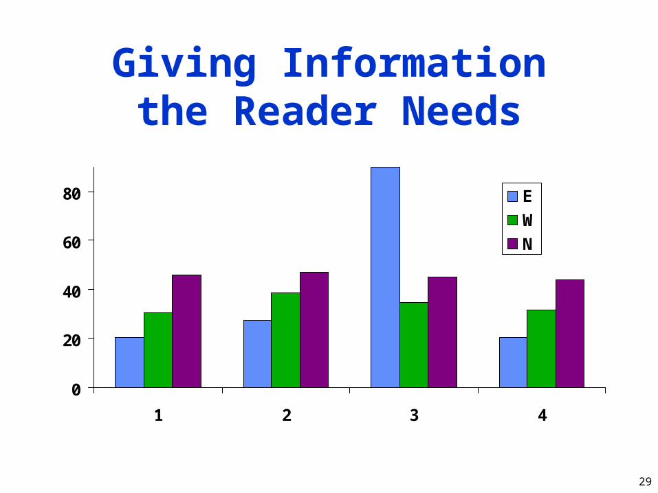
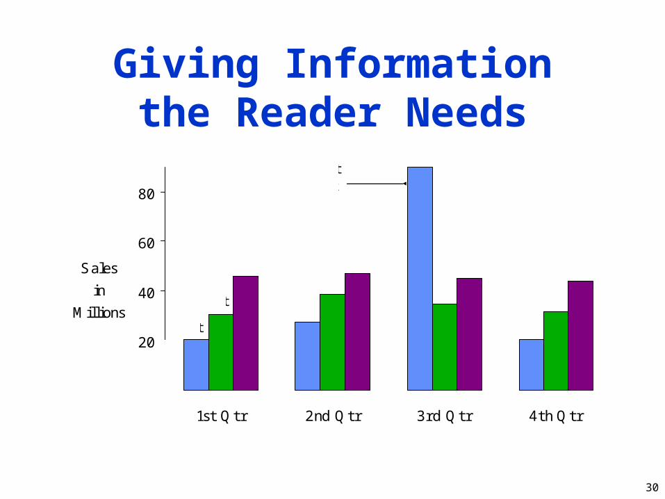
Give Informationthe Reader Needs
• Show informative axes– Use axes to indicate range
• Label things fully and intelligently• Highlight important points on the graph
29
Giving Informationthe Reader Needs
0
20
40
60
80
1 2 3 4
E
W
N
30
Giving Informationthe Reader Needs
0
20
40
60
80
1st Qtr 2nd Qtr 3rd Qtr 4th Qtr
Sales
in
Millions
MicrosoftContractSigned
East
North
West

31
Limit Complexityand Confusion
• Not too many curves• Single scale for all curves• No “extra” curves• No pointless decoration (“ducks”)

32
0
10
20
30
40
50
60
1st Qtr 2nd Qtr 3rd Qtr 4th Qtr
0
20
40
60
80
100
120 West
North
Northeast
Southwest
Mexico
Europe
Japan
East
South
International
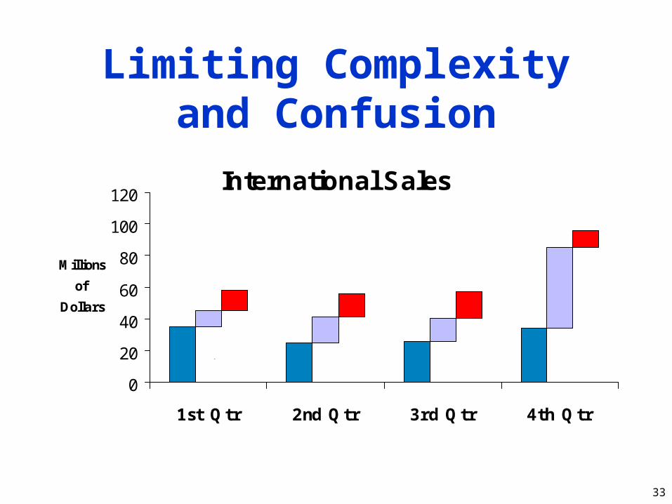
Limiting Complexityand Confusion
33
International Sales
0
20
40
60
80
100
120
1st Qtr 2nd Qtr 3rd Qtr 4th Qtr
Millions
of
Dollars
Japan
MexicoEurope
Limiting Complexityand Confusion
34
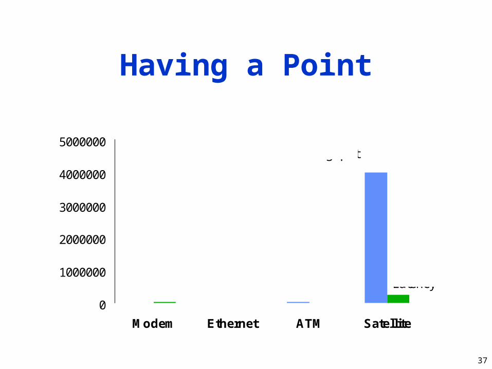
Have a Point
• Graphs should add information not otherwise available to reader
• Don’t plot data just because you collected it
• Know what you’re trying to show, and make sure the graph shows it
35
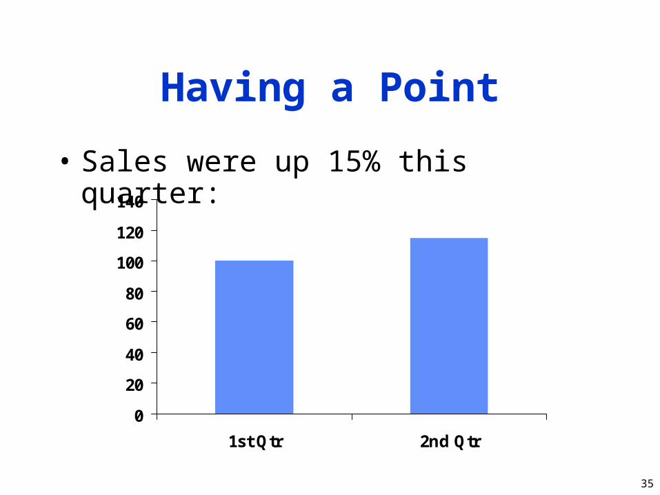
Having a Point
• Sales were up 15% this quarter:
0
20
40
60
80
100
120
140
1st Qtr 2nd Qtr
36
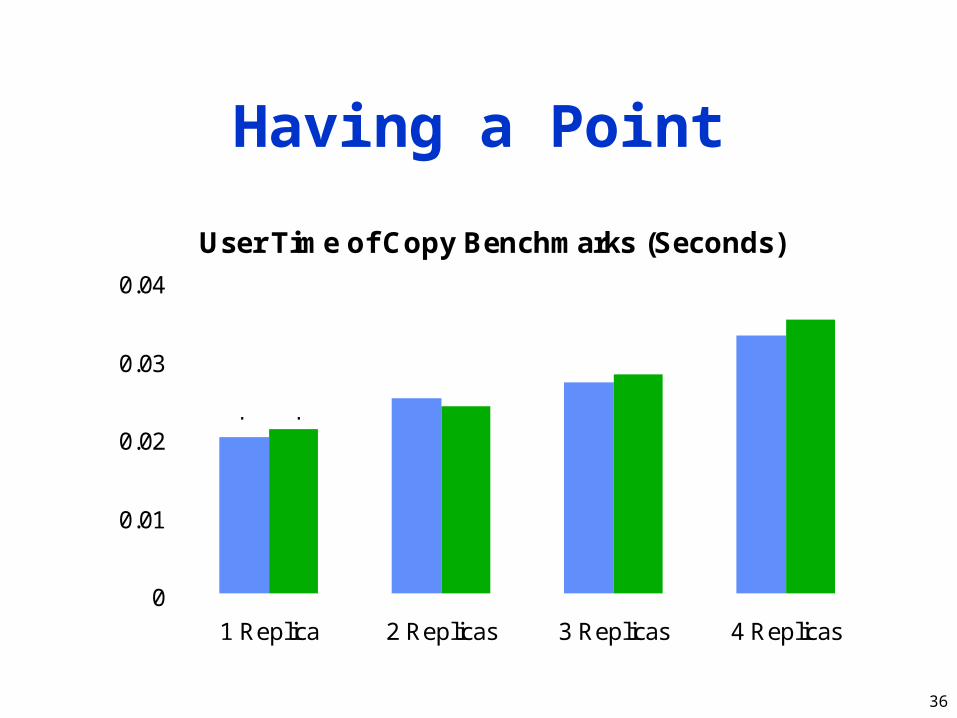
Having a Point
User Time of Copy Benchmarks (Seconds)
0
0.01
0.02
0.03
0.04
1 Replica 2 Replicas 3 Replicas 4 Replicas
cp rcp
37
Having a Point
0
1000000
2000000
3000000
4000000
5000000
Modem Ethernet ATM Satellite
Throughput
Latency

38
Having a Point
0.001
0.01
0.1
1
10
100
1000
0.01 0.1 1 10 100 1000
Throughput (Mbits/sec)
Latency(ms) Ethernet
Modem
ATM
Satellite

39
Show Statistics Graphically
• Put bars in a reasonable order– Geographical– Best to worst– Even alphabetic
• Make bar widths reflect interval widths– Hard to do with most graphing software
• Show confidence intervals on the graph– Examples will be shown later

40
Don’t AlwaysUse Graphics
• Tables are best for small sets of numbers– Tufte says 20 or fewer
• Also best for certain arrangements of data– E.g., 10 graphs of 3 points each
• Sometimes a simple sentence will do• Always ask whether the chart is the best
way to present the information– And whether it brings out your message

41
Text Would HaveBeen Better
Dem Rep Indep
Carter
Reagan
Anderson
Lib Mod Cons
LibDems
ModDems
ConsDems Lib Ind Mod Ind Cons Ind
42
Discuss It in the Text
• Figures should be self-explanatory– Many people scan papers, just look at
graphs– Good graphs build interest, “hook” readers
• But text should highlight and aid figures– Tell readers when to look at figures– Point out what figure is telling them– Expand on what figure has to say

43
Aesthetics
• Not everyone is an artist– But figures should be visually pleasing
• Elegance is found in– Simplicity of design– Complexity of data

44
Principles of Aesthetics
• Use appropriate format and design• Use words, numbers, drawings together• Reflect balance, proportion, relevant scale• Keep detail and complexity accessible• Have story about the data (narrative
quality)• Do professional job of drawing• Avoid decoration and chartjunk

45
Use AppropriateFormat and Design
• Don’t automatically draw a graph– Mentioned before
• Choose graphical format carefully• Sometimes “text graphic” works best
– Use text placement to communicate numbers
– Very close to being a table

46
GNP: +3.8 IPG: +5.8 CPI: +7.7 Profits: +13.3
CEA: +4.7
DR: +4.5
NABE: +4.5
WEF: +4.5
CBO: +4.4
CB: +4.2
IBM: +4.1
CE: +2.9
NABE: +6.2
IBM: +5.9
CB: +5.5
DR: +5.2
WEF: +4.8
IBM: +6.6
NABE: +6.5
CB: +6.2
WEF: +21
DR: +10.5
IBM: +10.4
CE: +6.5
WEF: 6.8
CB: 6.7
NABE: 6.7
IBM: 6.6
DR: 6.5
CBO: 6.3
CEA: 6.3
Unempl: 6.0
About a year ago, eight forecasters were asked for
their predictions on some key economic indicators.
Here’s how the forecasts stack up against the
probable 1978 results (shown in the black panel).
(New York Times,
Jan. 2, 1979)
Using Text as a Graphic

47
The Stem-and-Leaf Plot
• From Tukey, via Tufte, heights of volcanoes in feet:
0|987665621|977196302|999877665444222110098503|8766554120995514264|99988443319294333611075|976666665544222100977316|8986654410777610657|988554311006521080738|653322122937

48
Choosinga Graphical Format
• Many options, more being invented all the time– Examples will be given later– See Jain for some commonly useful ones– Tufte shows ways to get creative
• Choose a format that reflects your data– Or that helps you analyze it yourself
49
Use Words, Numbers, Drawings Together
• Put graphics near or in text that discusses them– Even if you have to murder your word
processor
• Integrate text into graphics• Tufte: “Data graphics are paragraphs
about data and should be treated as such”

50
Reflect Balance, Proportion, Relevant
Scale• Much of this boils down to “artistic sense”• Make sure things are big enough to read
– Tiny type is OK only for young people!
• Keep lines thin– But use heavier lines to indicate important
information
• Keep horizontal larger than vertical– About 50% larger works well

51
Poor Balanceand Proportion
• Sales in the North and West districts were steady through all quarters
• East sales varied widely, significantly outperforming the other districts in the third quarter
0
10
20
30
40
50
60
70
80
90
100
1st Qtr 2nd Qtr 3rd Qtr 4th Qtr

52
Better Proportion
• Sales in North and West districts were steady through all quarters
• East sales varied widely, significantly outperforming other districts in third quarter
0
50
100
Q1 Q2 Q3 Q4
53
Keep Detail and Complexity Accessible
• Make your graphics friendly:– Avoid abbreviations and encodings– Run words left-to-right– Explain data with little messages– Label graphic, don’t use elaborate
shadings and a complex legend– Avoid red/green distinctions– Use clean, serif fonts in mixed case

54
An Unfriendly Graph
050
100150200250300350400450
Time
CP
FIND
FINDGREP
GREP
LS
MAB
RCP
RM

55
A Friendly Version
0
100
200
300
400
1 2 3 4 5 6 7 8
Number of Replicas
Time in Seconds
Copy
Compile
Remove
Note almost no growth incompile/remove times

56
Even Friendlier
0
100
200
300
400
Copy Compile Remove
Benchmark and Number of Replicas
Time in Seconds
Note slower growth incompile and remove times
1 Replica
8 Replicas(note departurefrom linearity)

57
Have a Story About the Data (Narrative
Quality)• May be difficult in technical papers• But think about why you are drawing graph• Example:
– Performance is controlled by network speed– But it tops out at high end– And that’s because we hit a CPU bottleneck

58
Showing a StoryAbout the Data
0
20
40
60
0 2 4 6 8 10 12
Network Bandwidth (Mbps)
Transactionsper
SecondCPU bottleneck
reached

59
Do a Professional Jobof Drawing
• This is easy with modern tools– But take the time to do it right
• Align things carefully• Check final version in format you will use
– I.e., print Postscript one last time before submission
– Or look at your slides on projection screen• Preferably in presentation room• Color balance varies by projector

60
Avoid Decorationand Chartjunk
• Powerpoint, etc. make chartjunk easy• Avoid clip art, automatic backgrounds, etc.• Remember: data is the story
– Statistics aren’t boring– Uninterested readers aren’t drawn by
cartoons– Interested readers are distracted
• Does removing it change message?– If not, leave it out

61
Examples of Chartjunk
0
10
20
30
40
50
60
70
80
90
1st Qtr 2nd Qtr 3rd Qtr 4th Qtr
Gridlines!Vibration
Pointless
Fake 3-D Effects
Filled “Floor” Clip Art
In or out?
Filled
“Walls”
Borders and
Fills Galore
Unintentional
Heavy or Double Lines
Filled Labels
Serif Font with
Thin & Thick Lines

62
Common Mistakesin Graphics
• Excess information• Multiple scales• Using symbols in place of text• Poor scales• Using lines incorrectly
63
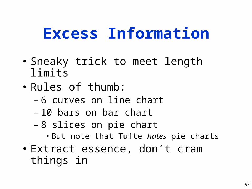
Excess Information
• Sneaky trick to meet length limits• Rules of thumb:
– 6 curves on line chart– 10 bars on bar chart– 8 slices on pie chart
• But note that Tufte hates pie charts
• Extract essence, don’t cram things in
64
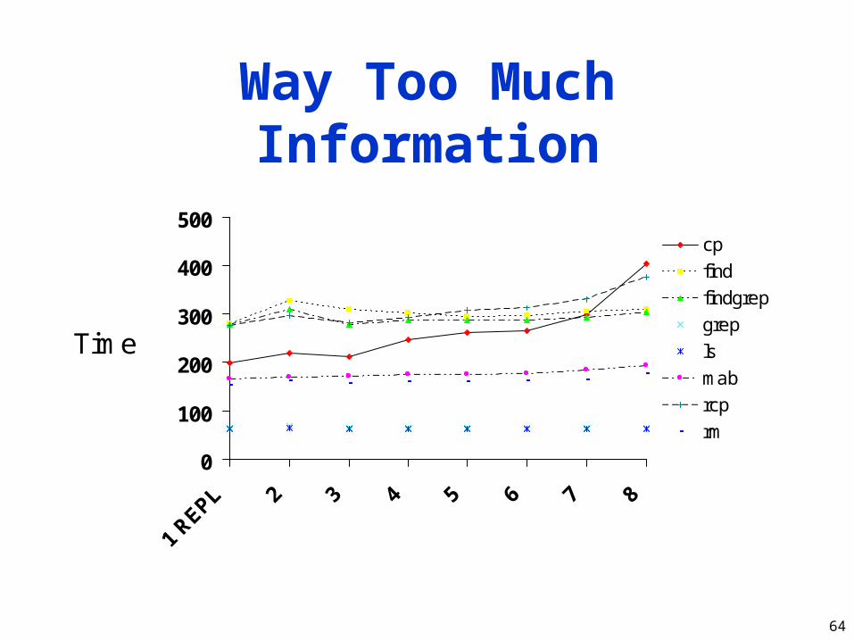
Way Too Much Information
0
100
200
300
400
500
Time
cp
find
findgrep
grep
ls
mab
rcp
rm

65
What’s ImportantAbout That Chart?
• Times for cp and rcp rise with number of replicas
• Most other benchmarks are near constant• Exactly constant for rm

66
The Right Amountof Information
0
100
200
300
400
500
0 1 2 3 4 5 6 7 8 9Replicas
Timecp
mab
rm
67
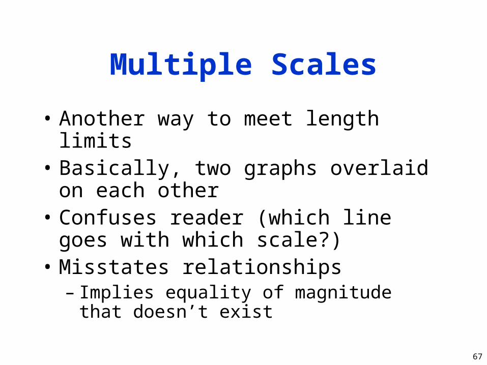
Multiple Scales
• Another way to meet length limits• Basically, two graphs overlaid on each
other• Confuses reader (which line goes with
which scale?)• Misstates relationships
– Implies equality of magnitude that doesn’t exist
68
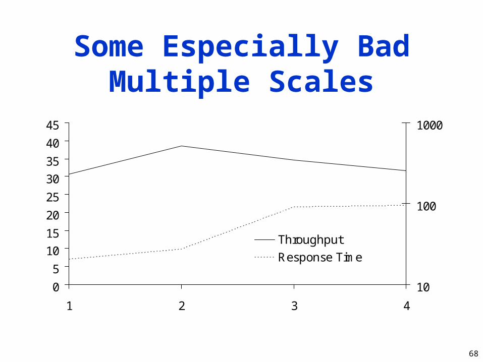
Some Especially Bad Multiple Scales
0
5
10
15
20
25
30
35
40
45
1 2 3 4
10
100
1000
Throughput
Response Time

69
Using Symbolsin Place of Text
• Graphics should be self-explanatory– Remember that the graphs often draw the
reader in
• So use explanatory text, not symbols• This means no Greek letters!
– Unless your conference is in Athens...
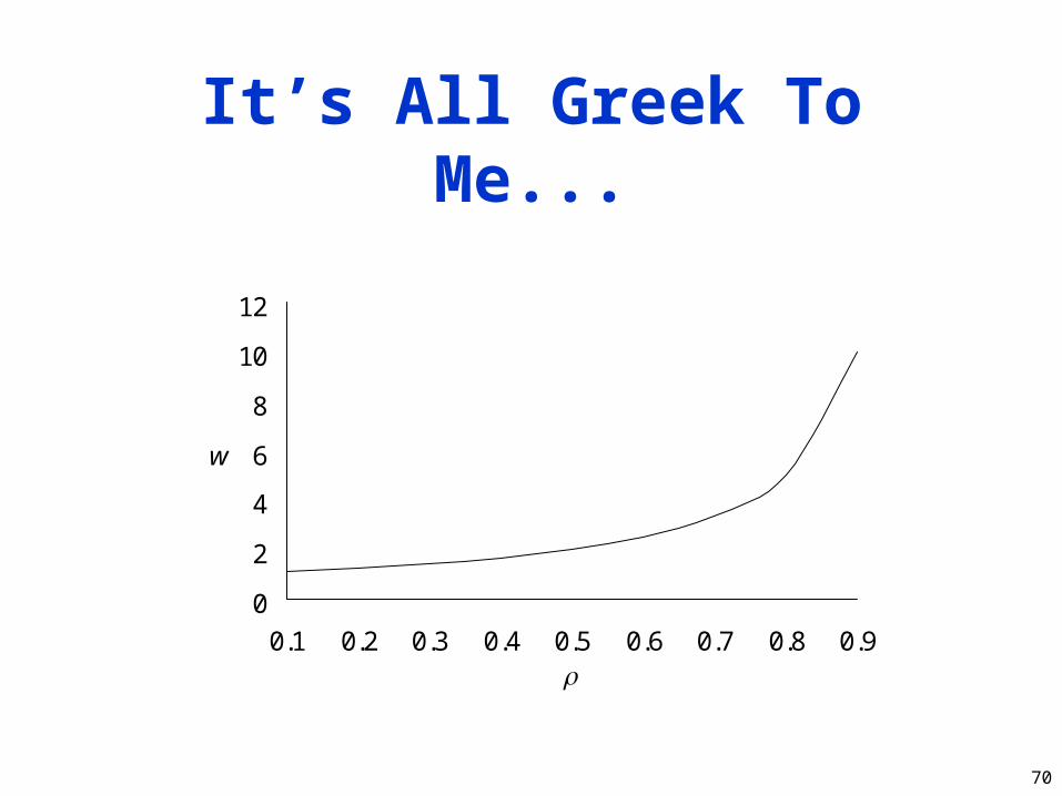
70
It’s All Greek To Me...
0
2
4
6
8
10
12
0.1 0.2 0.3 0.4 0.5 0.6 0.7 0.8 0.9
r
w

71
Explanation is Easy
Waiting Time asa Function of Offered Load
0
2
4
6
8
10
12
0.1 0.2 0.3 0.4 0.5 0.6 0.7 0.8 0.9
Offered Load
WaitingTime
72
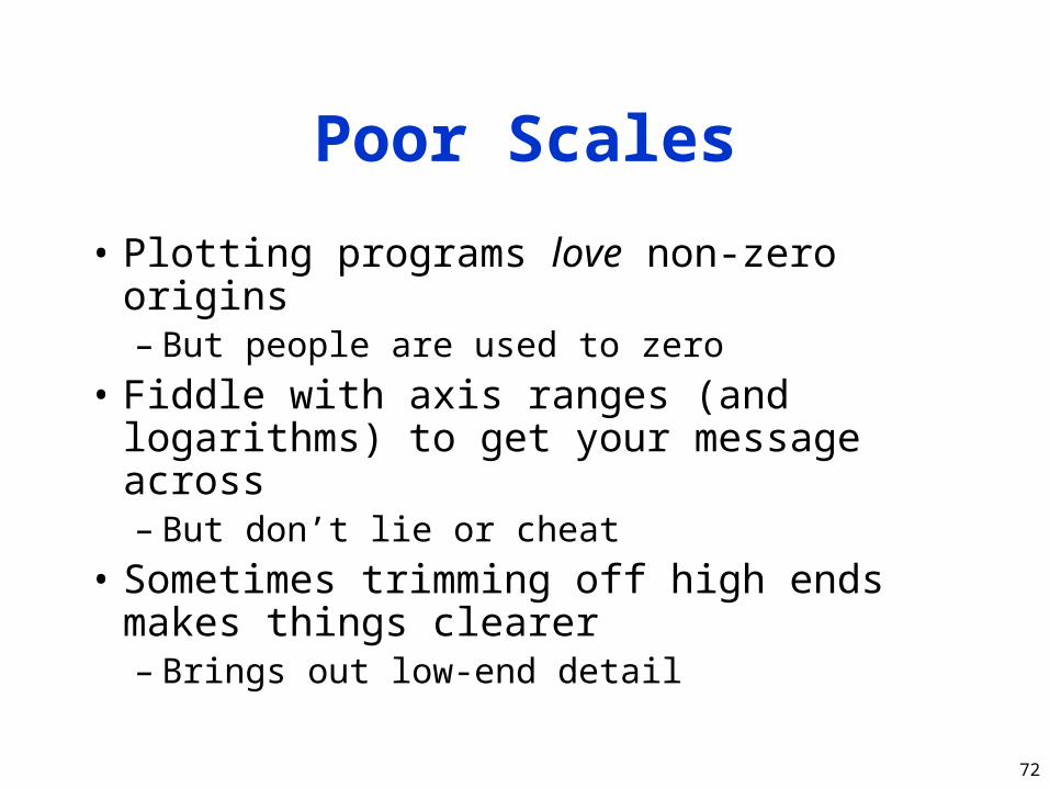
Poor Scales
• Plotting programs love non-zero origins– But people are used to zero
• Fiddle with axis ranges (and logarithms) to get your message across– But don’t lie or cheat
• Sometimes trimming off high ends makes things clearer– Brings out low-end detail
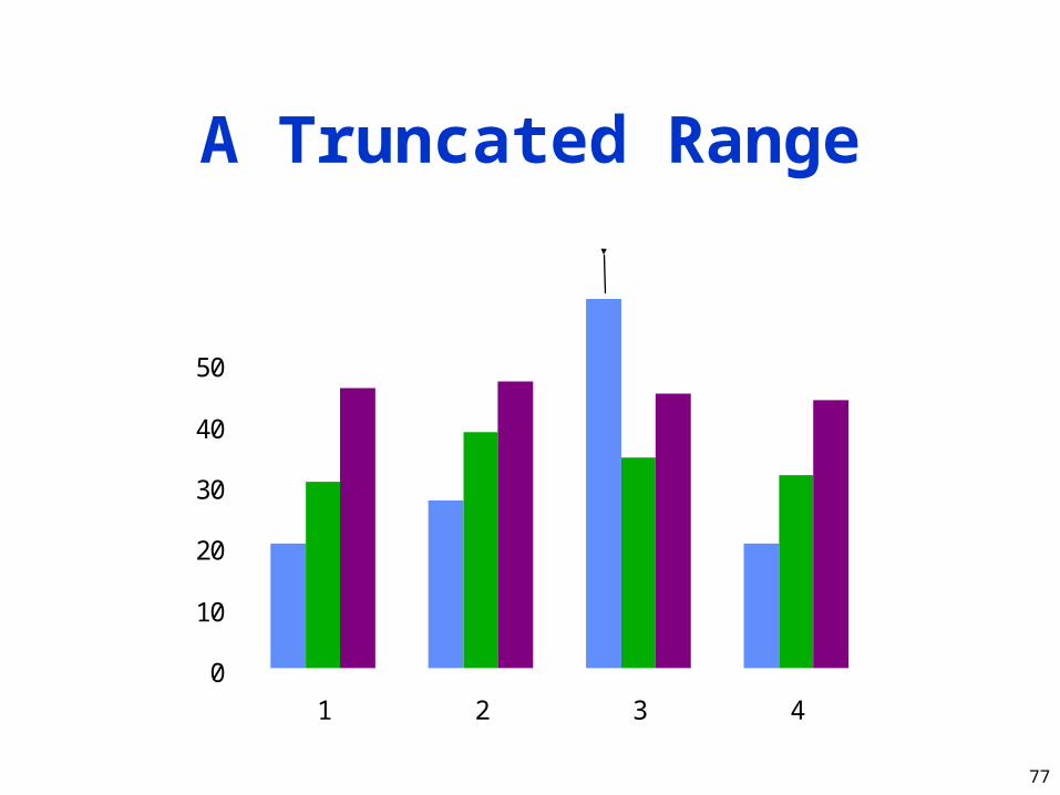
75
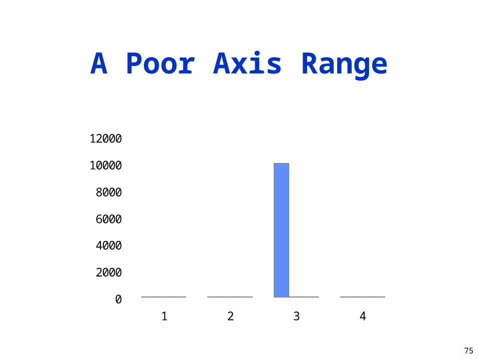
A Poor Axis Range
0
2000
4000
6000
8000
10000
12000
1 2 3 4
76
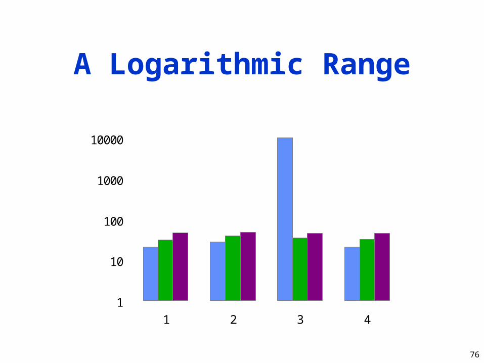
A Logarithmic Range
1
10
100
1000
10000
1 2 3 4
77
A Truncated Range
0
10
20
30
40
50
60
1 2 3 4
10000
78
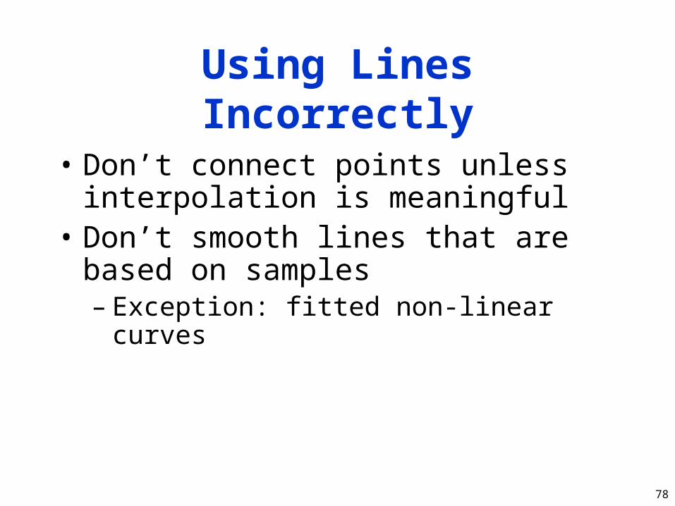
Using Lines Incorrectly
• Don’t connect points unless interpolation is meaningful
• Don’t smooth lines that are based on samples– Exception: fitted non-linear curves

79
Incorrect Line Usage
0
100
200
300
400
500
0 1 2 3 4 5 6 7 8 9Replicas
Timecp
mab
rm

80
Pictorial Games
• Non-zero origins and broken scales• Double-whammy graphs• Omitting confidence intervals• Scaling by height, not area• Poor histogram cell size

81
Non-Zero Originsand Broken Scales
• People expect (0,0) origins– Subconsciously
• So non-zero origins are great way to lie• More common than not in popular press• Also very common to cheat by omitting
part of scale– “Really, Your Honor, I included (0,0)”
82
Non-Zero Origins
20
21
22
23
24
25
26
27
1st Qtr 2nd Qtr 3rd Qtr 4th Qtr
Us
Them
0
20
40
60
80
100
1st Qtr 2nd Qtr 3rd Qtr 4th Qtr
Them
Us
83
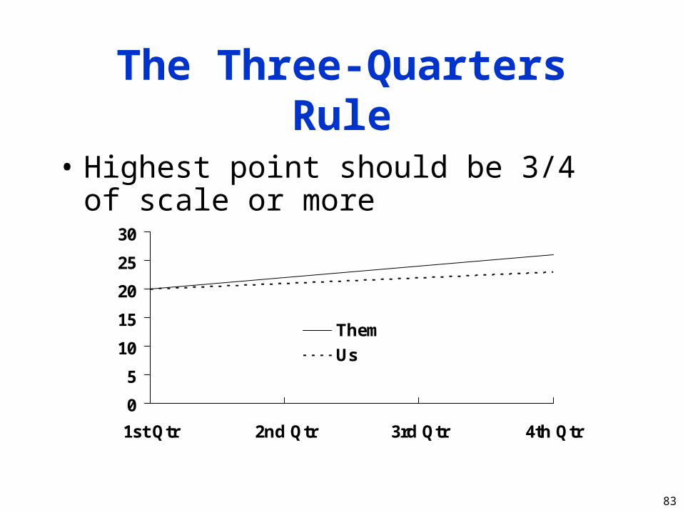
The Three-Quarters Rule
• Highest point should be 3/4 of scale or more
0
5
10
15
20
25
30
1st Qtr 2nd Qtr 3rd Qtr 4th Qtr
Them
Us

84
Double-Whammy Graphs
• Put two related measures on same graph– One is (almost) function of other
• Hits reader twice with same information– And thus overstates impact
0
20
40
60
1st Qtr 2nd Qtr 3rd Qtr 4th Qtr
Sales ($)
Units Shipped
85
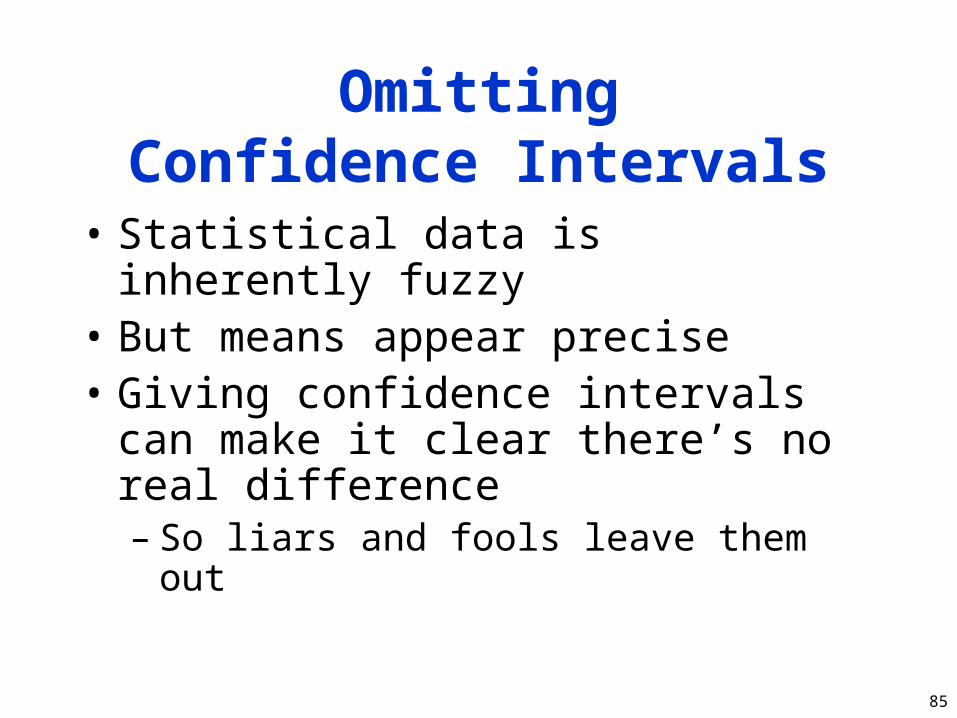
OmittingConfidence Intervals
• Statistical data is inherently fuzzy• But means appear precise• Giving confidence intervals can make it
clear there’s no real difference– So liars and fools leave them out
86
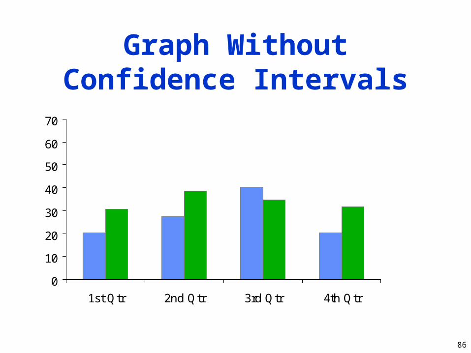
Graph WithoutConfidence Intervals
0
10
20
30
40
50
60
70
1st Qtr 2nd Qtr 3rd Qtr 4th Qtr
87
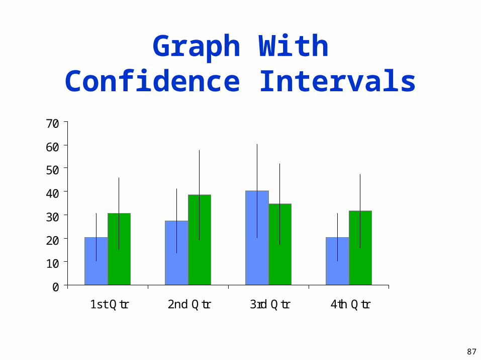
Graph WithConfidence Intervals
0
10
20
30
40
50
60
70
1st Qtr 2nd Qtr 3rd Qtr 4th Qtr

88
Scaling by HeightInstead of Area
• Clip art is popular with illustrators:
Women in the Workforce
1960 1980
89
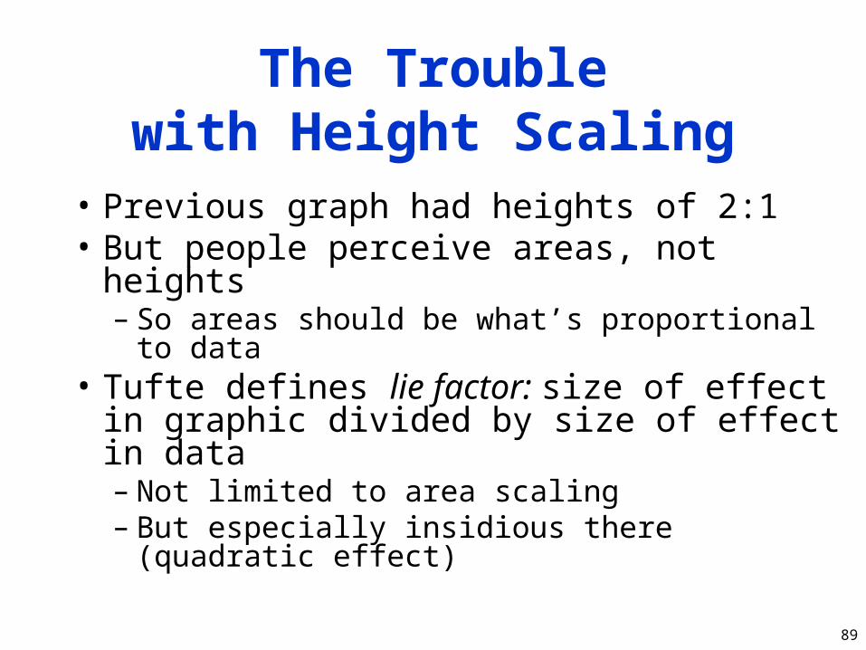
The Troublewith Height Scaling
• Previous graph had heights of 2:1• But people perceive areas, not heights
– So areas should be what’s proportional to data• Tufte defines lie factor: size of effect in
graphic divided by size of effect in data– Not limited to area scaling– But especially insidious there (quadratic effect)

90
Scaling by Area
• Same graph with 2:1 area:
Women in the Workforce
1960 1980

91
Poor Histogram Cell Size
• Picking bucket size is always problem• Prefer 5 or more observations per
bucket• Choice of bucket size can affect results:
02468
1012
5 10 15 20 25 30
92
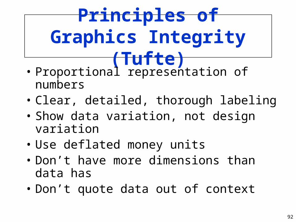
Principles ofGraphics Integrity
(Tufte)• Proportional representation of numbers• Clear, detailed, thorough labeling• Show data variation, not design variation• Use deflated money units• Don’t have more dimensions than data has• Don’t quote data out of context

93
Proportional Representation
of Numbers• Maintain lie factor of 1.0• Use areas, not heights, with clip art• Avoiding “decorative” graphs will do
wonders– Not too hard for most engineers!

94
Clear, Detailed,Thorough Labeling
• Goal is to defeat distortion and ambiguity
• Write explanations on graphic itself• Label important events in the data

95
Show Data Variation,Not Design Variation
• Use one design for entire graphic• In papers, try to use one design for all
graphs• Again, artistic license is big culprit

96
Use Deflated Money Units
• Often necessary to show money over time– Even in computer science– E.g., price/performance over time– Or expected future cost of a disk
• Nominal dollars are meaningless• Derate by some standard inflation
measure– That’s what the WWW is for!

97
Don’t Have More Dimensions Than Data
Has• This gets back to the Lie Factor• 1-D data (e.g., money) should occupy
one dimension on the graph: not• Clip art is prohibited by this rule
– But if you have to, use an area measure
$1.00$2.00
98
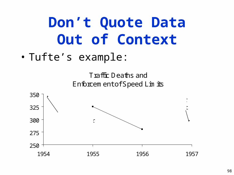
Don’t Quote DataOut of Context
• Tufte’s example:
Traffic Deaths andEnforcement of Speed Limits
250
275
300
325
350
1954 1955 1956 1957
Before stricterenforcement
After stricterenforcement
99
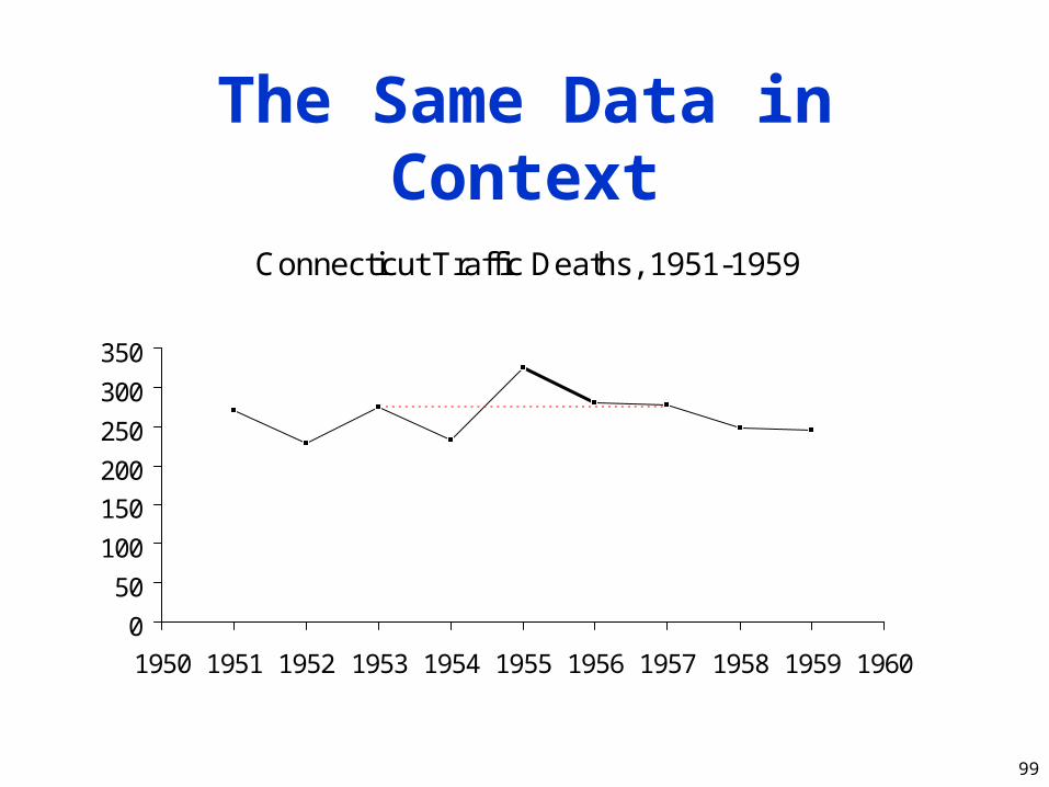
The Same Data in Context
Connecticut Traffic Deaths, 1951-1959
0
50
100
150
200
250
300
350
1950 1951 1952 1953 1954 1955 1956 1957 1958 1959 1960
100
Special-Purpose Charts
• Tukey’s box plot• Histograms• Scatter plots• Gantt charts• Kiviat graphs

101
Tukey’s Box Plot
• Shows range, median, quartiles all in one:
• Tufte can’t resist improvements:
or
or even
minimum
maximum
quartile
quartile
median
102
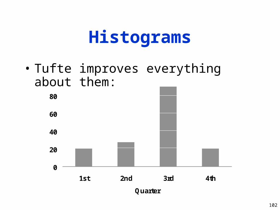
Histograms
• Tufte improves everything about them:
0
20
40
60
80
1st 2nd 3rd 4th
Quarter
103
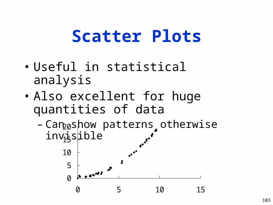
Scatter Plots
• Useful in statistical analysis• Also excellent for huge quantities of
data– Can show patterns otherwise invisible
0
5
10
15
20
0 5 10 15

104
Better Scatter Plots
• Again, Tufte improves the standard– But it can be a pain with automated tools
• Can use modified Tukey box plot for axes
0
1020
3040
50
0 20 40 60 80 100

105
Gantt Charts
• Shows relative duration of Boolean conditions
• Arranged to make lines continuous– Each level after first follows FTTF pattern
0 20 40 60 80 100
CPU
I/O
Network
106
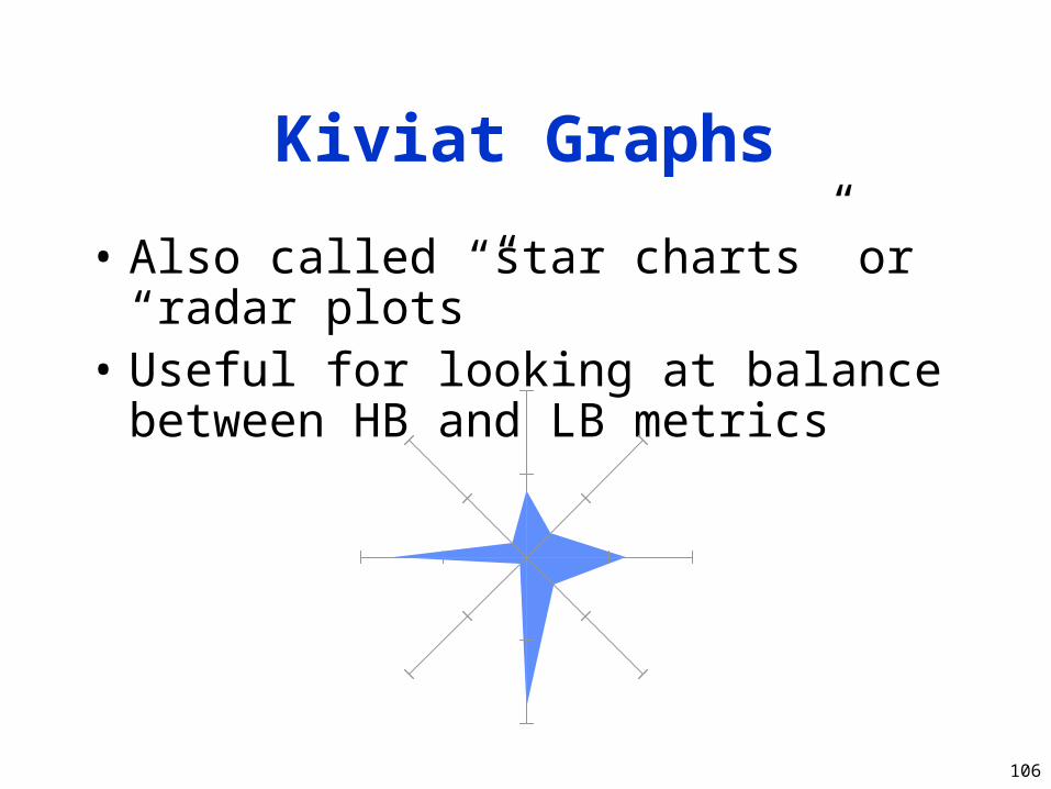
Kiviat Graphs
• Also called “star charts” or “radar plots”• Useful for looking at balance between
HB and LB metrics
107
A Few Examples
• A bad graph• Two good graphs

108
A Very Bad Graph

109
A Good Graph: Sunspots

110
A Superb Graph:DEC Traces

White Slide