introduction to matlab for experimental physicsphysics.gmu.edu/~rubinp/courses/407/matlab2.pdf ·...
TRANSCRIPT
Chapter 1
Introduction to Matlab for
Experimental Physics
Data analysis and representation are vital steps in any experimental exercise.
They lend meaning to the experiment and provide insight leading to a more
fundamental understanding of the underlying concept. Intelligent data processing
and representation also help the experimenter in re-designing the experiment for
increased accuracy and precision. Clever thinking may even encourage her to
adapt and tailor the procedural steps to elicit some otherwise hidden facet.
In the experimental physics lab, we will use Matlab for,
� analyzing experimental data and computing errors,
� curve �tting, and
� graphically representing experimental data.
The present write-up serves as a �rst introduction to Matlab. Students who are
not familiar with Matlab, or even with the computer, need not to worry. We will
proceed slowly, allowing everyone to familiarize and acclimatize with the culture
of computing. Luckily, Matlab is a highly user-friendly and interactive package
that is very easy to learn. Furthermore, subsequent laboratory sessions will give
all of us ample opportunity to practice Matlab.
It is important that every student independently works through all the examples
1

given in this hand-out and attempts all challenge questions. These challenge
questions are labelled with the box Q .
APPROXIMATE PERFORMANCE TIME 6-8 hours of independent work.
This tutorial has been split up into the following sections:
1. Vectors and matrices
2. Graphs and plotting
3. Curve �tting
1.1 Vectors and Matrices
1.1.1 Starting Matlab
You can start Matlab by double-clicking on the Matlab icon located on the Desk-
top. The Matlab environment launches showing three windows. On the top left
The Matlab
icon
is the directory window, showing the contents of the working directory. On the
bottom left is the history window, displaying your recently executed commands.
On the right is the larger-sized command window. This is where you will type in
your commands and where the output will be displayed.
Now let us get started with the exercise. The simplest calculation is to add two
numbers. In the command window, type
� 2 + 3
What do you see? Indeed, 5, displayed as the answer (ans) in the command
window. If we terminate the command with the semi-colon, � 2 + 3;
the output 5 will not be displayed.
Now take the square of a number, for example, by typing,
� 5 ^ 2
and verify if you get the correct answer.
2
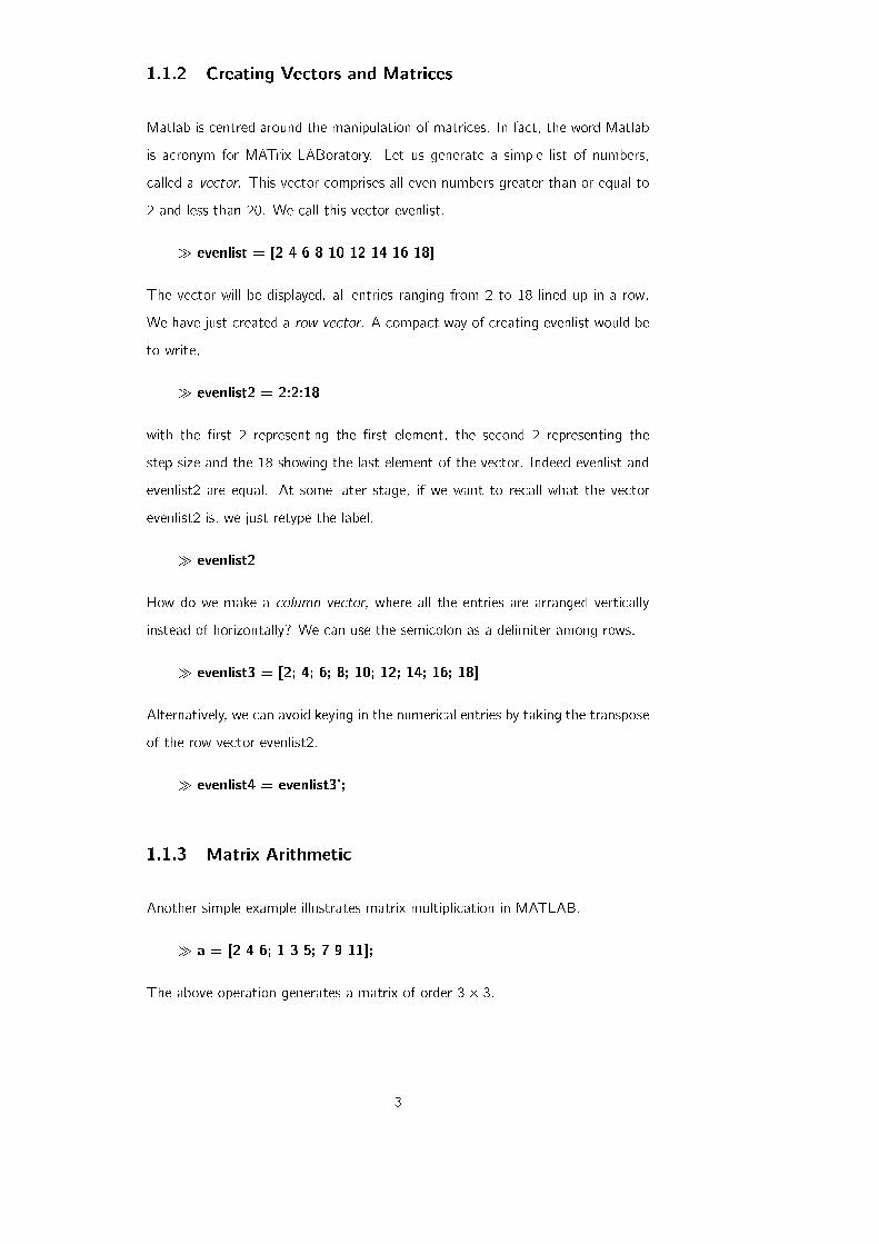
1.1.2 Creating Vectors and Matrices
Matlab is centred around the manipulation of matrices. In fact, the word Matlab
is acronym for MATrix LABoratory. Let us generate a simple list of numbers,
called a vector. This vector comprises all even numbers greater than or equal to
2 and less than 20. We call this vector evenlist.
� evenlist = [2 4 6 8 10 12 14 16 18]
The vector will be displayed, all entries ranging from 2 to 18 lined up in a row.
We have just created a row vector. A compact way of creating evenlist would be
to write,
� evenlist2 = 2:2:18
with the �rst 2 representing the �rst element, the second 2 representing the
step size and the 18 showing the last element of the vector. Indeed evenlist and
evenlist2 are equal. At some later stage, if we want to recall what the vector
evenlist2 is, we just retype the label.
� evenlist2
How do we make a column vector, where all the entries are arranged vertically
instead of horizontally? We can use the semicolon as a delimiter among rows.
� evenlist3 = [2; 4; 6; 8; 10; 12; 14; 16; 18]
Alternatively, we can avoid keying in the numerical entries by taking the transpose
of the row vector evenlist2.
� evenlist4 = evenlist3';
1.1.3 Matrix Arithmetic
Another simple example illustrates matrix multiplication in MATLAB.
� a = [2 4 6; 1 3 5; 7 9 11];
The above operation generates a matrix of order 3� 3.
3

2 4 6
1 3 5
7 9 11
: (1.1)
Type in the command,
� a ^ 2;
This performs the product of the matrices as a a and the resulting matrix is,
50 74 98
40 58 76
100 154 208
: (1.2)
Now perform the following operation on the same matrix,
� a. ^ 2
This operation just takes the square of each entry as shown,
4 19 36
1 9 25
49 81 121
: (1.3)
By typing a' in the command window, we get the transpose of the generated
matrix a as,
2 1 7
4 3 9
6 5 11
: (1.4)
To understand how MATLAB interprets the forward slash / and the backward
slash n, we try some simple commands.
By typing,
� a=4/2
4
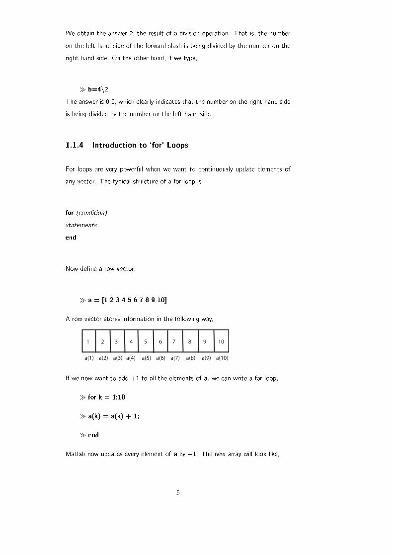
We obtain the answer 2, the result of a division operation. That is, the number
on the left hand side of the forward slash is being divided by the number on the
right hand side. On the other hand, if we type,
� b=4n2The answer is 0.5, which clearly indicates that the number on the right hand side
is being divided by the number on the left hand side.
1.1.4 Introduction to `for' Loops
For loops are very powerful when we want to continuously update elements of
any vector. The typical structure of a for loop is
for (condition)
statements
end
Now de�ne a row vector,
� a = [1 2 3 4 5 6 7 8 9 10]
A row vector stores information in the following way,
a(1) a(2) a(3) a(4) a(5) a(6) a(7) a(8) a(9) a(10)
1 2 3 4 5 6 7 8 9 10
If we now want to add +1 to all the elements of a, we can write a for loop,
� for k = 1:10
� a(k) = a(k) + 1;
� end
Matlab now updates every element of a by +1. The new array will look like,
5
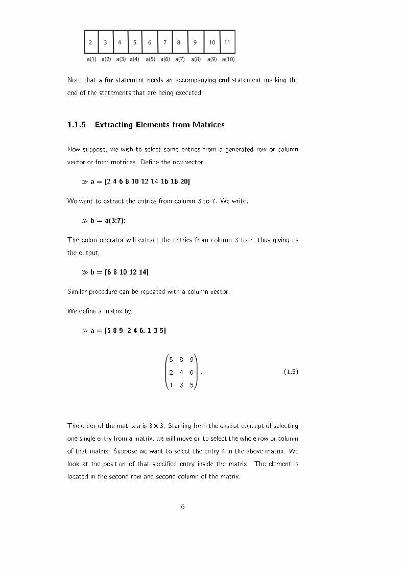
a(1) a(2) a(3) a(4) a(5) a(6) a(7) a(8) a(9) a(10)
2 3 4 5 6 7 8 9 10 11
Note that a for statement needs an accompanying end statement marking the
end of the statements that are being executed.
1.1.5 Extracting Elements from Matrices
Now suppose, we wish to select some entries from a generated row or column
vector or from matrices. De�ne the row vector,
� a = [2 4 6 8 10 12 14 16 18 20]
We want to extract the entries from column 3 to 7. We write,
� b = a(3:7);
The colon operator will extract the entries from column 3 to 7, thus giving us
the output,
� b = [6 8 10 12 14]
Similar procedure can be repeated with a column vector.
We de�ne a matrix by,
� a = [5 8 9; 2 4 6; 1 3 5]
5 8 9
2 4 6
1 3 5
: (1.5)
The order of the matrix a is 3� 3. Starting from the easiest concept of selecting
one single entry from a matrix, we will move on to select the whole row or column
of that matrix. Suppose we want to select the entry 4 in the above matrix. We
look at the position of that speci�ed entry inside the matrix. The element is
located in the second row and second column of the matrix.
6
� b =a(2,2)
This command takes the value from second row and second column of a and
saves it in b. The displayed output is 4.
To select a complete row or column of any matrix we have to use the colon
operator, \:" which means that all entries of that speci�ed row or column will
be selected. For example,
� a(2,:)
displays all the entries of the second row of the matrix, and
� a(:,2)
displays all the entries in the second column of the matrix a.
If we write d=a(:,:) in the command window, we get the complete matrix again,
i.e., we have selected all the rows and all the columns.
1.1.6 Higher Dimensional Matrices
Vectors are one-dimensional arrays, but it is also possible to create arrays or
matrices that are two, three or even higher dimensional. For example, let's
create a three-dimensional matrix of size 3 � 3 � 3. This means that there are
three layers of two dimensional data. Each layer comprises three rows and three
columns. Suppose the �rst sheet contains the �rst nine natural numbers arranged
in the form of a square.
1 2 3
4 5 6
7 8 9
(1.6)
The second sheet contains the squares of these numbers,
1 4 9
16 25 36
49 64 81
(1.7)
whereas the third comprises the cubes,
1 8 27
64 125 216
343 512 729
: (1.8)
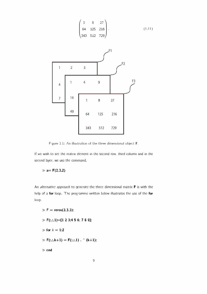
7
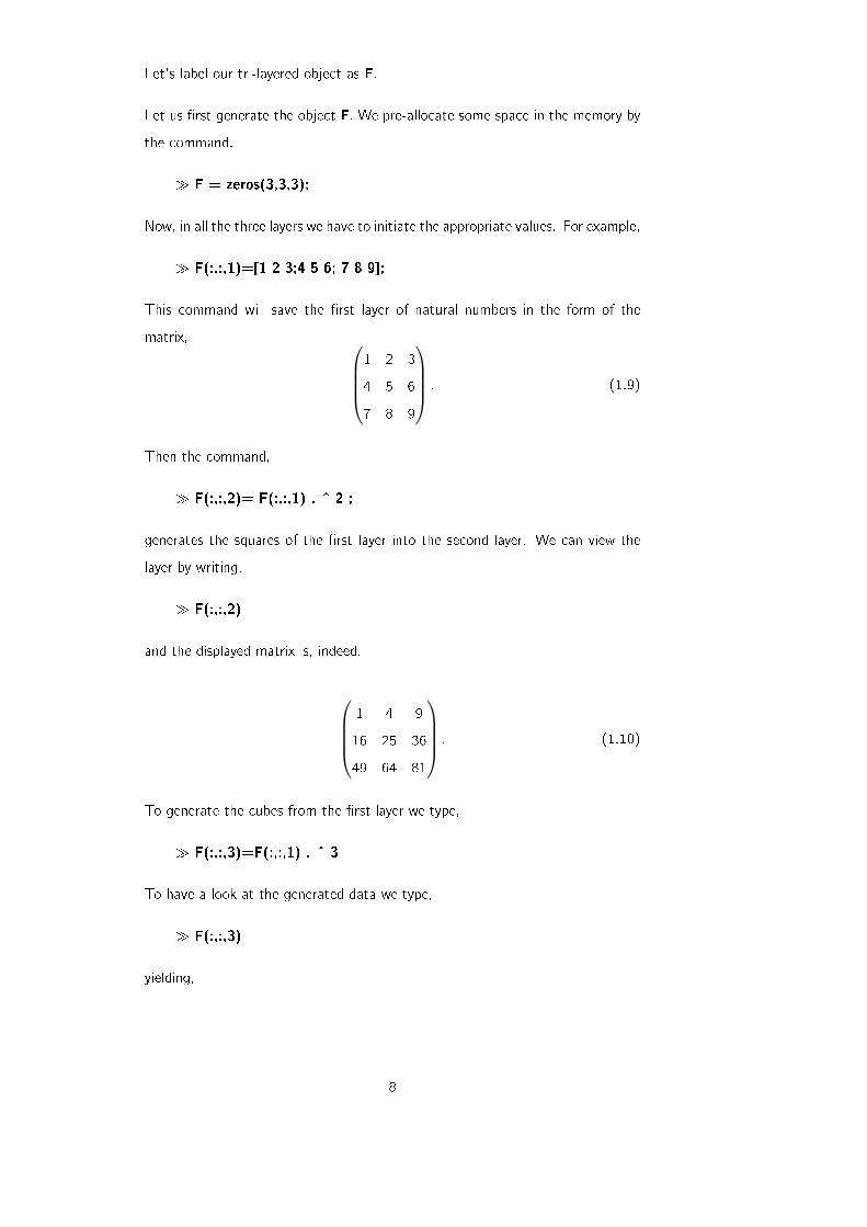
Let's label our tri-layered object as F.
Let us �rst generate the object F. We pre-allocate some space in the memory by
the command,
� F = zeros(3,3,3);
Now, in all the three layers we have to initiate the appropriate values. For example,
� F(:,:,1)=[1 2 3;4 5 6; 7 8 9];
This command will save the �rst layer of natural numbers in the form of the
matrix,
1 2 3
4 5 6
7 8 9
: (1.9)
Then the command,
� F(:,:,2)= F(:,:,1) . ^ 2 ;
generates the squares of the �rst layer into the second layer. We can view the
layer by writing,
� F(:,:,2)
and the displayed matrix is, indeed,
1 4 9
16 25 36
49 64 81
: (1.10)
To generate the cubes from the �rst layer we type,
� F(:,:,3)=F(:,:,1) . ^ 3
To have a look at the generated data we type,
� F(:,:,3)
yielding,
8
1 8 27
64 125 216
343 512 729
: (1.11)
Figure 1.1: An illustration of the three-dimensional object F.
If we wish to see the matrix element in the second row, third column and in the
second layer, we use the command,
� a= F(2,3,2)
An alternative approach to generate the three dimensional matrix F is with the
help of a for loop. The programme written below illustrates the use of the for
loop.
� F = zeros(3,3,3);
� F(:,:,1)=[1 2 3;4 5 6; 7 8 9];
� for k = 1:2
� F(:,:,k+1) = F(:,:,1) . ^ (k+1);
� end
9
Yet another alternative approach of creating F, is outlined below. Understand
how these options of creating F work.
� F = zeros(3,3,3);
� p = 1:1:9;
� F(:,:,1) = reshape(p,3,3)';
� for k = 1:3
� for m = 1:3
� F(k,m,2) = F(k,m,1). ^ 2;
� F(k,m,3) = F(k,m,1). ^ 3;
� end
� end
1.2 Graphs and Plotting
Graphs are extremely important in experimental physics. There are three impor-
tant uses of graphs [1].
� First, with the help of graphs we can easily determine slopes and intercepts.
� Second, they act as visual aids indicating how one quantity varies when the
other is changed, often revealing subtle relationships. These visual patterns
also tell us if there exist conditions under which simple (linear) relationships
break down or sudden transitions take place.
� Third, graphs help compare theoretical predictions with experimentally ob-
served data.
It is customary to plot the independent variable (the \cause") on the horizontal
axis and the dependent variable (the \e�ect") on the vertical axis. In Matlab,
the data for the independent and dependent variables are typed in as vectors.
10
1.2.1 Plotting Basics
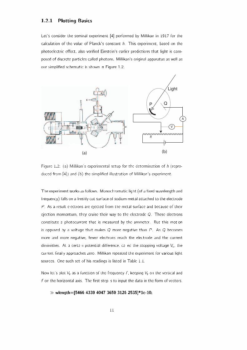
Let's consider the seminal experiment [4] performed by Millikan in 1917 for the
calculation of the value of Planck's constant h. This experiment, based on the
photoelectric e�ect, also veri�ed Einstein's earlier predictions that light is com-
posed of discrete particles called photons. Millikan's original apparatus as well as
our simpli�ed schematic is shown in Figure 1.2.
A
R
V
(a) (b)
P Q
Light
Figure 1.2: (a) Millikan's experimental setup for the determination of h (repro-
duced from [4]) and (b) the simpli�ed illustration of Millikan's experiment.
The experiment works as follows. Monochromatic light (of a �xed wavelength and
frequency) falls on a freshly cut surface of sodium metal attached to the electrode
P . As a result electrons are ejected from the metal surface and because of their
ejection momentum, they cruise their way to the electrode Q. These electrons
constitute a photocurrent that is measured by the ammeter. But this motion
is opposed by a voltage that makes Q more negative than P . As Q becomes
more and more negative, fewer electrons reach the electrode and the current
diminishes. At a certain potential di�erence, called the stopping voltage Vs , the
current �nally approaches zero. Millikan repeated the experiment for various light
sources. One such set of his readings is listed in Table 1.1.
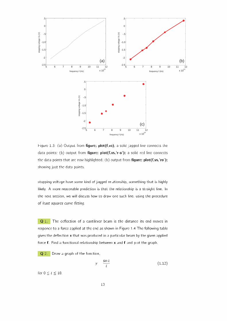
Now let's plot Vs as a function of the frequency f , keeping Vs on the vertical and
f on the horizontal axis. The �rst step is to input the data in the form of vectors.
� wlength=[5466 4339 4047 3650 3126 2535]*1e-10;
11

Stopping voltage Vs (V) �2:100 �1:524 �1:367 �0:9478 �0:3718 +0:3720
Wavelength �(�A) 5466 4339 4047 3650 3126 2535
Table 1.1: Millikan's readings for the stopping voltage as a function of the wave-
length of the incident length; results extracted from [4].
� vs=[-2.1 -1.524 -1.367 -.9478 -.3718 .3720];
Next, we convert the wavelengths to frequencies.
� c=3e8;
� f=c./wlength;
Here c is the speed of light, c=3e8; is a compact way of writing 3 � 108. Also
note the pointwise division of the speed of light by the wavelength, using the
familiar \." operator. The graph is achieved using the command,
� �gure; plot(f,vs);
and the horizontal and vertical axes are labelled using,
� xlabel(`frequency f (Hz)');
� ylabel(`stopping voltage Vs (V)');
The resulting graph is shown in Figure 1.3(a). The plot is a solid black line
joining the individual data points, even though the points themselves are not
distinguished. These points can in fact be highlighted using symbols such as \o",
\+" and \�". The colours can also be adjusted. For example, to plot a solid
red-coloured line with circles for the data points, we use the command,
� �gure; plot(f,vs,`r-o');
Furthermore, if it is required to display the data points only, suppressing the line
that connects between these points, we type,
� �gure; plot(f,vs,'ro');
This latter plot, shown in Fig. 1.3(c) in fact, represents a more justi�able picture
of the experimental data. This is because the lines drawn in (a) and (b) represent
more than what the data warrants: the lines show that the frequency and the
12
5 6 7 8 9 10 11 12
x 1014
frequency f (Hz)
stop
ping
vol
tage
Vs
(V)
(a)-2.5
-2
-1.5
-1.0
-.5
0
.5
5 6 7 8 9 10 11 12
x 1014
frequency f (Hz)
stop
ping
vol
tage
Vs
(V)
(b)-2.5
-2
-1.5
-1.0
-.5
0
.5
5 6 7 8 9 10 11 12
x 1014
frequency f (Hz)
stop
ping
vol
tage
Vs
(V)
(c)-2.5
-2
-1.5
-1.0
-.5
0
.5
Figure 1.3: (a) Output from �gure; plot(f,vs); a solid jagged line connects the
data points; (b) output from �gure; plot(f,vs,`r-o'); a solid red line connects
the data points that are now highlighted; (b) output from �gure; plot(f,vs,`ro');
showing just the data points.
stopping voltage have some kind of jagged relationship, something that is highly
likely. A more reasonable prediction is that the relationship is a straight line. In
the next section, we will discuss how to draw one such line, using the procedure
of least squares curve �tting.
Q 1. The de ection of a cantilever beam is the distance its end moves in
responce to a force applied at the end as shown in Figure 1.4 The following table
gives the de ection x that was produced in a particular beam by the given applied
force f. Find a functional relationship between x and f and plot the graph.
Q 2. Draw a graph of the function,
y =sin tt
(1.12)
for 0 � t � 10.
13
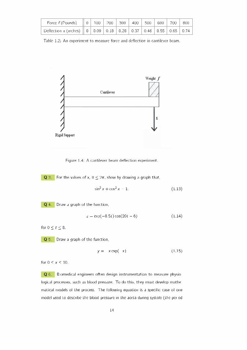
Force f (Pounds) 0 100 200 300 400 500 600 700 800
De ection x (inches) 0 0:09 0:18 0:28 0:37 0:46 0:55 0:65 0:74
Table 1.2: An experiment to measure force and de ection in cantilever beam.
Figure 1.4: A cantilever beam de ection experiment.
Q 3. For the values of x, 0 � 2�, show by drawing a graph that,
sin2 x + cos2 x = 1: (1.13)
Q 4. Draw a graph of the function,
z = exp(�0:5t) cos(20t � 6) (1.14)
for 0 � t � 8.
Q 5. Draw a graph of the function,
y = �x exp(�x) (1.15)
for 0 � x � 10.
Q 6. Biomedical engineers often design instrumentation to measure physio-
logical processes, such as blood pressure. To do this, they must develop mathe-
matical models of the process. The following equation is a speci�c case of one
model used to describe the blood pressure in the aorta during systole (the period
14
following the closure of the heart's aortic valve). The variable t represents time in
seconds and the dimensionless variable y represents the pressure the aortic valve,
normalized by a constant reference pressure.
y(t) = e�8t sin (9:7t +�2
): (1.16)
Plot this function for,
t � 0: (1.17)
1.2.2 Overlaying Multiple Plots
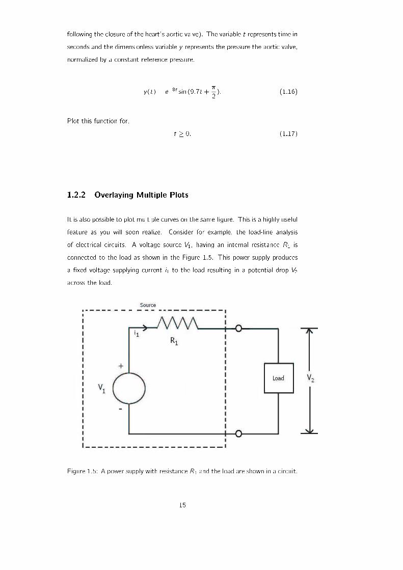
It is also possible to plot multiple curves on the same �gure. This is a highly useful
feature as you will soon realize. Consider for example, the load-line analysis
of electrical circuits. A voltage source V1, having an internal resistance R1 is
connected to the load as shown in the Figure 1.5. This power supply produces
a �xed voltage supplying current i1 to the load resulting in a potential drop V2
across the load.
Figure 1.5: A power supply with resistance R1 and the load are shown in a circuit.
15
An experimenter built the circuit shown in Figure 1.5. The current-voltage rela-
tionship approximated from the experiment was,
i1 = 0:16(e0:12V2 � 1): (1.18)
Let's suppose that we have a supply voltage of V1=15 V and the resistance of the
supply is 30 Ohms. In the �rst step, we write the equation of the circuit using
Kircho�'s Voltage Law.
V1 = i1R1 + V2; (1.19)
which implies,
V1 � i1R1 � V2 = 0: (1.20)
Load line tells us how the current across the load changes as the voltage across
the load is changed. So, we write Equation 1.20 in terms of current as,
i1 = � 1R1V2 +
V1
R1; (1.21)
which can be re-written after using the values as,
i1 = � 130V2 + 0:5: (1.22)
From equations 1.18 and 1.22, it is di�cult to calculate the values of i1 and V2
because of the exponential factor present in equation 1.18. But we can plot the
two curves individually and then overlap to �nd the solution.
We will use Matlab to plot the load voltage V2 against the experimentally obtained
relation of current and the relation for current obtained from the rearrangement
of Kircho�'s Voltage Law. The point at which these two curves intersect gives
us the solution.
� V2=0:0.1:20; (creating the voltage vector )
� current exp=0.16*(exp(0.12*V2)-1); (calculating the current from
the experimental relation)
For the calculation of the values of current from the Equation 1.22, we write,
� current th= -(1/30)*V2 +0.5; (generating the values of current
when load voltage is changed)
The load voltage can then be plotted against current by using the command,
16
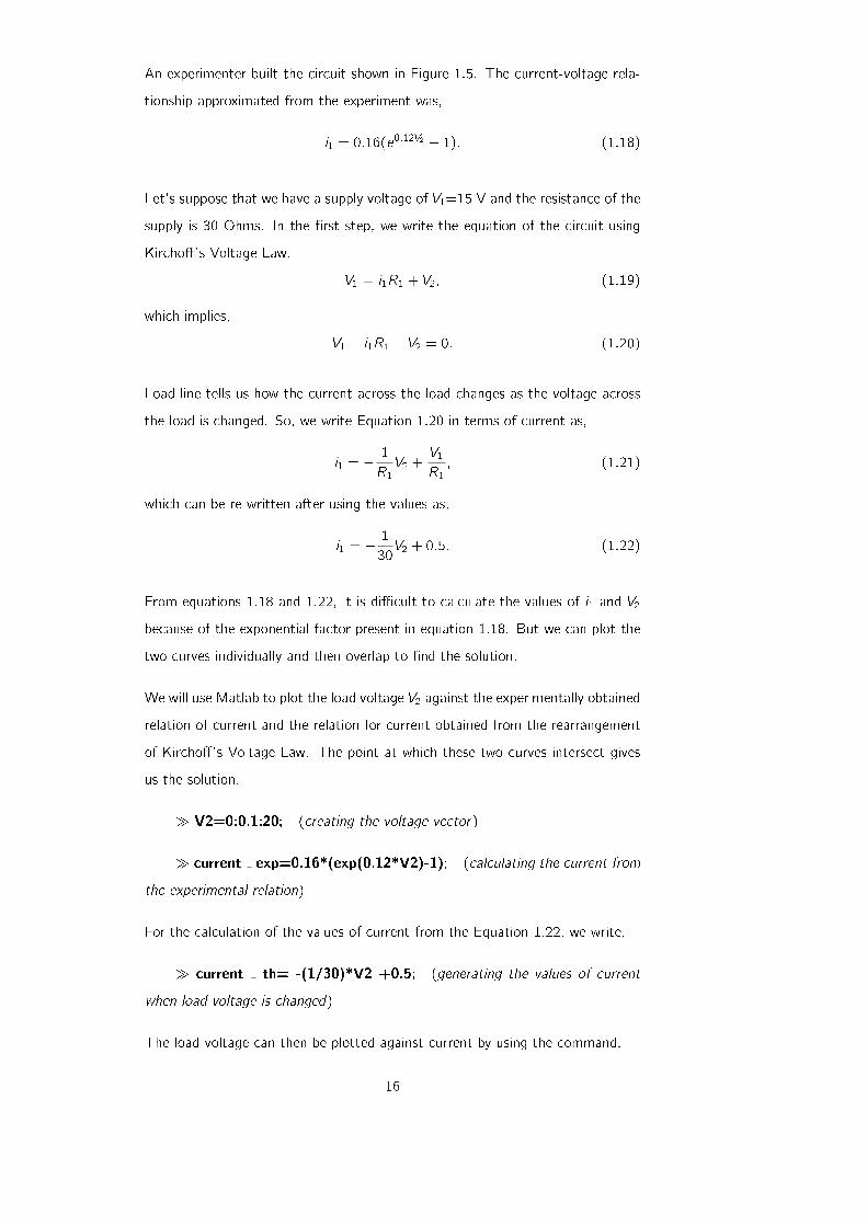
� �gure; plot(V2,current exp,`b-o');
where we have used b for blue and o for circles. The output is shown in the
Figure 1.6 (a).
To plot the load voltage versus current using Equation 1.22, write,
� �gure; plot(V2,current th,`g+');
where we have used g for green and + for plus sign. The output of the above
mentioned command is shown in Figure 1.6 (b).
Figure 1.6: (a) The load voltage V2 and the Current iexp. (b) The load voltage
V2 and the Current ith.
To plot both the graphs simultaneously, one on top of another, write,
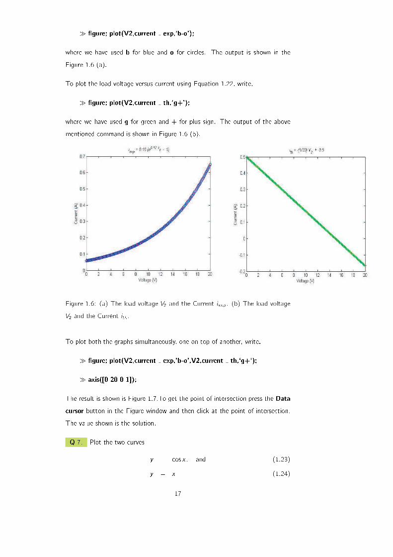
� �gure; plot(V2,current exp,'b-o',V2,current th,`g+');
� axis([0 20 0 1]);
The result is shown is Figure 1.7.To get the point of intersection press the Data
cursor button in the Figure window and then click at the point of intersection.
The value shown is the solution.
Q 7. Plot the two curves
y = cos x; and (1.23)
y = x (1.24)
17
Figure 1.7: Overlaying of two plots and �nding the point of intersection.
over the range x 2 [0; 3] and use the curves to �nd the solution of the equation
x = cos x .
Q 8. Plot the two curves
y = 2 cos x; and (1.25)
y = 2 sin x (1.26)
over the range x 2 [0; 4�].
Q 9. Suppose the relationship between the dependent variable y and the in-
dependent variable x is given by,
y = ae�x + b (1.27)
where a and b are constants. Sketch a curve of y versus x using arbitrary values
of a and b. Is it possible to obtain a straight line that represents this functional
relationship?
1.2.3 Resolution of the Graph
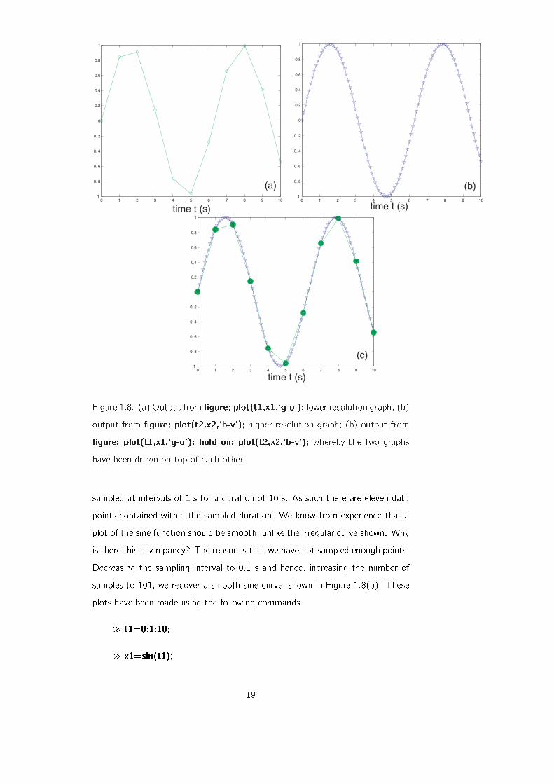
Figure 1.8(a) shows the result of plotting a sine curve
sin (t) (1.28)
18
0 1 2 3 4 5 6 7 8 9 10 1
0. 8
0. 6
0. 4
0. 2
0
0.2
0.4
0.6
0.8
1
0 1 2 3 4 5 6 7 8 9 10 1
0. 8
0. 6
0. 4
0. 2
0
0.2
0.4
0.6
0.8
1
0 1 2 3 4 5 6 7 8 9 10 1
0. 8
0. 6
0. 4
0. 2
0
0.2
0.4
0.6
0.8
1
time t (s) time t (s)
time t (s)
(a) (b)
(c)
Figure 1.8: (a) Output from �gure; plot(t1,x1,`g-o'); lower resolution graph; (b)
output from �gure; plot(t2,x2,`b-v'); higher resolution graph; (b) output from
�gure; plot(t1,x1,`g-o'); hold on; plot(t2,x2,`b-v'); whereby the two graphs
have been drawn on top of each other.
sampled at intervals of 1 s for a duration of 10 s. As such there are eleven data
points contained within the sampled duration. We know from experience that a
plot of the sine function should be smooth, unlike the irregular curve shown. Why
is there this discrepancy? The reason is that we have not sampled enough points.
Decreasing the sampling interval to 0:1 s and hence, increasing the number of
samples to 101, we recover a smooth sine curve, shown in Figure 1.8(b). These
plots have been made using the following commands.
� t1=0:1:10;
� x1=sin(t1);
19

� �gure; plot(t1,x1,`g-o'); (for the sub�gure (a))
� t2=0:.1:10;
� x2=sin(t2);
� �gure; plot(t2,x2,`b-v'); (for the sub�gure (b))
However, these plots cannot be overlaid one on top of each other using the com-
mand �gure; plot(t1,x1,`g-o',t2,x2,`b-v'); as t1 and t2 are essentially di�erent
vectors. A way around this is to use the following set of commands.
� �gure; plot(t1,x1,`g-o'); hold on; plot(t2,x2,`b-v');
We can also specify the color and size of lines which we use while making a plot.
Consider an equation,
y = tan[sin(x)]� sin[tan(x)]: (1.29)
We plot Equation 1.29 for the range x 2 [��; �] by writing,
� x=-pi:pi/10:pi;
� y=tan[sin(x)]-sin[tan(x)];
� �gure; plot(x,y,`- -rs',`LineWidth',2,`MarkerEdgeColor',`k',`MarkerFaceColor',`g',`MarkerSize',10);
y = tan[sin(x)] - sin[tan(x)]
Figure 1.9: Illustration of Color and Size of the lines.
This working produces a graph as shown in Figure 1.9 with,
20
� a dashed line having red color and square markers,
� squares having black color at the edges,
� squares �lled in with green color,
� marker size set to 10.
Lines with di�erent styles like solid, dashed and dotted etc. can be drawn with
marker types x, *, + and o. The color options include cyan, magenta, yellow,
black, red, green, blue and white with symbols c, m, y, k, r, g, b, w. There are
plenty of equations in Matlab for you to explore.
1.3 Curve Fitting
Consider, once again, Millikan's famous experiment for determining the Planck
constant. Observe Figure 1.3(c). Can we draw a straight line through these
points, not necessarily touching them? What could be the signi�cance of such a
line? In the present section, we will explore answers to this question.
1.3.1 Linear Relationships
5 6 7 8 9 10 11 12
x 1014
5 5..5 6 6..5 7 7..5 8 8..5 9f / Hz
0.5
0
-0.5
-1
-1.5
-2
-2.5
Vs
/ V
Vs
/ V
f / Hz
-2.2
-2
-1.8
-1.6
-1.4
-1.2
-1
-0.8
-0.6
x 1014
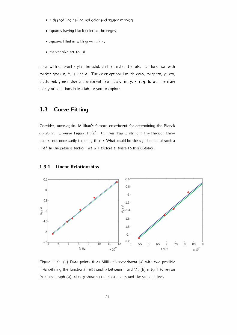
Figure 1.10: (a) Data points from Millikan's experiment [4] with two possible
lines de�ning the functional relationship between f and Vs ; (b) magni�ed region
from the graph (a), closely showing the data points and the straight lines.
21
Figure 1.10(a) is a reproduction of the data points shown in Figure 1.3(c). How-
ever, in this graph we have also drawn two straight lines. Why straight lines?
Linear relationships occur naturally in numerous natural instances and that is
why they have become the scientist's favourite. Linear relationships are direct
manifestations of direct proportionality. If the variables x and y are directly pro- F = ma
(Newton's law)
F = �kx(Hooke's law)
B = �0NI
(Ampere's law)
portional (x / y), an equal increase in x always results in an equal increase in
y . Be it the extension of a spring when loaded with masses, the acceleration
of an object as it experiences a force or the magnetic �eld that winds around a
current carrying conductor, linear relationships are ubiquitous. When these linear
functions are drawn on paper (or on the computer screen), they become straight
lines.
The straight lines we have drawn in Figure 1.10(a) represent a kind of interpola-
tion. In the real experiment, we measure the variables, (xi ; yi). In our case these
are frequency and stopping voltage. In a set of measurements, we have six pairs
of data points (x1; y1); (x2; y2); : : : ; (x6; y6). What if we want to determine the
stopping voltage for a frequency that was not used by Millikan? We could either
repeat his experiment with a light source with the desired frequency or estimate
using available data. In the latter case, we draw a straight line around the avail-
able measurements (xi ; yi). This line negotiates data points not available to the
experimenter.
But what straight line do we actually draw? This is a matter of choice. For
example, we have drawn two lines in the Figure. The light colored line takes the
�rst and the last data points as reference and connects these points; whereas
the dark colored line connects the mean (or the centre of gravity of the data) to
the end point. Both lines are di�erent and at the outset, are equally suitable for
de�ning the linear relationship between the variables of interest.
Let's brie y digress to see how we plotted, say, the red line. To plot a line, we
need an equation for the line. Given two points (x1; y1) and (x6; y6), a straight
line through these will be given by,
y � y1
y6 � y1=x � x1
x6 � x1; (1.30)
and in our case (x1; y1) = (0:5488 � 1015;�2:1) and (x6; y6) = (1:1834 �1015; 0:3720). (These numbers have been taken from the row vectors f and
vs.) After some basic arithmetic (also done in Matlab) we arrive at the following
22

equation for the red line,
y = 3:895� 10�15x � 4:2375; (1.31)
where in our particular case y is the stopping voltage vs and x is the frequency
f . Similarly, the equation for the blue line was computed by �rst calculating the
means of the x and y values. The resulting equation is,
y = 3:895� 10�15x � 4:2018; (1.32)
yielding a line parallel to the �rst, but displaced upwards. Figure 1.10(b) shows a
close-up of (a), revealing that these lines do not actually touch a majority of the
data points, they just graze within that region.
The graph has been plotted by using the following set of commands.
� line1=3.895e-15*f-4.2375;
� line2=3.895e-15*f-4.2018;
� �gure; plot(f,vs,`ro',f,line1,`g-',f,line2,`b-');
1.3.2 Least Squares Curve Fitting of Linear Data
y = mx + c
yi
xi
mxi + c
origin
di
Figure 1.11: Setting for the least squares best �t.
Consider Figure 1.11 where a straight line has been drawn around a set of exper-
imentally measured data points (xi ; yi). In this example we have N = 7 pairs of
23
measurements. The line is represented by the equation,
y = mx + c (1.33)
where m is the slope and c is the intercept. Of the many lines that can be
drawn, this particular line has a special property that we now investigate. If the
reading along the abscissa (x axis) is xi , the corresponding measurement along
the ordinate (y axis) is yi , but the line we have just drawn takes up the value,
mxi + c instead, which in general, is di�erent from yi . This di�erence
di = yi �mxi � c (1.34)
is called the residual or deviation. The special line we have drawn has the property
that it minimizes the sum of the squares of the deviations,
S = �Ni=1d
2i = �N
i=1(yi �mxi � c)2; (1.35)
and hence the name least squares curve �t. If the di 's are considered to be the
errors, the least squares curve �t is the best �t in the sense that it minimizes the
squares of the errors.
Q 10. Why do we minimize the sum squares of the residuals �Ni=1d
2i instead
of the sum of the residuals �Ni=1di?
There is an algorithmic procedure for deriving the equation for the least squares
�t. The goal is to �nd the parameters m and c that minimize the quantity S. The
minimum of S can be determined from elementary calculus. Take the derivative
of S, �rst with respect to m and then with respect to c and put the derivatives
equal to zero,
@S@m
= �2N∑
i=1
xi(yi �mxi � c) = 0 (1.36)
@S@c
= �2N∑
i=1
(yi �mxi � c) = 0: (1.37)
24
Rearranging Equation 1.37, we obtain,
N∑
i=1
(yi �mxi � c) = 0
N∑
i=1
yi �mN∑
i=1
xi � cN = 0
=) c =∑N
i yi �m∑Ni xi
N; (1.38)
whereN∑
i
�N∑
i=1
: (1.39)
The expression for c is inserted into Equation 1.36 and after some algebraic
manipulation,
N∑
i
xi(yi �mxi � c) = 0
N∑
i
(xiyi)�mN∑
i
x2i � c
N∑
i
xi = 0
N∑
i
(xiyi)�mN∑
i
x2i � [∑N
i yi �m∑Ni xi
N] N∑
i
xi = 0
N∑
i
(xiyi)�mN∑
i
x2i � 1
N( N∑
i
xi)( N∑
i
yi)
+mN
( N∑
i
xi)2 = 0;
(1.40)
the following expression for m pops out,
m =∑N
i (xiyi)� 1N
(∑Ni xi
)(∑Ni yi
)
(∑Ni x2
i
)�(∑N
i xi)2
N
: (1.41)
This cumbersome looking expression can be simpli�ed by noticing that,∑N
i xiN
= x (1.42)
is the mean of xi and ∑Ni yiN
= y (1.43)
is the mean of yi , yielding,
m =∑N
i (xiyi)� Nx y∑Ni x2
i � Nx2: (1.44)
Furthermore, we can also make use of the following simpli�cations for the nu-
25

merator and denominator of the above expression,
N∑
i
(xiyi)� Nx y =N∑
i
(xiyi)� (N∑
i
yi)x
=N∑
i
yi(xi � x); and (1.45)
N∑
i
x2i � Nx2 =
N∑
i
x2i + Nx2 � 2Nx2
=N∑
i
x2i + Nx2 � 2x
N∑
i
xi
=N∑
i
x2i +
N∑
i
x2 � 2xN∑
i
xi
=N∑
i
(x2i + x2 � 2xxi)
=N∑
i
(xi � x)2: (1.46)
This tedious but fruitful exercise yields the following compact expression for the
slope of the least squares curve �t,
m =∑N
i yi(xi � x)∑Ni (xi � x)2
: (1.47)
Substituting the expression for m back into (1.39) we can determine the intercept,
c = y �mx: (1.48)
Q 11. Prove that the least squares curve �t passes through the centre of
gravity (x; y) of the measured data.
Now we use Matlab to �nd the least squares curve for Millikan's experimental
data. The commands that generate the best �t line are given below.
� numerator=sum(vs.*(f-mean(f)));
� denominator=sum((f-mean(f)).^ 2);
� m=numerator/denominator;
� c=mean(vs)-m*mean(f);
The values are m = 3:9588 � 10�15 V/Hz and c = �4:2535 V. We can now
easily plot the least squares �t, shown in Figure 1.12.
� line3=m*f+c;
26
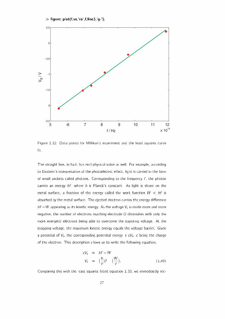
� �gure; plot(f,vs,`ro',f,line3,`g-');
x 1014
-2.5
-2
-1.5
-1
- 0.5
0
0.5
Vs
/ V
f / Hz
5 -6 7 8 9 10 11 12
Figure 1.12: Data points for Millikan's experiment and the least squares curve
�t.
The straight line, in fact, has real physical value as well. For example, according
to Einstein's interpretation of the photoelectric e�ect, light is carried in the form
of small packets called photons. Corresponding to the frequency f , the photon
carries an energy hf , where h is Planck's constant. As light is shone on the
metal surface, a fraction of the energy called the work function W < hf is
absorbed by the metal surface. The ejected electron carries the energy di�erence
hf �W appearing as its kinetic energy. As the voltage Vs is made more and more
negative, the number of electrons reaching electrode Q diminishes with only the
more energetic electrons being able to overcome the opposing voltage. At the
stopping voltage, the maximum kinetic energy equals the voltage barrier. Given
a potential of Vs , the corresponding potential energy is eVs , e being the charge
of the electron. This description allows us to write the following equation,
eVs = hf �WVs =
(he)f � (W
e): (1.49)
Comparing this with the least squares �tted equation 1.33, we immediately rec-
27
ognize that the slope m is in fact an estimate of h=e and the intercept c is an
estimate of W=e. Using the slope and intercept from the best-�t and a value of
e = 1:6022� 10�19 C, the Planck constant calculates to h = 6:342� 10�34 J s
and the work function to W = 6:814� 10�19 J or 4:2535 eV.
1.3.3 Least Squares Curve Fitting of Nonlinear Data
The concept of curve �tting can also be applied to the nonlinear data. Suppose
we route a sinusoidal ac voltage through a data acquisition system bringing it
into the computer. The hardware samples the voltage, acquiring one sample
every 50 ms and saves the �rst 21 points. The time sampling information is
stored in the form of the row vector t where 0:5 s shows the separation between
two sample points..
� t=0:0.05:1;
The voltage measurements made by the acquisition software are given by another
row vector v.
� v=[ 5.4792 7.4488 7.5311 5.7060 2.4202 -1.5217 -5.1546
-7.5890 -8.2290 -6.9178 -3.9765 -0.1252 3.6932 6.5438 7.7287
6.9577 4.4196 0.7359 -3.1915 -6.4012 -8.1072];
Note that size(t)=size(v). We are asked to �t this data to a least squares curve,
a sinusoidal function. Our best �t will be of the form,
A sin (!t + �); (1.50)
where A is the amplitude, ! is the angular frequency and � is the phase. The
curve �tting procedure determines approximations to these parameters, A, ! and
�; however, the simple algorithm outlined above for linear �ts does not work here.
Instead we use the inbuilt Matlab command lsqcurve�t. We �rst make a new
function �le named sinusoid.m that contains the �tting function. Follow the
following steps to make a new function �le, also called an \m-�le".
1. From the File menu item, click New and M-�le. A blank text editor opens.
2. Type in the following text in the editor window.
28
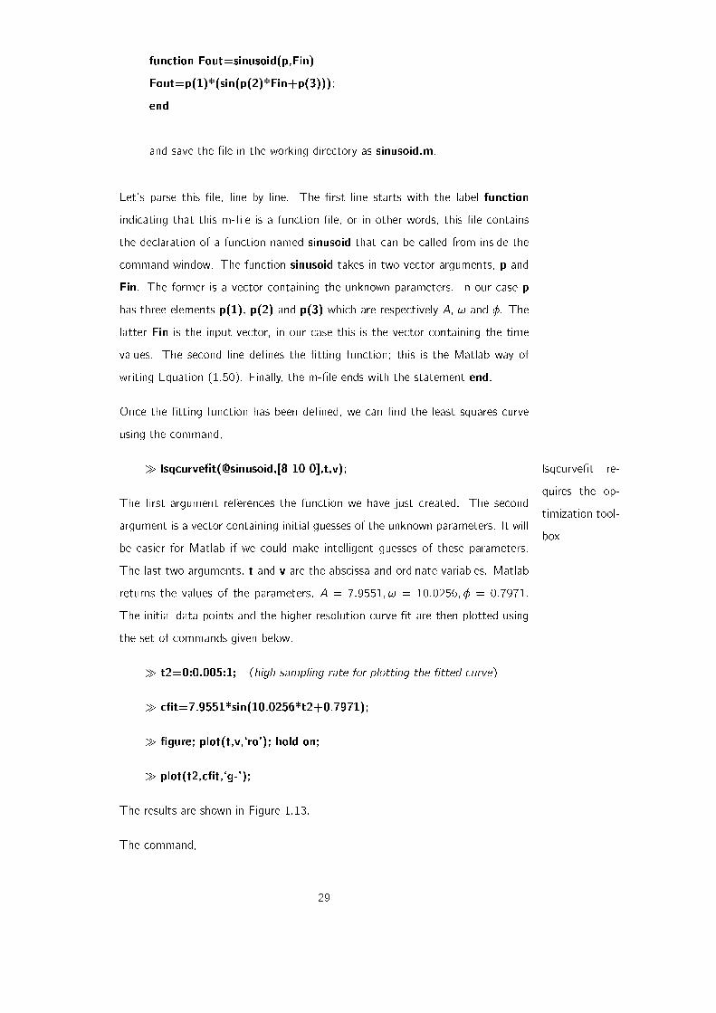
function Fout=sinusoid(p,Fin)
Fout=p(1)*(sin(p(2)*Fin+p(3)));
end
and save the �le in the working directory as sinusoid.m.
Let's parse this �le, line by line. The �rst line starts with the label function
indicating that this m-�le is a function �le, or in other words, this �le contains
the declaration of a function named sinusoid that can be called from inside the
command window. The function sinusoid takes in two vector arguments, p and
Fin. The former is a vector containing the unknown parameters. In our case p
has three elements p(1), p(2) and p(3) which are respectively A, ! and �. The
latter Fin is the input vector, in our case this is the vector containing the time
values. The second line de�nes the �tting function; this is the Matlab way of
writing Equation (1.50). Finally, the m-�le ends with the statement end.
Once the �tting function has been de�ned, we can �nd the least squares curve
using the command,
� lsqcurve�t(@sinusoid,[8 10 0],t,v); lsqcurve�t re-
quires the op-
timization tool-
box
The �rst argument references the function we have just created. The second
argument is a vector containing initial guesses of the unknown parameters. It will
be easier for Matlab if we could make intelligent guesses of these parameters.
The last two arguments, t and v are the abscissa and ordinate variables. Matlab
returns the values of the parameters, A = 7:9551; ! = 10:0256; � = 0:7971.
The initial data points and the higher resolution curve �t are then plotted using
the set of commands given below.
� t2=0:0.005:1; (high sampling rate for plotting the �tted curve)
� c�t=7.9551*sin(10.0256*t2+0.7971);
� �gure; plot(t,v,`ro'); hold on;
� plot(t2,c�t,`g-');
The results are shown in Figure 1.13.
The command,
29
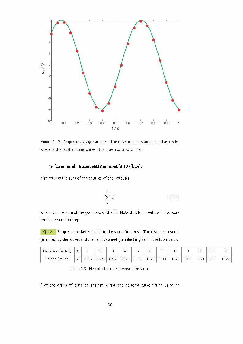
0 0.1 0.2 0.3 0.4 0.5 0.6 0.7 0.8 0.9 1 -10
-8
-6
-4
-2
0
2
4
6
8
t / s
v1 /
V
Figure 1.13: Acquired voltage samples. The measurements are plotted as circles
whereas the least squares curve �t is drawn as a solid line.
� [x,resnorm]=lsqcurve�t(@sinusoid,[8 10 0],t,v);
also returns the sum of the squares of the residuals,
N∑
i
d2i (1.51)
which is a measure of the goodness of the �t. Note that lsqcurve�t will also work
for linear curve �tting.
Q 12. Suppose a rocket is �red into the space from rest. The distance covered
(in miles) by the rocket and the height gained (in miles) is given in the table below,
Distance (miles) 0 1 2 3 4 5 6 7 8 9 10 11 12
Height (miles) 0 0:53 0:75 0:92 1:07 1:20 1:31 1:41 1:51 1:60 1:69 1:77 1:85
Table 1.3: Height of a rocket versus Distance.
Plot the graph of distance against height and perform curve �tting using an
30

equation,
y = apbx (1.52)
Q 13. An object covers a distance d in time t. A measurement of d with
respect to t produces the set of values given in Table 1.4 [5].
t (s) 1 2 3 4 5 6 7 8
d (m) 0:20 0:43 0:81 1:57 2:43 3:81 4:80 6:39
Table 1.4: Measurements of distance as a function of time.
Plot the distance with respect to t. Then plot with respect to t2. If the object
was initially at rest, calculate the acceleration. Use curve �tting.
Q 14. Biomedical instruments are used to measure many quantities such as
body temperature, blood oxygen level, heart rate and so on. Engineers developing
these devices often need a response curve that describes how fast the instrument
can make measurements. The response voltage v can be described by one of
these equations,
v(t) = a1 + a2e�3t=T
v(t) = a1 + a2e�3t=T + a3te�3t=T
(1.53)
where t is the time and T is an unknown constant. The data given in Table 1.5
gives the voltage v of a certain device as a function of time. Which of the above
functions is a better description of the data [7]?
t (s) 0 0:3 0:8 1:1 1:6 2:3 3
v (V) 0 0:6 1:28 1:5 1:7 1:75 1:8
Table 1.5: Response of a biomedical instrument switched on at time t = 0.
Q 15. In an RC series circuit, a parallel plate capacitor having capacitance C
charges through a resistor R. During the charging of capacitor, charge Q starts
to accumulate on the plates of the capacitor. The expression for growth of charge
V is given by,
V = Vo(1� exp (�t=�)) (1.54)
31
where the time constant � = RC. Fit the given data in Table 1.7 to the equation
for the voltage increase and �nd the value of � .
t (s) 0 3 6 9 12 15 18 21 24 27 30
V (V) 0 6:55 10 13 14:5 15 16 16:2 16:3 16:5 16:55
Table 1.6: Charging pattern for a capacitor in an RC circuit.
Q 16. When a constant voltage was applied to a certain motor initially at rest,
its rotational speed S(t) versus time was measured. The table given below shows
the values of speed against time.
Time (s) 1 2 3 4 5 6 7 8 10
Speed (rpm) 1210 1866 2301 2564 2724 2881 2879 2915 3010
Table 1.7: Motor speed when it is given a push.
Try to �t the given data with the function given below. Calculate the constants
b and c.
S(t) = b(1� ect) (1.55)
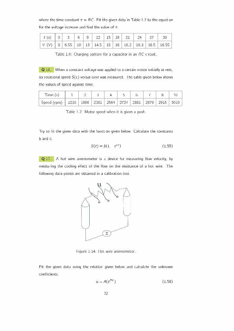
Q 17. A hot wire anemometer is a device for measuring ow velocity, by
measuring the cooling e�ect of the ow on the resistance of a hot wire. The
following data points are obtained in a calibration test.
Figure 1.14: Hot wire anemometer.
Fit the given data using the relation given below and calculate the unknown
coe�cients.
u = A(eBV ) (1.56)
32

u (ft/s) 66:77 59:16 54:45 47:21 42:75 32:71 25:43 8:18
V (volts) 7:58 7:56 7:55 7:53 7:51 7:47 7:44 7:28
Table 1.8: Measurement of ow velocity.
Q 18. The yield stress of many metals, �y , varies with the size of the grains.
Often, the relationship between the grain size, d, and the yield stress is modelled
with the Hall-Petch equation,
�y = �0 + kd�1=2 (1.57)
d (mm) 0:006 0:011 0:017 0:025 0:039 0:060 0:081 0:105
�y (MPa) 334 276 249 235 216 197 194 182
Table 1.9: Measurement of ow velocity.
Determine the constants and best �t the data points.
33

Bibliography
[1] G.L. Squires, Practical Physics, (Cambridge University Press, 1999).
[2] http://nsbri.tamu.edu/HumanPhysSpace/focus6/student2.html.
[3] http://zirka.dp.ua/Instructions.htm.
[4] R. Millikan, "A direct photoelectric determination of Planck's \h"",
Phys. Rev. 7 355 (1917).
[5] D. W. Preston, "The Art of Experimental Physics", (Cambridge University
Press, 1991).
[6] www.maths.dundee.ac.uk/ ftp/na-reports/MatlabNotes.pdf.
[7] W. J. Palm, "Introduction to Matlab 6 for Engineers", (McGraw-Hill Com-
panies, 2000).
[8] The Math Works, "The Language of Technical Computing", (The Math
Works, 2000).
[9] Amos Gilat and Vish Subramaniam, "Numerical Methods for Engineers and
Scientists", (Wiley Companies, 2007).
34