introduction to microsoft power bi - ita-software.com · introduction to microsoft power bi ......
TRANSCRIPT

This paper was originally presented at the Southwest Fox conference in Gilbert, Arizona in September, 2016. http://www.swfox.net
Introduction to Microsoft Power BI
Rick Borup Information Technology Associates, LLC
701 Devonshire Drive, Suite 127 Champaign, IL 61820
217.359.0918 [email protected]
Power BI (Business Intelligence) is Microsoft’s newest suite of tools for transforming your data into reports and visual presentations. It’s available both as an online service and as a Windows desktop application, and works with a wide variety of data sources. Tools such as Power Pivot, Power Query, and Power View are integrated with Microsoft Excel, making it easy for almost anyone to get started. But beyond the basics, non-technical users will likely turn to software developers and consultants for help. The Power BI REST API enables developers to push data from an application directly into a Power BI dataset for real-time updates. This session introduces Power BI and explores how you can learn to use it to create great reports and visuals from your data.

Introduction to Microsoft Power BI
Copyright 2016, Rick Borup Page 2 of 74
You will learn
• What Power BI is and how to get it • How to use the Power BI desktop app • About the Power BI tools that integrate with Microsoft Excel • How to import data into Power BI • How to create a data model • How to create reports and visuals representations of the data
Introduction Power BI is a set of services and tools from Microsoft. Its goal is to enable anyone to bring together data from a variety of sources and create visualizations to provide insights and analysis. Power BI is relatively new and is undergoing a period of rapid change. Before 2015, it was all about a suite of Power BI tools for Office 2013 – Power Query, Power Pivot, and Power View. These tools are still available, but with the release of Power BI Desktop, Microsoft appears to be recasting Power BI more as a cloud-based service integrated with a desktop tool. The Power BI online service is available in two flavors, Power BI (free) and Power BI Pro (subscription). The free Power BI Desktop product installs on a local machine and integrates with the Power BI online service.
How to get Power BI The home page for Microsoft Power BI is https://powerbi.microsoft.com. This is your starting point for all things Power BI directly from Microsoft. This site has the download link for Power BI Desktop as well as links to many instructional and other resources.
To get started, click the Get Started Free link on the home page. There is no need to sign in to anything at this point. This brings up the Choose How to Get Started page. From there, you can begin by downloading Power BI Desktop for Windows, or by signing up for the Power BI online service (see Figure 1), or both. If you start with the Power BI Desktop app you can sign up for the online service later, as we’ll do in this session.

Introduction to Microsoft Power BI
Copyright 2016, Rick Borup Page 3 of 74
Figure 1. You can get started by downloading Power BI Desktop for Windows or by signing up for the Power BI online service, or both.
How to get the Power BI Desktop app
If you started from the home page shown in Figure 1, click the Download button to download the installer for the Power BI Desktop application. If not, start from the Power BI Desktop download page at https://powerbi.microsoft.com/en-us/desktop/ (for U.S. English).
The download of a Windows Installer file named PBIDesktop_x64.msi should begin immediately. During the download, Microsoft ask you to say who you are, where you’re located, and how to reach you (see Figure 2). This is information you’ve probably given to Microsoft numerous times already, and you’ll give it to them later anyway when you sign up for the Power BI online service, so there’s probably no reason not to supply it now.

Introduction to Microsoft Power BI
Copyright 2016, Rick Borup Page 4 of 74
Figure 2. Microsoft asks you to tell them who you are.
After filling in the requested information, you get a Thank You page with links to some “getting started” resources including a link to a series of demo videos hosted on You Tube. The link takes you to the first video in the series. Once there, you’ll find a box to the right of the viewing area listing all the videos in this series (see Figure 3).

Introduction to Microsoft Power BI
Copyright 2016, Rick Borup Page 5 of 74
Figure 3. The Thank You for Downloading page has a link to a series of “getting started” videos on You Tube.
There are many, many online resources for Power BI across the Web. If you’re like me, you may find it difficult to organize or remember them all as you explore. Once you’ve downloaded Power BI Desktop you won’t be coming back to the Thank You page where the links to the videos in Figure 3 are found, so you may want to bookmark or otherwise store the link at this time so you can return to these resources later.
There is also a 32-bit version of Power BI Desktop. If you need that version, browse to the download page https://powerbi.microsoft.com/en-us/desktop/ and click the link for Advanced download options. The link is small and easy to overlook – see Figure 4.
Figure 4. Use Advanced download options if you need the 32-bit version of Power BI Desktop.

Introduction to Microsoft Power BI
Copyright 2016, Rick Borup Page 6 of 74
On the next page, select your language. You can expand the Details section to confirm the current version along with the names of the available download files. The download file for the 32-bit version is PBIDesktop.msi. This is only informational, it’s not the actual download page. To proceed, click the red Download button (see Figure 5).
Figure 5. The Details section shows the currently available version along with the names of the files. Click the red Download button to proceed.
On the next page, mark the check box for the version(s) you want to download and click Next (see Figure 6).

Introduction to Microsoft Power BI
Copyright 2016, Rick Borup Page 7 of 74
Figure 6. Mark the check box for the version(s) you want to download.
After downloading the appropriate installer for your system, install the app in the conventional manner.
Power BI is undergoing a period of rapid growth and change. The Power BI Desktop app is updated on a more or less monthly basis. When an update is available, the app alerts you with a hyperlink message in the lower right corner of the main window. Clicking the update notification takes you to the webpage where you can download the update. The download page for the July 2016 update is shown in Figure 7.
Figure 7. Power BI Desktop notifies you when an update is available and links to the webpage where you can download it.

Introduction to Microsoft Power BI
Copyright 2016, Rick Borup Page 8 of 74
How to sign up for the Power BI service
Signing up for the Power BI online service is free and easy. You can do it at any time. If you want to play with the Power BI Desktop app for a while, you can hold off signing up for the Power BI service until you’re ready to publish your work online. If you want to sign up right away, go to the Choose how to get started page at https://powerbi.microsoft.com/en-us/desktop/ and click the Sign Up button (see Figure 1).
The first step is to provide an email address. Look at Figure 8 and note that the placeholder text says “Enter your work email address” (emphasis mine). The Power BI service does not support email addresses provided by consumer email services or telecommunications providers. Work email addresses ending in .edu and .org are supported, along with .com and probably others, but those ending in .gov and .mil are not supported at this time. Note that your Power BI account does not need to be the same as other Microsoft Online or Microsoft Office 365 accounts you may already have.
Enter an acceptable email address and click Sign Up to proceed.
Figure 8. The Power BI service requires a work email address.
The Welcome to Power BI page (Figure 9) appears when your email address is validated and your Power BI account is created. If you already have data in a form suitable for Power BI you can import or connect to it from here. We have not yet created any Power BI data models in this session, so we’ll leave this page for now and come back to it later.

Introduction to Microsoft Power BI
Copyright 2016, Rick Borup Page 9 of 74
Figure 9. The Welcome to Power BI page is the starting point for using the Power BI online service from a browser.
Power BI vs Power BI Pro
Signing up for the Power BI service gets you the basic level, which is free. If you need more features or more capacity than the free version offers, you can purchase Power BI Pro for $9.99 per user per month. The differences between the basic and the Pro version are in data capacity (1 GB/user vs 10 GB/user), limits on streaming live data (10K rows/hours vs 1M rows per hour), collaboration features, and others. For details, see the Power BI pricing page at https://powerbi.microsoft.com/en-us/pricing/.
How to use Power BI Desktop This is a step-by-step overview of how to use Power BI Desktop. Here is the basic sequence of steps:
1. Get data from one or more of the supported types of data sources to form a dataset.
2. Create a data model by deleting unwanted columns, transforming data (e.g., text to numbers), combining or appending related data from other sources, creating relationships among tables, and so on.
3. Create one or more visualizations from the data model.
4. Combine visualizations into a report.

Introduction to Microsoft Power BI
Copyright 2016, Rick Borup Page 10 of 74
5. Save your work as a Power BI file.
6. Use filters to modify reports and analyze data.
7. Publish your work to Power BI online.
8. Pin reports to a dashboard.
Power BI Desktop GUI
The Power BI Desktop main window is shown in Figure 10. It starts out as a blank canvas before you load any data or create any reports.
Figure 10. When first opened, the Power BI Desktop window is a blank canvas waiting for you to do something. A message is displayed in the lower right corner If an update is available.
Use the icons along the left to select the desired view: the report (aka dashboard) view, the data view, or the relationships view. When the report view is selected, as in Figure 10, the Visualizations and Fields columns on the right are what you use to select fields and create visualizations.
A single Power BI Desktop report can have multiple pages, the same way a single Excel workbook can have multiple spreadsheets. Each page can contain a collection of visualizations. When multiple pages are open, you can select the one you want using the page tabs across the bottom (see Figure 11).

Introduction to Microsoft Power BI
Copyright 2016, Rick Borup Page 11 of 74
Figure 11. The Power BI Desktop main window has three views and page tabs along the bottom.
Get data
The first step is to get data and load it into a Power BI model. Power BI Desktop can get data from many different types of sources. Clicking the Get Data button on the Home ribbon brings up a menu with some common sources including Excel, SQL Server, and CSV files (see Figure 12).
Figure 12. The Get Data menu comes up with some of the most common data sources. Click More… to see more choices.

Introduction to Microsoft Power BI
Copyright 2016, Rick Borup Page 12 of 74
Click More… to see the full list of available data sources, which are organized by type. Choices in include files, databases, Web pages, online resources, and others. As database developers, we’re probably interested in the types of databases to which Power BI can connect. Figure 13 shows the list of available choices as of the July, 2016 update.
Figure 13. Power BI data sources are organized by type.
Most of the familiar databases are listed, but it’s no surprise that Visual FoxPro is not one of them. I was of course curious to find out if there was a way for Power BI to pull data directly from VFP. There is an ODBC data source type available under Other. This sounded promising, but so far I have been unable to connect to a VFP database or data table using the Power BI ODBC connection with a VFPODBC DSN. So the answer, at least for now, appears to be “no”.
Getting data from Excel
Data in a Power BI data model is organized into tables, which in turn contains rows and columns. This kind of data looks a lot like Excel spreadsheets when you work with it in Power BI Desktop. In fact, before Power BI Desktop came along, you could harness the features of Power BI directly in Excel by using Power Query, Power Pivot, and Power View. These three tools are still available in Excel 2013, Excel 2016, and Excel in Office 365, if you have one of the required versions. However, these same features and more are found in Power BI Desktop so you no longer have to work directly from Excel.

Introduction to Microsoft Power BI
Copyright 2016, Rick Borup Page 13 of 74
Given the widespread popularity of Excel, some of the data you want to work with in Power BI Desktop may already exist as an Excel spreadsheet. Power BI can import data directly from an Excel spreadsheet.
The session examples contain an Excel file named customers.xlsx, which is the customers table from the Northwind database in Excel format. To load this data into Power BI Desktop, select Excel as the type of data from the Get Data menu and select the customers.xlsx file. Power BI displays a Navigator window as shown in Figure 14. Because Excel workbook files can contain more than one spreadsheet, the Navigator enables you to mark the one you want. The customers spreadsheet is the only one is this workbook.
Figure 14. When importing from Excel, mark the desired spreadsheet within the workbook file.
At this point, there are two choices other than Cancel. Clicking the Load button loads the data directly into Power BI with no intervening steps. If you know the data is already formatted and structured the way you want it, choose Load. There isn’t really any penalty for doing this other than time it may take to load a large dataset. If you know up front that the source you’re loading from has a lot of columns or rows you don’t want, choose Edit and remove them before loading. Even if you do choose Load, you can always come back

Introduction to Microsoft Power BI
Copyright 2016, Rick Borup Page 14 of 74
later and use the Query Editor to remove unwanted rows or columns and perform other data manipulations.
The Edit button stages the data for loading and opens it in the Query Editor, where you have the opportunity to inspect it and optionally to perform transformations on it before loading. Figure 15 shows the customer data in the Query Editor.
Figure 15. The Edit button opens the data in the Query Editor before loading.
There are many different types of transformations that can be performed on the data in a query. Two of the more common ones are changing data type and deleting unwanted columns. Each transformation that’s applied is recorded as a step by the Query Editor. This is so the steps can be replayed if the same query is saved and then run again on new data from the same source. These steps can be seen, in sequence, in the Applied Steps panel on the right side of the Query Editor.
Power BI automatically performed two steps for us when it brought the data from Excel into the Query Editor. First, Power BI recognized that the top row of data contains header information, so it applied the Use First Row As Headers transformation to promote the top row to headers. The second transformation was to assign a data type to each column based on what Power BI considers to be the best choice given the contents of the column. You can see these two steps recorded in the Applied Steps panel in Figure 15. The ribbon across the top of the Query Editor gives you access to these and other functions so you can apply them manually.
There are other data transformations we’ll want to apply to this data, but we’ll stop here for now and save the ones that have already been performed. To do this, click the Close & Apply icon on the ribbon. Power BI applies the changes, loads the data into a data model, and closes the Query Editor.

Introduction to Microsoft Power BI
Copyright 2016, Rick Borup Page 15 of 74
The data is now ready for us to work with from the main Power BI window. The main area of the report, or dashboard, view shown in Figure 16 is empty because we have not yet created any reports. However, notice the two panels on the right hand side. Furthest right is the Fields panel, listing the fields in the customers table in this data model. To its left is the Visualizations panel, from which we can create charts and graphs, apply filters, and perform other operations to create the reports(s) we want.
Figure 16. The data has been loaded into a data model and is ready for visualization and analysis.
This would be a good point to save your work. However, in the next example we’re going to import this same data again from a CSV file, so we don’t need to save our work this time. Simply exit out of Power BI and choose not to save.
Getting data from a CSV file
I have been unsuccessful at getting Power BI to connect to a Visual FoxPro database directly, even via ODBC, but all is not lost for VFP developers. Comma-separated value (CSV) files are a de facto lowest common denominator file type for exchanging data among diverse applications, and fortunately for us, VFP can easily export data to a CSV file which Power BI can use.
The session examples contain a file named customers.csv, which is the customers table from the Northwind database exported from Visual FoxPro as a CSV file. This file can be loaded into Power BI Desktop by selecting CSV as the type of data source and pointing it to customers.csv.

Introduction to Microsoft Power BI
Copyright 2016, Rick Borup Page 16 of 74
Figure 17. The Northwind customers table can be loaded into Power BI from a CSV file.
Clicking the Edit button brings up the Power BI Query Editor with the data in its initial state, as shown in Figure 18. The Query Editor is a top-level window that can be moved outside the main Power BI Desktop window. Power BI automatically applied one data transformation, changing the data type of column 1 to text. You can see where this step has been recorded in the Applied Steps panel on the right.
Figure 18. The Edit bottom brings up the Power BI Query Editor, where you can make changes before loading the data.

Introduction to Microsoft Power BI
Copyright 2016, Rick Borup Page 17 of 74
With any new query there may be changes or transformations you want to apply manually before loading the data, and that’s true in this example. Looking at Figure 18, you can see that, unlike in the Excel example, Power BI did not automatically detect that the top row of data contains the column headers so the columns are generically named Column1, Column2, etc. We can fix this in one step by clicking the Use First Row As Headers control on the ribbon. The resulting transformation is shown in Figure 19.
Figure 19. When the first row of data contains column headers, click the Use First Row As Headers control on the ribbon to promote them to headers in the Power BI dataset.
When you’re finished with whatever you want to do in the Query Editor, click Close & Apply on the ribbon. As its name implies, this applies the changes to the data model and closes the Query Editor. The two steps are available separately if you want to use them that way.
After closing the Query Editor, you’re back in the main Power BI window. At this point, the work you’ve done is stored internally in Power BI where you can continue to work with it, but it has not yet been saved to disk. Power BI Desktop remembers your most recent queries on its Recent Queries list, but it does not save your data transformations, reports, or the other work you’ve done unless you save it as a Power BI file. Let’s save this work as Northwind_Customers.pbix.
Getting data from the Web
Power BI has the ability to pull data from a website, if a web page contains data in an appropriate form such as an HTML table. To demonstrate this, let’s see if we can pull data from the Who’s Coming page of the Southwest Fox conference website.
Start by choosing Web as the data source from the Get Data menu. Enter the URL of the desired web page and click OK (see Figure 20).
Introduction to Microsoft Power BI
Copyright 2016, Rick Borup Page 18 of 74
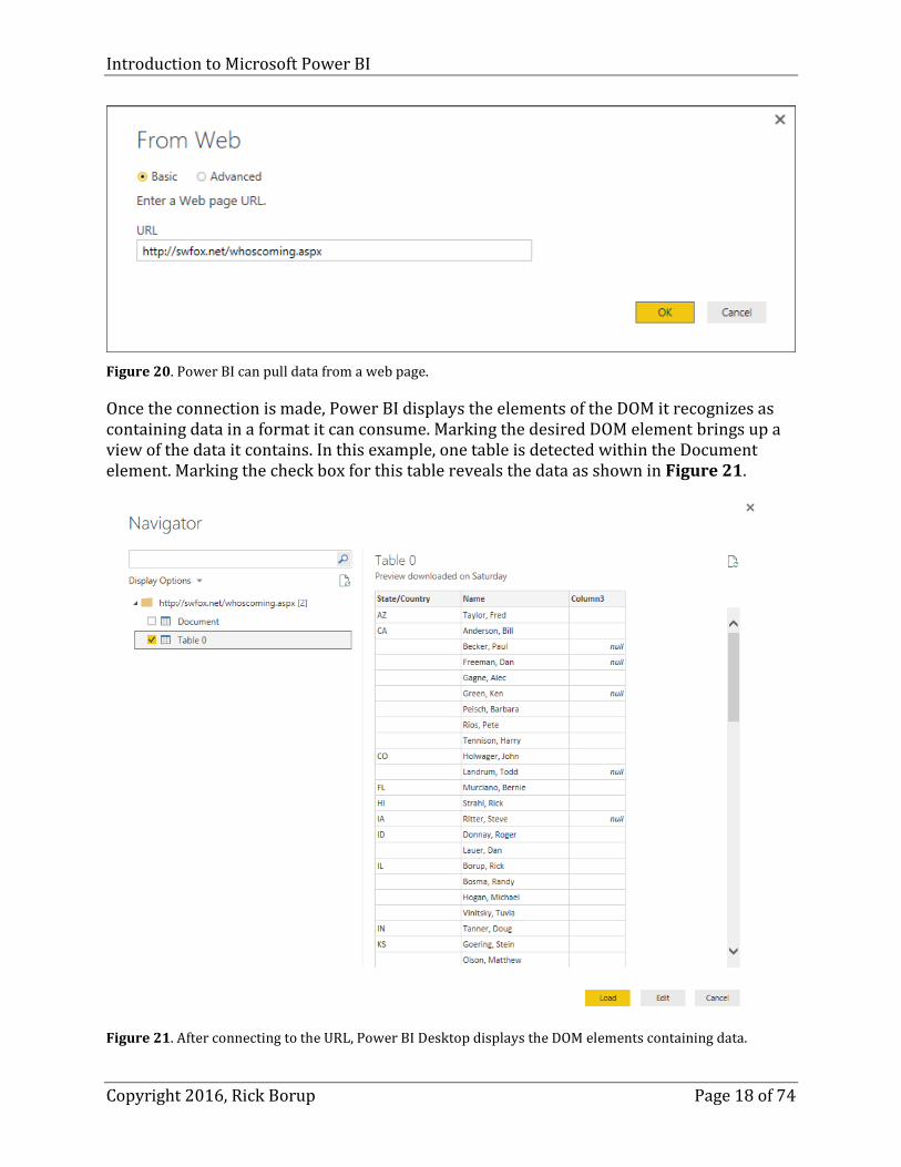
Figure 20. Power BI can pull data from a web page.
Once the connection is made, Power BI displays the elements of the DOM it recognizes as containing data in a format it can consume. Marking the desired DOM element brings up a view of the data it contains. In this example, one table is detected within the Document element. Marking the check box for this table reveals the data as shown in Figure 21.
Figure 21. After connecting to the URL, Power BI Desktop displays the DOM elements containing data.
Introduction to Microsoft Power BI
Copyright 2016, Rick Borup Page 19 of 74
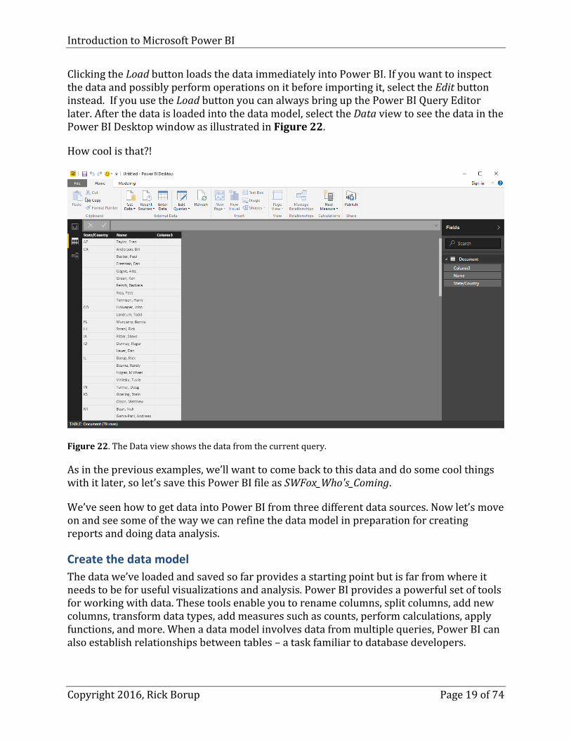
Clicking the Load button loads the data immediately into Power BI. If you want to inspect the data and possibly perform operations on it before importing it, select the Edit button instead. If you use the Load button you can always bring up the Power BI Query Editor later. After the data is loaded into the data model, select the Data view to see the data in the Power BI Desktop window as illustrated in Figure 22.
How cool is that?!
Figure 22. The Data view shows the data from the current query.
As in the previous examples, we’ll want to come back to this data and do some cool things with it later, so let’s save this Power BI file as SWFox_Who's_Coming.
We’ve seen how to get data into Power BI from three different data sources. Now let’s move on and see some of the way we can refine the data model in preparation for creating reports and doing data analysis.
Create the data model
The data we’ve loaded and saved so far provides a starting point but is far from where it needs to be for useful visualizations and analysis. Power BI provides a powerful set of tools for working with data. These tools enable you to rename columns, split columns, add new columns, transform data types, add measures such as counts, perform calculations, apply functions, and more. When a data model involves data from multiple queries, Power BI can also establish relationships between tables – a task familiar to database developers.

Introduction to Microsoft Power BI
Copyright 2016, Rick Borup Page 20 of 74
Microsoft refers to the process of transforming, appending, merging, and creating relationships among tables as “shaping” the data. The end result of shaping your data is a data model ready to be used for visualizations and analysis.
As an example, let’s work with the data we just imported from the Southwest Fox website. This is a very simple table with three columns. The first column is the state or country. The second column is the person’s name, formatted as a single string starting with the last name, followed by a comma, followed by the first name. The third column is empty.
Our objective is to create two reports (visualizations) of this data. We want the first to be a visualization of the distribution by state/country showing how many states and countries are represented and how many people are attending from each. For the second, we want a list we can sort by first name to see how many people share the same first name.
A couple of simple transformations gets this data in shape for our requirements. First of all, let’s get rid of the empty third column. To do this, simply right-click on the column header and choose Delete from the pop-up menu. Power BI asks you to confirm this is what you want to do (see Figure 23).
Figure 23. To delete a column, right-click on it, choose Delete, and confirm the deletion.
The State/Country column contains either the name of a US state or the name of a country if it’s not the USA. This will work fine for our purposes, because in our visualization we’re not going to distinguish between these for now – we only want to be able to see that people are attending from “X” number of US states and “Y” number of other countries.
However, there is one thing we do need to do to the data in the State/Country column. Looking at Figure 23, you can see there are several rows with an empty value. This is fine for display on a web page, where it’s clear that repeated values are suppressed for better readability. But this is not so fine for data analysis, because we don’t want empty values to

Introduction to Microsoft Power BI
Copyright 2016, Rick Borup Page 21 of 74
be a separate category. What we need to do is to fill in the empty values with the data from the row above.
Fortunately, Power BI gives us an easy way to do this. First, click the Edit Query button on the ribbon to open the Query Editor. In the Query Editor, click in the area of the State/Country column where you want to start replacing blank values with the value above. In this example we want to begin by replacing the blank values for CA, so we click on column 1 row 3. With the desired row and column selected, choose the Transform ribbon, click the Fill button (icon with a downward-pointing arrow) and select Down from the submenu as shown in Figure 24.
Figure 24. The Transform ribbon in the Query Editor includes a control to fill in blank values.
And surprise – it doesn’t work. The Applied Steps panel shows the Fill Down step was performed, but the blank values are still there.
This is one of many situations you may run into where Power BI may not behave quite as expected. I’m not exactly sure why it didn’t work, but I guessed it had something to do with the empty-looking cells not really being empty from Power BI’s point of view.
To test this theory, I added and additional step to replace all blank values with null before doing the fill down. Replacing values is another step that’s easy to do in the Query Editor. Right-click on a cell in the State/Country column and choose Replace Values… from the pop-up menu. In the Replace Values dialog, leave the Value To Find field blank and type null in the Replace With field, then click OK (see Figure 25).

Introduction to Microsoft Power BI
Copyright 2016, Rick Borup Page 22 of 74
Figure 25. The Query Editor makes it easy to replace values. Here, blank values are replaced with a null.
Once the empty values have been replaced with nulls (see Figure 26), perform the Fill Down function again as explained above.
Figure 26. The empty values have been replaced with nulls.
This time, Power BI recognizes the empty values and replaces them with the value from the non-empty row above, as expected. Every row in the dataset now has a non-blank value in the State/Country column, as shown in Figure 27.

Introduction to Microsoft Power BI
Copyright 2016, Rick Borup Page 23 of 74
Figure 27. The Fill Down feature replaced all the empty values in the State/Country column with the value above, so every row now has the correct value in that column.
The second transformation we want to apply is to separate the first name from the last name. Once again, the Transform ribbon on the Power Query ribbon has a tool for this.
Start by selecting the Name column. Then click the Split Column icon on the ribbon and select By Delimiter from the submenu. In the Split Column by Delimiter dialog, select Comma as the delimiter and mark the check box to perform the split at the left-most occurrence of that delimiter. Then click OK (see Figure 28).
Figure 28. Power Query can split one column into two based on a delimiter.
Introduction to Microsoft Power BI
Copyright 2016, Rick Borup Page 24 of 74
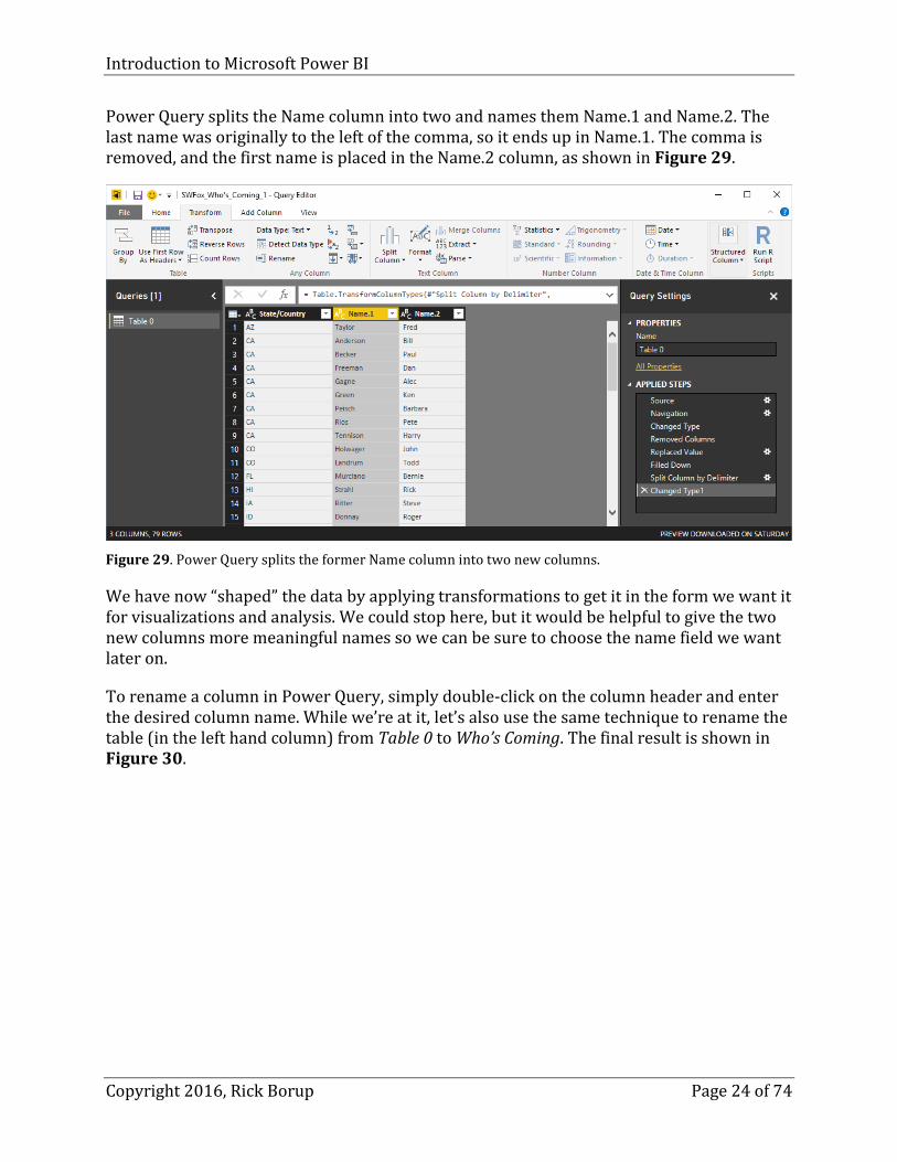
Power Query splits the Name column into two and names them Name.1 and Name.2. The last name was originally to the left of the comma, so it ends up in Name.1. The comma is removed, and the first name is placed in the Name.2 column, as shown in Figure 29.
Figure 29. Power Query splits the former Name column into two new columns.
We have now “shaped” the data by applying transformations to get it in the form we want it for visualizations and analysis. We could stop here, but it would be helpful to give the two new columns more meaningful names so we can be sure to choose the name field we want later on.
To rename a column in Power Query, simply double-click on the column header and enter the desired column name. While we’re at it, let’s also use the same technique to rename the table (in the left hand column) from Table 0 to Who’s Coming. The final result is shown in Figure 30.

Introduction to Microsoft Power BI
Copyright 2016, Rick Borup Page 25 of 74
Figure 30. The data is now “shaped” the way we want it for visualizations and analysis.
Note that all the steps we’ve performed have been recorded in the Applied Steps panel in Figure 30. To save all this work, select the Home page in the Query Editor and click Close and Apply to close the Query Editor and apply these changes to the data model. This is also a good time to save the Power BI file again by choosing File | Save from the main menu.
Create a visualization
Now that we have the Who’s Coming data in the desired format, we can begin to create reports. In Power BI, a report is one or more visualizations stored on a page in the report view. The idea is to combine visualizations that belong together into groups in such a way that all the visualizations for each group can be viewed at once. To do this, each logical grouping of visualizations can be placed on its own page in the reports view.
Let’s begin by creating a visualization showing the distribution of who’s coming to Southwest Fox by state and country. A pie chart is one appropriate type of visualization for this kind of data. Start by clicking the pie chart icon in the Visualizations column of the report view. This creates a placeholder on the canvas, as shown in Figure 31.

Introduction to Microsoft Power BI
Copyright 2016, Rick Borup Page 26 of 74
Figure 31. Clicking the Pie Chart icon in the Visualizations column creates a placeholder on the canvas.
Now select the field you want represented in the pie chart by marking the check box next to State/Country in the Fields panel on the right. Here’s another situation where Power BI doesn’t work quite the way I’d expect it to. I expected the State/Country data to show up immediately in the pie chart on the canvas. Instead, the lower portion of the Visualizations column was expanded and the Legend field was populated with State/Country (see Figure 32).

Introduction to Microsoft Power BI
Copyright 2016, Rick Borup Page 27 of 74
Figure 32. Mark the check box for the field you want in the pie chart.
Note the in area below the Values label of the Visualizations column it says Drag data fields here. To get the data to show up, drag the State/Country field from the Fields panel on the far right and drop it into that area. The pie chart now appears as expected. Grab a corner of it on the canvas and drag to make it larger and more readable (see Figure 33).
Power BI is smart enough to know we want the pie chart to represent the count of people in each category, as indicated by the title in the upper left hand corner of the pie chart.

Introduction to Microsoft Power BI
Copyright 2016, Rick Borup Page 28 of 74
Figure 33. Drop the State/Country field into the Values area to populate the pie chart with those values.
If you want to see this data as a bar chart, be sure the pie chart is selected (you can tell by the presence of the sizing controls on the corners and edges) and then click the bar chart icon in the Visualizations panel. The pie chart changes to a bar chart, as shown in Figure 34.

Introduction to Microsoft Power BI
Copyright 2016, Rick Borup Page 29 of 74
Figure 34. The visualization can be changed to a bar chart simply by clicking that icon in the Visualizations panel.
Combine multiple visualizations into a report
But wait… what if we want to see the data both as a pie chart and a bar chart in the same report? We’ve already said a report can contain more than one visualization. Let’s start by changing the current visualization back to a pie chart by clicking that icon in the Visualizations panel. Then click in the blank area of the canvas to the right of the pie chart and click the bar chart icon. This creates a placeholder bar chart on the canvas. As we did for the pie chart, mark the check box for the State/Country field to place it on the legend, then drag that field into the Values area to complete the bar chart, and resize it as desired. The two visualizations are shown side by side in Figure 35.
Introduction to Microsoft Power BI
Copyright 2016, Rick Borup Page 30 of 74
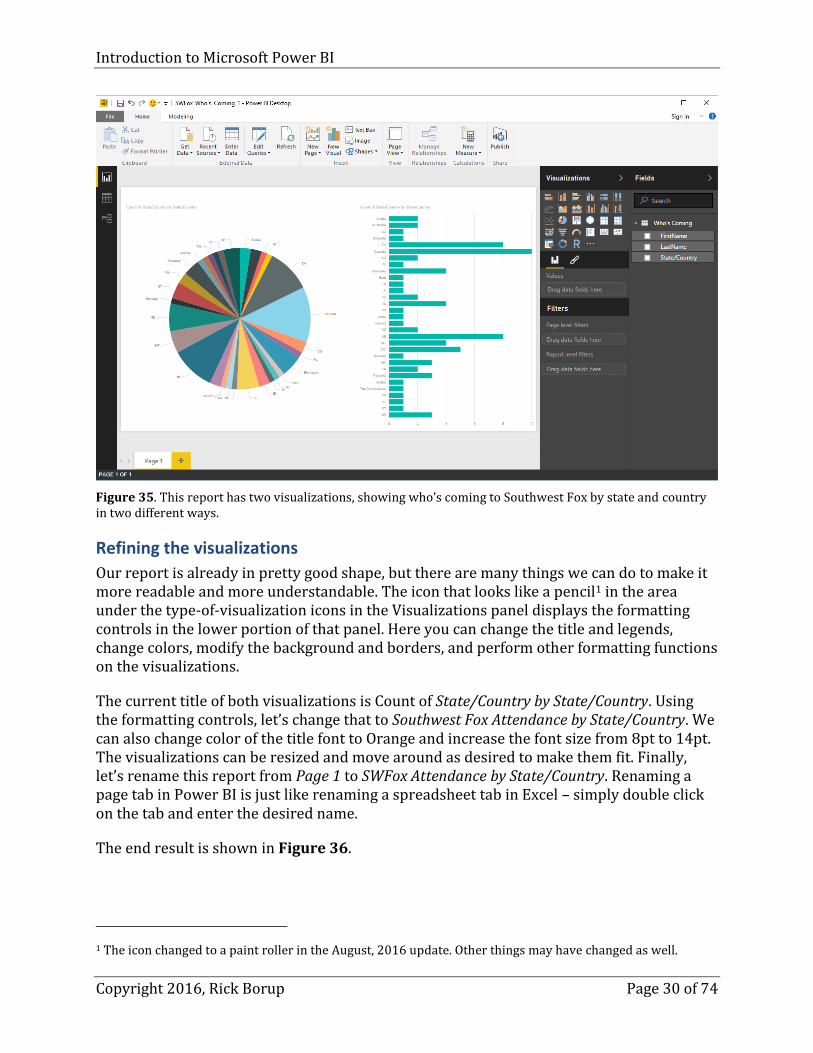
Figure 35. This report has two visualizations, showing who’s coming to Southwest Fox by state and country in two different ways.
Refining the visualizations
Our report is already in pretty good shape, but there are many things we can do to make it more readable and more understandable. The icon that looks like a pencil1 in the area under the type-of-visualization icons in the Visualizations panel displays the formatting controls in the lower portion of that panel. Here you can change the title and legends, change colors, modify the background and borders, and perform other formatting functions on the visualizations.
The current title of both visualizations is Count of State/Country by State/Country. Using the formatting controls, let’s change that to Southwest Fox Attendance by State/Country. We can also change color of the title font to Orange and increase the font size from 8pt to 14pt. The visualizations can be resized and move around as desired to make them fit. Finally, let’s rename this report from Page 1 to SWFox Attendance by State/Country. Renaming a page tab in Power BI is just like renaming a spreadsheet tab in Excel – simply double click on the tab and enter the desired name.
The end result is shown in Figure 36.
1 The icon changed to a paint roller in the August, 2016 update. Other things may have changed as well.

Introduction to Microsoft Power BI
Copyright 2016, Rick Borup Page 31 of 74
Figure 36. Use the formatting tools to change the title text, font size, and font color. The report has also been renamed to SWFox Attendance.
These are but two of the many types of visualizations that can be generated, and they demonstrate only a few of the many types of formatting that can be applied. Now that you’ve seen the basic techniques and learned where to find the controls, I encourage you to explore further on your own. This is a good time to save your Power BI file again, too.
Adding a second report
Now let’s add a second page to this report. Click the + sign next to the page tab at the bottom to open a second page, then change the name of this page to SWFox Attendance by First Name.
To create the visualization we want, we need the data to be in order by first name. Open the Query Editor, click on the arrowhead on the FirstName column header and choose Sort Ascending. Be sure the Select All check box is marked (see Figure 37). Repeat this procedure on the LastName column as a secondary sort field. The data are now sorted by first name and then last name. Click Close & Apply to close the Query Editor and apply this sort order to the data model.

Introduction to Microsoft Power BI
Copyright 2016, Rick Borup Page 32 of 74
Figure 37. Use the Query Editor to sort the data.
Back in the report view, use the filter area in the Visualizations panel to create a filter to show only items when the value is greater than 1 – i.e., when there is more than one attendee with the same first name. (see Figure 38). Click Apply filter.
Figure 38. Create a filter to reduce the amount of data shown in the visualization.

Introduction to Microsoft Power BI
Copyright 2016, Rick Borup Page 33 of 74
Now create a column chart to visualize this data. After applying a few formatting steps as we did in the earlier example, we get the result shown in Figure 39.
Figure 39. This column chart is derived from data sorted by first name and filtered to values greater than 1.
There main purpose of this example was to demonstrate how to add a second page to a report, how to sort data, and how to use a filter. As a side benefit, we discovered that if we run into somebody at the conference whose name we don’t know, our best chance of being correct is to guess “Rick”.
Extending the data model
Sometimes you need to manipulate the data model beyond simple data transformations in order to shape it for the report(s) you want. The following examples illustrate how to add new columns to a table and how to combine data from more than one source. Power BI provides tools that enable you to do both of these things, and more.
Adding columns
The Who’s Coming table in our Southwest Fox attendance examples contains a single column for State/Country. Suppose we’d like to be able to create reports that separate U.S. states from other countries. That would be easy if there were one column for country and another for state. How could we do that?
Introduction to Microsoft Power BI
Copyright 2016, Rick Borup Page 34 of 74
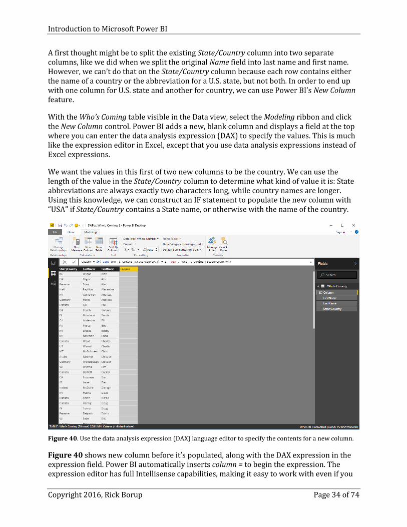
A first thought might be to split the existing State/Country column into two separate columns, like we did when we split the original Name field into last name and first name. However, we can’t do that on the State/Country column because each row contains either the name of a country or the abbreviation for a U.S. state, but not both. In order to end up with one column for U.S. state and another for country, we can use Power BI’s New Column feature.
With the Who’s Coming table visible in the Data view, select the Modeling ribbon and click the New Column control. Power BI adds a new, blank column and displays a field at the top where you can enter the data analysis expression (DAX) to specify the values. This is much like the expression editor in Excel, except that you use data analysis expressions instead of Excel expressions.
We want the values in this first of two new columns to be the country. We can use the length of the value in the State/Country column to determine what kind of value it is: State abbreviations are always exactly two characters long, while country names are longer. Using this knowledge, we can construct an IF statement to populate the new column with “USA” if State/Country contains a State name, or otherwise with the name of the country.
Figure 40. Use the data analysis expression (DAX) language editor to specify the contents for a new column.
Figure 40 shows new column before it’s populated, along with the DAX expression in the expression field. Power BI automatically inserts column = to begin the expression. The expression editor has full Intellisense capabilities, making it easy to work with even if you

Introduction to Microsoft Power BI
Copyright 2016, Rick Borup Page 35 of 74
don’t know DAX. In Power BI, as in Excel, you can point to the row or column containing the value you wish to insert into the expression.
In this case, we want an IF expression. The IF expression in DAX is like an immediate IF in Visual FoxPro and other languages – if some condition is true, use one value, otherwise use another value. In this example we want to insert the value “USA” if the length of the value in the State/Country column is 2, otherwise we want to insert the State/Country value itself. The completed expression is shown in Listing 1.
Listing 1. DAX expressions are similar to Excel expressions. This one inserts “USA” if the value in the State/Country column is 2 characters long, otherwise it inserts the State/Country value.
column = if( len( 'Who''s Coming'[State/Country]) = 2, "USA", 'Who''s Coming'[State/Country])
When the expression is complete, click the check mark icon to the left of the expression field. Figure 41 shows the Who’s Coming table after the values have been inserted and the new column has been renamed to Country.
Figure 41. The new column has been renamed Country and the values were inserted by the DAX expression.
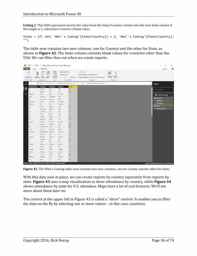
In the same way, we can add a new column for State name. The DAX expression for this column inserts the value from the State/Country column if its length is 2 (see Listing 2). Otherwise, it inserts a blank value into the new State column, because this data does not contain any state or region names for other countries.
Introduction to Microsoft Power BI
Copyright 2016, Rick Borup Page 36 of 74
Listing 2. This DAX expression inserts the value from the State/Country column into the new State column if the length is 2, otherwise it inserts a blank value.
State = if( len( 'Who''s Coming'[State/Country]) = 2, 'Who''s Coming'[State/Country], "")
The table now contains two new columns, one for Country and the other for State, as shown in Figure 42. The State column contains blank values for countries other than the USA. We can filter thse out when we create reports.
Figure 42. The Who’s Coming table now contains two new columns, one for County and the other for State.
With this data now in place, we can create reports by country separately from reports by state. Figure 43 uses a map visualization to show attendance by country, while Figure 44 shows attendance by state for U.S. attendees. Maps have a lot of cool features. We’ll see more about them later on.
The control at the upper left in Figure 43 is called a “slicer” control. It enables you to filter the data on the fly by selecting one or more values – in this case, countries.

Introduction to Microsoft Power BI
Copyright 2016, Rick Borup Page 37 of 74
Figure 43. This report comprises three visualizations based on country.
Figure 44. This report shows two possible visualizations based on state. Rows with a blank value have been filtered out.
Appending data
If there is another source of data that you want to include in your data model, and if that data is in exactly the same format as an existing table, Power BI can append the data from the second table to the data already in the first. This is directly analogous to using APPEND FROM in Visual FoxPro, or doing a SELECT * … UNION SELECT * in SQL. The target table ends up with all of its original rows plus all of the rows from the table being appended.

Introduction to Microsoft Power BI
Copyright 2016, Rick Borup Page 38 of 74
Earlier, we pulled data into Power BI from the CSV version of the Northwind customers table. Open the Northwind_Customers.pbix file from the session downloads and select the data view in Power BI. This displays all the data in the customers table, which at the moment is the only table in this Power BI data model. You can confirm this in a couple of ways: the customers table is the only one listed in the Fields panel, and if you select the relationships view you’ll see there’s only one table.
The session downloads also contain a file named customers_2.csv. This data in this file are in the same format as the data in customers.csv, and it has one row of data not found in customers.csv. If we want combine the data into a single dataset, we can append the new data to the customers table. Start by using Get Data to bring customers_2.csv into the data model, and select Edit. If Power BI did not automatically promote the first row to headers, do so now. The data should look like Figure 45.
Figure 45. The structure of the customers_2 table is identical to the structure of the customers table.
While still in the Query Editor, locate the Combine button at the right of the Home ribbon, as shown in Figure 45. The Combine button opens a drop-down menu with three choices: Merge Queries, Append Queries, and Combine Binaries. If your Query Editor window is wide enough, you won’t see the Combine button; instead, you’ll see those three choices as individual selections on the ribbon.
We want to append the data in customers_2 to the data already in customers. Click on the customers table name in the Queries column in the Query Editor to select it as the “to” side of the append, then select Append Queries from the Combine menu. This opens the Append dialog shown in Figure 46. Mark the radio button for Two tables and select customers_2 as the “from” table in the drop-down list under Table to append.

Introduction to Microsoft Power BI
Copyright 2016, Rick Borup Page 39 of 74
Figure 46. The Append dialog specifies the table(s) to append to the currently selected table.
Click OK to perform the append. If you scroll down to the bottom of the data, you’ll see the new row has been appended. Click Close & Apply to close the Query Editor and apply the changes to the data model.
Return to the data view, and note that the customers table is still the only table in this data model. We used the Append Queries feature to append the data from customers_2, but we did not add the customers_2 table itself to the data model. The new row is at the bottom of the table, so the table is no longer in order by customer ID. If this is important, you can use the Query Editor to sort the data by customer ID or you can deal with it later when creating reports.
Merging data
Often there will be data in other data sources that you’d like to combine with data already in a Power BI model. For example, as you can see in Figure 47, the Northwind customers table contains customer identification and address information but it does not contain any sales data. Sales by customer is something we’d be interested in modeling and visualizing, so how do we combine customer data with sales data into a model for reports?
Introduction to Microsoft Power BI
Copyright 2016, Rick Borup Page 40 of 74
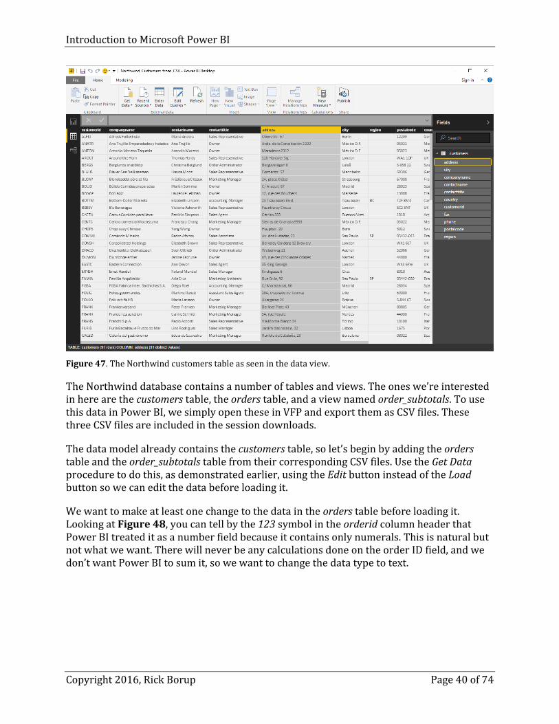
Figure 47. The Northwind customers table as seen in the data view.
The Northwind database contains a number of tables and views. The ones we’re interested in here are the customers table, the orders table, and a view named order_subtotals. To use this data in Power BI, we simply open these in VFP and export them as CSV files. These three CSV files are included in the session downloads.
The data model already contains the customers table, so let’s begin by adding the orders table and the order_subtotals table from their corresponding CSV files. Use the Get Data procedure to do this, as demonstrated earlier, using the Edit button instead of the Load button so we can edit the data before loading it.
We want to make at least one change to the data in the orders table before loading it. Looking at Figure 48, you can tell by the 123 symbol in the orderid column header that Power BI treated it as a number field because it contains only numerals. This is natural but not what we want. There will never be any calculations done on the order ID field, and we don’t want Power BI to sum it, so we want to change the data type to text.

Introduction to Microsoft Power BI
Copyright 2016, Rick Borup Page 41 of 74
Figure 48. The orderid field in the orders table comes in as a number field, but we want it to be text.
You can change a column’s data type by using the Data type control on the Transform ribbon, or by right-clicking on the column header and selecting Change type from the pop-up menu. Click Close & Apply after changing the data type of the orderid field to text.
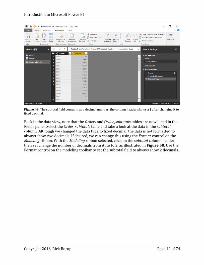
Get the order_subtotals CSV file in the same manner, using Edit instead of Load. This table has only two columns, orderid and subtotal. Change the data type of the orderid field to text, like we did in the orders table. The subtotal field comes in as a decimal number, as shown in Figure 49. The subtotal field comes in as a decimal number; the column header shows a $ after changing it to fixed decimal. In the Northwind database, this field is data type currency and contains a calculated value that includes a discount, meaning there might be more than two decimals. For our purposes, we only care about dollars and cents, so let’s change the data type of the subtotal column in this query to fixed decimal and round the value to two decimals using the control on the Transform ribbon.
Introduction to Microsoft Power BI
Copyright 2016, Rick Borup Page 42 of 74
Figure 49. The subtotal field comes in as a decimal number; the column header shows a $ after changing it to fixed decimal.
Back in the data view, note that the Orders and Order_subtotals tables are now listed in the Fields panel. Select the Order_subtotals table and take a look at the data in the subtotal column. Although we changed the data type to fixed decimal, the data is not formatted to always show two decimals. If desired, we can change this using the Format control on the Modeling ribbon. With the Modeling ribbon selected, click on the subtotal column header, then set change the number of decimals from Auto to 2, as illustrated in Figure 50. Use the Format control on the modeling toolbar to set the subtotal field to always show 2 decimals..

Introduction to Microsoft Power BI
Copyright 2016, Rick Borup Page 43 of 74
Figure 50. Use the Format control on the modeling toolbar to set the subtotal field to always show 2 decimals.
Now that we’ve performed some basic transformations, let’s start looking at the relationships between these three tables. The customers table contains a primary key field for customer ID, along with several columns for location and contact information. The orders table has a unique order ID as its primary key and stores the customer ID as a foreign key to customers. The orders table also has columns for order dates, ship dates, and shipping destination, among others. The order-subtotals table has only two columns: the order ID column is a foreign key to the orders table, and the subtotal column is the sub-total of all items for that order. It’s called a sub-total instead of a total because it does not include shipping, so the value does not represent the final order total as invoiced to the customer.
Figure 51. The Power BI relationships view shows the tables in the data model and the relationships between them. Hovering the mouse over a relationship line reveals the column names used to create the relationship.show the three tables in this data model as seen the Power BI relationships view. The relationships view will be very familiar to VFP and other database developers. It looks a lot like the Database Designer in Visual FoxPro, providing a graphical representation of the table names, the columns each table contains, and line representing the relationships between tables.

Introduction to Microsoft Power BI
Copyright 2016, Rick Borup Page 44 of 74
In the relationships view, you can move the tables around and adjust their size as desired, just like in the VFP Database Designer. In Figure 51, the three tables have been arranged side-by-side and their height has been adjusted to show all the columns in each table.
In this example, Power BI has been smart enough to figure out the relationships between these three tables on its own, based on the column names they have in common. The relationship lines show a one-to-many relationship from customers to orders, and a one-to-one relationship from orders to order_subtotals. It’s not immediately evident which columns are the basis for the relationship, but this is revealed when you hover the mouse over the relationship line. Figure 51 shows the mouse pointer hovering over the relationship line between customers and orders, which causes Power BI to draw a box around the column names used to form the relationship.
Figure 51. The Power BI relationships view shows the tables in the data model and the relationships between them. Hovering the mouse over a relationship line reveals the column names used to create the relationship.
If Power BI did not automatically detect any relationships, or if you want to add, edit, or delete any of them, you can use Power BI’s Manage Relationships feature to do so.
Visualizing the data
The visualization we have in mind for this data model is to represent total sales by country. Looking at Figure 51, you can see the relationships create a link from the customer ID in the customers table to the sub-total in the order_subtotals table, using orders as a join table. This give us everything we need to create a report using country column from the customers table and the subtotal column from the orders table.
Now it’s time to have some fun and create some cool visualizations. One of the simplest ways to visualize two-dimensional data like this is with a bar chart.

Introduction to Microsoft Power BI
Copyright 2016, Rick Borup Page 45 of 74
Switch to the report view and initiate the visualization by clicking on the bar chart icon (top left icon). Select the customers table in the Fields panel and open the drop-down control to see the columns in that table. Drag the country column from the Fields panel and drop it on the new (currently empty) bar chart on the report canvas. Alternately, you can drop it on the area that says Drag data fields here under the Axis label in the Visualizations panel. Either way, this establishes country as the Y axis for the bar chart.
Next, drag the subtotal column from the Fields panel and drop it into the space marked Drag data fields here under the Value label in the Visualizations panel. This establishes the values for the X axis. Note the summation sign to the left of the subtotal column name in the Fields panel, indicating this value will be summed. Finally, grab the lower right corner of the bar chart and drag it to fill the available space in the canvas. The result is illustrated in Figure 52.
Figure 52. This bar chart visualizes total sales by country.
Hovering the mouse over any of the bars reveals the country name and total sales for that country. For example, hovering over the bar for Canada reveals $50,196.30 in total sales to customers in that country, as illustrated in Figure 53.

Introduction to Microsoft Power BI
Copyright 2016, Rick Borup Page 46 of 74
Figure 53. Hovering the mouse of an element of the chart reveals the detail behind it.
By default, the data in the bar chart are sorted alphabetically by country. Suppose we’d prefer to see the data sorted by total sales. Power BI makes this easy – simply click the ellipsis control in the upper right corner of the chart and choose Sort By subtotal.
While a bar chart is one way to visualize this kind of data, we can do better. Power BI can generate a couple of different kinds of maps to visualize geographic data like we have here. We could add a map to the same page as the bar chart, but I’m working with an artificially small canvas here to make the figures more readable so I’ll add a second page to the reports view and create a map there.
One type of map is the filled map, which uses color saturation to illustrate relative values – lighter is lower, darker is higher. On Page 2 in the report view, click the Filled map icon (left-most icon on the fourth row). From the Fields panel, drag the country column of the customers table to the Location field, and drag the totalsales column to the Color saturation field. Power BI creates a map in which each country to which there were sales is shaded darker or lighter depending on the amount of total sales. As with the bar chart, hovering over a data area reveals the details, as illustrated in Figure 54.

Introduction to Microsoft Power BI
Copyright 2016, Rick Borup Page 47 of 74
Figure 54. The filled map visualization shades the data points and uses color saturation to indicate relative values.
There is another type of map that’s useful for this kind of data. Instead of shading the entire country, it draws a circle on top of it. Larger circles represent higher values while smaller circles represent lower values.
A cool feature of Power BI is that you can instantly switch from one type of visualization to another. With the filled map selected, as in Figure 54, click the globe-shaped icon fourth from the left in the third row. The visualization changes to represent the data with shaded circles, as shown in Figure 55.

Introduction to Microsoft Power BI
Copyright 2016, Rick Borup Page 48 of 74
Figure 55. This type of map visualizes the data using filled circles whose sizes correspond to the data values.
As with the other charts, hovering the mouse over a data point reveals the values.
If you thought that was cool, it gets even better. You can zoom in and out on these maps to focus on certain areas and see the data in more detail. This is especially important on a map like we see in Figure 55, where there is a cluster of overlapping data points in Europe and Scandinavia.
Use the mouse wheel to zoom in on Europe and Scandinavia. Drag the map around in the visible portion of the report and center it as desired. The data points are overlaid on Bing maps, so the more you zoom in the more geographic detail (cities, towns, highways, etc.) will be revealed as well. Figure 56 shows the map zoomed in and centered on Europe.

Introduction to Microsoft Power BI
Copyright 2016, Rick Borup Page 49 of 74
Figure 56. Use the mouse wheel to zoom in and out, and drag the map around to center the view as desired.
Another type of visualization is the matrix. A matrix helps people quickly see the actual values in the data model. Let’s add another new page to this report and create a matrix view of this data. Click the matrix icon (right most on the third row), drag the customers.country column to the Rows field and drag the order_subtotals.subtotal column to the Values field. Use the Edit controls to change the font size from 8pt to 14pt and adjust the width of the columns to display all the values without truncation. By default, the rows are in alphabetic order by country name. The result is shown in Figure 57.

Introduction to Microsoft Power BI
Copyright 2016, Rick Borup Page 50 of 74
Figure 57. The matrix visualization shows the total orders by country.
In order to make the visualizations big enough to show up well in the screenshots, I’ve been using a separate report page for each of them. This is not necessary, and in fact one of the nice things about a report is that you can arrange multiple visualizations on a single page. Figure 58 shows one possible way to represent all three visualizations on a single report page after adjusting font sizes, modifying titles, and adding a text box at the top.
Figure 58. A report page can contain multiple visualizations.
Looking at the rows of icons in the Visualizations panel, you can see how many different kinds of visualization Power BI can create. Pie charts, bar charts, maps, and matrix displays

Introduction to Microsoft Power BI
Copyright 2016, Rick Borup Page 51 of 74
are only a few of them. The one(s) you choose for your own visualizations will depend in part on the type of data you’re working and in part on your intended audience. Executives typically want summary information so they can grasp the “big picture” at a glance, while analysts usually want more detailed data they can dig into. The purpose of the preceding examples was to demonstrate the mechanics of shaping a data model and creating visualizations from it. Armed with this knowledge, you can go on to explore and to create your own visualizations from your own data.
Publishing to Power BI Online Once you have created your reports the way you want them in Power BI Desktop, you can publish them to the Power BI Online service. We can demonstrate how this works using the Northwind Sales by Country report we just finished building in Figure 58.
Begin by clicking the Publish icon on the Home ribbon in Power BI Desktop. If you do not have a Power BI Online account or are not signed in, you are prompted to take care of that now (see Figure 59).
Figure 59. You need to sign in to your Power BI Online account before you can publish to it.
After signing in, Power BI Desktop will spin for a while and display a message as it publishes your file online (see Figure 60).
Figure 60. Power BI Desktop displays a message while it’s publishing your file to Power BI Online.
If publishing is successful, you’ll get a message saying so (Figure 61).

Introduction to Microsoft Power BI
Copyright 2016, Rick Borup Page 52 of 74
Figure 61. Power BI displays a success message after publishing your report.
In my experience, clicking either of the two links takes you to the same place, which is the Web page where you can access your Power BI Online account in a browser. The base URL for accessing your Power BI Online account is https://app.powerbi.com. Once you’ve signed in, the URL is https://app.powerbi.com/groups/me/dashboards.
Power BI Online looks like a blank canvas when you first sign in (see Figure 62). The data and reports we just published are there, but the navigation panel on the left is collapsed by default.
Figure 62. Power BI Online looks like a blank canvas when you first sign in.
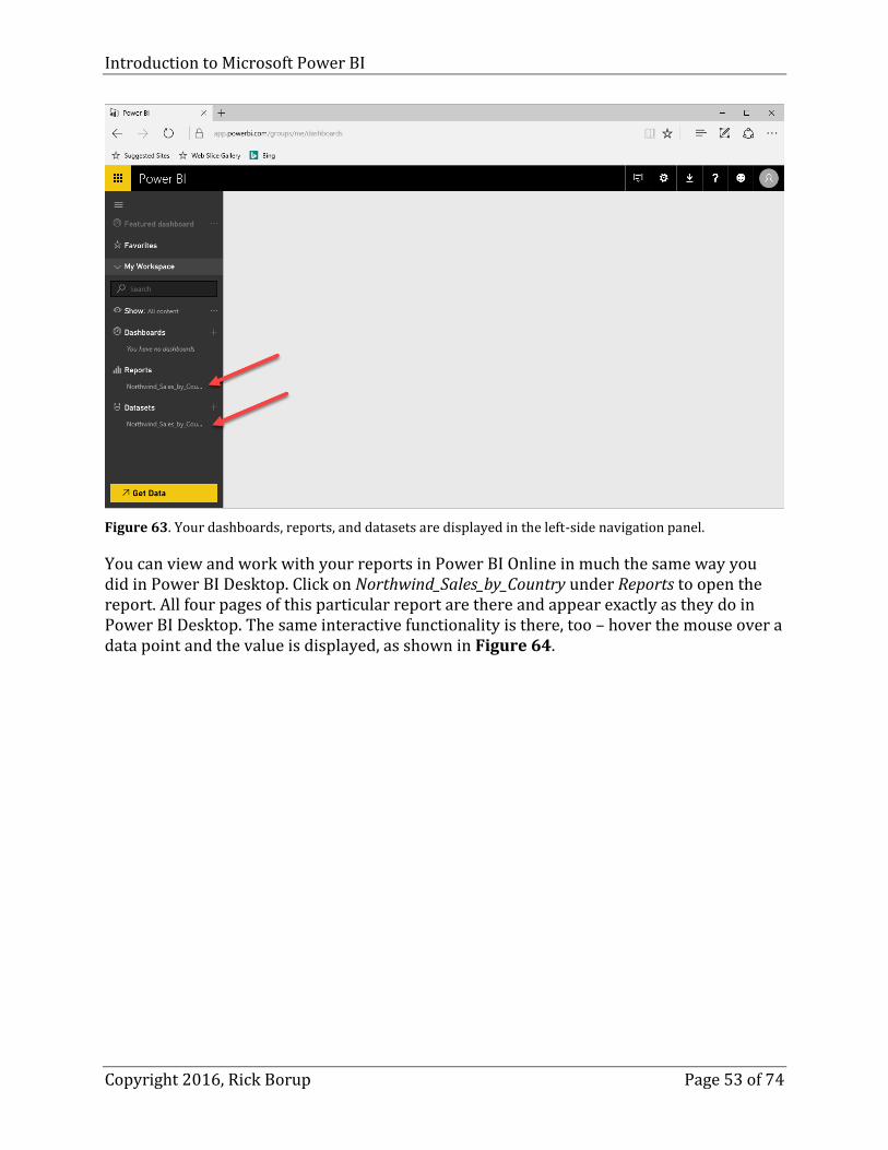
Click the hamburger menu icon at the top of the left-side navigation panel to view the contents of your workspace. Your dashboards, reports, and datasets are displayed in and can be selected from the navigation panel. The Northwind_Sales_by_Country dataset and report we just published are listed, as shown in Figure 63.
Introduction to Microsoft Power BI
Copyright 2016, Rick Borup Page 53 of 74
Figure 63. Your dashboards, reports, and datasets are displayed in the left-side navigation panel.
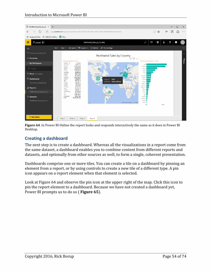
You can view and work with your reports in Power BI Online in much the same way you did in Power BI Desktop. Click on Northwind_Sales_by_Country under Reports to open the report. All four pages of this particular report are there and appear exactly as they do in Power BI Desktop. The same interactive functionality is there, too – hover the mouse over a data point and the value is displayed, as shown in Figure 64.
Introduction to Microsoft Power BI
Copyright 2016, Rick Borup Page 54 of 74
Figure 64. In Power BI Online the report looks and responds interactively the same as it does in Power BI Desktop.
Creating a dashboard
The next step is to create a dashboard. Whereas all the visualizations in a report come from the same dataset, a dashboard enables you to combine content from different reports and datasets, and optionally from other sources as well, to form a single, coherent presentation.
Dashboards comprise one or more tiles. You can create a tile on a dashboard by pinning an element from a report, or by using controls to create a new tile of a different type. A pin icon appears on a report element when that element is selected.
Look at Figure 64 and observe the pin icon at the upper right of the map. Click this icon to pin the report element to a dashboard. Because we have not created a dashboard yet, Power BI prompts us to do so ( Figure 65).

Introduction to Microsoft Power BI
Copyright 2016, Rick Borup Page 55 of 74
Figure 65. You can pin a report element to a dashboard to form a tile on that dashboard.
Let’s name this dashboard Northwind Sales. Enter that name in the field provided and click the Pin button. Then select the newly created dashboard in the navigation panel. At first, the dashboard looks like Figure 66.
Figure 66. The map element from the report has been pinned to the new dashboard.
The map is now a tile on this dashboard. There are many things you can do with it. Clicking on the tile takes you back to the report from which it was pinned. Hovering the mouse over
Introduction to Microsoft Power BI
Copyright 2016, Rick Borup Page 56 of 74
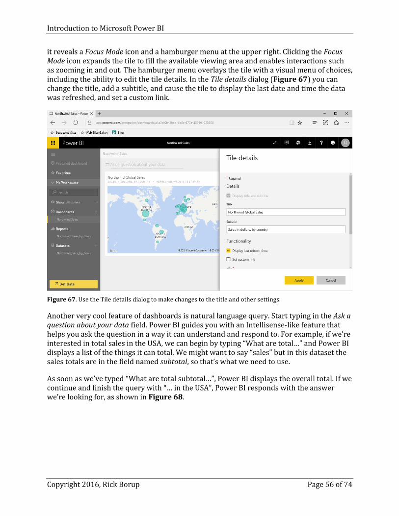
it reveals a Focus Mode icon and a hamburger menu at the upper right. Clicking the Focus Mode icon expands the tile to fill the available viewing area and enables interactions such as zooming in and out. The hamburger menu overlays the tile with a visual menu of choices, including the ability to edit the tile details. In the Tile details dialog (Figure 67) you can change the title, add a subtitle, and cause the tile to display the last date and time the data was refreshed, and set a custom link.
Figure 67. Use the Tile details dialog to make changes to the title and other settings.
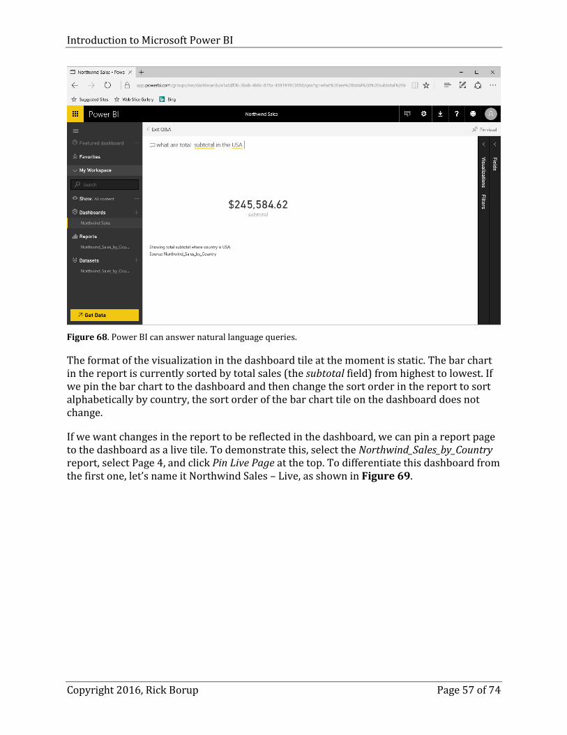
Another very cool feature of dashboards is natural language query. Start typing in the Ask a question about your data field. Power BI guides you with an Intellisense-like feature that helps you ask the question in a way it can understand and respond to. For example, if we’re interested in total sales in the USA, we can begin by typing “What are total…” and Power BI displays a list of the things it can total. We might want to say “sales” but in this dataset the sales totals are in the field named subtotal, so that’s what we need to use.
As soon as we’ve typed “What are total subtotal…”, Power BI displays the overall total. If we continue and finish the query with “… in the USA”, Power BI responds with the answer we’re looking for, as shown in Figure 68.
Introduction to Microsoft Power BI
Copyright 2016, Rick Borup Page 57 of 74
Figure 68. Power BI can answer natural language queries.
The format of the visualization in the dashboard tile at the moment is static. The bar chart in the report is currently sorted by total sales (the subtotal field) from highest to lowest. If we pin the bar chart to the dashboard and then change the sort order in the report to sort alphabetically by country, the sort order of the bar chart tile on the dashboard does not change.
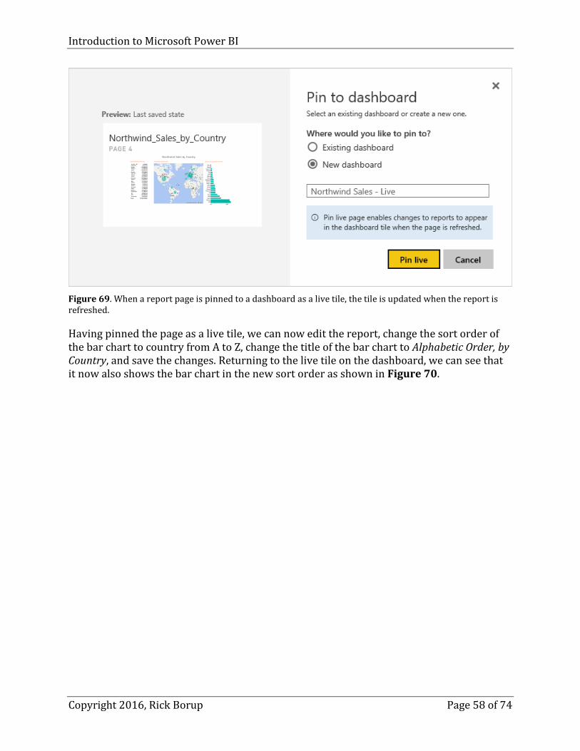
If we want changes in the report to be reflected in the dashboard, we can pin a report page to the dashboard as a live tile. To demonstrate this, select the Northwind_Sales_by_Country report, select Page 4, and click Pin Live Page at the top. To differentiate this dashboard from the first one, let’s name it Northwind Sales – Live, as shown in Figure 69.
Introduction to Microsoft Power BI
Copyright 2016, Rick Borup Page 58 of 74
Figure 69. When a report page is pinned to a dashboard as a live tile, the tile is updated when the report is refreshed.
Having pinned the page as a live tile, we can now edit the report, change the sort order of the bar chart to country from A to Z, change the title of the bar chart to Alphabetic Order, by Country, and save the changes. Returning to the live tile on the dashboard, we can see that it now also shows the bar chart in the new sort order as shown in Figure 70.

Introduction to Microsoft Power BI
Copyright 2016, Rick Borup Page 59 of 74
Figure 70. The bar chart on the live tile in the dashboard reflects the changes made to the report.
Sharing your dashboard
You probably didn’t go to all the trouble to create a great dashboard solely for your own benefit. The real value in a dashboard is the ability to share it with others. Power BI provides a mechanism for sharing your dashboard by distributing a link to its location in Power BI Online.
With your dashboard selected in your browser, click the Share icon at the upper right on the toolbar. This opens the Share Dashboard dialog, from which you can invite others to view your dashboard and control who has access.
The Share Dashboard dialog has two pages. The one named Share is where you create an invitation to another person to share your dashboard. Access to dashboards is granted by email address. To invite another person to share your dashboard, you add their email address to your access list.
It’s worth noting that the people with whom you want to share your dashboard need to have a Power BI account of their own. If you have a Power BI Pro account and want to share features that require a Pro account, the people you share with will need to have a Power BI Pro account, too. Otherwise, a free account is all they need.
On the Share page of the Share Dashboard dialog, enter the email address of the person with whom you want to share your dashboard. The two check boxes at the bottom determine whether you want the other person to be able to re-share the dashboard, and

Introduction to Microsoft Power BI
Copyright 2016, Rick Borup Page 60 of 74
whether you want Power BI to send an email notifying the person they’ve been invited to share. You can include an optional message if you want Power BI to send an email invitation.
Figure 71. You can share your dashboard with other people.
You can share your dashboard with people inside or outside of your organization. Power BI determines if they are outside your organization by their email domain name. You can invite more than one person at the same time by entering multiple email addresses. After filling in at least one email address and marking the other options as desired, click the Share button. Power BI displays a Success message when the operation is complete.
Now click the Share icon again and this time select the Access page. Here you can see the list of people who have access to your dashboard, along with its URL. You can also use this page to control whether someone can re-share the dashboard, and to stop sharing the dashboard with someone.
All of the Power BI Online work here has been done under an account I set up for this session under the name of Guy Fox, who has an email address in my company domain. Figure 72 shows that this dashboard is owned by its author, Guy Fox, and is shared with me at my company email address. Because the Send email notification to recipients check box was marked, I received an email informing me the dashboard had been shared with me and providing the link to accept the invitation and view the dashboard.

Introduction to Microsoft Power BI
Copyright 2016, Rick Borup Page 61 of 74
Figure 72. Use the Access page of the Share dashboard dialog to view and control who has access to your dashboard.
When you share a dashboard, everyone you share it with can view and interact with it but they cannot download the datasets, create new reports, or make permanent changes to the existing reports.
Using Power BI Online by itself You can use Power BI Online in different ways.
One way is to do all the data transformations, relationships, and report creation work in Power BI Desktop and then publish the Power BI Desktop file to a Power BI Online account, as we’ve seen in the preceding examples.
Another way is to use Power BI Online as a standalone tool. When used in this manner, you can import or connect to data from various types of data sources and create visualization entirely within Power BI Online, much like you do in Power BI Desktop. Power BI Online can also import Power BI Desktop files, so if you have a Power BI Desktop file that hasn’t been published, you can import it into Power BI Online and continue to work with it from there.
A free account is all you need to get started. You can buy a Pro account later if you need it. If you do not already have a Power BI account, please refer back to the earlier section in this paper entitled How to sign up for the Power BI service for instructions.

Introduction to Microsoft Power BI
Copyright 2016, Rick Borup Page 62 of 74
Connect to the Power BI Online service
Once you have established a Power BI account, go to https://powerbi.microsoft.com and sign in. The older https://powerbi.com now redirects to this URL as well. You are greeted with the Welcome to Power BI page already shown in Figure 9.
Get data
When you first sign in to your Power BI account from a browser, you’ll see a window that looks a lot like the Power BI Desktop app, as shown in Figure 73.
Figure 73. Power BI online is a blank canvas when you first sign in.
Click the hamburger menu at the top of the left-side navigation panel to slide out the workspace controls. Unless something was previously published to this account from Power BI Desktop, everything is initially empty – there are no dashboards, no reports, and no datasets (see Figure 74).

Introduction to Microsoft Power BI
Copyright 2016, Rick Borup Page 63 of 74
Figure 74. Click the hamburger menu to slide out the workspace controls.
Clicking the large yellow Get Data button at the bottom of the left-side navigation panel takes you to a window from which you can get data from various types of sources, as shown in Figure 75.

Introduction to Microsoft Power BI
Copyright 2016, Rick Borup Page 64 of 74
Figure 75. This Power BI web page is where you go to get data. When you are signed in to your account, the direct URL for this page is https://app.powerbi.com/groups/me/getdata.
Power BI Online can import data from CSV files, from spreadsheets in workbook files created by Excel 2013 or later for Windows, and from Power BI Desktop files. The data source for these files can be your local hard drive or an online source like OneDrive or SharePoint. Power BI can also connect to an Azure SQL database or data warehouse, to SQL Server Analysis Services, and to Spark on Azure.
Once the data is in Power BI, you can create reports and dashboards in much the same way as in Power BI Desktop.
With a dataset selected in Power BI Online, the documentation says you should be able to use the Explore feature to see and work with it, but I have not found this to be possible. I’ve successfully imported CSV, Excel, and Power BI files into my Power BI account, but in each case the choices on the Explore menu are disabled (see Figure 76). If this is a Power BI Pro feature, I haven’t found it documented anywhere. More likely, I’ve failed to do something that’s necessary to make these choices available.
Aside from not being able to explore the data in the dataset, working with reports in Power BI Online feels quite familiar after working with them in Power BI Desktop. The Power BI Online web page contains the same Visualizations and Fields panels found in the Desktop app. You can create a report from scratch, or modify a report that was imported from Power BI Desktop. Reports can be saved whenever you’re finished with whatever modifications or enhancements you want to make. Finally, you can pin reports or report elements to a dashboard, as in the previous example.

Introduction to Microsoft Power BI
Copyright 2016, Rick Borup Page 65 of 74
Figure 76. In my experience, the items on the Explore menu have always been disabled.
Refreshing your reports Data is dynamic. When you created a report, it’s a snapshot that’s frozen at that point in time, and it’s useful only until the data changes. Once the data becomes stale the report becomes useless.
You don’t want to have to re-create your reports from scratch every time the data changes. What’s needed is a way to refresh the data in an existing report. It’s no surprise that Power BI comes with tools to do this.
Refreshing a dataset
When you use a query to create a dataset, Power BI stores more than just the data. It also stores a reference to the data source along with any credentials that might be needed to access it. This enables Power BI to go get updated data from the same source without you needing to do anything other than telling it to refresh.
Power BI must be able to establish a connection to the data source in order to refresh a dataset. A distinction is made between local data sources and online data sources. Some data source files, such as Excel or CSV files, might be stored on your local hard drive. Power BI refers to these as on-premises data sources. Other data sources might be accessible online. These includes files stored on services such as OneNote or SharePoint, as well as data that can be queried from a Web page, from a SQL Server database, from Azure SQL databases, or other online-accessible sources or services.

Introduction to Microsoft Power BI
Copyright 2016, Rick Borup Page 66 of 74
You can refresh a dataset in both Power BI Desktop and in Power BI Online. If a dataset contains no on-premises data sources, you can refresh it from either place as long as a connection to the data source(s) can be established. For example, the Who’s Coming to Southwest Fox dataset gets its data from a publicly accessible web page. That dataset can be refreshed both in Power BI Desktop and Power BI Online as long as the web page is accessible.
On the other hand, if a dataset contains on-premises data sources, you can refresh it in Power BI Desktop (assuming it’s running on a machine that has access to the local resource) but you need a gateway if you want to refresh it from Power BI Online. Power BI provides both personal and enterprise gateways for this purpose.
How and when to refresh
Datasets can be refreshed manually, automatically according to some pre-determined schedule, or from streaming data inputs. The most basic way is to refresh manually. Both Power BI Desktop and Power BI Online provide a simple on-step way to do this. In Power BI Desktop, when the dataset is selected in the Data view, there’s a Refresh icon on the Home ribbon – refer back to Figure 22 as an example. In Power BI Online, right-clicking on a dataset brings up a menu of choices, one of which is Refresh Now as shown in Figure 77.
Figure 77. To refresh a report in Power BI Online, right-click on the dataset and choose REFRESH NOW.
The drawback to manually refreshing your datasets is of course that someone has to be involved every time the data needs to be refreshed. There are scenarios where this might be appropriate, such as a company executive or analyst who manually refreshes her Power

Introduction to Microsoft Power BI
Copyright 2016, Rick Borup Page 67 of 74
BI Desktop reports when she comes in to work every morning, in order to look at the latest numbers from the overnight data processing updates.
In other scenarios, data may change much more frequently and manual updating could become burdensome. If refreshing the data manually is not feasible for any reason, you can set up an automatic update schedule. Here there is a difference between free Power BI and paid Power BI Pro. Free Power BI allows you to schedule a once-daily update, while Power BI Pro allows up to eight scheduled updates per day. There are also differences on the amount of data that can be updated, as measured by rows per hour.
When deciding how often and when to refresh your datasets, you’ll want to consider how often the data changes and how important it is to show up-to-the-minute data in your Power BI dashboards and reports.
The Power BI REST API
For developers, Power BI offers a set of REST APIs enabling apps to interact with Power BI data and visualizations. One use for this is to push new data to refresh a report. Full coverage of the API is beyond the scope of this paper, but many resources are available to help you get going if this is something you want to pursue. Here are some good places to start:
Power BI Developer Center https://powerbi.microsoft.com/en-us/developers/
What can developers do with Power BI? https://powerbi.microsoft.com/en-us/documentation/powerbi-developer-overview-of-power-bi-rest-api/
Pushing Data into Power BI Preview Using the New REST API – Part 1 http://www.microsofttrends.com/2015/02/17/pushing-data-into-power-bi-preview-using-the-new-rest-api-part-1/
Overview of Power BI REST API https://msdn.microsoft.com/en-us/library/dn877544.aspx
Power BI REST API reference https://msdn.microsoft.com/en-us/library/mt147898.aspx
Using Power BI from Excel Power BI as we know it today has evolved from earlier tools over the last several years. Power Pivot was introduced as an add-in to Excel 2010. Power Pivot is the tool used to “shape” data into some desired format for analysis and insight. Power Query and Power View came along later with Excel 2013. Like Power Pivot, Power Query is a tool for creating data models in preparation for analysis and reporting, but more advanced. Power View is a tool for generating visualizations from data models created by Power Query. They are still available in Excel 2016, where Power Query is known as Get & Transform. For a while these

Introduction to Microsoft Power BI
Copyright 2016, Rick Borup Page 68 of 74
tools were also available as part of an Office 365 subscription, but it appears that has since been deprecated at least in some versions. Today, Power BI Desktop and the Power BI online service are the tools of choice.
Your version of Office matters. Power Pivot was available in Office Professional Plus 2013 and in the standalone version of Excel 2013. The best information I can find indicates that today it is available in Office 365 Pro Plus, Office Professional Plus, Office 2016 Professional, and the Excel 2016 standalone version.
The examples in this paper are based on Excel 2016 installed from an Office 365 Business subscription. If you’re using Excel 2013, the steps are similar but you may have to first download and install the Power BI add-ins. There are plenty of online resources to show you how to do that.
Power Query
Power Query is a downloadable add-in for Excel 2013. It’s built in to Excel 2016, where Microsoft refers to it as Get & Transform. This tool enables you to get data from various sources and provides a Query Editor you can use to perform transformations such as deleting columns, changing data types, splitting columns, appending data, and so on. The data can then be loaded into a data model for use in Power Pivot, and from there into visualizations using Power View.
To illustrate how to use Power Query in Excel, let’s reproduce the steps we took earlier in Power BI Desktop to import the Who’s Coming data from the Southwest Fox website.
Getting data from the Web
To import data from the Web in Excel, select the Data ribbon and click the New Query icon. From the drop-down list, choose From Other Sources | From Web as shown in Figure 78.

Introduction to Microsoft Power BI
Copyright 2016, Rick Borup Page 69 of 74
Figure 78. Use the New Query control on the Data ribbon to get data into Power Query in Excel.
In the dialog the follows, enter the URL of the desired Web page (see Figure 79).
Figure 79. Enter the URL of the desired Web page.
Much like when importing data from the Web in Power BI Desktop, Excel opens a Navigator window from which you can select the DOM element(s) that contain the data you want. Unlike Power BI Desktop, there are no check boxes next to the DOM element names so you

Introduction to Microsoft Power BI
Copyright 2016, Rick Borup Page 70 of 74
simply click on the one you want to select it. This Web page has only one table, identified as Table 0. Select it, as shown in Figure 80, and then click the Edit button.
Figure 80. Click to select the table containing the data you want to edit and load.
This opens the Query Editor in a separate window. Although its appearance may be different in some places, the Query Editor in Excel is entirely analogous to the Query Editor in Power BI Desktop. When it first comes up, the data appears as shown in Figure 81. Compare this to the initial state of the same data in Power BI Desktop (see Figure 22).

Introduction to Microsoft Power BI
Copyright 2016, Rick Borup Page 71 of 74
Figure 81. The Query Editor in Excel is analogous to the Query Editor in Power BI Desktop.
Using the Query Editor in Excel, we can follow the same sequence of steps we used in Power BI Desktop to shape this data the way we want it. The result is shown in Figure 82.
Figure 82. Use the controls in the Query Editor to shape the data the way we want it.

Introduction to Microsoft Power BI
Copyright 2016, Rick Borup Page 72 of 74
In Power Query for Excel, the Close & Load button in equivalent to the Close & Apply button in Power BI Desktop. When we’re finished shaping the data the way we want it, click Close & Load to load the query into an Excel spreadsheet.
If your version of Excel includes Power Pivot and Power View, you can use Power Pivot to load the data into a data model, manage relationships among tables, and further shape your data the way you want it, and then use Power View to create visualizations. If you do not have Power Pivot or Power View, you can use standard Excel functions to work with the data and you can use Excel’s charts and graphs to create visualizations that way, or you can use Excel’s native capabilities to shape the data as much as possible and then import the spreadsheet into Power BI Desktop or Power BI Online.
Getting data from a CSV file
In the same way you can get data from the Web in Excel, you can also get data from a file such as a CSV file. To illustrate this, we can use Get Data to bring in the data from the customers.csv file we used earlier in Power BI Desktop, as shown in Figure 83.
Figure 83. Excel can get data from a CSV file.
As with data from other sources, clicking the Edit button open the data in the Query Editor (see Figure 84).
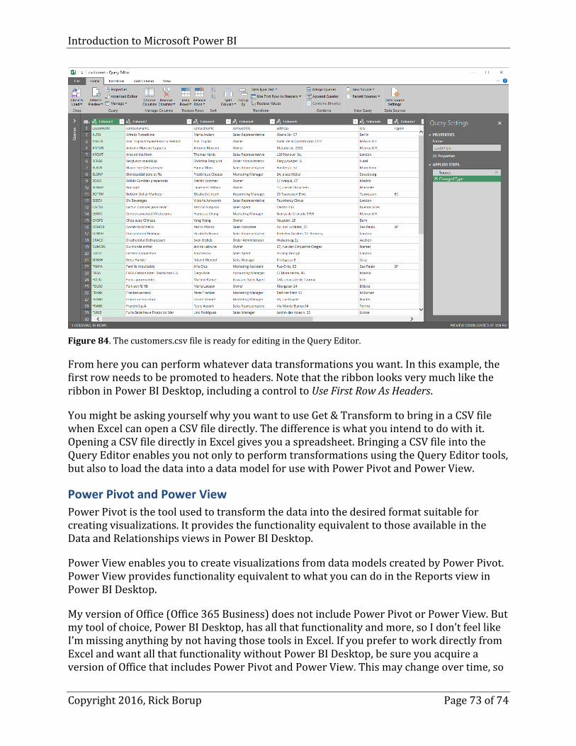
Introduction to Microsoft Power BI
Copyright 2016, Rick Borup Page 73 of 74
Figure 84. The customers.csv file is ready for editing in the Query Editor.
From here you can perform whatever data transformations you want. In this example, the first row needs to be promoted to headers. Note that the ribbon looks very much like the ribbon in Power BI Desktop, including a control to Use First Row As Headers.
You might be asking yourself why you want to use Get & Transform to bring in a CSV file when Excel can open a CSV file directly. The difference is what you intend to do with it. Opening a CSV file directly in Excel gives you a spreadsheet. Bringing a CSV file into the Query Editor enables you not only to perform transformations using the Query Editor tools, but also to load the data into a data model for use with Power Pivot and Power View.
Power Pivot and Power View
Power Pivot is the tool used to transform the data into the desired format suitable for creating visualizations. It provides the functionality equivalent to those available in the Data and Relationships views in Power BI Desktop.
Power View enables you to create visualizations from data models created by Power Pivot. Power View provides functionality equivalent to what you can do in the Reports view in Power BI Desktop.
My version of Office (Office 365 Business) does not include Power Pivot or Power View. But my tool of choice, Power BI Desktop, has all that functionality and more, so I don’t feel like I’m missing anything by not having those tools in Excel. If you prefer to work directly from Excel and want all that functionality without Power BI Desktop, be sure you acquire a version of Office that includes Power Pivot and Power View. This may change over time, so

Introduction to Microsoft Power BI
Copyright 2016, Rick Borup Page 74 of 74
check the Microsoft Office website to see which versions include these tools before you decide what to buy.
Summary Power BI brings the power of data visualization and analysis much closer to the end user than ever before. The free Power BI Desktop application provides everyone with the tools necessary to get data, transform and shape it into suitable form, and to create visualizations from which useful insights can be gained. Those who prefer to work in Excel can harness Power BI using the Power Query, Power Pivot, and Power View add-ins. The Power BI Online service, available in basic form for free and with additional capabilities as a paid subscription, can be used as a standalone tool or in conjunction with files created by Power BI Desktop as well as data from other sources. Dashboards created in Power BI Online can be shared with others.
I see an opportunity for developers here. As easy as it is for everyone to work with Power BI Desktop and Power BI Online, many clients, particularly mid- to senior-level executives, are most likely going to turn to in-house or contract professionals who know how to work with data and how to create dashboards with the information they want to see. By learning how to use Power BI, you can position yourself to take advantage of these opportunities and provide value-added benefits to your clients.
Biography Rick Borup is owner and president of Information Technology Associates, LLC, a professional software development, computer services, and information systems consulting firm he founded in 1993. Rick earned BS and MBA degrees from the University of Illinois and spent several years developing software applications for mainframe computers before turning to PC database development tools in the late 1980s. He began working with FoxPro in 1991, and has worked full time in FoxPro and Visual FoxPro since 1993. He is a co-author of the books Deploying Visual FoxPro Solutions and Visual FoxPro Best Practices For The Next Ten Years. He has written articles for FoxTalk and FoxPro Advisor, and is a frequent speaker at Visual FoxPro conferences and user groups. Rick is a Microsoft Certified Solution Developer (MCSD) and a Microsoft Certified Professional (MCP) in Visual FoxPro.
Copyright © 2016 Rick Borup. Windows® is a registered trademark of Microsoft Corporation in the United States and other countries. All other trademarks are the property of their respective owners