investigating the homogenization of web design: a mixed
TRANSCRIPT

Investigating the Homogenization of Web Design: AMixed-Methods Approach
Sam GoreeIndiana University Bloomington
Luddy School of Informatics, Computing, and EngineeringBloomington, Indiana, USA
Bardia DoostiIndiana University Bloomington
Luddy School of Informatics, Computing, and EngineeringBloomington, Indiana, USA
David J. CrandallIndiana University Bloomington
Luddy School of Informatics, Computing, and EngineeringBloomington, Indiana, USA
Norman Makoto SuIndiana University Bloomington
Luddy School of Informatics, Computing, and EngineeringBloomington, Indiana, USA
ABSTRACTVisual design provides the backdrop to most of our interactionsover the Internet, but has not received as much analytical attentionas textual content. Combining computational with qualitative ap-proaches, we investigate the growing concern that visual designof the World Wide Web has homogenized over the past decade. Byapplying computer vision techniques to a large dataset of repre-sentative websites images from 2003–2019, we show that designshave become significantly more similar since 2007, especially forpage layouts where the average distance between sites decreasedby over 30%. Synthesizing interviews from 11 experienced webdesign professionals with our computational analyses, we discusscauses of this homogenization including overlap in source codeand libraries, color scheme standardization, and support for mobiledevices. Our results seek to motivate future discussion of the fac-tors that influence designers and their implications on the futuretrajectory of web design.
CCS CONCEPTS• Human-centered computing→ User interface design.
KEYWORDSweb design, design homogenization, historical analysis, computa-tional social science, interviews
ACM Reference Format:Sam Goree, Bardia Doosti, David J. Crandall, and Norman Makoto Su. 2021.Investigating the Homogenization of Web Design: A Mixed-Methods Ap-proach. In CHI Conference on Human Factors in Computing Systems (CHI’21),May 8–13, 2021, Yokohama, Japan. ACM, New York, NY, USA, 14 pages.https://doi.org/10.1145/3411764.3445156
Permission to make digital or hard copies of all or part of this work for personal orclassroom use is granted without fee provided that copies are not made or distributedfor profit or commercial advantage and that copies bear this notice and the full citationon the first page. Copyrights for components of this work owned by others than theauthor(s) must be honored. Abstracting with credit is permitted. To copy otherwise, orrepublish, to post on servers or to redistribute to lists, requires prior specific permissionand/or a fee. Request permissions from [email protected] ’21, May 8–13, 2021, Yokohama, Japan© 2021 Copyright held by the owner/author(s). Publication rights licensed to ACM.ACM ISBN 978-1-4503-8096-6/21/05. . . $15.00https://doi.org/10.1145/3411764.3445156
1 INTRODUCTIONAs our interactions with the world become increasingly digital,designers of digital interfaces gain increasing influence over ourlives. In the same way that architecture and interior design shapeour offline behavior patterns by, for example, suggesting levels offormality or directing our attention [9], web design shapes ouronline behaviors. This influence is not simply about functionality:the aesthetics of an interface and the subtextual messages that thatinterface conveys about who or what a site is for can be just asinfluential [25]. For example, a website with large text and brightcolors may signal that it was designed for children. If designershave this kind of influence over users’ online lives, then the forcesthat shape those design choices may have a surprising amount ofindirect impact on users as well.
As technical constraints on the web (e.g., bandwidth) have loos-ened and CSS and JavaScript have matured into expressive designtools, we would expect the variety of visual designs on the web toexplode. Certainly the accessibility and power of such tools haveled to an influx of creative remixes in at least the video medium [48].Instead, at least anecdotally, the opposite has happened: a numberof design blogs have posed questions like, “Why do all websiteslook the same now?” [2, 3, 8, 22, 27, 49, 50, 53, 55, 62, 66]. Theseposts typically point out common web design patterns and surmisethat templates, common web frameworks, and the complexity re-quired of today’s sites (e.g., ensuring that they are accessible andresponsive to multiple screen sizes) have led to the current stateof designs. For some, homogenization is positive because it makesthe Internet more usable and inclusive [66], while others arguethat homogenization stifles creativity and negatively affects userexperience by divorcing form from content [55].
For similar reasons, HCI research has begun to examine trendsin website design. Chen et al. [20] speculate that web design hasevolved in concert with technological advancements such as chang-ing screen resolutions and sizes, new media formats, and the pop-ularity of templates. These are described as distinct web “designperiods.” Moran [54] and Brage [13] address the rise of Web Brutal-ism, a related counter-trend against homogeneous designs. Addi-tionally, there is a growing area of interest in the study of designhistory [29] and history is a growing area of interest in the study of

CHI ’21, May 8–13, 2021, Yokohama, Japan Sam Goree, Bardia Doosti, David J. Crandall, and Norman Makoto Su
web design [41]. Purely aesthetic design qualities have been shownto influence perceived usability [12, 52], making design historyimportant for studying the past, present, and future of interaction.Some of this work is motivated by a belief that understanding thehistory of web design can expand designers’ repertoire, leading toinnovative designs drawing from the past, for example.
Our central research question is: how has the visual homogeneityof the Internet changed between 2003 and 2019? We investigatethese dates in particular because of the design periods observed byChen et al. [20]: we believe that the homogenization trends thatdesigners and scholars have observed may have occurred withinand between the “Chaos,” “Formative,” and “Condensation” periodsthat they identify.
We use a mixed-methods approach to identify and explain ho-mogenization in website design. We introduce and apply compu-tational approaches to characterize visual properties of websitedesigns, first focusing on a small dataset of 100 representative web-sites, and then scaling up to three larger datasets which containover 200,000 snapshots of over 10,000 websites. To contextualize ourcomputational findings, we conducted semi-structured interviewswith 11 expert website design professionals (each having at leastabout 15 years of experience) involving their own historical portfo-lios. Our design history approach [24] is a first step to investigating,on a wide scale, the design evolution of the web. (However, weacknowledge that due to challenges of data availability and biasesin our own experiences of the web (cf. Section 3.1.1), our samplingstrategies tend towards sites from the American English-speakingweb.) Additionally, our work contributes a modeling exercise to anexisting conversation in the HCI community on how to quantifywebsites’ aesthetic qualities [12, 40, 45, 60, 63]. While no compu-tational approach may perfectly capture our intuitive notions ofdesign similarity, by analyzing when and why our metrics are rightand wrong, we can come to a better understanding of those intu-itions themselves.
We make the following contributions:
(1) We introduce two complementary approaches for quantify-ing the perceptual visual similarity between pairs of websiteimages, using (a) deep convolutional neural networks, whichare data-driven and do not start from prior knowledge orassumptions about which characteristics of sites are impor-tant; and (b) hand-engineered features based on color andlayout, which are easy to interpret and can be engineered tomatch our intuition.
(2) We find that the average difference between website layoutsin our datasets declined significantly—43%—between 2010 and2019, providing the first—to our knowledge—quantitativeevidence that website designs are becoming more similar toeach other.
(3) We investigate several potential explanations for this in-crease in homogeneity on the web including increasing over-lap in front-end source code library usage, color schemestandardization, and support for mobile devices. Our find-ings suggest that use of a few specific libraries is a strongpredictor of layout similarity.
(4) We also find that changes in the design process (which them-selves are driven by an amalgam of cultural, professional,
and technological trends) are at least partially responsiblefor the homogenization of the web.
The combination of two computational approaches applied to mul-tiple large-scale datasets as well as qualitative analyses gives ushigh confidence in our results above.
Homogenization is not necessarily a cause for alarm. Consistentuse of familiar design patterns can improve usability, since commonpatterns may have had rigorous usability testing and may alreadybe familiar to new users [67, 74]. Websites which conform to styletrends may also be more likely to satisfy accessibility standards [17](although the converse is not necessarily true: accessible sites donot have to look visually homogeneous). Yet we believe that designin technology should be scrutinized in terms of its potential to bemarginalized and commodified. Just as recent scholarship in HCIhas, for instance, highlighted the often insidious ways in whichalgorithms support entrenched systems of patriarchy [42], wemightwish to see how the designs we encounter on the web every day areshaped by dominant players. For example, the Mozilla Foundationargues that decentralization is essential to the long-term health ofthe Internet [31] to prevent companies from undermining privacy,openness, and competition. Arguably, the homogenization of designmay signal that a few corporations have gained influence over whatconstitutes proper design on web. While the scope of our paperdoes not allow settling the debate on the benefits or detriments ofhomogenization in web design, we anticipate that it will provide thenecessary groundwork to motivate such a debate in future work.
2 RELATEDWORKOur work lies at the intersection of two disciplines that crisscrossHCI: design history and cultural analytics.
2.1 Design HistoryDesign history argues that the seemingly mundane and anonymouswork of countless engineers and designers is worthy of seriousacademic study [30]. While much work has focused on either designof objects and material culture or graphic design in printed material,the World Wide Web has also been analyzed by design historians.Engholm [28] argues that web design should be part of the corpusconsidered in design history and describes how concepts of genreand style from design history can be applied to the web. Chenet al.’s interaction design criticism sessions identified a series ofdesign periods in the history of the web [20]. The latter arguesthat larger-scale work is needed to more holistically examine thedesign patterns in the history of the web. Our work takes a first steptowards this vision, using quantitative methods to analyze largedatasets in archives of the web to more broadly and systematicallymeasure trends in web design.
Our research also aligns with efforts by design historians in con-structing online galleries of web design, such as the Web DesignMuseum [43] and webmuseum.dk [1]. The process of acquiring,registering, and preserving websites as cultural artifacts is chal-lenging to do at scale [29]. Research on information retrieval andextraction techniques such as ours may help future web design cu-rators search the vast unorganized material available in collectionslike the Internet Archive [5].

Investigating the Homogenization of Web Design: A Mixed-Methods Approach CHI ’21, May 8–13, 2021, Yokohama, Japan
2.2 Cultural AnalyticsOnline trends have been the subject of much study in cultural ana-lytics research. Consumption patterns of social media videos [58]and photos [77] are significantly related to our cultural preferences.Various social media have been shown to predict trends in musicas well [71]. Specific to web design, some work has analyzed rawHTML [40, 45, 60], but Javascript, CSS, and other code makes itdifficult to study the visual design of a page without actually fullyrendering it.
Visual analysis methods have been used in cultural analytics aswell. Ushizima et al. [73] use visual features related to color, spatialorganization, edges, and texture to quantify the visual differencesbetween groups on Flickr. Metrics from computer vision have beenused to identify stylistic and cultural trends in art history data.Saleh and Elgammal usemetric learning on low-level image featuresto find metrics useful for classifying style, genre, and artist [65].Influenced by their metric learning approach, we focus on findinguseful interpretable representations and metrics specific to colorand layout.
Cultural analytics researchers have also studied web design.Brady and Phillips investigate the relationships between color, bal-ance, and usability [12], finding that websites modified to havespatially balanced pages and triadic color schemes are rated moreusable than unmodified sites. Ben-David et al. [11] use a “visual dis-tant reading” of color to study the websites of Yugoslavia between1997 and 2000 and observe both a decrease in color diversity anda shift away from the colors of the national flag at the start of theKosovo war. Cocciolo [21] automatically measures the quantity oftext on web pages and finds that text density has been decliningsince a peak around 2005. Wobbrock et al. [76] find that the per-ceived credibility of news websites is heavily related to the visualdesign, and that the “overall gestalt of a page is responsible forparticipants’ credibility judgments more than any single factor.”Overall this work lends further credence to how web design isintimately entangled with its users and their societal context [20].
Recent work has used Convolutional Neural Networks (CNNs)—the state-of-the-art technique in computer vision—to analyze visualdesign. CNNs have the advantage of being able to learn “holistic”and domain-specific feature representatives instead of relying onhand-engineered features. Jahanian et al. [41] use both color andCNN features to study web history, and Doosti et al. [26] use CNNfeatures to classify sites based on genre and year. Our work buildsdirectly on these last two papers—which address methods for quan-titatively characterizing designs—by focusing on a specific researchquestion about the homogeneity of the web and directly compar-ing learned and interpretable features. In addition, we conductedsemi-structured interviews with web design professionals to betterunderstand, contextualize, and validate the results suggested byour quantitative analysis.
3 METHODOLOGYWe use a mixed-methods approach in our research, developingand employing computational methods (computer vision) to un-cover large scale patterns of website design—namely, its increasinghomogenization—and conducting semi-structured interviews withexperienced web designers to identify sources of these patterns.
3.1 Computational Methods: UncoveringLarge-scale Patterns in Website Design
One of our contributions is to try to quantitatively measure whetherwebsite design is becoming more homogeneous. We do this by col-lecting and automatically analyzing large-scale historical corporaof rendered images of web pages. While computational analysis ofthe semantic structure and textual content of the web has yieldedimportant insights (e.g., ties between organizations) [15], recentwork suggests that the visual design of websites encodes informa-tion about changes in design standards, technological innovations,and aesthetics [20, 26]. We thus use rendered website screenshotsas our main source of data (see Figure 1 for an example).
To try to measure visual design differences at scale, we developedcomputer vision-based distance metrics that try to evaluate percep-tual similarity of website images, and then applied these metricsto our corpora. Due to the subjectivity of the problem, there is nogeneral computational metric that can accurately predict humanperception of visual similarity in all contexts. Given this lack of agold standard metric, we applied two very different approaches,with orthogonal strengths and weaknesses, to help avoid basingany findings on biases or artifacts of the metrics themselves.
First, using the de facto standard state-of-the-art techniques incomputer vision, deep convolutional neural networks, we took adata-driven approach to learn classifiers that estimate the visual dif-ference between web page images [26]. These deep learning modelshave become ubiquitous across nearly all problems in computervision because they can learn complex features that may be diffi-cult to describe algorithmically, including ones that predict humanperceptual similarity [79]. However, this advantage is also theirweakness: while these models typically perform very well, they are“black-boxes” [61] for which it is notoriously difficult to interpretthe features they learn or how they make their decisions.
Our second approach is designed to be complementary by us-ing hand-engineered representations of color and layout that wedesigned. Unlike the deep features, these hand-designed featuresare constrained by our prior assumptions about the design featuresthat may be relevant, but (also unlike deep features) they allow usto better interpret the similarity results.
3.1.1 Data Collection. We collected a large-scale dataset of websiteimages over time by using the historical crawls of the InternetArchive [5]. Just as there is no gold standard metric for comparingthe visual similarity of websites, there is no obvious choice of URLcorpus to use for our analysis. It may seem that the entire web (ora randomly-chosen subset) would be the ideal dataset, but such acorpus would not actually reflect the average web users’ perceptionof the web: it would over-represent sites having many distinctpages, pages of the dark and deep web (which vastly outnumberthose of the surface web [36]), and spam sites that arguably do notreflect the mainstream web. Moreover, random sampling of the webis difficult in practice because of its decentralized nature [14, 35],and the Internet Archive’s collection, while impressively expansive,does not include a dense history of the entire web.
As a baseline dataset, we collect the homepages of large publiccorporations of the Russell 1000 stock index, as it existed in 2018when we began the study. Indices such as Russell are commonlyused to gauge the health of the overall economy, and we reasoned

CHI ’21, May 8–13, 2021, Yokohama, Japan Sam Goree, Bardia Doosti, David J. Crandall, and Norman Makoto Su
that this sample might represent overall web trends, albeit biasedtowards corporate designs.
As a check against that bias, we verify our findings with twoadditional datasets based on different selection criteria: Alexa rank-ings [4] and Webby Award nominated URLs [57]. Alexa’s rankingsof websites have been used extensively, but its methodology is pro-prietary and has changed over time: it originally counted page loadsthrough a custom user-installed browser toolbar, but now uses avariety of data. Historical Alexa rankings are also incomplete andthe Internet Archive does not have regular snapshots of the fullrankings. Webby Award-nominated URLs belong to websites nomi-nated for an award in any “Websites” category. Since the structureof the Webby awards has changed over time, this is also an incon-sistent sample, and only includes websites owned by individualsor organizations who pay an entry fee. In total, our three datasetsconstitute 227,802 images of 10,482 websites.
Verifying our findings on separate corpora collected with differ-ent selection criteria helps reduce biases related to any one dataset,and allows us to compare design trajectories of these different setsas well. We use Russell as our baseline dataset, since its selectioncriteria are publicly available and consistent (unlike Alexa and theWebby awards described above, which use proprietary or subjectivecriteria), but we replicate our main results on all three. We believethat variety in collection methodology and the datasets themselveslends robustness to our findings.
For each of the above three corpora of URLs, we use the InternetArchive [5] to fetch historical snapshots of the source code every15 days, as available, from 2003–2017. For the Alexa and Webbysets, we do not look at the entire history of each site, but ratheruse snapshots within one year of each year that it appeared on theURL list. This makes this dataset reflect the changing population ofpopular and award-winning sites. Once we have downloaded thefront-end source code for each site at each point in time, we renderit as a 1200x1200 pixel image using PhantomJS [6].
Unfortunately, the Internet Archive does not have a dense histor-ical collection for each website, and some sites have been indexedmuch less frequently than others. When working with data whichis noisy and irregular, it is possible to find “trends” that are actuallyartifacts of methodological changes in the ranking and archivingprocesses. We thus conduct some experiments on what we call theDense Russell dataset, which is a more complete dataset consistingof 100 websites of the Russell-1000 dataset which are available atleast once every 15 days over the entire period 2003-2017. (Thisis not the same as the Russell 100 stock market index). Most ofthe 100 companies are Consumer Services (N=31) or Technology(N=29) according to the Russell 1000 categorization, while 15 areFinance, 13 are Capital Goods, 5 are Energy, 3 are Health Care, 2 areTransportation, and 2 are Basic Industries.
3.1.2 CNN Representation. We use deep learning with Convolu-tional Neural Networks (CNNs) to create a representation whichautomatically tries to quantify visual differences between websites.This representation is not based on our prior ideas about whatelements of a design are important, but is instead learned auto-matically from training data. To do this, we train a CNN model ona classification task: given a website image (taken at some pointin the period 2003–2019), identify which of the 100 companies in
(a) (b)
0% 20% 40% 60% 80% 100%Image Area
0°
45°
90°
135°
180°
225°
270°
315°
Hue0% 20% 40% 60% 80% 100%
Image Area
0°
45°
90°
135°
180°
225°
270°
315°
Hue
(c)
Figure 1: An example of our hand-engineered visual repre-sentations: (a) a sample website from the Alexa dataset, (b)nodes of the XY-tree decomposition, visualized as red boxesoverlaid on the raw image, and (c) circular hue histogramand area plot (inspired by visualizations [11] showing thewebsite’s color distribution as fractions of the X-axis).
the Dense Russell that each page belongs to. In addition to thereasons above, we use the Dense Russell instead of the full Russelldataset because CNN models are known to be sensitive to classimbalance [16], so it is important that each of the classes has aroughly equal number of snapshots. Our goal is not to produce aclassifier to solve this 100-way classification problem—we couldhave used a different task, such as autoencoding the input [75].Instead, we are interested in the features that the network learnswhile learning to solve this problem, because these features arelikely distinctive for characterizing and comparing images [70].
Inmore detail, we train a CNNmodel with 273 randomly-sampledimages from each of the 100 company websites, each resized to227 × 227 pixels, which is standard for CNN approaches. We usea canonical model architecture [44], the same model used in [26]except that the final fully-connected layer has 100 outputs, corre-sponding to the 100 classes of our classification problem; pleasesee [44] for network details. Each output is a number between 0 and1 that indicates the estimated similarity to that class (website). Weuse these outputs as a feature vector, and quantify the differencebetween two website images as the Euclidean distance betweentheir vectors. Since we are using our deep learning model not as anaccurate classifier but as a “data mining model” that lets us charac-terize any website using a feature vector, we use an established andwell-studied model architecture rather than newer, more complextechniques.
Investigating the Homogenization of Web Design: A Mixed-Methods Approach CHI ’21, May 8–13, 2021, Yokohama, Japan
Low Layout Distance, 2016, distance = 1.0178335739423836Low Layout Distance, 2016, distance = 1.0178335739423836 Low Color Distance, 2004, distance = 18.43Low Color Distance, 2004, distance = 18.43
Similar sites by layout distance Similar sites by color distance
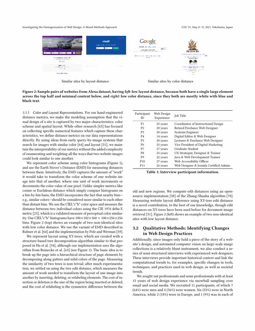
Figure 2: Sample pairs of websites fromAlexa dataset, having left: low layout distance, because both have a single large elementacross the top half and minimal content below, and right: low color distance, since they both are mostly white with blue andblack text.
3.1.3 Color and Layout Representations. For our hand-engineereddistance metrics, we make the modeling assumption that the vi-sual design of a site is captured by two major characteristics: colorscheme and spatial layout. While other research [63] has focusedon collecting specific numerical features which capture these char-acteristics, we define distance metrics on our data representationsdirectly. By using ideas from early query-by-image systems thatsearch for images with similar color [64] and layout [51], we main-tain the interpretability of ourmetrics without the added complexityof enumerating and weighting all the ways that two website imagescould look similar to one another.
We represent color scheme using color histograms (Figure 1),and use the Earth Mover’s Distance (EMD) for measuring distancesbetween them. Intuitively, the EMD captures the amount of “work”it would take to transform the color scheme of one website im-age into that of another, where one unit of work increments ordecrements the color value of one pixel. Unlike simpler metrics likecosine or Euclidean distance which simply compare histograms ona bin-by-bin basis, the EMD incorporates the fact that nearby bins—e.g., similar colors—should be considered more similar to each otherthan distant bins. We use the CIEL*c*h* color space and measure thedistance between two individual colors using the CIE 1976 delta Emetric [23], which is a validatedmeasure of perceptual color similar-ity. Our CIEL*c*h* histograms have 100×182×360 = 100×256×256bins. Figure 2 (top) shows an example of two non-identical siteswith low color distance. We use the variant of EMD described inRubner et al. [64] and the implementation by Pele andWerman [59].
We represent layout using XY-trees, which are created with astructure-based tree decomposition algorithm similar to that pro-posed in Ha et al. [34], although our implementation uses the algo-rithm from Reinecke et al. [63] (see Figure 1). The basic idea is tobreak up the page into a hierarchical structure of page elements bydecomposing along gutters and solid colors of the page. Measuringthe similarity of two trees is non-trivial; after much experimenta-tion, we settled on using the tree edit distance, which measures theamount of work needed to transform the layout of one image intoanother by inserting, deleting, or relabeling elements. The cost of in-sertion or deletion is the size of the region being inserted or deleted,and the cost of relabeling is the symmetric difference between the
Participant Web Design Job TitleID Experience
P1 25 years Coordinator of Instructional DesignP2 20 years Retired Freelance Web DesignerP3 20 years Systems EngineerP4 14 years Digital Editor & Web DesignerP5 20 years Lecturer & Freelance Web DesignerP6 25 years Vice President of Digital MarketingP7 27 years Graduate StudentP8 25 years UX Strategist, Designer & TrainerP9 22 years Java & Web Development TrainerP10 27 years Web Accessibility OfficerP11 26 years Web Designer & Joomla Certified Admin.
Table 1: Interview participant information.
old and new regions. We compute edit distances using an open-source implementation [38] of the Zhang-Shasha algorithm [78].Measuring website layout difference using XY-tree edit distanceis a novel contribution, to the best of our knowledge, though editdistances on XY-trees have been used before for document imageretrieval [51]. Figure 2 (left) shows an example of two non-identicalsites with low layout distance.
3.2 Qualitative Methods: Identifying Changesin Web Design Practices
Additionally, since images only hold a piece of the story of a web-site’s design, and automated computer vision on large-scale imagecollections is a relatively blunt instrument, we also conduct a se-ries of semi-structured interviews with experienced web designers.These interviews provide important historical context and link thecomputational trends to, for examples, specific changes in tools,techniques, and practices used in web design, as well as societaltrends.
We sought out professionals and semi-professionals with at least15 years of web design experience via snowball sampling overemail and social media. We recruited 11 participants, of which 7(64%) were men and 4 (36%) were women. Six (55%) were in NorthAmerica, while 2 (18%) were in Europe, and 1 (9%) was in each of

CHI ’21, May 8–13, 2021, Yokohama, Japan Sam Goree, Bardia Doosti, David J. Crandall, and Norman Makoto Su
South America, Asia, and Oceania, respectively. Semi-structuredinterviews were conducted remotely over the Zoom videoconfer-encing platform between May and July 2020, and each interviewlasted between one and two hours. Before each interview, the par-ticipant was asked to prepare a portfolio of 4–7 representativewebsites in which they had been involved in the design process. Toavoid confirmation bias, we did not pose direct questions regard-ing any hypothesized homogenization of web design; rather, thesemi-structured interview protocol focused on identifying factorswhich shaped the participants’ design decisions regarding the vi-sual appearance of their chosen websites. The portfolios proveduseful in grounding participant stories in concrete details of theirweb design practices [68, p.88]. All interviews were transcribed andanonymized.
3.2.1 Analytic Approach. We analyze our interview transcriptsusing a constructivist grounded theory approach [19]. Transcriptswere coded by the authors to identify emergent themes with afocus on tools, processes, technologies, and historical events whichshaped the designs of specific sites. Constructivist grounded theorywas particularly apt because its inductive approach draws fromboth a literature review (e.g., work by Chen et al. [20]) and multiplefocal points in data, such as our computational analyses.We initiallycoded interviews with open codes, then with axial codes focusedon concepts which may relate to broad trends in visual designpractices. Some codes described the tools that played key roles inthe design process (e.g., “JQuery,” “Adobe Photoshop,” “Wordpress”)while other codes described professional, cultural, and technologicalshifts in the design process (e.g., “negotiation,” “designing for webvs. print,” and “mobile-first design”). Throughout the interviewingand analysis, an iterative process of memoing led to a final set ofthemes, which was the genesis of our reported qualitative findings.
3.3 LimitationsOur study has several limitations. While we use two different mod-eling approaches for measuring the visual design similarity of pairsof websites, and compare results across three datasets, we cannotclaim our measures of similarity are definitive. The CNN distanceis taken from a model used to classify website identities and is notguaranteed to measure any particular visual qualities, althoughwe find that it tends to correlate with our interpretable color andlayout distances (see Section 4.1). Color and layout distances werehand-engineered based on our ideas about what makes sites looksimilar. All metrics for measuring subjective, aesthetic qualities arenecessarily imperfect, and we welcome critical dialogue which maycontribute towards better perceptual design similarity modeling inthe future.
Also, as we discussed above, it is difficult to collect a represen-tative sample of the web—or even to define what a representativesample should be. We use three different datasets with differentselection criteria to try to avoid artifacts of any single one, but ourselections can only reveal trends in the appearance of the English-language, and primarily American, web. Future work is neededto study how homogenization trends spread internationally andacross language barriers.
While our interview participants were involved with the designsof several of the specific websites in our datasets, we cannot say
for certain that their experiences explain the trends we observedthrough our computational analyses. Our selection criteria, whichprioritized designers who had experienced the whole temporalrange of our sample, does not capture the changing nature of webdesign as a profession.
4 RESULTSWe now turn to presenting the results of our mixed-methods anal-ysis. We start by introducing our central finding: according to ourmeasures, visual similarity on the web has been increasing, partic-ularly since 2007. We then describe our investigations of potentialunderlying causes for this homogenization in layout and color aswell as the significance of the time period from 2007. We organizethese findings into three sections which investigate the relation-ships, respectively, between layouts and software libraries, colorand image content, and the 2007 catalyst for mobile support andresponsive design.
4.1 Homogenization in the Dense RussellSubset Over Time
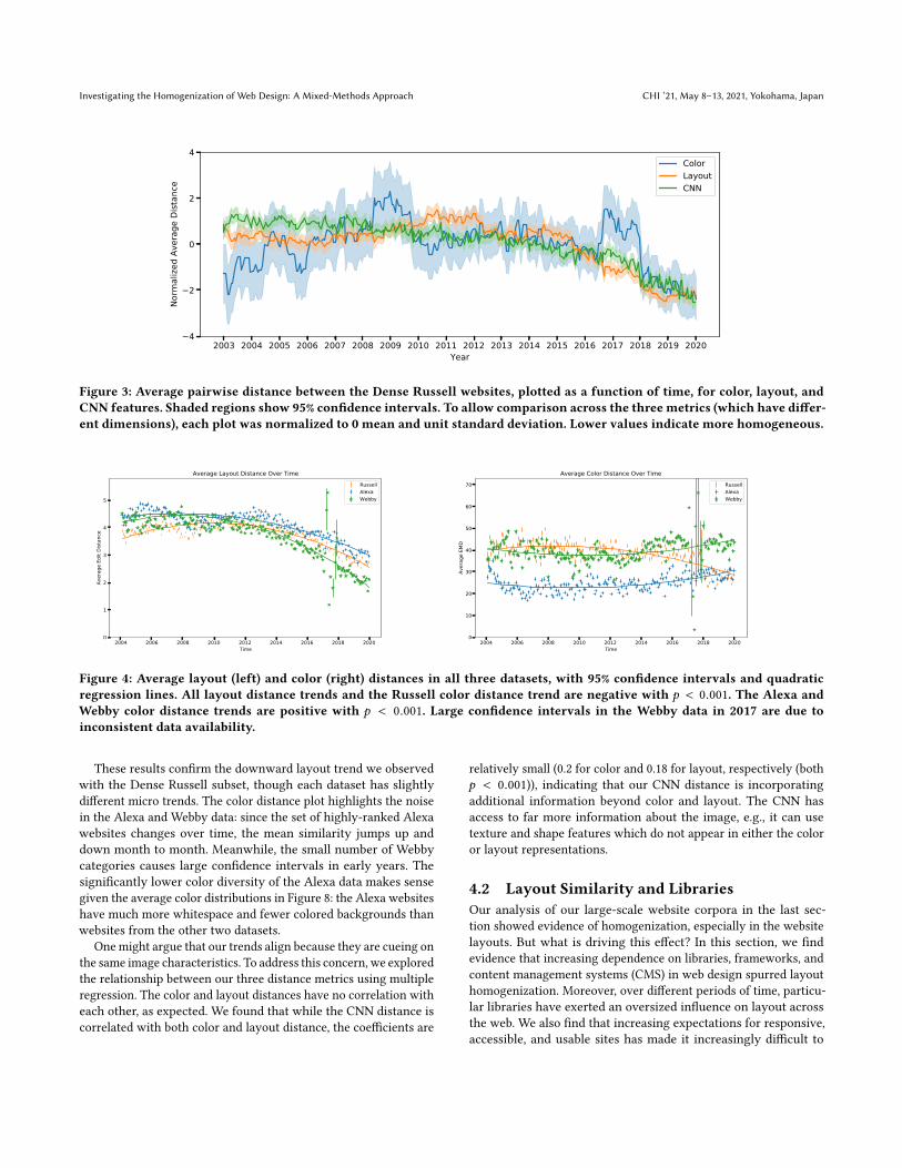
We begin our analysis by examining the Dense Russell subset (cf.Section 3.1.1), which includes 100 websites for which snapshotsare consistently available every 15 days in the Internet Archive.For each 15-day period, we computed the color feature for eachof the 100 websites, and computed the average Earth Mover’s Dis-tance (EMD) between all pairs of these sites. We also computed theaverage Euclidean distance between CNN features as well as theaverage tree distance between layout features at each time period.Figure 3 presents the results, showing three significant trends:
• Sites became less homogeneous (higher values) between 2003and 2007 and more homogeneous (lower values) afterwards.• Color distance declines 32% between 2008 and 2019.• Layout distance declines 44% from 2010 to 2019.
The CNN distance roughly follows the color distance metric with adecline of 30% between 2007 and 2019. Overall, this suggests thatwebsites have homogenized since 2007, and that layout in particularhas seen a significant decrease in diversity.
We emphasize the large scale of this analysis: while it only con-tains 100 pages, each page has a snapshot every 15 days for 17 years(408 snapshots per site), for a total of about 40,800 snapshots. Ateach temporal snapshot, each of the pages is compared to everyother ( 100×992 = 4950), for a total of about 2 million comparisons(4950 × 408).
As mentioned in Section 3.1.1, we curated additional datasets,collecting according to different criteria, in order to verify ourcomputational results. For both the Alexa rankings and WebbyAwards dataset, we randomly chose a subset of 100 sites that haddata available for each month, computed the pairwise distancesbetween them for each month, and plot the results over time withconfidence intervals and trend lines in Figure 4. Notably, all of thelayout trend lines have negative slope, indicating homogenizationover time, and the layout trend for the Webby data is particularlysteep. On the other hand, the Alexa and Webby datasets showdifferent color trends, with Alexa decreasing in homogeneity andthe Webby dataset remaining relatively consistent across time.
Investigating the Homogenization of Web Design: A Mixed-Methods Approach CHI ’21, May 8–13, 2021, Yokohama, Japan
2003 2004 2005 2006 2007 2008 2009 2010 2011 2012 2013 2014 2015 2016 2017 2018 2019 2020Year
4
2
0
2
4
Norm
alize
d Av
erag
e Di
stan
ceColorLayoutCNN
Figure 3: Average pairwise distance between the Dense Russell websites, plotted as a function of time, for color, layout, andCNN features. Shaded regions show 95% confidence intervals. To allow comparison across the threemetrics (which have differ-ent dimensions), each plot was normalized to 0 mean and unit standard deviation. Lower values indicate more homogeneous.
2004 2006 2008 2010 2012 2014 2016 2018 2020Time
0
1
2
3
4
5
Aver
age
Edit
Dist
ance
Average Layout Distance Over TimeRussellAlexaWebby
2004 2006 2008 2010 2012 2014 2016 2018 2020Time
0
10
20
30
40
50
60
70
Aver
age
EMD
Average Color Distance Over TimeRussellAlexaWebby
Figure 4: Average layout (left) and color (right) distances in all three datasets, with 95% confidence intervals and quadraticregression lines. All layout distance trends and the Russell color distance trend are negative with p < 0.001. The Alexa andWebby color distance trends are positive with p < 0.001. Large confidence intervals in the Webby data in 2017 are due toinconsistent data availability.
These results confirm the downward layout trend we observedwith the Dense Russell subset, though each dataset has slightlydifferent micro trends. The color distance plot highlights the noisein the Alexa and Webby data: since the set of highly-ranked Alexawebsites changes over time, the mean similarity jumps up anddown month to month. Meanwhile, the small number of Webbycategories causes large confidence intervals in early years. Thesignificantly lower color diversity of the Alexa data makes sensegiven the average color distributions in Figure 8: the Alexa websiteshave much more whitespace and fewer colored backgrounds thanwebsites from the other two datasets.
One might argue that our trends align because they are cueing onthe same image characteristics. To address this concern, we exploredthe relationship between our three distance metrics using multipleregression. The color and layout distances have no correlation witheach other, as expected. We found that while the CNN distance iscorrelated with both color and layout distance, the coefficients are
relatively small (0.2 for color and 0.18 for layout, respectively (bothp < 0.001)), indicating that our CNN distance is incorporatingadditional information beyond color and layout. The CNN hasaccess to far more information about the image, e.g., it can usetexture and shape features which do not appear in either the coloror layout representations.
4.2 Layout Similarity and LibrariesOur analysis of our large-scale website corpora in the last sec-tion showed evidence of homogenization, especially in the websitelayouts. But what is driving this effect? In this section, we findevidence that increasing dependence on libraries, frameworks, andcontent management systems (CMS) in web design spurred layouthomogenization. Moreover, over different periods of time, particu-lar libraries have exerted an oversized influence on layout acrossthe web. We also find that increasing expectations for responsive,accessible, and usable sites has made it increasingly difficult to

CHI ’21, May 8–13, 2021, Yokohama, Japan Sam Goree, Bardia Doosti, David J. Crandall, and Norman Makoto Su
0 20 40 60 80 1000
1000
2000
3000
4000
5000
6000
7000
8000
Histogram of Pairwise Color Distances in 2005 Typical Color Distance for 2005, distance = 38.38Typical Color Distance for 2005, distance = 38.38
Typical Layout Distance for 2005, distance = 4.59Typical Layout Distance for 2005, distance = 4.59
(a) 2005 distance histogram (c) Pair with average 2005 color distance (e) Pair with average 2005 layout distance
0 20 40 60 80 1000
1000
2000
3000
4000
5000
6000
7000Histogram of Pairwise Color Distances in 2016 Typical Color Distance for 2016, distance = 32.90Typical Color Distance for 2016, distance = 32.90
Typical Layout Distance for 2016, distance = 3.93Typical Layout Distance for 2016, distance = 3.93
(b) 2016 histogram (d) Pair with average 2016 color distance (f) Pair with average 2016 layout distance
Figure 5: Visualization of average color and layout distances in 2005 versus 2016. (a) and (b): Histograms of color distances in2005 and 2016, respectively. Note that this is a histogram of distances between color distributions, with units of image area ×CIE color distance. The observed change between 2005 and 2016 is due to a shift from colored backgrounds to off-white andimage backgrounds. (c) A sample pair of images with the average color distance between pairs of sites in 2005. (d) Same, foraverage color distance in 2016. (e) and (f) Same, with average layout distance in 2005 and 2016, respectively.
create unique, complex layouts that web designers of the past oncecould.
To give some intuition for our measure of layout similarity andhow it has changed over time, Figure 5(e) shows a sample pair ofwebsites from 2005 whose layout distance is the average distancein 2005, and (f) shows a sample pair in 2016 whose layout distanceis the average of 2016. The red rectangles show the decompositionfound by our layout analysis. As seen in these “prototypical” ex-amples, early sites often use box-based layouts with fixed size andshape, while later layouts often have flat designs with fewer boxesand more images, presumably allowing them to scale to differentsizes more easily.
4.2.1 Dependence on Packaged Code. One hypothesis for the in-creasing similarity of website layouts is that the rise of libraries,frameworks, and content management system (CMS) templatesmakes it easy to create new sites with a given predefined “look.”Indeed, many of the participants in our interviews mentioned theimpact that these have had on the design of the web. For example,participants P6, P8, and P11 pointed to CMS templates allowingusers without web design expertise to produce high quality sites.P1, P4, and P6 described instances where they made use of codesnippets copied from other sites on the Internet, because they werenot experienced enough with Javascript or it was simply easier toappropriate existing snippets. Participant P5 identified an influx ofsoftware engineers into web design around 2012-2014 who over-useframework defaults due to a lack of design experience.
To test the hypothesis that reuse of website source code and/orthe use of libraries, frameworks, and CMS templates may be driv-ing the increasing website layout similarity, we performed analysisdirectly on the source code files of our Dense Russell dataset. Wefirst compared the similarity of source code files themselves. Forevery pair of pages at a given time point, we used a string match-ing algorithm to compute the length of the substrings in common
between the two source code files over the sum of their lengths.Figure 6(a) presents the results. Surprisingly, we found that thecontent of websites (including their native CSS and JavaScript code)have become less similar over time, despite that visual appearancehas become more similar. One possible explanation is that as thedemands for online information content increase, the diversity andcomplexity of that content increases as well. Another explanation isthat over time the amount of native code has decreased, and insteadweb designers have increasingly used libraries instead of writing(or copying) native code.
To investigate library usage, we used Wappalyzer [7] to detectlibraries and back-end platforms from front-end web page sourcecode for each page at each time point of our Dense Russell dataset.The tool detects 101 JavaScript and 47 CSS libraries. For every pos-sible pair of websites at each time point, we computed the Jaccardsimilarity of the sets of libraries they use (i.e., the ratio of the sizeof intersection of the two sets over the size of the union). Thismetric ranges from 0 if two pages do not share any libraries incommon or do not use any libraries at all, to 1.0 if they use exactlythe same libraries. As Figure 6(b) shows, average similarity accord-ing to library usage has increased over time, especially after 2007,mirroring the results we found for visual similarity; the correlationbetween our CNN’s measure of visual similarity and our measureof library similarity is 0.77 (p < 0.001).
Taken together, these results suggest that the increasing homo-geneity of the visual web is not caused by increasing similarity ofwebsite content, but by increasing homogeneity in the choice oflibraries that web designers use.
4.2.2 Library Monopolies. If increasing use of common librariesis causing websites to look more similar, then it should be thattwo sites using the same library should predict a decrease in visuallayout distance. We perform multiple regression to predict layoutsimilarity using binary features indicating whether two websites

Investigating the Homogenization of Web Design: A Mixed-Methods Approach CHI ’21, May 8–13, 2021, Yokohama, Japan
Av
era
ge
Ja
cca
rd I
nd
ex
Av
era
ge
Ja
cca
rd I
nd
ex
(a) Similarity of code (b) Similarity of library usage
Figure 6: Average pairwise similarity between the Dense Russell websites, plotted as a function of time, according to (a) simi-larity of front-end source code, and (b) similarity of library use. We see that the source code itself has become less similar overtime, while websites have used more and more libraries in common.
share each of the 16 most common libraries. The regression coeffi-cients in Table 2 suggest that, yes, particular libraries are associatedwith increased similarity of web page layouts. Bootstrap correlatesstrongly with decreased layout distance, relative to other libraries.Other libraries, like SWFObject, which is used to embed AdobeFlash content, and jQuery tools, a Javascript user interface library,correlate with more varied layouts.
Several of our interview participants commented on the relation-ship between software tools and source code similarity. P5 and P10commented on the low quality and complexity of code that has beenauto-generated by a development environment (like Dreamweaver),CMS, or framework, indicating that the rise of libraries and frame-works may be contributing to the drop in code overlap. P4, P6, andP10 emphasize that these tools are essential time-savers to han-dle the complexity of the web, and P5 identifies a split betweenhighly technical and non-technical tooling for the web: “We havetools where we’re splitting the middle. We have tools that are gettingeasier and easier. . . to use. . .where people can build websites with noknowledge of code whatsoever and communicate their ideas and livewith whatever limitations those technologies put in place. And on theother end, if you want to get into the professional side of this, it isunbelievable the barriers to entry that have been put up.”
4.2.3 Shifting Layout Practices. Participants also discussed chang-ing best practices in web design related to layout. For example, theyrecalled some of their considerations during the earlier days of theweb: P1, P8, and P11 discussed using fixed-width wallpapers andbackground images for layout, P3 and P9 referenced a desire tokeep content “above the fold”—within the first screenful of content(Figure 7)—so that users did not have to scroll, P5 described usingsearch engines like Yahoo and AltaVista, which have highly com-plex layouts, as design examples, and P4, P5 and P9 described aprocess of designing a fixed layout in Photoshop and then “slicing”it into small images to put into an HTML table. These practices allbut disappeared with the advent of CSS, which allowed sophisti-cated and reusable layout and styling of text content, and whichwas better for load times and search engine optimization.
In addition to saving time, libraries and frameworks often pro-mote better usability and accessibility — a common topic in six of
Figure 7: A screenshot from one of our interviews regardinglayout practices. P5 explains, “The boss was very, very con-cerned with above the fold. . .And so not a lot of white spaceand a lot of words and a lot of text that’s a lot the same size.”
our interviews (P1, P2, P6, P7, P8, P10). P10 emphasized the deeprelationship between accessibility, usability, and resilience: “Makeyour designs as resilient as possible. . . They should work if somebodywants to blow the screen up to 300%, the interface should still work asintended.” Unlike the earlier mindset inherited from print design,web designers now see themselves designing flexible interfaces, notdocuments. P6 discussed that a web framework “comes with a lot ofaccessibility code built in. So it’s got ARIA [an accessibility standardfor web applications] and stuff like that.”

CHI ’21, May 8–13, 2021, Yokohama, Japan Sam Goree, Bardia Doosti, David J. Crandall, and Norman Makoto Su
Library Normalized Coefficient N pairs
Bootstrap -0.410 287Font Awesome -0.190 340jQuery UI -0.187 598Underscore -0.184 54Moment.js -0.173 25Modernizr -0.129 1489ZURB Foundation -0.007 52Scriptaculous 0.055 31yepnope 0.067 470Prototype 0.089 62jQuery 0.118 12523React 0.199 36Lightbox 0.204 23SWFObject 0.373 1719jQuery Tools 0.562 76
Table 2: Normalized regression coefficients for library over-lap and layout distance. Negative numbers indicate that thepresence of this library makes it more likely that two web-sites look similar, positive numbers indicate the opposite. NPairs indicates the number of site pairs that had that libraryin common out of 65703 total pairs.
4.3 Color Similarity andTechnological/Cultural Constraints
While it stands to reason that web frameworks would influencethe layout of websites, it is less clear if this would explain shifts incolor, given that frameworks allow color to be customized. So howcan we explain the homogenization of color schemes observed inFigure 3? In this section, we observe that the homogenization incolor schemes is related to the shift from monochromatic, usuallywhite backgrounds to more off-white backgrounds and image back-grounds, and we find that this shift comes from a combination oftechnological and cultural constraints.
By plotting the full histogram of color distances, rather thanjust the average, we observe that, year by year, the color distancesstart as a bimodal distribution with modes around 0 and 90, thenconverge to a single mode around 10 (see Figure 5). As backgroundshave a large number of pixels, they cause the distance to swingheavily towards low values when both sites have similar back-grounds. Photos, on the other hand, have many different colors ofpixels, so their distances are less polarized. We can also look at theaverage color distributions across time (Figure 8) and observe thatoff-white and dark colors have increased while black and whitehave decreased, which supports the notion that off-white and photobackgrounds are more common.
Interview data connects color distribution changes to changingtechnological and cultural constraints. In terms of technologicalconstraints, Participants P5 and P9 identify the “web-safe palette,”an early design constraint to ensure that web colors would appearcorrectly on different monitors. P9 mentions, “I tend to composecolors in multiples of 51. So I would say, oh, that’s a 51, 51, 102. Yeah, Istill tend to do that despite the fact that we don’t need to use web safecolors anymore.” P10 points to early differences between monitorgamuts (the range of colors that can be displayed) as a reason to
Russell
2004: 0% 20% 40% 60% 80% 100%Image Area
2016: 0% 20% 40% 60% 80% 100%Image Area
Alexa
2004: 0% 20% 40% 60% 80% 100%Image Area
2016: 0% 20% 40% 60% 80% 100%Image Area
Webby
2004: 0% 20% 40% 60% 80% 100%Image Area
2016: 0% 20% 40% 60% 80% 100%Image Area
Figure 8: Average color distributions for three datasets in2004 vs. 2016, in which bar width indicates the average frac-tion of each image made up of pixels of that color. In eachdataset, the amount of dark and off-white increases and theamount of white and black decreases.
avoid color on the early web. P4 and P5 mentioned that bandwidthlimitations prevented them from using much image content in theearly days of the web. Since images were large files, they wouldload slowly over poor connections and negatively impact user ex-perience. P7 identifies CSS and SVG as prerequisites to expressiveuse of color in web design, since they allowed a large degree ofcontrol over visual presentation without significantly increasingpage load times.
Cultural constraints come from the changing nature of web-site design. P1 and P7 describe how, in the early days of the web,their stakeholders like clients or organizational leadership gener-ally weren’t interested in the details of the website. As the web hasgrown, these stakeholders have become increasingly invested inthe look and feel of their organization’s web presence, and websitedesign and redesign has become a long, negotiated processes. Fiveparticipants (P1, P2, P3, P4, and P10) referenced negotiations spreadover weeks or months focused on visual details like typeface oraccent color during website redesigns. P1 describes the process fora website redesign in 2007: “They had focus groups. They come in andthey meet with large numbers of people and talk about their needs.And then they do a sitemap which kinda lays out the content, how

Investigating the Homogenization of Web Design: A Mixed-Methods Approach CHI ’21, May 8–13, 2021, Yokohama, Japan
it’s going to be organized. And then. . . they gave us like five options ofcolor schemes. . .And then our administration and faculty would basi-cally vote on it.” Because redesigns are more expensive and attractattention from stakeholders, designers are under more pressure tocomply with branding guidelines and avoid unusual color combina-tions. P10 explains how a background color choice was made: “Thissky background kind of came out of the branding efforts to do withwings. . .And there was, this kind of illustrated the transition fromIT running the show to marketing and communications running theshow.”
Wireframes — i.e., visual prototypes — are essential for facilitat-ing these long design cycles. P2 describes wireframing with penciland paper in 2004 while P8 references wireframing with softwaretools like InVision and Axure regularly from 2011 to the present.These wireframes function as drafts: they serve as a fixed point andground discussions through the design process for specialists whomay not have the time or expertise to edit the source code directly.
4.4 Catalyst for Mobile Support andResponsive Design
We observed that the abrupt change in web design visual similarityafter 2007 (Figure 3) coincides with the release of Apple’s first-generation iPhone. We hypothesized that this is not coincidental:the rapid need for mobile support may have caused the web to growmore homogeneous as companies began using similar front-endlibraries to support mobile platforms. In this section, we show thatour findings do suggest that visual similarity of website design hasmoved in tandem with increasing mobile support. Mobile designand therefore responsive design became de rigueur in the industry,pushed in part by search engine optimization (SEO) strategies.
To track mobile support in company websites over time, weanalyze the CSS code in each web page’s source code. If any ofthe CSS code has the “@mobile” keyword, we flag that website assupporting mobile screens in their design. The correlation betweenthe average website CNN similarity in each month and the corre-sponding rate of mobile support is 0.84 (p < 0.001), which suggeststhat websites which support mobile tend to look more similar thanwebsites which do not.
Our interview data strongly supports this relationship betweenmobile support and visual homogenization. Participants P5, P6, andP10 pointed to the rise of mobile web browsers as a major factorin their decision to adopt the philosophy of responsive design (i.e.,where content “responds” to the size and shape of the browser,rearranging to best use the screen space, usually with a CSS frame-work). While any web page design can be made responsive by hand,doing so requires tedious work specifying content rearrangementand resizing rules using CSS media queries, and it is difficult froma design perspective to create layouts that are visually appealingin several arrangements. P5 and P9 point towards Apple’s designdecisions not to support Flash and emphasize scrolling over otherforms of navigation on the iPhone. An increasing share of webtraffic coming from mobile devices has led to a rise in “mobile-first” design practice that several participants (P2, P6, P8, P9, P10)would recommend to new designers. Interestingly, all five of theseparticipants were quick to clarify that they do not personally usemobile-first practices in their design.
Four participants (P2, P4, P6, and P9) reference search engineoptimization (SEO), and Google’s policies in particular, as factors intheir work. While not claiming to be “SEO expert[s],” they identifiedstrategies for improving SEO. P4 said that he stopped using Flashfor interaction because Google would not index text inside Flashcomponents. P4 and P6 point to Google search’s 2015 “Mobileged-don” update, which suddenly prioritized search results which woulddisplay well on mobile, as the reason the web adopted responsivedesign. P2 and P9 say they use alt tags on images to improve SEOand P6 referenced using Google’s Accelerated Mobile Pages frame-work as a new SEO strategy, describing Google as “the 800-poundgorilla at this point. They’re driving a lot of what happens on the webin terms of design and stuff.”
5 DISCUSSIONWe set out to investigate a very straightforward question — hasvisual design on the web become more homogeneous? Answeringthis question turned out to be a much larger-scale endeavor thanwe had imagined. We first collected a large-scale set of over 200,000historical snapshots (over 15 years) of over 10,000 websites. Toavoid bias associated with any single selection criteria, the datasetconsisted of websites selected from three different sources: corpo-rate sites of the Russell 1000 stock index, winners and nomineesfor the Webby awards, and top-visited sites according to Alexa. Wethen developed novel computational methods for measuring andcharacterizing the similarity of website images. To avoid bias asso-ciated with any single measure, we developed three, one based ondeep learning and two hand-engineered features that characterizecolor and spatial layout features, respectively.
Across datasets and metrics, this large-scale, quantitative analy-sis showed strong evidence that website designs—especially with re-spect to page layouts—have become more similar, starting between2007 and 2010 and continuing until at least 2016. To understandwhy, we analyzed, again at large scale, the similarity of source code,the use of libraries, and support for mobile devices. We found thatthe use of a relatively small number of frameworks and libraries hasexpanded significantly, and that the use of similar libraries stronglycorrelates with visual similarity—suggesting that the rise of thesetools may be contributing significantly to the homogenization thatwe observed.
But this large-scale quantitative analysis could not reveal whatwas causing the uptake of libraries, or other more subtle factorsthat might be driving homogenization. We thus recruited and inter-viewed 11 web design professionals, each having at least 15 yearsof experience, to reflect on the changes in their design process overtime. These qualitative data contextualized our quantitative resultsand confirmed or introduced several explanations, including therise of software libraries and frameworks, increased use of largeimages, and support for mobile devices.
Layout homogenization appears to have begun after the releaseof the iPhone. Our interviews suggest that as mobile browsers grewin market share, responsive design and the libraries and frame-works that support them became an essential part of professionalweb design. This transformation was driven by libraries promotedby major tech companies, such as Twitter’s Bootstrap and FontAwesome which is incorporated into the BootstrapCDN (content

CHI ’21, May 8–13, 2021, Yokohama, Japan Sam Goree, Bardia Doosti, David J. Crandall, and Norman Makoto Su
delivery network), and jQuery and Modernizr which are both in-cluded in templates like Microsoft ASP.Net MVC. Responsive WebDesign has changed how we experience the web [39] and largelyreplaced older best practices like placing content “above the fold.”As developing for the responsive web requires more technical exper-tise, many designs shifted closer to library and framework defaultsto avoid time-consuming, difficult development work.
Color homogenization offers a less clear story. Histogram data(Figures 1 and 8) suggests a shift from colored backgrounds tooff-white backgrounds featuring images. Rather than being drivenby the display limitations of new mobile devices, these changesrespond to lifting bandwidth restrictions and increased support forCSS and SVG. While homogenization was the trend in the Russell1000 sites, the opposite trend was true for the Alexa and Webbydatasets, indicating that the shift to off-white backgrounds andlarge images does not consistently lead to color homogenizationon less corporate websites.
We choose to reserve judgment on whether the trend of visualhomogenization is good or bad. We suggest, however, that if thediversity of visual designs is indeed shrinking, this may limit theperceived repertoire of possible and legitimate designs that futurewebsite designers draw from, constraining the creativity and inno-vation of future websites.
Two decades ago, studies by Newman & Landay [56] notedthat web designers used many informal, flexible representationsof websites (e.g., sketches) for wireframing; these unconstrained,sometimes low-fidelity representations afford usual and unusualdesigns equally, limited only by the designer’s imagination. De-signers turned to media like paper for practical reasons: creatingpolished, high fidelity prototypes at the time was laborious.
Now, designers have a myriad of tools, including wireframingtools like InVision and Axure, CMS like Wordpress and Joomla,and frontend libraries and frameworks to rapidly prototype highfidelity websites. These tools allow designers to search for or choosefrom exemplar widgets and styles that follow the current landscapeof legitimate designs and studied interaction patterns [47, 74], atthe cost of making unusual designs more difficult to create [37].The bias towards legitimate designs is helpful for both amateurand professional designers: using such tools and strategies leads tofaster development cycles, reduced complexity, better accessibility,and use of learned affordances to achieve greater usability.
However, as HCI takes up other concerns such as value-sensitive,authentic, and reflective design [32, 69, 72], we may rethink howvisual design (and closely related ideas about interaction) can go be-yond concerns of usability, efficiency, or even marketing. We do notsuggest turning back progress on, for example, creating inclusivewebsites or open-source software, but we should investigate howto enable enjoyable, diverse, and/or provocative forms within thespace of inclusive design. For example, while animated GIFs mayviolate accessibility guidelines, the aesthetic qualities that makethem popular indicate that we should not prematurely limit thecreation of novel designs for accessibility reasons (see work byGleason et al. [33] on making GIFs accessible).
Future work investigating this concern over homogenizationshould examine prototyping and development tools, both in thecontext of their literal interfaces, as well as how they serve asan interaction point for designers, developers, usability experts,
and stakeholders. One could argue that such tools are inclusive,empowering a diverse group of people to become creators in theonline world. However, the “deskilling” [18] of Internet users andincreasing reliance on automated tools may be creating unhealthyconditions that restrict innovation to a small subset of web design-ers with deep technical expertise. To address these concerns, wewill likely need to turn to methods and theories from the humani-ties [10]. Future work will need to revisit questions such as,• How do prototyping tools both reflect and shape the spaceof legitimate designs?• How do amateur designers, who did not meet the participa-tion criteria for our interviews, create websites, and to whatextent are their designs guided by the designs of these tools?• How could prototyping tools be reimagined to better supportunusual designs?
We anticipate that our method and strategies can empower de-signers, historians, activists, and policymakers based on their valuesand priorities. Brügger and Schoreder [15] argue that unpackingthe history of websites allows us to analyze “societal developmentsat large.” Organizations such as the Mozilla Foundation [46] positthat consolidation is detrimental to the “health” of the Internet. Forexample, our tools may be a first step for researchers to investigatewhether or how homogenization of website designs may signal,overall, monopolization of design by a few companies.
6 CONCLUSIONWe see our research as starting a larger conversation over whetherthe very conveniences developed to make the web more accessibleto creators and users may also narrow the openness of design. Ourmixed-methods analyses combining computational and qualitativeapproaches suggest that the range of designs we see online arereducing and that this may be driven, at least in part, by relianceon libraries, templates, and services that mitigate the complexityof creating modern web designs. Interwoven with these causesare broader technological and societal shifts in the web designprofession and what users now expect in the web medium. Thechallenge then remains to see whether we can or should createan online design landscape that is diverse—without giving up theadvantages that maturity and standardization provide users andcreators.
ACKNOWLEDGMENTSWe thank Erika Biga Lee for her assistance in recruiting interviewparticipants. This work was funded in part by the National ScienceFoundation through a CAREER award (IIS-1253549) and a GraduateResearch Fellowship.
REFERENCES[1] 2009. webmuseum.dk. http://webmuseum.dk/[2] 2016. Longing For Innovation: Why Do All Websites Look The Same? Article on
webydo.com. Retrieved from https://cmd-t.webydo.com/longing-for-innovation-why do-all-websites-look-the-same-9c80f5c41c61?gi=25360bd9ad1b.
[3] 2016. Why All New Websites Look the Same. Blog post on fontbundles.net.Retrieved from https://fontbundles.net/blog/why-all-new-websites-look-the-same.
[4] 2019. Alexa: About Us. https://www.alexa.com/about.[5] 2019. The Internet Archive. http://www.archive.org.[6] 2019. PhantomJS. http://www.phantomjs.org.[7] 2019. Wappalyzer. https://www.wappalyzer.com/.

Investigating the Homogenization of Web Design: A Mixed-Methods Approach CHI ’21, May 8–13, 2021, Yokohama, Japan
[8] 2019. Why Do All Websites Look the Same? Blog post on bigtuna.com. Retrievedfrom https://bigtuna.com/why-do-all-websites-look-the-same/.
[9] Thomas Allen, Gunter Henn, and Gunter Henn. 2019. The Organization andArchitecture of Innovation. Routledge. https://doi.org/10.4324/9780080545370
[10] Jeffrey Bardzell and Shaowen Bardzell. 2015. Humanistic HCI. 8, 4 (2015), 1–185.https://doi.org/10.2200/S00664ED1V01Y201508HCI031
[11] Anat Ben-David, Adam Amram, and Ron Bekkerman. 2016. The Colors of theNational Web: Visual Data Analysis of the Historical Yugoslav Web Domain. 19,1 (2016), 95–106. https://doi.org/10.1007/s00799-016-0202-6
[12] Laurie Brady and Christine Phillips. 2003. Aesthetics and Usability: A Look atColor and Balance. Usability News 5, 1 (February 2003).
[13] Ellen Brage. 2019. The rise of brutalism and antidesign. http://www.diva-portal.org/smash/get/diva2:1304924/FULLTEXT01.pdf
[14] Niels Brügger. 2018. The Archived Web: Doing History in the Digital Age. TheMIT Press.
[15] Niels Brügger and Ralph Schroeder. 2017. The Web as History: Using Web Archivesto Understand the Past and the Present. UCL Press, London.
[16] Mateusz Buda, Atsuto Maki, and Maciej A Mazurowski. 2018. A systematicstudy of the class imbalance problem in convolutional neural networks. NeuralNetworks 106 (2018), 249–259.
[17] Ben Caldwell, Michael Cooper, Loretta Guarino Reid, and Gregg Vanderheiden.2008. Web content accessibility guidelines (WCAG) 2.0. WWWConsortium (W3C)(2008).
[18] Nicholas Carr. 2014. The Glass Cage: Automation and Us (1 edition ed.). W. W.Norton & Company.
[19] Kathy Charmaz. 2006. Constructing Grounded Theory: A Practical Guide ThroughQualitative Analysis. Pine Forge Press.
[20] Wen Chen, David J. Crandall, and Norman Makoto Su. 2017. Understandingthe Aesthetic Evolution of Websites: Towards a Notion of Design Periods. InProceedings of the 2017 CHI Conference on Human Factors in Computing Systems(Denver, Colorado, USA) (CHI ’17). ACM, New York, NY, USA, 5976–5987. https://doi.org/10.1145/3025453.3025607
[21] Anthony Cocciolo. 2015. The Rise and Fall of Text on the Web: A QuantitativeStudy of Web Archives. 20, 3 (2015). https://eric.ed.gov/?id=EJ1077827
[22] Mary Collins. 2016. Web Design Trends: Why Do All Websites Look The Same?Blog post on friday.ie. Retrieved from https://www.friday.ie/blog/why-do-all-websites-look-the-same/.
[23] Comission Internationale de l’Eclairage. 1978. Recommendations on uniformcolor spaces, color-difference equations, psychometric color terms. Paris: CIE(1978).
[24] Carl DiSalvo. 2014. The Need for Design History in HCI. Interactions 21, 6 (Oct.2014), 20–21. https://doi.org/10.1145/2669617
[25] Judith Donath. 2014. The Social Machine: Designs for Living Online. MIT Press.[26] Bardia Doosti, David J. Crandall, and Norman Makoto Su. 2017. A Deep Study
into the History of Web Design. In Proceedings of the 2017 ACM on Web ScienceConference (Troy, New York, USA) (WebSci ’17). ACM, New York, NY, USA, 329–338. https://doi.org/10.1145/3091478.3091503
[27] Dave Ellis. 2015. All Websites Look the Same. Blog post on novolume.co.uk.Retrieved from http://www.novolume.co.uk/blog/all-websites-look-the-same/.
[28] Ida Engholm. 2007. Design History of the WWW: Website Development fromthe Perspective of Genre and Style Theory. Artifact 1, 4 (Jan. 2007), 217–231.http://dx.doi.org/10.1080/17493460802127757
[29] Ida Engholm. 2010. Research-Based Online Presentation of Web Design History:The Case of webmuseum.dk. InWeb History, Niels BrÃijgger (Ed.). Peter LangInc.
[30] Kjetil Fallan. 2010. Design History: Understanding Theory and Method. Berg.[31] Mozilla Foundation. 2019. Internet Health Report v. 1.0 2018. https://
internethealthreport.org/2019[32] Batya Friedman, Peter H. Kahn, and Alan Borning. 2006. Value Sensitive Design
and Information Systems. In Human-Computer Interaction and ManagementInformation Systems: Foundations Advances in Management Information Systems.Advances in Management Information Systems, Vol. 5. M.E. Sharpe, 348–372.https://doi.org/10.1007/978-94-007-7844-3_4
[33] Cole Gleason, Amy Pavel, Himalini Gururaj, Kris M. Kitani, and Jeffrey P. Bigham.2020. Making GIFs Accessible. In The SIGACCESS Conference on Computers andAccessibility (ASSETS ’20). ACM, New York, NY, USA.
[34] Jaekyu Ha, Robert M. Haralick, and Ihsin T. Phillips. 1995. Recursive X-Y cutusing bounding boxes of connected components. Proceedings of 3rd InternationalConference on Document Analysis and Recognition 2 (1995), 952–955 vol.2.
[35] Scott A. Hale and Victoria D. Alexander. 2017. Live versus Archive: Comparing aWeb Archive and to a Population of Webpages. In The Web as History: Using WebArchives to Understand the Past and the Present. 45–61. OCLC: 1057656067.
[36] Bin He, Mitesh Patel, Zhen Zhang, and Kevin Chen-Chuan Chang. 2007. Access-ing the deep web: A survey. Commun. ACM 50, 5 (2007), 94–101.
[37] Scarlett R. Herring, Chia-Chen Chang, Jesse Krantzler, and Brian P. Bailey. 2009.Getting Inspired!: Understanding How and Why Examples Are Used in CreativeDesign Practice. In Proceedings of the SIGCHI Conference on Human Factors in
Computing Systems. ACM, 87–96.[38] Tim Hinderson. 2014. Zhang-Shasha: Tree edit distance in Python. https:
//github.com/timtadh/zhang-shasha[39] Azham Hussain and Emmanuel OC Mkpojiogu. 2015. The effect of responsive
web design on the user experience with laptop and Smartphone devices. JurnalTeknologi 77, 4 (2015).
[40] Melody Yvette Ivory. 2001. An Empirical Foundation for Automated Web InterfaceEvaluation. Ph.D. Dissertation. UC Berkeley.
[41] Ali Jahanian, Phillip Isola, and Donglai Wei. 2017. Mining Visual Evolution in 21Years of Web Design. In CHI EA.
[42] Matthew Kay, Cynthia Matuszek, and Sean A Munson. 2015. Unequal repre-sentation and gender stereotypes in image search results for occupations. InProceedings of the 33rd Annual ACM Conference on Human Factors in ComputingSystems. ACM, 3819–3828.
[43] Petr Kovár̆ and Ondr̆ej Letocha. 2019. Web Design Museum. https://www.webdesignmuseum.org/
[44] Alex Krizhevsky, Ilya Sutskever, and Geoffrey E Hinton. 2012. ImageNet Classifi-cation with Deep Convolutional Neural Networks. In NIPS.
[45] Ranjitha Kumar, Arvind Satyanarayan, Cesar Torres, Maxine Lim, Salman Ahmad,Scott R. Klemmer, and Jerry O. Talton. 2013. Webzeitgeist: Design Mining theWeb.
[46] Solana Larsen, Kasia Odrozek, and Jairus Khan. 2018. Internet Health Report.https://internethealthreport.org/2018/
[47] Brian Lee, Savil Srivastava, Ranjitha Kumar, Ronen Brafman, and Scott R. Klem-mer. 2010. Designing with Interactive Example Galleries. In Proceedings of theSIGCHI Conference on Human Factors in Computing Systems. ACM, 2257–2266.
[48] Lawrence Lessig. 2008. Remix: Making Art and Commerce Thrive in the HybridEconomy. Penguin.
[49] Benek Lisefski. 2019. Data-Driven Design Is Killing Our Instincts. Article onmedium.com. Retrieved from https://modus.medium.com/data-driven-design-is-killing-our-instincts-d448d141653d.
[50] Lexie Lu. 2015. Why Do All Modern Websites Look the Same? Blog post ondesignroast.org. Retrieved from https://designroast.org/why-do-all-modern-websites-look-the-same/.
[51] S. Marinai, E. Marino, and G. Soda. 2005. Layout based document image retrievalby means of XY tree reduction. In Eighth International Conference on DocumentAnalysis and Recognition (ICDAR’05). 432–436 Vol. 1. https://doi.org/10.1109/ICDAR.2005.150
[52] Eleni Michailidou, Simon Harper, and Sean Bechhofer. 2008. Visual complexityand aesthetic perception of web pages. Proceedings of the 26th Annual ACMInternational Conference on Design of Communication, 215–224. https://doi.org/10.1145/1456536.1456581
[53] DanMiller. 2019. Why do all websites look the same? Blog post on awareweb.com.Retrieved from https://www.awareweb.com/blog/why-do-all-websites-look-the-same.
[54] Kate Moran. 2017. Brutalism and Antidesign. Article on nngroup.com. Retrievedfrom https://www.nngroup.com/articles/brutalism-antidesign/.
[55] Boris Müller. 2018. Why Do All Websites Look the Same. Article on Medium.com.Retrieved from https://medium.com/s/story/on-the-visual-weariness-of-the-web-8af1c969ce73.
[56] Mark W. Newman and James A. Landay. 2000. Sitemaps, Storyboards, andSpecifications: A Sketch of Web Site Design Practice. In Proceedings of the 3rdConference on Designing Interactive Systems: Processes, Practices, Methods, andTechniques (New York, NY, USA, 2000) (DIS ’00). ACM, 263–274. https://doi.org/10.1145/347642.347758
[57] International Academy of Digital Arts and Sciences. 2019. Webby Awards. http://www.webbyawards.com
[58] Minsu Park, Jaram Park, Young Min Baek, and Michael Macy. 2017. Culturalvalues and cross-cultural video consumption on YouTube. PloS one 12, 5 (2017).
[59] O. Pele and M. Werman. 2009. Fast and robust Earth Mover’s Distances. In2009 IEEE 12th International Conference on Computer Vision. 460–467. https://doi.org/10.1109/ICCV.2009.5459199
[60] Xiaoguang Qi and Brian Davison. 2009. Web Page Classification: Features andAlgorithms. ACM Comp. Surv. 41, 2, Article 12 (Feb. 2009), 31 pages. https://doi.org/10.1145/1459352.1459357
[61] Zhuwei Qin, Fuxun Yu, Chenchen Liu, and Xiang Chen. 2018. How convolutionalneural networks see the world — A survey of convolutional neural networkvisualization methods. Mathematical Foundations of Computing 1 (2018), 149.https://doi.org/10.3934/mfc.2018008
[62] Paul Regensburg. 2014. 5 Reasons Why Most Websites Look the Same Today.Blog post on blog.raincastle.com. Retrieved from https://blog.raincastle.com/bid/105839/5-Reasons-Why-Most-Websites-Look-the-Same-Today.
[63] Katharina Reinecke, Tom Yeh, Luke Miratrix, Rahmatri Mardiko, Yuechen Zhao,Jenny Liu, and Krzysztof Z. Gajos. 2013. Predicting Users’ First Impressionsof Website Aesthetics with a Quantification of Perceived Visual Complexityand Colorfulness. In Proceedings of the SIGCHI Conference on Human Factors inComputing Systems (Paris, France). ACM, 2049–2058.

CHI ’21, May 8–13, 2021, Yokohama, Japan Sam Goree, Bardia Doosti, David J. Crandall, and Norman Makoto Su
[64] Yossi Rubner, Carlo Tomasi, and Leonidas J Guibas. 2000. The earth mover’sdistance as a metric for image retrieval. International journal of computer vision40, 2 (2000), 99–121.
[65] Babak Saleh and Ahmed Elgammal. 2016. Large-scale Classification of Fine-ArtPaintings: Learning the Right Metric on the Right Feature. International Journalfor Digital Art History 2 (October 2016). https://journals.ub.uni-heidelberg.de/index.php/dah/article/view/23376
[66] Yaron Schoen. 2016. In Defense of Homogeneous Design. Article on medium.com.Retrieved from https://medium.com/@yarcom/in-defense-of-homogeneous-design-b27f79f4bb87.
[67] Ahmed Seffah. 2010. The evolution of design patterns in HCI: from pattern lan-guages to pattern-oriented design. In Proceedings of the 1st International Workshopon Pattern-Driven Engineering of Interactive Computing Systems. ACM, 4–9.
[68] Irving Seidman. 2006. Interviewing as Qualitative Research: A Guide for Researchersin Education and the Social Sciences (3rd ed ed.). Teachers College Press.
[69] Phoebe Sengers, Kirsten Boehner, Shay David, and Joseph ’Jofish’ Kaye. 2005.Reflective Design. In Proceedings of the 4th Decennial Conference on CriticalComputing: Between Sense and Sensibility (New York, NY, USA, 2005) (CC ’05).ACM, 49–58. https://doi.org/10.1145/1094562.1094569
[70] Pierre Sermanet, David Eigen, Xiang Zhang, Michaël Mathieu, Rob Fergus, andYann LeCun. 2013. Overfeat: Integrated recognition, localization and detectionusing convolutional networks. arXiv preprint arXiv:1312.6229 (2013).
[71] Benjamin Shulman, Amit Sharma, and Dan Cosley. 2016. Predictability ofPopularity: Gaps between Prediction and Understanding. In ICWSM. https://aaai.org/ocs/index.php/ICWSM/ICWSM16/paper/view/13129/12754
[72] Norman Makoto Su and Erik Stolterman. 2016. A Design Approach for Au-thenticity and Technology. In Proceedings of the 2016 ACM Conference on De-signing Interactive Systems (New York, NY, USA, 2016) (DIS ’16). ACM, 643–655.
https://doi.org/10.1145/2901790.2901869[73] Daniela Ushizima, Lev Manovich, Todd Margolis, and Jeremy Douglas. 2012. Cul-
tural analytics of large datasets from flickr. In Sixth International AAAI Conferenceon Weblogs and Social Media.
[74] Douglas K. Van Duyne, James A. Landay, and Jason I. Hong. 2007. The Design ofSites: Patterns for Creating Winning Web Sites (2nd ed ed.). Prentice Hall. OCLC:ocm70911156.
[75] Pascal Vincent, Hugo Larochelle, Yoshua Bengio, and Pierre-Antoine Manzagol.2008. Extracting and composing robust features with denoising autoencoders. InProceedings of the 25th international conference on Machine learning. 1096–1103.
[76] Jacob O. Wobbrock, Anya K. Hsu, Marijn A. Burger, and Michael J. Magee. 2019.Isolating the Effects of Web Page Visual Appearance on the Perceived Credibilityof Online News Among College Students. In Proceedings of the 30th ACM Confer-ence on Hypertext and Social Media (Hof, Germany) (HT ’19). ACM, New York,NY, USA, 191–200. https://doi.org/10.1145/3342220.3343663
[77] Quanzeng You, Dario Garcia-Garcia, Mahohar Paluri, Jiebo Luo, and JungseockJoo. 2017. Cultural Diffusion and Trends in Facebook Photographs. In ICWSM.https://aaai.org/ocs/index.php/ICWSM/ICWSM17/paper/view/15704/14800
[78] Kaizhong Zhang and Dennis Shasha. 1989. Simple Fast Algorithms for the EditingDistance Between Trees and Related Problems. SIAM J. Comput. 18 (12 1989),1245–1262. https://doi.org/10.1137/0218082
[79] Richard Zhang, Phillip Isola, Alexei A Efros, Eli Shechtman, and Oliver Wang.2018. The unreasonable effectiveness of deep features as a perceptual metric. InProceedings of the IEEE Conference on Computer Vision and Pattern Recognition.586–595.