issn 1751-8806 visualisation environment for global software … · 2015-09-16 · visualisation...
TRANSCRIPT
Published in IET Software
Received on 10th September 2013
Revised on 14th May 2014
Accepted on 7th July 2014
doi: 10.1049/iet-sen.2013.0193
ISSN 1751-8806
Visualisation environment for global softwaredevelopment managementFélix García, Mª Ángeles Moraga, Manuel Serrano, Mario PiattiniInstituto de Tecnologías y Sistemas de Información, University of Castilla-La Mancha, Paseo de la Universidad 4, 13017,Ciudad Real, SpainE-mail: [email protected]
Abstract: Global software development (GSD) involves new challenges that need to be addressed when project managers have tomake significant decisions such as task allocation, resource assignments, etc. Visualisation techniques can be useful as regardshelping managers to process complex information and interpret the data shown. The main goal of this study is to describe avisualisation environment with which to support the decision-making process in GSD contexts. The environment contains aset of visualisation metaphors that can be organised in a hierarchical manner and which show both the information related toGSD projects and subprojects and the organisational context of companies and their corresponding factories. TheDESGLOSA tool has been developed to support the visualisation of measures and indicators in GSD. The tool has beenapplied in one of the INDRA Company’s GSD projects and two surveys have been conducted to validate the potentialusefulness of the environment and its applicability in the company. The results of these surveys were that most of theparticipants agreed that the tool is useful and stated that they would be willing to incorporate this kind of applications intotheir daily work.
1 Introduction
The software industry has been greatly affected byglobalisation, thus making it necessary for firms to adopt anew approach, which has had repercussions as regards themethodologies and management processes of softwareproducts [1]. Global software development (GSD) implies aseries of well-known benefits and drawbacks, as is welldocumented in the relevant literature [2–5].Its benefits include a reduction in delivery times and access
to a highly-skilled work-force, in addition to proximity tocustomers and markets. However, there are problems relatedto the three ‘C’s’ (i.e. Communication, Coordination andControl), which complicate the management of globalsoftware processes and may have a negative impact onquality and productivity.A recent study that sought to discover success factors as
regards GSD [6] has shown a changing trend: classic issuessuch as geography, time and socio-cultural aspects arecurrently no longer as important as they were since theyhave been alleviated by existing and emerging technologies[7, 8]. This has been confirmed in studies such as [9], andit has also been concluded that the team members’ skills,the appropriate management of GSD projects and processmaturity play an increasingly important role [6]. Aco-located project usually has a large quantity and diversityof available information, and decision-making in a globaldevelopment setting thus involves considerably greatercomplexity, as information from each of the factories andtheir corresponding subprojects has to be handled.
The above considerations suggest that managers who areinvolved in GSD projects may benefit from supporting toolswhen making critical decisions. These decisions could berelated to work allocation, along with identifying problemsrelated to quality or productivity in certain factories, or theselection of highly qualified staff, among others. This needto facilitate managers’ decisions, which are made on thebasis of using visualisation mechanisms to analyse a largeamount of information, was one of the most importantchallenges of the ORIGIN (Intelligent Global InnovativeOrganisations) R&D project, which constitutes the contextof this work. ORIGIN was set up by a consortiumcomposed of five companies and two Universities in Spainwhose aim was to create a conceptual, methodological andtechnological framework for the management anddevelopment of software in global contexts. To address thischallenge we propose the use of three-dimensional (3D)visualisation based on suitable metaphors. The applicationof metaphor-based visualisation in Software Engineering isrooted in the need to make it less complicated to understandsoftware-related issues. The use of visualisation metaphorsallows a relationship to be established between every-dayelements and these abstract software-related concepts. Thisrelationship in turn serves as an aid towards a fullerunderstanding of the concepts.Bearing all this in mind, this paper presents a visualisation
environment in which to represent measures and indicators ofquality and productivity in GSD. The environment takesvisualisation metaphors as its basis, and these are organisedin different levels of abstraction to allow GSD managers to
www.ietdl.org
IET Softw., 2015, Vol. 9, Iss. 2, pp. 51–64doi: 10.1049/iet-sen.2013.0193
51
& The Institution of Engineering and Technology 2015
understand and interpret the information better than iftraditional graph-representation techniques were used. Forinstance, the tool can help managers to decide whichfactories will develop a new project. This assignment maydepend on each factory’s experience as regards the topic ofthe new project, on the number of projects and employeesbelonging to the factory (to take the workload into account)or on other attributes that the manager considers relevant.All this information can be shown using one metaphor, andthe manager will have all the information needed to make adecision at a glance. When a project is already underdevelopment, the manager can use the tool to attain anoverview of the execution of the project. The tool can alsoshow indicators of quality and the productivity of a specificproject. This is useful for team leaders who can obtain avision of what is happening in the project. The visualisationof information can be personalised according to the needsof the project and the user profiles. The usefulness of thetool has been validated by applying the environment to anexample case that is based on real-life projects being carriedout at the INDRA Company, while two surveys were alsocarried out with representative samples of the firm’semployees.This paper is organised as follows: after this introduction,
Section 2 presents the proposed visualisation metaphors,and their organisation into visualisation levels is alsodescribed. We then go on to provide a description of theDESGLOSA environment in Section 3. An example of itsapplication in real-life cases in INDRA is provided inSection 4, whereas in Section 5 we provide details of thesurveys conducted to assess the proposal’s applicability inreal settings. Section 6 analyses the state-of-the-art and thecontribution of this proposal; and finally, our conclusionsand future work are set out in Section 7.
2 Proposal for the visualisation of GSDquality and productivity indicators based on ahierarchy of metaphors
As pointed out in the Introduction section, the aim of the toolis to provide support for both the organisational managementof GSD and the visualisation of relevant information, thelatter of which might include the geolocation of thefactories at which different parts of the project areundertaken, or a graphic representation of differentmeasures and indicators of software quality andproductivity. These measures and indicators will correspondto the information that is considered relevant, such asproductivity, number of employees or the specialisedmarket for the software factories. The tool visualises thedata from a database that are periodically updated. As a partof the tool requirements, data are not therefore shown in areal-time mode but rather in several snapshots as requiredby users.To show the information relating to measures of quality
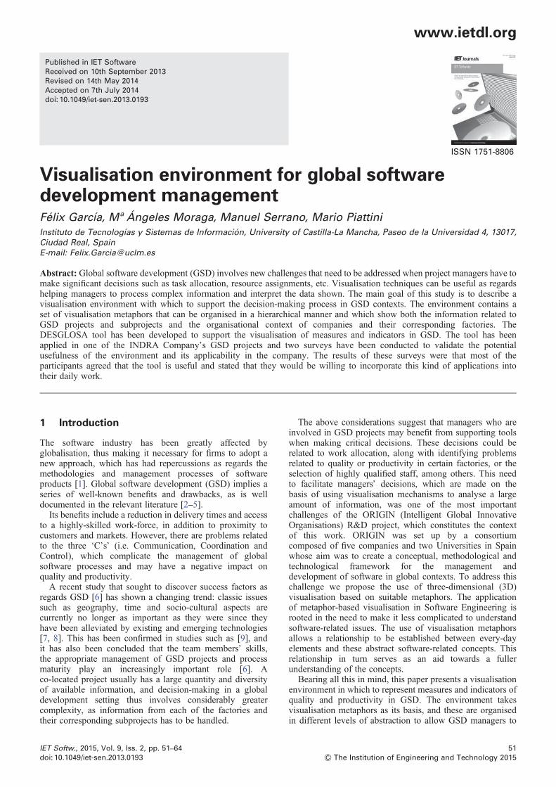
and productivity we propose the use of visualisationmetaphors, which are made up of a set of graphic elements,such that each model has multiple properties called‘dimensions’. We opted to perform the visualisation onthree levels (see Fig. 1):
† Industrial area (factories metaphor): This consists of agraphical model of the factories, shown in the form oftraditional industrial factories, which together make up anindustrial estate. The model depicts a factory that has a baseupon which there is a building and a smokestack. Thedimensions of this model will be the scale of the factory(global size), the colour of the smokestack and its height.
Fig. 1 Visualisation Hierarchy of Metaphors: example
www.ietdl.org
52
& The Institution of Engineering and Technology 2015
IET Softw., 2015, Vol. 9, Iss. 2, pp. 51–64doi: 10.1049/iet-sen.2013.0193
† Project and subproject visualisation (sphere metaphor):The lack of a metaphor that would come close torepresenting the concept of a project led to the design ofthis model, which seeks to meet the visualisation needsoutlined by the experts in the sector. The structure of thesphere metaphor contains a bottomsphere, the colour andshape of which may vary. This has a space reserved withinit for a mark, which may be either an icon of a green tickor a red cross. Each sphere has two ‘antennae’, both ofwhich have a small sphere at the end. These small spheresare red and green, respectively, and each shows a wholenumber above it. Lastly, a text chain is displayed under thebottom sphere.† Towers (city metaphor): Each tower represents a structuresimilar to a skyscraper (based on [10]). The scene depicts acity in which each district represents data that are groupedby project, market, etc. This model was designed to bespecifically tailored to any given entity and then torepresent it in a generic sense. The dimensions in eachtower are the width, depth, total height, height of shading(inner height) and colour.
It should be noted that these metaphors may be applied toany entity -that is, one single entity- (such as a project), whichcan be visualised using different metaphors. The user candefine visualisation levels and is able to navigate properlybetween them. As an example, the user may first need toobtain an overview of his/her factories, and this will allowhim/her to gain access to the projects that are beingundertaken in each one of them and thus keep track of theprogress of these projects. What is more, in a GSD contextit may be more appropriate to visualise the projects inwhich the company is involved in a first level and thenfocus on particular factories or subprojects in subsequent
levels. To meet this need, a solution is proposed in whichthe user could navigate between the different visualisationmetaphors by means of a hierarchy of visualisation profilesand choose the particular graphical models that he/shewishes to consider (see Fig. 1).
3 DESGLOSA-GSD
The objective is that Desglosa-GSD will be an ‘intuitive’ webapplication and it has been developed with JAVA technologyfor the visualisation of indicators in a GSD context. Thevisualisation in this environment needs to be flexible, thusallowing users to configure the visualisation type that bestsuits them, and it should also be extensible to permit newvisualisation metaphors to be added quickly and easily. Thetool is accessible for the following roles:
† Administrator: This is an expert user of the system, withcomplete control of all the functionalities, who is in chargeof managing the configuration tasks of the companies andfactories in the system, along with visualisation profiles.† Project Manager: This system user’s job consists oflooking after the configuration of the projects andsubprojects he/she leads.
The tool permits Administrator users (visualisation experts)to choose which metaphor to employ for the representation ofthe information of a particular entity (company, factory,project or subproject). The user can then configureassociations between the different characteristics of theentity (its name, different measures or indicators and so on),in addition to the dimensions of the graphical model. Thismeans that the display will vary, depending on the values
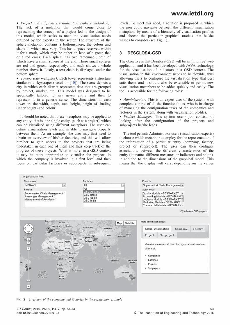
Fig. 2 Overview of the company and factories in the application example
www.ietdl.org
IET Softw., 2015, Vol. 9, Iss. 2, pp. 51–64doi: 10.1049/iet-sen.2013.0193
53
& The Institution of Engineering and Technology 2015

that are stored by the entity’s attributes. The administrators’expertise in visualisation allows them to tailor thevisualisation, and they are therefore responsible forchoosing the best metaphors for each project according tothe users’ requirements. These users are expected to knowthe characteristics of each metaphor and thus interpret thevisualisation results correctly. The tool also displays extrainformation to support a better understanding, such as theexplanation of the meaning of each dimension in themetaphor. The objective of these mechanisms is to facilitatethe interchange of information and a commonunderstanding of visualisation among project stakeholders.The main functionalities of DESGLOSA-GSD are:
† The management of companies, factories, projects andsubprojects: These functionalities allow the administrator tocreate, eliminate and modify information about thecompanies and their factories, along with that concerningthe projects that are being carried out in the companies andthe subprojects that are being undertaken in each of thefactories. The system enables information that is relevant tothe user to be shown, and selection filters have been appliedto these elements (see Section 4, Fig. 2). The geolocation ofeach factory is also displayed on a map.† The management of visualisation profiles: Thisencompasses the functionalities of creating, consulting andeliminating visualisation profiles, and these profilesconfigure the desired information in each metaphor,showing it in 3D graphic form. The user can choose themeasure or indicator to be shown, in addition to theattribute of the metaphor with which it will be represented.For instance, the size of a factory (an attribute of agraphical model), can represent the number of employees atthat factory (a measure that is of interest). The ranges ofvalues can also be selected to facilitate an appropriatescaling of the visualisation.† The visualisation of measures and indicators: This is themain functionality of the tool, and permits the user tovisualise the relevant information of an entity (company,factory, project or subproject), according to a givenvisualisation profile. The user can similarly choose thegrouping mode, that is, the user decides the meaning ofeach of the districts (which may be classified according tothe company, factory or project, among others). Once theuser has gained access to the particular scene that is
brought up in the visualisation, he/she has the possibility ofnavigating around that scene (moving the camera around,rotating it, focusing on particular objects, etc.). Each timean element is chosen, the system shows the user someinformation about the element selected and allows him/herto visualise the information related to the element by meansof a visualisation profile (small red arrows in Fig. 1). Forexample, if a factory in the metaphor of the industrial estateis chosen, its profile will be used to show information aboutonly that factory (projects and subprojects in which thefactory is involved). In this case, the user is gaining accessto a new level of visualisation (blue arrows in Fig. 1).
The following sections provide descriptions of how the toolwas validated (using an application example) and twosurveys, respectively.
4 Application example of DESGLOSA-GSD
In an attempt to obtain an initial insight into the validity of thetool in real environments, an application example wasdesigned based on real projects being carried out atINDRA, that is, the Indra Software Labs (ISL). ISL is asubsidiary company of the INDRA group, which specialisesin software development and is composed of 9000professionals in 21 factories, distributed throughout severalcountries such as in Europe, Africa, the USA and Asia. Thecompany’s volume of sales has been increasing over thelast few years, mainly as the result of the positive evolutionof the international market, and this situation highlights thesignificance of GSD in the company.The data that are visualised in this example are fictitious to
preserve their confidentiality, but they are representative ofGSD projects since they were inspired by actual recordsfrom the project. This example is that which is included inthe demo of the tool, a video of which was watched by theprofessionals who participated in the first survey (seeSection 6). The example consists of visualising the globalprojects carried out at INDRA, and more precisely atfictitious factories located in Brazil, Australia, India andSpain (Fig. 2).The work allocation mode in the application example is ‘by
modules’ and the projects that are being developed globallyare:
Fig. 3 Scenes of the application example
a Industrial area scene of the application exampleb Project scene of the application example
www.ietdl.org
54
& The Institution of Engineering and Technology 2015
IET Softw., 2015, Vol. 9, Iss. 2, pp. 51–64doi: 10.1049/iet-sen.2013.0193

† The Management of a Supermarket Chain, which iscomposed of six modules allocated as follows: two inSpain, two in Brasil, one in India and one in Australia.† Passenger Management, which includes five modules(three in India, one in Brazil and one in Australia).† Accidents Management (Insurance Sector), which iscomposed of three modules (two in India and one in Spain).
The visualisation defined was organised in three levels(thus allowing the user to navigate freely around the scene):
† Level 1. Factories Metaphor: The number of employees inthe factory is represented as the height of the smokestack,while the market in which the factory specialises isrepresented by the colour of the stack. Each district groupstogether the factories that are developing each project(Fig. 3a). The visualisation is complemented by the textualdata, which is shown on the right of the element selected inthe scene.† Level 2. Sphere Metaphor (Project Visualisation): The aimof the scene is to show certain characteristics of the GSDprojects that are being developed in different factories(Fig. 3b). The measure mapping with graphical elements is:Sphere Size – Estimated Lines of Code in the project(obtained after conversion of estimation of Function Points);number over the small sphere on the right-hand side –
non-solved problems; number over the small sphere on theleft-hand side – solved problems; sphere colour: delayed(red); non-delayed (green); sphere mark – the project wasaudited in the company (this is a special characteristic inthe INDRA projects). Each district represents a factory, andthe spheres are therefore the projects in which the factory is
involved. When the user clicks onto a sphere, the panel onthe right shows detailed information about the elementselected.† Level 3. City Metaphor (subproject visualisation): Thismetaphor was chosen to represent characteristics of thesubprojects. It is important to highlight that the term‘subproject’ in the context of this example is used to meanthe development of each module by the factories. Twoscenes were created:
o Scene 1: This shows the issue management process ofthe factory in the project (Fig. 4). The mapping was: height ofthe tower – total number of problems discovered; innerHeight (filled-in area in each tower) – number of problemssolved; colour – resolution ratio on a scale composed ofthree colours (red, orange and green).
o Scene 2: This shows the quality subcharacteristic ofmaintainability, the value of which is collected along withthe other quality characteristics, according to theclassification provided in the ISO 25010 standard. As aresult, the company also gives a score to the total quality.In this case, the mapping was: inner height (filled-in area) –maintainability and colour – quality ratio. the height, widthand depth of the tower were given constant values.
In this example, the hierarchy of visualisation wasorganised into the levels of factory, project and subproject,respectively, but it is important to stress that the user is freeto select the entity that he/she wishes to consider in eachlevel, and can use the ‘organisational filter’ combo lists forthis purpose (see upper part of Fig. 2).
Fig. 4 Subproject scene of the application example
Problem resolution visualisation
www.ietdl.org
IET Softw., 2015, Vol. 9, Iss. 2, pp. 51–64doi: 10.1049/iet-sen.2013.0193
55
& The Institution of Engineering and Technology 2015

As a result of the development of the application example,we concluded that it was possible to apply the tool properly torepresent the example case, which is based on real scenariosin INDRA.
5 Exploratory analysis of DESGLOSAapplication in GSD environments
To test the feasibility of using DESGLOSA in real settings, apreliminary validation was conducted which was composedof two main phases: a first phase in which a survey wasconducted with 22 practitioners from INDRA softwarecompany. The recommendations and feedback obtainedwere used as the basis to enhance the DESGLOSA tool,and a second survey was then sent to six highly skilledsoftware managers in the company who used the tool witha representative example. Detailed descriptions of thesestages are provided in the following subsections.
5.1 First stage: initial survey
A survey was carried out to validate the DESGLOSAenvironment and the visualisation metaphors it contains.Starting from the results, the applicability of the tool wasanalysed before it was handed over for use in the company.The survey was put together by following the specific stepsand recommendations of [11–16]. Special attention wastherefore paid to the selection of the questions thatappeared. These were formulated in such a way thatrespondents could answer them easily and accurately, andthey were purposeful, concrete and closed. We bore in mindthat the number of questions should be adequate (not toomany). With regard to the questionnaire format, we left aspace to allow the participants to provide a comment foreach question, and used spaces between questions, boxes,etc. to maximise the clarity of questions.We carried out a non-supervised survey in which a
researcher does not need to be on hand to deal with queries.The research questions were:
† RQ1: Is the graphical visualisation useful?† RQ2: Is the choice of metaphors and their organisationadequate for GSD projects?† RQ3: Are the visualisation metaphors appropriate?† RQ4: Should the tool be customisable?† RQ5: Is the tool easy to use?
We shall now go on to present the steps followed toconduct this survey in a satisfactory manner.
5.1.1 Survey design: The questionnaire was designedusing a prototype that was a kind of self-control study.After the users had seen a demo-video about theDESGLOSA tool and the metaphors used in it (which wereillustrated in Section 4), they were asked questions aboutwhat they had seen.
5.1.2 Sample size: The next step was to determine thesample. We knew that the survey population we werestudying would be made up of the participants in theORIGIN project – about 60 subjects, and we therefore useda non-probabilistic sampling method to establish thesample. As a result, we obtained a sample made up of 22people, all of whom answered the questionnaire.
5.1.3 Constructing the survey instrument: In drawingup the questions, the purpose and objectives of the surveywere borne in mind, thus allowing us to ensure that thequestions were directly related to the survey’s objectives.The following factors were also taken into account whendeciding what to ask: (a) the questions needed to be wordedin such a way that those answering could do so easily andaccurately; (b) there had to be an appropriate number ofquestions; (c) the answers needed to be standardised usingthe following ordinal scale: 1: Totally disagree, 2: Disagree,3: Neither agree nor disagree, 4: Agree, 5: Totally agree.To produce the questions we realised that they had to make
sense and that they needed to be specific. The language usedwas therefore conventional, using terminology that would befamiliar to the participants, and negative questions were notincluded.All the questions were of the closed-type, that is, the
participants had to choose one of the answers provided, andwe also included an additional question with a blank spacein which participants could make observations. We alsoincorporated some questions at the beginning of thequestionnaire which were related to demographiccharacteristics (the participant’s gender, age and experience,along with the department in which he/she worked).Moreover, as the questionnaires were non-supervised, it
was important to take into account both the format of thequestionnaire and the instructions that were provided tocarry it out properly. To that end, before asking the surveyquestions we incorporated some instructions on how to fillin the questionnaire (see Appendix 1).
5.1.4 Questionnaire evaluation: After carrying out theabove steps, the questionnaire then had to be assessed. Thiswas done by bearing the following points in mind [13]:
† The subjects of the survey must be motivated.† Partiality on the part of the person conducting the surveymust be avoided, or at least minimised.† The questionnaire has to be assessed formally. This wasdone by carrying out a pilot study in which an expert wasgiven the questionnaire; he answered and checked it andthen provided us with feedback in the form of a series ofsuggestions which were used to improve the quality of thesurvey (specifically, the understandability of certain questions).
All the information related to the survey that was carriedout is presented in this section and Appendix 1.
5.1.5 Data analysis: Once the survey had been carriedout, the final step consisted of analysing the resultsobtained. The survey was distributed to 22 people in all,with a response rate of 100%. The survey’s reliability wasfirst tested using ‘Cronbach’s Alpha’, and a value of 0.9was obtained. This value is appropriate since it is over 0.7,the threshold above which the reliability of results isassured. Having proven the reliability of the survey, theprofile of those surveyed was established. The majority ofthe participants were male, with an average age of 36. Theywere seen to have a wide experience in quality managementin general (8.7 years, on average) and also in globalsoftware projects (5.7 years, on average). The next step wasto analyse the results obtained for each of the questionsasked with regard to the tool and the visualisationmetaphors. The questionnaire was made up of a total of 31questions, divided into 7 sections which we shall calldimensions: General, GSD Visualisation, Visualisation
www.ietdl.org
56
& The Institution of Engineering and Technology 2015
IET Softw., 2015, Vol. 9, Iss. 2, pp. 51–64doi: 10.1049/iet-sen.2013.0193

metaphors, Factory Metaphor, Sphere Metaphor, CityMetaphor and The Tool. Fig. 5 presents the analysis of theresults by dimensions.Fig. 5 shows the results of the survey classified by
dimensions. The majority of the participants considered thatall the aspects under study were positive (they agreed ortotally agreed with the survey questions) for all thedimensions. A more detailed analysis of the informationshown in Fig. 6 reveals that:
† In the general dimension (questions Q1–Q2), theparticipants considered that it is better to have graphicalvisualisations than textual displays (91% of the participantswere either in total agreement or in agreement). In fact, theparticipants considered that it is better to use metaphorsthan traditional graphs. (60% of the users agreed). All thepercentages are shown in Fig. 6.† In the GSD visualisation dimension (questions Q3–Q5):between 60 and 77% of participants totally agreed or agreedthat the visualisation offered by the tool improves theinterpretation of the indicators in comparison with classicalrepresentations; they also agreed that it is necessary tovisualise the indicators using different levels and that the
metaphors should vary depending on the information beingdisplayed.† In the visualisation metaphors (questions Q6–Q10), theparticipants agreed or totally agreed that the interpretationof the result is easier if you can navigate around the scene(62%) or can go from one level to another, choosing anelement of the metaphor (66%). However, there was not asimilar consensus as regards the suitability of the metaphorsused. Of the three metaphors used in the tool, two of them(the factory metaphor and the city metaphor) producedgood results, but in the case of the sphere metaphor only43% of the participants totally agreed or agreed that it wassuitable, whereas 47% of the participants neither agreed nordisagreed. This metaphor should therefore be improved infuture versions.† Specific metaphor dimensions. We asked about thefactory metaphor (Q11–Q16), the sphere metaphor, (Q17–Q22) and the city metaphor (Q23–Q28). For all themetaphors we asked whether: the metaphor is natural,understandable, the quantity of information it contains isappropriate, allows us to draw conclusions easily, thedefault colours used are appropriate and whether it isimportant to be able to move around the scene to avoid
Fig. 5 Frequencies for each dimension in the survey
www.ietdl.org
IET Softw., 2015, Vol. 9, Iss. 2, pp. 51–64doi: 10.1049/iet-sen.2013.0193
57
& The Institution of Engineering and Technology 2015

mistakes in the interpretation. The factory metaphor obtainedthe best results; whereas the sphere and city metaphorsobtained similar results. The worst result was for the spheremetaphor in relation to the question about whether it wasnatural. Only 38% of the participants agreed that it wasnatural as opposed to the 33% who disagreed. This findingis owing to the lack of a similar element in the real world.However, the sphere metaphor obtained good results in theother questions.† Tool dimension (Q29–Q 31). Most of the participants (81and 71%) agreed or totally agreed that it is important to beable to configure which graphic element corresponds with aparticular indicator, and that the user should configure thevisualisation levels and the metaphor to be used in eachone, respectively. With regard to whether the tool is easy touse, 52% of participants agreed or totally agreed that it iseasy to use, whereas only 9% disagreed or totally disagreed.
One conclusion that it is possible to draw from an analysisof the results of the survey carried out is that most of thepeople who took part in the survey considered this type oftool to be useful. They believed that it could be ofassistance in their work, in the context of evaluatingproduct quality in GSD. The participants considered thefollowing to be positive: the way in which the tool tacklesits task with the separation into different hierarchical levels,the different visualisation metaphors with several indicatorsshown in one single display, the customisation of levels andmetaphors, and the possibility of choosing the metaphors.The evaluation we received of the sphere metaphor wasfairly moderate, and this metaphor may therefore need to beanalysed in detail in an attempt to make it seem moresimilar to a particular real-life element.
5.2 Second stage: final survey
The results obtained in the first step led to some interviewsbeing conducted to collect new requirements with which toenhance the tool. The main new requirement was thepossibility of supporting the grouping of results in districtsnot only according to the company, factory or project butby also considering other possible variables of interest suchas the market, the country or the programming language.This resulted in the release of a new version of the toolwhich supports the groupings by any variable whose type isBoolean, String or Numeric. Another significant aspect thatwas addressed in the second stage was that the respondentsactually used the tool to do the application example beforeanswering the survey (the survey is shown in Appendix 2).This new release was applied in a second validation stage
by 6 software managers in INDRA who work withindicators concerning project estimation, requirements,quality, productivity and testing. The survey was conductedby following the same research method as in the previousstage, but the main findings will be summarised here for thesake of simplicity.Fig. 7 shows that none of the participants totally disagreed
with any of the question. In fact, only one participantdisagreed with three questions (Q2, Q4 and Q7). Thisindicates that, in general, the participants agreed with theaspects of the tool that we asked about in the survey. Uponperforming a detailed analysis for each question, the mainresults are the following. The majority of the participantsagreed with questions Q1–Q9. Questions Q1–Q4 werefocused on the use of metaphors, the navigation around thescene and the different levels of visualisation. The vastmajority of the participants (83% for Q1, Q2 and 100% forQ4) agreed or totally agreed with these aspects. Questions
Fig. 6 Percentages for each response
www.ietdl.org
58
& The Institution of Engineering and Technology 2015
IET Softw., 2015, Vol. 9, Iss. 2, pp. 51–64doi: 10.1049/iet-sen.2013.0193

Q5–Q7 were related to the usefulness of the metaphorsproposed in the tool. As a result we have obtained that 67%of participants agreed or totally agreed with the usefulnessof the metaphors. The worst result was obtained for the citymetaphor since one participant disagreed that it was useful.With regard to Q8 and Q9, 67 and 100% of theparticipants, respectively, agreed or totally agreed withthem. These questions are more focused on the possibilityof adapting the tool to the specific needs of each case.Question Q10 obtained the same values for the scales 3, 4and 5. This question concerned the usefulness of the tool asregards making better decisions in a GSD project, and thisresult therefore indicates that the tool is really useful. Atotal of 67% of participants agreed or totally agreed withthis affirmation.
5.3 Threats to validity
Various recommendations have been followed in the designand production of the survey, in the quest for maximumrigour and precision. There were, however, some limitationsor threats to validity. In the first place, in spite of the factthat the sample was as heterogeneous as possible it must berecognised that all the subjects belonged to the sameorganisation, signifying that it will be necessary to carry outnew surveys with the personnel from different companies inthe future. Although the results may be different, webelieve that they will also find the tool useful. However,these outcomes must be tested. Another threat to validitythat we have detected is the scalability of the data. Thesurveys were carried out by designing two small examples.Although the examples were not too complex, they didserve to illustrate the tool’s behaviour. It should also benoted that both examples are sufficiently representative ofan actual GSD project at the Indra Company, since onlyfour or five factories at the most are usually involved in asoftware development project. We thus consider that theexamples are sufficiently representative to fulfil the purposeof carrying out the survey, although we are planning todesign a larger and more complex system in the future.It should also be noted that another threat to validity is the
sample size. In the first survey, although the number of peoplesurveyed was not particularly high, the population that thetool is designed for is not excessively large. This meansthat the size of the sample can be considered as acceptableand representative as regards achieving the goal in oursurvey, that is, to validate the usefulness of the tool and themetaphors used.
In the case of the second survey, the sample size is smallerand this is therefore the principal threat to its validity. We areaware that this may have affected the validity of results, butthe difficulty involved in finding highly skilled managers inGSD projects must be stressed, and these results areconsequently encouraging and can be considered as a goodstarting point for a future replication in which the potentialapplicability and usefulness of DESGLOSA in real settingswill be tested.With regard to the threat to validity of data Visualisation,
we principally used the city metaphor as it has beensuccessfully used in other tools such as Citilizer, whichhave been validated in [17–21]. What is more, to tackle thespecial needs of GSD, we also added representations in theforms of spheres and factories. To improve the capability togeneralise the results of these two new metaphores furthervalidation should be conducted in more industrial contexts.
6 Related work
There are a host of approaches in the visualisation field,among which we could highlight the basic ones describedin [22]: bar charts matrices [23], landscapes, networks [24],dot-plots, histograms, data sheets [25, 26], paraboxes [27]and timetables. The last few years have witnessed theappearance of various advances in many visualisation-related issues, and fresh visualisation techniques and theirapplication to new environments have been proposed.
6.1 New visualisation techniques
With regard to improvements in visualisation techniques,Agrawala et al. [28] identified the main design principlesfor visual communication, proposing a methodology withwhich to identify, instantiate and evaluate visual designprinciples for specific domains. Burkhard and Meier [29],meanwhile, suggest a new visualisation technique based onthe underground railway map known as Tube Map, whileda Silva et al. [30] proposed the use of Cockpits for thevisualisation and coordination of distributed softwaredevelopment. It is worth highlighting the Code_swarmsystem [31], an organic visualisation technique which seeksto display information about the development of a project,Metaballs [32] which aims to ease program comprehensionby using 3D enhancing balls, and CodeTrees [33]. Lastly,we should mention the improvements in visualisation thatare based on cities, such as those proposed by [17–21].
6.2 Visualisation in software development
In the field of software evolution, it is worth mentioningVRCS [34], a 3D system aimed at developers andmaintainers to allow them to analyse the different versionsof a particular software, Release History [35], which is a3D software structure evolution system based on VRML,EPO (see [36]) a 3D visualisation system to show thedependencies between software components, and SME [37],which uses an interactive differential and temporal approachto visualise software evolution. Last of all in this overview,we should mention the city metaphor found in [10, 21], andCode_Swarm [31] whose principal objective is to representevolution in the development of a software system.In the area of software requirements analysis, we should
draw the reader’s attention to systems such as ReqViz3d[38] for the display, validation and understanding of
Fig. 7 Percentages for each response (Survey 2)
www.ietdl.org
IET Softw., 2015, Vol. 9, Iss. 2, pp. 51–64doi: 10.1049/iet-sen.2013.0193
59
& The Institution of Engineering and Technology 2015

requirements, along with ScenarioML [39], which modelscenarios and display cross-project transitions. Thevisualisation of requirements in distributed environmentshas been tackled in work such as that of ReBlock [40], atool that uses pyramids to represent requirements information.It is in design and software maintenance that most headway
has been made as regards visualisation, since this is generallywhere there has been a greater sense of the need to visualisesoftware systems. This is because these systems tend to bereally large, making it necessary to use visualisationsystems to be able to manage them properly. Someexamples of these systems are Geons3D [41],CodeMapping [42], TraceCrawler [43], X3D-UML [44],Vizz3D [45], Citylizer [18], Tulip 3 [46] or World View [47].
6.3 Visualisation of global software development
There have been few real breakthroughs in this area ofvisualisation of GSD because the majority of systems arebased on the portrayal of large-scale systems. The work thatmay be found in this context is, for example World View[47], which proposes the display of development on a worldmap, along with Ariadne and TraVis, which support theautomatic analysis of dependencies, visualisation of socialdependency information and the display of traceability [48].Another stream of research in visualisation which may beuseful in GSD contexts is related to tools that provide anawareness of human activities in software development [49]such as SecondWatch [50] and ProxiScientia [51].In short, work on visualisation in GSD has focused on
aspects of coordination and traceability; there is no solutionthat would make it possible to visualise quality andproductivity indicators with flexibility and in which thenecessary attention is paid to users’ preferences. In ourwork, we have proposed a system that seeks a synergy byusing several of the techniques already mentioned, such asCitylizer or World View, alongside a proposal for newvisualisation metaphors for GSD. The aim is to produce anintegrated visualisation system that would be of assistanceto global project managers, thus helping them to administersuch a highly complex undertaking appropriately.In summary, the main innovation as regards the
contributions of the proposal in relation to existingvisualisation tools is that DESGLOSA provides managerswith a visualisation environment that is focused on qualityand productivity in GSD, which includes new metaphors toassist in the visualisation (factories and spheres) and adaptsthe city metaphor for its application in GSD. Thisvisualisation is, moreover, organised in a hierarchy, andvisualisation can be customised according to the final users’preferences and profiles.
7 Conclusions
In this paper, we have proposed a tool that aims to visualisethe data management of GSD using metaphors. Thisreduces complexity, both in understanding data and inglobal project management, which in turn means thatmanagerial decision-making is supported. TheDESGLOSA-GSD tool has been presented here as a 3Dvisualisation web application which focuses on presentingglobal development software project data to projectmanagers and company executives. This tool is easilyconfigurable, with several visualisation metaphors, and isable to structure data at different hierarchical levels. To
obtain an initial insight into the suitability of the tool in anindustrial context, an application example based on realcases and two surveys were conducted in the context of theORIGIN industrial project. The survey aimed to evaluatethe usefulness and appropriateness of the tool and wasanswered by a group of project and quality managersworking at the INDRA Company. This is a veryrepresentative context, given that GSD is currentlyfundamental in the company’s business.One conclusion drawn from this study is that most of the
subjects considered that the tool was useful and theyaffirmed that they were willing to incorporate it into theirdaily work. Those who responded to the first surveyexpressed the opinion that the possibility of customising thetool to user needs was a positive characteristic, as was thatof being able to organise the data in levels. Another pluspoint was the use of different metaphors to visualise data.The subjects also agreed with most of the metaphors chosenfor the display of the data, although most of them found thesphere metaphor difficult to understand and not so useful.The second survey confirmed that, from the softwaremanagers’ perspective, the use of metaphors with differentlevels of visualisation is useful. The respondents to thissurvey considered that the specific metaphors chosen forinclusion in the tool are useful as regards making theinterpretation of data easier. With regard to the possibilityof customising the tool, these software managers consideredthat it is a necessary option. Finally, the most importantpoint was that they believed that the tool could help themmake better decisions in a GSD project.We believe that the results obtained are encouraging and
have provided interesting feedback for the future work. Ourfuture work will be particularly focused on refining thesphere metaphor and on carrying out further empiricalstudies in which the tool will be applied in realenvironments. We also plan to develop new visualisationmetaphors that will suit managers’ needs, and we wish tointegrate the visualisation environment into INDRA’stechnological infrastructure to support its managers’ andexecutives’ decision-making processes. New studies in othercontexts will also be planned to reinforce the externalvalidity of the visualisation environment.
8 Acknowledgments
We would like to thank all the professionals from INDRAwho kindly responded to our surveys, and we areparticularly grateful to Ángel Sevilla and Iñaki Díez fortheir help in conducting them. This work was funded by theORIGIN project (IDI-2010043 (1-5)) funded by CDTI andFEDER, GEODAS-BC project (Ministerio de Economía yCompetitividad and FondoEuropeo de Desarrollo RegionalFEDER, TIN2012-37493-C03-01) and VILMA (JCCMPEII 11-0316-2878) funded by JCCM and FEDER.
9 References
1 Boehm, B.: ‘A view of 20th and 21st century software engineering’.ICSE, 2006, New York, NY, USA, 2006, pp. 12–29
2 Ågerfalk, P.J., Fitzgerald, B., Holmström, H., Conchúir, E.: ‘Benefits ofglobal software development: the known and unknown’. Int. Conf. onSoftware Process Leipzig, Germany, 2008, pp. 1–9
3 Conchúir, E.Ó., Ågerfalk, P.J., Olsson, H.H., Fitzgerald, B.: ‘Globalsoftware development: where are the benefits?’, Commun. ACM, 2009,52, (8), pp. 127–131
4 Ebert, C., De Neve, P.: ‘Surviving global software development’, IEEESoftw., 2001, 18, (2), pp. 62–69
www.ietdl.org
60
& The Institution of Engineering and Technology 2015
IET Softw., 2015, Vol. 9, Iss. 2, pp. 51–64doi: 10.1049/iet-sen.2013.0193

5 Smite, D., Wohlin, C., Gorschek, T., Feldt, R.: ‘Empirical evidence inglobal software engineering: a systematic review’, Empir. Softw. Eng.,2010, 15, (1), pp. 91–118
6 Vizcaíno, A., García, F., Villar, J.C., Piattini, M., Portillo, J.: ‘ApplyingQ-methodology to analyse the success factors in GSD’, Inf. Softw.Technol., 2013, 55, (7), pp. 1200–1211
7 García, F., Vizcaíno, A., Ebert, C.: ‘Process management tools’, IEEESoftw., 2011, 28, (2), pp. 15–18
8 Portillo-Rodríguez, J., Vizcaíno, A., Piattini, M., Beecham, S.: ‘Toolsused in Global Software Engineering: a systematic mapping review’,Inf. Softw. Technol., 2012, 54, (7), pp. 663–685
9 Nguyen, T., Wolf, T., Damian, D.: ‘Global software development anddelay: does distance still matter?’. IEEE Int. Conf. on Global SoftwareEngineering, India, August 17–20 2008, pp. 45–54
10 Wettel, R., Lanza, M.: ‘CodeCity: 3D visualization of large-scalesoftware’. ICSE Companion 2008, Leipzig, Germany, May 10–182008, pp. 921–922
11 Kitchenham, B.A., Pfleeger, S.L.: ‘Principles of survey research. Part 2:designing a survey’, Softw. Eng. Notes ACM SIGSOFT., 2002, 27, (1),pp. 18–20
12 Kitchenham, B.A., Pfleeger, S.L.: ‘Principles of survey research. Part 3:constructing a survey instrument’, Softw. Eng. Notes ACM SIGSOFT.,2002, 27, (2), pp. 20–24
13 Kitchenham, B.A., Pfleeger, S.L.: ‘Principles of survey research. Part 4:questionnaire evaluation’, Softw. Eng. Notes ACM SIGSOFT., 2002, 27,(3), pp. 20–23
14 Kitchenham, B.A., Pfleeger, S.L.: ‘Principles of survey research. Part 5:population and samples’, Software Engineering Notes. ACM SIGSOFT.,2002, 27, (5), pp. 17–20
15 Kitchenham, B.A., Pfleeger, S.L.: ‘Principles of survey research. Part 6:data analysis’, Softw. Eng. Notes ACM SIGSOFT., 2003, 28, (2),pp. 24–27
16 Pfleeger, S.A., Kitchenham, B.: ‘Principles of survey research. Part 1:turning lemons into lemonade’. In ACM Sigsoft, SoftwareEngineering Notes, 2001, pp. 16–18
17 Bentrad, S., Meslati, D.: ‘2D and 3D visualization of AspectJ Programs’.Tenth Int. Symp. on Programming and Systems, 2011, pp. 183–190
18 Biaggi, A.: ‘A 3D visualization plug-in for eclipse’. Retrieved from http://www.old.inf.usi.ch/faculty/lanza/Downloads/Biagg2008a.pdf, 2008
19 Panas, T., Lincke, R., Löwe, W.: ‘Online-configuration of softwarevisualizations with Vizz3D’. Proc. 2005 ACM Symp. on SoftwareVisualization, Saint Louis, Missouri, USA, May 14–15 2005,pp. 173–182
20 Souza, R., Silva, B., Mendes, T., Manoel, M.: ‘SkyscrapAR: anaugmented reality visualization for software evolution’. II BrazilianWorkshop on Software Visualization, Natal, Brazil, September 23,2012, pp. 17–24
21 Wettel, R., Lanza, M.: ‘Visualizing software systems as cities’. FourthIEEE Int. Workshop on Visualizing Software for Understanding andAnalysis, Banff Center, Alberta, Canada, June 25–26, 2007, pp. 92–99
22 Eick, S.G.: ‘Visualizing multi-dimensional data’, SIGGRAPH Comput.Graph., 2000, 34, (1), pp. 61–67
23 Bertin, J.: ‘Graphics and graphic information processing’ (Walter deGruyter & Co., Berlin, 1981)
24 Wills, G.J.: ‘Nicheworks – interactive visualization of very largegraphs’. Proc. Graph Drawing’97, 1997, pp. 403–414
25 Eick, S.G.: ‘Graphically displaying text’, J. Comput. Graph. Stat., 1994,3, (2), pp. 127–142
26 Eick, S.G., Graves, T.L., Karr, A.F., Mockus, A.: ‘Web-based textvisualization’. SoftStat ’97 Advances in Statistical Software 6, 1997,pp. 3–10
27 Inselberg, A.: ‘Don’t panic…just do it in parallel!’, Comput. Stat., 1999,14, (1), pp. 53–78
28 Agrawala, M., Li, W., Berthouzoz, F.: ‘Design principles for visualcommunication’, Commun. ACM, 2011, 54, (4), pp. 60–69
29 Burkhard, R., Meier, M.: ‘Tube map: evaluation of a visual metaphor forinterfunctional communication of complex projects’. Proc. I-Know,2004, vol. 4, pp. 449–456
30 Da Silva, I., Alvim, M., Ripley, R., Sarma, A., Werner, C., van derHoek, A.: ‘Designing software cockpits for coordinating distributedsoftware development’. First Workshop on Measurement-basedCockpits for Distributed Software and Systems Engineering Projects,2007, pp. 14–19
31 Ogawa, M., Ma, K.-L.: ‘Code_swarm: a design study in organicsoftware visualization’, IEEE Trans. Vis. Comput. Graph., 2009, 15,(6), pp. 1097–1104
32 Rilling, J., Mudur, S.P.: ‘3D visualization techniques to supportslicing-based program comprehension’, Comput. Graph., 2005, 29,(3), pp. 311–329
33 Erra, U., Scanniello, G.: ‘Towards the visualization of software systemsas 3D forests: the codetrees environment’. 27th Annual ACM Symp. onApplied Computing, 2012, pp. 981–988
34 Koike, H., Chu, H.-C.: ‘Vrcs: integrating version control and modulemanagement using interactive 3d graphics’. Proc. 1997 IEEE Symp.on Visual Languages, Washington, DC, USA, 1997, p. 168
35 Gall, H., Jazayeri, M., Riva, C.: ‘Visualizing software release histories:the use of color and third dimension’. Proc. IEEE Int. Conf. on SoftwareMaintenance, Washington, DC, USA, 1999, p. 99
36 Burch, M., Diehl, S., Weibgerber, P.: ‘Visual data mining in softwarearchives’. Proc. 2005 ACM Symp. on Software visualization,New York, NY, USA, 2005, pp. 37–46
37 Novais, R.L., Lima, C.A., de F Carneiro, G., Paulo, R.M.S., Mendonça,M.: ‘An interactive differential and temporal approach to visuallyanalyze software evolution’. Sixth IEEE Int. Workshop on VisualizingSoftware for Understanding and Analysis, Williamsburg, Virginia,USA, September 29–30 2011, pp. 1–4
38 Teyseyre, A.R., Campo, M.: ‘Early requirements validation with 3dworlds’, Comput. Syst. Sci. Eng., 2005, 20, pp. 61–72
39 Alspaugh, T.A., Tomlinson, B., Baumer, E.: ‘Using social agents tovisualize software scenarios’. Proc. 2006 ACM Symp. on SoftwareVisualization, New York, USA, 2006, pp. 87–94
40 Savio, D., Anitha, P., Patil, A., Creighton, O.: ‘Visualizing requirementsin distributed system development’. IEEE Second Workshop onRequirements Engineering for Systems, Services andSystems-of-Systems, Chicago, IL, USA, September 25, 2012, pp. 14–19
41 Irani, P., Ware, C.: ‘Diagramming information structures using 3Dperceptual primitives’, ACM Trans. Comput.-Hum. Interact., 2003, 10,(1), pp. 1–19
42 Bonyuet, D., Ma, M., Jaffrey, K.: ‘3D visualization for softwaredevelopment’. Proc IEEE Int. Conf. on Web Services. Washington,DC, USA, 2004, p. 708
43 Greevy, O., Lanza, M., Wysseier, C.: ‘Visualizing feature interaction in3-D’. Proc. Third IEEE Int. Workshop on Visualizing Software forUnderstanding and Analysis, Washington, DC, USA, 2005, p. 30
44 McIntosh, P., Hamilton, M., van Schyndel, R.G.: ‘X3D-UML: enablingadvanced UML visualisation through X3D’. Proc Tenth Int. Conf. on 3DWeb Technology, 2005, pp. 135–142
45 Panas, T., Epperly, T., Quinlan, D., Saebjornsen, A., Vuduc, R.:‘Communicating software architecture using a unified single-viewvisualization’. Proc. 12th IEEE Int. Conf. on Engineering ComplexComputer Systems, Auckland, July 11–14 2007, pp. 217–228
46 Auber, D., Archambault, D., Bourqui, R., et al.: ‘The Tulip 3Framework: a scalable software library for information visualizationapplications based on relational data’, Retrieved from http://hal.inria.fr/hal-00659880, 2012
47 Sarma, A., Van Der Hoek, A.: ‘Towards awareness in the large’. Int.Conf. on Global Software Engineering, Florianopolis, Brazil, October16–19, 2006, pp. 127–131
48 Cleidson, R., De Souza, B., Hildenbrand, T., Redmiles, D.: ‘Towardvisualization and analysis of traceability relationships in distributedand offshore software development projects’. Proc. first Int. Conf. onSoftware Engineering Approaches for Offshore and OutsourcedDevelopment, 2007, pp. 182–199
49 Storey, M.-A.D., Cubranic, D., Germán, D.M.: ‘On the use ofvisualization to support awareness of human activities in softwaredevelopment: a survey and a framework’. SOFTVIS 2005, 2005,pp. 193–202
50 Ye, E., Lev, A., D. Hiep, Q., Chang, L.: ‘SecondWATCH: a workspaceawareness tool based on a 3-d virtual world’. 31st Int. Conf. on SoftwareEngineering, Vancouver, Canada, May 16–24, 2009, pp. 291–294
51 Borici, A., Blincoe, K., Schroter, A., Valetto, G., Damian, D.:‘ProxiScientia: toward real-time visualization of task and developerdependencies in collaborating software development teams’. Fifth Int.Workshop on Cooperative and Human Aspects of SoftwareEngineering, 2012, pp. 5–11
10 Appendix
10.1 Appendix 1
See Fig. 8
10.2 Appendix 2
See Fig. 9
www.ietdl.org
IET Softw., 2015, Vol. 9, Iss. 2, pp. 51–64doi: 10.1049/iet-sen.2013.0193
61
& The Institution of Engineering and Technology 2015

Fig. 8 DESGLOSA survey
www.ietdl.org
62
& The Institution of Engineering and Technology 2015
IET Softw., 2015, Vol. 9, Iss. 2, pp. 51–64doi: 10.1049/iet-sen.2013.0193

Fig. 8 Continued
www.ietdl.org
IET Softw., 2015, Vol. 9, Iss. 2, pp. 51–64doi: 10.1049/iet-sen.2013.0193
63
& The Institution of Engineering and Technology 2015

Fig. 9 DESGLOSA survey II
www.ietdl.org
64
& The Institution of Engineering and Technology 2015
IET Softw., 2015, Vol. 9, Iss. 2, pp. 51–64doi: 10.1049/iet-sen.2013.0193