it’s what’s on the inside campaign brand guidelines
TRANSCRIPT

I T ’ S W H A T ’ S O N T H E I N S I D E C A M PA I G N
OC TOB E R 2 0 2 1
Brand Guidelines
V O S S . I T ’ S W H A T ’ S O N T H E I N S I D E - C A M PA I G N B R A N D G U I D E L I N E S - 2 0 2 1 PA G E 2
Known for its sleek, beautiful exterior, VOSS represents perhaps the most iconic and recognizable water bottle ever. That beauty on the outside reflects the beauty of what is on the inside of every bottle of VOSS Water. With a history rooted in the impeccable quality of an incredibly pure-tasting water born in Norway, as VOSS expands its product line to offer a range of water products to suit your everyday needs, the high standard of premium quality within remains unchanged. From naturally pure, crisp, refreshing water to the finest sparkling around to the VOSS+ line of water that works harder for you, we encourage people all over the world to continue to admire VOSS for its outer beauty but to also appreciate it for what’s on the inside.
V O S S . I T ’ S W H A T ’ S O N T H E I N S I D E

V O S S . I T ’ S W H A T ’ S O N T H E I N S I D E - C A M PA I G N B R A N D G U I D E L I N E S - 2 0 2 1 PA G E 3
T A B L E O F C O N T E N T S
VOSS Logo and Lockup
VOSS Logo Lockup, 5
VOSS Logo Standalone, 11
Campaign Branding
Typography, 15
Color Palette, 16
Key Images, 17
International Campaign Branding
.......................... 4
............................... 14
...... 25
VOSS+ Branding
Logo, 28
Logo and Descriptor, 32
Logo Color Palette, 34
Logo and Product Logo Lockup, 35
Logo Product Specific Info, 38
Key Images, 41
Product and Campaign Copy
Key Messaging, 53
Romance Copy, 55
URL, Social Media and Legal Lines, 57
.................................... 27
.............. 52

VOSS Logo and Lockup
V O S S . I T ’ S W H A T ’ S O N T H E I N S I D E - C A M PA I G N B R A N D G U I D E L I N E S - 2 0 2 1 PA G E 4

Primary use campaign logo. Should also be used in wide spaces (eg: shelf talkers and 728x90 digital banners).
Horizontal logo minimum width:
300 pixels
4.2 inches
10.6 centimeters
For tall and square shaped spaces and all small spaces as it allows for a bigger more legible tagline (eg: social media profile photo and 160x600 digital banners).
Stacked logo minimum width:
100 pixels
1.4 inches
3.5 cm
Horizontal
Vertical
V O S S . I T ’ S W H A T ’ S O N T H E I N S I D E - C A M PA I G N B R A N D G U I D E L I N E S - 2 0 2 1 PA G E 5
L O G O L O C K U P

No matter which logo lockup you use, it should always be a minimum of one “V” space from the edge of its container or any other text / icon on the page. It should always be centered within a container.
When used as a headline, the horizontal version is preferred and when used as a sign off in the bottom right bottom right corner, follow the minimum size guidelines on page 3 to determine which version to use.
Container
V O S S . I T ’ S W H A T ’ S O N T H E I N S I D E - C A M PA I G N B R A N D G U I D E L I N E S - 2 0 2 1 PA G E 6
L O G O L O C K U P U S A G E

RGB: 124 126 130
HEX: 7C7E82
CMYK: 45 32 27 12
PMS: Cool Gray 7 C
RGB: 159 191 220
HEX: 70ACDE
CMYK: 38 12 2 0
PMS: 2708 C
On WhiteWhen the logo is used on a white background, there is an option to use either gray or color lockups. No matter what the lockup, the tagline color will always be the equivalent color of the VOSS logo at 70% opacity.
Or use the darker gray tothe left at 70% opacity.
Or use the darker blue tothe left at 70% opacity.
RGB: 80 82 87
HEX: 505257
CMYK: 57 42 38 27
PMS: Cool Gray 10 C
RGB: 112 172 222
HEX: 70ACDE
CMYK: 54 20 0 0
PMS: 2142 C
V O S S . I T ’ S W H A T ’ S O N T H E I N S I D E - C A M PA I G N B R A N D G U I D E L I N E S - 2 0 2 1 PA G E 7
L O G O C O L O R
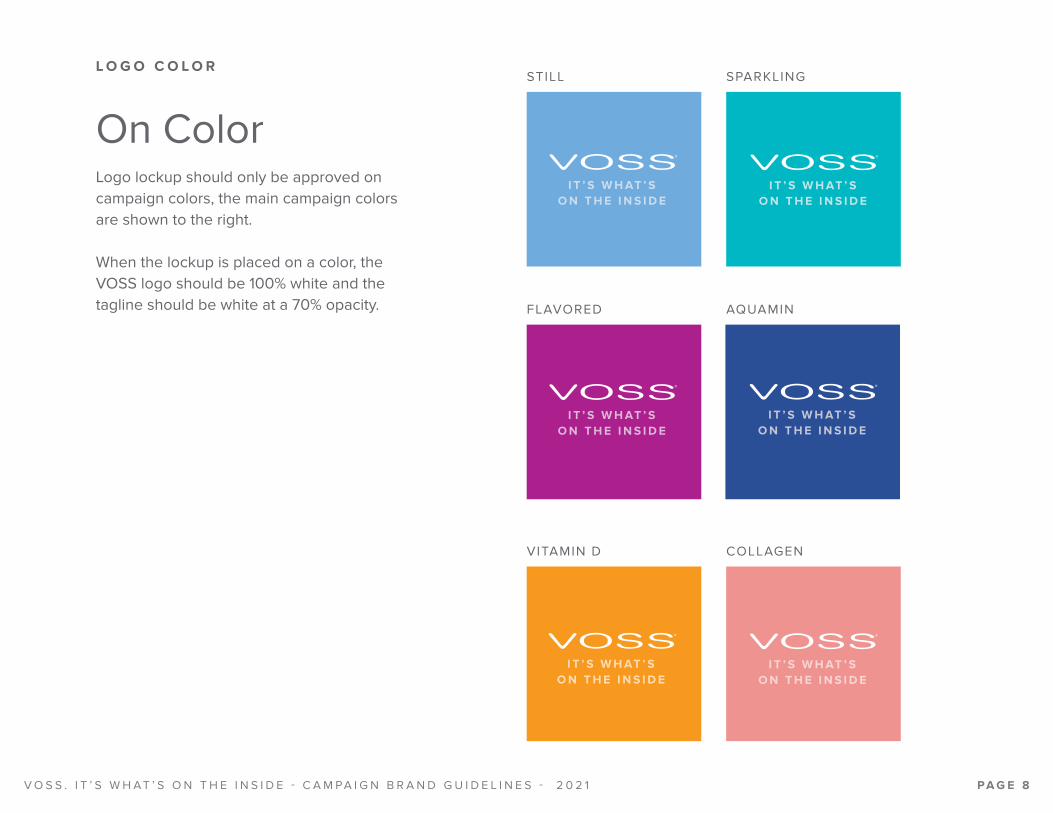
On ColorLogo lockup should only be approved on campaign colors, the main campaign colors are shown to the right.
When the lockup is placed on a color, the VOSS logo should be 100% white and the tagline should be white at a 70% opacity.
STILL
FLAVORED
VITAMIN D
SPARKLING
AQUAMIN
COLLAGEN
V O S S . I T ’ S W H A T ’ S O N T H E I N S I D E - C A M PA I G N B R A N D G U I D E L I N E S - 2 0 2 1 PA G E 8
L O G O C O L O R

This font is for the tagline and also used in the creative campaign. When used in all-caps such as the tagline, it should have a letter spacing of 100 em.
https://fonts.adobe.com/fonts/proxima-nova
Proxima Nova Bold
ABCDEFGHIJKLMNOPQRSTUVWXYZ
abcdefghi jklmnopqrstuvwxyz
V O S S . I T ’ S W H A T ’ S O N T H E I N S I D E - C A M PA I G N B R A N D G U I D E L I N E S - 2 0 2 1 PA G E 9
L O G O L O C K U P T Y P O G R A P H Y

Logo lockup should never be shown so close to the edge of a container, especially when using the color-block “V.”
See page 6 for usage guides within a container.
Logo lockup should never be shown in gray on a colored background.
See page 5 for usage guides on color.
Logo lockup should not be placed over a busy image where the legibility isn’t clear.
The logo lockup should not be altered from the approved orientations. In other words do not re-break or re-align the logo with the tagline.
See page 3 for approved lockups.
Improper Usage
V O S S . I T ’ S W H A T ’ S O N T H E I N S I D E - C A M PA I G N B R A N D G U I D E L I N E S - 2 0 2 1 PA G E 1 0
L O G O L O C K U P U S A G E

Standalone logo should only be used:
• As a tertiary option when a single letter of the tagline is smaller than the specified minimum.
Under: Digital: 6.5 pixels high Print: 0.17 inches high
• When tagline becomes illegible due to specific media types (eg: small embroidery on a polo).
• On deliverables with more than a year exposure that cannot be easily switched out (eg: packaging).
• When specifically requested.
* Use of standalone logo does not need to be within a container.
The standalone logo should always be a minimum of one “V” space from all other elements
Limited Use
Clearance
V O S S . I T ’ S W H A T ’ S O N T H E I N S I D E - C A M PA I G N B R A N D G U I D E L I N E S - 2 0 2 1 PA G E 1 1
S T A N D A L O N E L O G O

On Color (Or Black)
On Light Colors
On White
*Use of logo in black is discouraged, but allowed if vendor requires a one color black logo.
Approved Colors
Color Usage
RGB: 80 82 87
HEX: 505257
CMYK: 57 42 38 27
PMS: Cool Gray 10 C
RGB: 112 172 222
HEX: 70ACDE
CMYK: 54 20 0 0
PMS: 2142 C
RGB: 255 255 255
HEX: FFFFFF
CMYK: 0 0 0 0
White
V O S S . I T ’ S W H A T ’ S O N T H E I N S I D E - C A M PA I G N B R A N D G U I D E L I N E S - 2 0 2 1 PA G E 1 2
S T A N D A L O N E L O G O C O L O R

Logo should always be legible, do not place a white logo on a light colored background or a gray logo on a dark background.
Logo must always use an ® and it must not be moved from its original position.
Logo should not be placed over a busy image where the legibility isn’t clear.
Never warp logo and never place logo at an angle other than fully vertical or fully horizontal.
Improper Usage
V O S S . I T ’ S W H A T ’ S O N T H E I N S I D E - C A M PA I G N B R A N D G U I D E L I N E S - 2 0 2 1 PA G E 1 3
S T A N D A L O N E L O G O U S A G E

Campaign Branding
V O S S . I T ’ S W H A T ’ S O N T H E I N S I D E - C A M PA I G N B R A N D G U I D E L I N E S - 2 0 2 1 PA G E 1 4

https://fonts.adobe.com/fonts/proxima-nova
Proxima Nova Bold
U S E D F O R H E A D L I N E S , A L L- CA P S , 1 3 0 E M ( S E C O N DA RY CA L LO U TS T R AC K I N G 1 5 5 E M )
ABCDEFGHIJKLMNOPQRSTUVWXYZ
Proxima Nova Extra Bold
U S E D F O R N E W / O F F E R C A L L O U T S , A L L- C A P S , 1 5 5 E M
ABCDEFGHIJKLMNOPQRSTUVWXYZ
Proxima Nova Medium
USED FOR EMPHASIS BODY COPY, ALL-CAPS, TRACKING 70 EM
ABCDEFGHIJKLMNOPQRSTUVWXYZ
Proxima Nova Semi bold
USED FOR SOCIAL MEDIA AND URL, ALL-CAPS, TRACKING 70 EM
ABCDEFGHIJKLMNOPQRSTUVWXYZ
Proxima Nova Regular
Used for blocks of body copy, Sentence case, Tracking 0-50 em
ABCDEFGHIJKLMNOPQRSTUVWXYZabcdefghi jk lmnopqrstuvwxyz
T Y P O G R A P H Y - T Y P E F A C E S
V O S S . I T ’ S W H A T ’ S O N T H E I N S I D E - C A M PA I G N B R A N D G U I D E L I N E S - 2 0 2 1 PA G E 1 5

RGB: 112 172 222
HEX: 70ACDE
CMYK: 54 20 0 0
PMS: 2142 C
RGB: 156 196 232
HEX: 9CC4E8
CMYK: 37 12 0 0
RGB: 0 167 181
HEX: 00A7B5
CMYK: 77 2 21 1
PMS: 7710 C
RGB: 191 77 165
HEX: BF4DA5
CMYK: 29 86 4 0
PMS: 2353 C
RGB: 106 187 105
HEX: 6ABB69
CMYK: 61 2 79
PMS: 2256 C
RGB: 243 208 62
HEX: F3D03E
CMYK: 0 10 80 0
PMS: 129 C
Still
*When representing the general VOSS brand the Still Blues should always be the default color.
PRIMARYCOLORS
SECONDARYCOLORS
GRADIENT
Consists of primary and secondary colors
Sparkling RaspberryRose
LimeMint
LemonCucumber
RGB: 120 196 207
HEX: 78C4CF
CMYK: 51 4 18 0
RGB: 217 156 204
HEX: D99CCC
CMYK: 12 45 0 0
RGB: 194 224 158
HEX: C2E09E
CMYK: 26 0 48 0
RGB: 255 242 184
HEX: FFF2B8
CMYK: 1 2 34 0
V O S S . I T ’ S W H A T ’ S O N T H E I N S I D E - C A M PA I G N B R A N D G U I D E L I N E S - 2 0 2 1 PA G E 1 6
S T I L L A N D S PA R K L I N G C O L O R PA L E T T E

S T I L L K E Y I M A G E S
Print Larger format example DigitalSmaller format example
When representing the general VOSS brand the Still bottle should always be used the default product.
V O S S . I T ’ S W H A T ’ S O N T H E I N S I D E - C A M PA I G N B R A N D G U I D E L I N E S - 2 0 2 1 PA G E 1 7

Print Larger format example DigitalSmaller format example
V O S S . I T ’ S W H A T ’ S O N T H E I N S I D E - C A M PA I G N B R A N D G U I D E L I N E S - 2 0 2 1 PA G E 1 8
S PA R K L I N G K E Y I M A G E S

Fruit ImagesShould only be used in lockups where there is room to accommodate all three flavors, or if a flavored product is being shown individually.
Print Larger format example
Digital Smaller format example
V O S S . I T ’ S W H A T ’ S O N T H E I N S I D E - C A M PA I G N B R A N D G U I D E L I N E S - 2 0 2 1 PA G E 1 9
F L A V O R E D S PA R K L I N G K E Y I M A G E S

S T I L L A N D S PA R K L I N G L A Y O U T C O M P O N E N T S
Product PedestalSecondary Callout VOSS What’s Inside
Logo Lockup
Background V imagery (or pattern)Headline
Headline and secondary callout are left justified.
Legal NoteLegal is in lower left corner, small and discrete without being illegible. No smaller than 6 point in print, 8 point in digital.
Space between headline and secondary callout should have visible space between the lines. They should always appear as two distinct elements.
Centered bottle, V shape background, and pedestal.
STILL BACKGROUND
SPARKLING BACKGROUND
FLAVORED SPARKLING BACKGROUNDS
Social media and URL placement
V O S S . I T ’ S W H A T ’ S O N T H E I N S I D E - C A M PA I G N B R A N D G U I D E L I N E S - 2 0 2 1 PA G E 2 0

STILL HORIZONTAL DIGITAL BANNER STILL COLD BOX CLING
STILL CASE HANGER
SPARKLING HORIZONTAL DIGITAL BANNER
V O S S . I T ’ S W H A T ’ S O N T H E I N S I D E - C A M PA I G N B R A N D G U I D E L I N E S - 2 0 2 1 PA G E 2 1
A D D I T I O N A L S T I L L A N D S PA R K L I N G L A Y O U T E X A M P L E S

Never mix still and sparkling color palettes.
Never show headlines or secondary callouts in lower or mixed case, they should always be upper case.
Never mix colors within the sparkling creative.
If multiple sparkling flavored products are used together only sparkling blue color palette should be used.
Never use different background pattens from what is provided.
Improper Usage
NATURALLYPure for a crisp,refreshing taste
All layouts should include a background V element.
When using secondary still callout legal line must be present.
V O S S . I T ’ S W H A T ’ S O N T H E I N S I D E - C A M PA I G N B R A N D G U I D E L I N E S - 2 0 2 1 PA G E 2 2
S T I L L A N D S PA R K L I N G U S A G E

V O S S F A M I LY K E Y I M A G E
VOSS Family Key Image
This execution should be used when VOSS family* of products are featured.*VOSS family of products meaning showing multiple products lines at once - Still, Sparkling, Flavored and/or Plus)
V O S S . I T ’ S W H A T ’ S O N T H E I N S I D E - C A M PA I G N B R A N D G U I D E L I N E S - 2 0 2 1 PA G E 2 3

MOBILE LAYOUT
HORIZONTAL DIGITAL BANNER
RGB: 79 161 207
HEX: 54FA1CF
CMYK: 66 23 5 0
RGB: 71 181 219
HEX: 47B5DB
CMYK: 64 9 7 0
RGB: 51 217 227
HEX: 33D9E3
CMYK: 59 0 17 0
V O S S . I T ’ S W H A T ’ S O N T H E I N S I D E - C A M PA I G N B R A N D G U I D E L I N E S - 2 0 2 1 PA G E 2 4
A D D I T I O N A L V O S S F A M I LY C O L O R & L A Y O U T E X A M P L E S
VOSS Family Gradient
Layout Examples

International Campaign Branding
V O S S . I T ’ S W H A T ’ S O N T H E I N S I D E - C A M PA I G N B R A N D G U I D E L I N E S - 2 0 2 1 PA G E 2 5

Water ClassificationThe water classification is “Natural Mineral Water” for Still internationally.
Note: Bottle is 100% rPET, Still creative stays the same, only bottle image changes.
V O S S . I T ’ S W H A T ’ S O N T H E I N S I D E - C A M PA I G N B R A N D G U I D E L I N E S - 2 0 2 1 PA G E 2 6
B R I T A I N A N D E U 1 0 0 % r P E T S T I L L K E Y I M A G E S

VOSS+ Branding
V O S S . I T ’ S W H A T ’ S O N T H E I N S I D E - C A M PA I G N B R A N D G U I D E L I N E S - 2 0 2 1 PA G E 2 7
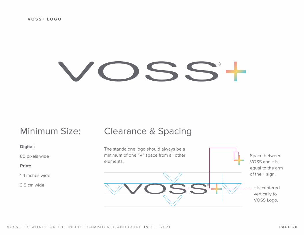
The standalone logo should always be a minimum of one “V” space from all other elements.
Clearance & SpacingMinimum Size:Digital:
80 pixels wide
Print:
1.4 inches wide
3.5 cm wide
Space between VOSS and + is equal to the arm of the + sign.
+ is centered vertically to VOSS Logo.
V O S S . I T ’ S W H A T ’ S O N T H E I N S I D E - C A M PA I G N B R A N D G U I D E L I N E S - 2 0 2 1 PA G E 2 8
V O S S + L O G O

On WhiteFull Color
2 Color
1 Color
On Dark ColorFull Color
2 Color
1 Color
V O S S . I T ’ S W H A T ’ S O N T H E I N S I D E - C A M PA I G N B R A N D G U I D E L I N E S - 2 0 2 1 PA G E 2 9
V O S S + L O G O C O L O R

RGB: 237 148 143
HEX: ED948F
CMYK: 3 51 35 0
RGB: 247 214 102
HEX: F7D666
CMYK: 3 13 71 0
RGB: 97 196 214
HEX: 61C4D6
CMYK: 57 2 15 0
VOSS Logo
+ Sign
RGB: 80 82 87
HEX: 505257
CMYK: 57 42 38 27
PMS: Cool Gray 10 C
RGB: 255 255 255
HEX: FFFFFF
CMYK: 0 0 0 0
White
ON WHITE ON DARK COLOR
PRIMARY COLORS SECONDARY COLOR*
RGB: 124 126 130
HEX: 7C7E82
CMYK: 45 32 27 12
PMS: Cool Gray 7 C
*Only when 4 color is not an option.
ON WHITE OR DARK COLOR
V O S S . I T ’ S W H A T ’ S O N T H E I N S I D E - C A M PA I G N B R A N D G U I D E L I N E S - 2 0 2 1 PA G E 3 0
V O S S + L O G O C O L O R S

Logo should always be legible, do not place a white logo on a light colored background or a gray logo on a dark background.
Never alter the position of the + sign.
Logo should not be placed over a busy image where the legibility isn’t clear.
Never warp logo and never place logo at an angle other than fully vertical or fully horizontal.
Improper Usage
V O S S . I T ’ S W H A T ’ S O N T H E I N S I D E - C A M PA I G N B R A N D G U I D E L I N E S - 2 0 2 1 PA G E 3 1
V O S S + L O G O U S A G E

Single Line Descriptor Stacked Descriptor
WAT E R T H AT WO R K S H A R D E R F O R YO U WAT E R T H AT WO R K S H A R D E R F O R YO U
WAT E R T H AT WO R K S H A R D E R F O R YO UWAT E R T H AT WO R K S H A R D E R F O R YO U
WAT E R T H AT WO R K S H A R D E R F O R YO U Space between VOSS+ logo and descriptor is equal to 1.5X the single line height of the descriptor (Same rule applies for stacked descriptor lockup).Logo and descriptor are always centered.
Spacing
Descriptor Typography Proxima Nova boldAll-caps,Tracking 130
V O S S . I T ’ S W H A T ’ S O N T H E I N S I D E - C A M PA I G N B R A N D G U I D E L I N E S - 2 0 2 1 PA G E 3 2
V O S S + L O G O A N D D E S C R I P T O R L O C K U P

Never show descriptor in anything other than all-caps.
Never show descriptor above VOSS+ logo.
Never stack descriptor in any way other than the two examples shown in previous page.
Never abbreviate descriptor, it should always be used in full.
Improper Usage
Wa t e r t h a t w o r k s h a r d e r f o r y o u
WAT E R T H AT WO R K S H A R D E R F O R YO U
WAT E R T H AT WO R K S H A R D E R F O R YO U
WAT E R T H AT WO R K S H A R D E R
V O S S . I T ’ S W H A T ’ S O N T H E I N S I D E - C A M PA I G N B R A N D G U I D E L I N E S - 2 0 2 1 PA G E 3 3
V O S S + L O G O A N D D E S C R I P T O R U S A G E

RGB: 157 212 205
HEX: 9DD4CD
CMYK: 38 1 22 0
RGB: 80 194 189
HEX: 50C2BD
CMYK: 63 0 31 0
RGB: 250 162 31
HEX: FAA21F
CMYK: 0 42 98 0
RGB: 43 91 169
HEX: 2B5BA9
CMYK: 90 71 0 0
RGB: 242 177 176
HEX: F2B1B0
CMYK: 2 36 21 0
RGB: 0 176 151
HEX: 00B097
CMYK: 76 3 43 0
RGB: 255 152 0
HEX: FF9800
CMYK: 0 39 100 0
RGB: 44 79 153
HEX: 2C4F99
CMYK: 94 78 8 1
RGB: 240 148 145
HEX: F09491
CMYK: 0 49 28 0
RGB: 44 79 153
HEX: 2C4F99
CMYK: 94 78 8 1
PMS: 2146 C
RGB: 0 176 151
HEX: 00B097
CMYK: 76 3 43 0
PMS: 2400 C
RGB: 255 152 0
HEX: FF9800
CMYK: 0 39 100 0
PMS: 2013 C
RGB: 240 148 145
HEX: F09491
CMYK: 0 49 28 0
PMS: 2339 C
All Plus
PRIMARYCOLORS
SECONDARYCOLORS
GRADIENT
For digital use only
Aquamin Vitamin D Collagen
RGB: 103 210 223
HEX: 67D2DF
CMYK: 49 0 7 0
PMS: 3105 C
RGB: 255 209 0
HEX: FFD100
CMYK: 0 5 100 0
PMS: 109 C
RGB: 229 85 79
HEX: E5554F
CMYK: 0 79 64 0
PMS: 2348 C
V O S S . I T ’ S W H A T ’ S O N T H E I N S I D E - C A M PA I G N B R A N D G U I D E L I N E S - 2 0 2 1 PA G E 3 4
V O S S + C O L O R PA L E T T E

Horizontal
Stacked
For use on product-specific creative, or infographic creative.
V O S S . I T ’ S W H A T ’ S O N T H E I N S I D E - C A M PA I G N B R A N D G U I D E L I N E S - 2 0 2 1 PA G E 3 5
V O S S + L O G O A N D P R O D U C T L O G O L O C K U P

On White On Dark Color
Full Color (2 Color) Full Color (2 Color)1 Color 1 Color
Color Use
Spacing
Height of product name should be the same height as the VOSS logo.
Space between + and product name should be one letter length.
123456
VOSS Logo should be 2/6 height of full stack height.
Space between first and second line should be 1/6 of the full stack height.
V O S S . I T ’ S W H A T ’ S O N T H E I N S I D E - C A M PA I G N B R A N D G U I D E L I N E S - 2 0 2 1 PA G E 3 6
V O S S + L O G O A N D P R O D U C T L O G O L O C K U P C O L O R & S T R U C T U R E

Never show product name in anything other than all-caps.
In stacked lockup + sign should always come directly after VOSS logo, not in front of the product name.
Logo lockup should not be placed over a busy image where the legibility isn’t clear.
Aquamin must always use an ® and it must not be moved from its original position.
Improper Usage
V O S S . I T ’ S W H A T ’ S O N T H E I N S I D E - C A M PA I G N B R A N D G U I D E L I N E S - 2 0 2 1 PA G E 3 7
V O S S + L O G O A N D P R O D U C T L O G O L O C K U P U S A G E

Product Benefit
Product Icon
Product Info
V O S S . I T ’ S W H A T ’ S O N T H E I N S I D E - C A M PA I G N B R A N D G U I D E L I N E S - 2 0 2 1 PA G E 3 8
V O S S + P R O D U C T - S P E C I F I C I N F O

AquaminProductBenefit
Vitamin D & Collagen
Product Flavor
Proxima Nova Semi boldSentence Case,Tracking 0 em
Product Ingredient
Proxima Nova boldAll-caps,Tracking 70 em
*PER BOTTLE should always be a few points smaller than the product ingredients.
Proxima Nova boldAll-caps,Tracking 140
Proxima Nova boldAll-caps,Tracking 155 em
V O S S . I T ’ S W H A T ’ S O N T H E I N S I D E - C A M PA I G N B R A N D G U I D E L I N E S - 2 0 2 1 PA G E 3 9
V O S S + P R O D U C T - S P E C I F I C I N F O , T Y P O G R A P H Y

Improper UsageBenefit should always be legible, do not place white copy on a light colored background or a gray copy on a dark background.
Never use all-caps for Aquamin info. This should always be shown in sentence case.
Never have product benefit above or before the product name.
Never show product name or icon without + sign.
Improper UsageAquamin must always use an ® and it must not be moved from its original position.
Never abbreviate words unless given specific instruction to do so.
V O S S . I T ’ S W H A T ’ S O N T H E I N S I D E - C A M PA I G N B R A N D G U I D E L I N E S - 2 0 2 1 PA G E 4 0
V O S S + P R O D U C T - S P E C I F I C I N F O U S A G E

V O S S + L I F E S T Y L E - F O C U S E D K E Y I M A G E S
Lifestyle-Focused Key ImagesAQUAMIN CREATIVE
VITAMIN D CREATIVE COLLAGEN CREATIVE
V O S S . I T ’ S W H A T ’ S O N T H E I N S I D E - C A M PA I G N B R A N D G U I D E L I N E S - 2 0 2 1 PA G E 4 1

V O S S + L I F E S T Y L E - F O C U S E D L A Y O U T C O M P O N E N T S
“NEW” flag to be used until January 2022.
Product InfoAlways left justified.
Social media and URL placement
VOSS What’s Inside LockupIf the space permits, lockup should always be included as a kind of sign off.
Headline consists of:VOSS+ product lockup and product benefit.
Where possible, flag copy, flag and bottle should be centered.
Legal NoteLegal is in lower left corner, small and discrete without being illegible. No smaller than 6 point in print, 8 point in digital.
V O S S . I T ’ S W H A T ’ S O N T H E I N S I D E - C A M PA I G N B R A N D G U I D E L I N E S - 2 0 2 1 PA G E 4 2

Never mix product color palettes.
Never show headlines or secondary callouts in lower or mixed case, they should always be upper case (unless otherwise specified).
Never switch primary and secondary colors other than shown.
Never show VOSS+ Product without the product benefit.
Improper UsageNever use different lifestyle photography from what is provided.
Never show multiple + product lines on these key visuals. They are all specifically designed for their specified product.
V O S S . I T ’ S W H A T ’ S O N T H E I N S I D E - C A M PA I G N B R A N D G U I D E L I N E S - 2 0 2 1 PA G E 4 3
V O S S + L I F E S T Y L E - F O C U S E D L A Y O U T U S A G E

V O S S + I N F O G R A P H I C K E Y I M A G E
Infographic Key Image
V O S S . I T ’ S W H A T ’ S O N T H E I N S I D E - C A M PA I G N B R A N D G U I D E L I N E S - 2 0 2 1 PA G E 4 4

V O S S + I N F O G R A P H I C L A Y O U T C O M P O N E N T S
“NEW” flag to be used until January 2022.
Bottle Order: Should always be (left to right)
1. Aquamin
2. Vit D
3. Collagen
Social media and URL placement
VOSS What’s Inside LockupIf the space permits, lockup should always be included as a kind of sign off.
Each product’s section involves the following:
1. Product Logo
2. Product Benefit
4. Product Info*
3. Product Icon*
*If space is available
Headline Consists of:VOSS+ logo and logo descriptor.
Product info section
Legal NoteLegal is in lower left corner, small and discrete without being illegible. No smaller than 6 point in print, 8 point in digital.
V O S S . I T ’ S W H A T ’ S O N T H E I N S I D E - C A M PA I G N B R A N D G U I D E L I N E S - 2 0 2 1 PA G E 4 5

BASE WRAP
COLD BOX CLING CASE HANGER
V O S S . I T ’ S W H A T ’ S O N T H E I N S I D E - C A M PA I G N B R A N D G U I D E L I N E S - 2 0 2 1 PA G E 4 6
A D D I T I O N A L V O S S + I N F O G R A P H I C L A Y O U T E X A M P L E S
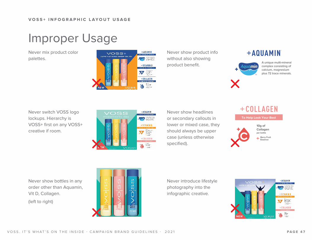
Never mix product color palettes.
Never show headlines or secondary callouts in lower or mixed case, they should always be upper case (unless otherwise specified).
Never switch VOSS logo lockups. Hierarchy is VOSS+ first on any VOSS+ creative if room.
Never show bottles in any order other than Aquamin, Vit D, Collagen.
(left to right)
Improper UsageNever show product info without also showing product benefit.
Never introduce lifestyle photography into the infographic creative.
V O S S . I T ’ S W H A T ’ S O N T H E I N S I D E - C A M PA I G N B R A N D G U I D E L I N E S - 2 0 2 1 PA G E 4 7
V O S S + I N F O G R A P H I C L A Y O U T U S A G E

V O S S + P R O D U C T - F O C U S E D K E Y I M A G E S
Product-Focused Key Images
AQUAMIN CREATIVE VITAMIN D CREATIVE COLLAGEN CREATIVE ALL VOSS+ CREATIVE
V O S S . I T ’ S W H A T ’ S O N T H E I N S I D E - C A M PA I G N B R A N D G U I D E L I N E S - 2 0 2 1 PA G E 4 8

V O S S + P R O D U C T - F O C U S E D L A Y O U T C O M P O N E N T S
Product Pedestal Product Logo and Product Descriptor
VOSS+ and Logo Descriptor lockup
Background V Imagery (or pattern)
Centered bottle, V shape background, and pedestal.
ALL VOSS+ BACKGROUND
AQUAMIN BACKGROUND
VITAMIN D BACKGROUND
COLLAGEN BACKGROUND
“NEW” flag to be used until January 2022.
Legal NoteLegal is in lower left corner, small and discrete without being illegible. No smaller than 6 point in print, 8 point in digital.
All VOSS+ Bottle Image When shown together should be in chevron pattern and should always be (left to right).
1. Aquamin 2. Vit D 3. Collagen
V O S S . I T ’ S W H A T ’ S O N T H E I N S I D E - C A M PA I G N B R A N D G U I D E L I N E S - 2 0 2 1 PA G E 4 9

HORIZONTAL DIGITAL BANNER
SQUARE FORMAT DIGITAL BANNER
V O S S . I T ’ S W H A T ’ S O N T H E I N S I D E - C A M PA I G N B R A N D G U I D E L I N E S - 2 0 2 1 PA G E 5 0
A D D I T I O N A L V O S S + P R O D U C T - F O C U S E D L A Y O U T E X A M P L E S

Never mix product color palettes.
Never show product logo without product benefit.
Never mix product background V’s. Each background is specifically designed to fit the use of each product.
Never introduce lifestyle photography into the product focused creative.
Improper UsageNever show bottles in any order other than Aquamin, Vit D, Collagen.
(left to right)
Never show product descriptors, VOSS+ logo descriptor, or any CTA buttons in lower or mixed case.
V O S S . I T ’ S W H A T ’ S O N T H E I N S I D E - C A M PA I G N B R A N D G U I D E L I N E S - 2 0 2 1 PA G E 5 1
V O S S + P R O D U C T - F O C U S E D L A Y O U T U S A G E

Product and Campaign Copy
V O S S . I T ’ S W H A T ’ S O N T H E I N S I D E - C A M PA I G N B R A N D G U I D E L I N E S - 2 0 2 1 PA G E 5 2

Still
Headline:
Naturally Pure For A Crisp, Refreshing Taste
Secondary:
VOSS Is One Of The World’s Purest Bottled Waters*
Legal line must be present with above statement:
*Less Than 45 Parts Per Million Total Dissolved Solids
Sparkling
Headline:
The Finest Sparkling Around
Secondary:
Delicate Bubbles For A More Refined Taste
Flavored Sparkling
Headline:
The Most Flavorful Sparkling Around
Secondary:
Guilt-Free Flavor
Sustainability Message
VOSS maintains a strong commitment to sustainabili-
ty focusing on package optimization, carbon footprint
reduction, and water stewardship. A priority is reducing
plastic with significant reductions in the amount used in
each bottle and a commitment to expand use of recy-
cled PET across the VOSS portfolio including our new
VOSS+ items available in 100% rPET bottles.
*Note: Starting in 2022, VOSS Still 500ml and 850ml
will be 50% rPET in the United States, and we will
continue with our 800ml and 375ml glass. In the EU
and Great Britain, VOSS Still water will be exclusively
glass or 100% rPET.
V O S S . I T ’ S W H A T ’ S O N T H E I N S I D E - C A M PA I G N B R A N D G U I D E L I N E S - 2 0 2 1 PA G E 5 3
K E Y M E S S A G I N G

VOSS+Descriptor:
Water That Works Harder For You
Required copy for POS:
Electrolytes added for taste
VOSS+ AquaminProduct Benefit:
VOSS+ Aquamin For Optimal Hydration
Product Info:
A unique multi-mineral complex consisting of calcium,
magnesium plus 72 trace minerals. With a blend of trace
minerals and electrolytes for the active and on-the-go.
VOSS+ Vitamin DProduct Benefit:
VOSS+ Vitamin D To Help Feel Your Best
Product Info:
50% Recommended Daily Value of Vitamin D per bottle
+Citrus Fruit Essence
Additional Copy:
No calories or sweeteners
Bottle is 100% recycled PET
VOSS+ CollagenProduct Benefit:
VOSS+ Collagen To Help Look Your Best
Product Info:
10g of Collagen Per Bottle
+Berry Fruit Essence
Additional Copy:
Get 10g of collagen per bottle to help you look your
best with this smooth, great-tasting water while also
hydrating your body.
40 Calories per bottle, no sweeteners added
Bottle is 100% recycled PET
V O S S . I T ’ S W H A T ’ S O N T H E I N S I D E - C A M PA I G N B R A N D G U I D E L I N E S - 2 0 2 1 PA G E 5 4
K E Y M E S S A G I N G - V O S S +

Still Examples:
VOSS Still has been loved for over 20 years for its nat-
urally pure, crisp refreshing taste from a pristine natural
source. Available in both our original glass bottle as well
as two sizes of PET plastic making VOSS the perfect
companion for wherever your day takes you.
Make every day feel like a day at the spa with your own
VOSS Water fruit infusions. The elegant design and
unique wide-mouthed bottle make our VOSS Still bot-
tles perfect for infused water combinations. For maxi-
mum flavor, refrigerate for up to 12 hours before con-
suming. And share your creations with us on Instagram
– we could all use some extra inspiration!
Sparkling Example:
Pure, low in minerals and incomparable in taste. Its deli-
cate bubbles enhance the many flavors of your favorite
foods, including seafood, fruit and chocolate to help
liven up any meal.
Flavored Sparkling Full Line Example:
Vibrant and unique flavor combinations without the
calories, artificial sweeteners or unhealthy additives.
Incredibly satisfying on their own and also as a mixer for
cocktails or mocktails.
Raspberry Rose Example:
There is something about tart and sweet raspberries
and fragrant rose that just complements each other.
Sweetly exotic without any of the guilt, this is the best
combination to come around since roses and choc-
olate but with no calories, sugar, artificial ingredients
or sweeteners. Enjoy alone or perfect as a mixer for a
mocktail or cocktail.
Lime Mint Example:
Our lime mint infused sparkling tastes like summer… Tart
lime flavor cut with refreshing mint will take you away to
your warm weather utopia. Guilt-free flavor meant to en-
joy all year long with no calories, sugar, artificial ingredi-
ents or sweeteners. (It also works great as a mixer for a
mean skinny mojito!)
Lemon Cucumber Example:
Like a trip to the spa in a bottle, our lemon and cucum-
ber infused sparkling water will transport you to that
moment of zen no matter where you are. Guilt-free fla-
vor you can enjoy every day with no calories, additives
or sweeteners. (Also great as a cocktail or mocktail to
wind down your day in the best way possible.)
V O S S . I T ’ S W H A T ’ S O N T H E I N S I D E - C A M PA I G N B R A N D G U I D E L I N E S - 2 0 2 1 PA G E 5 5
R O M A N C E C O P Y
VOSS+ Full Line Example:
Water that works harder for you, the VOSS+ line of pre-
mium functional water gives you a little something “ex-
tra” for your everyday life to help optimize your health
and wellness. Proudly available in 100% recycled PET
bottles as part of our ongoing commitment to
sustainability.
VOSS+ Aquamin Example:
Enhanced with Aquamin® for optimal hydration. Aqua-
min® is a unique multi-mineral complex sustainably
sourced from the coastal seas of Iceland, consisting of
74 trace minerals and electrolytes for a refreshing taste
and optimal hydration. Perfect for the active and on-the-
go. Bottle is 100% recycled PET.
You know those days. Tough workout at the gym.
Back-to-back meetings all over town. Hot day in the
sun. Sometimes we need a little bit extra to get that
hydration our bodies crave. With VOSS+ Aquamin, get
the same crisp refreshing taste you love but with a trace
amount of minerals and electrolytes* to help take
you farther.
VOSS+ Vitamin D Example:
The best source for getting your Vitamin D fix is to
spend time in the sun, but that’s not always possible
and even when we do, use of sunscreen to protect
the skin can diminish the benefits. We like to think of
VOSS+ Vitamin D as an extra insurance policy to ensure
we are getting what we need packaged in a ready-to-
go delicious citrus-infused bottle.
VOSS+ Collagen Example:
Do you know that the body starts to lose collagen as
early as in our 20’s? Yes, really! Since collagen supports
healthy, hydrated and youthful skin, it’s really never too
soon to start thinking about how to replenish. VOSS+
Collagen is an easy (and refreshingly delicious) way to
incorporate collagen into your everyday life – just grab
it and go.
V O S S . I T ’ S W H A T ’ S O N T H E I N S I D E - C A M PA I G N B R A N D G U I D E L I N E S - 2 0 2 1 PA G E 5 6
R O M A N C E C O P Y - V O S S +

VOSSWATER.COM
Required on all materials.
Brand Hashtags: #VOSS #VOSSWATER #VOSSWORLD
URL Social Media Handles
Hashtags
Legal Line®VOSS of Norway AS All Rights Reserved 2021
VOSS legal line must be present on one side or screen of all deliverables.
Approved Typefaces: Proxima Nova and Helvetica Condensed
Font size should not be smaller than 6pt.
Instagram icon and handle is required on all print materials. Facebook and Twitter icons and handles should be included if there is enough room. Not required on out-of-home applications.
Social media icons should always be present with handles.
Instagram: @VOSSWORLD
Facebook: /VOSSWORLD
Twitter: @VOSSWATER
V O S S . I T ’ S W H A T ’ S O N T H E I N S I D E - C A M PA I G N B R A N D G U I D E L I N E S - 2 0 2 1 PA G E 5 7
U R L , S O C I A L M E D I A , A N D L E G A L L I N E S