journal of public transportation long tien truong
TRANSCRIPT

A Framework for the Assessment and Policy Development ofWater Transit Services in Dubai, UAE
Analysis of Passenger-Ferry Routes Using Connectivity Measures
Pickup Modifications for Rural Transport Services in Cambodia
An Examination of the Quality and Ease of Use ofPublic Transport in Dublin from a Newcomer’s Perspective
Open Government Data and Public Transportation
Using GIS to Identify Pedestrian-VehicleCrash Hot Spots and Unsafe Bus Stops
Volume 14, No. 1, 2011
Vo
lum
e 14, No
. 1
Jo
urn
al of P
ub
lic Transp
ortatio
n
2011 N C T R
Faisal AhmedYaser E. HawasMunjed MaraqaMohammad Nurul Hassan
Avishai (Avi) CederJenson Varghese
Matthew Ericson
James KinsellaBrian Caulfield
Kenneth Kuhn
Long Tien TruongSekhar V. C. Somenahalli
Gary L. Brosch, EditorLisa Ravenscroft, Assistant to the Editor
EDITORIAL BOARD
Robert B. Cervero, Ph.D. University of California, Berkeley
Chester E. ColbyE & J Consulting
Gordon Fielding, Ph.D.University of California, Irvine
Jose A. Gómez-Ibáñez, Ph.D. Harvard University
Naomi W. Ledé, Ph.D. Texas Transportation Institute
William W. Millar American Public Transportation Association
SUBSCRIPTIONS
Complimentary subscriptions can be obtained by contacting:
Lisa Ravenscroft, Assistant to the EditorCenter for Urban Transportation Research (CUTR)University of South FloridaFax: (813) 974-5168Email: [email protected]: www.nctr.usf.edu/jpt/journal.htm
SUBMISSION OF MANUSCRIPTS
The Journal of Public Transportation is a quarterly, international journal containing original research and case studies associated with various forms of public transportation and re-lated transportation and policy issues. Topics are approached from a variety of academic disciplines, including economics, engineering, planning, and others, and include policy, methodological, technological, and financial aspects. Emphasis is placed on the identifica-tion of innovative solutions to transportation problems.
All articles should be approximately 4,000 words in length (18-20 double-spaced pages). Manuscripts not submitted according to the journal’s style will be returned. Submission of the manuscript implies commitment to publish in the journal. Papers previously published or under review by other journals are unacceptable. All articles are subject to peer review. Factors considered in review include validity and significance of information, substantive contribu-tion to the field of public transportation, and clarity and quality of presentation. Copyright is retained by the publisher, and, upon acceptance, contributions will be subject to editorial amendment. Authors will be provided with proofs for approval prior to publication.
All manuscripts must be submitted electronically in MSWord format, containing only text and tables —No linked images. If not created in Word, each table must be submitted separately in Excel format and all charts and graphs must be in Excel format. Each chart and table must have a title and each figure must have a caption. Illustrations and photographs must be submitted separately in an image file format, (i.e., TIF, JPG, AI or EPS), having a minimum 300 dpi, and measuring at least 4.5” x 7” in size, regardless of orientation. However, charts and graphs may be submitted for use as spreads, covering two facing pages of an article. Please include all sources and written permissions for supporting materials.
All manuscripts should include sections in the following order, as specified:Cover Page - title (12 words or less) and complete contact information for all authorsFirst Page of manuscript - title and abstract (up to 150 words)Main Body - organized under section headingsReferences - Chicago Manual of Style, author-date formatBiographical Sketch - of each author
Be sure to include the author’s complete contact information, including email address, mailing address, telephone, and fax number. Submit manuscripts to the Assistant to the Editor, as indicated above.
The contents of this document reflect the views of the authors, who are responsible for the facts and the accuracy of the information presented herein. This document is disseminated under the sponsorship of the U.S. Department of Transportation, University Research Institute Program, in the interest of information exchange. The U.S. Government assumes no liability for the contents or use thereof.
Steven E. Polzin, Ph.D., P.E.University of South Florida
Sandra Rosenbloom, Ph.D.University of Arizona
Lawrence SchulmanLS Associates
George Smerk, D.B.A.Indiana University
Vukan R. Vuchic, Ph.D., P.E.University of Pennsylvania
Volume 14, No. 1, 2011ISSN 1077-291X
The Journal of Public Transportation is published quarterly by
National Center for Transit ResearchCenter for Urban Transportation Research
University of South Florida • College of Engineering4202 East Fowler Avenue, CUT100
Tampa, Florida 33620-5375Phone: (813) 974-3120
Fax: (813) 974-5168Email: [email protected]
Website: www.nctr.usf.edu/jpt/journal.htm
© 2011 Center for Urban Transportation Research
PublicTransportation
Journal of


iii
Volume 14, No. 1, 2011ISSN 1077-291X
CONTENTS
A Framework for the Assessment and Policy Development of Water Transit Services in Dubai, UAE Faisal Ahmed, Yaser E. Hawas, Munjed Maraqa, Mohammad Nurul Hassan .............1
Analysis of Passenger-Ferry Routes Using Connectivity Measures Avishai (Avi) Ceder, Jenson Varghese ............................................................................................. 29
Pickup Modifications for Rural Transport Services in Cambodia Matthew Ericson .......................................................................................................................................57
An Examination of the Quality and Ease of Use of Public Transport in Dublin from a Newcomer’s PerspectiveJames Kinsella, Brian Caulfield ...........................................................................................................69
Open Government Data and Public Transportation Kenneth Kuhn .............................................................................................................................................83
Using GIS to Identify Pedestrian-Vehicle Crash Hot Spots and Unsafe Bus Stops Long Tien Truong, Sekhar V. C. Somenahalli ...............................................................................99


1
A Framework for the Assessment and Policy Development of Water Transit Services in Dubai, UAE
A Framework for the Assessment and Policy Development of Water
Transit Services in Dubai, UAEFaisal Ahmed, Yaser E. Hawas, Munjed Maraqa,
and Mohammad Nurul Hassan
UAE University
Abstract
The Marine Agency-Roads and Transport Authority (MA-RTA) of Dubai-UAE recently undertook a study to develop a new transport policy for service delivery. The goal of the new policy is to increase rider share and use of MA-RTA services. The existing service policy guidelines of the water transit services were barely supported by the loading patterns, existing market coverage, adequate intermodal planning tools, economic feasibility, and capital return of services. Based on user and operators sur-veys of the water transit services, aiming at assessing the baseline conditions, meth-odologies are suggested to estimate important service attributes, including service coverage, intermodal connectivity, and market demand estimation. The estimated service attributes were used as measures to develop the service policy standards to increase water transit ridership and enhance service efficiency. It is recommended to incorporate some of the service standard/guideline measures under a framework discussed in this study for developing service plans, monitoring performance, and providing short or long term alteration to the services.
Journal of Public Transportation, Vol. 14, No. 1, 2011
2
IntroductionUrban development and prosperity, as well as the quality of life of city dwellers in Dubai, depend on the accessibility and smooth operation of public transit. Public transit that provides people with outstanding service is a real alternative to the automobile, thus contributing directly to sustainable development. Investing in public transit is also a lever for economic development because of the transporta-tion industry’s role in our production chain and daily activities. Improvement in marine transport would relieve some of the pressure on the congested roads in the city.
Waterbus service has been introduced recently in Dubai-UAE as a mode of marine transport under the authority of the Marine Agency-Roads and Transport Author-ity (MA-RTA). As such, it was necessary to develop a service policy and operational guidelines for the Waterbus in particular and for marine transport modes in gen-eral. This service policy and guidelines are important for the monitoring, assess-ment, and improvement of marine transport services and particularly to support MA-RTA’s vision of increasing ridership of marine modes to reduce demand on land transport modes, and subsequently to reduce congestion in the Emirate of Dubai. Therefore, MA-RTA undertook a study aimed at developing a transport policy for service delivery. Policy development would initially depend on the assess-ment of existing baseline services by RTA through user and operators surveys (Has-san et al. 2010). The assessment of transport system performance through targets is becoming increasingly widespread worldwide (FHWA,2004; NCHRP 2004; Zogra-fos et al. 2004; Hidas and Black 2002; Turner et al. 1999; Gates 2001). The study was conducted by the Roadway, Transportation and Traffic Safety Research Center (RTTSRC) at UAE University (RTTSRC 2008a,b). The overall goal of the new policy is to increase the ridership or use of MA-RTA services. To attain this goal, MA-RTA adopted a five-year service policy for the establishment of modern, cost-effective, and efficient services to attract higher ridership.
In general, the literature on issues of marine transport operation and planning of services is scarce, with little of relevance to marine agency policy development. No literature of relevance was found related to policy development, such as how poli-cies are developed, whether they are developed subjectively or using a quantitative approach, how guidelines are developed, the difference between policies and short term planning of service enhancements, and data needed for policy development and planning. Presented herein is previous work of relevance to marine operation in general but not necessarily policy development.
3
A Framework for the Assessment and Policy Development of Water Transit Services in Dubai, UAE
Previous work in the area of marine operation and services tackled issues of plan-ning for services (Cedar 2006), evaluation of services (Odek and Barthen 2009), forecasting demand (Laube and Dyer 2007; Outwater et al. 2003), best practices for public outreach (Camay et al. 2008), marine network design (Wang and Lo 2008), and intermodal modeling (East and Armstrong 1999).
Ceder (2006) presented a planning approach with an evaluation procedure for making the best use of existing water and pier resources to improve public ferry transit through the provision of commercially-viable services in Hong Kong. Odek and Brathen (2009) developed the so-called data envelopment analysis model to demonstrate ferry performance evaluation and service improvements in Norway. Laube and Dyer (2007) presented a model for demand forecasting of the ferry ser-vice system to serve the National Park of New York Harbor. Outwater et al. (2003) tackled the expansion of mode choice models to account for traveler attitudes and different market segments. The causal relationships between traveler socio-eco-nomic profile and travel attitudes towards ferry services of San Fransisco Bay Area were integrated into the mode choice models. Camay et al. (2008) described some best-practice methodologies for public outreach, focusing on socio-economic and community assessment of ferry services. Wang and Lo (2008) developed a heuristic model for the network design of Hong Kong ferry services. East and Armstrong (1999) dealt with planning intermodal transfers of passengers from transit to ferries for six ferry terminals of the Washington State ferry systems.
The RTTSRC (2008a) identified some specific objectives that should be included in the mission of the RTA marine transport. Policy goals, objectives, and associated performance measures and targets are to be established through policy formula-tion and, ideally, integrated within the agency’s planning process. To evaluate the progress towards achieving the mission of MA-RTA, the study identified the service policy objectives that represent the most important characteristics of a “world-class” transit system: (1) accessibility, where services are made geographically available throughout the community and are operated at convenient times and frequencies (MBTA 2006); (2) reliability, where services are operated as scheduled; (3) safety, where services are provided at a safe manner; (4) comfort, where services offer a pleasant and comfortable riding environment; and (5) cost effectiveness, where services are tailored to target markets in a financially-sound and cost-effec-tive manner (MBTA 2006).
The main objectives of this paper are (a) to propose a service policy development framework based on field survey data and (b) to illustrate how the guidelines (in

Journal of Public Transportation, Vol. 14, No. 1, 2011
4
the service policy) were developed on the basis of user demand perspectives, with the goal to increase marine transport ridership. Therefore, this paper highlights the methods to estimate some important service parameters that are needed for assessment of existing services. The parameters were estimated based on a field user survey (Hassan et al. 2010) in the absence of relevant direct data. The inferred service parameters (obtained from a field user survey) were used in developing the standards of MA-RTA service policy. The service attributes under consideration include mobility rate as an indication of existing service coverage, level of perceived service difficulty as an indication of intermodal connectivity, and demand-fare prediction as an indication of the responsiveness of the demand market to changes in fare policies.
Existing Marine Transport ServicesMA-RTA operates a comprehensive set of transit services. This paper addresses two particular modes of the existing RTA marine services: Abra includes small vessels with 20-passenger capacity that link two points in the two districts of Deira and Bur Dubai across the opposite sides of Dubai Creek, and Waterbus includes 36-pas-senger vessels that make multiple stops, are air-conditioned, and offer luxury seats and high-tech features such as panoramic windows, LCD screens, and access for special needs passengers. Figure 1 shows the route maps of both Abra and Water-bus in Dubai, and Table 1 summarizes the features of the various routes of service for these two public marine transport modes.
Figure 1. Location of Dubai Marine Service Stations and Routes

5
A Framework for the Assessment and Policy Development of Water Transit Services in Dubai, UAE
Table 1. Basic Information of MA-RTA Services*
RouteRoute
StationsWorking
HrsVessel
CapacityNumber
of VesselsNumber of Operators
Route Length
(km)
Average Daily
Person Trips
R1 S1- S2 5am - 12 midnight
20 40 80 0.55 10,839
R2 S3 - S4 24 hrs 20 110 220 0.8 28,186
B1 S1 - S4 6am - 11pm 36 1
24
1.058 109
B2 S3 – S5 6am - 11pm 36 2 1.286 335
B3 S4 - S5 - S6
6am - 11pm 36 2 1.966 393
B4 S3 - S4 12 midnight - 6am
36 1 0.907 107
*R and B refer to Abra and Waterbus routes, respectively. S1 Bur Dubai station, S2 Diera Old Souk station, S3 Dubai Old Souk station, S4 Al Sabkha station, S5 Baniyas station, and S6 Al Seef station.
Service Policy Development FrameworkThe framework for the assessment and development of the service policy guide-lines of the MA-RTA is presented briefly in Figure 2. This framework is based on the survey conducted by Hassan et al. (2010) that collected opinions of existing marine transport users. The system-wide survey was meant to assess the existing service efficiencies at a broader scale and to specify directions on how the service can be improved in the form of a policy or general guidelines. It is essential to note that a policy is not meant to get into a detailed level of the route specifics, and it is usually developed with coarse system data. The survey questionnaire was designed to capture the necessary field data to estimate the direct and, hence, inferred parameters of the major service perspectives such as service coverage, availability of intermodal connectivity, and trip fare and demand relationships. The collected data were particularly limited to user characteristics and service utilization.
It is essential to consider collecting more thorough data on demand characteris-tics as well as prospective users. This will be required for purposes of planning the marine services, including route reconfigurations (if needed), particular route fre-quencies, etc. It is important to differentiate here between data needed for policy and for planning for service operation. While planning for services mandates exten-sive data on demand characteristics and prospective users, policy development

Journal of Public Transportation, Vol. 14, No. 1, 2011
6
Figure 2. Service Policy Development Framework

7
A Framework for the Assessment and Policy Development of Water Transit Services in Dubai, UAE
and assessment can be accomplished using only broader observations of existing user characteristics and service utilizations or efficiencies. The study recommends extensive and systematic collection of data on demand characteristics and pro-spective users (for planning purposes) to reconfigure the service characteristics and consequently optimize the services. Such data can also be useful, to some extent, in reviewing the developed policy or guidelines.
After analyzing the relevant service parameters with regard to strategic goals, pro-spective service guidelines with service policy targets are recommended for imple-mentation. Finally, performance monitoring is carried out to re-evaluate MA-RTA service enhancement in light of the recommended service policy guidelines.
Survey Design ProcessThe survey design adopted was the “stated preference survey” (Hassan et al. 2010). In this type of survey, people are placed in hypothetical choice situations and asked what they would do if they were faced with this particular choice (Espino et al. 2007; Ahern and Tapley 2008). The user survey form provides the stated preference of the responses in terms of service characteristics, accessibility, and marine transport station facilities. The questions were designed to capture the (1) socioeconomic characteristics in terms of gender, age, level of education, and per-sonal (family) income and (2) factors affecting the choice of modes for connecting trips, the purpose of the trips, the possibility of switching to an alternative mode, willingness to pay an increased trip fare, the origin and destinations of their regular travel patterns, general satisfaction level regarding the service and problems, and suggestions for using the infrastructure facilities.
Substantial efforts were invested in ensuring that the relevant information on preferences was elucidated with fewer questions. The on-site survey method was used as it allowed the interviewer to elaborate on the marine transport character-istics as well as personally interview the respondents. This enabled respondents to make more informed “stated preference” decisions on the marine transport and increased the reliability of the responses. The population of the survey represented actual MA-RTA services users; it did not include non-users (or prospective users). The key data from the user survey include purpose of trip, route, fare, economic ability of the user, accessibility of modes to other land transport systems, trip travel time, frequency, comfort, safety, and user preference of services.

Journal of Public Transportation, Vol. 14, No. 1, 2011
8
Sample SizeA simple random sampling procedure was considered. Each response, either quan-titative or qualitative, of a question was considered of equal importance and had equal likelihood of selection. For distribution of responses with normal distribu-tion, the minimum number of surveys required for a 90% confidence level was calculated using the following formula (Miller et al., 1990):
(1)
where, n is the minimum sample size (number of users), v is the coefficient of varia-tion (assumed as 0.5), and d is the tolerance level (assumed as 5%). Therefore, the minimum sample size of the survey to obtain the specified statistical significance was determined to be 324.
This sample size was determined to provide a statistically significant sample to assess the overall system or to estimate the overall service characteristics and efficiencies. As such, route-specific performance data or daily loadings were not particularly addressed. As indicated earlier, this may be essential only for “planning” purposes. Hence, detailed Abra and Waterbus route performance surveys entailed a larger sample size and were, in fact, recommended for the second phase of the project to address planning issues.
It should be noted that the proportions of Abra and Waterbus riders in the overall population of marine transport riders are about 98 percent and 2 percent, respec-tively. Applying these proportions to the sample size, very few surveys would have been collected from the Waterbus riders (only 7 surveys would be needed for Waterbus). A total of 500 samples were targeted to have more representation of Waterbus responses. A larger sample size was sought to collect more information on Waterbus riders, while maintaining the necessary minimum of Abra riders to obtain statistical significance. This explains why the “targeted” sample size was larger than the minimum needed. The number of approached Abra and Waterbus riders to fill the survey was about 675. The number of successfully conducted sur-veys was 506 (about 75% response rate), comprising 384 (76.4%) for Abra and 119 (23.6%) for Waterbus. More emphasis on Waterbus users was made intentionally to have better representation, keeping in mind that one of the policy objectives is to increase the ridership of Waterbus in particular or to have a fair balance between the two modes.
9
A Framework for the Assessment and Policy Development of Water Transit Services in Dubai, UAE
The two modes were combined to report the overall marine transport system efficiencies. In other instances, the two modes were analyzed independently to assess the mode-specific characteristics and efficiencies. It should be noted that the two modes are mostly complementary (i.e., they serve different routes), with only one route being served competitively by the two modes. The two modes serve essentially two groups of riders with different socio-economic characteristics. Hassan et al. (2010) reported that 53 percent of Abra users earn AED 2000 or less monthly, while 70.3 percent of Waterbus users earn AED 5000 or more monthly. Nonetheless, the two rider groups equally ranked trip fare followed by safety as the most important criteria of service effectiveness. Therefore, both rider groups are driven by same service characteristics, despite differences in their socio-economic characteristics.
Survey Management ProcessThe survey team consisted of transport engineers, transport planners, and survey specialists. Team members were of different nationalities and spoke Arabic, English, Hindi, Urdu, Bengali, and Filipino fluently in order to communicate more comfort-ably with users.
A preliminary (pilot) survey questionnaire was tested to check if the questions were understandable, answerable, well-motivated, and useful. The pilot survey also was used to check timing and response behavior. Moreover, the pilot survey was intended to examine whether or not the survey questions contained technical jar-gon or were long-winded, biased, redundant, or made the respondent uncomfort-able. The questionnaire was slightly modified after the pilot survey to incorporate the shortcomings.
The survey was conducted on both weekdays and weekends to cover the potential variability of the service on different days and to capture the various trip purposes. The survey schedule also considered hourly variations (i.e., morning and evening working hours).
As the survey management process was critical to the successful execution of the survey, the aspects of survey quality control and response rate were monitored carefully. Survey quality control includes recruitment and training of interviewers, supervision of survey staff, procedures for data capturing and cleaning, and com-munications with the public. Users at the stations were either given the survey form to fill out or interviewed by a survey team member, whichever was more conve-nient to the user. In many instances, the survey team member boarded along with
Journal of Public Transportation, Vol. 14, No. 1, 2011
10
the Abra or Waterbus passengers to increase the convenience level for the users. Respondents of little education were interviewed by a survey team member.
Service CoverageService Coverage Assessment Measures Mobility is one of the important efficiency measures of any transport system. This system efficiency measure could be assessed from the end-user side in the absence of other system efficiency parameters data. The mobility indicator in terms of “trips per user per day” of the relevant system used in this study could be defined as the extent of service coverage among the existing daily regular commuter who could make at least two trips/user/day, assuming that all passengers make return trips at least daily. If 100 percent of daily users make at least one trip daily, then the value of the mobility indicator would be one trip/user/day, and if 100 percent of daily users make a return trip daily, then the value of the mobility indicator rate would be two trips/user/day. This mobility indicator could take a maximum value of 2.15 trips/user/day for the marine system, assuming 90 percent of the daily passengers return (i.e., making two trips/user/day) and 10 percent of the passengers make several trips a day (assumed here as 3.5 trips/user/day).
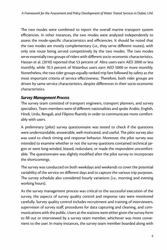
One question on the user field survey questionnaire was intended to capture the daily frequency of the marine transport usage (Abra or Waterbus). The daily usage was mathematically manipulated to estimate the mobility indicator of the service coverage among the regular commuter. As shown in Figure 3, the daily users (i.e., at least one trip daily) for the Abra and Waterbus were 38 percent and 41.2 percent, respectively.
The frequency of the combined marine transport of both Abra and Waterbus was obtained from the weighted average based on the number of users of the two modes as collected from the field data. For the frequency of the combined marine transport service usage, the following results were found:
31.41 percent of the respondents indicated two or more trips daily; 90 per-•cent of this group used the marine transport system twice (for roundtrip) and 10 percent used it several times, with an average of about 2.15 trips daily.
7.36 percent of the respondents indicated only one trip daily.•
11
A Framework for the Assessment and Policy Development of Water Transit Services in Dubai, UAE
14.51 percent of the respondents indicated several trips weekly, or approxi-•mately 0.5 trips daily.
5.57 percent of the respondents indicated one trip per week, or approxi-•mately 0.143 trips daily.
8.35 percent of the respondents indicated several trips per month, or •approximately 0.117 trips daily.
14.31 percent of the respondents indicated one trip per month, or approxi-•mately 0.033 trips daily.
Figure 3. Frequency of Use of Marine Service
Journal of Public Transportation, Vol. 14, No. 1, 2011
12
14.51 percent of the respondents indicated use on weekends only; two-thirds •of this group took a round trip, and the remainder took a single trip. This group accounts for 0.238 trips daily.
3.98 percent of the respondents indicated that they were using the mode •for the first time and had never used it earlier. This group accounts for approximately 0.003 trips daily.
The service coverage of the marine transport in terms of the mobility rate (M) indicator can be calculated as:
(2)
The overall mobility rate (denoting the average number of trips per user per day) for the marine transport system of the combined Abra and Waterbus is 0.88 trips/user/day. In another way, it can be explained that the equivalent of 88 percent of existing daily regular users use the marine transport for making at least one trip daily. For the Abra system, the mobility rate is 0.89 trips/user/day, and for the Waterbus it is 0.85 trips/user/day. These mobility indicator rates imply that not all the existing daily users make at least one trip daily with the existing marine trans-port modes. It should be noted that the mobility measure can be applied to either the Abra or Waterbus systems separately or for each route separately to determine the characteristics of daily users and their daily mobility pattern.
Service Coverage Policy Targets The overall mobility rate measure found for the combined systems indicates that the existing daily users are commuting with less than one trip daily. This means that opportunity remains for MA-RTA to enhance its services, which can be directly measured by the mobility rate. A higher mobility rate is a true reflection of more utilization of the marine service and implicitly indicates an improvement in the ser-vice. That is, the MA-RTA could adopt this system efficiency performance standard with some annual incremental increase to attract more users to use the marine services on a daily basis.
Setting annual incremental targets is, of course, constrained by the flexibility of changing services as well as budget constraints. It was found that reasonable but sustainable progress with limited funding requirements can be attained by setting the target mobility rate at 1.10 trips/user/day (in two years) and at 1.30 trips/user/

13
A Framework for the Assessment and Policy Development of Water Transit Services in Dubai, UAE
day (in five years). These set targets could be achieved if the RTA marine transport system service is enhanced to attract more existing users to become regular single- or return-trip makers rather than making trips several times weekly or monthly. Therefore, these two targets were included in the system efficiency guidelines within the service policy standards of MA-RTA.
It should be noted that in setting the improvement increments, or the targets, the values were specified subjectively and reasonably in order not to add any consider-able financial or human burden on MA-RTA. Guidelines were provided on how to increase ridership, utilizing more or less the same financial and human resources. In prioritizing the measures to achieve the targets, the most effective measures with little added financial/ human resources were ranked higher. Therefore, the devised policy and guidelines not only provide incremental targets on effectiveness indi-cators (such as mobility rate), but also specify the most appropriate measures to achieve these targets. For instance, policy and guidelines specify how mobility rates can be increased by reducing trip fares, applying promotion periods, etc.
Intermodal ConnectivityIntermodal Connectivity Assessment Measures Intermodal connectivity is another important efficiency measure of any transport system. This system efficiency measure can be assessed from the operator’s sup-ply side and/or from the end-user’s demand side. The final outcome should come from the perceptions of the end-users, as it affects their mode choice patterns. Therefore, the end-user’s perception on the level of difficulty was included in the field survey. The intermodal connectivity difficulties were evaluated in terms of availability and frequency of getting either taxis and/or public buses at the marine transport stations. Figure 4 illustrates the perceived levels of difficulties at the vari-ous water transit stations (S1 through S6).
Two observations can be made from the survey results: (1) for all marine stations, around 40 percent of the users confirmed difficulty of using land transportation modes, and (2) at least 60 percent or more of the users indicated some degree of difficulty at different stations. This reveals the importance of intermodal connec-tivity of the marine transport services and other surface public transport modes from the users’ side. Therefore, the perceived level of difficulty by the users could be an important efficiency measure as it indicates the absence of a smooth inter-modal connectivity. This level of difficulty of intermodal connectivity might be

Journal of Public Transportation, Vol. 14, No. 1, 2011
14
a factor that discourages non-users from using marine transport services at the current conditions.
Figure 4. Availability of Public Transport (Bus and Taxi) to/from Marine Stations
Intermodal Connectivity Policy TargetsWith the introductions of the new metro services by the end of year 2009, with various metro stations in the vicinity of the water transit stations, and with a plan of extensive bus coverage to facilitate connectivity to the metro stations, the MA-RTA could gain considerable benefits by working closely with the land public transport systems to improve intermodal connectivity.
A policy would indicate, for instance, that the overall system difficulty should not be more than 20 percent. The general guidelines would specify how to achieve this objective (again, at a broader level). Examples of general guidelines would be more frequent land transport, provision of parking areas for private cars or taxis, etc. These guidelines are extracted from the opinions (via system-wide surveys) of the current service users. Having this in mind, a target was set to reduce the perceived level of intermodal connectivity difficulty from its current value of 60 percent to 40 percent in two years and to 10 percent in five years. These two targets were included in the service policy standards of MA-RTA.
The detailed planning of the service adjustments (which is usually done at a lower level with more frequent updates or revisions) will then require detailed data col-lection (route specific, particular route surveys, opinions of prospective users of the route, etc). Specific actions to address such intermodal difficulties at a route level
15
A Framework for the Assessment and Policy Development of Water Transit Services in Dubai, UAE
usually are addressed at the planning level of service adjustments, which is beyond the scope of this paper. Indeed, for planning purposes of service adjustments, detailed route information, particularly intermodal difficulties,the inclusion of prospective users is essential.
Market Demand EstimationMarket Demand Assessment Measures Having access to detailed service parameters such as waiting times, frequency, and travel times is the basis for developing utility-based route choice or mode choice (logit or probit) mathematical models to accurately capture the demand levels in response to service changes. Nonetheless, from the system-wide survey results, it was evident, as clearly stated by the majority of users, that fare is their primary deci-sion making factor in the selection of the mode. Given that this study was mainly intended to develop policy (not the planning of service adjustments), it may be adequate to depend on the fare parameter to capture the expected demand mar-ket in response to fare policy changes. In detailed planning of service adjustments, it will be essential to gather detailed route-specific parameters including user wait-ing times, travel times, transfer times, etc. These data should be used to calibrate utility-based demand models.
Existing market demand is obtained from counts of both the Abra and Waterbus riders; this information is readily available through the rider counting gates and service revenues. The market demand may change as a result of any newly-applied fare policy. To estimate what will be the new market demand with such newly-introduced fares, users were asked how much of a fare increase they would be will-ing to accept and still consider using the same mode. This survey question was used in developing the fare-dependent demand curves, as will be explained later.
The Abra and Waterbus demand curves in a perfectly competitive market were estimated based on several assumptions. First, the demand (i.e., willingness to use) of the marine transport system primarily changes with the trip far’ attribute. This is justifiable since the survey revealed that trip fare is the highest-ranked attribute by the users. Second, when, theoretically, there is no trip fare (i.e., free ride), the demand of the transport system reaches its maximum capacity.
Third, the number of total daily users who would be willing to use the system even after a trip fare increase is assumed to be proportional to the response rate found in the survey. Here, the real-world response of marine users to fare adjustments
Journal of Public Transportation, Vol. 14, No. 1, 2011
16
is assumed to be similar (equal) to the responses obtained from the system-wide surveys. For instance, if the users in the survey indicated full acceptance of a 25 per-cent increase in fares, we assume that, in reality, a 25 percent fare increase will have little impact on market demand. If, in the survey, all users indicate no acceptance of 100 percent fare increase, we assume that, in reality, a fare increase of 100 percent will have a significant impact on ridership (considerable loss of ridership).
Fourth, the demand curve was assumed a typical “exponentially decreasing” shaped cost-demand curve, commonly used in transport economics analysis. Using the aforementioned assumption, the demand curve was calibrated using the sur-vey data to obtain the best fit curve by regression analysis.
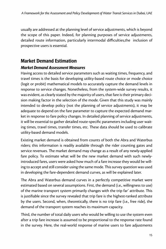
Waterbus Demand CurvesThe maximum daily capacity of the Waterbus system is calculated in Table 2. The daily capacity of each route is calculated by multiplying Waterbus vessel capacity by the number of scheduled daily trips along the route.
Table 2. Maximum Daily Capacity of Waterbus System
RouteDescription
(from Station – to Station)Daily Capacity (Vessel Capacity
Multiplied by Scheduled Daily Trips)
B1 Sabkha – Bur Dubai 2,448
B2 Baniyas – Old Souk 4,896
B3 Al Seef- Baniyas- Sabkha 4,896
B4 Dubai Old Souk – Sabkha 432
Total capacity 12,672
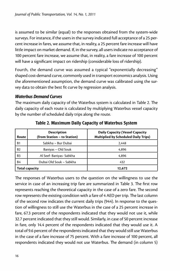
The responses of Waterbus users to the question on the willingness to use the service in case of an increasing trip fare are summarized in Table 3. The first row represents reaching the theoretical capacity in the case of a zero fare. The second row represents the existing condition with a fare of 4 AED per trip. The last column of the second row indicates the current daily trips (944). In response to the ques-tion of willingness to still use the Waterbus in the case of a 25 percent increase in fare, 67.3 percent of the respondents indicated that they would not use it, while 32.7 percent indicated that they still would. Similarly, in case of 50 percent increase in fare, only 14.4 percent of the respondents indicated that they would use it. A total of 9.6 percent of the respondents indicated that they would still use Waterbus in the case of a fare increase of 75 percent. With a fare increase of 100 percent, all respondents indicated they would not use Waterbus. The demand (in column 5)
17
A Framework for the Assessment and Policy Development of Water Transit Services in Dubai, UAE
was estimated by multiplying the existing demand (944) by the cumulative per-centage of users who would be willing to use the Waterbus system.
Table 3. Willingness-to-Pay Responses for Waterbus System
Trip Price (AED)
Trip-Fare Increase (%)
Cumulative Unwillingness to Use Waterbus (%)
Willingness to Use Waterbus (%)
Demand (daily User Trips)
0 - - - 12,670
4 0 - - 944
5 25 67.3 32.7 311
6 50 85.6 14.4 137
7 75 90.4 9.6 91
8 100 100.0 0.0 0
Regression analysis was conducted on the results shown in Table 3 using SPSS. The following formula found the best fit trip-fare demand relationship, with a coefficient of determination (r2) of 0.828: Q = 28.7 · 0.366P (3)
where, Q is the daily user trips (in 1000 trips) (column 5 of Table 3), and P is the trip fare in AED (column 1 of Table 3).
No restrictions (constraints) were made on meeting the maximum capacity at a zero trip fare. To account for the maximum capacity at a zero fare, while minimiz-ing the standard errors, the regression was constrained by enforcing the zero fare data point. The calibrated equation of the Waterbus trip-fare demand curve is:
Q = 12.6 · 0.51P (4)
It should be noted that Eqs. (3) and (4) are based on using the same data (shown in Table 3). Equation (3) was derived using the first and last columns of Table 3. Equation (4) was calibrated from the same data set, but with the regression “constrained,”forcing the regression curve to pass through the “zero fare” data point following the typical shape of the demand curve. At the zero-fare point, the expected demand is assumed to be equal to the maximum capacity of the marine service vessels.
The monopoly market demand curve was estimated by simply assuming no change in the daily user trips in case of an increase in the trip fare. This assumption is justi-fied, given that there is no other suitable, feasible, or cheaper alternative mode for passengers to shift from the existing Waterbus system.

Journal of Public Transportation, Vol. 14, No. 1, 2011
18
Figure 5 illustrates the three curves of the Waterbus: the demand curve from sur-vey opinions (without restrictions on the theoretical capacity), the demand curve with the theoretical capacity enforced, and the monopoly demand curve.
Figure 5. Waterbus Demand Curves
Waterbus Price ElasticityThe price (fare) elasticity of the Waterbus (E) can be calculated as (Papacostas and Prevedouros 2001):
(5)
where, Q and P are as defined before.
Papacostas and Prevedouros (2001) describe that the negative sign of the elastic-ity value reflects the fact that a percentage increase in P will cause a percentage decrease in Q and, depending on the demand function, the price elasticity of demand is not constant for all points on the curve. In addition, the value of the
19
A Framework for the Assessment and Policy Development of Water Transit Services in Dubai, UAE
price elasticity of demand reflects the implication of a price change on the total revenue (P • Q) of the supplier. For example, when E < -1, the percent decrease in Q is larger than the percent increase in P. In this case, the demand is said to be elastic, and the total revenue, after an increase in price, decreases because the loss of sales volume outweighs the extra revenue obtained per unit sold. When E > -1, the demand is said to be inelastic, and the total revenue increases after raising the price. When E = -1, the demand is unitarily elastic, and the revenue derived from selling less units at a higher price is equal to the total revenue prior to raising the price. When E = 0, the market is a perfect monopoly and, hence, the price change does not cause a change in demand.
Differentiating Eq. (4) and substituting in Eq. (5), the price elasticity for a perfectly competitive market can be stated as:
(6)
Using the current trip-fare (P = 4 AED) and an estimated demand from Eq. (5) of 0.852 thousand trips/user/day, the E value would be -2.69. This price elasticity value indicates that for an increase in trip fare (from the current 4 AED per trip), the demand for Waterbus would fall at a significant response rate (in case other suit-able alternatives were available in a perfectly competitive market). Alternatively, the demand would significantly increase when the trip-fare is reduced. A proposal was made to reduce the existing trip fare to 2 AED (instead of 4). The expected demand and difference in revenue is shown in Table 4. The expected number of daily person trips under the proposed scenario was calculated using Eq. (4).
Table 4. Expected Revenue Scenario with Reduced Trip Fare for Waterbus
ScenarioTrip-Fare
(AED)
Daily Person-
TripsDaily Revenue
(AED/day)
Increase in Daily Revenue from Current
(AED/day)
Increased Revenue from
Current (%)
Existing 4 945 3,780 - -
Proposed 2 3,277 6,554 2,774 73
Abra Demand CurvesUsing a similar procedure to the Waterbus demand curve estimation method, the regression analysis of the Abra fare demand relationship is as follows:
Q = 9.7P2 - 62.1P+84.8 ; r2 = 0.98 (7)
Journal of Public Transportation, Vol. 14, No. 1, 2011
20
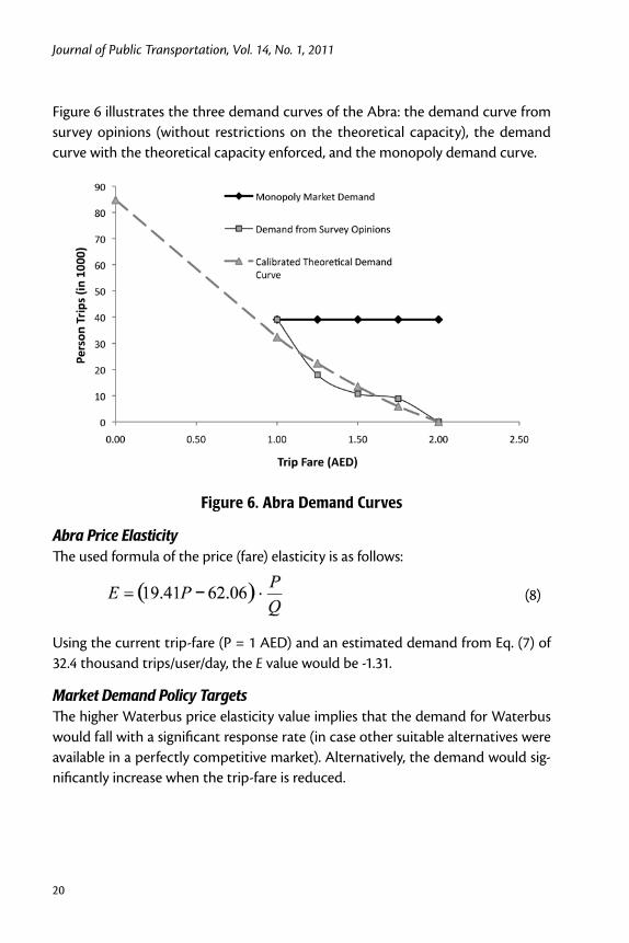
Figure 6 illustrates the three demand curves of the Abra: the demand curve from survey opinions (without restrictions on the theoretical capacity), the demand curve with the theoretical capacity enforced, and the monopoly demand curve.
Figure 6. Abra Demand Curves
Abra Price ElasticityThe used formula of the price (fare) elasticity is as follows:
(8)
Using the current trip-fare (P = 1 AED) and an estimated demand from Eq. (7) of 32.4 thousand trips/user/day, the E value would be -1.31.
Market Demand Policy TargetsThe higher Waterbus price elasticity value implies that the demand for Waterbus would fall with a significant response rate (in case other suitable alternatives were available in a perfectly competitive market). Alternatively, the demand would sig-nificantly increase when the trip-fare is reduced.

21
A Framework for the Assessment and Policy Development of Water Transit Services in Dubai, UAE
This monopoly market scenario illustrates the inelastic situation that more or less represents the existing Waterbus market. Nonetheless, even with a prevailing monopoly market, policymakers should consider this significant response rate that actually quantifies the unwillingness of users to pay higher prices for the trip fare. This explains the small daily loading percentages of Waterbus, indicating non-pop-ularity among commuters even though Waterbus is known to be more comfort-able and safer than Abra. In the survey, some Abra users suggested that they might shift to Waterbus if the current price level were reduced to 2 AED.
As a solution to increase Waterbus ridership, the single trip fare was suggested to be reduced to 2 AED for single trip (i.e., 4 AED for round trips) to increase the number of passengers by attracting non-users in the coverage area or some of Abra users.
Implementation and Performance Monitoring Trips Fare Reduction Guideline for WaterbusFollowing the recommendations of the study, the RTA Board of Directors approved in March 2009 a fare of 4 AED per round trip during a single day (khaleejtimes.com). The recommendation was expected to attract various non-users as well as divert a portion of the Abra users, as explained earlier. It also was expected that the overall revenue of MA-RTA services would increase in light of a Waterbus fare reduction.
Monitoring of Waterbus Ridership An essential element of policy development is performance monitoring in light of the suggested recommendations. Although early at this stage to make an overall system performance assessment, early indicators suggested considerable gains due to the implementation of the new service policy.
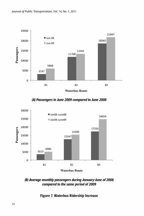
Over 43,351 passengers were ferried in 11,100 trips by Waterbus in June 2009, according to recently-released counts by MA-RTA. These counts show an increase of 12,052 passengers for Waterbus compared to June 2008 statistics (khaleejtimes.com ). The ridership increase on Waterbus B1, B2 and B3 routes in certain months in 2009 as compared to counterpart periods in 2008 is shown in Figure 7.
Journal of Public Transportation, Vol. 14, No. 1, 2011
22
(B) Average monthly passengers during January-June of 2008 compared to the same period of 2009
Figure 7. Waterbus Ridership Increase
(A) Passengers in June 2009 compared to June 2008

23
A Framework for the Assessment and Policy Development of Water Transit Services in Dubai, UAE
The application of fare reduction was implemented in March 2009, and the increase in Waterbus ridership was reported in June 2009. During this short period, there was no major land-use change within or nearby the study area. Also, the study area consists primarily of offices, traditional markets, shopping areas, and residential areas. There are no industrial activities near the marine transport sta-tions. Therefore, it can be concluded that the effects are not related to other land-use or exogenous factors.
The increase in Waterbus ridership was reported immediately following the fare reduction. More time is needed for the demand to stabilize and then be re-mea-sured. Also, the demand on transport modes in general is less during summer as compared to winter. The expected demand levels in response to the fare change (as shown in Figures 5 and 6) represent the upper bound of the demand increase in the case of a fare reduction/increase. An important point to note is that the demand levels on all transport modes in 2009 were considerably affected by the global economic crisis on one hand and the economic status of Dubai in particular on the other. Dubai has witnessed considerable losses in demand levels on all transporta-tion modes in general. Therefore, the reported 30 percent increase in a few months is a good indicator of a successful fare reduction policy.
It should be noted that throughout the survey, many Abra users indicated their willingness to shift to Waterbus if its fare were reduced to a compatible level with that of Abra. The suggestion to reduce the Waterbus fare was particularly sup-ported by evidence from surveys as well as the developed fare-ridership demand curves. The increase in Waterbus ridership following application of the fare reduc-tion can be attributed to several possibilities: 1) shifting of Abra users to the more convenient Waterbus mode, 2) an increase in the number of trips of Waterbus rid-ers, and 3) newly-generated trips by prospective users. Suggestions for continuous monitoring and post-implementation surveys were made to MA-RTA to follow up on causes of ridership increases/changes and generally on the post-effects of policy and guideline implementations.
ConclusionsThe existing service policy guidelines of MA-RTA are supported little by existing market coverage, loading patterns, adequate intermodal planning tools, economic feasibility, and capital return of services. The service policy planning models cur-rently used for strategic planning of the various modes by RTA need to be critically
Journal of Public Transportation, Vol. 14, No. 1, 2011
24
validated. Moreover, major initiatives of service changes are not driven by policies, outcome measures, or performance indicators. For these reasons, it is impera-tive that the policy guidelines for MA-RTA are introduced in a precise and well-documented way, creating a formal and systematic method for service assessment and planning, operation monitoring, and evaluation. Therefore, MA-RTA should incorporate some of the service standard/guideline measures under the adopted framework discussed above for developing service plans, monitoring performance, and providing short or long term alteration to services. The indicators of system performance under the new service fare policy are quite encouraging.
It would have been useful to have more post-policy data for verification and fine-tuning of the guidelines. However, this was not possible since few of the sug-gested policies and guidelines were implemented. As such, we focused only on the implemented policies within a reasonable time frame. The fare policy was the first to be implemented; thus, we included some findings of the Waterbus fare reduc-tion policy. Full incorporation of the service policy guideline would require more time to reach system stability. Future work would entail reporting detailed service performance in light of the adopted guidelines, together with the fine-tuning of service target values. Therefore, collecting more post-policy data should be consid-ered in future research.
Acknowledgment
This research was funded by MA-RTA project number MR014. The authors would like to acknowledge the efforts of Farida Yaqoob, Hussain Al Saffar, and Sarah Mohammad of MA-RTA for their valuable contributions and feedback throughout the study.
References
Ahern, A. A., and N. Tapley. 2008. The use of stated preference techniques to model modal choices on interurban trips in Ireland. Transportation Research Part A 42: 15–27.
Camay, S., L. Ramasubramanian, B. Derman, E. Bohn, J. Albrecht, W. Milczarski, M. Boile, and S. Theofanis. 2008. Ferry parking and landside access study: Imple-menting public outreach and impact assessment. Transportation Research Record 2077: 39-45.

25
A Framework for the Assessment and Policy Development of Water Transit Services in Dubai, UAE
Ceder, A. 2006. Planning and evaluation of passenger ferry service in Hong Kong. Transportation 33(2): 133-152.
East, R. S., and E. V. Armstrong. 1999. Intermodal ferry terminal master plans for Washington State ferries: Planning for the future. Transportation Research Record 1677: 105-116.
Espino, R., J. deD. Ortuzar, and C. Roman. 2007. Understanding suburban travel demand: Flexible modelling with revealed and stated choice data. Transporta-tion Research Part A 41: 899–912.
FHWA. 2004. Transportation performance measures in Australia, Canada, Japan, and New Zealand. International Scanning Study Team Report, U.S. Federal Highway Administration, url: http://www.international.fhwa.dot.gov, 8/20/08.
Gates, S. 2001. Aligning strategic performance measures and results. Presentation to the Balanced Scorecard Interest Group. url: www. conference-board.org, 8/25/08.
Hassan, M. N., Y. Hawas, F. Ahmed, M. Maraqa, and M. B. Khan. 2010. Water transit services in Dubai: Users and operators surveys development and quantitative analyses. Journal of Public Transportation 13(2): 71-92.
Hidas, P., and J. Black. 2002. Targets and performance indicators for sustainable urban transport: A review of current practice in Sydney, Australia. In Brebbia, C.A., J. F. Martin-Duque, and L. C. Wadhwa (eds.), The Sustainable City II. Urban Regeneration and Sustainability. WIT Press, Hampshire.
Khaleejtimes.com. 2009. http://www.khaleejtimes.com/displayarticle.asp?xfile=data/ theuae/2009/July/theuae_July508.xml§ion=theuae&col), last visited on 07-12-2009.
Laube, M. M., and M. M. Dyer. 2007. Ferry service market analysis: National Parks of New York Harbor. Transportation Research Record 1793: 99-105.
MBTA. 2006. Service delivery policy. Massachusetts Bay Transportation Authority.
Miller, I. R., J. E. Freund, and R. Johnson. 1990. Probability and Statistics for Engineers, 4th Edition. Prentice Hall Inc., New Jersey.
NCHRP. 2004. Strategic Planning and Decision Making in State Departments of Transportation: A Synthesis of Highway Practice. National Cooperative High-way Research Program Synthesis 326. Transportation Research Board, Wash-ington, DC., U.S.A.

Journal of Public Transportation, Vol. 14, No. 1, 2011
26
Odeck, J., and S. Brathen. 2009. The efficiency of Norwegian ferries in providing public transport services. International Journal of Transport Economics 36(1): 121-139.
Outwater, M. L., S. Castleberry, Y. Shiftan, M. Ben-Akiva, Y. S. Zhou, and A. Kup-pam. 2003. Attitudinal market segmentation approach to mode choice and ridership forecasting: Structural equation modeling. Transportation Research Record 1854: 32-42.
Papacostas, C. S., and P. E. Prevedouros. 2001. Transportation Engineering and Plan-ning, 3rd edition. Prentice Hall Inc., New Jersey.
RTTSRC. 2008a. Development of service policy for the RTA Marine Agency: Assess-ment of current practice. Submitted to RTA Marine Agency, Report Number RTTS-RTA-1-2008, Dubai, September 2008.
RTTSRC. 2008b. Development of service policy for the RTA Marine Agency: Guide-line development. Submitted to RTA Marine Agency, Report Number RTTS-RTA-2-2008, Dubai, December 2008.
Turner, D., M. Dix, K. Gardner, and S. Beevers. 1999. Setting traffic reduction targets for London. Traffic Engineering and Control 40 (4): 186–194.
Wang, D. Z. W., and H. K. Lo. 2008. Multi-fleet ferry service network design with passenger preferences for differential services. Transportation Research, Part B 42: 798-822.
Zografos, K. G., A. D. May, G. Marsden, J. Kallioinen, and H. Tegner. 2004. Survey of transport institutional issues in Europe. Deliverable 3, Transport Institutions in the Policy Process, DG TREN. www.strafica.fi\tipp, 8/20/08.
About the Authors
Faisal Ahmed ([email protected]) is a Ph.D. student at the Roadway, Transportation and Traffic Safety Research Center (RTTSRC) at UAE University. He obtained his M.Sc. in Management of Transportation from Chalmers University of Technology (CTH), Sweden. His research focuses on traffic engineering, transport planning, and ITS.
Yaser E. Hawas ([email protected]) is a professor in the Department of Civil and Environmental Engineering and Director of the RTTSRC at UAE University. He obtained his Ph.D. from the Civil Engineering Department at the University of
27
A Framework for the Assessment and Policy Development of Water Transit Services in Dubai, UAE
Texas at Austin in 1996 and joined UAE University in 1998. He has published more than 40 international journal and conference papers and has carried out several professional studies and consultancy works for local and international agencies including the Texas Department of Transportation, the Federal Highway Admin-istration, Holden vehicle manufacturers (Australia), the United Nations (ESCWA), and many others in the UAE.
Munjed Maraqa ([email protected]) is an associate professor in the Depart-ment of Civil and Environmental Engineering and is associated with the RTTSRC at UAE University. He has a Ph.D. in Environmental Engineering from Michigan State University. His research focuses on mass transfer in porous media and environmental issues associated with transportation.
Mohammad Nurul Hassan ([email protected]) is a research assistant at the RTTSRC at UAE University. He has an M.Sc. degree in Urban and Regional Planning from Bangladesh University of Engineering and Technology. His research focuses on land use and transport planning and policy.

Journal of Public Transportation, Vol. 14, No. 1, 2011
28

29
Analysis of Passenger-Ferry Routes Using Connectivity Measures
Analysis of Passenger-Ferry Routes Using Connectivity Measures
Avishai (Avi) Ceder and Jenson Varghese University of Auckland
Abstract
This study examines ferry routes that arrive at a Central Business District (CBD) during peak periods. Ferries are investigated because in certain locations they pro-vide an alternative to buses and private vehicles, with potentially faster and more reliable journey times. The objectives of the study were to (1) conduct a connectivity analysis of existing commuter ferry services and (2) investigate potential demand for ferry services and develop potential new routes. The case study is of Auckland, New Zealand. The first stage of the study analyzed the connectivity of existing ferries routes to the CBD with bus services within the CBD utilizing measures of connectiv-ity with attributes of walking, waiting, and travel times, and scheduled headways. The second stage involved developing new commuter routes from within the greater Auckland region to the CBD. The origins of these new routes were developed based on the potential demand of area units derived from journey-to-work data from the 2006 New Zealand Census. These new routes were then compared with existing bus routes from similar locations to the CBD to provide an additional assessment of the feasibility of the new routes. Finally, recommendations are made on the establish-ment of the new ferry routes.
IntroductionFerries are an alternative to land-based modes of transportation such as buses and private vehicles, with potentially faster and more reliable journey times, as they do

Journal of Public Transportation, Vol. 14, No. 1, 2011
30
not compete for road space on congested road networks. An effective ferry service has the potential to reduce traffic congestion on roads by taking people off the road through modal shift to ferry services.
Objectives This research study builds on previous research carried out by Ceder et al. (2009). The objectives of this study are to:
Conduct a connectivity analysis of existing commuter ferry services.•
Investigate demand for existing ferry services.•
Develop new potential routes based on geographic feasibility and potential •demand.
Apply the methodology developed to the Auckland area and Central Busi-•ness District (CBD) during the morning peak period.
BackgroundThe Auckland CBD is New Zealand’s largest employment center, with over 70,000 employees and 9,000 businesses (Auckland City Council 2006). In the Auckland region, the Auckland Regional Transport Authority (ARTA) is responsible for the coordination, planning, and funding of passenger transport. ARTA’s Passenger Transport Network Plan 2006-2016 (2006) forecasts that ferry passenger trips will increase from 4.3 million to 6.6 million per year by 2016.
The ARTA Draft Ferry Development Plan (2008) identifies key issues that will need to be addressed to ensure that the forecasted increase in patronage is served. The issues identified include the need for improved coordination of ferry route mainte-nance and upgrades to the Downtown Ferry Terminal, which is the destination of all commuter passenger services to the CBD.
The ARTA Sustainable Transport Plan (2007) sets out a 10-year program of scoped and costed projects and practical actions to help people make safer and more sustainable travel choices in Auckland. The plan aims to integrate sustainable transport activities with each other and with planned improvement to infrastruc-ture and services. The sustainable transport plan identifies a significant increase in demand management activities, from the current level of around $10 million per year to an average of $42 million per year for the next 10 years. This investment is expected to divert 20,000 car trips each morning peak to walking, cycling, and passenger transport.

31
Analysis of Passenger-Ferry Routes Using Connectivity Measures
The completion of the Central Connector busway in 2010 will result in more effi-cient travel between the CBD and Newmarket via key locations such as Auckland Hospital and The University of Auckland. (Auckland City Council 2009) As part of the project, there are several planned improvements to bus services, includ-ing increased frequencies, dedicated bus lanes, new bus stops and shelters, and improved traffic signals.
Literature ReviewThis section contains a review of papers that propose methods for optimizing the configuration of public-transport (PT) routes systems. A passenger ferry rout-ing system has basically same characteristics as any other PT system in terms of objectives, constraints, and integration consideration. Baaj and Mahmassani (1991, 1992, 1995) developed PT network design methods based on artificial intelligence (AI). The discussed methods are based on a typical formulation of the network design problem as a programming problem with minimal frequency and load fac-tor and fleet size constraints. The first paper (Baaj and Mahmassani 1991) gives a quantitative description, using flow charts, of a three-stage design process of a route network. In the first stage, a large set of routes is generated; the second stage involves network analysis and determination of frequencies; the third stage is network improvement. The second paper (Baaj and Mahmassani 1992) focuses on the method of representing the transportation network, using lists and arrays, in order to make the solution procedure efficient. The third paper (Baaj and Mah-massani 1995) concentrates on the stage of creating the initial set of routes, which are supposed to be modified and improved later. To generate this initial route set, a set of basic skeletons is created along the shortest paths between nodes with a high passenger demand; the skeletons are expanded using a set of node insertion manipulations.
Ramirez and Seneviratne (1996) propose two methods for route network design, under multiple objectives, using GIS. Both methods involve ascribing an imped-ance factor to each possible route and then choosing those that have the minimum impedance. In the first method, the impedance factor depends on passenger flow and the traveled road length. This method requires use of an assignment model. In the second method, the impedance factor depends on the number of employees who have a reasonable walking distance from the route.

Journal of Public Transportation, Vol. 14, No. 1, 2011
32
Pattanik et al. (1998) present a methodology for determining route configuration and associated frequencies using a genetic algorithm. In genetic algorithms, solu-tions are chosen out of a large set of possibilities in an iterative process, where the chances of a solution to survive through the iterations are higher if it yields a high value to a given fitness function. The method presented here adopts a typical pro-gramming formulation of the route network design problem, with the objective of minimizing a weighted combination of passenger time costs and operator time costs; the objective function is the basis for the calculation of the fitness function values. A methodology also is presented for the coding of variables as strings with fixed or variable length.
Soehodo and Koshi (1999) formulated a programming problem for designing PT routes and frequencies. Similar to other models, the problem is solved by first cre-ating all feasible routes and then choosing an optimal subset. In addition to some traditional components, such as minimal frequency and fleet size constraints, the problem has some unique elements, such as the inclusion of private car user costs, transit passenger crowding costs, and transfer costs to the minimized objective function. A sub-model is developed for each of these cost types. Equilibrium of network flows is another constraint. The model assumes that demand is elastic and, therefore, the shift of passengers between different modes of transport has a major role. Both PT and non-PT demand assignment models are used.
Bielli et al. (2002) describe another method for designing a bus network using a genetic algorithm. As in other genetic algorithms, each population of solutions goes through reproduction, crossover, and mutation manipulations whose output is a new generation of solutions. In the proposed model, each iteration involves demand assignment on each network of the current set of solutions, and a calcula-tion of performance indicators based on the assignment results. These indicators take part in a multi criteria analysis of each network, which leads to the calculation of its fitness function value.
Wan and Lo (2002) developed a network design model with an explicit consider-ation of intermodal and inter-route transfers. The model has two separate phases. First, the points that are to be connected with a direct service are determined in a heuristic algorithm. This algorithm uses a network representation approach named State Augmented Multi-Model (SAM), which involves inserting imaginary links to the actual road network where a direct service is provided. Afterwards, an actual bus route system is built in a mixed integer linear programming problem.

33
Analysis of Passenger-Ferry Routes Using Connectivity Measures
Yan and Chen (2002) present a method for designing routes and timetables that aims to optimize the correlation between bus service supply and passenger demand. The method is based on the construction of two time-space networks: a fleet flow network and a passenger flow network. Both networks are bi-dimensional diagrams where the horizontal dimension represents bus stops and the vertical dimension represents time. While the fleet flow network shows potential activities of the bus fleet, the passenger flow network illustrates trip demand. The objective of the model is to flow buses and passengers simultaneously in both networks with a minimum cost. A mixed integer multiple commodity network flow problem and a solution algorithm, based on Lagrangean relaxation, are presented.
Tom and Mohan (2003) continued the development of genetic methods for route network design. In the current model, frequency is the variable, and thus it differs from earlier models in terms of the adopted coding scheme. While fixed string length and variable string length codings were used in previous models, the simultaneous route and frequency coding model is proposed here. The literature review presented in this section sheds light on what methodologies and quantita-tive methods recently were used to overcome the planning issues of PT network design. What follows is a different concept coordination-based with the idea to bridge between theory and practice.
The literature reviewed provides a spectrum of modeling approaches for public-transport network design, including the construction of ferry routes. However, none of the approaches furnishes a sound methodology for the inclusion of con-nectivity measures within the optimization framework. It is the purpose of this work to shed light on both the connectivity measures and consideration of realign-ment of ferry routes.
Public-Transport Connectivity AnalysisConnectivity analysis of PT services is made up of the following quantitative attri-butes (Ceder at al., 2009; Ceder, 2007):
e1 = Average walking time (for a connection)
e2 = Variance of walking time
e3 = Average waiting time (for a connection)
e4 = Variance of waiting time

Journal of Public Transportation, Vol. 14, No. 1, 2011
34
e5 = Average travel time (on a given transit mode and path)
e6 = Variance of travel time
e7 = Average scheduled headway
e8 = Variance of scheduled headway
In addition to the quantitative attributes, there are also qualitative attributes, which are not as easily measured and quantified. There are:
e9 = Smoothness (ease)-of-transfer (on a given discrete scale)
e10 = Availability of easy-to-observe and easy-to-use information channels (on a given discrete scale)
e11 = Overall intra- and inter-agency connectivity satisfaction (on a given dis-crete scale)
These attributes contribute to an individual’s preference for passenger transport of alternative modes. It is noted that each individual will have different preferences and importance (weightings) assigned to the above attributes. To determine the relative importance and weighting attributed to each of the 11 attributes, surveys need to be conducted on the preferences of passenger transport users. Such sur-veys were conducted by Ceder et al. (2009).
As noted above, measuring PT connectivity involves various parameters and com-ponents. Therefore, the following notations are introduced to ease the explicit construction of connectivity measures.
For a given time window (e.g., peak-hour, average week-day):
O = {Oi} = set of origins Oi
D = {Du} = set of destinations Du
PDk = {P} = set of inter-route and inter-modal paths to Dk
POk = {Pi} = set of inter-route and inter-modal paths from Ok
Mp = {m} = set of transit routes and modes included in path p
Et = {et} = set of quantitative attributes suitable for connectivity measures
Eℓ = {eℓ} = set of qualitative attributes suitable for connectivity measures
e jmp = the value of attribute ej, j = t, ℓ, related to mode m on path p

35
Analysis of Passenger-Ferry Routes Using Connectivity Measures
αe = weight/coefficient for each attribute ej, j = t, ℓ
c jp = quantitative and qualitative (j= t, ℓ) connectivity measure of path p
Fp = average number of passengers using path p
cp(i,j) = capacity (flow of passengers) of arc (i,j) between route and mode i, and between route and mode j; each i can also be an origin Oi or des-tination Di; (i,j) is contained in path p and is part of a network-flow model.
Based on the notations, the following equation-based notations are established:
, j = t,ℓ (1)
, j = t,ℓ (2)
, j = t,ℓ (3)
, j = t,ℓ (4)
, j = t,ℓ (5)
, j = t,ℓ (6)
, j = t,ℓ (7)
, j = t,ℓ (8)
, j = t,ℓ (9)
, j = t,ℓ (10)

Journal of Public Transportation, Vol. 14, No. 1, 2011
36
Equation (1) has the purpose of comparing paths (chains of trips) that each have an origin and destination and may include transfers. This comparison is usually carried out when there is a change in one or more paths; otherwise, it categorizes the different paths by their access/egress connectivity quality using the evaluation tool proposed.
Equation (2) is used to compare destinations. Equations (6) and (7) have the same purposes as Equations (1) and (2), respectively, but include the consideration of passenger flow by determining of the average number of passengers exposed to the calculated level of connectivity. Equation (9) compares groups of destinations with regard to overall existing connectivity quality.
All the connectivity measures that consider passenger flows should be updated in the event of changes or improvements to schedules, routes, or services. When referring to a group of destinations (zonal-based, purpose-based), paths can have a stop at one destination and continue to others.
MethodologyConnectivity AssessmentTo develop an assessment of the existing operation of commuter ferry networks to the Auckland CBD during the AM peak period of 7 AM to 9 AM, an analysis was carried out on the connectivity of existing ferry routes to the CBD with outward-bound bus services from within the CBD. This was the first stage of the study and is outlined below.
The connectivity analysis was carried out using the following assumptions:
The analysis incorporated the quantitative measures, while qualitative •measures were excluded. These qualitative measures were ease-of-transfer, availability of information, and overall intra- and interconnectivity.
The travel times and service headway information were based on published •timetables from MAXX (see below).
The weighting attributes used in the analysis were based on the results of •Ceder et al (2009).
The connectivity measures developed did not incorporate passenger flow •and were normalized by each quantitative measure to allow for cross-comparison.
37
Analysis of Passenger-Ferry Routes Using Connectivity Measures
The travel time and headway information for the specific routes was obtained from published timetable information from MAXX, the regional transport brand for Auckland managed by the Auckland Regional Transport Authority (ARTA).
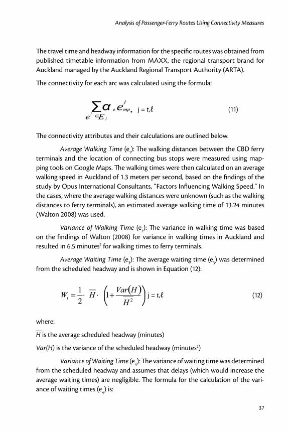
The connectivity for each arc was calculated using the formula:
j = t,ℓ (11)
The connectivity attributes and their calculations are outlined below.
Average Walking Time (e1): The walking distances between the CBD ferry terminals and the location of connecting bus stops were measured using map-ping tools on Google Maps. The walking times were then calculated on an average walking speed in Auckland of 1.3 meters per second, based on the findings of the study by Opus International Consultants, “Factors Influencing Walking Speed.” In the cases, where the average walking distances were unknown (such as the walking distances to ferry terminals), an estimated average walking time of 13.24 minutes (Walton 2008) was used.
Variance of Walking Time (e2): The variance in walking time was based on the findings of Walton (2008) for variance in walking times in Auckland and resulted in 6.5 minutes2 for walking times to ferry terminals.
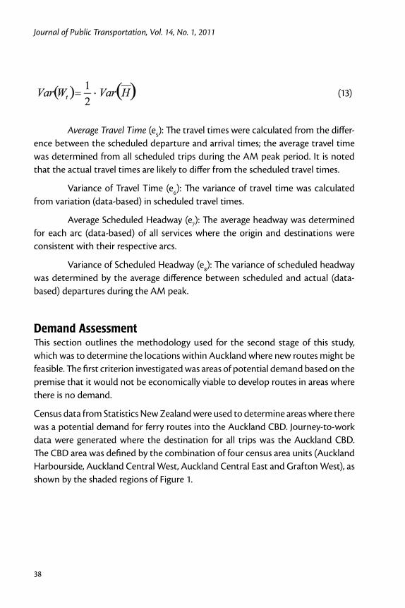
Average Waiting Time (e3): The average waiting time (e3) was determined from the scheduled headway and is shown in Equation (12):
j = t,ℓ (12)
where:
H is the average scheduled headway (minutes)
Var(H) is the variance of the scheduled headway (minutes2)
Variance of Waiting Time (e4): The variance of waiting time was determined from the scheduled headway and assumes that delays (which would increase the average waiting times) are negligible. The formula for the calculation of the vari-ance of waiting times (e4) is:
Journal of Public Transportation, Vol. 14, No. 1, 2011
38
(13)
Average Travel Time (e5): The travel times were calculated from the differ-ence between the scheduled departure and arrival times; the average travel time was determined from all scheduled trips during the AM peak period. It is noted that the actual travel times are likely to differ from the scheduled travel times.
Variance of Travel Time (e6): The variance of travel time was calculated from variation (data-based) in scheduled travel times.
Average Scheduled Headway (e7): The average headway was determined for each arc (data-based) of all services where the origin and destinations were consistent with their respective arcs.
Variance of Scheduled Headway (e8): The variance of scheduled headway was determined by the average difference between scheduled and actual (data-based) departures during the AM peak.
Demand AssessmentThis section outlines the methodology used for the second stage of this study, which was to determine the locations within Auckland where new routes might be feasible. The first criterion investigated was areas of potential demand based on the premise that it would not be economically viable to develop routes in areas where there is no demand.
Census data from Statistics New Zealand were used to determine areas where there was a potential demand for ferry routes into the Auckland CBD. Journey-to-work data were generated where the destination for all trips was the Auckland CBD. The CBD area was defined by the combination of four census area units (Auckland Harbourside, Auckland Central West, Auckland Central East and Grafton West), as shown by the shaded regions of Figure 1.

39
Analysis of Passenger-Ferry Routes Using Connectivity Measures
Figu
re 1
. A
uckl
and
CBD
Are
a U
nits
Journal of Public Transportation, Vol. 14, No. 1, 2011
40
It is assumed that the majority of these journey-to-work trips were carried out in the AM peak period. In the use of the census data, the following limitations were noted.
Age of Census DataThe census was carried out on March 7, 2006, which meant that the journey-to-work data were over three years old at the time this analysis was undertaken. An implication of the time lag is that economic events (such as fuel price rises) and land use and transport infrastructure changes over the past three years may have altered the region’s travel patterns. This was noted and taken into account when estimating the potential demand. Investigations confirmed that all existing ferry routes were operational by 2006, and the impacts of improvements to bus and ferry infrastructure were assumed to be negligible for the purposes of this investi-gation.
Modes of TravelIn the 2006 census, respondents were asked to enter their main mode of travel to work on March 7, 2006. The modes of travel indicated were:
Drove a Private Car, Truck, or Van•
Drove a Company Car, Truck, or Van•
Passenger in a Car, Truck, Van, or Company Bus•
Public Bus•
Train•
Motorcycle or Power Cycle•
Bicycle•
Walked or Jogged•
Other•
Worked at Home•
Did Not Go To Work Today•
Not Elsewhere Included•
A limitation of the census data is that journey-to-work by ferry was not included as an option for respondents to select. Discussions with Statistics New Zealand1 indi-cated that travel by ferry was expected to be covered under the category “Other,” which also might have included travel by taxi or airplane. Statistics New Zealand
41
Analysis of Passenger-Ferry Routes Using Connectivity Measures
also acknowledged the possibility that certain respondents who traveled by ferry may have selected “Not Elsewhere Included” category instead of selecting “Other.” This limitation does not affect the assessment of future ferry demand, although in determining existing demand, the assumption was made that the value in the “Other” field would reflect travel by ferry for areas close to existing ferry departure points, given that all existing ferry terminals are a significant enough distance away from the CBD to make travel by taxi unlikely from a cost perspective (and travel by airplane to the CBD is not possible).
Another constraint with the census data was that any field that had a value of less than six (for example, five people traveling to the CBD by train from Wellington) was suppressed to ensure confidentiality of individuals. These suppressed values were treated as zero values, and it has been identified that this would result in lower demand estimates for all modes; however, given that this analysis was looking at area units (catchment areas) of high demand, it was considered acceptable that areas with potential demand less than six were ignored.
Discussions were held with Fullers Ferries Ltd.,2 the main operator of ferries in the Auckland region, to determine the patronage on the existing services. Patronage information on individual routes was not available due to commercial sensitivity, although archived ARTA business reports indicate a total monthly ferry patronage of approximately 440,000 in March 2006 and 445,000 in March 2009. This captured all weekday and weekend trips, and it was not possible to accurately break down this information to obtain estimates of patronage or demand on existing ferry routes. The CBD Access Strategy 2006 identified 2,700 passengers arriving in the CBD during the AM peak (Auckland City Council 2006).
An estimation of existing demand from the census data was made based on the assumption that all trips from area units near existing ferry infrastructure under the category “Other” were ferry trips.
The estimation of the potential demand for new ferry routes was developed using census data on bus patronage. This was based on the premise that bus users would be more likely to shift modes to ferry transport if the new services provided more attractive travel times and connectivity. It is also likely that the introduction of new ferry services might result in commuters currently traveling by private vehicle to switch to ferries; however, to ensure a conservative estimation of demand only bus patronage was investigated.

Journal of Public Transportation, Vol. 14, No. 1, 2011
42
Area units with more than 10 commuters traveling by bus were identified. These area units were then filtered out based on their proximity to the ocean. As the location of any potential ferry terminal or pier would be by the sea, all area units that were more than 1,000m away from the ocean were eliminated, based on the assumption that passenger transport users were willing to walk an average of 1,000 meters to a transport hub, based on the findings of Walton (2008). This eliminated any potential demand areas where passengers might drive to ferry terminals to ensure conserva-tive demand estimation, as this is not consistent with regional policy. Once these constraints were incorporated in the evaluation, the remaining area units with high bus patronage were used to develop the potential ferry routes.
Route Feasibility AssessmentOnce the areas of high demand were identified, Fullers Ferries was consulted on the feasibility of new routes to service these areas. Catchment areas that required routes traveling under bridges with unacceptably low clearances or tidal con-straints were eliminated. It also was noted that some of the potential piers and wharfs investigated might require significant infrastructural investment before they would be feasible ferry terminals. As this study focuses on demand, the potential cost implications of the engineering requirements were not taken into consideration.
Once the new potential catchment areas were identified, options for new routes were developed based on estimated journey times. The journey times of these new routes were then compared with existing bus routes to provide an additional assessment of the feasibility of the new routes. The use of intermediate nodes on ferry routes also was investigated, and this was determined from estimated journey times.
Auckland Case StudyThe Auckland region has the largest population in New Zealand at approximately 1.3 million. It is also one of the fastest growing regions in New Zealand, with a forecasted increase of 440,000 people over the next 15 years (ARTA 2008). This increase in population will put additional pressure on an already-congested road transport network.
This study investigated ferry routes to the Auckland CBD and their connectivity with bus services to develop an increased understanding of the effectiveness of the

43
Analysis of Passenger-Ferry Routes Using Connectivity Measures
Auckland CBD as a passenger transport hub. This study also looked at new ferry routes to potentially improve the efficiency of road-based passenger transport through the creation of a mode shift from private vehicles to ferries. The initial analysis conducted benefited from the study of ferry-route design in Hong Kong by Ceder and Sarvi (2007).
Ferry Operations in the Auckland RegionThere are six ferry operators in the Auckland region, with Fullers Ferries being the largest operator of commuter ferry trips to the Auckland CBD (Downtown). Table 1 presents a summary of ferry services within the Auckland region.
Table 1. Ferry Services in the Auckland Region
Service Terminals Type Operator
Weekday frequency
(trips each way)
Bus Feeder
Devonport Downtown-Devonport Passenger Fullers 31 All trips
Stanley Bay Downtown-Stanley Bay Passenger Fullers 8
Bayswater Downtown-Bayswater Passenger Fullers 21 All trips
Birkenhead Downtown- Birkenhead-Northcote
Passenger Fullers 24 Most trips
West Harbour Downtown-Westpark Marina
Passenger Belaire Ferries
8
Gulf Harbour Downtown-Gulf Harbour
Passenger 360 Discovery
2-3 1 trip
Half Moon Bay Downtown-Half Moon Bay
Passenger Fullers 11 Most trips
Waiheke Passenger Downtown-Matiatia Passenger Fullers 20 All trips
Waiheke Vehicular Half Moon Bay- Kennedy Pt
Vehicular Sealink 12
Waiheke Vehicular Half Moon Bay- Kennedy Pt
Vehicular Waiheke Shipping
4-7
Pine Harbour Downtown-Pine Harbour
Passenger Pine Harbour Ferries
11
Great Barrier Island Wynyard-Tryphena Vehicular Sealink 1
Rangitoto Downtown-Rangitoto Passenger Fullers 4
Rakino Pine Harbour-Rakino Passenger Pine Harbour Ferries
0 (week-end only)
Source: ARTA Ferry Development Plan
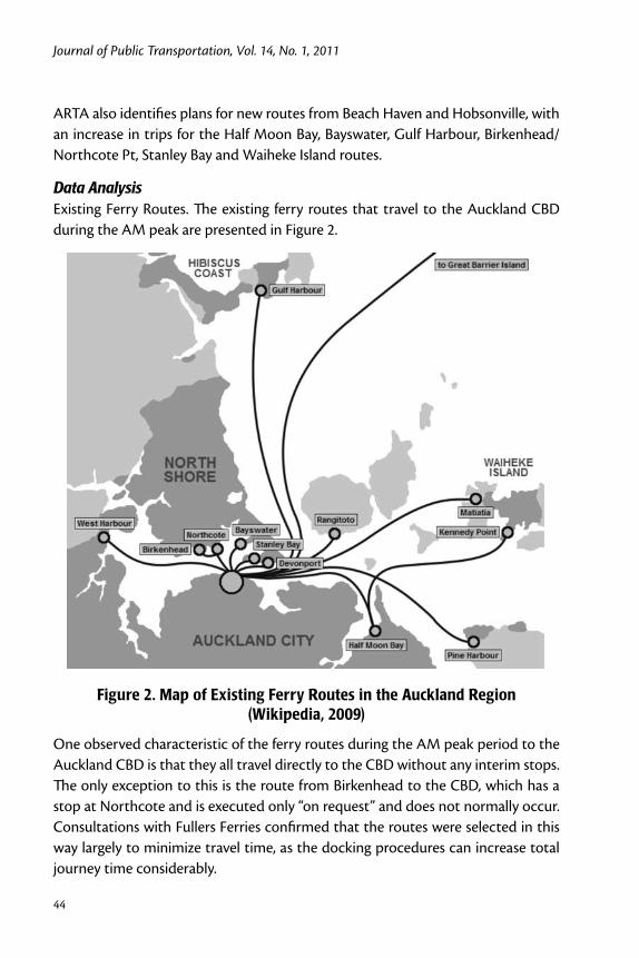
Journal of Public Transportation, Vol. 14, No. 1, 2011
44
ARTA also identifies plans for new routes from Beach Haven and Hobsonville, with an increase in trips for the Half Moon Bay, Bayswater, Gulf Harbour, Birkenhead/Northcote Pt, Stanley Bay and Waiheke Island routes.
Data AnalysisExisting Ferry Routes. The existing ferry routes that travel to the Auckland CBD during the AM peak are presented in Figure 2.
Figure 2. Map of Existing Ferry Routes in the Auckland Region (Wikipedia, 2009)
One observed characteristic of the ferry routes during the AM peak period to the Auckland CBD is that they all travel directly to the CBD without any interim stops. The only exception to this is the route from Birkenhead to the CBD, which has a stop at Northcote and is executed only “on request” and does not normally occur. Consultations with Fullers Ferries confirmed that the routes were selected in this way largely to minimize travel time, as the docking procedures can increase total journey time considerably.
45
Analysis of Passenger-Ferry Routes Using Connectivity Measures
From the analysis carried out, the origins of ferry trips to the CBD during the defined AM peak period were:
West Harbour•
Birkenhead•
Bayswater•
Stanley Bay•
Devonport•
Half Moon Bay•
Matiatia (Waiheke Island)•
Gulf Harbour•
Northcote•
The Pine Harbour, Rangitoto, Kennedy Point, and Great Barrier Island routes were not included, as they did include any trips during the AM peak period.
Connecting Bus Routes. The paths that were analyzed in terms of their con-nectivity were the ferry arcs defined above added to the arcs of bus services within the CBD.
Analysis of Census Data. The demand assessment used census data to identify regions of high numbers of residents traveling by bus. The census mesh blocks (approximately 9,800 mesh blocks for the Auckland region) were grouped into area units. This resulted in 253 area units with 6 or more residents traveling by bus, which were, in turn, grouped into regions based on Work and Income New Zealand’s regional agglomerations. Table 2 shows a summary of the analysis carried out on the census journey-to-work data.
Feasibility of Catchment Areas. By analyzing Table 2, several regions and their respective area units could be eliminated as unfeasible locations for future ferry terminals. The summary of these findings is presented in Table 3, with five regions excluded from further analysis due to their geographic location or low number of commuter bus trips (less than 10). This reduced the number of feasible area units to 195.
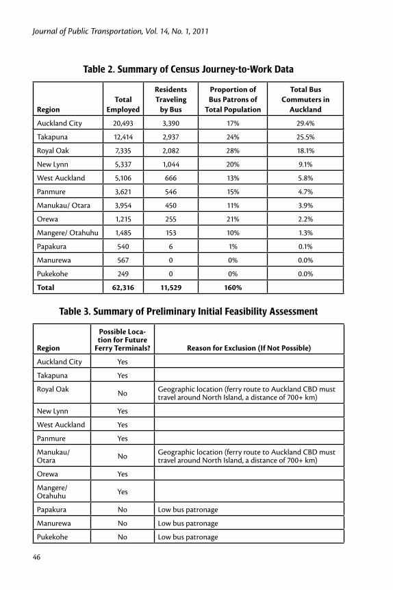
Journal of Public Transportation, Vol. 14, No. 1, 2011
46
Table 2. Summary of Census Journey-to-Work Data
RegionTotal
Employed
Residents Traveling
by Bus
Proportion of Bus Patrons of
Total Population
Total Bus Commuters in
Auckland
Auckland City 20,493 3,390 17% 29.4%
Takapuna 12,414 2,937 24% 25.5%
Royal Oak 7,335 2,082 28% 18.1%
New Lynn 5,337 1,044 20% 9.1%
West Auckland 5,106 666 13% 5.8%
Panmure 3,621 546 15% 4.7%
Manukau/ Otara 3,954 450 11% 3.9%
Orewa 1,215 255 21% 2.2%
Mangere/ Otahuhu 1,485 153 10% 1.3%
Papakura 540 6 1% 0.1%
Manurewa 567 0 0% 0.0%
Pukekohe 249 0 0% 0.0%
Total 62,316 11,529 160%
Table 3. Summary of Preliminary Initial Feasibility Assessment
Region
Possible Loca-tion for Future
Ferry Terminals? Reason for Exclusion (If Not Possible)
Auckland City Yes
Takapuna Yes
Royal Oak No Geographic location (ferry route to Auckland CBD must travel around North Island, a distance of 700+ km)
New Lynn Yes
West Auckland Yes
Panmure Yes
Manukau/ Otara No Geographic location (ferry route to Auckland CBD must
travel around North Island, a distance of 700+ km)
Orewa Yes
Mangere/ Otahuhu Yes
Papakura No Low bus patronage
Manurewa No Low bus patronage
Pukekohe No Low bus patronage

47
Analysis of Passenger-Ferry Routes Using Connectivity Measures
Analysis of Existing Ferry Demand. Analysis was carried out on areas near the existing ferry terminals to assess the existing ferry catchment areas and identify proportions of ferry users relative to bus users. This is summarized in Table 4.
Table 4. Estimated Bus and Ferry Patronage of Existing Ferry Catchment Areas
Route OriginPublic
Bus
"Public Bus" Trips as %
of Total Employed
Other (Assumed to be Ferry
Trips)
"Other" Trips as %
of Total Employed
Not Elsewhere Included
Total Employed (in CBD)
Waiheke Island
0 0% 237 67% 69 354
Stanley Bay 0 0% 105 51% 39 207
Devonport 0 0% 288 52% 93 558
Bayswater 153 13% 303 26% 120 1,149
Birkenhead 456 23% 195 10% 66 1,995
Northcote 219 27% 51 6% 27 798
Half Moon Bay
147 13% 147 13% 27 1,110
Gulf Harbour 168 9% 69 4% 42 1,806
West Harbour 54 10% 30 5% 9 549
Total 1,197 14% 1,425 17% 492 8,526
The high proportion of journey-to-work trips to the CBD from Waiheke Island is expected because there is no alternative mode of transport to the CBD from the island. It is noted that approximately 20 percent of commuters from Waiheke Island selected the option “Not Elsewhere Included,” which indicates a limitation in the use of the census data for the purposes of demand estimation.
Stanley Bay and Devonport operators also have a high proportion of CBD commut-ers traveling by ferry, with no commuters traveling by bus from these identified catchment areas. This attributed to the difference in journey times where Stanley Bay and Devonport have scheduled ferry travel times to the CBD of 10 and 15 min-utes, respectively, while a similar journey by bus from either location would take at least 45 minutes with one transfer, according to bus schedules. West Harbour has the lowest number of commuter trips by Ferry at 30, according to the results of the census data analysis.

Journal of Public Transportation, Vol. 14, No. 1, 2011
48
If Waiheke Island is excluded from the above analysis (because there is no alterna-tive to traveling by ferry), then there is an even proportion of commuters traveling to the CBD by bus and ferry.
Analysis of Potential Future RoutesAfter eliminating these regions, the number of feasible area units was reduced to 195 area units. After grouping area units by their geographic locations, the following catchment areas were developed, and the estimated modal patronage of each catch-ment area was obtained, based of the findings of an equal mode share between buses and ferries in areas of existing ferry patronage, as shown in Table 5.
Table 5. Estimated Ferry Patronage
Future Catchment Areas
Existing Situation (2006 Census)
After the Addition of Proposed Ferry Routes
Bus Patronage
Estimated Ferry Patronage
Estimated Bus Patronage
City West 540 270 270
Mission Bay 282 141 141
Orewa North 132 66 66
Panmure 150 75 75
Takapuna 462 231 231
West Auckland 27 14 13
West Auckland (Te Atatu) 111 56 55
City West 540 270 270
Mission Bay 282 141 141
Orewa North 132 66 66
It is noted that from the above analysis, the number of potential ferry users from West Auckland is lower than what was calculated for existing ferry catchments; however, this has been identified by ARTA for a future ferry route.Results
ConnectivityThe results of the connectivity analysis are presented in Figure 3 in normalized con-nectivity values of paths from ferry terminals to major locations in the CBD. The arcs that originate from Matiatia (Waiheke Island) present the highest normalized connectivity compared with arcs from other ferry routes to the same locations.

49
Analysis of Passenger-Ferry Routes Using Connectivity Measures
Figu
re 3
. Pat
h Co
nnec
tivi
ty A
naly
sis

Journal of Public Transportation, Vol. 14, No. 1, 2011
50
This is a result of the higher variance in scheduled headways than other ferry routes.
The destination with the highest normalized connectivity value is Victoria Park, as this has the highest variance of scheduled headway and the highest average travel time of all analyzed bus routes within the CBD.
New Route RecommendationsFrom the geographic feasibility and demand estimations assessments, the follow-ing routes were identified as possible ferry routes (for ferry trips into the Auckland CBD), as shown in Figure 4 by the dotted line.
Figure 4. Potential Ferry Routes

51
Analysis of Passenger-Ferry Routes Using Connectivity Measures
Summary, Future Study and RecommendationsConnectivity AnalysisThis research investigated the connectivity of ferries with bus routes in the Auck-land CBD and can serve as a tool and analytical framework for any ferry-related connectivity and routing study. The next step to progress the analysis of passenger transport connectivity within the Auckland would be the inclusion of rail services and the extension of all bus and rail services beyond the Auckland CBD region.
Auckland is currently undergoing significant passenger transport infrastructure upgrades, particularly with bus and rail trips to and from the CBD. On completion of these upgrades, current scheduled services will change significantly (new jour-ney times, frequencies, and routes), and it is recommended that the connectivity assessments then be updated to capture these changes.
Demand EstimationThe approach of using existing bus commuters provided an initial estimate of the potential patronage if new ferry routes were to be established. However, to develop a more detailed estimate of the potential demand for new ferry routes, several other factors may need to be taken into consideration. These factors include ferry fares, bus fares, journey times by car, and socio-economic statistics of the catch-ment area, such as median incomes and private vehicle ownership, among others. One potential area for future research is the development of a probability logit model to incorporate the impact these factors have on potential ferry patronage and to provide estimates on mode shifts from other modes of transport (bus, car and train).
The census data used in this analysis were over three years old, and this research has already identified potential flaws with the use of census data (such as there was no field for ferry commuters), which contributes to limitations in the demand estima-tion process. Further investigation into additional sources of patronage informa-tion such as ferry passenger and occupancy surveys would provide independent data that could be cross-checked against the census information.
The development of new passenger transport routes is sometimes the result of political decisions or in preparation for expected increases in land use develop-ment or population growth. These factors have not been considered in the demand analysis but may need to be considered in future demand estimation work.
Journal of Public Transportation, Vol. 14, No. 1, 2011
52
Geospatial AnalysisThe analysis of ferry catchment areas and ferry routes into the CBD involved a level of manual analysis of area units, geographic locations, and distances. This has a higher degree of error than potentially linking this directly with New Zealand statistics GIS database or carrying out more sophisticated geospatial analysis such as isochrones.
Financial FeasibilityBecause the ferry services in Auckland are commercially operated, a detailed finan-cial feasibility analysis should be implemented before any new routes would be recommended. This would involve detailed demand estimation, determination of appropriate fares, an evaluation of the expected operational costs, and determin-ing the level of capital investment required (in terms of wharf infrastructure and procurement of new vessels). Once decisions are made on the number and types of vessels to be purchased for the new routes, it would be possible to develop an expected timetable for these new routes, which could then be incorporated back into the connectivity analysis.
RecommendationsThis study conducted an analysis of existing ferry services to the Auckland CBD and their connectivity with bus services in the CBD during the AM peak period of 7AM to 9AM. This investigation can serve as an analytical framework for any ferry-related connectivity and routing study. The study examined demand for existing ferry services using 2006 census journey-to-work data from Statistics New Zealand and identified new potential routes based on areas of high potential demand and feasible geographic locations.
Following are recommendations for further analysis:
The connectivity analysis be updated on completion of the Central Con-1. nector busway, which will significantly change the connectivity in the Auckland CBD.
A potential mode shift should be investigated and financial feasibility of 2. the proposed new routes determined to gain a better understanding of the benefits of the development of new routes.
53
Analysis of Passenger-Ferry Routes Using Connectivity Measures
Endnotes1 Personal communication, May 21, 2009, Statistics New Zealand Client Servicing Team Leader.
2 Personal communication, May 25, 2009, Fullers Ferries Operations Manager.
References
Auckland Regional Transport Authority (ARTA). 2006. Auckland Passenger Trans-port Network Plan 2006-2016, ARTA Report.
Auckland City Council. 2006. Central Access Strategy, Auckland City Council Report.
Auckland Regional Transport Authority (ARTA). 2007. Sustainable Transport Plan 2006-2016, ARTA Report.
Auckland Regional Transport Authority (ARTA). 2008 . Draft Ferry Development Plan, ARTA Report.
Auckland City Council. 2009. Central Connector, http://www.aucklandcity.govt.nz/auckland/Transport/ctc/default.asp, accessed June 17, 2009.
Baaj, M. H., and H. S. Mahmassani. 1991. An AI-based approach for transit route system planning and design. Journal of Advanced Transportation 25: 187-210.
Baaj, M. H., and H. S. Mahmassani. 1992. Artificial intelligence-based system repre-sentation and search procedures for transit route network design. Transporta-tion Research Record 1358: 67-70.
Baaj, M. H., and H. S . Mahmassani. 1995. Hybrid route generation heuristic algo-rithm for the design of transit network. Transportation Research 3C: 31-50.
Bielli, M., M. Caramia, and P. Carotenuto. 2002. Genetic algorithms in bus network optimization. Transportation Research 10C: 19-34.
Ceder, A., and M. Sarvi. 2007. Design and evaluation of passenger ferry routes. Jour-nal of Public Transportation 10(1): 59-79.
Ceder, A. 2007. Public Transit Planning and Operation: Theory, Modeling and Prac-tice. Elsevier, Butterworth-Heinemann, Oxford, UK.

Journal of Public Transportation, Vol. 14, No. 1, 2011
54
Ceder, A., Y. Le, Y. Net, and C. Coriat. 2009. Measuring public transport connectiv-ity performance applied in Auckland, New Zealand. Transportation Research Record 2111: 138-147, 2009.
Pattnaik, S. B., S. Mohan, S. and V.M. Tom. 1998. Urban bus transit route network design using genetic algorithm. Journal of Transportation Engineering 124: 368-375.
Ramirez, A. I., and P. N. Seneviratne. .1996. Transit route design applications using geographic information systems. Transportation Research Record 1557: 10-14.
Soehodo, S., and M. Koshi. 1999. Design of public transit network in urban area with elastic demand. Journal of Advanced Transportation 33: 335-369.
Tom, V. M., and S. Mohan. 2003. Transit route network design using frequency coded genetic algorithm. Journal of Transportation Engineering 129: 186-195.
Walton, D. 2008. Impediments to walking as a mode choice. Land Transport New Zealand Research Report 329.
Wan, Q. K., and H. K. Lo. 2002. Two-phase transit network design in an integrated transit system. Advanced Modeling for Transit Operations and Service Planning – Workshop Proceedings, Crusher Advanced Study Institute.
Wikipedia. 2007. Auckland Ferry Routes, http://en.wikipedia.org/wiki/File:AucklandFerryRoutes.png, accessed April 10, 2009.
Yan, S., and H. L. Chen. 2002 . A scheduling model and a solution algorithm for inter-city bus carriers. Transportation Research 36A: 805-825.
About the Author
Avishai (Avi) Ceder ([email protected]) is Professor and Chair in Trans-portation in the Department of Civil and Environmental Engineering at the Uni-versity of Auckland and Director of the newly-established Transportation Research Centre (TRC). He was Head of the Transportation Engineering and Geo-Information Department at the Technion and a Visiting Professor at the Massachusetts Institute of Technology, the University of California at Berkeley, and others. He was the Chief Scientist at the Israel Ministry of Transport from 1994 to 1997 and the Israel del-egate to the Transport Program of the European Community. In 2007, he published the book Public Transit Planning and Operation: Theory, Modelling and Practice

55
Analysis of Passenger-Ferry Routes Using Connectivity Measures
(Elsevier, Oxford, UK), which was translated into Chinese by Tsinghua Publishing Press (Beijing) in June 2010.
Jenson Varghese is a transportation engineer with a broad range of international and local experience in transport planning, project management, traffic modeling, procurement, and financial and economic modeling. He currently works for McCor-mick Rankin Cagney in Auckland, where he provides advice to public and private sector clients in areas such as transportation policy, sustainability, and economic development. He has Bachelor of Engineering (Engineering Science) and Master of Engineering Studies (Transportation) degrees from the University of Auckland and a Diploma in Economics from the University of the South Pacific.

Journal of Public Transportation, Vol. 14, No. 1, 2011
56
Pickup Modifications for Rural Transport Services in Cambodia
57
Pickup Modifications for Rural Transport Services in Cambodia
Matthew Ericson Monash University
Abstract
This paper regards the operation of rural public transport services provided by pickup trucks and minibuses in Cambodia. Presented are survey data revealing how pickup modifications, especially cargo area canopies, are used to increase passenger and cargo capacity. A particular emphasis is placed on the importance of pickup transport services to economic activity. The results reveal that passengers traveling for economic reasons constitute 66 percent of passengers and carry 77 percent of the cargo weight. Transport operators may be modifying vehicles in response to their passengers’ commercial requirements. This paper highlights both the economic benefits and safety risks of such modifications.
IntroductionThere is a lack of rural transport services in much of the developing world and, where roads are poor, pickups are a preferred mode of transport, which is vital to economic development. Consequently, pickups are often fitted with benches and roof racks, enabling them to comfortably carry a dozen or more passengers on trips of up to 200km (Starkey et al. 2002).
Cambodia’s pickups carry 13 percent more passengers and 5 times the cargo weight of minivans (Rozemuller, Thou and Yan 2002). However, pickups are more susceptible to rollover because of their high center of gravity. The risk of rollover is heightened when goods are loaded on roofracks, as the center of gravity is raised

Journal of Public Transportation, Vol. 14, No. 1, 2011
58
even higher. Each additional passenger in the cargo area also raises the pickup’s center of gravity, while their unrestrained weight movement further increases vehicle instability (Anderson et al. 2000). Banning overloaded vehicles, however, is unlikely to be successful in developing countries. Supply limitations mean com-muters have few other options, and curtailing their travel would have severe social and economic consequences; transport services have been shown to be vital to economic development and poverty reduction in rural areas (Starkey et al. 2002; Nelson and Strueber 1991).
Figure 1. Pickup Taxi Fitted with Canopy Boarding the Preaek Ta Meak Ferry
As the main risk of injury in pickup trucks is from falls and ejections (CIPP 2000), a canopy attached to the pickup offers some protection for passengers. Canopies have proven effective in Australia’s aboriginal communities (Macaulay et al. 2003; Hawkes 2005). The conditions in these communities are likened to those in third-world countries (Young 1995). These conditions include poor roads, an under-supply of vehicles, a predominance of old and poorly-maintained vehicles, and poor driver training (NTRS 2006).
Cambodia is a low-income country with a gross national income of US$1820 per capita at purchasing power parity, and 80 percent of its 14.7 million people live in

Pickup Modifications for Rural Transport Services in Cambodia
59
rural areas (World Bank 2009). Rural roads are in a poor state, and there are few motorized vehicles (0.8 four-wheelers per 100 people). Cambodia’s fleet of trans-port providers is “fragmented,” and most vehicles are aged and overloaded (World Bank 2007).
Pickup trucks operate as taxis throughout rural Cambodia. The pickup taxis follow regular bus-like routes but pick up and put down passengers where requested. The principal alternatives to pickup and minibus taxis are large air-conditioned coaches. Coaches are essentially luxury transport with a fixed price (e.g., US$2.50 between Phnom Penh and Kampong Cham). In comparison, a pickup or minibus taxi costs around $1.25. However, prices for taxis are negotiable, and greater discounts are available to passengers willing to ride on the roof or bonnet.
Accidents and injuries involving—though not necessarily resulting from—over-loaded taxis are frequently reported in Cambodia’s popular media. There is, for instance, the case of a passenger who was killed when her pickup lost control and overturned (Koh Santepheap 2006b). Similar cases of fatal accidents involving vulnerable minibus passengers are reported, including roof-riding passengers (Koh Santepheap 2006a). There are also events involving multiple casualties, including one involving more than 30 casualties (HIB 2007) and another involving 23 (AFP 2008).
Figure 2. Sign Denoting Wrong Way/Correct Way (Neak Chea, 2006, used with permission)
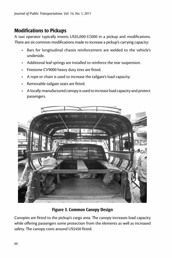
Journal of Public Transportation, Vol. 14, No. 1, 2011
60
Modifications to PickupsA taxi operator typically invests US$5,000-$7,000 in a pickup and modifications. There are six common modifications made to increase a pickup’s carrying capacity:
Bars for longitudinal chassis reinforcement are welded to the vehicle’s •underside.
Additional leaf-springs are installed to reinforce the rear suspension.•
Firestone CV9000 heavy duty tires are fitted.•
A rope or chain is used to increase the tailgate’s load capacity. •
Removable tailgate seats are fitted.•
A locally-manufactured canopy is used to increase load capacity and protect •passengers.
Figure 3. Common Canopy Design
Canopies are fitted to the pickup’s cargo area. The canopy increases load capacity while offering passengers some protection from the elements as well as increased safety. The canopy costs around US$450 fitted.

Pickup Modifications for Rural Transport Services in Cambodia
61
Figure 4. Removable Seats Attach to the Tailgate
These seats accommodate four additional passengers but are nominally prohibited. There is no discernible media support for the ban (see Figure 2), and passengers pay the same price for a fixed or removable seat. There are no known incidents of passengers falling from removable seats.
Research MethodThese data emerged incidentally from a safety review of canopy use in Cambodia. A survey was undertaken of 100 adult passengers at three Kandal province ferry crossings (see Figure 5) located 25km north northeast of Phnom Penh at Preaek Ta Meak (N=42), Svay Ath (N=17) and Ruessei Chrouy (N=41). Passengers were traveling routes along National Highway 6A between Phnom Penh and the eastern provinces of Kampong Cham, Prey Veng, and Svay Rieng. The sample distribution at each site was a proportional random selection of daily traffic estimated by ferry staff. The sample group for the structured-interview questionnaires was selected on the basis of convenience, as taxis were required to stop at the Kandal ferry ter-minals. The respondent selection was randomized by selecting the adult passenger seated in the middle of the row closest to the interviewer’s approach. The passen-
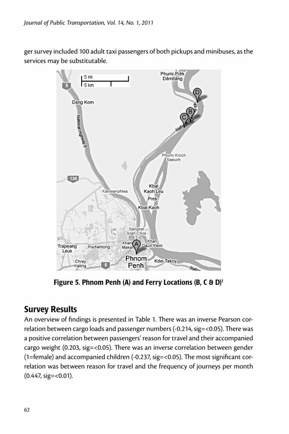
Journal of Public Transportation, Vol. 14, No. 1, 2011
62
ger survey included 100 adult taxi passengers of both pickups and minibuses, as the services may be substitutable.
Figure 5. Phnom Penh (A) and Ferry Locations (B, C & D)1
Survey Results An overview of findings is presented in Table 1. There was an inverse Pearson cor-relation between cargo loads and passenger numbers (-0.214, sig=<0.05). There was a positive correlation between passengers’ reason for travel and their accompanied cargo weight (0.203, sig=<0.05). There was an inverse correlation between gender (1=female) and accompanied children (-0.237, sig=<0.05). The most significant cor-relation was between reason for travel and the frequency of journeys per month (0.447, sig=<0.01).
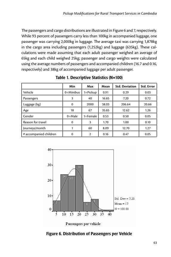
Pickup Modifications for Rural Transport Services in Cambodia
63
The passengers and cargo distributions are illustrated in Figure 6 and 7, respectively. While 93 percent of passengers carry less than 100kg in accompanied luggage, one passenger was carrying 2,000kg in luggage. The average taxi was carrying 1,878kg in the cargo area including passengers (1,252kg) and luggage (635kg). These cal-culations were made assuming that each adult passenger weighed an average of 65kg and each child weighed 25kg; passenger and cargo weights were calculated using the average numbers of passengers and accompanied children (16.7 and 0.16, respectively) and 38kg of accompanied luggage per adult passenger.
Table 1. Descriptive Statistics (N=100)
Min Max Mean Std. Deviation Std. Error
Vehicle 0=Minibus 1=Pickup 0.91 0.29 0.03
Passengers 3 40 16.65 7.20 0.72
Luggage (kg) 0 2000 38.03 206.64 20.66
Age 18 67 35.65 12.62 1.26
Gender 0=Male 1=Female 0.53 0.50 0.05
Reason for travel 0 3 1.70 1.00 0.10
Journeys/month 1 60 8.09 12.70 1.27
# accompanied children 0 2 0.16 0.47 0.05
Figure 6. Distribution of Passengers per Vehicle

Journal of Public Transportation, Vol. 14, No. 1, 2011
64
Figure 7. Distribution of Cargo per Vehicle
Each passenger’s reason for travel was classified into one of four categories: eco-nomic, such as “to sell things at market”; health, such as ”coming back from the hospital”; social, such as traveling “to the pagoda to perform a ritual”; and not clas-sified, where the response was, in every case,“returning home” (seeTable 2). The 30 economic travelers were actively engaged in commercial activities such as capital acquisitions (“to buy fishery equipment”) and wholesale trade (”to buy thing for selling at the market” or ”taking things to sell at market”). Some travel reasons were marginally economic but have been assigned to one of the other categories. For instance, passengers traveling “to buy medicines for personal use” have been classified as health. Table 2 includes the frequency of travel by tertiles of journeys per month. The most frequent third of travelers took more than five journeys per month, while the least frequent travelers averaged fewer than three.
While 42 percent of passengers were traveling for social reasons, they represent only 20 percent of the market, as they make fewer journeys (Table 3). The higher journey frequency of economic travelers means they represent 66 percent of the market. Comparing reason for travel with respondent luggage weight, economic travelers’ luggage is 2.5 times the average weight. This is important: economic trav-elers represent 66 percent of journeys and carry 77 percent of the luggage weight. They are the most important part of the market, and 97 percent of these passen-gers prefer to travel by pickup rather than minibus.

Pickup Modifications for Rural Transport Services in Cambodia
65
Table 2. Passenger Numbers and Luggage Weight by Frequency of Journeys per Month and Reason for Travel
NMean
Passengers Luggage (Kg)
Reason for travel
Social 42 17.21 8.67
Not classified 19 16.58 26.21
Economic 30 16.10 98.00
Health 9 16.00 0.11
Tertiles of journeys/month
Most (>5) 36 16.61 85.69
Mid (4-5) 19 17.32 16.32
Least (<3) 45 16.40 9.07
Table 3. Luggage Weights and Monthly Travel Frequency by Reason for Travel
Reason for Travel N
Travel Frequency (per month) Luggage weight (kg)
Mean Sum % of Sum Mean Sum % of Sum
Social 42 4 167 20.6 8.7 364 9.6
Economic 30 17.9 537 66.4 98.0 2940 77.3
Health 9 2.8 25 3.1 0.1 1 0.0
Not classified 19 4.2 80 9.9 26.2 498 13.1
Total 100 8 809 100 38 3,803 100.0
ConclusionThis research provides further evidence of the important role pickup trucks play in facilitating transport and economic activity in rural areas. Most notably, pas-sengers traveling for economic reasons constitute 66 percent of the market and accompany 77 percent of the cargo load. More importantly, this paper documents the technical modifications made to pickups so they can carry additional passen-gers and cargo. Rural public transport in Cambodia is benefiting from a capacity improvement by using cargo canopies and removable tailgate seats on pickup trucks. These modifications enable taxis to transport an average of 17 passengers plus a 635kg cargo load.
Given the important results, further research is required. A study with a larger sample should be undertaken and should be designed with the express objective
Journal of Public Transportation, Vol. 14, No. 1, 2011
66
of identifying trends in cargo and passenger transport with and without cargo canopies and by various vehicle types. A longitudinal study that examines changes over time and includes vehicle weights would yield data better able to inform transport policy makers. Comparative research in other jurisdictions also needs to be undertaken.
This paper also raises important safety implications for policy makers. By increasing the load capacity of the pickup at a higher center of gravity, the canopy and vehicle modifications reduce the stability and handling of the vehicle. To what extent this detracts from the canopy’s protection of cargo-space occupants is very important, but unknown. Consequently, a high priority for further research is the real-world crash effectiveness of the canopy; more needs to be known about passenger inju-ries and the circumstances in which the most serious occur. Even with a canopy, injuries resulting from shifting cargo (Williams and Goins 1981), impact with the interior of the cargo area (Anderson et al. 2000), or the canopy becoming detached (Children’s Safety Network 2005) could be expected. Ultimately, as Agran et al. (1994) warned, “there is no safe, crash-tested means of travel in the cargo areas of pickup trucks.”
Acknowledgements
Thanks to two anonymous reviewers for their suggested improvements; Ian John-ston, David Logan, and Bruce Corben of the Monash University Accident Research Centre; David Chandler of the Monash Asia Institute; the Monash Research Gradu-ate School; the staff and crew of the Kandal ferries; Uy Sareth and Kim Pagna of the Coalition for Road Safety; and the staff of the Commissariat General of National Police, Department of Land Transport, Department of Rural Roads, and Handicap International Belgium. This paper was prepared with the assistance of a Postgradu-ate Publications Award from the Monash Research Graduate School.
Endnotes1 The ferries are situated at +11° 44' 40.49", +104° 59' 29.04" (N 11.74458 E 104.99140), 23.1 km NxNE of Phnom Penh; +11° 45' 10.91", +105° 0' 3.13" (N 11.75303 E 105.00087), 24.4 km NxNE of Phnom Penh; and +11° 46' 58.33", +105° 0' 44.75" (N 11.78287 E 105.01243), 27.9 km NxNE of Phnom Penh. A satellite map has been prepared at http://mapper.acme.com/?ll=11.69460,104.96784&z=11&t=H&marker0=11.55000%2C104.91669%2CPhnom%20Penh&marker1=11.75303%2C105.00087

Pickup Modifications for Rural Transport Services in Cambodia
67
%2C24.4%20km%20NxNE%20of%20Phnom%20Penh&marker2=11.78287%2C105.01243%2C27.9%20km%20NxNE%20of%20Phnom%20Penh&marker3=11.74458%2C104.99140%2C23.1%20km%20NxNE%20of%20Phnom%20Penh
References
AFP. 2008. Drivers beware at New Years. Phnom Penh Post, 4 April.
Agran, P., D. Winn, and C. Anderson. 1994. Injuries to occupants in cargo areas of pickup trucks. Western Journal of Medicine 161(5): 479-482.
Anderson, C. L., P. F. Agran, D. G. Winn, and S. Greenland. 2000. Fatalities to occu-pants of cargo areas of pickup trucks. Accident Analysis & Prevention 32(4): 533-40.
Children’s Safety Network. 2005. Youth Riding in Pickup Truck Cargo Areas. New-ton: Children’s Safety Network.
CIPP (Committee on Injury and Poison Prevention). 2000. Children in pickup trucks. Pediatrics 106(4): 857-859.
Hawkes, E. 2005. Open Load Space Project. Perth: Office of Road Safety, Depart-ment of Premier and Cabinet.
HIB (Handicap International Belgium). 2007. Cambodia Road Traffic Accident and Victim Information System: Monthly Report, March 2007. Phnom Penh: Handi-cap International Belgium.
Koh Santepheap. 2006a. Broken neck, death in fall from roof of 12-seat taxi: 8 injured. Koh Santepheap, 13 August, 9.
Koh Santepheap. 2006b. Taxi has flat tyre and overturns: 1 killed and 9 injured. Koh Santepheap, 23 June, 1, 7.
Macaulay, J., R. Thomas, N. Mabbot, T. Styles, C. Edmonston, M. Sheehan, and C. Schonfeld. 2003. Australian Indigenous Road Safety. Melbourne: ARRB.
Nelson, D. C., and J. V. Strueber. 1991. The effect of open-back vehicles on casualty rates: the case of Papua New Guinea. Accident Analysis & Prevention 23(2-3): 109-17.
NTRS (Northern Territory Road Safety Taskforce). 2006. Safer Road Use: A Territory Imperative. Darwin: Northern Territory Government.
Journal of Public Transportation, Vol. 14, No. 1, 2011
68
Rozemuller, B., P. Thou, and S. Yan. 2002. Rural Transporters: A Survey of Transport Businesses in Rural Cambodia. Technical Assistance to the Labour-Based Rural Infrastructure Works Programme reports, No. CMB/97M02/SID. Phnom Penh: Ministry of Rural Development/International Labour Organisation.
Starkey, P., S. Ellis, J. Hine, and A. Ternell. 2002. Improving rural mobility: options for developing motorized and nonmotorized transport in rural areas. World Bank Technical Papers, No. 525. Washington: World Bank.
Williams, A. F., and S. E. Goins. 1981. Fatal falls and jumps from motor vehicles. American Journal of Public Health 71(3): 275–279.
World Bank. 2007. Overview. World Bank 2007 [cited 24 October 2007]. Available from http://go.worldbank.org/BTXYYERF51.
World Bank. 2009. World Development Indicators 2008. Washington: World Bank.
Neak Chea. 2006. The wrong way/Correct. Neak Chea 8, 30.
Young, E. A. 1995. Third World in the First: Development and Indigenous Peoples. London: Routledge.
About the Author
Matthew Ericson ([email protected]) recently submitted his PhD at the Monash University Accident Research Centre (MUARC). He holds Bachelor of Economics (Honours) and Master of Public Policy (Honours) degrees from the University of Sydney. His primary research interest is in road transport safety.

69
An Examination of the Quality and Ease of Public Transport in Dublin
An Examination of the Quality and Ease of Use of Public Transport
in Dublin from a Newcomer’s Perspective
James Kinsella and Brian Caulfield Trinity College, Dublin, Ireland
Abstract
This paper examines the opinions of newcomers and visitors to the public transpor-tation system in Dublin. The motivations for this research were twofold. First, tour-ism is very important to the Irish economy and, as such, it is important that visitors to Dublin can use the public transport system. Second, by asking visitors what the think of the public transport system available in comparison to the system they use in their home country, their responses can help planners learn about the areas for improvement in the current system in Dublin. The paper reports the findings of a survey conducted in Dublin asking respondents how they perceived the public trans-port system compared to the system they use in their home country. The results of this show that visitors or newcomers to a city are less concerned with the traditional aspects of public transport service quality and, instead, are more concerned with information and reliability.
Introduction Public transportation for Dublin plays an important role in achieving a sustainable, efficient, attractive tourist destination. Ireland had approximately 8 million over-
Journal of Public Transportation, Vol. 14, No. 1, 2011
70
seas visitors in 2007 (CSO, 2008). Over half of all trips were for holiday purposes. Earnings from these visitors were $6,479m in 2007. Dublin was the most popular region for holiday makers in 2007, with 61 percent of visitors spending at least one night in the region (CSO 2008).
The importance of providing adequate, high quality and attractive transport to newcomers in any city is obvious. It supports the growth of a competitive and sustainable tourism industry, enhancing its contribution to national economic and social goals. According to the Irish Department of Transport, a good public trans-port network introduces Dublin as an attractive holiday destination, providing tourists with access to all of Dublin’s amenities and recreational facilities. In addi-tion, public transportation provides people with mobility and access to employ-ment, community resources, medical care, and recreational opportunities. While many newcomers use public transport in Dublin, there are many who do not use it to its full potential. There are several reasons for this. The conventional factors are time and money (Wardman and Waters 2001). However, there are many more fac-tors. The complex question of how and when newcomers use, or do not use, public transport has not been identified in its entirety.
Thompson et al. (2007) states that tourist satisfaction with public transport has been neglected by transport service providers. The authors (2007) also found that the cost of public transport in Manchester is the main barrier to overseas visitors’ use. The most important attributes of public transport satisfaction, such as punc-tuality and speed, are rated lower on the basis or performance than less important attributes such as cleanliness of vehicles. In the case of overseas visitors’ attitudes toward public transport in Greater Manchester, ticket cost was found to have the greatest gap between importance and performance.
Dziekan (2008) found that knowledge of a new transport system depends on experiences of other cities or hometowns. If one had previously learned how the public transport system in a metropolitan area operates, learning a new (similar structured) system was much easier. When visiting a new city, tourists are over-loaded with new information, and their ability to retain new information on public transport systems may be limited. According to Miller (1956), individuals can store seven plus or minus two items in working memory. Anderson (1995) states that four or five items can be stored in the visual image memory. Therefore, it is impera-tive to ensure that visitors are presented with an attractive, easy-to-use, and highly visible public transport system. The results presented in Dziekan (2008) support

71
An Examination of the Quality and Ease of Public Transport in Dublin
this assumption and also that public transportation lines that are more visible in the urban areas are easier to retrieve from memory.
Bamberg (2006) conducted a study using the theory of planned behavior on indi-viduals that had recently moved to Stuttgart. In the study, participants were given a free public transport pass and personalized travel information. The purpose of this intervention was to encourage newcomers to Stuttgart to use sustainable modes of transport. Bamberg’s findings show that when the right support is provided, attracting a newcomer to a city as a public transport user is easier than breaking the habits of residents. This is due to the situational circumstances. Business trav-elers and tourists often arrive without a car and are not dedicated to a particular transport mode. In addition, newcomers to a city also are forced to think over their mobility options.
The literature has shown that newcomers to a city rely heavily on information when making their public transport decisions. This research focuses on the provi-sion of this information to understand how important providing information is to newcomers in Dublin and how providing the appropriate information can improve the overall transport experience.
Results and Data Collection This section presents the results of the survey undertaken to ascertain what factors impact newcomers’ perceptions of a public transport system. Another objective of this research is to examine the impact that newly-designed maps and timetables would have on the public transport experience for newcomers to Dublin city. The first subsection presents the details of the survey sample; the second subsection presents the results of the importance performance analysis. The third subsection details the respondents’ opinions regarding the ease of use of the public transport system and the fourth subsection compares the public transport system in Dublin to other European public transport systems in terms of ease of use. The final set of results presented examines the respondents’ perceptions of the different public transport maps in use in Dublin.
Data Collection and Sample Characteristics An online survey was sent to a number of non-Irish visiting students to a univer-sity in Dublin. The survey was conducted in February 2009, and respondents were given a week to complete the survey. The entire questionnaire took approximately 10 minutes to complete. The sample required for this study was that of visitors to

Journal of Public Transportation, Vol. 14, No. 1, 2011
72
Dublin City. A random sample of visiting students was used for the sample. The survey resulted in 80 responses. To benchmark the results of the primary survey, 25 Irish respondents were surveyed. A smaller sample of Irish students was randomly selected from the same student population used to select the sample of new-comers. The results of the Irish respondents were compared to the results of the newcomers to ascertain differences in individuals’ opinions of the public transport system.
Table 1 contains the main characteristics of the newcomers and the local respon-dents. The first characteristic presented is gender. The results show that 58 percent of newcomers and 52 percent of local respondents were male. This indicates a relatively balanced gender mix in both groups. The second set of characteristics examines the area the respondent lived in prior to moving to Dublin. The results show that 42 percent of newcomers said they lived in an urban area before moving to Dublin. Of the local respondents, 60 percent said they lived in an urban area and 40 percent said they lived in a suburban area. The final characteristics examined in Table 1 relate to the age of the respondent. The results for bot sections show a relatively similar age profile with the majority of respondents are aged 19-24.
Table 1. Sample Characteristics
Newcomer Respondents
Local Respondents
GenderMale 58% 52%
Female 42% 48%
How would you describe where you live (home country)?
Urban 42% 60%
Suburban 53% 40%
Rural 5% -
Age
Under 18 5% 4%
19-24 47% 50%
25-34 42% 41%
35-44 2% 5%
45 + 5% -
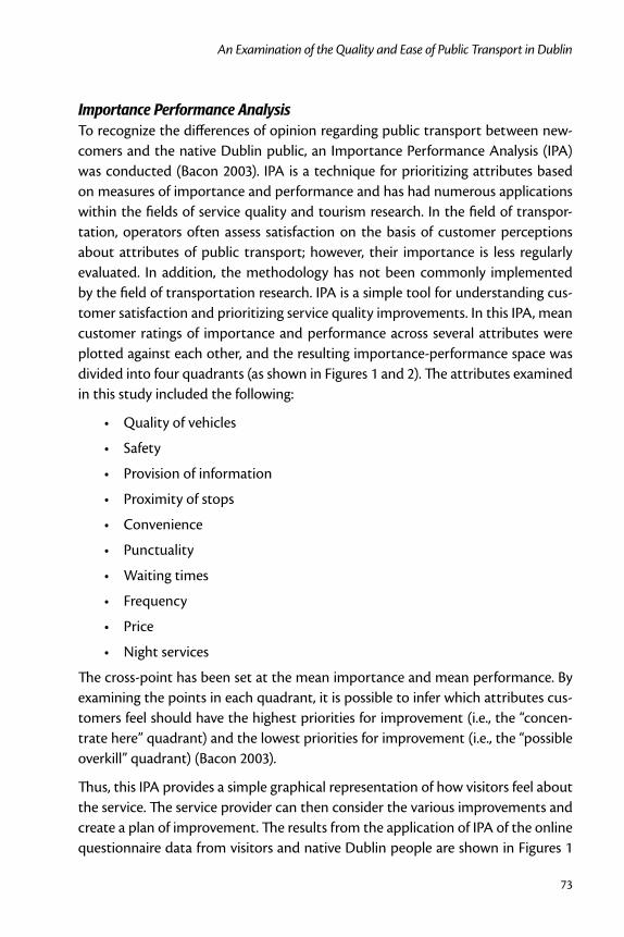
73
An Examination of the Quality and Ease of Public Transport in Dublin
Importance Performance AnalysisTo recognize the differences of opinion regarding public transport between new-comers and the native Dublin public, an Importance Performance Analysis (IPA) was conducted (Bacon 2003). IPA is a technique for prioritizing attributes based on measures of importance and performance and has had numerous applications within the fields of service quality and tourism research. In the field of transpor-tation, operators often assess satisfaction on the basis of customer perceptions about attributes of public transport; however, their importance is less regularly evaluated. In addition, the methodology has not been commonly implemented by the field of transportation research. IPA is a simple tool for understanding cus-tomer satisfaction and prioritizing service quality improvements. In this IPA, mean customer ratings of importance and performance across several attributes were plotted against each other, and the resulting importance-performance space was divided into four quadrants (as shown in Figures 1 and 2). The attributes examined in this study included the following:
Quality of vehicles •
Safety •
Provision of information •
Proximity of stops •
Convenience •
Punctuality •
Waiting times •
Frequency •
Price •
Night services•
The cross-point has been set at the mean importance and mean performance. By examining the points in each quadrant, it is possible to infer which attributes cus-tomers feel should have the highest priorities for improvement (i.e., the “concen-trate here” quadrant) and the lowest priorities for improvement (i.e., the “possible overkill” quadrant) (Bacon 2003).
Thus, this IPA provides a simple graphical representation of how visitors feel about the service. The service provider can then consider the various improvements and create a plan of improvement. The results from the application of IPA of the online questionnaire data from visitors and native Dublin people are shown in Figures 1
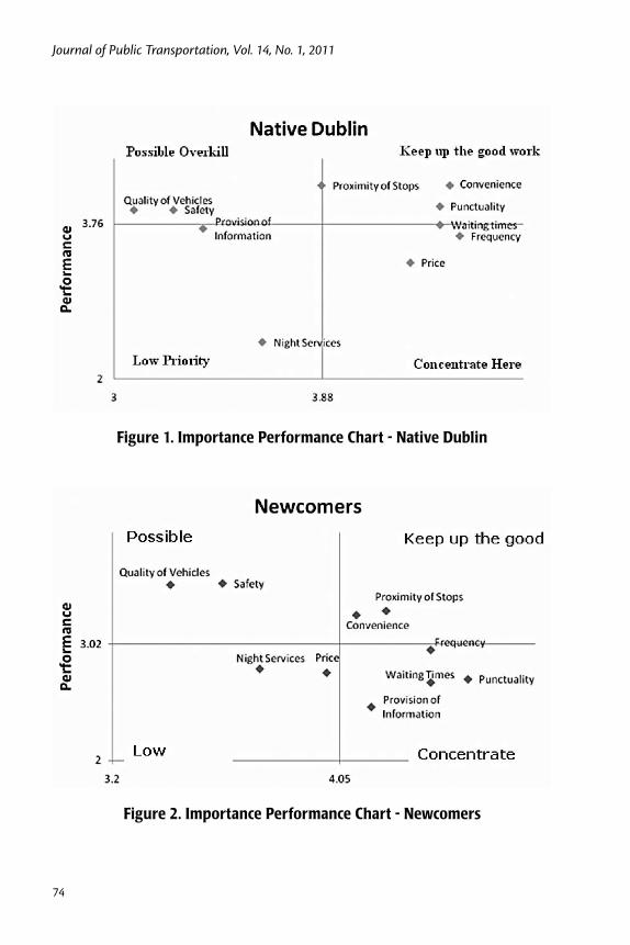
Journal of Public Transportation, Vol. 14, No. 1, 2011
74
Figure 1. Importance Performance Chart - Native Dublin
Figure 2. Importance Performance Chart - Newcomers

75
An Examination of the Quality and Ease of Public Transport in Dublin
and 2. Drawing on the findings of the survey of attitudes towards public transport in Dublin, the analysis identifies the attributes of greatest importance and their perceived level of performance. Newcomers believed punctuality, frequency, wait-ing times, and provision of information to be of great importance but rated quality of vehicles and safety less important.
According to the newcomers, the most important attributes of punctuality, fre-quency and waiting times (reliability) and the provision of public transport infor-mation are rated lower on the scale of performance and, consequently, appear in the “concentrate here” quadrant. The least important attributes such as quality of vehicles and safety were rated higher on the scale of performance and appear in the “possible overkill” quadrant. To compare newcomers needs to those of regular users, a small sample of 25 native Dubliners was analysed using the same approach. The native Dublin public also rated punctuality, frequency, and waiting times of great importance. In addition, they rated price and convenience of high impor-tance. On the performance scale, the native Dublin public rated night services and price and as poor.
Measuring Ease of Use The research conducted on the ease of use of public transport has developed several concepts to define and measure ease of use. For the purposes of this paper, it was found that in addition to saving time and money, newcomers want to save effort before (pre-planning) and when using public transport. Straddling (2002) defines three types of effort:
Physical Effort• - the physical activity on a journey.
Cognitive Effort• - effort expended on a journey by means of information gathering and having to process the information for route planning, naviga-tion, and re-orientation.
Affective Effort• - the emotional energy expended on a journey in dealing with uncertainties regarding safety and delays.
In addition, it is known from service research that a product recommended to others tends to be of relatively high quality. Reichheld (2003) suggested using a recommendation question to measure customer satisfaction. For the purposes of this paper, the product is equated to a public transport service.
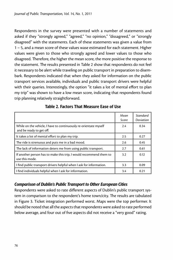
Journal of Public Transportation, Vol. 14, No. 1, 2011
76
Respondents in the survey were presented with a number of statements and asked if they “strongly agreed,” “agreed,” “no opinion,” “dissagreed,” or “strongly disagreed” with the statements. Each of these statements was given a value from 1 – 5, and a mean score of these values wase estimated for each statement. Higher values were given to those who strongly agreed and lower values to those who disagreed. Therefore, the higher the mean score, the more positive the response to the statement. The results presented in Table 2 show that respondents do not feel it necessary to be alert while traveling on public transport in preparation to disem-bark. Respondents indicated that when they asked for information on the public transport services available, individuals and public transport drivers were helpful with their queries. Interestingly, the option “it takes a lot of mental effort to plan my trip” was shown to have a low mean score, indicating that respondents found trip planning relatively straightforward.
Table 2. Factors That Measure Ease of Use
Mean Score
Standard Deviation
While on the vehicle, I have to continuously re-orientate myself and be ready to get off.
2.4 0.34
It takes a lot of mental effort to plan my trip. 2.5 0.27
The ride is strenuous and puts me in a bad mood. 2.6 0.45
The lack of information deters me from using public transport. 2.7 0.61
If another person has to make this trip, I would recommend them to use this mode.
3.2 0.12
I find public transport drivers helpful when I ask for information. 3.3 0.09
I find individuals helpful when I ask for information. 3.4 0.21
Comparison of Dublin’s Public Transport to Other European CitiesRespondents were asked to rate different aspects of Dublin’s public transport sys-tem in comparison to the respondent’s home town/city. The results are tabulated in Figure 3. Ticket integration performed worst. Maps were the top performer. It should be noted that all the aspects that respondents were asked to rate performed below average, and four out of five aspects did not receive a “very good” rating.
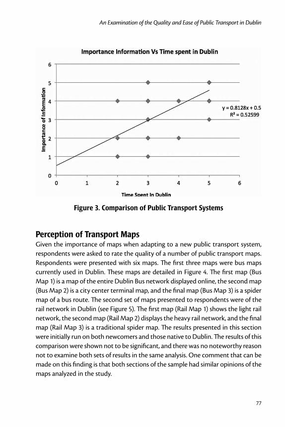
77
An Examination of the Quality and Ease of Public Transport in Dublin
Figure 3. Comparison of Public Transport Systems
Perception of Transport Maps Given the importance of maps when adapting to a new public transport system, respondents were asked to rate the quality of a number of public transport maps. Respondents were presented with six maps. The first three maps were bus maps currently used in Dublin. These maps are detailed in Figure 4. The first map (Bus Map 1) is a map of the entire Dublin Bus network displayed online, the second map (Bus Map 2) is a city center terminal map, and the final map (Bus Map 3) is a spider map of a bus route. The second set of maps presented to respondents were of the rail network in Dublin (see Figure 5). The first map (Rail Map 1) shows the light rail network, the second map (Rail Map 2) displays the heavy rail network, and the final map (Rail Map 3) is a traditional spider map. The results presented in this section were initially run on both newcomers and those native to Dublin. The results of this comparison were shown not to be significant, and there was no noteworthy reason not to examine both sets of results in the same analysis. One comment that can be made on this finding is that both sections of the sample had similar opinions of the maps analyzed in the study.

Journal of Public Transportation, Vol. 14, No. 1, 2011
78
Figure 4. Bus Maps
Figure 5. Rail Maps
Figure 6 shows the results of the interpretation of the maps presented to respon-dents. A total of 35 percent of respondents stated that the Dublin Bus City Termi-nal Map was “very bad,” with 33 percent stating the same for Dublin Bus Routes Map. The generic spider map performed the best, with the Luas map placing second. The spider map is a schematic cartographic product generalising all bus

79
An Examination of the Quality and Ease of Public Transport in Dublin
routes serving a hub. The schematic diagram is based on the design of the world famous London Underground Map. According to Transport for London, the popu-larity of the product has led to the creation of over 900 spider maps spread across the Greater London Area. The color coding of the map makes it easy to distinguish different routes, which allow for quicker orientation. At the moment, Dublin’s Luas (light rail) is fairly a simple network, with just two lines operating, but this system has the potential to become more complex with the introduction of more lines. Based on the results presented in Figure 6, a spider map appears to be the most appropriate format if further lines are to be introduced. The results show that pas-sengers found the current provision of maps in Dublin inadequate, especially the Dublin Bus Routes Map and Dublin Bus City Terminal Map, based upon the results presented in Figure 6.
Figure 6. Perception of the Quality of Public Transport Maps
Discussion and Conclusions This study shows that public transport providers cannot assume that the needs of newcomers to Dublin are the same as the needs of the native Dublin public. Results from this study and other literature illustrate that newcomers place less importance on traditional aspects of public transport such as quality and safety of
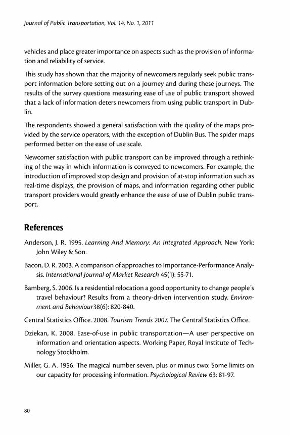
Journal of Public Transportation, Vol. 14, No. 1, 2011
80
vehicles and place greater importance on aspects such as the provision of informa-tion and reliability of service.
This study has shown that the majority of newcomers regularly seek public trans-port information before setting out on a journey and during these journeys. The results of the survey questions measuring ease of use of public transport showed that a lack of information deters newcomers from using public transport in Dub-lin.
The respondents showed a general satisfaction with the quality of the maps pro-vided by the service operators, with the exception of Dublin Bus. The spider maps performed better on the ease of use scale.
Newcomer satisfaction with public transport can be improved through a rethink-ing of the way in which information is conveyed to newcomers. For example, the introduction of improved stop design and provision of at-stop information such as real-time displays, the provision of maps, and information regarding other public transport providers would greatly enhance the ease of use of Dublin public trans-port.
References
Anderson, J. R. 1995. Learning And Memory: An Integrated Approach. New York: John Wiley & Son.
Bacon, D. R. 2003. A comparison of approaches to Importance-Performance Analy-sis. International Journal of Market Research 45(1): 55-71.
Bamberg, S. 2006. Is a residential relocation a good opportunity to change people s travel behaviour? Results from a theory-driven intervention study. Environ-ment and Behaviour38(6): 820-840.
Central Statistics Office. 2008. Tourism Trends 2007. The Central Statistics Office.
Dziekan, K. 2008. Ease-of-use in public transportation—A user perspective on information and orientation aspects. Working Paper, Royal Institute of Tech-nology Stockholm.
Miller, G. A. 1956. The magical number seven, plus or minus two: Some limits on our capacity for processing information. Psychological Review 63: 81-97.

81
An Examination of the Quality and Ease of Public Transport in Dublin
Reichheld, F. 2003. The one number you need to grow. Harvard Business Review, December.
Stradling, S. G. 2002. Transport user needs and marketing public transport. Munici-pal Engineer, Proceedings of the Institution of Civil Engineers 151: 23-28.
Thomson, D. J, M. Gylseth, R. McGarry, and C. V. Garcia. 2007. The VVIP System: Encouraging the use of public transport in Edinburgh. Conference on Human Factors in Computing Systems.
Wardman, M., and W. G. Waters. Advances in the valuation of travel time savings. Transportation Research Part E: Logistics and Transportation Review 37(5): 85-90.
About the Authors
Brian Caulfield ([email protected]) is a lecturer in Civil Engineering in the Department of Civil, Structural, and Environmental Engineering in Trinity College Dublin. He has published and has interests in public transport services, stated pref-erence modeling, environmental impacts of transport, and road safety.
James Kinsella ([email protected]) is a graduate in Civil Engineering from Trinity College Dublin.

Journal of Public Transportation, Vol. 14, No. 1, 2011
82

Open Government Data and Public Transportation
83
Open Government Data and Public Transportation
Kenneth Kuhn, University of Canterbury
Abstract
Governments are increasingly making public transportation data available to the public on the Internet. The data can be used to explore and characterize current and historical service levels or to forecast operations in the immediate future. This paper considers, as an example, real-time bus location data provided by the San Francisco Municipal Transit Agency. General techniques for making use of such data to benefit both providers and users of public transportation are described. There is a brief discussion of why the advantages of making data available often outweigh the disadvantages.
IntroductionMany governments are increasing opportunities for the general public to access government data over the Internet. One of the most famous examples is the www.data.gov Web site, set up by the national government of the United States to allow users to “easily find, download, and use datasets generated by the Federal govern-ment” (www.data.gov/about). The www.data.govt.nz and www.datasf.org Web sites link to datasets from the governments of the nation of New Zealand and the City and County of San Francisco, respectively. Several of the data sets made avail-able recently relate to public transportation.
Google Transit allows the public to access transit route and schedule data hun-dreds of cities worldwide have provided through either the maps.google.com or www.google.com/transit Web sites. The Web sites provide directions on how to

Journal of Public Transportation, Vol. 14, No. 1, 2011
84
take transit to complete a trip based on desired origin, destination, and either time of arrival or time of departure. Directions are typically viewed on a Google Maps interface familiar to most. The interface allows for fast and simple map panning and zooming, while at a higher level ensuring maps are reproducible and can be embedded into other Web pages. The display can be customized to reflect the device used to access the transit data and the preferred language of the user. Tran-sit route and schedule data are provided to the public in a common format, making it relatively easy for those interested to download, understand, and manipulate the data behind Google Transit. In particular, it is relatively simple to make and then explore maps showing transit routes alongside one of the many other available data sets formatted for use within Google Maps. This can be done by those with a casual interest in public transportation service analyses or by developers inter-ested in creating a commercial application based on the available data. All of this is accomplished with public agencies responsible only for the initial step of providing route and schedule data in the established format.
The Bay Area Rapid Transit system in the San Francisco Bay Area and the TriMet public transportation system in the Portland, Oregon, area make predictions of vehicle arrival times at stops available online. The San Francisco Municipal Transit Agency (SF MUNI) recently made such predictions available, along with the real-time locations of transit vehicles. The data are discussed in more detail in later sections of this paper and on Web sites accessible from www.datasf.org. The open, online posting of forecast and especially real-time vehicle location data will lead to a variety of applications involving analyzing historical or real-time transit service levels, as well as forecasting future operations.
This paper considers bus location data from San Francisco and suggests, by way of example, some ways in which the data could be processed to provide useful information. The following section describes the data, focusing on data collection and initial processing steps that will be important for a variety of applications. The next section focuses on analyzing historical or real-time service levels. Discussion regarding forecasting future operations follows. A brief subsequent section argues that the benefits of posting public transportation data, even real-time vehicle loca-tion data, on the Internet likely outweigh the costs.

Open Government Data and Public Transportation
85
Example Data and Pre-ProcessingThis section describes the collection and initial processing of example data from SF MUNI. San Francisco, like many cities, has collected information on the real-time positions of its transit vehicles for a number of years using an automatic vehicle location (AVL) system. There has been a great deal of interest in the transporta-tion engineering research community regarding the use of AVL data, especially for predicting vehicle arrival and departure times at stops. For example, Maclean and Dailey (2002) report on the construction of one system that provides predictions of transit vehicle stop departure times to potential riders with mobile phones. Shalaby and Farhan (2004) describe another system that uses AVL and passenger count data to forecast stop arrival times for both potential customers as well as those controlling the public transportation system.
Recently, San Francisco began to allow anyone with an Internet connection to load Web pages that contain data describing, for each transit vehicle on a user-specified SF MUNI route, an identification tag referred to as a BusID, the latest recorded posi-tion of the vehicle by latitude and longitude (lat/lon), and a timestamp indicating when the lat/lon data were collected. To inform the following discussion of the issues associated with open transit data, data regarding the SF MUNI bus route “1” or “1 – California” available on the Internet were studied. A program was written in the computer programming language Ruby to periodically load Web pages and then save relevant data (i.e., to scrape data off the Internet) for subsequent analy-sis. The collected data contained the positions of the buses in operation on the SF MUNI 1 – California route every minute for three weeks in February 2010.
An immediately noticeable flaw in the data posted by SF MUNI is that provided lat/lon coordinates are often some distance away from the transit route specified. AVL systems typically identify the positions of transit vehicles via radio triangula-tion, often using global positioning system (GPS) satellites. In urban environments, radio waves reflect off buildings and other objects, introducing error in position estimation. Ochieng and Sauer (2002) report that in a trial in downtown London, roughly 30 percent of reported GPS fixes were not within 10 meters of true loca-tions. Another concern is that AVL systems may incorrectly identify which buses are on which routes, due to hardware, software, or human error. This issue will be discussed further subsequently. Finally, drivers do not always follow anticipated routes, for instance, when maintenance work closes a portion of road on a bus route.

Journal of Public Transportation, Vol. 14, No. 1, 2011
86
For several of the foreseeable uses of transit vehicle location data, it makes sense to pre-process available data, replacing reported lat/lon pairs with likely positions on the route of interest and discarding data points that refer to buses that are likely not on the route of interest. Pre-processing of this sort may provide a more realistic picture of actual transit vehicle locations on the route of interest. Ideally pre-processing would be based on controlled studies comparing actual positions of transit vehicles with data posted on the Internet. The Kalman filter is often used to refine GPS position estimates, and Cathey and Dailey (2003) have applied it to AVL data in this context, obtaining vehicle speeds and other relevant information in the process.
A simpler method for pre-processing the raw data was used here. Lat/lon data on the real-time locations of buses were compared to each link of the chosen bus route (route data being available on the Internet). The points on the bus route closest to the reported positions were then noted, along with the distances between loca-tion data points and the bus route. The data points furthest from the bus route in question were considered outliers and discarded. The calculations involved finding lines perpendicular to transit route links and took negligible amounts of computa-tion time. It seems reasonable to expect such a method will be used by those with a casual interest in studying public transport operations based on open data.
Figure 1 shows an example of the output of this procedure. In the section of San Francisco shown in Figure 1, the 1 bus route runs on Clay Street towards downtown (at right) but returns on Sacramento Street, a block to the south, away from the downtown area. Small question marks indicate the positions of data points that were among the 15 percent of data points furthest away from the route of the 1. These data points were subsequently removed from the collected data. Triangles indicate the positions of all other data points, and straight lines connect these data points with the route of the 1. The street map, like the bus position data, is available to the general public on the Internet (at www.openstreetmap.org).
After this preprocessing, a series of latitude and longitude pairs all located on the bus route of interest were obtained. It was then possible to reduce these data to normalized, one-dimensional measures of how far along the route different buses were at different times. Following the language of Cathey and Dailey (2003), the one-dimensional measure is labeled “distance-into-trip.”
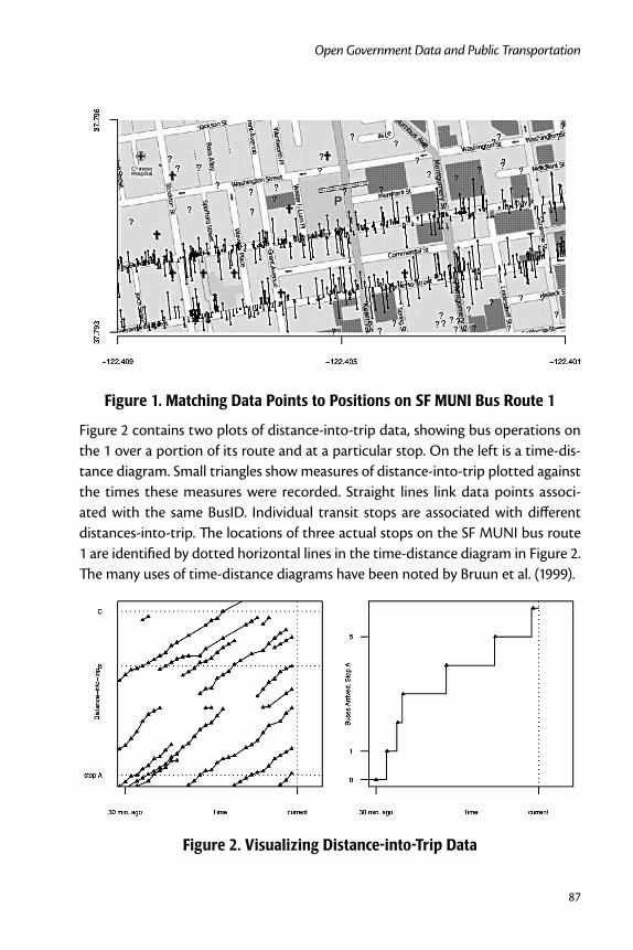
Open Government Data and Public Transportation
87
Figure 1. Matching Data Points to Positions on SF MUNI Bus Route 1
Figure 2 contains two plots of distance-into-trip data, showing bus operations on the 1 over a portion of its route and at a particular stop. On the left is a time-dis-tance diagram. Small triangles show measures of distance-into-trip plotted against the times these measures were recorded. Straight lines link data points associ-ated with the same BusID. Individual transit stops are associated with different distances-into-trip. The locations of three actual stops on the SF MUNI bus route 1 are identified by dotted horizontal lines in the time-distance diagram in Figure 2. The many uses of time-distance diagrams have been noted by Bruun et al. (1999).
Figure 2. Visualizing Distance-into-Trip Data

Journal of Public Transportation, Vol. 14, No. 1, 2011
88
On the right of Figure 2, the data from the time-distance diagram is processed to show how many buses have passed the location of one bus stop as a function of time. The small triangles here mark the times each bus was first actually observed at a location downstream of the selected stop, while the lines link estimated stop arrival times based on the time-distance diagram. The computational burden of the steps required to create graphs of the type shown in Figure 2 is minimal, and such graphs could be created in real-time as data are collected. To make this point, time in Figure 2 is measured in terms of minutes prior to “current” time.
Time-distance diagrams based on the data scraped off the Internet often showed buses appearing and disappearing in the middle of their route. This may reflect errors in the association of buses to routes, or prolonged periods of time when buses were either not reporting location data or reporting data significant dis-tances away from their route. Other times, data points that appeared to track a single vehicle trajectory were associated with multiple BusID tags.
Although posted data are imperfect, plots like those shown in Figure 2 are mean-ingful and relatively easy to create. The forms of both plots are well known in trans-portation engineering. It would be possible for someone with training in this area to scan graphs like those provided and immediately recognize when and where there are problems associated with the actual provided bus service. For instance, if bus bunching were a problem, the time-space diagram would show the trajec-tories of buses in a bunch in close proximity to one another, with large headways on the time axis separating different bunches of trajectories. The characteristic step shape of the graph at the right of Figure 2 would become more irregular, with long headways alternating with sharp jumps up the graph whenever a bunch of buses arrived. If data are available regarding passenger arrival times at transit stops (for instance, data on turnstile movements at subway train stations), it would be relatively simple to compare these data to plots like those at the right in Figure 2 to determine where and when transit passengers were or are waiting for service. Monitoring graphs like those presented in Figure 2 in real-time could aid tactical or operational decision making, while performing analyses of historical data could aid strategic planning. The reader is referred to Bruun et al. (1999) for further discus-sion of the potential of time-distance diagrams in particular.
Analyzing Service LevelsFigure 2 contains estimates of the times transit vehicles arrived at stops based on empirical observations of when the vehicles were last observed traveling towards

Open Government Data and Public Transportation
89
stops and first observed traveling away from stops. Bus arrival times at stops can be used to study the headways between transit vehicles. For instance, Figure 3 shows histograms of the headways at the three stops depicted in Figure 2. Such a figure could be studied to see how frequent and how regular public transport service is at different stops. Figure 3 indicates that service at stop C was somewhat less regular than service at stops A and B. Scheduled headways varied between 3 and 15 minutes during the period when data were collected but were identical across the three stops.
Figure 3. Observed Headways at Three Stops
By linking data points associated with the same identification tag, as in the time-distance diagram in Figure 2, it also becomes possible to study the magnitude and regularity of bus travel times on different sections of the roadway network. Such analyses would prove useful if a public agency, not necessarily the agency managing the public transport system, was considering implementing traffic management initiatives to control transit vehicle or general traffic speeds. Figure 4 contains histograms of the transit times different buses took traversing the two links con-necting the three stops shown in Figure 2.
Figure 4 makes clear that travel times are significantly longer and less consistent on travel between stops A and B, as opposed to between stops B and C. Such data might help convince decision makers to invest in traffic management initiatives on the roadways linking stops A and B. It is worth noting here that recent analysis shows that the variance of the travel time on a trip across multiple sections of a roadway network is grossly underestimated by the sum of link-specific travel time variance estimates (i.e., ignoring covariance terms) (Nicholson et al. 2010). Techni-cal points like this are likely to be overlooked by casual policy analysts, possibly leading to erroneous findings.

Journal of Public Transportation, Vol. 14, No. 1, 2011
90
Figure 4. Observed Travel Times on Two Links
As more local authorities post data on the Internet, it would be possible to com-pare public transportation service at stops or over routes in different cities. Data on the service levels offered by public transportation systems also could be com-pared to other data sets to explore potential correlations. For example, weather data could be used to study how precipitation impacts transit service on different routes or in different cities. Public health, land use, and demographic data already support a wide range of interesting studies. For instance, one work by Yi et al. (2008) describes how maps of cancer incidence and age-adjusted mortality rates can be created quickly, easily, and for free using open government data and open-source mapping tools. There are numerous studies that could be done comparing public health, land use, and demographic data to public transportation data. The online publication of real-time transit vehicle location data will allow such studies to explore actual, rather than scheduled, transit service. As more open government data are created, the possibilities for further research expand combinatorially.
Forecasting Future OperationsSome of the most interesting applications of open public transportation data involve predicting vehicle arrival and departure times at stops or otherwise fore-casting future operations. As was mentioned previously, significant research effort has been directed towards establishing techniques for generating and displaying predictions of arrival and departure times for buses. To inform discussion, this section will describe two methods to forecast the times particular buses take to traverse the portion of the route of the SF MUNI 1 – California line between stops A and C shown in Figure 2.

Open Government Data and Public Transportation
91
An example of a naïve approach to forecasting would be to predict that the travel time of a bus on a particular portion of its route will match the travel time of the last bus to have traversed the same portion of the route. Slightly better results would likely result if a few recent travel times were considered and averaged, pos-sibly weighted according to how long ago they were recorded. An alternate naïve approach would be to predict the travel time using the travel time recorded at the same time-of-day on a similar day. Again, multiple data points, related by time-of-day, could be studied to improve results. Combining the two approaches described above would allow for consideration of seasonality (time-of-day dependence) as well as more localized variations in traffic conditions. One framework generalizing the naïve approaches described above is the k-Nearest Neighbour (kNN) method. This method will be described and used here, based on previous research employ-ing the technique for traffic flow forecasting (Smith et al. 2002).
Whenever an estimate of travel time is requested, information would be provided on the current state of the bus and the bus route. Such information would include current time-of-day and day of the week. Such information also could include data such as prevailing weather conditions and how far ahead or behind schedule the preceding vehicle is, if such information were deemed relevant to travel time prediction. Observed state information is compared to similar state information associated with empirical observations of travel times. The k observed travel times deemed to have the most similar state information are then selected. The kNN method then estimates the travel time of the bus in question by averaging the selected travel times, possibly weighted according to proximity (in terms of state information) to current conditions.
The kNN method is relatively easy to implement, requiring limited application-spe-cific expertise, and makes no parametric assumptions on variables of interest. The method does require definitions of system state and the metric for evaluating the differences between states. Exploratory analysis of historical data should be used to ensure the data used to define states are relevant to the data being forecast. For instance, here, data from one work week of operations of the SF MUNI 1 bus route were set aside for initial data analysis. As Figure 5 makes clear, no correlation was evident between how far ahead or behind schedule one bus was and the travel time for the following bus on the link chosen for analysis. (This finding helps explain why bus bunching was not observed in Figure 2.)
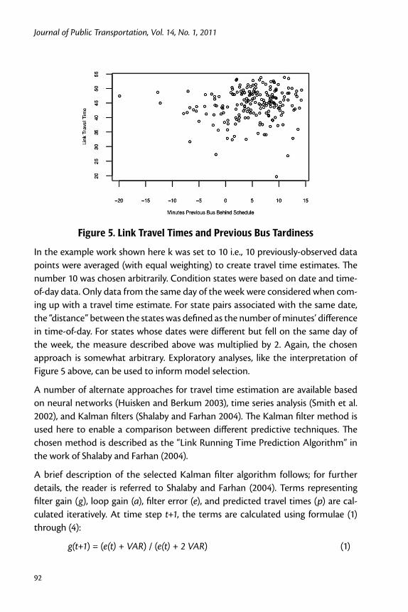
Journal of Public Transportation, Vol. 14, No. 1, 2011
92
Figure 5. Link Travel Times and Previous Bus Tardiness
In the example work shown here k was set to 10 i.e., 10 previously-observed data points were averaged (with equal weighting) to create travel time estimates. The number 10 was chosen arbitrarily. Condition states were based on date and time-of-day data. Only data from the same day of the week were considered when com-ing up with a travel time estimate. For state pairs associated with the same date, the “distance” between the states was defined as the number of minutes’ difference in time-of-day. For states whose dates were different but fell on the same day of the week, the measure described above was multiplied by 2. Again, the chosen approach is somewhat arbitrary. Exploratory analyses, like the interpretation of Figure 5 above, can be used to inform model selection.
A number of alternate approaches for travel time estimation are available based on neural networks (Huisken and Berkum 2003), time series analysis (Smith et al. 2002), and Kalman filters (Shalaby and Farhan 2004). The Kalman filter method is used here to enable a comparison between different predictive techniques. The chosen method is described as the “Link Running Time Prediction Algorithm” in the work of Shalaby and Farhan (2004).
A brief description of the selected Kalman filter algorithm follows; for further details, the reader is referred to Shalaby and Farhan (2004). Terms representing filter gain (g), loop gain (a), filter error (e), and predicted travel times (p) are cal-culated iteratively. At time step t+1, the terms are calculated using formulae (1) through (4):
g(t+1) = (e(t) + VAR) / (e(t) + 2 VAR) (1)
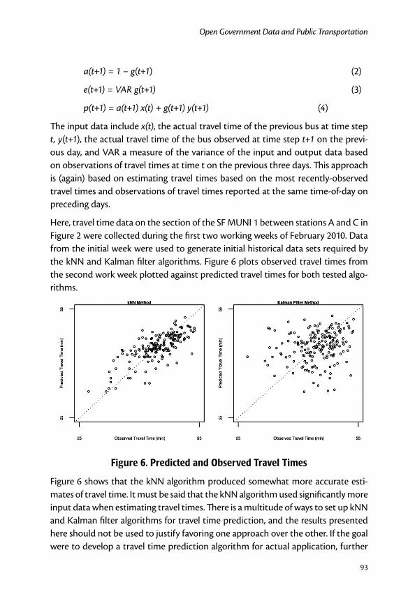
Open Government Data and Public Transportation
93
a(t+1) = 1 – g(t+1) (2)
e(t+1) = VAR g(t+1) (3)
p(t+1) = a(t+1) x(t) + g(t+1) y(t+1) (4)
The input data include x(t), the actual travel time of the previous bus at time step t, y(t+1), the actual travel time of the bus observed at time step t+1 on the previ-ous day, and VAR a measure of the variance of the input and output data based on observations of travel times at time t on the previous three days. This approach is (again) based on estimating travel times based on the most recently-observed travel times and observations of travel times reported at the same time-of-day on preceding days.
Here, travel time data on the section of the SF MUNI 1 between stations A and C in Figure 2 were collected during the first two working weeks of February 2010. Data from the initial week were used to generate initial historical data sets required by the kNN and Kalman filter algorithms. Figure 6 plots observed travel times from the second work week plotted against predicted travel times for both tested algo-rithms.
Figure 6. Predicted and Observed Travel Times
Figure 6 shows that the kNN algorithm produced somewhat more accurate esti-mates of travel time. It must be said that the kNN algorithm used significantly more input data when estimating travel times. There is a multitude of ways to set up kNN and Kalman filter algorithms for travel time prediction, and the results presented here should not be used to justify favoring one approach over the other. If the goal were to develop a travel time prediction algorithm for actual application, further
Journal of Public Transportation, Vol. 14, No. 1, 2011
94
research should be done exploring residual data values to find opportunities to increase accuracy.
The Case for Open Government DataThe preceding sections described how real-time vehicle location data could be processed to analyze public transportation service levels or forecast future opera-tions. It is here argued that it is in the government’s interest to place such data on the Internet. In particular, analyses are likely to be more diverse and applications more efficient when raw data are made available to all. Robinson et al. (2009) have identified specific technical areas where it is preferable to have numerous private actors, rather than one government agency, processing data. Three of these areas of clear significance for public transportation are “advanced search,” “mashups with other data sources,” and “data visualization.”
In the context of this paper, advanced search relates to the ability of interested par-ties to find data on the service levels offered by a particular set of public transport routes at a particular set of stops and over a particular set of time periods. It would be in the commercial interest of private companies to have efficient algorithms for selecting data relevant to user searches. It is worth noting that users will have significantly different search requests, due to the multitude of meaningful ways vehicle location data can be used (some of which were described above). Allowing many actors to access raw data increases the chances that a user with an unusual search request will be able to find a way to satisfy this request.
A mashup is the result of matching or comparing two or more distinct data sets. In the context of public transportation data, mashups could be especially useful, for instance, linking route maps of two different public transportation systems or comparing public health and transit data. Government agencies can create their own mashups, but opening up data will create a more diverse set of results. It is here possible to leverage the public’s interest in transit. There are already large numbers of interesting mashups based on the limited public transportation data currently available on the Internet. For example, on www.thestar.com/staticcontent/822896, a map shows district-specific rates of driver’s license suspensions for drunk driving alongside discs identifying areas within 1 kilometer of subway stations in Toronto. The mashup provides weak evidence for the hypothesis that those who live within walking distance of the subway are less likely to drink and drive and could spur further research or changes to public policy.

Open Government Data and Public Transportation
95
There are large numbers of interesting ways in which private citizens and compa-nies have visualized available public transportation data without creating mashups. For instance, www.swisstrains.ch shows the real-time positions of trains in Switzer-land on a Google map. This Web site, like the previously-discussed Google Transit, is popular in part because data are shown on a Google Maps interface that many find familiar and highly usable, allowing quick and easy panning and zooming. Again, it is in the commercial interest of parties processing the government data to provide high-quality data visualization tools. The relative advantage of private sector pro-vision of data visualization services will become more apparent as more complex data are made available, requiring a greater integration of advanced search and data visualization.
Studies indicate that many public transportation customers are very interested in receiving information on system operations in the immediate future (Dailey 2001). This public interest suggests that when data are made available, private citizens and companies will create applications based on the data. Empirical evidence supports this conclusion. BayTripper (www.baytripper.org) is one of many currently-available applications based on SF MUNI data. These applications supplement public trans-portation service, for instance, allowing users to wait at home rather than at a bus stop for a delayed bus. To support such applications, public agencies are required only to make vehicle location data available. In particular, the government need not specify what data applications will provide to users, how to forecast transit vehicle movements, or how to display forecast data. In fact, the best results are typically achieved when the government makes raw data available and does not focus on encouraging one or two specific potential applications of such data (Rob-inson et al. 2009). Competition makes it likely that the best-designed applications become the most-used applications.
It is worth noting that all of the applications using transit data cited in this paper are free to the general public. Private citizens with a casual interest in studying public transportation service levels seek to attract attention and create policy change but not to make money. Companies providing applications that describe or predict transit operations will use automated analyses where the marginal costs of providing information to one additional user are essentially nil. Such companies will typically generate revenue via advertising or very small user fees.

Journal of Public Transportation, Vol. 14, No. 1, 2011
96
ConclusionThe San Francisco Municipal Transit Agency recently made information on the real-time positions of its vehicles available to the general public on the Internet. This research describes how such data encourage private citizens and corporations to create products, especially Web and mobile phone applications, which enhance or supplement public transportation services. Further research monitoring the impacts of San Francisco’s decision to post public transportation data on the Internet is warranted. It appears likely that a committed and savvy public trans-portation agency can extract significant value for a minimal investment posting operation data on the Internet.
References
Bruun, E. C., Vuchic, V. R., and Y.-E. Shin. 1999. Time-distance diagrams: A powerful tool for service planning and control. Journal of Public Transportation 2: 1-24.
Cathey, F. W., and D. J. Dailey. 2003. A prescription for transit arrival/departure prediction using automatic vehicle location data. Transportation Research Part C 11: 241-264.
Cherry, C., Hickman, M., and A. Garg. 2006. Design of a map-based transit itinerary planner. Journal of Public Transportation 9: 45-68.
Dailey, D. J.. 2001. Smart Trek: A model deployment initiative. Final Research Report WA-RD 505.1. Washington State Department of Transportation.
Huisken, G., and E. C. van Berkum. 2003. A comparative analysis of short-range travel time prediction methods. Transportation Research Board annual meet-ing, Washington D.C.
Maclean, S. D., and D. J. Dailey. 2002. Wireless Internet access to real-time transit information. Transportation Research Record 1791: 92-98.
Nicholson, A., Kuhn, K., and K. Munakata. 2010. Travel time reliability and correla-tion. Submitted to Transportation Research Part A.
Ochieng, W. Y., and K. Sauer. 2002. Urban road transport navigation: Performance of the global positioning system after selective availability. Transportation Research Part C 10: 171-187.

Open Government Data and Public Transportation
97
Peng, Z.-R., and R. Huang. 2000. Design and development of interactive trip plan-ning for Web-based transit information systems. Transportation Research Part C 8: 409-425.
Robinson, D., Yu, H., Zeller, W. P., and E. W. Felten. 2009. Government data and the invisible hand. Yale Journal of Law and Technology 11: 160-175.
Shalaby, A., and A. Farhan. 2004. Prediction model of bus arrival and departure times using AVL and APC data. Journal of Public Transportation 7: 41-61.
Smith, B. L., Williams, B. M., and R. K. Oswald. 2002. Comparison of parametric and nonparametric models for traffic flow forecasting. Transportation Research Part C 10: 303-321.
Yi, Q., Hoskins, R. E., Hillringhouse, E. A., Sorensen, S. S., Oberle, M. W., Fuller, S. S., and J. C. Wallace. 2008. Integrating open-source technologies to build low-cost information systems for improved access to public health data. International Journal of Health Geographics 7: 29.
About the Author
Kenneth D. Kuhn ([email protected]) is a lecturer in the Depart-ment of Civil and Natural Resources Engineering at the University of Canterbury in Christchurch, New Zealand. His research explores the mathematical and economic foundations of transportation decision making.

Journal of Public Transportation, Vol. 14, No. 1, 2011
98

99
Using GIS to Identify Pedestrian-Vehicle Crash Hot Spots and Unsafe Bus Stops
Using GIS to Identify Pedestrian-Vehicle Crash Hot Spots and
Unsafe Bus StopsLong Tien Truong and Sekhar V. C. Somenahalli
University of South Australia
Abstract
This paper presents a GIS approach based on spatial autocorrelation analysis of pedestrian-vehicle crash data for identification and ranking of unsafe bus stops. Instead of crash counts, severity indices are used for analysis and ranking. Moran's I statistic is employed to examine spatial patterns of pedestrian-vehicle crash data. Getis-Ord Gi* statistic is used to identify the clustering of low and high index values and to generate a pedestrian-vehicle crash hot spots map. As recent studies have shown strong correlations between pedestrian-vehicle crashes and transit access, especially bus stops, bus stops in pedestrian-vehicle crash hot spots are then selected and ranked based on the severity of pedestrian-vehicle crashes in their vicinities. The proposed approach is evaluated using 13 years (1996–2008) of pedestrian-vehicle crash data for the Adelaide metropolitan area. Results show that the approach is efficient and reliable in identifying pedestrian-vehicle crash hot spots and ranking unsafe bus stops.
IntroductionIdentifying pedestrian-vehicle crash hot spots, referred to as high pedestrian-vehi-cle crash locations, is important for understanding the causes of pedestrian-vehicle crashes and to determine effective countermeasures based on the analysis of the

Journal of Public Transportation, Vol. 14, No. 1, 2011
100
causal factors. Recent studies (Clifton and Kreamer-Fults 2007; Hess et al. 2004) have shown strong correlations between pedestrian-vehicle crashes and pedes-trian generators, more specifically, bus stops. Indeed, unsafe movements, encour-aged by lack of necessary facilities close to bus stops such as pedestrian signals and crosswalks, result in pedestrian-vehicle crashes impacted by buses or other vehicles travelling on streets (Pulugurtha and Vanapalli 2008).
Common methods to profile crash hot spots use crash concentration maps that are based on Kernel Density Estimation (KDE) with absolute number of crashes. The KDE method calculates the density of crashes in a neighborhood around those crashes. However, these methods raise two potential issues. First, concentration maps are subject to different search bandwidths, also known as neighborhood sizes. Second, absolute counts of crashes may not truly indicate safety problems, while crash types and exposure measures, such as pedestrian and vehicular vol-umes, are neglected. Crash rates per unit exposure or crash rates based on severity would be more useful. This paper uses hot spot analysis to examine the spatial pat-terns of pedestrian-vehicle crashes and determines if they are statistically clustered, dispersed, or random. Criteria for analysis are severity indices that consider both the number and the severity of crashes. A hot spot is represented by a pedestrian-vehicle crash location with a statistically high severity index surrounded by other pedestrian-vehicle crash locations with high severity indices as well. Such spatial analysis can be performed using Geographical Information Systems (GIS) software programs such as ESRI’s ArcGIS.
The main objective of this paper is to develop a GIS approach based on analysis of spatial autocorrelation of pedestrian-vehicle crash data to profile pedestrian-vehi-cle crash hot spots and to identify and rank unsafe bus stops in pedestrian-vehicle crash hot spots areas. The proposed approach is evaluated using 13 years (1996-2008) of pedestrian-vehicle crash data for the Adelaide metropolitan area.
Literature ReviewRoad crash hot spot analysis has been widely examined in the academic press, and various types of methods for identifying unsafe locations have been developed. Simple methods for identifying unsafe locations, where the number of crashes or the crash rate per unit exposure exceeds a given threshold, are routine and straightfor-ward (Taylor et al. 2000). Austroads (1988) describes another method that uses criti-cal crash rates to determine whether the crash record of each location is significantly

101
Using GIS to Identify Pedestrian-Vehicle Crash Hot Spots and Unsafe Bus Stops
greater than the system wide average. Other statistical models, such as the empirical Bayes method, involve developing a statistical model based on the reference popu-lation and comparing the expected number of crashes with the observed number (Elvik 2008; Li and Zhang 2008). In addition to crash rates, unsafe locations are ranked according to their severity. Geurts et al. (2004) use the values of 1, 3, and 5 as the weights for a light, serious, or fatal casualty of a crash. Similarly, ranking methods also are made of a severity index, which is computed based on weights of 3.0 for fatal crashes, 1.8 for serious injury, 1.3 for other injury, and 1.0 for property damage only crashes (RTA 1994). In addition to these individual ranking methods, other compos-ite methods that consider more than one factor at a time are also used. For instance, Vasudevan et al. (2007) use the average of the ranks based on frequency, weighted factor, pedestrian exposure, and traffic volume for ranking pedestrian hazardous locations. However, these methods, along with other traditional methods, focus on road segments or specific locations and thus produce results that are partially depen-dent on the length of road segment (Thomas 1996) and might not be able to capture area wide crash hot spots (Anderson 2009).
Numerous methods for studying spatial patterns of crash data as point events have recently been developed. One of the most widely used is KDE. Many recent studies use planar KDE for hot spot analysis, such as the study of high pedestrian crash zones (Pulugurtha et al. 2007), road crash hot spots (Anderson 2009), and highway crash hot spots (Erdogan et al. 2008). The goal of planar KDE is to develop a continuous surface of density estimates of discrete events such as road crashes by summing the number of events within a search bandwidth. However, planar KDE has been challenged in relation to the fact that road crashes usually happen on the roads and inside road networks that are portions of 2-D space. Road crashes are, therefore, needed to be considered in a network space, a simplification of the road network represented by 1-D lines. Several studies have extended the KDE to network spaces, which estimates the density over a distance unit instead of an area unit (Xie and Yan 2008; Yamada and Thill 2004). Neither planar or network KDE can be tested for statistical significance; this is a major weakness of these methods (Anderson 2009; Xie and Yan 2008).
Spatial patterns of crash data can also be analysed by spatial autocorrelation, statis-tics that take into account simultaneously discrete events’ locations and their values. Moran's I Index and Geary’s C Ratio are two popular indices for measuring spatial autocorrelation. Both of these methods combine two measures of attribute similarity and location proximity into a single index. The main difference between them is either

Journal of Public Transportation, Vol. 14, No. 1, 2011
102
the similarity of attribute values of two points is computed from direct comparison in Geary’s C Ratio or with reference to the mean value in Moran’s I Index. Therefore, the two indices have different ranges and different statistical properties. Possible val-ues of Moran’s I range from -1 to 1. A positive value indicates clustering and a negative value indicates dispersion. Possible values of Geary’s C range from 0 to 2. A Geary’s C value near 0 indicates clustering, while a Geary’s C value near 2 indicates dispersion. In contrast to the KDE, the statistical significance for both Moran's I and Geary’s C can be calculated using z-score methods (Erdogan 2009; Wong and Lee 2005). In fact, Moran's I Index and Geary’s C Ratio are global statistics since they are measures of the entire study area. To investigate the spatial variation and the spatial associations, it is necessary to rely on local measures such as the local Moran’s I (Anselin 1995) and Getis-Ord Gi* statistics (Getis and Ord 1992). Particularly, Getis-Ord Gi* statistics are useful to identify cold/hot spots where their values are significantly low or high and be surrounded by other low or high values as well. Both Moran's I and Getis-Ord Gi* are available in commercial GIS software packages, such as ESRI’s ArcGIS.
Study Area and DataThe required data for the study includes pedestrian-vehicle crash data, bus stop data, and street network data in GIS layers. Since bus ridership data are unavailable, bus stop data include location and bus route information only. This paper used 13 years (1996-2008) of pedestrian-vehicle crash data in Adelaide, the capital city of South Australia. However, due to the lack of information to determine pedestrian-vehicle crashes that involved bus users, this research used all pedestrian-vehicle crash data for identifying unsafe bus stops. This could be biased since some pedes-trian-vehicle crashes might have happened as a result of other reasons. Another limitation of the data is the lack of exposure data such as annual average daily traf-fic (AADT) and alighting and boarding data.
MethodologyThe methodology can be subdivided into the following steps:
Load pedestrian-vehicle crash data and aggregate the data at each location.1.
Compute a severity index at each location.2.
Examine the spatial patterns of the pedestrian-vehicle crash data. 3.
Create a pedestrian-vehicle crash hot spots map.4.

103
Using GIS to Identify Pedestrian-Vehicle Crash Hot Spots and Unsafe Bus Stops
Load the bus stop data and identify bus stops in hot spots areas. 5.
Compute severity indices and rank unsafe bus stops. 6.
ArcGIS software with the Spatial Statistic toolbox is used for mapping and spatial analyses.
1) Load pedestrian-vehicle crash data and aggregate the data at each location. The street network theme and pedestrian-vehicle crash data are loaded in the ArcGIS software program (Figure 1). Each of the data points may represent a single pedestrian-vehicle crash or multiple crashes since a number of pedestrian-vehicle crashes may be reported at the same location such as an intersection. Therefore, the pedestrian-vehicle crash data are aggregated to produce counts for each type of crashes at each location.
2) Compute a severity index at each location.Without weighted data, it is difficult to know whether high or low clustering exists. Counts of crashes are commonly used to evaluate safety problems at a location. There is a belief that the more severe crashes should have greater weights in identi-fying unsafe locations on the basis of crash costs. Additionally, results of the crash severity method are sensitive to various weighting systems (Geurts et al. 2004). Although there is no consensus on how the optimum weighting system should be developed, a compromise approach is becoming increasingly popular. The approach is to give weights to the more severe crashes, but not with the extreme high values computed in direct proportion to the crash costs. This research employs a crash severity weighting system in which the basic factor is tow-away crashes (RTA 1994). The severity index is computed by the following equation:
(1) Where:
X1= total number of fatal crashes
X2= total number of serious injury crashes
X3= total number of other injury crashes
X4= total number of property-damage-only crashes
This severity index is used as the criterion for spatial analysis in this research. Figure 2 shows the distribution of the severity indices. Visual observation of this figure indicates some high severity index zones. However, it needs a statistical significance test to examine the degree of clustering.

Journal of Public Transportation, Vol. 14, No. 1, 2011
104
Figu
re 1
. Loc
atio
ns o
f Ped
estr
ian-
Vehi
cle
Cras
hes

105
Using GIS to Identify Pedestrian-Vehicle Crash Hot Spots and Unsafe Bus Stops
Figu
re 2
. D
istr
ibut
ion
of S
ever
ity
Indi
ces

Journal of Public Transportation, Vol. 14, No. 1, 2011
106
3) Examine the spatial patterns of the pedestrian-vehicle crash data.To examine spatial patterns, this research makes use of the Moran's I Index to mea-sure spatial autocorrelation. Moran’s I combines the measure for attribute similar-ity and the measure of location proximity into an index. The location proximity weight between two points often is defined as the inverse of the distance between them. The attribute similarity of severity indices of two points is defined as the difference between each value and the global mean value (Wong and Lee 2005). Therefore, the index can be calculated using the following equation:
(2)
Where:
wij = the proximity weight of location i and location j with wii=0
xi = the severity index at location j
x = the global mean value
n = the total number of pedestrian-vehicle crash locations
The statistical significance for Moran’s I can be calculated using z-score meth-ods. Based on the expected values (E[I]) for a random pattern and the variances (VAR[I]), the standardized Z-score can be mathematically represented as follows:
(3)
In this research, the Spatial Autocorrelation tool was used to compute Moran's I statistics and z-scores. Since each data point is analysed in terms of its neighboring data points defined by a distance threshold, it is necessary to find an appropriate distance threshold where spatial autocorrelation is maximized. The Spatial Auto-correlation tool was run multiple times with different distance thresholds to find the distance with the maximum z-score. Table 1 shows that with a distance thresh-old of 1,000 metres, the z-score reaches the highest value of 136.2, which means the pedestrian-vehicle crash data is clustered until a distance threshold of 1,000 metres with a statistical significance level of 0.01.

107
Using GIS to Identify Pedestrian-Vehicle Crash Hot Spots and Unsafe Bus Stops
Table 1. Spatial Autocorrelation by Distance Thresholds
Distance (m) 200 600 800 1,000 1,200 1,400 2,000
Z score 55.62 120.1 132.7 136.2 134.3 130.5 108.9
Sig. 0.01 0.01 0.01 0.01 0.01 0.01 0.01
4) Create a pedestrian-vehicle crash hot spots map.In this step, Getis-Ord statistic is used to identify pedestrian-vehicle crash hot spots. A high value of Getis-Ord statistic represents a cluster of high index values (hot spots), while a low value represents a cluster of low index values (cold spots). Getis-Ord
statistic and its z-score are mathematically expressed by the following equations.
(4)
(5)
Where:
wij= the weight for the target neighbour pair
d = distance threshold
xj = the severity index at location j
The distance threshold of 1,000 metres associated with maximum z-score in the previous step is chosen for the Getis-Ord analysis using the Hot Spot Analysis and Rendering tool. The result of the analysis is shown in Figure 3. It indicates that there are hot spots with z score greater than 1.96 at a statistical significance level of 0.05.
5) Load bus stop data and identify bus stops in hot spots areas.This step makes use of the pedestrian-vehicle crash hot spots map to identify bus stops in the vicinities of the pedestrian-vehicle crash hot spot. In general, a person is willing to walk about 0.25 miles (400 metres) to reach a bus stop (O'Sullivan and Morrall 1996). Bus stop data are overlaid on the hot spots map to identify bus stops that are within 400 metres of each pedestrian-vehicle crash hot spot. This can be achieved using the Network Analyst tool to generate a 400-metre network buffer of the hot spots, which represents areas influenced by hot spots (Figure 4).
Journal of Public Transportation, Vol. 14, No. 1, 2011
108
Figu
re 3
. Ped
estr
ian-
Vehi
cle
Hot
Spo
ts M
ap
109
Using GIS to Identify Pedestrian-Vehicle Crash Hot Spots and Unsafe Bus Stops
Figu
re 4
. Uns
afe
Bus
Stop
s in
Hot
Spo
ts A
reas
Journal of Public Transportation, Vol. 14, No. 1, 2011
110
6) Compute the severity indices and rank unsafe bus stops.In this step, unsafe bus stops, identified in the previous step, are ranked based on the severity of pedestrian-vehicle crashes in their vicinities. The goal of this step is to compute an appropriate severity index for each potentially unsafe bus stop. It can be argued that pedestrian-vehicle crashes that occurred closer to a bus stop more likely could be related to that bus stop than others. Therefore, they should be given greater weights in computing severity index for that bus stop. Another issue is to select a buffer size so that only pedestrian-vehicle crashes related to unsafe bus stops are considered for calculations. A small buffer size of 100 feet (30 metres) is recommended in the study of hazardous bus stops (Pulugurtha and Vanapalli 2008). Arguably, a small buffer size might miss some crashes associated with bus users, while a greater buffer size might capture crashes that do not involve bus users. In the final choice, all pedestrian-vehicle crashes within a 100-metre network distance to an identified bus stop were used for computing the severity index for that bus stop. A weight of 1.5 was given to those within 50 metres as they are more likely to be related to the bus stop. The bus stop severity index is defined as fol-lows:
(6)
Where:
SI50 and SI50−100 are computed using Equation (1)
SI50 = severity index of all pedestrian-vehicle crashes within a 50-metre network buffer of the bus stop
SI50−100= severity index of all pedestrian-vehicle crashes within a 100-metre network buffer, but outside a 50-metre network buffer of the bus stop
Finally, unsafe bus stops are ranked based on their severity indices.
Results and DiscussionThe Moran’s I analysis indicated a statistically significant clustering pattern of pedestrian-vehicle crash data for the Adelaide metropolitan area (Table 1). The Getis-Ord analysis also detected pedestrian-vehicle crash hot spots with the 0.05 level of significance. The majority of hot spots were located near the intersections of Main North Road, Prospect Road, and Regency Road in Northern Adelaide (Fig-ure 3). In this area, there were 3 pedestrian-vehicle crash hot spots at intersections and 10 hot spots at mid-block locations. This indicated pedestrian-vehicle crashes

111
Using GIS to Identify Pedestrian-Vehicle Crash Hot Spots and Unsafe Bus Stops
at mid-block locations were more severe. To identify bus stops that are within 400 metres of a hot spot, influenced areas of the hot spots were generated using the Network Analyst tool (Figure 4). A total of 31 bus stops in the influenced areas were identified and ranked. Table 2 shows the top 10 unsafe bus stops with at least 3 pedestrian-vehicle crashes. It can be seen that some bus stops have extremely high severity indices, such as stop number 117 Regency Road and stop number 17 Main North Road. Site observations shows that pedestrian facilities such as pedestrian signals are available only at the intersection of Regency Road and Main North and the intersection of Regency Road and Prospect Road. In addition, many T-junctions with traffic from and to local streets in this area will generate considerable turning movements. In general, bus users need to cross streets at least once for a return trip. Therefore, it can be argued that the lack of pedestrian facilities, high turning movements, and pedestrian failure to yield are main reasons for pedestrian-vehicle crashes at mid-block locations in this area.
There are ways in which this study could be improved. It would be more reliable to apply a multi-criteria approach to rank unsafe bus stops depending on the
Table 2. Ranking Unsafe Bus Stops
Rank Stop Direction Street
Within 50m 50-100m
S.IP.D Fat Seri Oth P.D Fat Seri Oth
1 117 Anti Regency 4 4 7 24.10
2 17 DownMain North
8 2 18.20
3 17 UpMain North
8 2 18.20
4 116 Anti Regency 4 6 15.00
5 14 UpMain North
1 1 2 3 12.15
6 117 Clock Regency 5 1 1 12.05
7 16 UpMain North
1 1 4 11.65
8 15 Down Prospect 1 1 1 2 9.05
9 15 Up Prospect 1 1 1 2 9.05
10 14 DownMain North
1 1 1 5.95
P.D. =Property damage only crashes; Fat = Fatal crashes; Seri = Serious injury crashes; Oth = Other injury crashes; S.I = Severity Index.
Journal of Public Transportation, Vol. 14, No. 1, 2011
112
availability of data. For instance, bus stops are ranked based on an average rank of multiple criteria such as severity index and crash rates per million kilometres and per number of bus users boarding and alighting the bus. In addition, while an opti-mum search distance is statistically identified in hot spot analysis, sizes of buffers are issues in ranking unsafe bus stops. Different sizes may produce different severity indices and, therefore, different rankings. Sensitivity analysis should be conducted to find an appropriate buffer size.
ConclusionsThis research presents a GIS approach based on the spatial autocorrelation of pedestrian-vehicle crash data for identification and ranking of unsafe bus stops. The merits of spatial autocorrelation statistics and GIS concepts and technology enable statistical evaluations of spatial patterns of pedestrian-vehicle crash data. Instead of absolute number of crashes, severity indices, considering both the num-ber and the severity of crashes, are used for analysis and ranking.
The results from analyzing pedestrian-vehicle crash data in Adelaide indicate that the proposed approach can statistically detect spatial patterns of crash data and reasonably identify and rank unsafe bus stops in pedestrian-vehicle crash hot spot areas. The identification of pedestrian-vehicle crash hot spots is reliable and accu-rate because it is conducted using well-designed spatial statistics that consider both the locations of point events and their attributes. Spatial analysis based on raw data locations can provide more information to better capture safety indi-cations. For instance, hot spot analysis shows that pedestrian-vehicle crashes at mid-block locations are more severe than at intersections. The issues of pedestrian-vehicle crashes at mid-block locations and bus stop safety are, in fact, raised by the lack of appropriate pedestrian facilities and high turning movements at the sites. The selection of buffer sizes used in ranking unsafe bus stops is an issue since it can-not be tested for statistical significance and the crash data do not indicate whether a crash is associated with bus users. Overall, this research offers a sound basis for identifying pedestrian-vehicle crash hot spots and prioritizing unsafe bus stops in order to study the causal factors, determine effective countermeasures, and plan a safer bus transit system.
Further research should include a multi-criteria ranking method and sensitivity analysis of buffer sizes. Such improvements could improve the accuracy and reli-ability of the prioritization of unsafe bus stops.
113
Using GIS to Identify Pedestrian-Vehicle Crash Hot Spots and Unsafe Bus Stops
References
Anderson, T. K. 2009. Kernel density estimation and K-means clustering to profile road accident hot spots. Accident Analysis & Prevention 41(3): 359-364.
Anselin, L. 1995. Local indicators of spatial association-LISA. Geographical Analysis 27(2): 93-116.
Austroads. 1988. Guide to Traffic Engineering Practice: Part 4, Road Crashes. Sydney: Austroads.
Clifton, K. J., and K. Kreamer-Fults. 2007. An examination of the environmental attributes associated with pedestrian-vehicular crashes near public schools. Accident Analysis & Prevention 39(4): 708-715.
Elvik, R. 2008. A survey of operational definitions of hazardous road locations in some European countries. Accident Analysis & Prevention 40(6): 1830-1835.
Erdogan, S. 2009. Explorative spatial analysis of traffic accident statistics and road mortality among the provinces of Turkey. Journal of Safety Research 40(5): 341-351.
Erdogan, S., I. Yilmaz, T. Baybura, and M. Gullu. 2008. Geographical information sys-tems aided traffic accident analysis system case study: City of Afyonkarahisar. Accident Analysis & Prevention 40(1): 174-181.
Getis, A., and J. K. Ord. 1992. The analysis of spatial association by use of distance statistics. Geographical Analysis 24(3): 189-207.
Geurts, K., G. Wets, T. Brijs, and K. Vanhoof. 2004. Identification and ranking of black spots: Sensitivity analysis. Transportation Research Record 1897: 34-42.
Hess, P. M., A. V. Moudon, and J. M. Matlick. 2004. Pedestrian safety and transit corridors. Journal of Public Transportation 7(2): 73-93.
Li, L., and Y. Zhang. 2008. Bayesian approach based on geographic information systems to identify hazardous roadway segments for traffic crashes. Transpor-tation Research Record 2024: 63-72.
O'Sullivan, S., and J. Morrall. 1996. Walking distances to and from light-rail transit stations. Transportation Research Record 1538: 19-26.
Pulugurtha, S. S., V. K. Krishnakumar, and S. S. Nambisan. 2007. New methods to identify and rank high pedestrian crash zones: An illustration. Accident Analy-sis & Prevention 39(4): 800-811.

Journal of Public Transportation, Vol. 14, No. 1, 2011
114
Pulugurtha, S. S., and V. K. Vanapalli. 2008. Hazardous bus stops identification: An illustration using GIS. Journal of Public Transportation 11(2): 65-83.
RTA. 1994. Road TrafficAaccidents in NSW - 1993. Sydney: Roads and Traffic Author-ity of NSW.
Taylor, M. A. P., P. W. Bonsall, and W. Young. 2000. Understanding Traffic Systems: Data, Analysis and Presentation. 2nd ed. Aldershot: Ashgate.
Thomas, I. 1996. Spatial data aggregation: Exploratory analysis of road accidents. Accident Analysis & Prevention 28 (2):251-264.
Vasudevan, V., S. Pulugurtha, and S. Nambisan. 2007. Methods to prioritize pedes-trian high-crash locations and statistical analysis of their relationships. Trans-portation Research Record 2002: 39-54.
Wong, D. W. S., and J. Lee. 2005. Statistical Analysis of Geographic Information with ArcView GIS and ArcGIS. Hoboken: Wiley.
Xie, Z., and J. Yan. 2008. Kernel Density Estimation of traffic accidents in a network space. Computers, Environment and Urban Systems 32(5): 396-406.
Yamada, I., and J. C. Thill. 2004. Comparison of planar and network K-functions in traffic accident analysis. Journal of Transport Geography 12(2): 149-158.
About the Authors
Long Tien Truong ([email protected]) is a graduate student in the Transport System Engineering in the School of Natural and Built Environ-ments (NBE), University of South Australia, Adelaide.
Dr. Sekhar V.C. Somenahalli ([email protected]) currently teaches courses related to Geographic Information Systems (GIS) and their applica-tions to Transport and Urban Planning disciplines in the School of Natural and Built Environments (NBE), University of South Australia, Adelaide. He has over 5 years of consulting experience and over 16 years of teaching and research experience and has worked in India, Malaysia, and Australia.