key color generation for affective multimedia production
TRANSCRIPT
Key Color Generation for Affective Multimedia Production: An Initial Method and Its Application
EunJin Kim
Department of Industrial Design, KAIST 291 Daehak-ro, Yuseong-gu
Daejeon 34141, Republic of Korea 82-42-350-4523
Hyeon-Jeong Suk Department of Industrial Design, KAIST
291 Daehak-ro, Yuseong-gu Daejeon 34141, Republic of Korea
82-42-350-4523
ABSTRACT
In this paper, we introduce a method that generates a key color to
construct an aesthetic and affective harmony with visual content.
Given an image and an affective term, our method creates a key
color by combining a dominant hue of the image and a unique
tone associated with the affective word. To match each affective
term with a specific tone, we collected color themes from a
crowd-sourced database and identified the most popular tone of
color themes that are relevant to each affective term. The results
of a user test showed that the method generates satisfactory key
colors as much as designers do. Finally, as a prospective
application, we employed our method to a promotional video
editing prototype. Our method automatically generates a key color
based on a frame of an input video and apply the color to a shape
that delivers a promotional message. A second user study verifies
that the video editing prototype with our method can effectively
deliver the desired affective state with a satisfactory quality.
Keywords
color selection; key color generation; color perception; affective
multimedia production
1. INTRODUCTION Color is one of the most important factors that have a strong
influence on human perception. A wide range of aesthetic and
affective responses can be elicited by either one or more colors.
The aesthetic and affective meanings of color have been
investigated in many fields and such studies have expanded our
understandings of color perception. In the practice of media
production, however, colors are rarely utilized solitarily. Instead
of being isolated, colors are often accompanied with various
visual content including images, videos and infographics. We can
easily find such combinations of colors and visual content on
book covers, commercial film, websites, and a variety of user
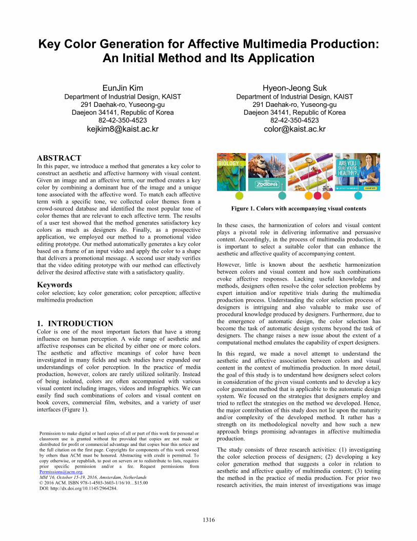
interfaces (Figure 1).
Figure 1. Colors with accompanying visual contents
In these cases, the harmonization of colors and visual content
plays a pivotal role in delivering informative and persuasive
content. Accordingly, in the process of multimedia production, it
is important to select a suitable color that can enhance the
aesthetic and affective quality of accompanying content.
However, little is known about the aesthetic harmonization
between colors and visual content and how such combinations
evoke affective responses. Lacking useful knowledge and
methods, designers often resolve the color selection problems by
expert intuition and/or repetitive trials during the multimedia
production process. Understanding the color selection process of
designers is intriguing and also valuable to make use of
procedural knowledge produced by designers. Furthermore, due to
the emergence of automatic design, the color selection has
become the task of automatic design systems beyond the task of
designers. The change raises a new issue about the extent of a
computational method emulates the capability of expert designers.
In this regard, we made a novel attempt to understand the
aesthetic and affective association between colors and visual
content in the context of multimedia production. In more detail,
the goal of this study is to understand how designers select colors
in consideration of the given visual contents and to develop a key
color generation method that is applicable to the automatic design
system. We focused on the strategies that designers employ and
tried to reflect the strategies on the method we developed. Hence,
the major contribution of this study does not lie upon the maturity
and/or complexity of the developed method. It rather has a
strength on its methodological novelty and how such a new
approach brings promising advantages in affective multimedia
production.
The study consists of three research activities: (1) investigating
the color selection process of designers; (2) developing a key
color generation method that suggests a color in relation to
aesthetic and affective quality of multimedia content; (3) testing
the method in the practice of media production. For prior two
research activities, the main interest of investigations was image
Permission to make digital or hard copies of all or part of this work for personal or
classroom use is granted without fee provided that copies are not made or
distributed for profit or commercial advantage and that copies bear this notice and
the full citation on the first page. Copyrights for components of this work owned
by others than ACM must be honored. Abstracting with credit is permitted. To
copy otherwise, or republish, to post on servers or to redistribute to lists, requires
prior specific permission and/or a fee. Request permissions from
MM '16, October 15-19, 2016, Amsterdam, Netherlands
© 2016 ACM. ISBN 978-1-4503-3603-1/16/10…$15.00
DOI: http://dx.doi.org/10.1145/2964284.
1316

data, which is one of the most prevalent visual contents in
multimedia. The key color generation method was developed in
consideration of aesthetic and affective quality of color-image
combinations. Then, the method was verified in a wider context
through the last research activity that utilized videos.
In the following sections, we firstly overview the related research
and present the process and results of research activities involved
in this study. For the first research activity, we conducted an
experiment with 10 designers to understand their color selection
process. Based on the findings from designers, we built a structure
of a key color generation method and refined its detail by utilizing
a crowd-sourced database. A user test was carried out to examine
the performance of the method by comparing its results against
those of designers. Finally, we embedded our method in an
automatic video editing system, and examined the performance of
the method in a wider context of multimedia production.
2. RELATED WORK Aiming at developing a key color generation method that
enhances the aesthetic and affective quality of visual content, we
reviewed previous studies in relation to any of these factors: color
perception, color emotion, and color semantics of images. Based
on these studies, we were able to identify three main contexts for
our research: 1) the effects of color on emotion, 2) principles and
tools to construct harmonious color combinations, and 3) method
to extract colors from images.
2.1 Color Emotion The choice of color has a complex but strong relationship with the
aesthetic and affective experience of design. Hence, the
perception of color and color combinations has attracted interests
of many researchers. For instance, Adams and Osgood [1, 26]
revealed the cross-cultural universality of affective feelings about
colors. They associated colors with perceptual dimensions such as
evaluation, activity, and potency. According to their study, red is
active and strong, while gray is passive, bad and weak. Wright
and Rainwater [41] suggested six connotative factors including
happiness, showiness, forcefulness, warmth, elegance and
calmness. These six factors were the most susceptible to the
changes in saturation, and the least influenced by the hue.
Similarly, the study of Valdez and Mehrabian [38] reported that
saturation and brightness evidenced the strong and consistent
effects on emotions.
Since color is rarely perceived in isolation, there have been many
investigations on color combinations as well. Ou and Luo [27, 28]
developed a three-dimensional color-emotion space with axes of
color activity, color weight and color heat. By applying the same
space to single colors and color combinations, they confirmed that
emotion induced by combination of two colors can be predicted
by the mean of single color emotions. Kobayashi [11, 12]
examined the meaning of color and color combinations, and he
developed the Color Image Scale. The scale correlated single
colors, 3-color themes and 180 affective keywords together on the
image scale map and provided the relationship between affective
keywords and colors.
These studies have contributed to the understanding of emotional
aspects of colors and have been utilized prominently in various
applications [32, 34, 40]. However, these findings have not yet
been examined in the presence of other visual content, which is
more prevalent cases in multimedia practice. To our best
knowledge, this study is the first to understand the perception of
colors with accompanying visual content as an extension of
previous color-emotion studies.
2.2 Color Harmony In addition to the perception of color combinations, many early
studies concentrated on identifying principles of harmonious color
combinations. Like Goethe [5], Munsell [23] viewed balance as a
key to creating harmonious color combinations. Based on the
Munsell color system, various color harmony principles were
suggested and a quantitative measure developed by Moon and
Spencer [19] was one of them. Itten [10] designed a new color
wheel of twelve hues and introduced relative positioning of hues
that would harmonize together. A more recent study of Ou and
Luo [28] also emphasized the great influence of hue on color
harmony.
Given the principles and theories of these studies, a variety of
tools have been developed to assist color selection of both experts
and novices. Hu et al. [7] presented a tool that helps users to
interactively explore and generate color schemes based on color
harmony principles. Moretti [21, 22] developed ‘color
harmonizer’ that automates the generation of harmonious color
schemes and demonstrated its application in GUI design. Meier et
al. [18] introduced a toolset, Interactive Palette Tools, that enables
browsing, breeding and displaying of color palettes.
Although these tools and methods have provided easier ways of
tailoring colors, their applications have mainly focused on
suggesting harmonious color combinations, instead of
constructing a harmony between the color and visual content.
Since visual content such as images and videos comprises more
complex and contextual features than a single color, multifaceted
approaches should be devised in order to construct reliable
harmony principles and materialize the principles in automatic
multimedia production. As an attempt to do so, we believe that
this study can contribute to creating aesthetic and affective
multimedia works by investigating the association of colors and
visual content and developing a computational method to generate
a key color.
2.3 Color Extraction from Images In the image processing field, extracting representative colors
from images has long been an interest of several researchers. The
purpose of color extraction was widely distributed over image
abstraction [13], image indexing [34], color transfer [2, 24] and
creating color schemes for design [6]. The methods also varied
from clustering algorithms [8, 36], histogram thresholding [33,
37] and even to computational learning algorithms [14]. As shown
in their purpose and application, however, these studies rarely
considered the color as a design component that can contribute to
the process of creating multimedia works. Although there has
been an attempt to utilize the perspective of art students in
extracting color themes [14], the outcomes have yet to be applied
to multimedia production in order to enhance the affective quality.
In this regard, our study has a unique standpoint that views color
as a component of multimedia outcomes.
Moreover, we tried to reflect the procedural knowledge of
designers in developing the key color generation method. Most of
color extraction studies have examined colors that have already
extracted by human [14, 15], instead of investigating the process
that people extract a color from an image. In contrast, our
approach to develop a computational method considered findings
from both process and outcomes of designers.
1317

3. ANALYSIS OF COLOR SELECTION
PROCESS We conducted experiments with 10 designers to understand their
creative color selection process. We analyzed the qualitative data
from verbal protocols and quantitatively investigated the colors
generated by designers.
3.1 Methodology
3.1.1 Participants We recruited ten designers who majored in graphic or industrial
design (4 females and 6 males). Three of them had three, four, and
eight years of professional experiences, respectively, and the
others are currently enrolled in a graduate school of industrial
design. The participants’ mean age was 28.0, ranging from 25 to
33.
3.1.2 Stimuli: Images and Keywords As stated before, image data was chosen among various types of
visual content due to its commonality with other visual contents
and popularity in media. For the experiment, 30 images of 1000
pixels by 1000 pixels were prepared. The selected images were
pictures of various topics including people, objects, animals,
plants and landscapes. We also prepared four affective terms such
as excited, afraid, depressed and relaxed in order to present them
as target emotions of final designs. As shown in the Figure 2, each
corresponds to one of the four quadrants of the emotion space
derived from PAD theory [31, 38], which are characterized by the
pleasure state (horizontally) and the arousal state (vertically).
Since these four emotions are primary and discrete to each other,
we’ve thought that they could be a good anchor point to expand
our finding into more variations. This experimental design
allowed us to investigate how designers express an emotion with a
variety of visual content, and how a key color can be determined
differently depending on target emotions.
3.1.3 Procedure The experiment was conducted individually in an isolated room
that disguised as an office environment with a desk, a chair and a
desktop computer. When the experiment began, one of the 30
images was randomly presented with an affective keyword. The
designers were instructed to decide a key color that is harmonious
with a given image and expresses the emotion described by the
affective word. As shown in Figure 3, they applied the selected
color to a rectangle of 1000 pixels wide and 350 pixels tall
positioned below the image by using Adobe Photoshop® CS6. The
color-selection task was described as a part of designing a book
cover or a poster. By specifying the design context, we’ve tried to
help participants perform the task with confidence in its purpose
and applications.
Figure 2. Four emotions defined by PAD theory
Figure 3. Key color selection task presented to designers
Throughout the experiment, each designer received 30 images and
selected four colors for each image to deliver four affective
keywords. Consequently, we obtained 120 color-image
combinations from each designer. When finished, we made a
retrospective interview to retrieve the latent thoughts and criteria
that designers employed during the color selection process. While
reviewing their design outcomes one by one, designers were asked
to retrace their preceding design process and to report what they
were thinking as they create colors based on perceived images and
affective terms.
3.1.4 Data Analysis Through the experiments, we obtained verbal protocols and colors
selected by designers. After analyzing the verbal protocols using
an open-coding, we interwove the findings with the quantitative
analysis of colors to validate and confirm the results from the
protocols. As a result of an integrated analysis, we identified a
general procedure of designers to select key colors and noted how
emotion and image affect the selection of colors. Since the aim of
this analysis was understanding the general color selection process
of designers, main findings are presented in the following section
instead of reporting the specific results.
3.2 Characterizing Color Selection Process
3.2.1 Representative Color of a Given Image Designers firstly explored existing colors of a given image in
order to find a good starting point. They were often interested in a
dominant color that represents a relatively large area of the image.
Dominant colors were preferred since they could provide a robust
harmony between a color and the image. For instance, the left two
picture of Figure 4 are images dominated by a narrow range of
hue. The colors selected by participants tended to follow the
dominant hue of the given image. Contrary to the consideration of
dominance, participants also interested at salient colors that are
much more distinctive and noticeable than the rest. The right two
images of Figure 4 are examples that few salient regions had a
strong influence on participants’ color selection. In general,
participants investigated a better representative while exploring in
between dominance and salience.
Figure 4. Images and related key colors by participants
1318

3.2.2 Tone Guided by Emotions Once they finished selecting a starting color from an image,
designers proceeded to elaborate their selection in a more detail.
They often explored contiguous colors with minor changes in hue
and tone. In relation to color elaboration, we found repetitive and
explicit mentions regarding the association of emotion and color
tone. Four participants recognized the association by themselves
and explicitly mentioned about it. Other designers did not elicited
it into verbal expression, but showed a strong congruence in
selecting tones of colors.
The congruence was also supported by the quantitative analysis of
designers’ colors as well. In Figure 5, the saturation and
brightness values of designers’ key colors are plotted across the
four emotion words. Although the given images were distributed
in a wide range of brightness and saturation, the key colors
showed a coherent pattern for each emotion. Vivid colors with
higher brightness were preferred for vigorous emotion. Pale colors
were frequently chosen to deliver relaxed emotion, while dark-
grayish colors were selected to express sad emotion. This results
indicate that designers tend to articulate the tone of color in
consideration of emotions rather than the image itself.
In summary, designers began their color selection process by
picking a representative color of a given image. Once a
satisfactory color was identified, designers proceeded to polish the
color by applying minor changes to its hue and tone. In particular,
the tone of the color was mainly refined and finally confirmed
according to the target emotion. Such tendency of designers seems
to align with the findings of previous color studies that showed
emotional responses to colors are varied more by the tone rather
than the hue [4, 28, 35, 38].
4. KEY COLOR GENERATION METHOD Based on the insights from the designers, we formulated the
framework of a key color generation method. Similar to the
general color selection process of designers, our method involves
two steps that consist of hue-extraction and tone-match. Figure 6
illustrates the framework of the method with an image and four
emotional keywords that were utilized in the designers’
experiment.
The latent principle of the framework corresponds to the earlier
color studies. Itten [10] and Ou and Luo [28] argued that hue is
the most important factor to construct a harmony among colors. In
our method, the key color inherited hue from the color semantics
of an image. By synchronizing the hue of a key color with a given
image, we expect an aesthetic harmony between the image and the
key color. Contrary to the hue, the brightness and saturation
values are totally independent from an image. The tone is defined
according to the target emotion by referring to color-emotion
scales. We viewed the tone as a tuner of the emotional aspect of a
key color, and this conforms to the findings of previous color-
emotion studies that have revealed the major influence of tone
upon the emotion [28, 35, 38].
Figure 5. Saturation (x-axis) and brightness (y-axis) of
designers’ key colors for each emotion
Figure 6. Framework of key color generation method
The novelty of our method is the articulation of the tone of a key
color exclusively depending on the affective term given by a user.
Most of previous color extraction studies have aimed at extracting
colors from color features of a given images. Hence, regardless of
their diversity in methods and results, the range of extracted
colors were constrained within the color features of the image. In
contrast, our method generates a novel color that may not belong
to a given image by separating the tone of a key color from the
image.
4.1 Hue-extraction from an Image The aim of this step is to extract a hue that is perceptually
dominant within an image. Since the method is an initial attempt
to embody the strategies of designers, we devised a K-means
clustering for simplicity rather than fine methods suggested by
previous studies [2, 14, 15]. Through iterative simulations, we
decided to form 10 clusters using the normalized HSB values of
image pixels. We extracted a hue value from the center of the
largest cluster, and used it as the hue of a key color to be
suggested for the given image.
4.2 Tone-match In order to complete a key color, the hue extracted from an image
was matched to a specific tone composed of brightness and
saturation values. The core of the tone-match step is manifestation
of the affective characteristic by matching a certain tone with a
specific emotion. To identify an appropriate tone for a given
affective term, we utilized color themes from Adobe Color CC®
(Adobe Kuler), a well-known crowd-sourced color database. The
platform enables users to create, rate and modify the themes with
five colors. Over 45,000 themes have been created on this
platform and each theme has a name and a rating score by users.
Its richness has provided a reliable resource to infer color emotion
in several studies [15, 39, 40]. Like these studies, we’ve tried to
derive a solid and latest knowledge about color emotion by
associating color features and the name of each theme.
Figure 7 demonstrates the process of matching a tone with a
certain affective term. To define the tone for affective term
‘excited’, up to 40 color themes were crawled from the searching
results in order of their ratings. Since each color theme has five
colors, a total of 200 colors is obtained. Each color mapped on the
saturation-brightness matrix according to its values.
Figure 7. Identifying tone for excited key colors
1319

Then, we quantized the matrix into 10 by 10 cells and counted the
frequency of colors belong to each cell. By utilizing the histogram
of saturation and brightness, we’ve tried to avoid the limitation of
average that can be compromised by outliers. We identified the
most popular tone range among 100 cells, and defined the tone of
an affective term as the highest saturation and brightness value of
the cell. In the case of excited, the tone range with the highest
frequency was saturation 90~100% and brightness 90~100%.
Among 200 colors, 76 colors were located in the cell. As a result,
the tone of excited was defined as the combination of 100%
saturation and 100% brightness.
By combining the hue extracted from an image and the tone
defined by color themes from Adobe Color CC®, a key color is
generated. In Figure 8, examples of key colors with four affective
terms are presented. Since the hue of a key color is inherited from
the given image, all key colors have the same hue but are
differentiated by the tones matched with affective terms.
4.3 User Test 1: Verification of Our Method Based on the developed method, a user test was conducted. The
goal of the first user test was to assess the performance of our
method in comparison with the designers’ selection. Since our
method is composed of two separate steps, we evaluated the key
color generation method in two aspects. In more details, the
performance of hue-extraction step was assessed by rating the
aesthetic harmony between a color and an image, and the
performance of tone-match step was assessed by rating the
affective quality of each color-image combination.
4.3.1 Stimuli and Procedure As stimuli for the test, we used 30 images from the previous
designers’ workshop and prepared six variations of key colors for
each of the images. Five of the variations were made by five
experienced designers and the sixth one was generated by our
method. Moreover, an image-color combination had one of the
four affective terms – excited, afraid, depressed and relaxed – as
the theme. As a result, we had a total of 120 image-color
combination sets for the experiment.
A total of 30 subjects (15 male, 15 female) participated in the test
and exposed to the 120 sets. When one set is displayed, the
subjects rated each of the six variations in terms of aesthetic
harmony and affective quality using a 7-point-Likert scale.
4.3.2 Results The average ratings on designers’ key colors and our method are
presented in Table 1. A repeated measures one-way ANOVA was
conducted twice to compare the aesthetic harmony and overall
affective quality of key colors generated by designers and our
method. In addition, a one-way ANOVA was performed four
times in order to compare the affective quality of key colors for
each of four affective terms.
Figure 8. Key colors generated by our method: hue extracted
from image and tone matched according to emotion
Key color generator
Mean(SD)
1: very poor ~ 7: excellent
5 designers our method
Aesthetic quality 4.17 (1.61) 3.63 (1.55)
Affective quality 4.27 (1.54) 4.56 (1.45)
excited 4.28 (1.54) 4.73 (1.49)
afraid 3.88 (1.58) 3.66 (1.37)
depressed 4.52 (1.55) 4.85 (1.15)
relaxed 4.40 (1.41) 5.00 (1.39)
Table 1. Average ratings on 120 image-color combinations
created by five designers and by our method (N = 30)
For the ratings on aesthetic harmony, there was a significant
difference among key colors generated by designers and by our
method (F(5,7194) = 70.68, p <.05). The post hoc comparison
with Tukey’s HSD indicated that the ratings on colors by our
method were significantly lower (M = 3.63, SD = 1.55) than the
ones on colors by four designers. Only one designer showed a
nonsignificant difference with our method in the perspective of
aesthetic harmony.
In the case of overall affective quality, key colors by our method
have received the highest mean ratings and the ratings were
significantly higher (M = 4.56, SD = 1.45) than colors by four
designers (F(5,7194) = 13.88, p <.05). We also performed a one-
way ANOVA test and post hoc test for each emotion. The results
confirmed significant differences in six variations for all four
affective terms. In cases of excited and relaxed, our method
received the highest mean score, and significantly better than four
designers (p <.01 with Bonferroni correction). Our method also
received significantly better score for depressed key colors than
three designers (p <.01). In the case of afraid state, there were no
significant differences among our method and four designers (p
<.01). Only one designers showed a significant better performance
than our method (p <.01).
With regard to the aesthetic quality, the designers’ choices were
more appreciated than the colors generated by our method. In the
present study, we devised a simple K-means clustering to extract
the most dominant hue of an image. Although the method
provided us simple and acceptable solutions, it does not consider
the spatial information and saliency of each pixel that have been
highlighted in designers’ color selection process. A more
elaborated method will be explored further using a knowledge
base of computer vision studies. In particular, studies related to
saliency [9, 16] and human perception [14] could be employed in
the process of improving hue-extraction algorithm.
In the case of affective quality, our method has a strength in
expressing desired affective states in comparison with designers.
It indicates that exclusive engagement of tone and affective term
could have a practical benefits and potential. Compared to
previous color extraction methods, our method can generated a
wider range of colors by assigning a tone regardless of the color
features of images. This could provide more creative and
insightful alternatives for color selection of multimedia
production. For future study, an extension of this method will be
explored by refining the tone identification process and utilizing a
wider range of resources. In particular, prior knowledge upon
color emotion could be used in order to process and filter possible
noise of crowd-sourced data [12, 30].
1320

Figure 9. Overview of the automatic video editing prototype
5. APPLICATION POTENTIAL As a prospective application, we adopted our key color generation
method into a prototype of an automatic video editing system. The
system aims at creating a commercial film or a promotional video
for local retail stores, which are mainly operated by individual
owners. Unlike stores from franchised chains, it is difficult for
local retail store owners to manage and update their promotional
materials continuously. The video editing prototype allows users
to quickly make a promotional video of their retail stores with a
video taken by themselves and a keyword of an affective style
they want to express.
Among various application alternatives, we have chosen this
video editing prototype for three reasons. First, a video can be
viewed as a series of images. In this manner, video is a type of
media that an image-based method can be easily extended. Second,
the quality of user-generated videos are poor in general. Hence,
the performance of our method in enhancing the aesthetic quality
of multimedia outcomes can be examined effectively. At last,
unlike home videos, commercial films usually have target
emotions or styles to express. In this sense, we thought that it is an
appropriate application to verify the affective tone-match of our
method.
5.1 Overview of the Video Editing System Figure 9 illustrates the overall flow of the automatic video editing
system. It has two pre-constructed databases; one is a shape
database of various graphical elements and the other is an image
database regarding diverse themes. And three types of algorithms
or computational methods are embedded as core functions of the
system; the first one is a video summarization algorithm, the
second one is a key color generation method and the last is a set of
motion graphic algorithms to combine multiple footages. In this
paper, we will only discuss the role and advantages of the key
color generation method, where the main focus of this study is
laid on.
By utilizing the two databases and three algorithms, the prototype
generates a video from three types of user input including a user-
generated video, an affective term and commercial messages to be
presented in the final video. In step 1, the system summarizes the
user-generated video into nine segments of three seconds long.
Previous studies about the qualities of videos have suggested that
the shot length is one of the most crucial aspect that enables
people to distinguish the work of professionals and amateurs [3,
25]. Majority of professional video shots are shorter than 6
seconds, and shot of 3~4 second length were appeared most
1321

frequently [25]. Base on this finding, we decided to summarize a
user-generated video into multiple segments of 3 second footage.
Then, three segments are combined into a footage of 9 seconds in
step 2. This process enables us to construct longer video footages
while improving the perceived quality.
The step 3 is the core part that our key color generation method
contributes. The system captured the first and the last frame from
each of 9s footages. For each frame, our method generates a key
color through extracting the most dominant hue of the frame and
matching the tone defined by the affective term. Since two key
colors are generated for a footage, total six key colors are
generated during this process. In step 4, the system retrieves three
partial elements and three full elements from the shape database,
and change the color of each shape into a key color. For each
footage, a key color from the first frame is transferred to a partial
element and the one from the last frame is used for a full element.
The shape database was constructed by three industrial designers,
and the system randomly retrieves six among approximately 100
shapes.
In step 5, the system combines all footages including images from
the database, video footages and shapes with full element. As
shown in the Figure 9, each video footage constructs a unit with a
preceding image and a followed full shape. The partial element is
overlaid on the video with 10% reduced opacity. Finally, in step 6,
a commercial film is created by entering the commercial messages
that a user want to deliver. A motion graphic algorithm plays a
pivotal role in these step 5 and 6 to combine each footage into a
smooth narrative.
The system involves a variety of techniques, algorithms and
decision making protocols that did not fully described in this
paper. The details of them are beyond the scope of this paper.
Instead, we tried to provide a brief but holistic view in order to
locate our method in the overall system.
5.2 User Test 2: Investigating Benefits of Key
Color Generation Method in Video Editing A user test was carried out in order to examine the benefits of the
key color generation method within the automatic video editing
system. The study was composed of two experiments. For the first
experiment, we focused on assessing the overall performance of
the system in comparison with other automatic video editing
systems. The aesthetic benefits of our method was examined in
this experiment. The second experiment measured the extent to
which our method delivers the desired affective state. Both
experiments conducted in a room with a 40inch display and a
supplementary 27inch display (Figure 10). In total, 30 subjects
(15 male, 15 female) participated in both experiments, and they
were 21.33(± 3.20) old in average. None of them have participated
in the first user test.
Figure 10. Display setting of the experiment 1
Table 2. Pairs of retail-affective term for experiment 1
Retail Affective term Retail Affective term
Fashion Feminine Restaurant Fresh
Leisure Noble Performance Provocative
Medical Modern Education Cheerful
Living Tranquil
5.2.1 Experiment 1: Assessing Overall Quality To assess the overall performance of the system, we searched for
comparable services or systems that help users to create a video
with few steps. As a result, we identified three alternative systems.
The first one is magisto, an automatic online video editor that
turns videos and images into an edited film. Although the solution
of magisto does not perfectly fit to the commercial film, it was
selected due to its popularity with more than 70M users. The
second one is Shakr, which provides hundreds of video design
templates specialized in a business purpose. Up to our best
knowledge, Shakr showed the highest similarity with our system
in the aspects of considering target emotions for a promotional
purpose. The last one is MagicInfo, a bundle software of a digital
signage display manufactured and sold by a well-known global
company. Unlike prior two systems, it offers a set of images that
represents diverse retails. Using these images, user can create a
promotional video without taking any footage by themselves.
5.2.1.1 Stimuli Utilizing these three systems and ours, we prepared four
variations of commercial films for each of seven retails. Table 2
shows the seven pairs of a retail and a target affective state. We
used the same images, user-generated videos and commercial
messages for a retail. However, commercial messages were not
included in magisto, and videos were not utilized for MagicInfo
due to their functional limitation.
5.2.1.2 Procedure Each participant saw one of the commercial films presented in a
40inch display. For each retail, four variations of commercial
films were presented in a random order. A supplementary 27inch
display was used to play four variations together in a screen
(Figure 10). After watching four variations, participants asked to
rank them in four aspects; aesthetic quality, attention capturing,
message deliverability and preference as a commercial film.
We’ve devised these four criteria based on several studies that
have investigated the quality and effectiveness of advertisements
with diverse perspectives [17, 20, 29].
5.2.1.3 Results and Discussions The ranking data of each evaluation criteria was analyzed with a
Friedman test and multiple Wilcoxon signed rank tests for post
hoc analysis. Table 3 summarizes the results of analysis.
For aesthetic quality, a Friedman test showed a significant
difference among four types of commercial films (χ2(3) = 106.68,
p <.05). Wilcoxon signed rank tests showed that Shakr ranked as
significant better than our system (Z = 2.50, p <.05). There was a
significant difference between ours and MagicInfo (Z = 6.69, p
<.05), while there was no significant difference between ours and
magisto. There was a statistically significant difference in
attention capturing among four variations (χ2 (3)= 150.15, p
<.05). Our system received significantly better ranks compared to
the second ranked Shakr (Z = 3.50, p <.05).
1322

Table 3. Comparison of four video editing systems.
Asterisks* indicate ties.
Ours Shakr magisto Magic-
Info
Aesthetic
quality 2nd rank* 1st rank 2nd rank* 4th rank
Attention
capturing 1st rank 2nd rank 3rd rank 4th rank
Message
deliverability 1st rank 2nd rank 4th rank 3rd rank
Preference 1st rank* 1st rank* 4th rank 3rd rank
For message deliverability, a Friedman test showed a significant
difference (χ2 (3) = 273.41, p <.05). Our system ranked
significantly better than any other services, especially in
comparison with the second ranked Shakr (Z = 5.50, p <.05).
Finally, for the preference as a commercial film, a significant
difference was confirmed (χ2 (3) = 121.96, p <.05). Our system
ranked significantly better than MagicInfo (Z = 6.65, p <.05), but
was not significantly different with Shakr.
In general, the performance of our system and Shakr were quite
comparable, while Shakr has a competency in aesthetics and ours
has strengths in message deliverability and promotional
preference. Although it is hard to discriminate the effect of the
key color generation method in the entire system, key colors may
have a strong influence on the aesthetic quality and attention
capturing rather than the message deliverability. In this regard, it
seems like that the key color generation method requires an
improvement in constructing an aesthetic harmony with a given
visual content. This implication also resonates with the results of
the method verification presented in section 4.3.2. For further
investigation, we will explore established knowledge in computer
vision, image processing and color theory, and will refine our key
color generation method by adopting relevant methods.
5.2.2 Experiment 2: Assessing Affective Quality The goal of the second experiment was to assess the performance
of the video editing prototype in delivering a desired affective
state. As shown in the Table 4, seven retails were targeted same as
the first experiment and three different affective terms were tested
for each retail. Accordingly, a total of 21 films was prepared using
the video editing prototype. Figure 11 shows the exemplar scenes
of fashion retail films. Although each film has used the same user-
generated videos, key colors with different tones provide
distinctive and satisfactory visuals for all three cases.
Figure 11. Example scenes from fashion retail films
Table 4. Pairs of retail-affective term for experiment 2.
Highlighted cell indicates films that have expressed the target
emotion successfully according to the assessment results.
Retail Affective term
Fashion Feminine Flamboyant Sporty
Leisure Enjoyable Noble Natural
Medical Gentle Trustworthy Modern
Living Classic Dynamic Tranquil
Restaurant Traditional Modern Fresh
Performance Elegant Fiery Progressive
Education Cheerful Free Intellectual
5.2.2.1 Procedure Each participant watched one of the 21 commercial films and
asked to mark 2 ~ 4 keywords that describe the affective state or
the style of the film. For each film, we provided a list of eight
affective terms including a term that the film originally targeted.
The affective terms were derived from the word set of Color
Image Scale developed by Kobayashi [12]. This process was
repeated for all 21 films.
5.2.2.2 Results and Discussions We compared the participants’ selection with the affective terms
which were targeted originally. Among 630 trials (30 participant ×
21 films), 553 were correct matches with the target emotions, that
indicate 87.78% of agreement. We analyzed the responses for
individual films as well. The frequency of selected words was
calculated in order to identify the most frequently chosen word for
each film. The results showed that 15 films successfully delivered
the target emotion as the most appealed one. These films are
highlighted in Table 4. In cases of four films, the target term was
ranked as the second, and the remaining two films were better
described by two other terms than the original one.
According to the results, it seems like that the prototype performs
well in creating commercial films to deliver a desired emotion in
general. However, the detailed analysis shows a possibility of
confusions and misleading about the affective state the film wants
to express. In particular, two films – sporty in fashion retail,
trustworthy in medical retail – were not successful enough to
deliver the target emotion.
There could be several reasons for this. First, certain contents may
have a higher variability due to the subjectivity of people’s
perception on films and interpretation of keywords. In the
perspective of key color generation, it implies a limitation of tone-
match process. The method now uses colors crawled from Adobe
Color CC®, and the collected dataset reflects the characteristics of
a given affective term, but does not the context of retails. Hence,
the tone of a key color defined by the dataset may not suitable to
the context of a specific retail. In fact, the affective state modern
was fully expressed in medical retail while it was not fully
delivered in restaurant retail (Table 4). In addition, the amount of
colors we used was quite limited and they were constrained in the
Adobe Color CC® database. To improve the performance of tone-
match process, more diverse data sources can be incorporated. We
believe a context-specific tone match with a larger database might
suggest a more persuasive tone of a key color.
1323
6. DISCUSSIONS AND FUTURE WORK We constructed an initial version of a key color generation
method in order to create aesthetic and affective harmony between
color and visual content. Two successive user tests revealed
limitations of our method that should be resolved in the advanced
study. The issues are summarized below for each step of the
method individually. Not only the limitations, but we were also
able to identify its potential in the practice of multimedia
production. By addressing practical advantages we’ve brought, we
locate our study in the growing body of knowledge in the
multimedia discipline.
6.1 Improving Hue-Extraction Method In computer vision and image processing discipline, a variety of
color extraction algorithms have been developed and verified. By
utilizing established knowledge of the field, we will fully
considered the various color features that images possess. In
addition to color features, contextual information will be
considered in the future study. We noticed that similar colors can
evoke distant feelings depending on the objects that each color
represents. For instance, yellow from fruits was regarded as warm
and tender, while the yellow from a New York taxi was rarely
associated with warm and tender images. By incorporating the
meanings and contexts of a given content, hue-extraction method
could be strengthen in order to produce persuasive results for
various contents. In addition, other types of images such as
drawings and illustrations could be used for further investigation.
6.2 Elaborating Tone-match Method For each keyword, the current method utilizes 200 colors from the
searching results of Adobe Color CC® database. Although we
selected these colors based on their ratings in the most recent
database, there are several pitfalls that should be handled in the
future study. First of all, 200 colors may not be enough to gratify
the comprehensive needs and wants of users considering the
diversity of colors and emotions that people pursue. Increasing the
number of colors used can be a possible solution, but it also
increases the amount of possible noises that crowd-sourced data
innately has. Especially the data from Adobe Color CC® has
possibilities of an internal dissonance, since there could be a
discrepancy between the emotion of a color theme and the one of
an individual color belongs to the theme. In order to maximize the
benefits of a crowd-sourced data, we will firstly filter the database
by employing acknowledged color emotion theories and increase
the number of colors that to be used for the tone-match step. In
addition, real-time data crawling could leverage the advantages of
a crowd-sourced database, which is susceptible to changes and
adjustments. Moreover, each affective term can be interpreted
differently depending on the contexts, retails and events the term
is used for. Context-specific color searching process can enhance
the congruency between desired emotion and retrieved colors.
6.3 Implications on Multimedia Production Contrary to previous color extraction studies, our key color
generation method can generate colors beyond the color features
of a given images due to the tone-match. This feature makes our
method novel and be capable of generating creative color
solutions. We believe that this feature could bring not only a
wider range of alternatives but also unexpected insights to
designers in the multimedia discipline. Our key color generation
method also showed a possible extensibility across content types.
Although it has developed based on image database, it generates
acceptable solutions with videos. This implies the compatibility of
a key color generation method with various visual contents. As a
starting point, we hope that this paper inspires localized works in
diverse multimedia domains to fully enjoy the aesthetic and
affective effects of colors. Lastly, a versatility of crowd-sourced
data was introduced in multimedia production. The tone-match
algorithm highly depends on the external databases constructed by
crowds. By employing the knowledge of crowd-sourced data, the
method has a dynamic and evolving properties that respond to the
situations, trends and even to target users. For future investigation,
utilization of social data can be a possible direction to suggest a
customized solution for each user.
7. CONCLUSIONS In this study, we proposed a key color generation method to
construct an aesthetic and affective harmony between color and
visual content. Inspired from the color selection process of
designers, our method is composed of two steps including hue-
extraction and tone-match. With a given image and an affective
term, a key color was generated by combining a dominant hue of
an image and a specific tone defined by the affective term. To
identify the most dominant hue of an image, K-means clustering
was devised due to its simplicity that supports a quick and easy
embodiment of the initial concept of hue-extraction method. The
second step tone-match defines saturation and brightness values of
the dominant hue by identifying the prevalent tone of colors
among color themes related to a specific emotion. A crowd-
sourced database was utilized in this step, which comprises
approximately 45,000 color themes with respective names that
describe characteristics of each theme. Since a key color has a
tone independent of a given image, the key color by our method
possesses an eccentric but creative feature beyond the color
features of the image. This specificity differentiates our method
with previous studies related to color extraction.
The key color generation method was examined through two user
tests. The prior test aimed at comparing the performance of our
method with the ability of designers. The later one weighed our
method in a more complex situation – video editing tasks –
against existing video editing tools. The results of both tests
indicated that our method is good at generating affective key
colors while aesthetic performance is needed to be refined further.
As the first attempt to bring the strategy of designers into a
computational method, we believe that this study can broaden the
design space in multimedia production by promoting creative and
affective color usages.
8. REFERENCES [1] Adams, F. M., and Osgood, C. E. 1973. A cross-cultural study
of the affective meanings of color. Journal of cross-cultural
psychology. 4, 2, 135-156.
[2] Chang, H., Fried, O., Liu, Y., DiVerdi, S., and Finkelstein, A.
2015. Palette-based photo recoloring. ACM Transactions on
Graphics (TOG). 34, 4, 139.
[3] Choi, J.-H., and Lee, J.-S. (2015. Automated Video Editing for
Aesthetic Quality Improvement. Paper presented at the
Proceedings of the 23rd Annual ACM Conference on
Multimedia Conference.
[4] Gao, X. P., and Xin, J. H. 2006. Investigation of human's
emotional responses on colors. Color Research & Application.
31, 5, 411-417.
1324
[5] Goethe, J. v. W. 1971. Goethe’s Color Theory (Matthei, R.,
Trans.). New York. Van Nostrand Reinhold.
[6] Hsiao, S. W., and Tsai, C. J. 2014. Transforming the natural
colors of an image into product design: A computer‐aided
color planning system based on fuzzy pattern recognition.
Color Research & Application.
[7] Hu, G., Pan, Z., Zhang, M., Chen, D., Yang, W., and Chen, J.
2014. An interactive method for generating harmonious color
schemes. Color Research & Application. 39, 1, 70-78.
[8] Hu, Y.-C., and Lee, M.-G. 2007. K-means-based color palette
design scheme with the use of stable flags. Journal of
Electronic Imaging. 16, 3, 033003.
[9] Huang, C., Liu, Q., and Yu, S. 2011. Regions of interest
extraction from color image based on visual saliency. The
Journal of Supercomputing. 58, 1, 20-33.
[10] Itten, J. 1961. The Art of Color; The Subjective Experience
and Objective Rationale of Color (Hagen, E.V., Trans.). New
York. Ernst Van Hagen.
[11] Kobayashi, S. 1981. The aim and method of the color image
scale. Color Research & Application. 6, 2, 93-107.
[12] Kobayashi, S. 1991. Color image scale. Kodansha Amer
Incorporated.
[13] Kyprianidis, J. E., and Döllner, J. (2008. Image Abstraction
by Structure Adaptive Filtering. Paper presented at the TPCG.
[14] Lin, S., and Hanrahan, P. (2013. Modeling how people
extract color themes from images. Paper presented at the
SIGCHI Conference on Human Factors in Computing
Systems.
[15] Liu, S., and Luo, H. 2015. Hierarchical emotional color
theme extraction. Color Research & Application.
[16] Liu, Z., Le Meur, O., Luo, S., and Shen, L. 2013. Saliency
detection using regional histograms. Optics letters. 38, 5, 700-
702.
[17] Ma, Z., Qing, L., Miao, J., and Chen, X. (2009.
Advertisement evaluation using visual saliency based on
foveated image. Paper presented at the Multimedia and Expo,
2009. ICME 2009. IEEE International Conference on.
[18] Meier, B. J., Spalter, A. M., and Karelitz, D. B. 2004.
Interactive color palette tools. Computer Graphics and
Applications, IEEE. 24, 3, 64-72.
[19] Moon, P., and Spencer, D. E. 1944. Aesthetic measure
applied to color harmony. JOSA. 34, 4, 234-242.
[20] Moorthy, A. K., Obrador, P., and Oliver, N. 2010. Towards
computational models of the visual aesthetic appeal of
consumer videos. Computer Vision–ECCV 2010. Springer. 1-
14.
[21] Moretti, G., Lyons, P., and Marsland, S. 2013. Computational
production of colour harmony. Part 1: A prototype colour
harmonization tool. Color Research & Application. 38, 3,
203-217.
[22] Moretti, G., Marsland, S., and Lyons, P. 2013. Computational
production of colour harmony. Part 2: Experimental
evaluation of a tool for gui colour scheme creation. Color
Research & Application. 38, 3, 218-228.
[23] Munsell, A. H., and Birren, F. 1969. A grammar of color.
Van Nostrand Reinhold.
[24] Nagai, Y., Uchida, Y., Myodo, E., and Sakazawa, S. (2013. A
color transformation method based on color theme that takes
constraints on color ratio and spatial coherence into
consideration. Paper presented at the 2013 IEEE International
Conference on Image Processing (ICIP).
[25] Niu, Y., and Liu, F. 2012. What makes a professional video?
a computational aesthetics approach. Circuits and Systems for
Video Technology, IEEE Transactions on. 22, 7, 1037-1049.
[26] Osgood, C. E., Suci, G. J., and Tannenbaum, P. H. 1957. The
measurement of meaning. Urbana, USA. University of Illinois
Press.
[27] Ou, L. C., Luo, M. R., Woodcock, A., and Wright, A. 2004.
A study of colour emotion and colour preference. Part I:
Colour emotions for single colours. Color Research &
Application. 29, 3, 232-240.
[28] Ou, L. C., Luo, M. R., Woodcock, A., and Wright, A. 2004.
A study of colour emotion and colour preference. part II:
colour emotions for two‐colour combinations. Color Research
& Application. 29, 4, 292-298.
[29] Pawlowski, D. R., Badzinski, D. M., and Mitchell, N. 1998.
Effects of metaphors on children's comprehension and
perception of print advertisements. Journal of Advertising. 27,
2, 83-98.
[30] Plutchik, R. 1980. Emotion: A psychoevolutionary synthesis.
Harpercollins College Division.
[31] Russell, J. A. 1980. A circumplex model of affect. Journal of
personality and social psychology. 39, 6, 1161.
[32] Shin, Y., and Kim, E. Y. (2010. Affective prediction in
photographic images using probabilistic affective model.
Paper presented at the ACM International Conference on
Image and Video Retrieval.
[33] Siang Tan, K., and Mat Isa, N. A. 2011. Color image
segmentation using histogram thresholding–Fuzzy C-means
hybrid approach. Pattern Recognition. 44, 1, 1-15.
[34] Solli, M., and Lenz, R. (2010. Color semantics for image
indexing. Paper presented at the Conference on Colour in
Graphics, Imaging, and Vision.
[35] Suk, H. J., and Irtel, H. 2010. Emotional response to color
across media. Color Research & Application. 35, 1, 64-77.
[36] Sulaiman, S. N., and Isa, N. A. M. 2010. Adaptive fuzzy-K-
means clustering algorithm for image segmentation. IEEE
Transactions on Consumer Electronics. 56, 4, 2661-2668.
[37] Sural, S., Qian, G., and Pramanik, S. (2002. Segmentation
and histogram generation using the HSV color space for
image retrieval. Paper presented at the 2002 IEEE
International Conference on Image Processing (ICIP).
[38] Valdez, P., and Mehrabian, A. 1994. Effects of color on
emotions. Journal of Experimental Psychology: General. 123,
4, 394.
[39] Wang, B., Yu, Y., Wong, T.-T., Chen, C., and Xu, Y.-Q.
(2010. Data-driven image color theme enhancement. Paper
presented at the ACM Transactions on Graphics (TOG).
[40] Wang, X., Jia, J., and Cai, L. 2013. Affective image
adjustment with a single word. The Visual Computer. 29, 11,
1121-1133.
[41] Wright, B., and Rainwater, L. 1962. The meanings of color.
The Journal of General Psychology. 67, 1, 89-99.
1325