kinga piskorz portfolio
DESCRIPTION
Interior design and graphic works by Kinga PiskorzTRANSCRIPT

KING
A pi
skor
z

Table of contents
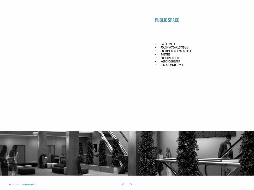
public space

Diploma with honourswarsaw 2009
the leading concept of the place is to unite the ama-teurs of the film art and to promote the cultural life of the city. the aim of the design was to combine three different functions - a cinema, a café and a shop - in one cameral space. the design allows the users to
effect their interests, to discuss with other film fans and to taste some original specialities from the “film-café” menu. the important aspect of the design was to reflect the atmosphere of the world’s greatest movies and to express it in the interior form.
mezzanine area: 45 m2
Groundfloor area: 76 m2
studio film clubCafe Lumiere

the aim of the design was to create an elegant place for Vips to enjoy their time during football matches. the de-sign was based on multifunctional requirements of the presidential Box and provides comfortable and luxurious surrounding. the arrangement of the interior allows the users to choose between three different types of sitting
areas with diverse table heights: the lower seat area, the dining area, the bar area. the space was analyzed in or-der not to disturb the main communication channels. the golden-black colour scheme clarifies the function divi-sion and the unique choice of details highlights the Vip character of the interior.
warsaw 2010/2011
POLISH National Stadium Presidential Box

POLISH National Stadium Presidential Box (multifunctional)
the design of the presidential Box was focused on the requirements of the multifunctional usage of the space besides the football matches. the concept of the design was to create a flexible and easily rear-rangeable interior which can fulfil four different
functions - a conference centre, a fashion show, a banquet or a wedding party and a play, a concert or a cabaret show. the golden-black colour scheme clarifies the function division and the unique choice of details highlights the Vip character of the interior.
Conference
Fashion show
Banquet
play/show
warsaw 2010/2011
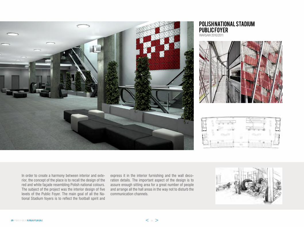
POLISH National Stadium public foyer
in order to create a harmony between interior and exte-rior, the concept of the place is to recall the design of the red and white façade resembling polish national colours. the subject of the project was the interior design of five levels of the public Foyer. the main goal of all the na-tional stadium foyers is to reflect the football spirit and
express it in the interior furnishing and the wall deco-ration details. the important aspect of the design is to assure enough sitting area for a great number of people and arrange all the hall areas in the way not to disturb the communication channels.
warsaw 2010/2011

POLISH National Stadium public foyerwarsaw 2010/2011
the concept of the public Foyers, which is to recall the design of the extraordinary façade, continues on the up-per stories of the warsaw national stadium. the space arrangement was aimed not to disrupt the communica-tion channels.
the main idea of the pitch level foyer is to reflect the football spirit. this level has the strongest football motive visible directly through the furnishing design.

warsaw 2010/2011
POLISH National Stadium VIP foyer
the inspiration of the Vip Foyers was red and white fa-çade resembling polish national colours. the subject of the project was to design the interior for two underground and four upper ground levels of the warsaw national sta-dium.
the upper levels are located directly in front of the en-trance to the lodges. the concept was to connect the colour palette of the stadium Foyers with the elegance of the Vip boxes and express it in the proper furnishing and materials.
Competition winnerwarsaw 2011
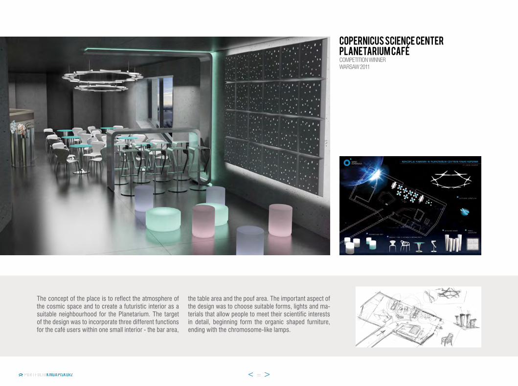
the concept of the place is to reflect the atmosphere of the cosmic space and to create a futuristic interior as a suitable neighbourhood for the planetarium. the target of the design was to incorporate three different functions for the café users within one small interior - the bar area,
the table area and the pouf area. the important aspect of the design was to choose suitable forms, lights and ma-terials that allow people to meet their scientific interests in detail, beginning form the organic shaped furniture, ending with the chromosome-like lamps.
Copernicus Science Center planetarium cafe

elBlaG 2011
local Theatre Main stage foyer
the design was adjusted to the new interior space of a renovated building. the aim of the design was to create a new, fresh look of the old theatre but with maintaining the history and tradition of the building.
the direct inspiration for the main stage foyer was the collection of posters of the plays painted by a local artist. the individual colour scheme and the artistic character of the interior were successfully maintained.
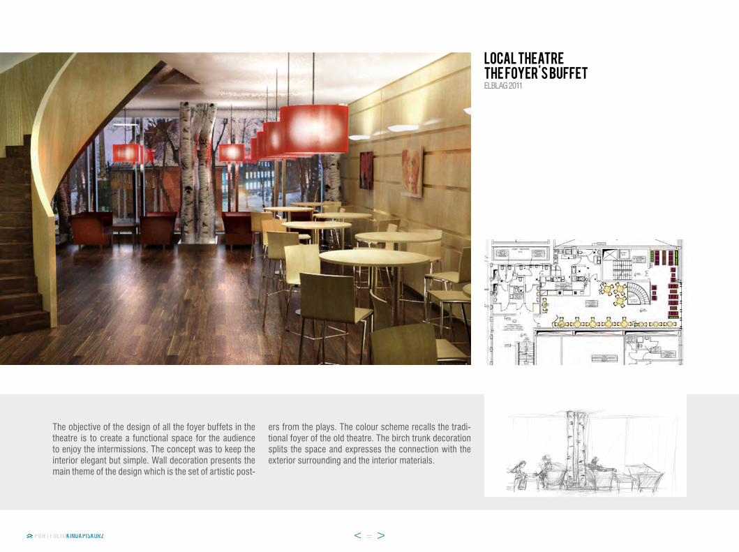
the objective of the design of all the foyer buffets in the theatre is to create a functional space for the audience to enjoy the intermissions. the concept was to keep the interior elegant but simple. wall decoration presents the main theme of the design which is the set of artistic post-
ers from the plays. the colour scheme recalls the tradi-tional foyer of the old theatre. the birch trunk decoration splits the space and expresses the connection with the exterior surrounding and the interior materials.
elBlaG 2011
local Theatre the Foyer's Buffet

elBlaG 2011
European Culture Centrecinema foyer
the aim of the design was to create a new, fresh look from the old building’s interiors and give it proper func-tionality taking into consideration the requirements of a cultural centre. the old concrete construction of the building was maintained but it was supplemented with a nature-inspired scandinavian style design.
the goal of the cinema foyer is to assure enough room for a great number of people and still make them feel like in a cameral space. that is why the area was divided into several relaxing corners using only the furniture and the birch trunk decoration arrangement.

elBlaG 2011
European Culture Centre restaurant&cafe
the idea of the restaurant follows the nature-inspired scandinavian style design of the cultural centre. the open and airy character of the mezzanine area was en-hanced with the light forms of the furniture and the origi-nal lighting design.
this concept allows the customers to feel easy in a not disturbing interior and to enjoy their meal time in a peace-ful environment. the birch trunk decoration reflects the wall covering design and emphasizes the simplicity of the interior style.

slant open international lanDsCape DesiGn Competition “eVokinG memories” 2013
THE SECRET GARDEN WEDDING THE WEDDING SHELTER
the direct inspiration for the form was the leaf geometry created by nature itself. the final shelter design responds to a hornbeam’s leaf and is a scaled and simplified ver-sion of its venation map. the leaf’s core is made from laminated curved wooden beams which can be covered
with a tensile membrane or with a milky reinforced pCV boards providing additional uV protection. the leaf has basically a function of a stage area. Floor is divided into 2 levels: 1st - lower for the main ceremony and 2nd - higher, for a host, a guest musician or a signer.

the concept of the designed space was inspired by Frances hodgson’s novel the secret Garden. the aim of the design was to create a place where people can bring back memories and open to the new ones. the area of the secret garden was divided into 4 dif-ferent functions intended for the site: a leaf canopy
where all the celebrations would take place, guests area covered with pergola, resting corner, buffet area for apéritif during a wedding reception. the spatial design (or a leaf canopy itself) can serve additional purpose as host to musical concerts, spectacles and many other open-air events.
THE SECRET GARDEN WEDDING THE WEDDING SHELTERslant open international lanDsCape DesiGn Competition “eVokinG memories” 2013
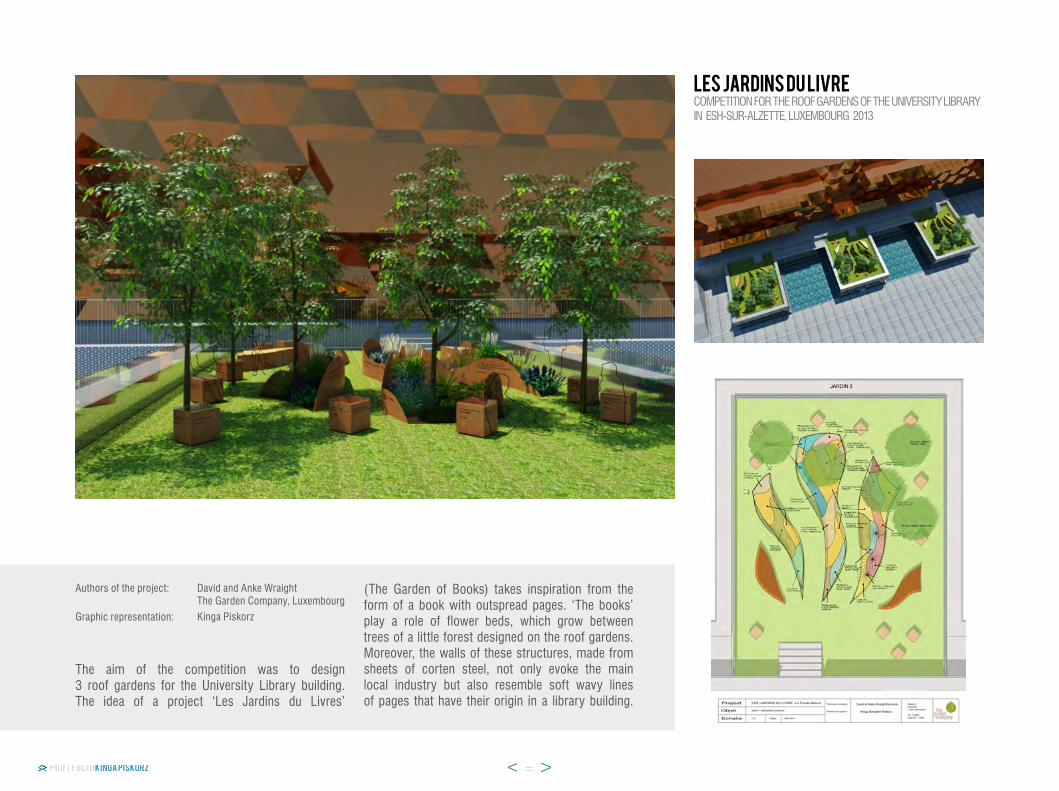
Competition For the rooF GarDens oF the uniVersity liBrary in esh-sur-alzette, luxemBourG 2013
authors of the project:
Graphic representation:
the aim of the competition was to design 3 roof gardens for the university library building. the idea of a project ‘les Jardins du livres’
(the Garden of Books) takes inspiration from the form of a book with outspread pages. ‘the books’ play a role of flower beds, which grow between trees of a little forest designed on the roof gardens. moreover, the walls of these structures, made from sheets of corten steel, not only evoke the main local industry but also resemble soft wavy lines of pages that have their origin in a library building.
LES JARDINS DU LIVRE
David and anke wraightthe Garden Company, luxembourgkinga piskorz
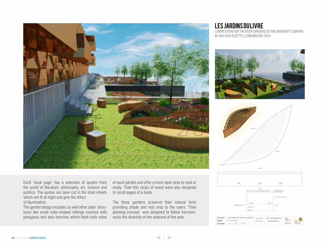
each ‘book page’ has a selection of quotes from the world of literature, philosophy, art, science and politics. the quotes are laser cut in the steel sheets which are lit at night and give the effectof illumination.the garden design includes as well other steel struc-tures like small cube-shaped sittings covered with plexiglass and also benches which flank both sides
of each garden and offer a more open area to read or study. their thin strips of wood were also designed to recall pages of a book.
the three gardens preserve their natural form providing shade and rest area to the users. their planting concept was designed to follow harmoni-ously the diversity of the seasons of the year.
LES JARDINS DU LIVRECompetition For the rooF GarDens oF the uniVersity liBrary in esh-sur-alzette, luxemBourG 2013
OFFICE DESIGN
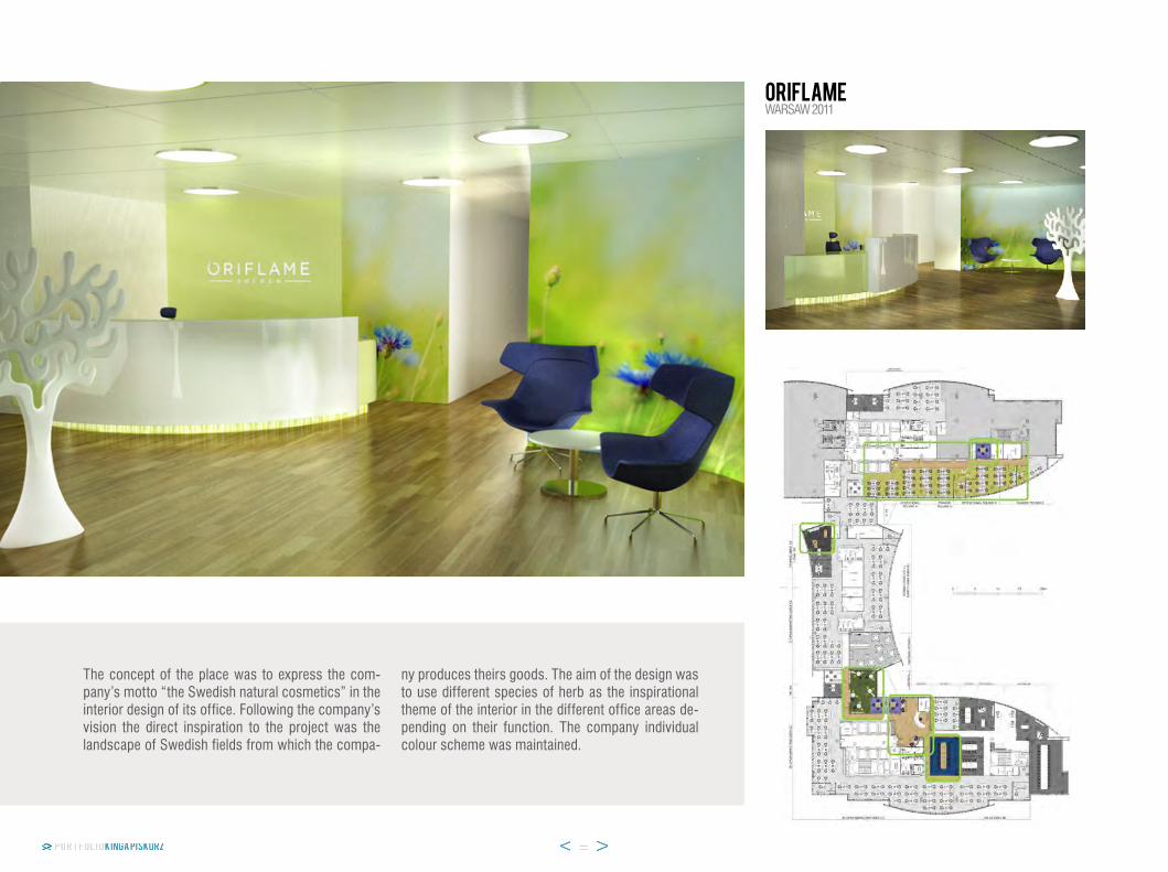
warsaw 2011oriflame
the concept of the place was to express the com-pany’s motto “the swedish natural cosmetics” in the interior design of its office. Following the company’s vision the direct inspiration to the project was the landscape of swedish fields from which the compa-
ny produces theirs goods. the aim of the design was to use different species of herb as the inspirational theme of the interior in the different office areas de-pending on their function. the company individual colour scheme was maintained.

RABOBANK
the purpose was to design a coherent office interior which follows the origin of the netherlands based company. the design takes inspiration from old tra-ditional windmills which are an important symbol of the Dutch agriculture. the idea was not only to in-
corporate the same motive in various spaces of the office but also to use the forms and the materials which express the dynamics and motion of the wind. the colour palette was chosen to remind of the rural life and the typical country landscape.
warsaw 2012
Concept of the wall layout

omron
the design was oriented to the requirements of the Japanese based company and its technical function-ality. the concept of the place is to express the com-pany’s Japanese origins in the representative parts of the interior and arrange the back office in a way which meets individual user’s needs.
the aim of the design of this part of the office was to create the waiting lounge area for guests and cus-tomers who arrive for conferences, spend here their coffee breaks and admire the exposition of the com-pany’s products.
warsaw 2012
exposition wall

omron
the intention of the hall space design was to follow the cultural references to Japan. the narrow back hall which leads to the terrace was widen by a zen garden and a mirror wall illusion. this concept al-lows to increase the amount of sunlight in the com-munication area and creates a nice connection to the outdoors.
the main entrance wall presents two panels with Japanese inscriptions of the company name and the company motto. all the walls in the representative area where covered with vinyl silk-like covering.
warsaw 2012
entrance wall
zen garden section
zen garden plan
RESIDENCE

the subject of the project was to redesign the interior of a house in accordance with the needs of the owners. the purpose was to add more light and space illusion into the dark ground-level room and create an open area that contains four different functions: dinning, kichen, living room and fireplace lounge. the modern style of the in-tertior design and the function arrangement coresponds with the owners expectations and their life style.
MODERN STYLE SINGLE FAMILY HOUSEliving&dining areawarsaw 2010
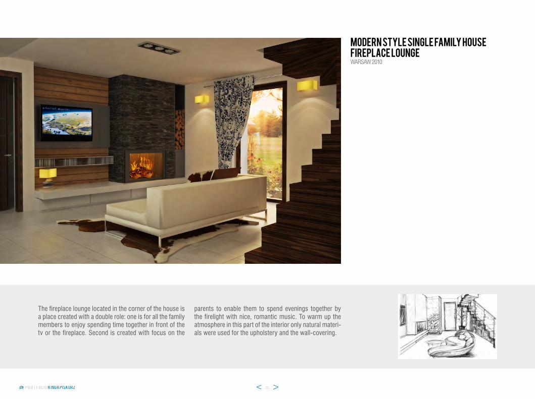
the fireplace lounge located in the corner of the house is a place created with a double role: one is for all the family members to enjoy spending time together in front of the tv or the fireplace. second is created with focus on the
parents to enable them to spend evenings together by the firelight with nice, romantic music. to warm up the atmosphere in this part of the interior only natural materi-als were used for the upholstery and the wall-covering.
MODERN STYLE SINGLE FAMILY HOUSEFireplace Loungewarsaw 2010
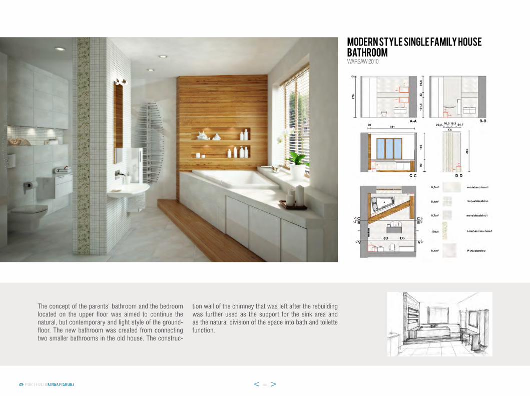
the concept of the parents’ bathroom and the bedroom located on the upper floor was aimed to continue the natural, but contemporary and light style of the ground-floor. the new bathroom was created from connecting two smaller bathrooms in the old house. the construc-
tion wall of the chimney that was left after the rebuilding was further used as the support for the sink area and as the natural division of the space into bath and toilette function.
MODERN STYLE SINGLE FAMILY HOUSEbathroomwarsaw 2010

the concept of the place raised from holiday impres-sions of the apartment’s owner who made a memorable journey to tuscany. the most important aspect of the design was not only to reflect the atmosphere of the rustic tuscan interiors but also to incorporate individual
requirements and taste of the owner herself. the interior colour scheme and materials was taken directly from the warm palette of the tuscan landscape. each section of the aparment is determined by a different colour tone.
TUSCAN STYLE APARTMENTbedroompruszkow 2012

the design of the kitchen was inspired by the traditional country interiors with creamy white wall coloring and clay coloured terracotta floor finishing. the rusticated chimney wall in the corner of the room was created from
handmade cobalt blue wall tiles. the furniture was de-signed to be fully functional and yet charmingly simple with a roughly finished look at the same time. the original apron sink recalls the cottage style interior design.
TUSCAN STYLE APARTMENTkitchenpruszkow 2012

the bathroom was inspired by the colour of tuscan cypresses. small size of the room was visualy widened with the ilussion created by a big mirror located upon the sink area and mimimum amount of the wall tiles used. the rustic design of the furniture reflects the shutters of a tuscan country house. the olive green colour in this room is accented on the cornices made from an original stove tiles.
TUSCAN STYLE APARTMENTbathroompruszkow 2012

leGionowo 2012classical STYLE kitchen
the kitchen was designed as a union of old and contem-porary design. the cabinet details and wall tiles have the characteristics of the style most popular in england in the 18th and 19th centuries. on the other hand the louis Ghost chair, by philipe starck, made from transparent plastic stand for the design icons of 21st century.

graphic DESIGN

the main idea was to create the entire visual identifica-tion of the café as the supplement to the Diploma project. the logo was inspired by the French word “la lumière” which means “light”. the final concept raised from a
deep analysis of light&shadow effects of letters’ contour casting shadow on a wall. apart form the logotype de-sign the studies included also: interior and exterior visual identification, business stationery and papergoods.
annual bill
Café menu
Business card
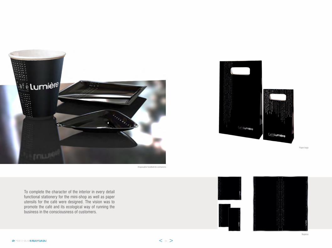
to complete the character of the interior in every detail functional stationery for the mini-shop as well as paper utensils for the café were designed. the vision was to promote the café and its ecological way of running the business in the consciousness of customers.
napkins
Disposable food&drink containers
paper bags

the aim was to create a graphic image of the company. the idea of the design was based on the owner’s vision to create fresh and positive impression of the company but with an extraoridinary layout. the subject of the design was a full set of business stationery and complementary advertisement materials.
Business cards
Business paper

the aim was to create a logotype for the company that organizes extraordinary professional training for youth to help them develop their personality. the company’s profile is divided into four sections which are represented by four different colours of the train
logo. the idea of the design was to create a modern and dynamic image that will appeal especially to young people. the logotype was prepared in three different types, sizes and colours depending on the purpose of use.
middle size logotype colour
small size logotype colour
middle size logotype black&white
small size logotype black&white

the aim was to create a logotype for the tailor’s work-shop that is located in the old part of warsaw. the main idea of the image was to refelect the historical surround-ings and to design a retro-style logotype that will express the chic and classic character of the place.
small size logotype
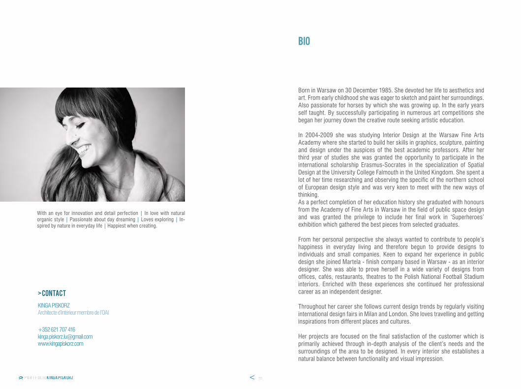
Born in warsaw on 30 December 1985. she devoted her life to aesthetics and art. From early childhood she was eager to sketch and paint her surroundings. also passionate for horses by which she was growing up. in the early years self taught. By successfully participating in numerous art competitions she began her journey down the creative route seeking artistic education.
in 2004-2009 she was studying interior Design at the warsaw Fine arts academy where she started to build her skills in graphics, sculpture, painting and design under the auspices of the best academic professors. after her third year of studies she was granted the opportunity to participate in the international scholarship erasmus-socrates in the specialization of spatial Design at the university College Falmouth in the united kingdom. she spent a lot of her time researching and observing the specific of the northern school of european design style and was very keen to meet with the new ways of thinking.as a perfect completion of her education history she graduated with honours from the academy of Fine arts in warsaw in the field of public space design and was granted the privilege to include her final work in ‘superheroes’ exhibition which gathered the best pieces from selected graduates.
From her personal perspective she always wanted to contribute to people’s happiness in everyday living and therefore begun to provide designs to individuals and small companies. keen to expand her experience in public design she joined martela - finish company based in warsaw - as an interior designer. she was able to prove herself in a wide variety of designs from offices, cafés, restaurants, theatres to the polish national Football stadium interiors. enriched with these experiences she continued her professional career as an independent designer.
throughout her career she follows current design trends by regularly visiting international design fairs in milan and london. she loves travelling and getting inspirations from different places and cultures.
her projects are focused on the final satisfaction of the customer which is primarily achieved through in-depth analysis of the client’s needs and the surroundings of the area to be designed. in every interior she establishes a natural balance between functionality and visual impression.
bio
with an eye for innovation and detail perfection | in love with natural organic style | passionate about day dreaming | loves exploring | in-spired by nature in everyday life | happiest when creating.
kinGa piskorzarchitecte d’intérieur membre de l’oai
> contact
+352 621 707 [email protected]