known for being of and about new york city. she has a
TRANSCRIPT
ROSE MARCUS
JM: There is a hint of the architect and painter at odds with one another in the way you manipulate photographs and with the materials you choose to print on. What is your relationship to the gestural and to gesture?
RM: In 2008, I began my first series of photos. I took images of empty storefronts in Manhattan which closed closed due to the crash. They were like double negatives; I caught exterior images reflected in the storefront glass while shooting the interiors. I used a digital camera with no viewfinder so more often than not I was using the window as an extra lens and my shadow allowed the camera access to the interiors. I guess that was the first stage with gesture, honoring the found gesture. All the smears on the windows were painting and compositions of debris inside were like sculpture for me. The resulting images were just so common that I felt like it let both a lot of concept and memory in at the same time. I printed these on the adhe-sive vinyl at a scale true to storefronts and adhered them to the wall. Both Louise Lawler's and Zoe Leonard’s practices were very close. And what your question brings to mind is a distinc-tion maybe, of conceits. That interior-exterior relationship was important because I wanted more subjectivity, more emotional content.
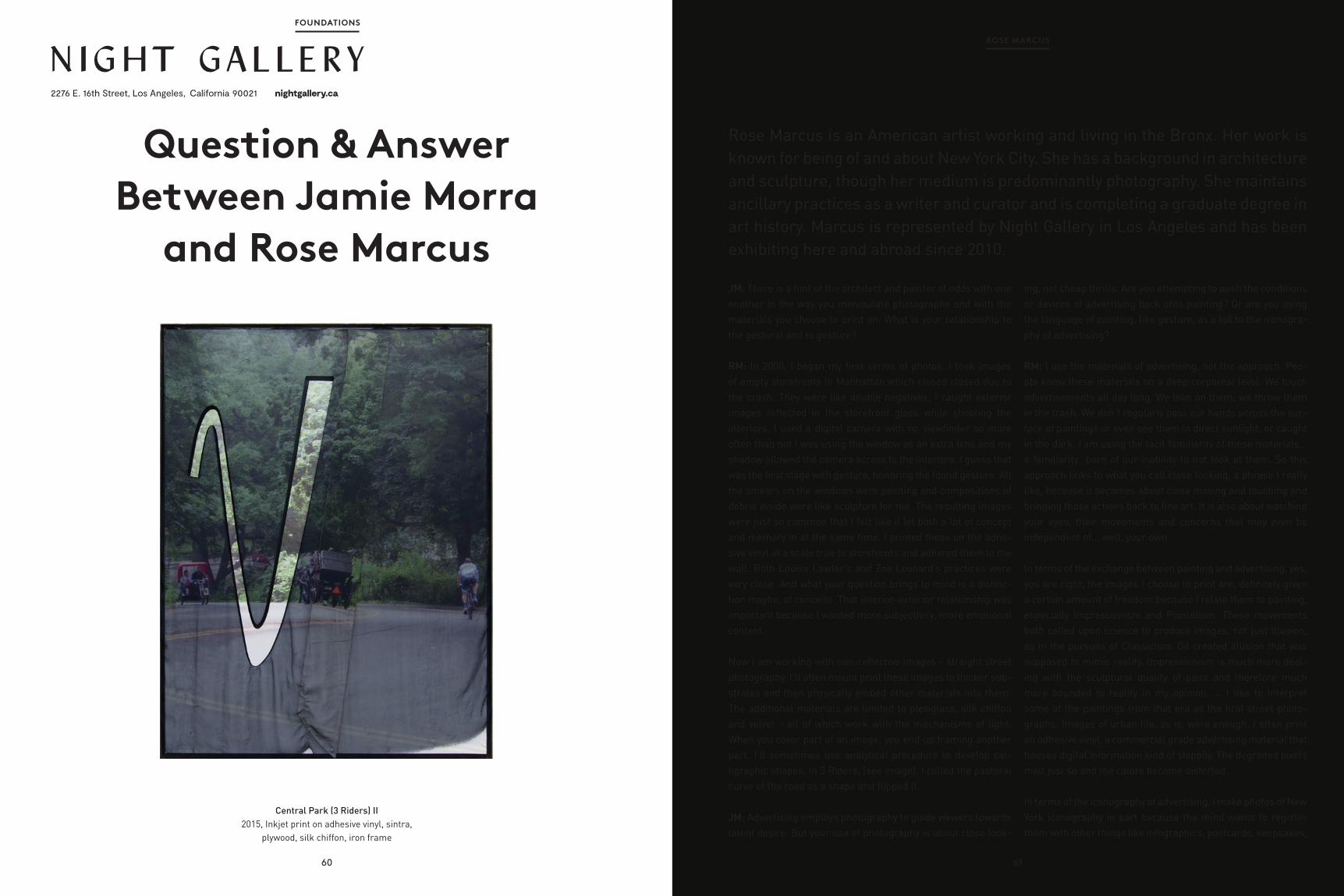
Now I am working with non-reflective images - straight street photography. I’ll often mount print these images to thicker sub-strates and then physically embed other materials into them. The additional materials are limited to plexiglass, silk chiffon and velvet - all of which work with the mechanisms of light. When you cover part of an image, you end up framing another part. I’ll sometimes use analytical procedure to develop cal-ligraphic shapes. In 3 Riders, (see image), I culled the pastoral curve of the road as a shape and flipped it.
JM: Advertising employs photography to guide viewers towards latent desire. But your use of photography is about close look-
ing, not cheap thrills. Are you attempting to push the conditions or devices of advertising back onto painting? Or are you using the language of painting, like gesture, as a foil to the iconogra-phy of advertising?
RM: I use the materials of advertising, not the approach. Peo-ple know these materials on a deep corporeal level. We touch advertisements all day long. We lean on them; we throw them in the trash. We don’t regularly pass our hands across the sur-face of paintings or even see them in direct sunlight, or caught in the dark. I am using the tacit familiarity of these materials... a familiarity born of our inability to not look at them. So this approach links to what you call close looking, a phrase I really like, because it becomes about close moving and touching and bringing those actions back to fine art. It is also about watching your eyes, their movements and concerns that may even be independent of... well, your own.
In terms of the exchange between painting and advertising, yes, you are right, the images I choose to print are, definitely given a certain amount of freedom because I relate them to painting, especially Impressionism and Pointillism. These movements both called upon science to produce images, not just illusion, as in the pursuits of Classicism. Oil created illusion that was supposed to mimic reality. Impressionism is much more deal-ing with the sculptural quality of paint and therefore much more bounded to reality in my opinion. ... I like to interpret some of the paintings from that era as the first street photo-graphs. Images of urban life, as is, were enough. I often print on adhesive vinyl, a commercial grade advertising material that houses digital information kind of sloppily. The degraded pixels melt just so and the colors become distorted.
In terms of the iconography of advertising, I make photos of New York iconography in part because the mind wants to register them with other things like infographics, postcards, keepsakes,
Rose Marcus is an American artist working and living in the Bronx. Her work is known for being of and about New York City. She has a background in architecture and sculpture, though her medium is predominantly photography. She maintains ancillary practices as a writer and curator and is completing a graduate degree in art history. Marcus is represented by Night Gallery in Los Angeles and has been exhibiting here and abroad since 2010.
61
FOUNDATIONS
60
Central Park (3 Riders) II 2015, Inkjet print on adhesive vinyl, sintra,
plywood, silk chiffon, iron frame
Question & Answer Between Jamie Morra
and Rose Marcus
2276 E. 16th Street, Los Angeles, California 90021 nightgallery.ca

Central Park, 2015, Inkjet print on adhesive vinyl, BC plywood, plexi glass, rubber, iron frame
Central Park, 2015, Inkjet print on adhesive vinyl, BC plywood, silk chiffon, plexi glass, iron frame
63
ROSE MARCUSFOUNDATIONS
snapshot and yes, advertising ... and also just not knowing what to do with memories. I make photos that, seemingly, could eas-ily be taken, but are chosen for a tone that doesn’t quite fit into in one of the those categories. The photos I work with, if taken for pedestrian purposes, would most likely not be printed and would never be printed large. And by printing them really large I dip back into the language of public space and advertising, but for me, this scale registers first with painting.
JM: Is there a reason your images often depict figures but remain faceless?
RM: I just read an interview with Carroll Dunham whose fig-ures are also faceless. We have the same motive on that - faces just have too much personality and the viewer will either be attracted or alienated. It is not about being a voyeur, it is about giving more space for the viewer to project themselves. As you suggested in an earlier conversation, identity is at stake, but expressions, like gesture, tell a story. Portraiture is portraiture.
JM: Is the 1:1 scale of your work a reference to the body?
RM: The scale is not always 1:1, recent work is even larger than 1:1. I want what looks like photography to have sculptural weight. At times, I am testing the strength of the material and I like that the work can become unmanageable, physically, for me. It makes my decisions more risky. And it makes a practice that is largely outsourced, i.e. the printing, require a lot more physical tasks which I like. I want to manually stay involved with the work.
When the work is figurative, I especially want viewers to think
about the physical weight of a person on the ground. In part, I’ve focussed on the lower half of the body in that work for this reason. This is why contrapposto is still so effective, there is sex appeal, but it is also a diagram of the weight of the body on itself and on the ground. I studied painting for a summer at the Studio School and Graham Nixon talked a lot about Giacomet-ti’s paintings. He talked about how the figure was pinned into the world by its surroundings. In short, the frame creates the body. Contour lines and isolated figures were dishonest, deadly. As if gravity itself assists in making the images.
JM: We have discussed problems with words like quotidian, colloquial, pedestrian and voyeuristic to describe your work. I think of your content as vernacular, both in its relationship to language and architecture. Is there a word or way of describing these images you feel comfortable with yet?
RM: No.
JM: Your images of Central Park pit culture against nature, reframing public space as a private moment. Are you actively positioning these ‘dialectics of the landscape’ to borrow some of Robert Smithson’s terminology?
RM: I have been trying to work my reasoning away from bina-ries. I think culture is embedded in nature. In terms of public space, it strikes me more as circumstance, on relating to the limits of language. Public space is a condition. This sentence, “I spent the afternoon in Central Park.”, is such a fixed idea that it could be translated into a pictogram. It is often about fulfilling an expectation of having a private moment in public.
62
Impressionism is much more dealing with the sculptural quality of paint and therefore much
more bounded to reality in my opinion. ... I like to interpret some of the paintings from that era as
the first street photographs.

JM: New York is clearly your muse/mistress. How do you maintain an intimate relationship to this subject qua object?
RM: Well, wow. I think I remain intimate with the city by ensuring that my relationship to it is more lateral. A hier-archical relationship would be more like: I must do this in order to be in this city or this city must do certain things for me—or else. I have been coming to New York my whole life; this is where my grandparents are from. The fact that it keeps performing itself, its cinematic self, over and over again is wild. We have talked about how both Robert Morris and Tony Smith made work that confused monument, sculpture and architecture. I feel like living in that space and consciously confusing those terms is a good way for an artist to move around the city. And that is part of the way I want to use my work, to help me move around. The last several series have all been of New York icons, like the Empire State Building, Strawberry Fields and the Seagrams Building. They are places, like art, where the viewer has a quick clean understanding of who is watching and what is performing. I am trying to slow down that process and also trying to figure out how the objects themselves change. This arc of thought goes back to Man Ray’s "Dust Breeding".
And going back to gesture... Since Classicism, it has been the gesture of the body that moved art forward, think Hel-lenistic sculpture. Gesture is vision becoming action or maybe it is the beginning of action. Eyesight is impaired by New York; it is so easy to walk around blindly. So iso-lating gesture is another reminder that looking is an act too—eyes just don’t have arms.
Like everyone, I have taken thousands of digital photos. I should probably never take
another one again. Its starting to hurt. I should probably only use 10 photos for the rest of my life. ... All I know is when a photo
has not been figured out, I reuse it.
65
ROSE MARCUSFOUNDATIONS
Central Park, like Smithson’s work, was designed to encourage a dialectical relationship between culture and nature. Maybe these dialectics always get simplified into surface? Go five miles in any direction away from the park and you will find the indus-try that creates that aforementioned image of an afternoon. I’m just trying to make these simple connections reappear... that incessant division between the concrete and metaphysical, mind and body, and in this context, entertainment from indus-try. We consistently seek readymade experience. My hope is that loosening fixed things, especially icons, monuments and public space, will re-tether them to their opposites. And I do love parks.
JM: You reuse images and materials towards different ends in your work, which seems to serve a narrative thread. Do you feel comfortable defining the terms of your practice within these choices?
RM: All of the works are one-of-a-kind but the digital informa-
tion can be reused. Like everyone, I have taken thousands of digital photos. I should probably never take another one again. It's starting to hurt. I should probably only use 10 photos for the rest of my life—All I know is when a photo has not been figured out, I reuse it.
I’m curious how the images will look in 20 years. Repetition gets called branding but it is much deeper. I think about Jim Dine’s bathrobes a lot. Our reality is so dense, so much has changed in the last century, half century, decade, that to really honor a material, or even just one image you have to go back to it, or you are not letting it fully deliver the information it keeps.
JM: Do social issues creep into your work as a result of the setting in which the images take place or is this something you are trying to address as content?
RM: Purposeful content, absolutely.
64
Installation view at And Now Dallas, Texas, 2016