lab 4: displaying geospatial data - wordpress.com · qgis lab series - lab 4 – displaying...
TRANSCRIPT

QGIS LAB SERIES GST 101: Introduction to Geospatial Technology
Lab 4: Displaying Geospatial Data
Objective – Explore and Understand How to Display Geospatial Data
Document Version: 2014-06-05 (Final)
Copyright © National Information Security, Geospatial Technologies Consortium (NISGTC) The development of this document is funded by the Department of Labor (DOL) Trade Adjustment Assistance Community College and Career Training (TAACCCT) Grant No. TC-22525-11-60-A-48; The National Information Security, Geospatial Technologies Consortium (NISGTC) is an entity of Collin College of Texas, Bellevue College of Washington, Bunker Hill Community College of Massachusetts, Del Mar College of Texas, Moraine Valley Community College of Illinois, Rio Salado College of Arizona, and Salt Lake Community College of Utah. This work is licensed under the Creative Commons Attribution 3.0 Unported License. To view a copy of this license, visit http://creativecommons.org/licenses/by/3.0/ or send a letter to Creative Commons, 444 Castro Street, Suite 900, Mountain View, California, 94041, USA.
Author: Kurt Menke, GISP

QGIS LAB SERIES - Lab 4 – Displaying Geospatial Data
6/6/2014 Copyright © 2013 NISGTC Page 1 of 30
Contents
1 Introduction ................................................................................................................. 2
2 Objective: Create a Map that Meets the Customer’s Requirements ........................... 2
3 How Best to Use Video Walk Through with this Lab ................................................ 3
Task 1 Add Data, Organize Map Layers and Set Coordinate Reference System ............ 3
Task 2 Style Data Layers ............................................................................................... 13
Task 3 Compose Map Deliverable ................................................................................. 23
5 Conclusion ................................................................................................................ 29
6 Discussion Questions ................................................................................................ 29
7 Challenge Assignment .............................................................................................. 30

QGIS LAB SERIES - Lab 4 – Displaying Geospatial Data
6/6/2014 Copyright © 2013 NISGTC Page 2 of 30
1 Introduction
In this lab, students will learn how to complete a well-designed map showing the
relationship between species habitat and federal land ownership. The student will learn
how to style GIS data layers in QGIS Desktop. They will then learn how to use the QGIS
Print Composer to design a well crafted map deliverable. The final map will include
standard map elements such as the title and map legend.
This lab will also continue to introduce students to the QGIS interface, as QGIS Desktop
will be used throughout the course. It is important to learn the concepts in this lab as
future labs will require the skills covered in this lab.
This lab includes the following tasks:
Task 1 – Add data, organize map layers and set map projections.
Task 2 – Style data layers.
Task 3 – Compose map deliverable.
2 Objective: Create a Map that Meets the Customer’s Requirements
Often times, you will be provided with a map requirements document from a coworker or
customer. For this lab, the student will respond to a map requirements document from a
customer who is writing a paper about the state of Greater sage-grouse habitat in the
western United States. The map requirements from the customer are below.
Map Requirements from Customer:
Hi, my name is Steve Darwin. I am a wildlife biologist writing a paper on the state of
Greater sage-grouse (Figure 1) populations in the western United States. I need a letter
sized, color, map figure that shows the relationship between current occupied Greater
sage-grouse habitat and federal land ownership. I am interested in seeing how much
habitat is under federal versus non-federal ownership.
I have been provided data from the US Fish and Wildlife Service depicted current
occupied range for Greater sage-grouse. I also have federal land ownership, state
boundaries and country boundaries from the US National Atlas. The land ownership data
has an attribute column describing which federal agency manages the land (AGBUR).
I want to have the habitat data shown so that the federal land ownership data is visible
beneath. I would like each different type of federal land styled with standard Bureau of
Land Management colors. The map should also include a title (“Greater sage-grouse
Current Distribution”), a legend, data sources and the date. The map should be a high-
resolution (300 dpi) jpg image.
I trust that you will get the figure right the first time, so please just submit the completed
figures to the managing editor directly.

QGIS LAB SERIES - Lab 4 – Displaying Geospatial Data
6/6/2014 Copyright © 2013 NISGTC Page 3 of 30
Figure 1: Male Greater sage-grouse
3 How Best to Use Video Walk Through with this Lab
To aid in your completion of this lab, each lab task has an associated video that
demonstrates how to complete the task. The intent of these videos is to help you move
forward if you become stuck on a step in a task, or you wish to visually see every step
required to complete the tasks.
We recommend that you do not watch the videos before you attempt the tasks. The
reasoning for this is that while you are learning the software and searching for buttons,
menus, etc…, you will better remember where these items are and, perhaps, discover
other features along the way. With that being said, please use the videos in the way that
will best facilitate your learning and successful completion of this lab.
Task 1 Add Data, Organize Map Layers and Set Coordinate Reference System
In this first task you will learn a new way to add data to QGIS Desktop. You will then set
the projection for the map project, organize the data layers in the Table of Contents and
change the layer names.
1. The data for this lab is located at C:\GST101\Lab 4 on the lab machine. Copy this
data to a new working directory of your choosing.
2. Open QGIS Desktop 2.2.0.

QGIS LAB SERIES - Lab 4 – Displaying Geospatial Data
6/6/2014 Copyright © 2013 NISGTC Page 4 of 30
In Lab 2 you learned how to add data to QGIS Desktop by using the Add Vector Data
and Add Raster Data buttons. Now you’ll learn another method of adding data to QGIS
Desktop. You’ll use the QGIS Desktop Browser tab.
3. Select the Browser tab at the bottom of the Table of Contents (Figure 1).
NOTE: If the Browser tab is not there right click on the blank space to the right of
the Help menu. This opens a context menu showing all the toolbars and windows that
can be added to the QGIS Desktop interface. Check the box next to Browser. The
Browser tab is added to the Table of Contents .
Figure 1: QGIS Browser Tab in QGIS Desktop
4. Using the file tree in the Browser window navigate to the Lab 4 data folder.
5. Right click on the Lab 4 data folder and choose Add as a favourite from the
context menu.

QGIS LAB SERIES - Lab 4 – Displaying Geospatial Data
6/6/2014 Copyright © 2013 NISGTC Page 5 of 30
6. When recent changes have been made, such as setting a folder as a favourite, the
Refresh button needs to be used in order to see the changes. Click the Refresh
button (Figure 2).
Figure 2: Refresh button in the QGIS Desktop Browser window
7. Now expand Favourites near the top of the file tree in the Browser window by
clicking the plus sign to the left. You will see the Lab 4 data folder listed. Setting
the folder as a favourite allows you to quickly navigate to your working folder.
8. You will see 5 shapefiles in the lab data folder:
Canada.shp
Land_ownership.shp
Mexico.shp
Sage_grouse_current_distribution.shp
Western_states.shp
9. You can select them all by holding down the Ctrl key on your keyboard while left
clicking on each shapefile. Select the five shapefiles (Figure 3).

QGIS LAB SERIES - Lab 4 – Displaying Geospatial Data
6/6/2014 Copyright © 2013 NISGTC Page 6 of 30
Figure 3: Shapefiles selected in Browser window
10. You can select them all by holding down the Ctrl key on your keyboard while left
clicking on each shapefile. Select the five shapefiles (Figure 3).
11. While holding the Ctrl key down drag the five selected shapefiles onto the map
canvas. This is another way of adding geospatial data to QGIS Desktop. QGIS
Desktop should now look like Figure 4. The random colors that QGIS assigns to
the layers may be different than Figure 4 but that is fine

QGIS LAB SERIES - Lab 4 – Displaying Geospatial Data
6/6/2014 Copyright © 2013 NISGTC Page 7 of 30
Figure 4: Shapefiles added to map window
12. Now click on the Layers tab on the Table of Contents window to switch to the
view of your map layers. (Figure 5).

QGIS LAB SERIES - Lab 4 – Displaying Geospatial Data
6/6/2014 Copyright © 2013 NISGTC Page 8 of 30
Figure 5: Layers tab in QGIS Desktop
13. Save your map. Click on Project Save from the menu bar. Navigate to your
Lab 4 folder and save your project as Lab 4 (Figure 6).

QGIS LAB SERIES - Lab 4 – Displaying Geospatial Data
6/6/2014 Copyright © 2013 NISGTC Page 9 of 30
Figure 6: Saving QGIS Project
14. We have five layers but currently all we can see are data for Canada, Mexico and
the Western states. When you cannot see a dataset one approach is to make sure
the spatial extent of your map window covers that dataset. Right click on the
Sage_grouse_current_distribution and choose Zoom to Layer Extent from the
context menu. This will zoom you into the extent of that dataset.
15. That zooms you into the western United States but you still cannot see anything
that looks like habitat data (Figure 7).
Figure 7: Zoomed into Sage_grouse_current_distribution

QGIS LAB SERIES - Lab 4 – Displaying Geospatial Data
6/6/2014 Copyright © 2013 NISGTC Page 10 of 30
The data layers in the table of contents are drawn in the order they appear in. So the layer
that is on the top of the list in the Table of Contents will be drawn on top of the other
layers in the map view. Notice that the Western_states layer is in that top position. This
mean that Western_states is covering up the Sage_grouse_current_distribution and
Land_ownership data.
16. You can change this drawing order. Select the Land_ownership data layer in the
Table of Contents and drag it to the top position. You will see a blue line as you
drag this layer up the list.
17. Your map should now look like Figure 8.
Figure 8: Land ownership in the top position
18. Now drag the Sage_grouse_current_distribution layer into the top position.
Your map should now resemble Figure 9. Now all the data layers should be in the
correct order. Typically, data layers will be organized with point data layers on
top of line layers on top of polygon layers. Raster data layers are usually placed
near the bottom. There are always exceptions however.

QGIS LAB SERIES - Lab 4 – Displaying Geospatial Data
6/6/2014 Copyright © 2013 NISGTC Page 11 of 30
Figure 9: Land ownership in the top position
19. Next you will set the coordinate system for the map. Note that the lower left hand
corner of QGIS reads EPSG: 4269. This is the EPSG code for the coordinate
reference system (CRS) the map is currently in (Figure 10).
Figure 10: Map EPSG code
20. Click on Project Properties from the menu bar to open the Project
Properties window. Select the CRS tab. The current QGIS map CRS is listed at
the bottom (Figure 11). This is a fuller explanation of the maps CRS which is a
geographic coordinate system using the NAD83 datum. This CRS makes the
lower 48 look stretched out and distorted so you’ll want to change the maps CRS
into something that makes the lower 48 “look correct”. Make sure that the Enable
‘on the fly’ CRS transformation option is checked. Click OK to close the
Project Properties window.
Since the Sage_grouse_current_distribution layer is in an Albers projection, and the
QGIS map is in a geographic CRS, that means that the
Sage_grouse_current_distribution layer, is being projected on the fly into the
geographic projection of the map.

QGIS LAB SERIES - Lab 4 – Displaying Geospatial Data
6/6/2014 Copyright © 2013 NISGTC Page 12 of 30
Figure 11: Map CRS from Project Properties
21. Right click on the Sage_grouse_current_distribution layer and choose Set
Project CRS from Layer option on the context menu (Figure 12). This will put
the map into the Albers CRS of the Sage grouse layer. Note that the EPSG code in
the lower right corner now reads 5070 for the Albers CRS. This CRS gives the
western US an appearance we are more used to. Any other map layers not in
Albers, will now be projected on the fly into Albers.
Figure 12: Map CRS from Project Properties
22. Now you will change the layer names in the Table of Contents. The layer names
match the names of the shapefiles by default. However, these names will appear
on the legend. So you will always want to change these to proper names that your
map reading audience will understand. Right click on the
Sage_grouse_current_distribution layer, and choose the Properties from the
context menu, to open the Layer Properties window. Choose the General tab on
the left. Click in the box next to Layer name and change the name to Sage-
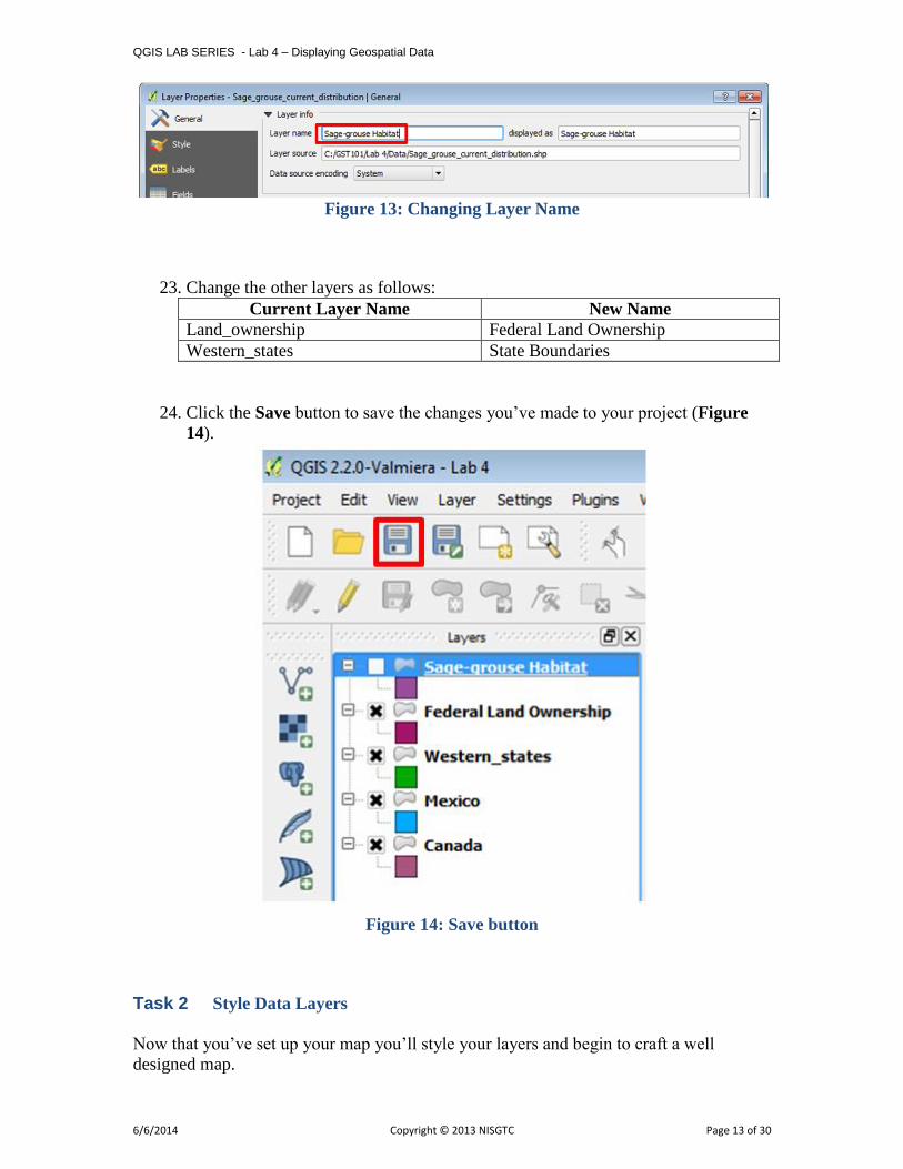
grouse Habitat (Figure 13). Click OK to close the Layer Properties window.
QGIS LAB SERIES - Lab 4 – Displaying Geospatial Data
6/6/2014 Copyright © 2013 NISGTC Page 13 of 30
Figure 13: Changing Layer Name
23. Change the other layers as follows:
Current Layer Name New Name
Land_ownership Federal Land Ownership
Western_states State Boundaries
24. Click the Save button to save the changes you’ve made to your project (Figure
14).
Figure 14: Save button
Task 2 Style Data Layers
Now that you’ve set up your map you’ll style your layers and begin to craft a well
designed map.

QGIS LAB SERIES - Lab 4 – Displaying Geospatial Data
6/6/2014 Copyright © 2013 NISGTC Page 14 of 30
1. Visually you’ll want the land ownership and sage-grouse habitat to have the most
weight. Canada and Mexico are there for reference but should fall to the
background. You’ll make them both light gray.
2. Double click on the Canada layer to open the Layer Properties window. This is
another way to open Layer Properties.
3. Click on the Style tab.
4. In the Symbol layers box click on Simple fill (Figure 14).
Figure 14: Layer Style
5. Find the Symbol layer type box on the right side of the window. This allows you
to change both the fill and outline symbols for this polygon layer. Click on the
colored box to the right of Fill to open the Select Color window.
6. You can pick existing Basic colors or define a color via A) hue, saturation and
value (HSV) or B) red blue and green (RGB) values. Set the color to Hue: 0 Sat:
0 and Val: 225. Make your Select Color window match Figure 15. Click the
Add to Custom Colors button to save this color. Click OK to close the window.

QGIS LAB SERIES - Lab 4 – Displaying Geospatial Data
6/6/2014 Copyright © 2013 NISGTC Page 15 of 30
Figure 15: Select Color
7. Click OK on the Layer Properties window to close and style the Canada layer.
8. Open Layer Properties for Mexico. Make Mexico the same color as the Canada
layer. You can just choose the Custom color you just saved.
9. Your map should now look like Figure 16.
Figure 16: Mexico and Canada changed to a gray fill

QGIS LAB SERIES - Lab 4 – Displaying Geospatial Data
6/6/2014 Copyright © 2013 NISGTC Page 16 of 30
10. Using the same workflow give the State Boundaries a white fill. You’ll be able
to find white in the Basic colors palette.
11. Now you’ll style the Land Ownership layer. Instead of making the entire layer
one color as you’ve done thus far, you’ll assign a unique color to each land
managing agency. How do you know who is managing each parcel? This will be
information contained in the attribute table. Right click on Land Ownership and
choose Open the Attribute Table from the context menu. There are 13 column
of information (Figure 17). Can you find the one that contains the land manager?
Figure 17: Land Ownership attribute table
12. Open the Layer Properties for Land Ownership to the Style tab. So far you’ve
used the default Single Symbol type. Now you’ll switch to Categorized. Click
the drop down menu and change from Single Symbol to Categorized (Figure
18).
Figure 18: Categorized symbolization

QGIS LAB SERIES - Lab 4 – Displaying Geospatial Data
6/6/2014 Copyright © 2013 NISGTC Page 17 of 30
13. Now you have the option of choosing an attribute column to symbolize the layer
by. The column AGBUR is the one that contains the managing agency values.
Click the drop down arrow and choose AGBUR for the Column. Then click the
Classify button (Figure 19). This tells QGIS to sort through all the records in the
table and identify all the unique values. Now you can assign a specific color to
each.
Figure 19: Categorized symbols by Attribute
14. Notice that there is a symbol with no values. These are parcels with no values
(NULL) in the AGBUR field. They represent private and state inholdings within
federal lands. Since you’re just interested in depicting federal land ownership
you’ll delete that symbol class. Select that top symbol by clicking on it, and then
click the Delete button below to remove that symbol. Now those parcels will not
be included on the map.
For the remaining federal land ownership symbols you’ll use the BLM Standards Manual
for land ownership maps
(http://www.blm.gov/noc/st/en/business/mapstandards/colormod.html). They have
designated colors for each type of land ownership. When composing a map it is important
to pay attention to industry specific standards. Following them will make the map more
intuitive to the target audience. For example, people are used to seeing Forest Service
land depicted in a certain shade of green.
15. To color BLM lands double click on the color patch left of BLM in the Style
window. The Symbol selector will open. Click on Simple fill. You won’t want
any border lines on these polygons. With such a complicated thematic polygon
layer they are too visually distracting. Choose a Border style of No Pen. Then

QGIS LAB SERIES - Lab 4 – Displaying Geospatial Data
6/6/2014 Copyright © 2013 NISGTC Page 18 of 30
click on the color patch right of Fill (Figure 20) to open the Select Color
window.
Figure 20: Symbol Selector for BLM lands
16. In the Select Color window change the Red, Green and Blue values to 254 – 230
– 121 (Figure 21). This will change the color to a specific shade of tan
representing BLM lands. Click OK in the Select Color window. Then click OK
in the Symbol Selector to save the BLM style.
Figure 21: Select Color for BLM lands
QGIS LAB SERIES - Lab 4 – Displaying Geospatial Data
6/6/2014 Copyright © 2013 NISGTC Page 19 of 30
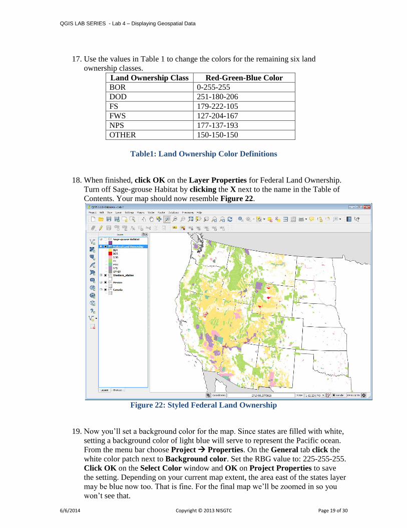
17. Use the values in Table 1 to change the colors for the remaining six land
ownership classes.
Land Ownership Class Red-Green-Blue Color
BOR 0-255-255
DOD 251-180-206
FS 179-222-105
FWS 127-204-167
NPS 177-137-193
OTHER 150-150-150
Table1: Land Ownership Color Definitions
18. When finished, click OK on the Layer Properties for Federal Land Ownership.
Turn off Sage-grouse Habitat by clicking the X next to the name in the Table of
Contents. Your map should now resemble Figure 22.
Figure 22: Styled Federal Land Ownership
19. Now you’ll set a background color for the map. Since states are filled with white,
setting a background color of light blue will serve to represent the Pacific ocean.
From the menu bar choose Project Properties. On the General tab click the
white color patch next to Background color. Set the RBG value to: 225-255-255.
Click OK on the Select Color window and OK on Project Properties to save
the setting. Depending on your current map extent, the area east of the states layer
may be blue now too. That is fine. For the final map we’ll be zoomed in so you
won’t see that.

QGIS LAB SERIES - Lab 4 – Displaying Geospatial Data
6/6/2014 Copyright © 2013 NISGTC Page 20 of 30
20. The states are white with a black border and serve to show non-federal land as
white which is great. However, the state boundaries are obscured since State
Boundaries are below Federal Land Ownership. Go to the Browser tab and add
Western_states.shp to the map again. You can have multiple copies of layers for
cartographic purposes. Drag the Western_states layer to the top of the Table of
Contents. Go into the Layer Properties Style tab and click on Simple fill.
Give the layer a Fill style of No Brush (Figure 23). It will now just be the state
outlines above Federal Land Ownership. Click OK to save.
Figure 23: Giving Western_states a No Brush fill
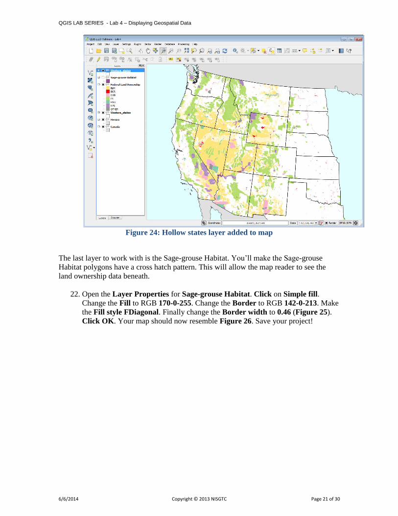
21. Your map should now resemble Figure 24.
QGIS LAB SERIES - Lab 4 – Displaying Geospatial Data
6/6/2014 Copyright © 2013 NISGTC Page 21 of 30
Figure 24: Hollow states layer added to map
The last layer to work with is the Sage-grouse Habitat. You’ll make the Sage-grouse
Habitat polygons have a cross hatch pattern. This will allow the map reader to see the
land ownership data beneath.
22. Open the Layer Properties for Sage-grouse Habitat. Click on Simple fill.
Change the Fill to RGB 170-0-255. Change the Border to RGB 142-0-213. Make
the Fill style FDiagonal. Finally change the Border width to 0.46 (Figure 25).
Click OK. Your map should now resemble Figure 26. Save your project!

QGIS LAB SERIES - Lab 4 – Displaying Geospatial Data
6/6/2014 Copyright © 2013 NISGTC Page 22 of 30
Figure 25: Sage-grouse Habitat styling
Figure 26: All layers styled

QGIS LAB SERIES - Lab 4 – Displaying Geospatial Data
6/6/2014 Copyright © 2013 NISGTC Page 23 of 30
Task 3 Compose Map Deliverable
Now that all the data is well styled you can compose the map deliverable.
1. Zoom in tighter to the Sage-grouse Habitat data. Use the Zoom in tool and
drag a box encapsulating the sage-grouse habitat. Leave a little of the Pacific
Ocean visible to the west to give some context (Figure 27). As it turns out the
data for Mexico is not needed. Sometimes you are given data that doesn’t end up
being used.
Figure 27: Final Map Extent
2. From the menu bar choose Project New Print Composer. Call the Composer
“Lab 4- Sage-grouse Habitat” (Figure 28). Click OK. The Print Composer will
open. This is where you craft your map.
Figure 28: New Print Composer

QGIS LAB SERIES - Lab 4 – Displaying Geospatial Data
6/6/2014 Copyright © 2013 NISGTC Page 24 of 30
The Print Composer is an application window with many tools that allow you to craft a
map. You may want to refer to the QGIS manual here:
http://www.qgis.org/en/docs/user_manual/print_composer/print_composer.html The
main window shows the piece of paper upon which the map will be designed. There are
buttons along the left side of the window that allow you to add various map elements:
map, scalebar, photo, text, shapes, attribute tables etc. Each item added to the map canvas
becomes a graphic object that can be further manipulated (if selected) by the Item
Properties tab on the right side of the composer. Across the top are buttons for exporting
the composition, navigating within the composition and some other graphic tools
(grouping/ungrouping etc.)
3. On the Composition tab you can specify details about the overall composition.
Set the Presets to ANSI A (Letter). Set the Orientation to Landscape. Set the
Export resolution to 300 DPI. These are listed as map requirements at the
beginning of the lab.
4. Using the Add new map button drag a box on the map canvas where you’d
like the map to go. Remember that you’ll need room for a title at the top of the
page and a legend to the right of the map (Figure 29). The map object can be
resized after it’s added by selecting it and using the handles around the perimeter
to resize.
Map extent helpful hints: Generally, the map will look as it does within QGIS Desktop.
However, you may need to change the map extent in QGIS Desktop, go back to the
Print Composer, select the map object and go to the Item Properties tab and choose
Update Preview. While there, you can also choose to Set to Map Canvas Extent. If the
map extent is still not quite right, you can use the Move Item Content button on the left
side to pan the map contents around within the map object. It is normal to have some
back and forth with QGIS Desktop and the Print Composer before getting the map just
right.
Figure 29: New Print Composer
QGIS LAB SERIES - Lab 4 – Displaying Geospatial Data
6/6/2014 Copyright © 2013 NISGTC Page 25 of 30
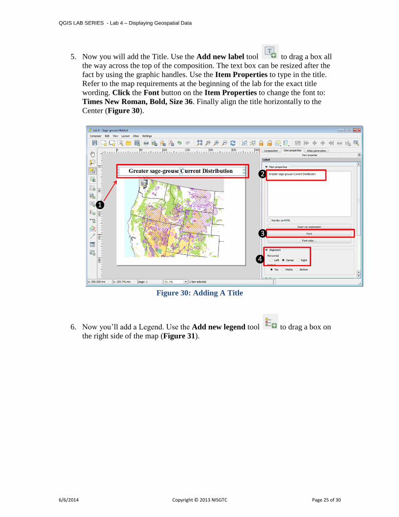
5. Now you will add the Title. Use the Add new label tool to drag a box all
the way across the top of the composition. The text box can be resized after the
fact by using the graphic handles. Use the Item Properties to type in the title.
Refer to the map requirements at the beginning of the lab for the exact title
wording. Click the Font button on the Item Properties to change the font to:
Times New Roman, Bold, Size 36. Finally align the title horizontally to the
Center (Figure 30).
Figure 30: Adding A Title
6. Now you’ll add a Legend. Use the Add new legend tool to drag a box on
the right side of the map (Figure 31).

QGIS LAB SERIES - Lab 4 – Displaying Geospatial Data
6/6/2014 Copyright © 2013 NISGTC Page 26 of 30
Figure 31: Adding A Legend
7. The upper most Western_states layer doesn’t need to appear in the legend, nor
does Mexico. Western_states is there purely for cartographic reasons. Mexico
doesn’t appear on the map. The Item Properties tab will be used to configure the
legend (Figure 32).
Figure 32: Legend Properties

QGIS LAB SERIES - Lab 4 – Displaying Geospatial Data
6/6/2014 Copyright © 2013 NISGTC Page 27 of 30
8. Select the Western_states layer and click the Delete item button to remove
it. Do the same for Mexico.
9. Expand the Federal Land Ownership layer. Click on the BLM class and click
the Edit button . Change the name to “Bureau of Land Management”. Go
through each remaining land ownership class and edit them to match Figure 33.
Figure 33: Legend Layer Labels
10. Add a neatline. A neatline is a frame around that map. Click the Add Rectangle
tool (Figure 34). Drag a box around the map object and legend. On the Item
Properties tab click the Style Change button. Click Simple fill and give it a Fill
style of No Brush. Give it a Border width of 1. Adjust the box so that it aligns
with the map boundary.

QGIS LAB SERIES - Lab 4 – Displaying Geospatial Data
6/6/2014 Copyright © 2013 NISGTC Page 28 of 30
Figure 34: Adding a Neatline
11. The last items to add are the data sources and date. Use the Add new label tool
click in the lower right hand corner of the composition. Using the Item Properties
type:
Data Sources: The National Atlas & USFWS
Date: Month Day, Year
12. Make the font size 8. (Figure 35)
Figure 35: Adding Supplemental Text

QGIS LAB SERIES - Lab 4 – Displaying Geospatial Data
6/6/2014 Copyright © 2013 NISGTC Page 29 of 30
13. Congratulations your map is finished! The final step is to export it to a high
resolution jpg image.
14. Click the Export as image button .
15. Choose JPEG as the Save as type and save the image to your Lab 4 folder.
Name the file “Lab4_Map.jpg” and click Save.
16. The final map should look like Figure 36.
Figure 36: Final Map
5 Conclusion
In this lab you’ve created a well-designed map using some of the cartography tools
available in QGIS Desktop. You created a nice map highlighting federal land ownership
within sage-grouse habitat for a client. This involved styling layers, styling layers by
categorical attributes and crafting a map composition.
.
6 Discussion Questions
1. Export the final map as a high resolution jpg for your instructor to grade.
2. What are two ways to add vector data to QGIS Desktop?

QGIS LAB SERIES - Lab 4 – Displaying Geospatial Data
6/6/2014 Copyright © 2013 NISGTC Page 30 of 30
3. How would a portrait orientation change the composition of the map? Describe
how you would arrange the map elements.
4. No map is perfect. Critique this map. What do you like about it? What do you
dislike about it? How would you change this map to improve it? Would you add
other data layers or add labels?
7 Challenge Assignment
Another biologist working with black bears on the east coast heard about your great work
on the sage-grouse map. She would like you to create a similar map for her. The data she
is providing is in the Lab 4/Data/Challenge folder.
She also needs letter sized, color, map figure but that shows the relationship between
black bear habitat and federal land ownership along the eastern seaboard. She is
interested in seeing how much habitat is under federal versus non-federal ownership.
She is providing data from the US Fish and Wildlife Service depicted current occupied
range for black bear on the east coast. She is also providing federal land ownership, state
boundaries and country boundaries from the US National Atlas. The land ownership data
has an attribute column describing which federal agency manages the land (AGBUR).
This land ownership dataset has another category in the AGBUR field for Wilderness
Areas called "Wild". These should be styled with a dark green.
She wants to have the habitat data shown so that the federal land ownership data is visible
beneath. She would like each different type of federal land styled with standard Bureau of
Land Management colors. The map should also include a title (“Black Bear Current
Distribution”), a legend, data sources and the date. The map should be a high-resolution
(300 dpi) jpg image. Perhaps you can incorporate some improvements to this map!