labour market efficiency and economic performance · labour market efficiency, equity and economic...
TRANSCRIPT

Draft
Labour Market Efficiency, Equity and Economic Performance
Jonathan Wadsworth
Centre for Economic Performance London School of Economics and Royal Holloway College, University of London
Address for correspondence: Centre for Economic Performance London School of Economics Houghton Street. London WC2A 2AE Tel: (44) 0207 955 7063 Fax: (44) 0207 955 6971 E-mail [email protected] Acknowledgements
Thanks to Andrew Sharpe and participants at the Ford Foundation sponsored workshop at the university of Salamanca, February 2002 for helpful comments.
Labour Market Efficiency, Equity and Economic Performance
Jonathan Wadsworth
Many commentators, policy makers and academics regularly work with broad
aggregate labour market measures as the means to assess and compare economic
performance across time or across countries. For example, the unemployment rate is
often used as the gauge of the extent of spare capacity in the labour market and also as
an indicator of likely wage and inflationary pressure. Yet the unemployment rate is
also used as a measure of social distress caused by the absence of work. A low
unemployment rate is thought to signal that most workers have been allocated jobs
and that the economy, as a result, is performing reasonably well and efficiently.
However, there are reasons to think that this view may be a little too simplistic and
that reliance on a single indicator as a summary statistic of many different aspects is
perhaps a little ambitious. Given two economies both with the same measure of labour
market performance, then the country that manages to provide good labour market
prospects for all, would probably be judged to be doing better than one in which there
were large variations in job prospects around a high average measure of performance.
Yet reliance on a simple aggregate indicator like the national unemployment rate will
never allow analysts to distinguish between these two outcomes. Equity and
efficiency issues are not necessarily features to be traded off. This paper provides
evidence from readily available household survey data to argue that labour market
performance can instead be captured better by regular use of a broader range of labour
market indicators in which the aggregate unemployment rate is just one factor. Only
be regular use of a broader range of measures accurate assessments be made between
countries or within countries over time.

Generating employment, in a country like Britain, is reasonably
straightforward at an aggregate level. Historically the evidence suggests that GDP
growth has to exceed around 2% a year and jobs begin to flow but that the rate of job
generation has been limited, by macro policy intervention, because of fears of
inflationary pressures that may arise when labour becomes scarce. Britain now has the
lowest unemployment rate for twenty years and an employment-to-population rate
that is one of the highest among developed nations. Yet despite this, the rate of
inflation is currently lower than for any sustained period since the 1960s. However,
this good news masks mounting evidence that worklessness is increasingly
concentrated on selected individuals, households, socio-economic groups and
geographical areas. Simply focussing on the aggregate unemployment rate by-passes
many of these issues. Likewise, concentration on average wages and wage growth
obscures the effects of the highest level of wage inequality observed for more than
one hundred years, (Gregg and Machin (1994)). In other words, whilst the macro-
economic signals coming from the labour market can look good, the evidence on the
distribution side can be less welcome.
Moreover, there is often more than one way to achieve a given a level of
labour market performance and this distinction in policy direction can not be
ascertained simply by looking at aggregate indicators. The US economy, for example,
has managed to achieve low unemployment alongside an extremely uneven level of
income inequality, whereas many European economies have achieved similar
unemployment levels with much more equal distributions of income. This suggests
that efficiency and equity are not necessarily substitutes to be traded off against each
other in the effort to improve performance.

This study therefore advocates the regular use of a wider range of labour
market performance indicators – all taken from the information contained in
internationally comparable household survey data sets - that can also be used to
highlight distributional and equity issues, as a means of informing the debate about
the direction and performance of labour market policy and which can be readily
assembled in countries where there is access to comparable household survey data. In
what follows we give examples, mainly for Britain but which can be replicated for
any country that has a labour force survey, where concentration on average statistics
can conceal important changes and offer suggestions of how best to capture these
events that would be otherwise overlooked.
Non-Employment
Although the unemployment rate is the most commonly used measure of labour
market performance, the labour market status of individuals is often characterised as
comprising one of three states: employment, unemployment and inactivity. The
OECD and the ILO rules for determining labour market status, together with the
responses to questions in household surveys are used to classify individuals
accordingly. The linkages between these three states is summarised by the identity
E/P = (1-U/L)*L/P (1)
So that any change in labour market status can be written as
dLn(E/P) = dLn(1-U/L)+dln(L/P) (2)
Hence the unemployment rate can fall if the employment rate goes up or the inactivity
rate rises.
The ILO definition of employment is reasonably clear. Anyone who has
worked or was temporarily absent from a job that involved at least one hour’s work in
the survey reference week is deemed to be in employment. However, the divide
between unemployment and inactivity is less tangible. To be counted as unemployed
an individual has to have been out of work but looked for work within the last 4
weeks and be available to start work within the next two weeks. Anyone not satisfying
these criteria is classified as economically inactive. The economically inactive in
Britain, are a broad group, currently comprising some 7.5 million people, consisting
of students, lone parents, the sick and disabled, those with household commitments, as
well as many smaller groups. Many of those not in work or currently searching for
work will be experiencing income deprivation and many of those deemed inactive
want work and will start to search if jobs become more plentiful. Indeed some are
already searching but are not counted as unemployed because they are not available to
start within two weeks.
Figure 1 outlines changes in the employment rates for four countries over the
past twenty-five years. The data are obtained using a time series of cross-section of
UK Labour Force Surveys (LFS) aggregated up from individual responses. The data
refer to the population of working age excluding full-time students1. The employment
definitions are ILO based and therefore should be comparable across different
countries with similar data sources. The aggregate rate moves with the economic
cycle, but the 2000 rate is essentially little different from the 1975 level, even after 8
years of economic recovery. One might be tempted to conclude on the basis of the
aggregate employment rate that the labour market was little changed compared with
the mid-1970’s. However, disaggregating by gender reveals that the composition of
those in work is very different from that of twenty-five years ago. The female
employment rate has risen almost continuously over the period, by around 15
percentage points, whilst the male employment rate. Concentration on an aggregate 1 16-64 in every country except Britain which is 16-64 for men and 16-59 for women. Students are excluded to remove any trends in tertiary education enrolment which could otherwise disguise the influences more directly related to labour market performanc.

statistic does not reveal this important trend. Similar trends can be observed in the
U.S., Spain and Germany.
A similar pattern emerges in Figure 2, when the non-employment rate for
Britain, (one minus the employment rate) is split into its constituent components of
inactivity and unemployment. One might be tempted to conclude from inspection of
the top panel of Figure 2, that nothing much had changed over the period. The non-
employment rate has been relatively stable as have the unemployment and inactivity
rates. However, it is only when the data are split by gender that it becomes apparent
that there have been large scale changes in the composition of non-employment.
Male non-employment has doubled since the mid-70s, and the composition of
non-employment has shifted radically toward inactivity. In 2000, around 2.3 million
men of working age (excluding students) were classified as economically inactive.
That is, neither employed nor looking for work. Twenty years previously, this
number was only 400 thousand. There are now more than twice as many men of
working age economically inactive than unemployed. In the 1970’s, there were more
men unemployed than inactive. For women, the non-employment rate has fallen
almost continuously over the period driven mainly by a steady fall in the inactivity
rate for women.
The three-way decomposition can be disaggregated further according to the
extent of labour market attachment. Table 1 below illustrates ways in which the
disaggregation can be expanded to arrive at alternative definitions of the jobless rate.

Figure 1. Non-Employment Rates by Gender Female
Non-employment Rates by Genderyear
Male individ. non-employment
GB
75 80 85 90 95 20000
.1
.2
.3
.4
ES
75 80 85 90 95 20000
.2
.4
.6
.8
US
75 80 85 90 95 2000.1
.2
.3
.4
.5
DE
75 80 85 90 95 2000.1
.2
.3
.4
.5

Figure 2. Non-Employment, Unemployment and Inactivity in Britain by Gender ra
te
Aggregate Non-Employment, Unemployment & Inactivity
Non-Employment Unemployment inactivity
75 80 85 90 95 2000
0
.1
.2
.3
rate
Male Non-Employment, Unemployment & Inactivity
Non-Employment Unemployment Inactivity
75 80 85 90 95 2000
0
.1
.2
rate
Female Non-Employment, Unemployment & Inactivity
Non-Employment Unemployment Inactivity
75 80 85 90 95 2000
0
.1
.2
.3
.4

Table 1. Alternative Jobless Measures, Great Britain (ex. full-time students) Year ILO unemployed Discouraged
workers All inactive who
want jobs Inactivity
All Level Jobless Rate
Level Jobless Rate
Level Jobless Rate
Level Rate
’000 % ’000 % ’000 % ’000 % 1993 2,750 10.5 140 11.0 1,650 16.8 6,150 19.0
2000 1,430 5.3 60 5.5 1,900 12.3 6,190 18.8
Men 1993 1,870 12.5 80 13.0 540 16.1 1,920 11.3 2000 880 5.8 30 6.0 750 10.7 2,210 12.8
Women 1993 870 7.8 60 8.3 1,100 17.7 4,230 27.5 2000 540 4.7 30 5.0 1150 14.7 3,980 25.5
Source: LFS, authors’ calculations
Often these different measures are positively correlated, in that they all rise at
the same time or all fall, to a greater or lesser extent at the same time. However,
inspection of Figure 2 shows that there are lengthy periods when this is not true.
Between 1993 and 1998 the inactivity rate for men rose when the unemployment rate
was falling. So part of the fall in unemployment over this period, (around 25%
according to (2)), can be attributed to a movement not into work, but out of the labour
force. As such, knowledge of movements in participation and employment rates
alongside the unemployment rate would seem to be fundamental to better labour
market understanding. These problems are likely to be most prevalent around turning
points in the economic cycle. Since the jobless stock are rather heterogeneous, as will
be the options open to them, certain groups are more likely to benefit/suffer from any
upturn/downturn and this will be reflected in differential movement in the various
jobless measures.
Jobless Concentrations
It is well known that the chances of being in work vary considerably across the
population. Examination of aggregate labour market statistics will reveal nothing of
any differentials in labour market prospects. Often there is a presumption that if the

aggregate numbers are improving, then so must be the prospects, to a greater or lesser
extent, for all. As we show below, however, this is not always so.
Subject to sample size constraints imposed by the data, labour force statistics
can always be disaggregated by the main correlates associated with the likelihood of
being out of work. Figures 3 and 4 repeat the exercise for Britain disaggregating by
gender, age and educational attainment. More detailed disaggregation reveals that
joblessness, in Britain, is concentrated on older, less educated workers - who also
form a majority of the stock of inactive. For women, the Figures demonstrate that
most of the improved employment performance has come from women previously
outside the labour force. Indeed for the 50-59 age group, 70% of the 5 percentage
point rise in employment between 1993 and 2000 can be accounted for by a rise in
labour force participation and only 30% by a fall in the unemployment rate. Again a
simple focus on the unemployment rate alone would not reveal such dramatic
developments elsewhere in the labour market.
Unemployment rates for men have worsened dramatically for men with no
qualifications (though this group comprises a falling share of the workforce, down to
around one tenth of the population of working age, compared with one quarter in
1977). If we group individuals by level of educational attainment so that the bottom
25% of the population appear in the same category in each year, (Figure 4 and Table
2), it is again apparent that for certain groups (men over 50 in the lowest 30% of
educational attainment), inactivity rates and non-employment can rise when the group
and national unemployment rates are falling.
Table 2. Non-Employment, Unemployment and Inactivity in Britain by Age, Gender and Qualification Year ILO unemployed Inactivity Non-Employment
Total Men 50-59
Men 50-59, low
qualifications
Men 50-59
Men 50-59, low
qualifications
Men 50-59
Men 50-59, low
qualifications 1993 9.5 11.9 14.7 27.3 33.0 35.9 42.8

1994 8.8 10.9 14.4 27.9 33.8 35.7 43.3
1999 5.7 5.6 7.6 27.3 36.4 31.4 41.3 2000 5.2 5.2 6.9 27.3 36.9 31.1 40.3 Source: LFS author’s calculations
Poor employment performance of less educated mainly a failure of inactivity rates to
fall during recovery. Whether these trends are primarily supply or demand driven
matters for policy recommendation. For men, the majority of inactivity is caused by
sickness and disability, particularly among the prime age group. In this group, the
majority of inactive women report themselves as looking after home and family. For
older workers, sickness, disability and early retirement are very important for both
men and women. This suggests that we should investigate further the role of sickness
and disability.
Table 3 suggests with or those without qualifications, aged 25-54, the
proportion of the male population who are inactive because of sickness or disability
increased from 3.1 percent in 1979 to 18. The number doubled since 1993, during a
period when unemployment was falling and the overall economy was buoyant. Many
more older graduates who are inactive say they are retired. This suggests that
inactivity is not, primarily, a supply side problem. (supply would suggests richer
individuals would retire early).

Figure 3. Non-Employment, Unemployment and Inactivity in Britain by Age & Gender
Non-Employment, Unemployment & Inactivity by Age & Gender
Rat
e
Men - Age 16-24
Non-Employment inactivity Unemployment
75 79 84 90 93 2000
0
.1
.2
.3
Rat
e
Men - Age 25-49
Non-Employment inactivity Unemployment
75 79 84 90 93 2000
0
.05
.1
.15
Rat
e
Men - Age 50+
Non-Employment inactivity Unemployment
75 79 84 90 93 2000
0
.1
.2
.3
.4
Rat
e
Women - Age 16-24
Non-Employment inactivity Unemployment
75 79 84 90 93 2000
0
.2
.4
Rat
e
Women - Age 25-49
Non-Employment inactivity Unemployment
75 79 84 90 93 2000
0
.2
.4
Rat
e
Women - Age 50+
Non-Employment inactivity Unemployment
75 79 84 90 93 2000
0
.2
.4
.6

Figure 4. Non-Employment, Unemployment and Inactivity in Britain by Age & Qualifications (Men)
Non-Employment, Unemployment & Inactivity by Age & Quals. - Men
Men - Low Quals aged 16-24
Non-Employment Inactivity Unemployment
93 95 97 2000
0
.2
.4
Men - Low Quals aged 25-49
Non-Employment Inactivity Unemployment
93 95 97 2000
0
.1
.2
.3
Men - Low Quals aged 50+
Non-Employment Inactivity Unemployment
93 95 97 2000
0
.2
.4
Men - Other Quals aged 16-24
Non-Employment Inactivity Unemployment
93 95 97 2000
.05
.1
.15
.2
.25
Men - Others aged 25-49
Non-Employment Inactivity Unemployment
93 95 97 2000
0
.05
.1
Men - Others aged 50+
Non-Employment Inactivity Unemployment
93 95 97 2000
0
.1
.2
.3

Table 3. Male Sickness Inactivity Rates By Sex, Age And Level Of Qualification 1979 1985 1990 1993 1996 1998 2000 Age 25-54 Degree 0.2 0.4 0.5 1.1 1.0 1.1 1.0 Higher Intermediate
0.4 1.3 1.8 3.4 3.1 4.3 3.4
Lower 0.8 1.1 1.6 2.7 4.9 5.2 5.2 None 3.1 4.9 6.9 8.7 14.8 18.0 17.2 Age 55-64 Degree 1.8 3.3 3.8 8.5 6.1 6.7 4.8 Higher Intermediate
4.5 10.6 12.5 16.5 13.5 19.3 15.0
Lower 4.2 7.3 11.0 15.1 20.1 17.6 20.8 None 8.6 17.3 22.1 24.9 31.9 34.6 33.8 Source: LFS; author’s calculations Ethnic Minorities One of the other main correlates of differential labour market performance, in Britain,
is ethnic origin. Again these statistics are easily gathered from survey data so that
unemployment, employment and inactivity rates by (self-defined) ethnic origin could
be a simple feature to monitor. One of the features of the current recovery in Britain is
that unemployment rates for West Indian and Bangladeshi men have begun rising
again, despite falling unemployment rates at national level, (Table 4 and Figure 5).
Historically, employment and unemployment gaps between whites and those from
ethnic minorities tend to narrow during economic recovery. The Table below
indicates that this process has stalled somewhat at the end of the current recovery.
Again focus on aggregate unemployment numbers disguises important labour market
developments.
Table 4. Labour Market Performance of Ethnic Minority Men During Recovery Total White West
Ind. Black Africa
Indian Pakistan Banglad.
Chines Oth.
Ump. 1993 11.2 10.6 26.5 35.9 14.1 29.4 31.3 8.6 18.7 1999 6.1 5.8 14.3 15.9 6.7 14.6 19.8 7.7 14.0 2000 5.5 5.0 14.4 15.9 7.2 14.3 19.9 8.4 12.6 2001 5.2 4.8 15.9 12.3 7.0 14.9 20.2 6.3 9.9 Emp.

1993 77.9 78.6 60.9 52.0 75.4 58.2 52.3 75.9 67.1 1999 81.4 82.0 68.9 69.9 80.5 69.7 57.9 73.9 71.2 2000 81.8 82.4 71.0 69.7 80.8 69.0 62.6 75.6 71.3 2001 81.8 82.4 70.9 71.5 79.8 68.1 62.4 78.5 71.6 Source: LFS author’s calculations.

Figure 5. Unemployment Rates by Ethnic Origin
a) Men R
ate
Unemployment rate by Ethnic Origin - menyear
White
0
.2
.4
West Indian African
Indian
0
.2
.4
Pakistani Bangladeshi
80 85 90 952000Chinese
80 85 90 9520000
.2
.4
Other
80 85 90 952000
b) Women
Rat
e
year
White
0
.2
.4
.6West Indian African
Indian
0
.2
.4
.6Pakistani Bangladeshi
80 85 90 952000Chinese
80 85 90 9520000
.2
.4
.6Other
80 85 90 952000

Regions
It is also widely recognised that Britain’s regions have long been operating at
different levels of labour market capacity, with the South of England, outside London,
typically performing best and the old, industrial conurbations of Scotland and the
north of England languishing behind. It is apparent from Table 5 that less skilled
workers generally do better in tighter labour markets. Employment rates for all the
sub-groups we identify are always higher in the tight labour markets of the south-east
than in the depressed urban conurbations.
Glyn and Salverda (2000) have criticized the use of the ratio of unemployment
rates across skill groups as a method of measuring the relative prospects facing
different skill groups in different countries. They argue that the difference in
unemployment rates between less-skilled and more-skilled workers better captures the
relative probabilities of less-skilled workers being unemployed. Comparisons of
absolute unemployment rates, however, may not capture the idea that at any given
level of unemployment, any labour market improvement concentrated on a particular
group should reduce the relative unemployment rate.
Table 5 suggests that both the absolute and relative employment gaps between
the disadvantaged groups and other individuals is smaller in the tighter labour markets
and also narrowed as the labour market in these areas tightened further after 1993.
This is not the case in the low employment areas, where despite a recovery in which
the average employment rate in these regions rise from 65 to 70%, both absolute and
relative employment gaps between the less skilled and the rest are much higher,
narrowed less over time and in some cases increased.
Table 5. Area Economic Performance and Employment Rates of Disadvantaged Workers High employment areas Low employment areas 1993 2000 Change 1993 2000 Change

Area average
76.8 81.8 +4.0 65.2 70.1 +4.9
Low quals. – men
73.8 79.4 +5.6 52.7 55.1 +2.4
No quals. – men
71.4 72.5 +1.1 48.5 44.6 -3.9
Low quals – women
59.2 63.5 +4.3 46.3 48.2 +1.9
No quals. – women
57.1 55.7 -1.4 47.3 40.4 -6.9
Lone Parents, Low quals.
28.1 37.0 +8.9 22.2 32.4 +10.2
High employment areas are South-East (not London) and East Anglia. Low employment areas are Tyne & Wear, South Yorkshire, Merseyside and Strathclyde. Low quals comprises those in bottom 30% of the qualification distribution in each year.
Employment Types
There is also more than one way of achieving a given employment rate by
differential patterns of job creation. In order to compare performance it is useful to
know whether any aggregate change has been accompanied by changes in the shares
of the different job types that comprise the stock of employment. Table 6 outlines the
share of the employed in several quantifiable job types over the recovery periods in
both Britain and the United States. In general, in neither country’s recovery has relied
heavily, by international standards, on increases in the shares of "flexible" forms of
employment such as part-time work, temporary working, self-employment, or
employment in small and medium enterprises.
Table 6. Job Types in Britain and the U.S. During Recovery United States Britain % of employed who are: 1989 1992 2000 1993 2000 1. Non-union workers 83.6 84.2 86.5 68.7 72.9 2. Part-time 18.1 18.9 16.7 23.8 24.9 3. Part-time, involuntary 4.3 5.7 2.4 3.4 2.4 4. Part-time, voluntary 13.8 13.2 14.4 20.4 22.5 5. Temporary workers 1.1 1.3 2.6 5.8 6.1 6. Employment in SMEs 20.9 20.3 19.1 36.1 35.3 7. Self-employment 7.6 7.5 6.6 12.7 11.3 Notes: 1. US: Economic Policy Institute, http://www.epinet.org/datazone/dznational.html, updated using US BLS, "Union Members in 2000," January 18, 2001. 2., 3., and 4. US: US BLS, Employment and Earnings, January 1990, 1993, and 2000. 5. US: US BLS, http://stats.bls.gov/webapps/legacy/cesbtab1.htm, series EEU80736301 over
series EEU00000001. 6. US: share of workers employed in firms with fewer than 20 employees; figure for 2000 refers to 1998; from: US Small Business Administration, "U.S. totals, 1988 - 1998," http://www.sba.gov/advo/stats/data.html, accessed May 3, 2001. UK: share of workers employed in firms with fewer than 25 employees. 7. US: Self-employment in nonagricultural industries as share of total paid employment, US BLS, http://stats.bls.gov/, series LFU11104080000 and LFU11104010000. Source: Schmitt and Wadsworth (2002).
Duration
A given level of unemployment can be associated with differential duration structure
and this could have differential consequences for economic performance. Most
countries now report statistics – based on ILO-consistent survey data – on the share of
long-term unemployed workers. Around one quarter of the ILO unemployed in
Britain are currently long-term unemployed, down from a peak of 50% in the mid
eighties. The share of long-term unemployment in Britain tends to lag movements in
the aggregate unemployment count by around one year. At the beginning of a
recession, new inflows, the short-term unemployed dominate the stock. At the onset
of recovery, the long-term unemployed are the last to leave the unemployment count
and so the share stays higher. The long-term unemployed share has fallen in Britain
over the last ten years or so, but in order to obtain a more complete understanding of
duration structures it would be useful to have similar information for the employed
and inactive. The table therefore also documents the shares of job tenure above and
below certain thresholds, along with a duration threshold for the inactive by way of
example of what could easily be done. Again, as with the aggregate unemployment
count it is important to realise that there can be substantial variation around these
average duration statistics. Inspecting the one year job share statistics one might be
tempted to conclude that nothing had changed much between 1990 and 2000.
However, Table 8 shows that aggregate stability disguises a fall in job tenure amongst
men and a rise in job tenure among women, primarily among those with children.

Table 7. Unemployment and Employment Durations in Britain YEAR
Unemployed
%
unemployed > =6 months
% unemployed
>=12 months
% Job Tenure < 1 year
% Job Tenure >=10 years
% Inactive for > 3 years
1985 11.3 66.8 49.9 17.8 42.6 50.9 (65.5) 1990 6.8 48.8 33.1 20.2 41.2 60.5 (63.1) 1995 8.8 61.1 43.8 17.6 37.5 56.9 (60.6) 2000 5.6 41.7 27.0 19.8 38.1 60.5 (59.4)
All 16 and over Source: LFS Historical Supplement (ONS). Gregg and Wadsworth (2002)
Table 8. Distribution of Job Tenure, 1990-2000 Median < 1 year > 5 years >10 years Total 1990 4, 8 20.3 46.4 30.2 2000 4, 6 19.8 47.7 29.7 Men 1990 6,7 16.9 53.4 37.3 2000 5,4 18.4 51.2 34.3 Women – no dependent children
1990 4,4 20.6 34.8 27.9 2000 4,8 18.7 38.0 29.5 Women – children
1990 2,6 29.9 28.0 12.2 2000 3,6 24.5 38.3 18.4 Note. Median tenure in years and months. Source: LFS. Gregg and Wadsworth (2002b). Households
On first inspection, the state of the labour market in a country like Britain looks
healthy. Britain now has an ILO unemployment rate around 5 per cent, (the lowest
for twenty five years), and an employment rate close to that observed at previous
cyclical peaks, which is, currently, also one of the highest in the industrial world.
However, this good news is not matched by other measures of social distress based on
household level data. Poverty and inequality amongst the working age population are
inordinately high, especially among families with children. In addition, there is
evidence, (Gregg and Wadsworth 1999), that joblessness is now increasingly
concentrated on certain groups and in certain areas.
In a series of articles, Gregg and Wadsworth (1996, 1998, 2001, 2002) have
shown that over the past twenty years, the pattern of employment in certain OECD
countries has become increasingly unevenly distributed across households. The share
of households where everyone is in paid work has grown at the same time as a rise the
share of households where no adult works, so employment is increasingly
concentrated into work-rich households. This, despite aggregate employment rates, as
shown above, that have changed little over the past twenty years, allowing for cyclical
variation.
The scale of this change, in some countries, has been so large that analysis of
labour market performance using individual level data can reach radically different
conclusions to that provided by a household based analysis, using the same source of
information. The current workless household rate in Britain and Spain, for example, is
now double that of the late seventies when the aggregate non-employment rate was at
the same level. Despite near record high employment rates, nearly 1 in 5 children in
Britain are growing up in a household where no one works.
Households lacking wage income will be more dependent on welfare
payments than households containing a mixture of those in and out of work and more
at risk of experiencing poverty. This in turn has profound implications for the scale of
government welfare finance for a given level of joblessness. It is also easy to think of
unemployment models where the amount of wage pressure could vary with the
distribution of work across households in a different way to the usual hypothesised
effect of the aggregate jobless rate. In sum, labour markets now can be very different
from those of twenty-five years ago, but examination of individual-based jobless data

will not always reveal this. Figure 5 and Table 9 below indicate the divergence in
signals that emanate from individual and household based aggregations of non-
employment.
Whilst the aggregate, individual based, non- employment rate in Britain moves
over the cycle but remains broadly untrended, the share of households where no adult
works triples over the same period. During the mid-eighties and early nineties the
individual-based non-employment rate falls back, but the household non-employment
rate continues to rise. A similar pattern can be seen for Spain, where the workless
household rate doubles between 1977 and 1998 but the non-employment rate is
essentially unchanged. In the US, the workless household rate is the same as in the
late seventies, but the individual-based non-employment rate has fallen by some six
percentage points over the same period. Only in Germany do the two non-
employment rates appear to move together over time. The workless household rate in
Germany begins rising in the early nineties since when the labour market has
stagnated. It is our contention that labour markets are very different from those of
twenty years ago, but that inspection and use of the individual based jobless rate
would not always reveal this. Again, as with the aggregate unemployment count it is
important to realise that there can be substantial variation around these average
household statistics and disaggregation by (household) characteristics would be a
sensible strategy to pursue2.
Table 9a. Workless Households Rates in Britain, Spain, the US, Germany
G.B. US Sp. De.
1977
8.3 (0.1)
11.6 (0.2)
7.1 (0.1)
2 For more details on decomposing and reconciling the household jobless measure with the individual based count, see Gregg and Wadsworth (2001, 2002).

1984
15.1 (0.2)
11.6 (0.2)
14.6 (0.2)
14.5 (0.4)
1990
14.1 (0.2)
12.0 (0.2)
13.0 (0.2)
12.6 (0.5)
1996
19.2 (0.2)
12.4 (0.2)
16.0 (0.2)
16.5 (0.5)
2000
16.9 (0.2)
10.7 (0.2)
12.6 (0.2)
16.3 (0.4)
Table 9b. Non-Employment Rates in Britain, Spain, the US, Germany and Australia
GB US Sp. De.
1977 24.0 27.9 39.6
1984 29.1 24.9 47.2 31.4
1990 23.2 24.0 42.7 27.5
1996 26.2 23.6 44.1 29.8
2000 23.0 21.6 36.3 27.3 Source: Gregg and Wadsworth (2002). Standard errors in brackets.
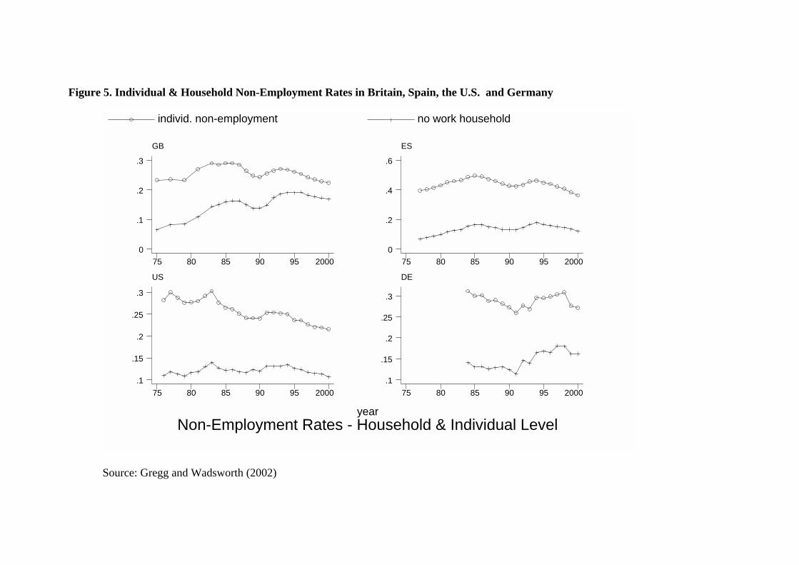
Figure 5. Individual & Household Non-Employment Rates in Britain, Spain, the U.S. and Germany
Non-Employment Rates - Household & Individual Levelyear
individ. non-employment no work household
GB
75 80 85 90 95 20000
.1
.2
.3
ES
75 80 85 90 95 20000
.2
.4
.6
US
75 80 85 90 95 2000.1
.15
.2
.25
.3
DE
75 80 85 90 95 2000.1
.15
.2
.25
.3
Source: Gregg and Wadsworth (2002)

Wages
Labour market performance does not just concern employment opportunity, the
quality of jobs also matters. It may be possible to achieve a given level of
employment with differing wage outcomes or wage distributions. Britain has
experienced an unprecedented rise in income and wage inequality over the past
twenty years. This followed a period in the 1970s when wage dispersion declined.
Wage inequality rose through the 1990s but the scale of the increase was much less
than in the 1980s. The marked deterioration of the low paid (bottom decile) relative to
the median in Britain is in contrast to that observed in most other industrialised
countries, with the exception of the United States. Most countries statistical/labour
offices report average (mean) earnings routinely. Very few give details on other
quantiles of the wage distribution. Yet this seems to be necessary in order to achieve a
more complete understanding of labour market performance. Table 10 illustrates one
way in which this could be done using readily available survey data.
Table 10. Distribution of Real Hourly Pay, Great Britain
Bottom
10% Median Top 10% 90/10 ratio 90/50 ratio 50/10 ratio All £ £ £ 1994 3.50 6.70 14.60 4.2 2.2 1.9 2000 3.80 7.20 15.60 4.1 2.2 1.9 Men 1994 3.90 7.90 16.40 4.2 2.1 2.0 2000 4.20 8.30 17.90 4.2 2.2 1.9 Women 1994 3.30 5.80 12.20 3.7 2.1 1.7 2000 3.60 6.20 13.30 3.7 2.1 1.7 Source: LFS, authors’ calculations (pooled 4 quarter averages). Numbers converted to January 2001 prices.
Low Wage Persistence
The sharp increase in the cross sectional dispersion of earnings clearly has serious
welfare implications. However, the degree to which increases in cross-sectional
dispersion translate into increases in lifetime earnings dispersion will depend on the
persistence of individual earnings. Dickens (1999) presents information on the extent
of earnings mobility in Britain. He shows that there is considerable immobility within
the earnings distribution from one year to the next. For example, over 48% of males
in the bottom decile of the hourly earnings distribution in 1993 are still there in 1994.
Many of these low paid workers drop out of employment so that only 20% actually
move up the pay distribution. Most of those that do progress tend not to move very
far, with two thirds of these moving into the next decile and virtually nobody moving
beyond the median. Mobility is somewhat greater when earnings are observed over a
longer time period. For example, only 22% of males in the bottom decile in 1989 are
still there in 1994. However, again many have dropped out of employment so that
only 30% have actually moved into a higher decile over this five year period with
very little long range movement.
Table 11. One year Transition rates Within Hourly Pay Distribution by Decile
1977/78 1988/89
Pay
distribution
Same decile Moved 1
decile
Bottom decile 40.1 11.4 41.7 12.9
2nd decile 28.6 25.7 36.0 26.7
9th decile 44.7 24.1 52.5 22.3
10th decile 61.1 9.5 66.3 9.1
Source: Dickens (1999).
In the light of increasing cross sectional inequality the important question is not so
much about the level of mobility but the extent to which there have been any changes
in mobility. Dickens (1999) presents evidence that short run mobility has fallen since
the late 1970s. Computing a mobility index based on changes in the individuals
ranking within the earnings distribution from year to year he shows that this index has
fallen by some 41% for both males and females between 1980 and 1994. This is
rather disconcerting because it suggests that lifetime earnings dispersion has increased
by more than that observed in cross section data on earnings.
The Low Pay - No Pay Cycle
In addition to persistence in low pay it is also evident that the low paid are much more
likely to leave employment than those higher up the pay distribution. Stewart (1999)
shows that employees paid below £3.50 an hour (in April 1997 prices) were three
times more likely to be out of work one year later than those paid above £3.50 an
hour. In addition, some 33% of those employees who were out of work a year ago are
paid below, £3.50 an hour, compared with just 8% of those who were in work the year
before. So the low paid are more likely to exit work and new entrants are likely to
enter into low paying jobs.

Furthermore, there is evidence of persistence in low pay across different
employment spells, that leads to a cycle of low pay-no pay for certain individuals.
Looking at re-entrants to work who were out of work a year ago Stewart (1999)
reports that some 42% of those who were in low paid work two years ago will enter
low pay again compared to 14% of those high paid two years ago. Some workers,
therefore, face a cycle of movement in and out of low paying jobs and non-
employment.
Table 12. Low-Pay/No-Pay Cycle
Low Pay Threshold
£3.50/hour £4.00 £4.50
% Low Paid 10.9 25.7
Prob not working at time t given
Low paid at t-1 0.14 0.12 0.11
Higher paid at t-1 0.05 0.05 0.04
Prob. Of being low paid at t given not
working at t-1 and in work at t-2
Low paid t-2 0.42 0.61 0.68
High paid t-2 0.14 0.22 0.32
Source: Stewart 1999.
Entry Wages Many studies assume that wages taken by the non-employed correspond to average
wages. This is far from true. Survey data can be used to indicate the likely wage on
offer to job seekers and its relative size. Employers may feel able to reduce wage
offers if workers are prepared to take vacancies at lower wages with the prospect of
tax cuts and benefit top-ups to supplement their pay. Alternatively, the new National
Minimum Wage (NMW) and the tightening labour market may force employers to
raise wage offers to attract recruits. It is therefore interesting to look at wages in jobs
open to potential entrants relative to average wages.
Since 1996 entry wages of adults have risen in real terms and relative to the
wages of other workers. For adult men have grown rapidly from £4-90 an hour to £5-

60 an hour. This is an average of 3.6% per cent above inflation each year and faster
than average wage growth so that the typical entry wage for adult men has risen from
60% to 66% of the average wage. The typical entry job has risen in the overall wage
distribution such that now 20% of all jobs pay less than the typical entry job.
Table 13. Median Real Wages men aged 22-65 and women aged 22-59
Hourly (£ an hour) Weekly (£ a week)
Men All jobs Entry jobs Non-entry jobs All jobs Entry jobs
Non-entry jobs
1996 8.20 4.90 8.40 347 187 356 2000 8.60 5.60 8.70 365 223 369
Hourly (£ an hour) Weekly (£ a week)
Women All jobs Entry jobs Non-entry jobs All jobs Entry jobs
Non-entry jobs
1996 6.00 4.20 6.10 193 73 190 2000 6.50 5.00 6.60 212 97 211
Source: Gregg and Pasanen (2001). LFS . Wages measured in 2000 prices.
In 1996, hourly wages for men returning to employment after a period out of work
typically paid just 60% of the average male wage. Half of these entry jobs were
amongst the worst paid sixth of all jobs. For women entry jobs paid around 70% of
the typical wage. This came at the end of a long period of relative decline in the
wages paid in entry jobs, but since 1997 there has been a significant recovery in entry
wages. Wages for adults taking entry jobs have typically risen 6% faster than those for
jobs in general.
Conclusion
Equity and efficiency of labour market performance need not be incompatible. Since
there may be more than one way of achieving outcomes, like the unemployment rate,
then economies can be judged by whether they provide good prospects for all. What is
clear is that focussing attention only on aggregate measures of performance will not
reveal differentials in labour market opportunities across groups and so a more

disaggregated approach to the production of labour market statistics is needed. This is
a simple task. Most countries undertake regular household based surveys that conform
to ILO/OECD guidelines that can be used to calculate these numbers. As shown
above, once a more disaggregated approach is done it is apparent that there can be
substantial dispersion around the traditional measures of labour market performance.
Moreover a general improvement in labour market prospects is not always shared by
all sectors of the population. At certain times the unemployment rate for a group can
be rising, or static when the aggregate rate is falling. The unemployment rate can also
fall not because employment is rising, but because individuals are leaving the labour
force.
All this suggests that disaggregation of existing labour market statistics needs
to be accompanied by use of a broader set of indicators, of which this article has
highlighted just a few, in order to achieve a better understanding of labour market
developments and issues.

References
Dickens, R., (1999), ‘Wage Mobility in Great Britain ‘ in P. Gregg and J. Wadsworth (eds.) The State of Working Britain, Manchester University Press. Dickens, R., Gregg P., and Wadsworth, J., (2000), ‘New Labour and the Labour Market’, Oxford Review of Economic Policy, Vol. 16, No. 1, pp. 95-113. Glyn, A. and Salverda, W., (2000), "Employment inequalities," in M. Gregory, W. Salverda, and S. Bazen (eds), Labour Market Inequalities: Problems and Policies of Low-Wage Employment in International Perspective. Oxford: Oxford University Press. Gregg, P. and Machin, S., (1994), ‘Is the Rise in UK Wage Inequality Different?’ in The UK Labour Market, R. Barrell (ed.), Cambridge University Press. Gregg, P. and Pasanen, P., (2001), ‘Entry Wages Since 1996’, in Dickens, R., Gregg P., and Wadsworth, J., (eds). The State of Working Britain Update, 2001. C.E.P., London Gregg, P. and Wadsworth, J., (2001), "Two Sides to Every Story. Measuring Worklessness and Polarisation at Household Level ‘, Centre for Economic Performance Working Paper No. 1099 Gregg, P. and Wadsworth, J., (2001), “Everything You Ever Wanted to Know about Workless Households, but Were Afraid to Ask”, Oxford Bulletin of Economics and Statistics, Vol. 63, pp. 777-806. Gregg, P. and Wadsworth, J., (2002), “Go-Betweens. Why we should (also) Measure Worklessness at the Household Level. Theory and Evidence from Britain, Spain, Germany and the United States’, Centre for Economic Performance Working Paper 1168. Gregg, P. and Wadsworth, J., (2002), “Job Tenure in Britain 1975-2000. Is a Job for Life or Just for Christmas?” Oxford Bulletin of Economics and Statistics, Vol. 64, No. 1, pp. 111-134. Schmitt, J. and Wadsworth, J., (2002), ‘"Is the OECD Jobs Strategy Behind US and British Employment and Unemployment Success in the 1990s", forthcoming in A. Glyn, D. Howell and J. Schmitt (eds). ‘ Stewart, M., (1999), ‘Low Pay in Britain’ in P. Gregg and J. Wadsworth (eds.) The State of Working Britain, Manchester University Press.


Figure. Distribution of Work Across Households in Britain, Germany, the United States and Spain
year
no work household mix work household all work household
GB
75 80 85 90 95 20000
.2
.4
.6
.8
ES
75 80 85 90 95 20000
.2
.4
.6
.8
US
75 80 85 90 95 20000
.2
.4
.6
.8
DE
75 80 85 90 95 20000
.2
.4
.6


Figure. Distribution of Hours Worked by Gender
hour
s
Total
(mean) h50 (mean) hm (mean) h90 (mean) h10
77 83 87 93 2000
20
40
60

hour
s
Women
(mean) fh50 (mean) fhm (mean) fh90 (mean) fh10
77 83 87 93 2000
10
20
30
40
50
hour
s
Men
(mean) mh50 (mean) mhm (mean) mh90 (mean) mh10
77 83 87 93 2000
30
40
50
60

Wage Inequality by Gender Men
relsw10 relsw50 relsw90
74 80 90 98
1
1.2
1.4
1.6
1.8
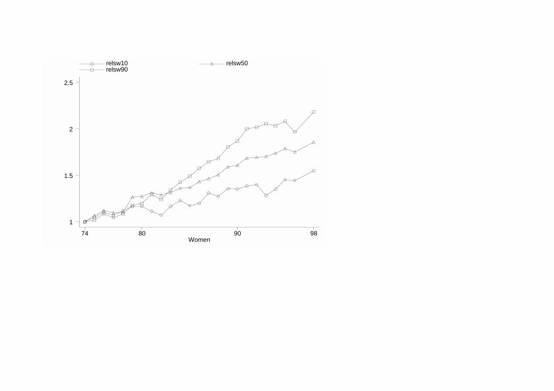
Women
relsw10 relsw50 relsw90
74 80 90 98
1
1.5
2
2.5

Labour Market Flows by Gender 1975-2000 a) Men
rate
rate
E to E75 80 85 90 95 2000
.92
.94
.96
.98
rate
E to U75 80 85 90 95 2000
.02
.03
.04
.05
.06
rate
E to N75 80 85 90 95 2000
.005
.01
.015
.02
.025
rate
U to E75 80 85 90 95 2000
.2
.3
.4
.5
rate
U to U75 80 85 90 95 2000
.45
.5
.55
.6
.65
rate
U to N75 80 85 90 95 2000
0
.05
.1
.15
.2
rate
N to E75 80 85 90 95 2000
.1
.2
.3
.4
.5
rate
N to U75 80 85 90 95 2000
.05
.1
.15
.2
rate
N to N75 80 85 90 95 2000
.2
.4
.6
.8
a) Women

rate
E to E75 80 85 90 95 2000
.9
.92
.94
rate
E to U75 80 85 90 95 2000
.01
.02
.03
.04
rate
E to N75 80 85 90 95 2000
.04
.05
.06
rate
U to E75 80 85 90 95 2000
.3
.35
.4
.45
.5ra
te
U to U75 80 85 90 95 2000
.3
.4
.5
.6
rate
U to N75 80 85 90 95 2000
.1
.15
.2
.25
.3
rate
N to E75 80 85 90 95 2000
.12
.14
.16
.18
.2
rate
N to U75 80 85 90 95 2000
.04
.05
.06
.07
.08
rate
N to N75 80 85 90 95 2000
.74
.76
.78
.8
.82

rate
Labour Market Flows - Men, Low Quals.
rate
E to E83 85 90 95 100
.9
.92
.94
rate
E to U83 85 90 95 100
.03
.04
.05
.06
.07
rate
E to N83 85 90 95 100
.015
.02
.025
.03
rate
U to E83 85 90 95 100
.25
.3
.35
.4
rate
U to U83 85 90 95 100
.45
.5
.55
.6
.65
rate
U to N83 85 90 95 100
.12
.14
.16
.18
.2
rate
N to E83 85 90 95 100
.1
.15
.2
.25
rate
N to U83 85 90 95 100
.06
.08
.1
rate
N to N83 85 90 95 100
.65
.7
.75
.8

rate
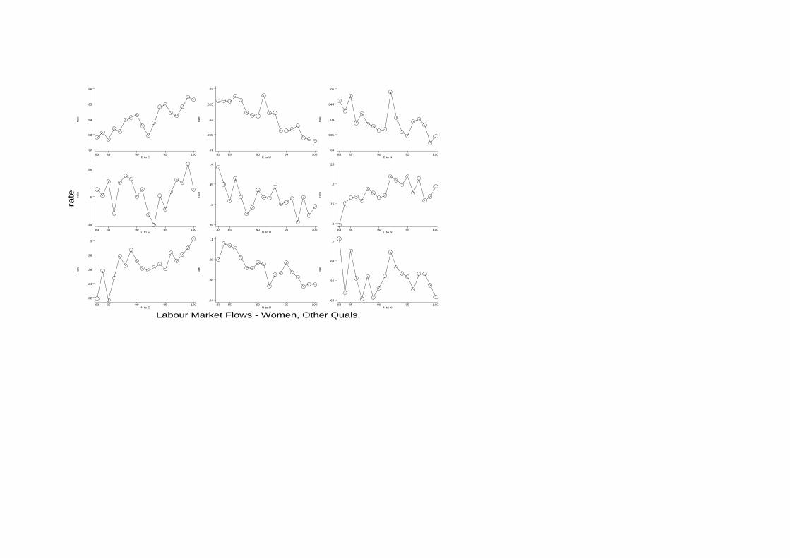
Labour Market Flows - Men, Other Quals.
rate
E to E83 85 90 95 100
.93
.94
.95
.96
.97
rate
E to U83 85 90 95 100
.01
.02
.03
.04
.05
rate
E to N83 85 90 95 100
.005
.01
.015
.02
.025
rate
U to E83 85 90 95 100
.35
.4
.45
.5
rate
U to U83 85 90 95 100
.4
.45
.5
.55
rate
U to N83 85 90 95 100
.05
.1
.15
rate
N to E83 85 90 95 100
.2
.3
.4
.5
rate
N to U83 85 90 95 100
.05
.1
.15
rate
N to N83 85 90 95 100
.4
.5
.6
.7
.8

rate
Labour Market Flows - Women, Low Quals.
rate
E to E83 85 90 95 100
.9
.91
.92
.93
.94
rate
E to U83 85 90 95 100
.02
.025
.03
.035
.04
rate
E to N83 85 90 95 100
.045
.05
.055
.06
rate
U to E83 85 90 95 100
.3
.35
.4
.45
rate
U to U83 85 90 95 100
.3
.4
.5
rate
U to N83 85 90 95 100
.15
.2
.25
.3
.35
rate
N to E83 85 90 95 100
.1
.12
.14
.16
rate
N to U83 85 90 95 100
.04
.05
.06
.07
.08
rate
N to N83 85 90 95 100
.76
.78
.8
.82
.84
rate
Labour Market Flows - Women, Other Quals.
rate
E to E83 85 90 95 100
.92
.93
.94
.95
.96
rate
E to U83 85 90 95 100
.01
.015
.02
.025
.03
rate
E to N83 85 90 95 100
.03
.035
.04
.045
.05
rate
U to E83 85 90 95 100
.45
.5
.55
rate
U to U83 85 90 95 100
.25
.3
.35
.4
rate
U to N83 85 90 95 100
.1
.15
.2
.25
rate
N to E83 85 90 95 100
.22
.24
.26
.28
.3
rate
N to U83 85 90 95 100
.04
.06
.08
.1
rate
N to N83 85 90 95 100
.64
.66
.68
.7