landing critique-toronto-2013
TRANSCRIPT

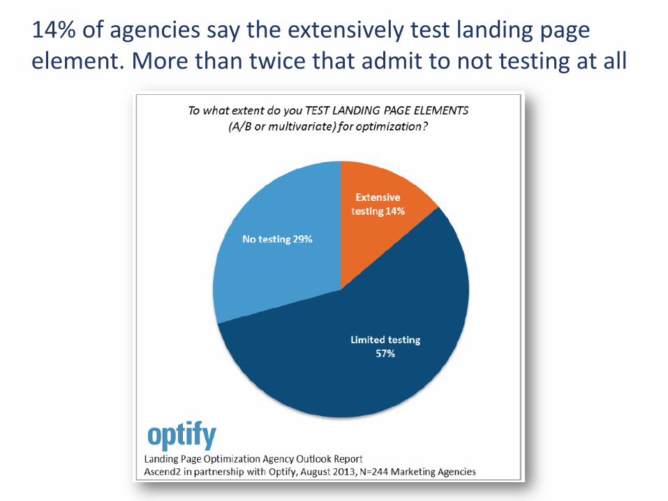
14% of agencies say the extensively test landing page element. More than twice that admit to not testing at all

Agencies that test landing page elements most often test the call-to-action, headline & Registration form.
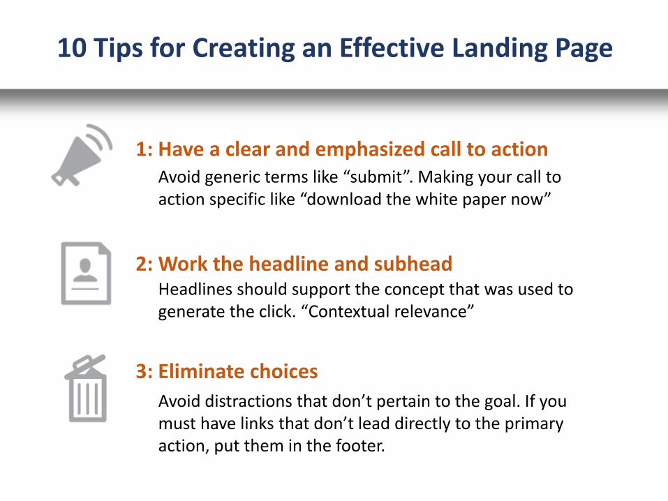
1: Have a clear and emphasized call to action
2: Work the headline and subhead
Avoid generic terms like “submit”. Making your call toaction specific like “download the white paper now”
Headlines should support the concept that was used to generate the click. “Contextual relevance”
3: Eliminate choices
Avoid distractions that don’t pertain to the goal. If you must have links that don’t lead directly to the primary action, put them in the footer.
10 Tips for Creating an Effective Landing Page
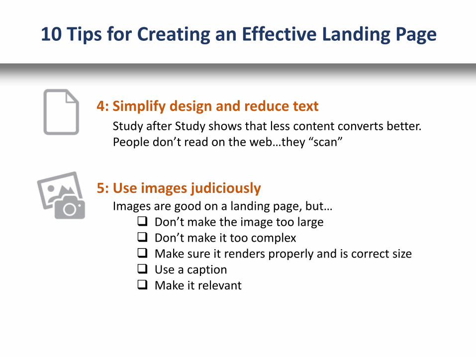
5: Use images judiciously
Study after Study shows that less content converts better. People don’t read on the web…they “scan”
Images are good on a landing page, but… Don’t make the image too large Don’t make it too complex Make sure it renders properly and is correct size Use a caption Make it relevant
10 Tips for Creating an Effective Landing Page
4: Simplify design and reduce text
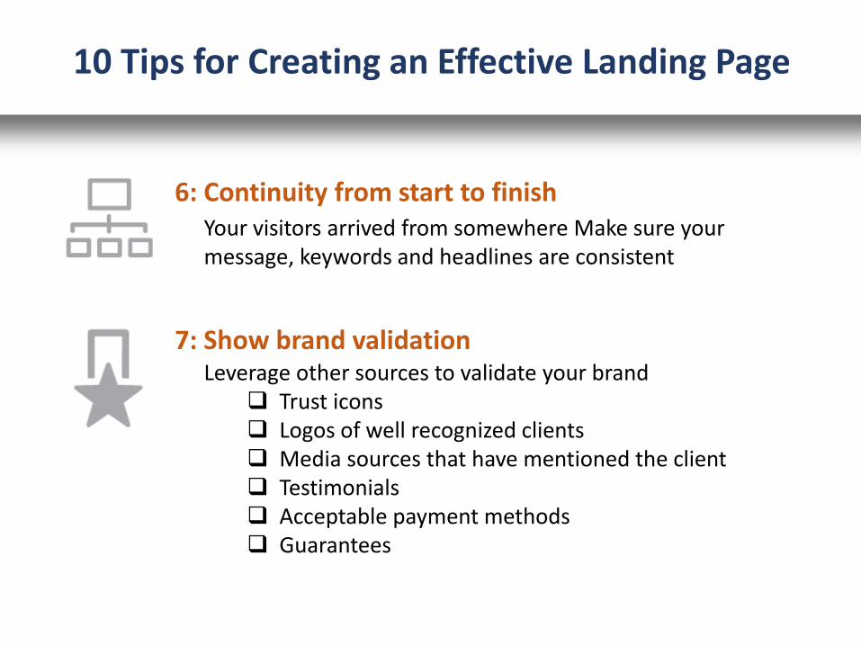
6: Continuity from start to finishYour visitors arrived from somewhere Make sure your message, keywords and headlines are consistent
10 Tips for Creating an Effective Landing Page
7: Show brand validationLeverage other sources to validate your brand
Trust icons Logos of well recognized clients Media sources that have mentioned the client Testimonials Acceptable payment methods Guarantees
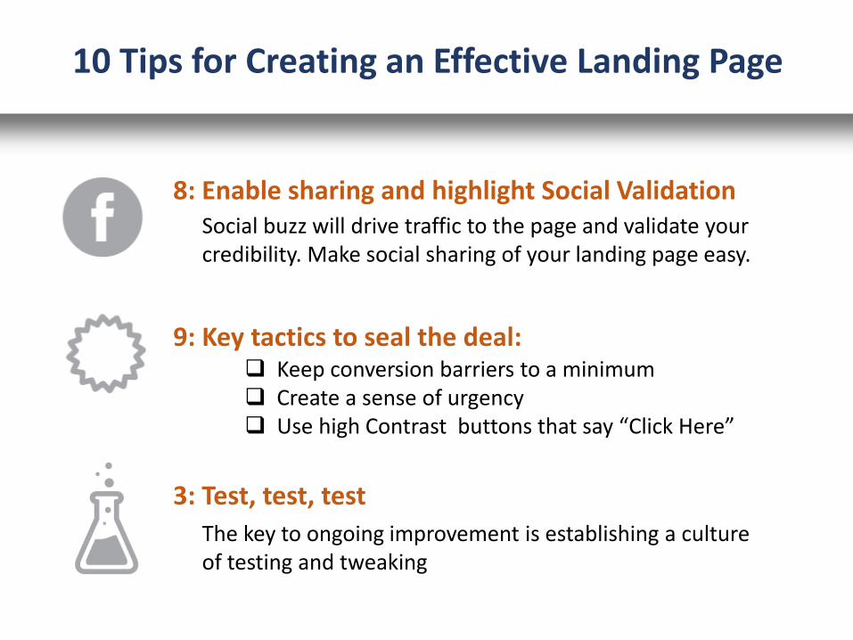
8: Enable sharing and highlight Social ValidationSocial buzz will drive traffic to the page and validate your credibility. Make social sharing of your landing page easy.
10 Tips for Creating an Effective Landing Page
9: Key tactics to seal the deal: Keep conversion barriers to a minimum Create a sense of urgency Use high Contrast buttons that say “Click Here”
3: Test, test, test
The key to ongoing improvement is establishing a culture of testing and tweaking
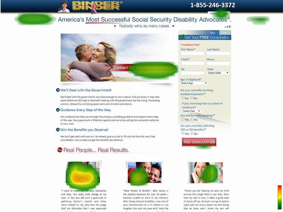
8
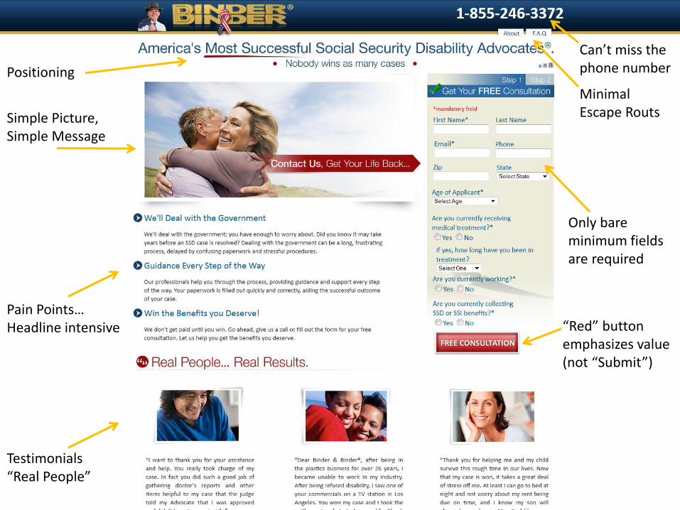
Can’t miss the phone number
Minimal Escape Routs
Only bare minimum fields are required
“Red” button emphasizes value (not “Submit”)
Positioning
Simple Picture, Simple Message
Pain Points…Headline intensive
Testimonials“Real People”

©2012 RAM. All rights reserved.
©2012 RAM. All rights reserved.

Poor Contrast in Banner and on form
Draws attention to form
Trust iconGood picture with prominent offer
“Who it’s for” & Guarantee!
Review with stars
Submit?
Minimal escape routes
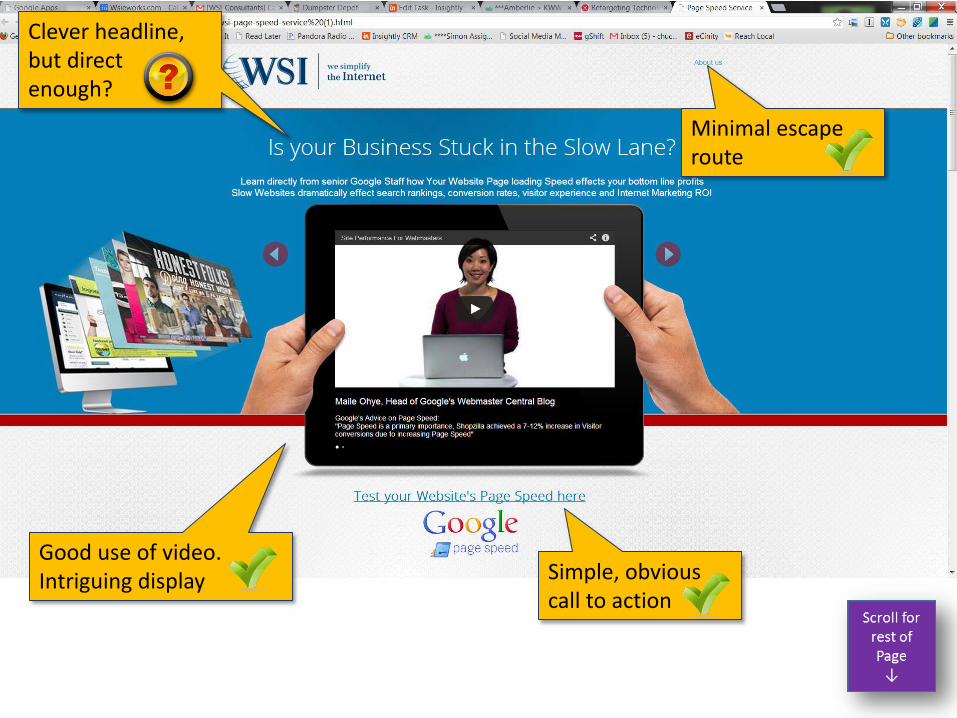
Good use of video.Intriguing display
Minimal escape route
Simple, obvious call to action
Clever headline, but direct enough?
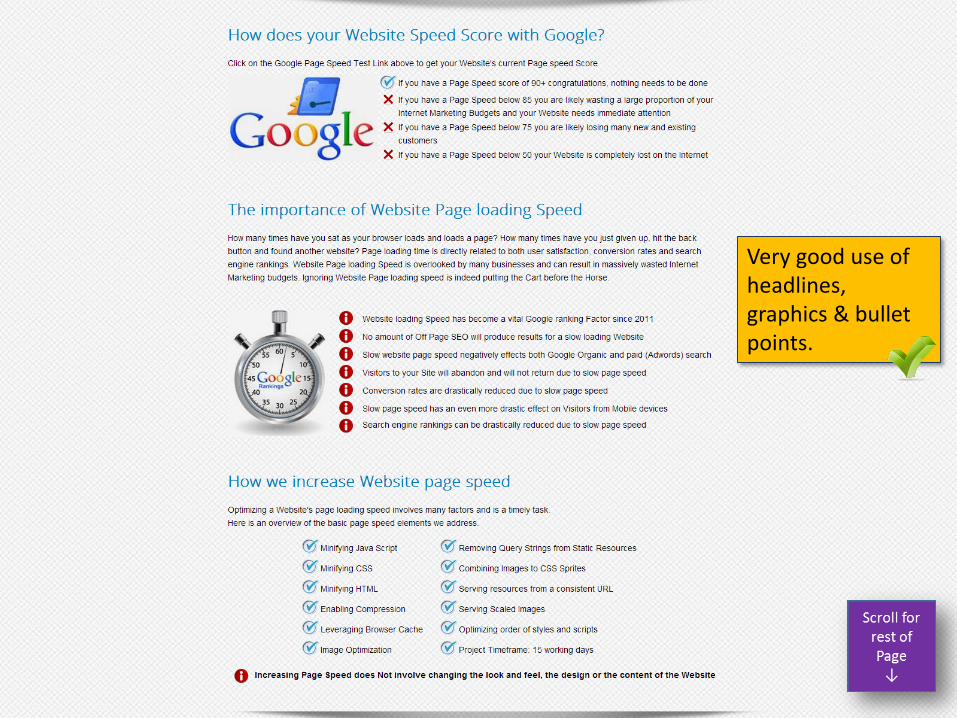
Very good use of headlines, graphics & bullet points.

Love the Guarantee!
Could have been leveraged towards the top as well.The concept…not the graphic

Trust icons, Certifications & Validation
FAQ never leaves the page!

Too many links and distractions.
48 hyperlinks! (highlighted in Red)
(not including dropdowns and footer)

Scrolls back and forth. Informative or annoying?
Says exactly what this is about
Too much text. Much of this can be condensed and/or saved for subsequent pages
Suggestion:Make the copy concise and drive to the “Call-to-Action”
Think sequence….
Minimal escape Routes
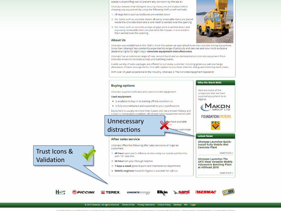
Trust Icons & Validation
Unnecessary distractions

Too crowded. Try separating into 3 sections

Prominent & Simple. Not asking for too much information.
Missed opportunity. Could say something more exciting.
Too many distractions
Suggestion:Could benefit from a picture so the top navigation becomes unnecessary
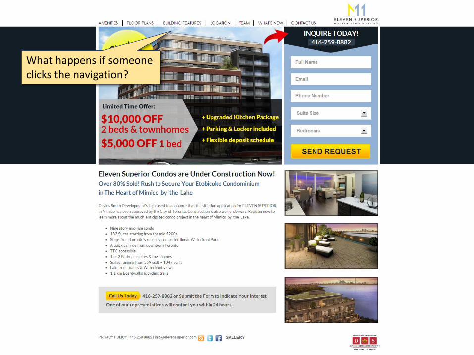
What happens if someone clicks the navigation?

Might better leverage deadline for a sense of urgency
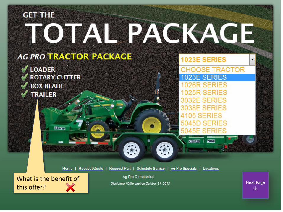
What is the benefit of this offer?
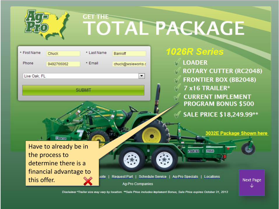
Have to already be in the process to determine there is a financial advantage to this offer.
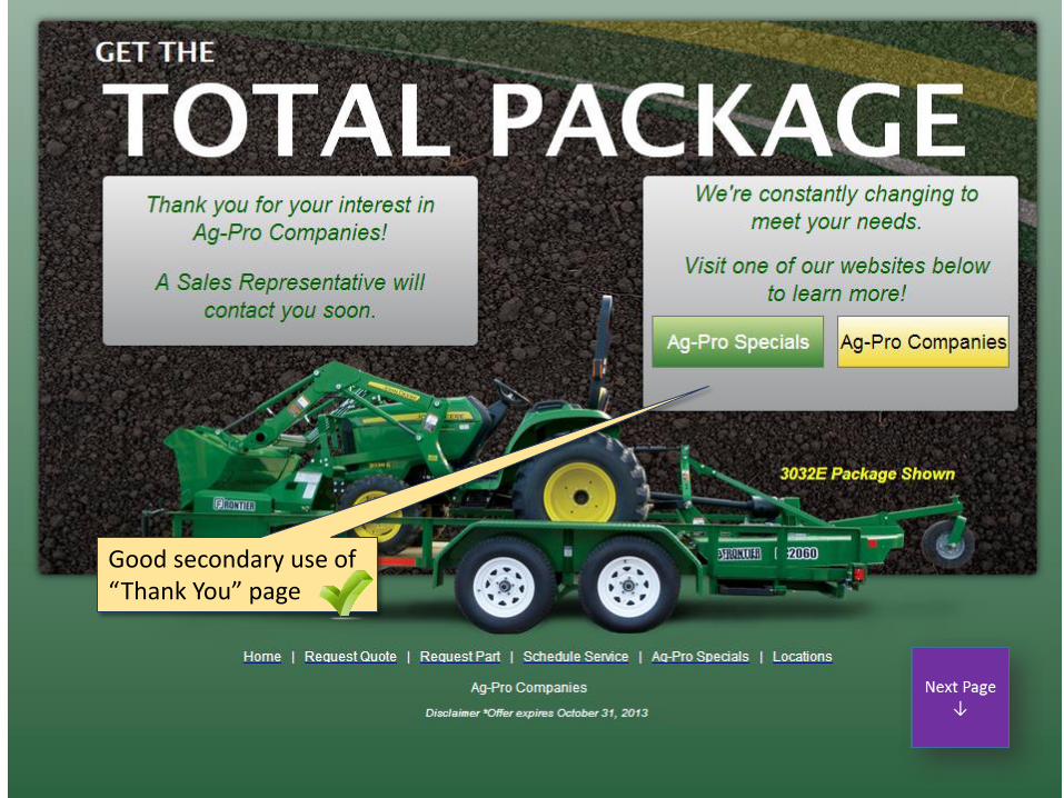
Good secondary use of “Thank You” page
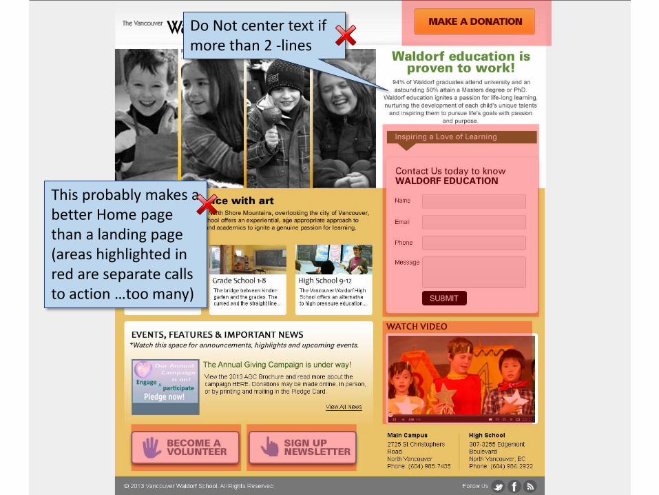
Do Not center text if more than 2 -lines
This probably makes a better Home page than a landing page (areas highlighted in red are separate calls to action …too many)
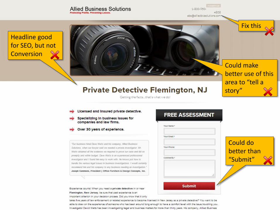
Headline good for SEO, but not Conversion
Could do better than “Submit”
Could make better use of this area to “tell a story”
Fix this
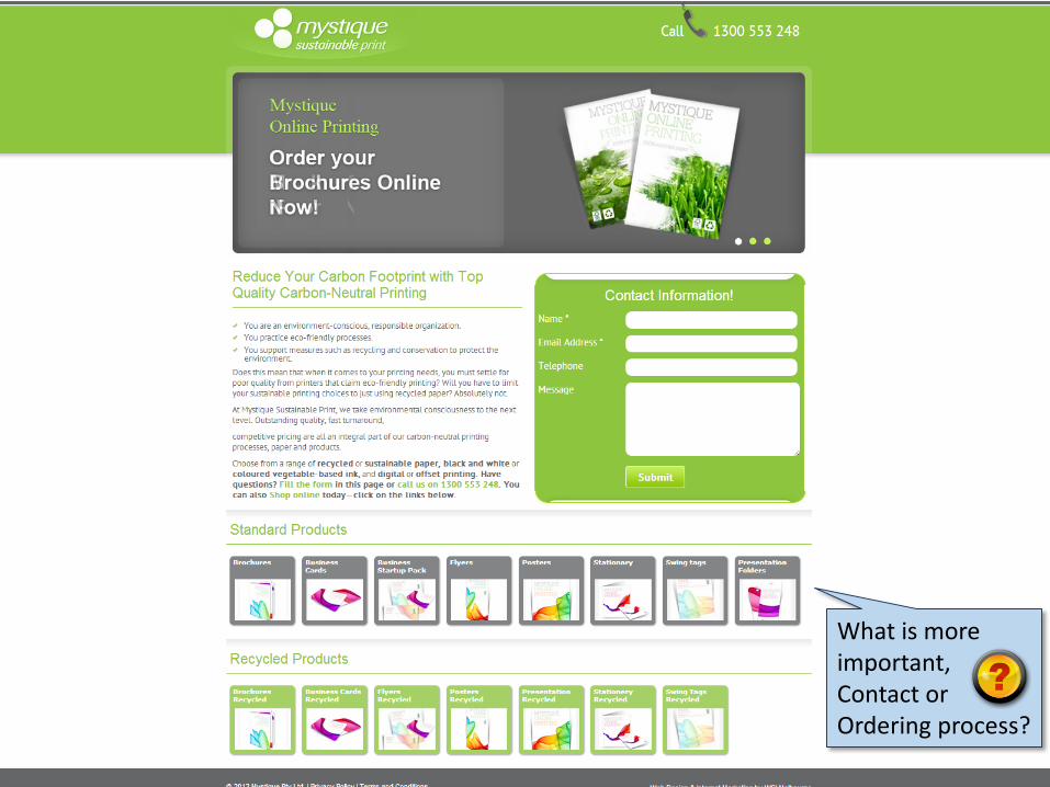
What is more important, Contact or Ordering process?

Good conversion tool
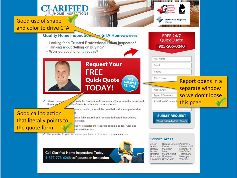
Report opens in a separate window so we don’t loose this page
Good call to action that literally points to the quote form
Good use of shape and color to drive CTA