lecture 2. a descriptive technique an organized tabulation showing exactly how many individuals...
TRANSCRIPT
Lecture 2
A descriptive technique An organized tabulation showing exactly how many individuals are located in each category on the scale of measurement
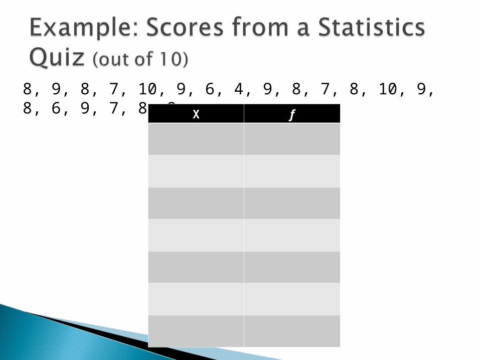
8, 9, 8, 7, 10, 9, 6, 4, 9, 8, 7, 8, 10, 9, 8, 6, 9, 7, 8, 8
X f
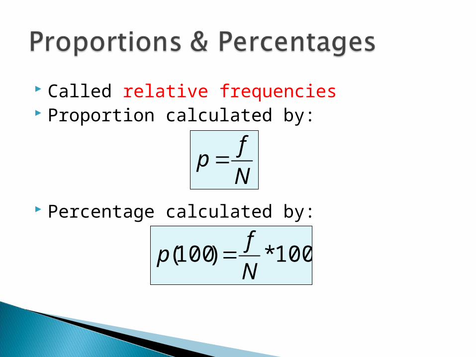
Called relative frequencies Proportion calculated by:
Percentage calculated by:
N
fp
100*)100(N
fp
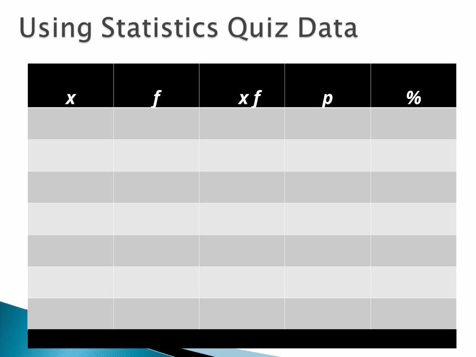
x f x f p %
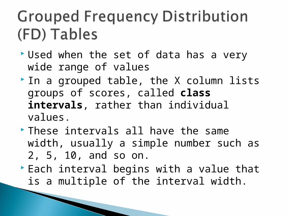
Used when the set of data has a very wide range of values
In a grouped table, the X column lists groups of scores, called class intervals, rather than individual values.
These intervals all have the same width, usually a simple number such as 2, 5, 10, and so on.
Each interval begins with a value that is a multiple of the interval width.
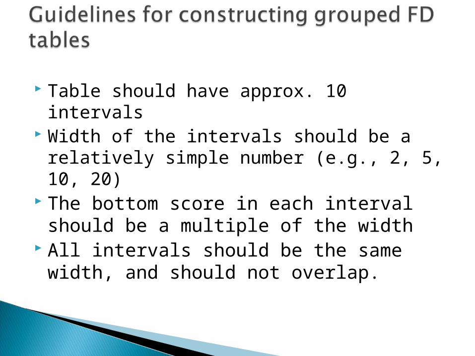
Table should have approx. 10 intervals Width of the intervals should be a relatively
simple number (e.g., 2, 5, 10, 20) The bottom score in each interval should
be a multiple of the width All intervals should be the same width,
and should not overlap.
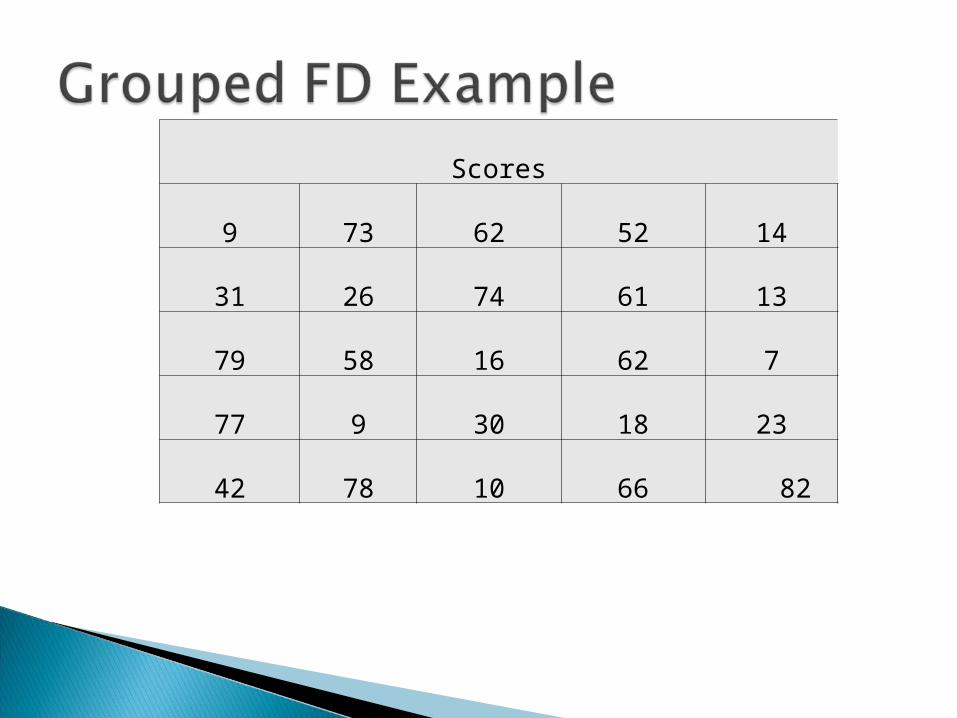
Scores
9 73 62 52 14
31 26 74 61 13
79 58 16 62 7
77 9 30 18 23
42 78 10 66 82
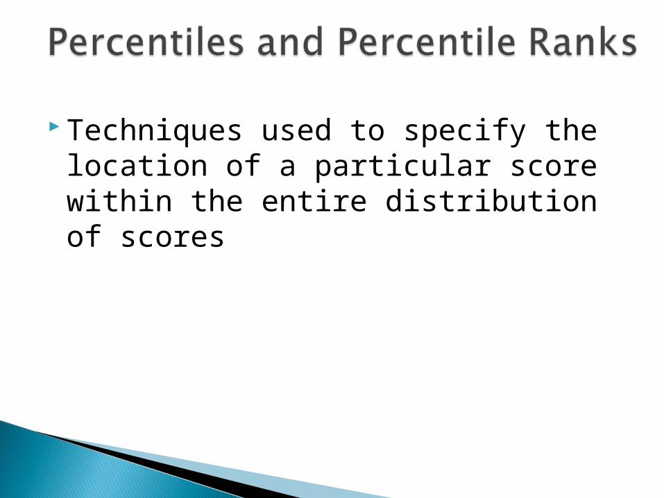
Techniques used to specify the location of a particular score within the entire distribution of scores
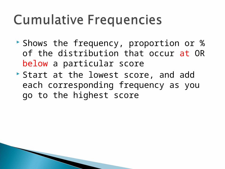
Shows the frequency, proportion or % of the distribution that occur at OR below a particular score
Start at the lowest score, and add each corresponding frequency as you go to the highest score
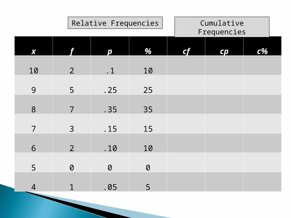
x f p % cf cp c%
10 2 .1 10
9 5 .25 25
8 7 .35 35
7 3 .15 15
6 2 .10 10
5 0 0 0
4 1 .05 5
Relative Frequencies Cumulative Frequencies

In a frequency distribution graph, the score categories (X values) are listed on the X axis and the frequencies are listed on the Y axis.
When to use a histogram or a polygon:
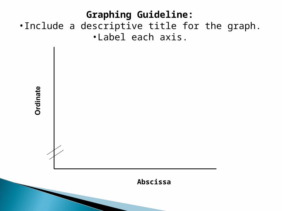
Abscissa
Graphing Guideline:•Include a descriptive title for the graph.
•Label each axis.
Smooth Curve
The smooth curve emphasizes the fact that the distribution is not showing the exact frequency for each category.
Used when you have a nominal or ordinal scale
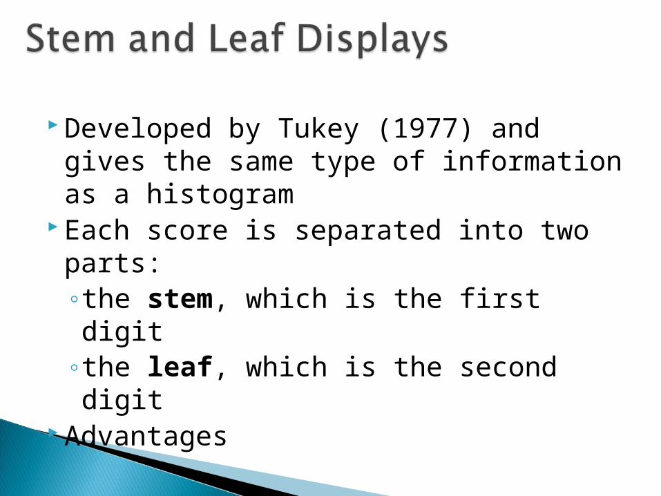
Developed by Tukey (1977) and gives the same type of information as a histogram
Each score is separated into two parts: ◦the stem, which is the first digit◦the leaf, which is the second digit
Advantages
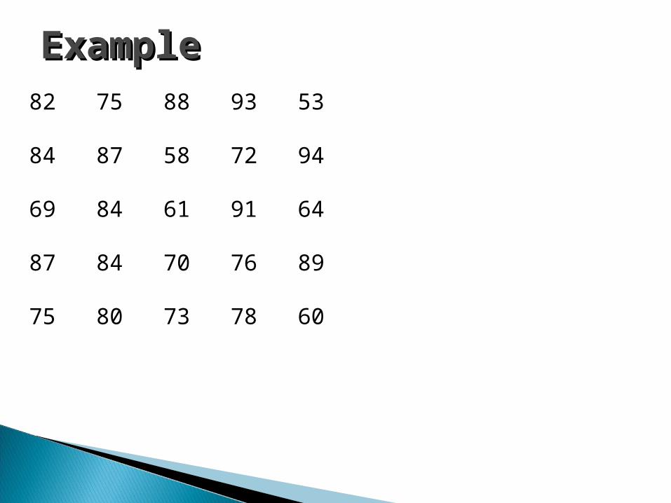
ExampleExample82 75 88 93 53 84 87 58 72 94 69 84 61 91 64 87 84 70 76 89 75 80 73 78 60
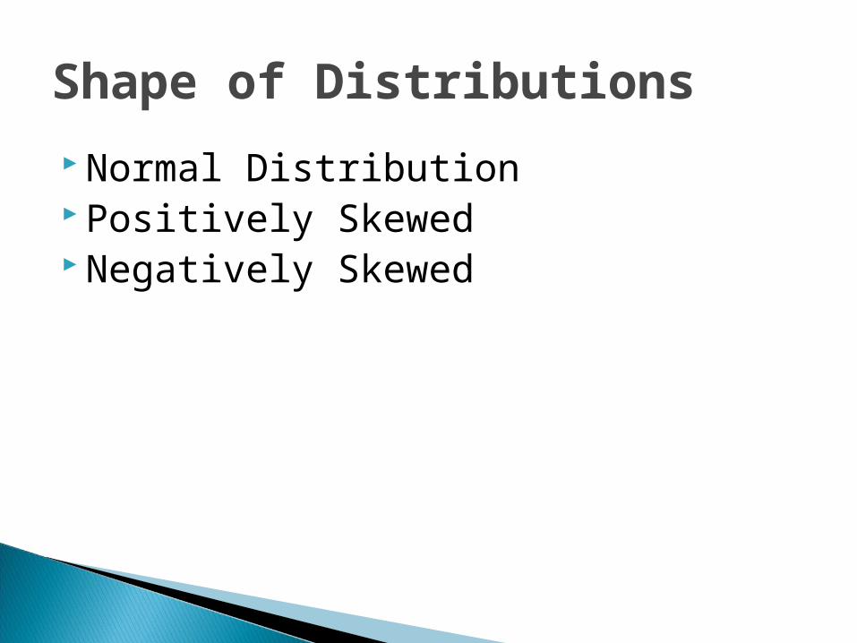
Shape of Distributions
Normal Distribution Positively Skewed Negatively Skewed