lesson 2 - ia for small screens
TRANSCRIPT

Information ArchitectureLESSON 2 – SMALL SCREEN DEVICES

Fernando Loizides & Hanna-Liisa Pender
What does it mean…. Small Screen Device?
There is no official definition when we talk about a ‘Small Screen’ Device.
For the purposes of this lesson, we will refer to Small Screen Devices to mean mobile phones and tablets.
There are other devices, such as netbooks, that could also be considered as small screen devices.

Fernando Loizides & Hanna-Liisa Pender
One thing that you need to be clear when evaluating a clients product is to define it well. Do not let competitors criticize your work on amateur mistakes.
• A mobile phone is a device that can be used to take calls through radio connections, while roaming through a geographic area.
• A tablet device is a portable computer whose, screen, circuitry and battery are a single unit.
• A Netbook is a category of portable, light and inexpensive computers.
• An iPod is… • A portable music player?• A portable music player with a touch screen?• A portable small screen device containing touch capabilities?

Fernando Loizides & Hanna-Liisa Pender
Inputting Data on Small Screen Devices
Usually on small screen devices (modern devices at least), users will use their fingers alone as a means of input.
Some devices encourage the use of a stylus (A pen like instrument that conducts low levels of electricity on its tip and acts as an input device for touch screens ).
Some devices still have a keyboard available to the user. Most of these devices, such as blackberry, are widely used in a secure corporate setting.
Voice control is gaining popularity.

Fernando Loizides & Hanna-Liisa Pender
When is using a stylus an advantage?
Note takingSome applications allow you to take physical notes. Instead of using a physical or virtual keyboard, the user scribbles notes and drawings on the screen, some of which may be translated by OCR to electronic text.
Signing DocumentsHave you ever signed a physical signature digitally? Perhaps to get a passport or ID card? Try signing using your finger!
DrawingFrom simple doodles to complete artistic digital creations, tablets now offer multitudes of applications for the more creative ones among us. The increased accuracy and increased dexterity of using the stylus can produce better results in this situation.

Fernando Loizides & Hanna-Liisa Pender
Touch Sensor TypesOptical TouchInfra red rays from the corners of the screen are projected to the other. When the user touches the screen then these rays are interrupted. These x and y coordinates are then processed.
Resistive TouchThe user touches the screen and pushes the small membrane back to touch a contact point. A small piece of electricity passes through the point touched. These x and y coordinates are then processed.
Capacitive TouchA small amount of electrical energy is released and stored on the screen. When a bare finger touches the screen, a small current flows to that point. These x and y coordinates are then processed.

Fernando Loizides & Hanna-Liisa Pender
When creating our interfaces and their interactions we need to consider not only the type of screen but also the amount of touch points available to us.
Single Touch PointThe device can only detect one point touched at a time..
Multi-touchMany points on the screen can be detected at any point.
Don’t forget about Multi-modality!Entering data or input can also take place in other modes (sometimes simultaneously). For example, Gyroscopically and voice control.
Fernando Loizides & Hanna-Liisa Pender
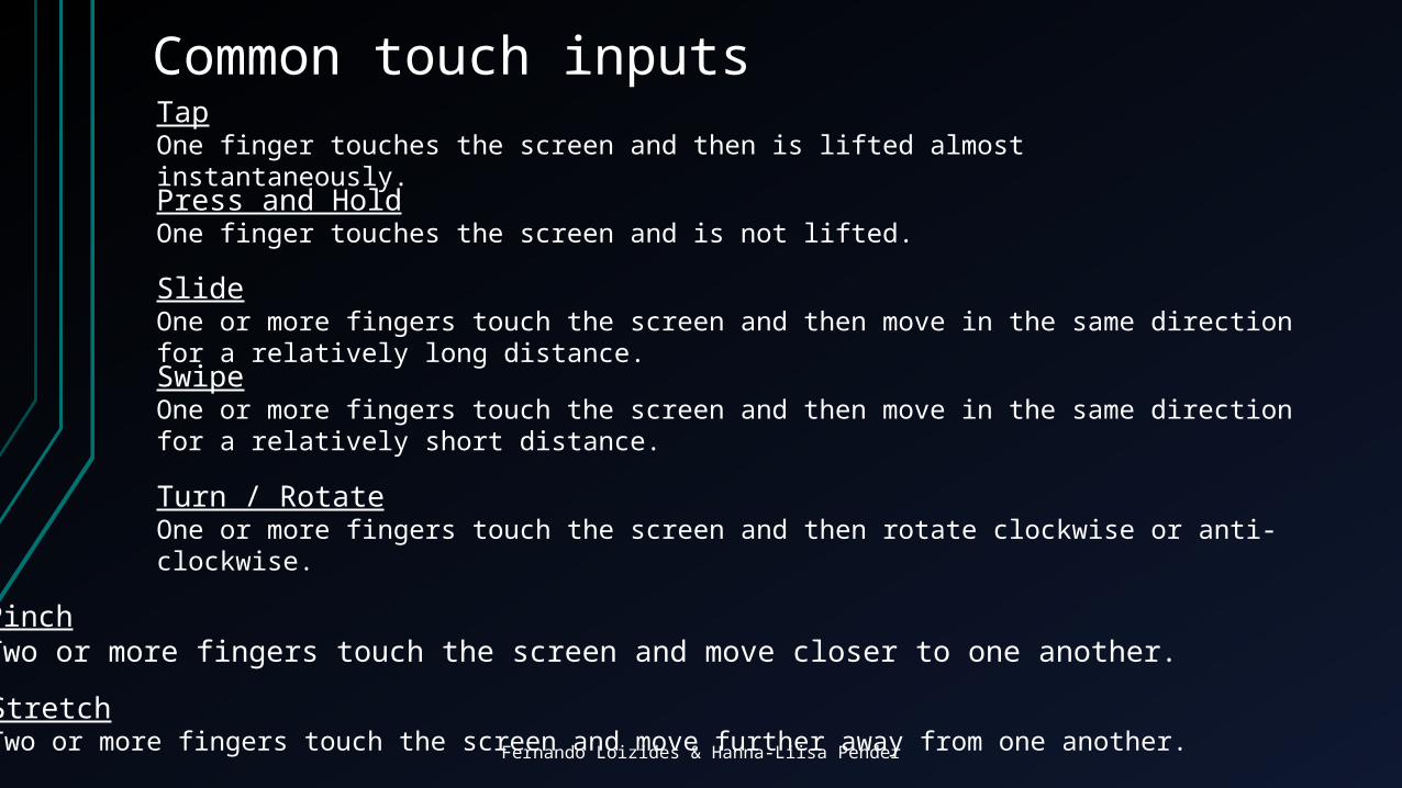
Common touch inputsTapOne finger touches the screen and then is lifted almost instantaneously.
Press and HoldOne finger touches the screen and is not lifted.
SlideOne or more fingers touch the screen and then move in the same direction for a relatively long distance.
SwipeOne or more fingers touch the screen and then move in the same direction for a relatively short distance.
Turn / RotateOne or more fingers touch the screen and then rotate clockwise or anti-clockwise.
PinchTwo or more fingers touch the screen and move closer to one another.
StretchTwo or more fingers touch the screen and move further away from one another.
Fernando Loizides & Hanna-Liisa Pender
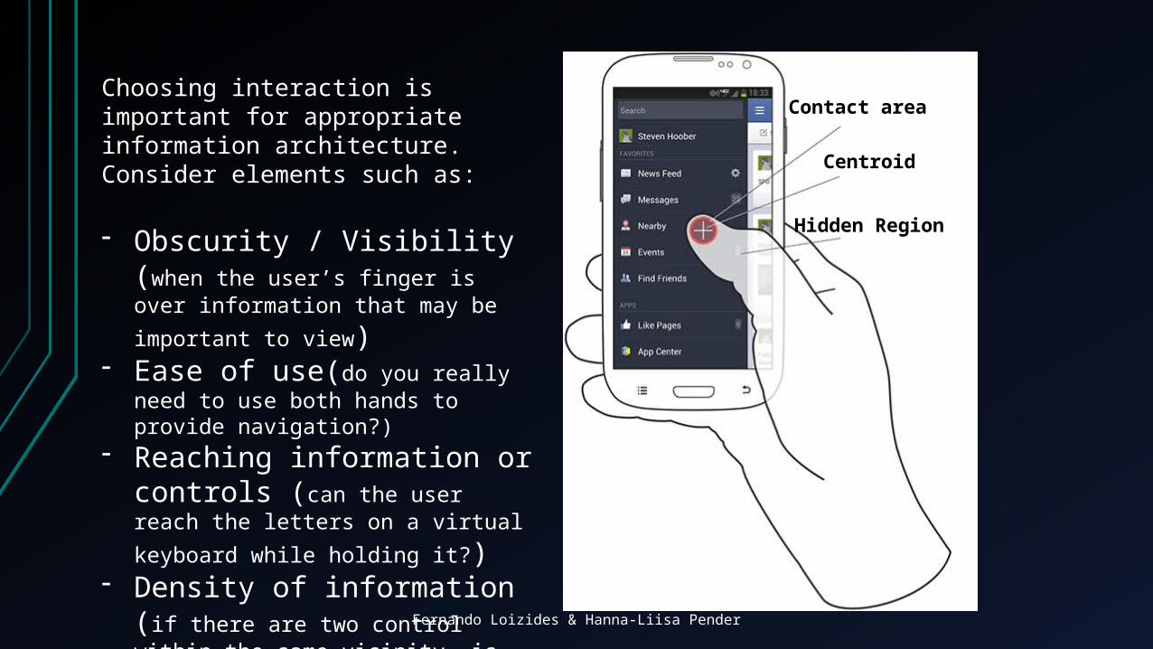
Contact area
Centroid
Hidden Region
Choosing interaction is important for appropriate information architecture. Consider elements such as:
- Obscurity / Visibility (when the user’s finger is over information that may
be important to view)- Ease of use(do you really need to
use both hands to provide navigation?)- Reaching information or
controls (can the user reach the letters
on a virtual keyboard while holding it?)- Density of information (if there are
two control within the same vicinity, is it likely that the user will press the wrong
one?)

Fernando Loizides & Hanna-Liisa Pender
Screen Orientation
Portrait (left)
Horizontal (right)
Portrait (left)
Horizontal (right)
Fernando Loizides & Hanna-Liisa Pender
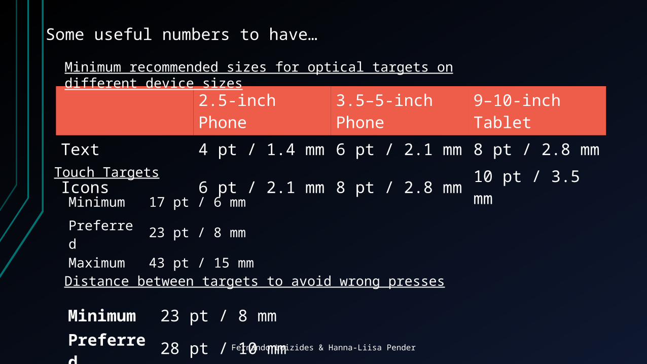
2.5-inch Phone 3.5–5-inch Phone 9–10-inch TabletText 4 pt / 1.4 mm 6 pt / 2.1 mm 8 pt / 2.8 mmIcons 6 pt / 2.1 mm 8 pt / 2.8 mm 10 pt / 3.5 mm
Minimum recommended sizes for optical targets on different device sizes
Some useful numbers to have…
Minimum 17 pt / 6 mm
Preferred 23 pt / 8 mm
Maximum 43 pt / 15 mm
Touch Targets
Minimum 23 pt / 8 mmPreferred 28 pt / 10 mm
Distance between targets to avoid wrong presses

Fernando Loizides & Hanna-Liisa Pender
Types of Applications
Adaptive Design - Responsive Websites

Fernando Loizides & Hanna-Liisa Pender
Native application
Types of Applications

Fernando Loizides & Hanna-Liisa Pender
Hybrid Application
Web style Interface with Access to the native functions of a device
Types of Applications
Fernando Loizides & Hanna-Liisa Pender
κατακόρυφο προσανατολισμό
οριζόντιο προσανατολισμό
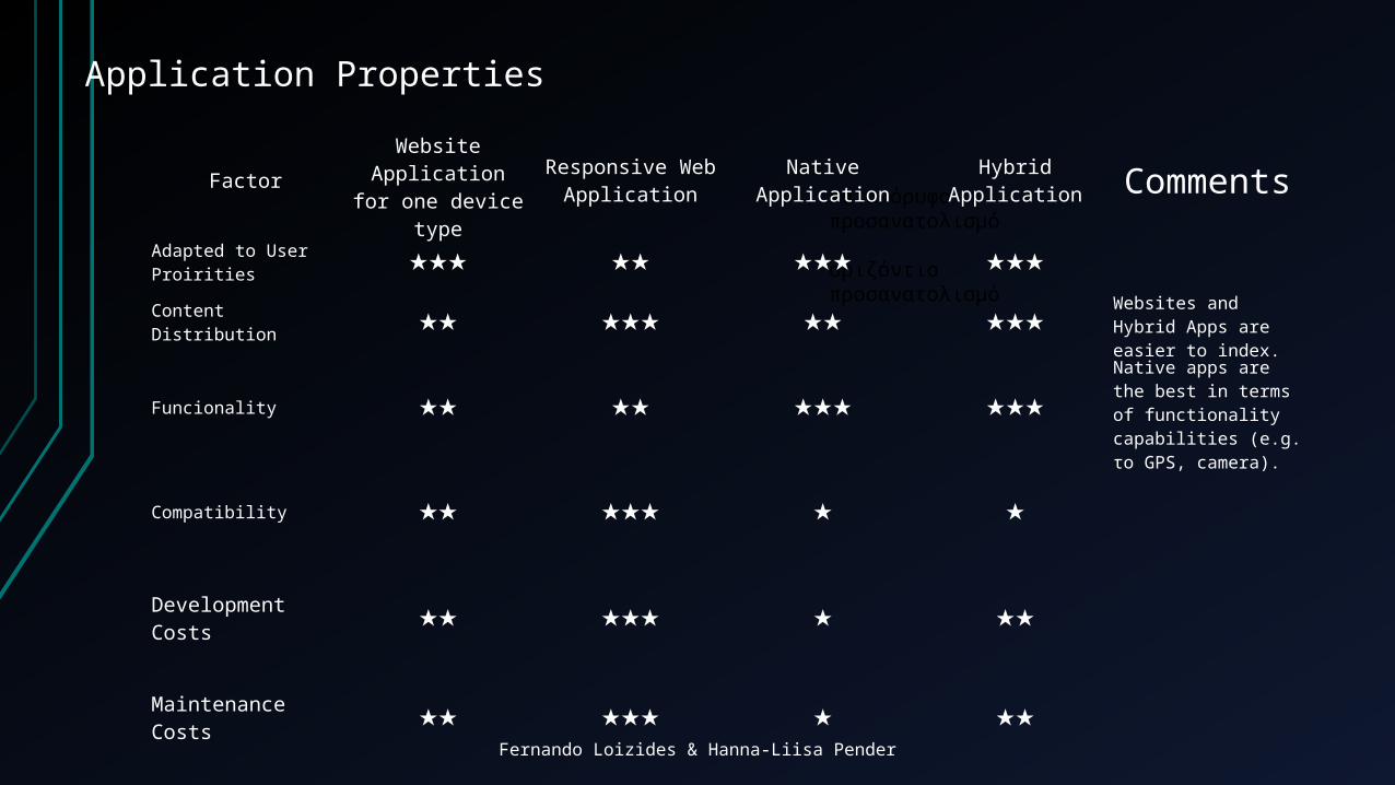
Application Properties
Factor Website Application for one device type
Responsive Web Application Native Application Hybrid Application Comments
Adapted to User Proirities ★★★ ★★ ★★★ ★★★
Content Distribution ★★ ★★★ ★★ ★★★ Websites and Hybrid Apps are easier to index.
Funcionality ★★ ★★ ★★★ ★★★Native apps are the best in terms of functionality capabilities (e.g. το GPS, camera).
Compatibility ★★ ★★★ ★ ★
Development Costs ★★ ★★★ ★ ★★
Maintenance Costs ★★ ★★★ ★ ★★

Fernando Loizides & Hanna-Liisa Pender
Navigation and Menu Structures
Hierarchy
Good :Organising complicated site structures that need to follow a desktop site’s structure.
Weaknesses:Sometimes the Navigation. Multi-faceted navigation structures can present a problem to people using small screens.

Fernando Loizides & Hanna-Liisa Pender
Hub and Spoke
Good:Suitable for Multi-functional tools and apps.
Weaknesses:For people that want to multitask.
Navigation and Menu Structures

Fernando Loizides & Hanna-Liisa Pender
Nested Doll
Good:Apps or sites with singular or closely related topics. This can also be used as a sub section pattern inside other parent patterns, such as the standard hierarchy pattern or hub and spoke.
Weaknesses:Users won’t be able to quickly switch between sections so consider whether this will be suitable, rather than a barrier to exploring content.
Navigation and Menu Structures

Fernando Loizides & Hanna-Liisa Pender
Tabbed View
Good:Apps or sites with large quantities of content, such as articles, images and videos. Can be a good basis for magazine style apps or sites, or as a sub pattern within another navigational pattern.
Weaknesses:Mobile. Filters and faceted search can be difficult to display on a smaller screen due to their complexity.
Navigation and Menu Structures

Fernando Loizides & Hanna-Liisa Pender
Filtered view
Good:Apps or sites with large quantities of content, such as articles, images and videos. Can be a good basis for magazine style apps or sites, or as a sub pattern within another navigational pattern.
Weaknesses:Mobile. Filters and faceted search can be difficult to display on a smaller screen due to their complexity.
Navigation and Menu Structures
Fernando Loizides & Hanna-Liisa Pender
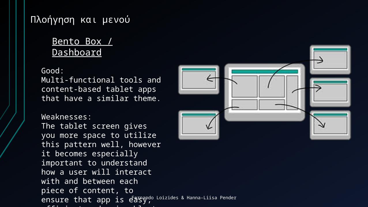
Πλοήγηση και μενού
Bento Box / Dashboard
Good:Multi-functional tools and content-based tablet apps that have a similar theme.
Weaknesses:The tablet screen gives you more space to utilize this pattern well, however it becomes especially important to understand how a user will interact with and between each piece of content, to ensure that app is easy, efficient and enjoyable to use.

Fernando Loizides & Hanna-Liisa Pender
Fast Exercise
Classify the apps on your phone in terms of:
1) Type of Application
2) Navigation Structure

Fernando Loizides & Hanna-Liisa Pender
Information Design PrinciplesEvery Screen should focus on one task, and do that task really well.
Less is more - You probably have heard of this one, but it is accentuated on small screen devices. Make sure there is no clutter, and the user’s focus is not distracted.
Native Platform - Your app should reflect the design and styles of the platform which you are developing for. There have been crash and burn scenarios where ports have been attempted from blackberry to Android with very little IA redesign…ouch!
Similar Experience - Your users will most probably be acquainted with Android or IOS from previous apps. Use this to your advantage. If you change the way they are used to interacting, then learnability becomes harder and the user experience can deteriorate.
Suitable Layout of Objects - Similar to the previous point, things should always be where they are expected to be. Imagine changing the menu structure on every screen.

Fernando Loizides & Hanna-Liisa Pender
Information Design PrinciplesLoading indicator - if there is something running and taking up processing time, set your user at ease by showing him a loading icon.
Get orientation right! - Keep it portrait or landscape depending on the task (or if you can for the whole app). Choose wisely and also adapt the screen for transitions between the two.
Reduce Scrolling - Scrolling is often not required and reduces the usability and findability of information. How annoying is it when you accessa web page or a document and you have to scroll up and down, but even worst, left and right to read the text / information.
Expand for more - to be used with caution. More information can be displayed this way but less information is shown to the user at first glance which may give the impression that the information needed is not there.

Fernando Loizides & Hanna-Liisa Pender
Information Design Principles
Reduce input need. Text input being the highest on this list.
Use auto-complete where appropriate. Dictionary files can be simulated with suggestions in text boxes.
Ease findability and increase searching capabilities - Filter large lists into facets for example, reduces scrolling too...
Auto-complete - You can use autocomplete if you already know information about the user, such as name address email etc.

Fernando Loizides & Hanna-Liisa Pender
In Class Workshop
The task you have is simple…
You are to create a clickable prototype (using AXURE) of a mobile website to be used on a screen (=< 5.5 inches / use your own screen size). You can choose a topic from one of the following (note: each team must pick a different topic):
A) An online shop
B) A holiday website (booking.com style)
C) An online digital library with resource discovery tools
The application should be seemingly fully functional to the user. Of course the key to this is to use the principles learned in this class to create it.

Fernando Loizides & Hanna-Liisa Pender
In Class Workshop – Part 2
Yes, there is a part 2….
One of your team members will now move to the next team with the application running on his / her phone.
You will give the application on your phone to the other team and say nothing. You are only there for technical support in case the phone shuts or something similar. Return to your desk and be on standby in case your phone needs attention.
The other team will then explore the application and write a joint report on it using the principles as heuristics.