lesson 2.1 graphing data you will learn to… * display data in a circle graph and a pareto graph *...
TRANSCRIPT

Lesson 2.1Graphing Data
You will learn to…* display data in a circle graph and
a Pareto Graph* organize data in a stem-and-leaf plot and a dot plot* display data in a time series graph

Circle Graphs and
Bar Graphs are used to display
qualitative data.

A circle graph shows relationships of parts
to a whole.
It is easy to compare the size of each part to the whole.
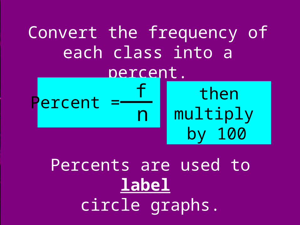
Convert the frequency of each class into a percent.
Percents are used to label circle graphs.
Percent =
f n
then multiply by 100

Convert the frequency of each class into a degree.
Degrees are used to create circle graphs.
angle = percent · 360˚
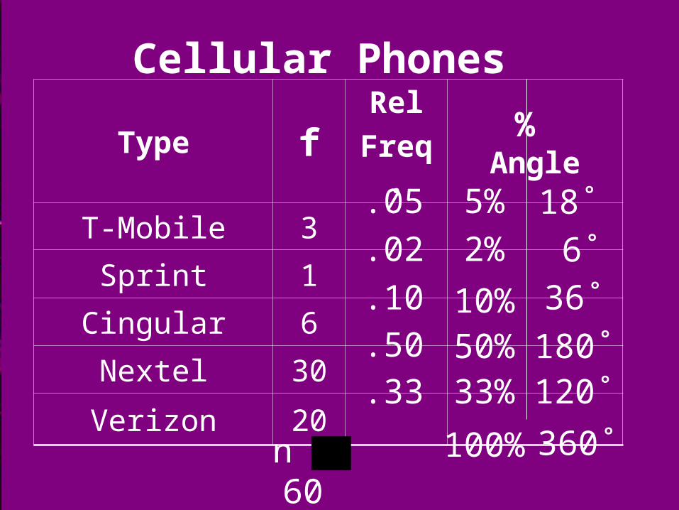
n = 60
Cellular Phones
Type fRel
Freq. % Angle
T-Mobile 3
Sprint 1
Cingular 6
Nextel 30
Verizon 20
18˚
6˚
36˚
180˚120˚
360˚
.05
.02
.10
.50
.33
100%
5%
2%
10%50%33%

Cellular Phones
Sprint2%
T-Mobile5%
Cingular10%
Verizon33%
Nextel50%

A Bar Graph displaying qualitative data should be drawn
with space between bars of equal width.
It is easy to compare the sizes of the parts to each other.

n = 60
Cellular Phones
Type fRel
Freq. % Angle
T-Mobile 3
Sprint 1
Cingular 6
Nextel 30
Verizon 20
18˚
6˚
36˚
180˚120˚
360˚
.05
.02
.10
.50
.33
100%
5%
2%
10%50%33%

Cellular Phones
Nextel
353025201510 5N
umbe
r of
Pho
nes
Type of Service
Verizon
Cingular
T-Mobile
Sprint

n = 60
Cellular Phones
Type fRel
Freq. % Angle
T-Mobile 3
Sprint 1
Cingular 6
Nextel 30
Verizon 20
18˚
6˚
36˚
180˚120˚
360˚
.05
.02
.10
.50
.33
100%
5%
2%
10%50%33%

Cellular Phones
Nextel
Type of Service
Verizon
Cingular
T-Mobile
Sprint
.70
.60
.50
.40
.30
.20
.10Rel
ativ
e F
requ
ency

A Pareto chart is a bar graph
Bars in a Pareto chart are always arranged in descending order

Cellular Phones
Nextel
353025201510 5N
umbe
r of
Pho
nes
Type of Service
Verizon
Cingular
T-Mobile
Sprint

Practice A# 2.1.A

We display quantitative data to identify a pattern of variability.
One of the simplest graphs used is the dot plot.

In a dot plot each data entry is plotted (using a point) above a
horizontal axis.
It is similar to a bar graph but the display still contains the
original data values

60 65 70 75 80 85 90 95 100
Construct a Dot Plot for the following test scores of 20 students.
60 70 90 65 70 70 80 90 85 80 85 85 85 90 70 65 95 85 95 100

Stem-and-leaf plots provide an easy way to sort data.
Each number is separated into a “stem”
Similar to a bar graph but the display still contains the original
data values

Stem-and-Leaf Plot Key
Key: 4 | 5 = 45
Key: 11 | 6 = 116
Key: 12 | 3 = 12.3Data entries with 1 digit after the decimal
Two digit data entries
Three digit data entries
Always use consecutive integers for stems.
If there is no data for a stem, the leaf part is empty.

50 40 41 17 11 7 22 44 28 21 19 23 37 51 54 42 88 41 78 56 72 56 17 7
Number of Minutes on the InternetStem-and-Leaf Plot
What stems should we use?

0123456 7 8
Key: 1| 6 = 16
Number of Minutes on the Internet

50 40 41 17 11 7 22 44 28 21 19 23 37 51 54 42 88 41 78 56 72 56 17 7
Number of Minutes on the Internet

0 7 7 1 7 1 9 72 2 8 1 33 7 4 0 1 4 2 15 0 1 4 6 6 67 8 2 8 8
Key: 1| 6 = 16
Now, order the data
Number of Minutes on the Internet

0 7 7 1 7 1 9 72 2 8 1 33 7 4 0 1 4 2 15 0 1 4 6 6 67 8 2 8 8
Key: 1| 6 = 16Number of Minutes on the Internet
Does the Plot look like a bar graph?
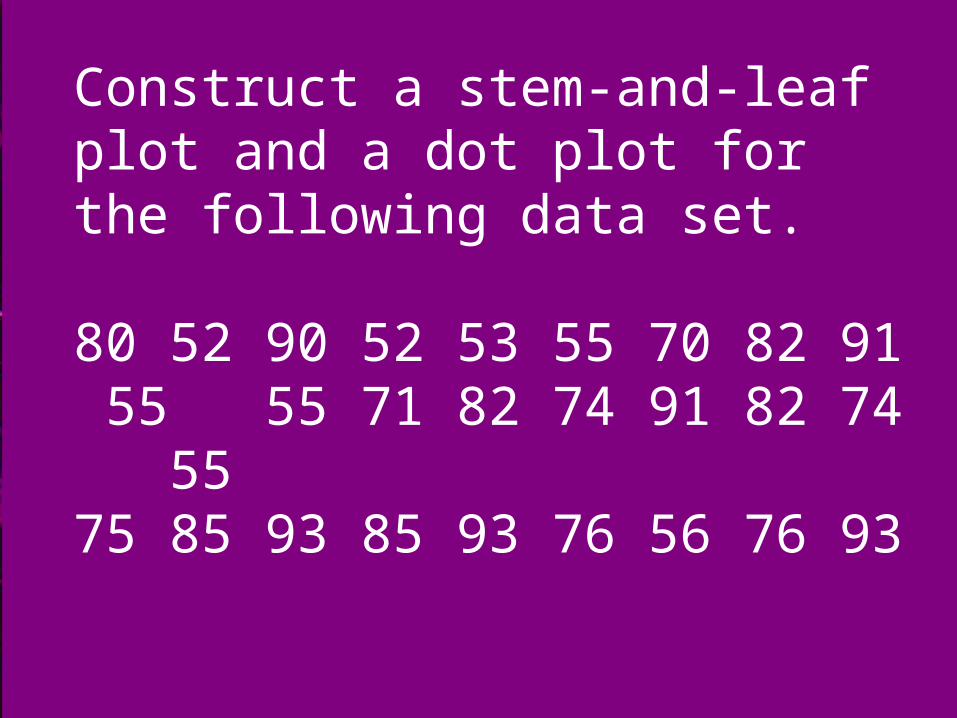
Construct a stem-and-leaf plot and a dot plot for the following data set.
80 52 90 52 53 55 70 82 91 55 55 71 82 74 91 82 74 5575 85 93 85 93 76 56 76 93

5 2 2 3 4 5 5 5 5 667 0 1 4 4 5 6 6 8 0 2 2 2 5 5 9 0 1 1 3 3 3
Key: 6|4 is 64
50 55 60 65 70 75 80 85 90 95

Practice A# 2.1.B


A time series graph is a line graph used to show a pattern that occurs over a
period of time
Horizontal axis: year/monthVertical axis: number or percent

time series graph
> gas prices each week for 3 months
> # students enrolled at RV
> winning times in an Olympic race for the last 10 Olympics
> sales each month of one year

Month J F M A M J J A S O N DAverage price for a gallon of gas
$1.85$1.77$1.80$1.86$1.95$2.05$2.15$2.25$2.05$2.15$2.25$2.30
J F M A M J J A S O N D
2.402.302.202.102.001.901.801.701.60
Gas
Pric
e pe
r ga
llon
MONTH
Average Price Per Gallon of Gasoline

Practice A# 2.2.C
