linkin park magazine advert
TRANSCRIPT
Linkin Park – “A Thousand Suns” Magazine Advert
Linkin Park
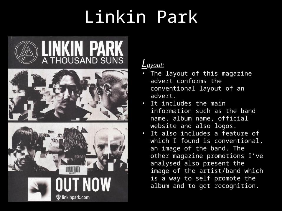
Layout:• The layout of this magazine advert
conforms the conventional layout of an advert.
• It includes the main information such as the band name, album name, official website and also logos.
• It also includes a feature of which I found is conventional, an image of the band. The other magazine promotions I’ve analysed also present the image of the artist/band which is a way to self promote the album and to get recognition.

Linkin ParkContent:• This magazine advert includes some
conventional content of which you tend to find. Parts of the content conforms the conventional features and other parts subvert.
For example:• This advert contains 2 different images of the
band. In both images a square edit has been created, making the original images slightly deformed. It can be conventional of rock bands to have a twist on their promotional materials or something unique of which will catch the audiences attention.
• The advert contains some textual information. It uses the conventional bands name along with the title of the album. It also contains an official website and “Out Now” promoting the fact it’s already out. However, unlike the other magazine adverts I’ve analysed, this album doesn’t contain hit singles which is subverts the conventional magazine adverts, even in the rock genre. This could make it hard for them to promote the big singles on this album as the audience won’t know straight away what tracks it includes – they would have to find out.
• As well as imagery and text, this advert uses a variety of logos such a record label logos and a band identity logo. The band logo is navigated right at the top of the advert by the band’s name and this is a logo of which the target audience and fans can quickly associate with.

Linkin Park
Style/design/use of colour:• This advert is presented in a faded
black and white filter which can be conventional of the genre. Black and white images usually suggest the meaning and feelings are quite moody and atmospheric, this could link to images of the band and the fact that they’re making expressionless eye contact with the camera.
• The style of the advert is extremely eye catching, from the unusual image effect to the bold typography. I feel like this is a successful style and design as it focus right on the image and gives the promotional details like “OUT NOW” which persuades you to go and listen.
Linkin Park
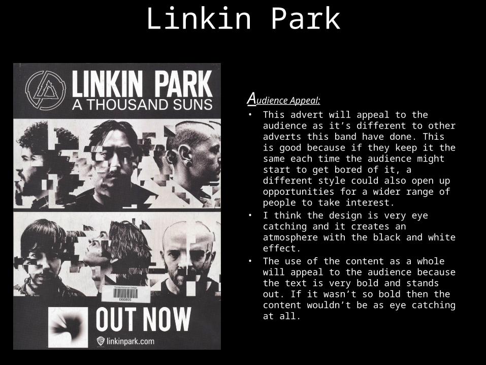
Audience Appeal:• This advert will appeal to the
audience as it’s different to other adverts this band have done. This is good because if they keep it the same each time the audience might start to get bored of it, a different style could also open up opportunities for a wider range of people to take interest.
• I think the design is very eye catching and it creates an atmosphere with the black and white effect.
• The use of the content as a whole will appeal to the audience because the text is very bold and stands out. If it wasn’t so bold then the content wouldn’t be as eye catching at all.

Linkin Park
Imagery:• There isn’t much mise-en-scene
used within this advert, however you can tell this was shot in a studio due to the high key lighting and shadowing on the faces. The use of the studio gives the images a crisper shot which is good for conveying a certain facial expression and mood.
• The shot size doesn’t show much of the members due to it being a close up of them, but you can make out the stereotypical costumes such as checked shirt and leather jacket which is associated with rock and masculinity.
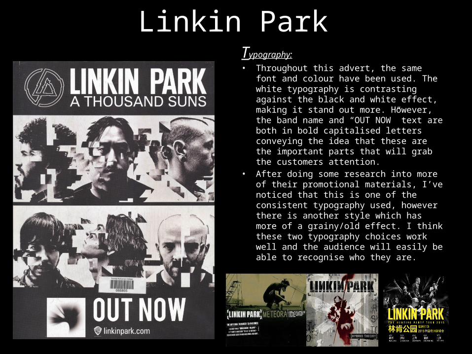
Linkin ParkTypography:• Throughout this advert, the same font
and colour have been used. The white typography is contrasting against the black and white effect, making it stand out more. However, the band name and “OUT NOW” text are both in bold capitalised letters conveying the idea that these are the important parts that will grab the customers attention.
• After doing some research into more of their promotional materials, I’ve noticed that this is one of the consistent typography used, however there is another style which has more of a grainy/old effect. I think these two typography choices work well and the audience will easily be able to recognise who they are.
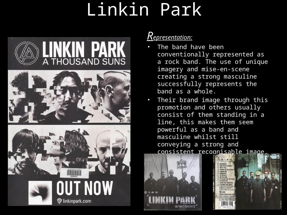
Linkin ParkRepresentation:• The band have been
conventionally represented as a rock band. The use of unique imagery and mise-en-scene creating a strong masculine successfully represents the band as a whole.
• Their brand image through this promotion and others usually consist of them standing in a line, this makes them seem powerful as a band and masculine whilst still conveying a strong and consistent recognisable image.
Linkin Park
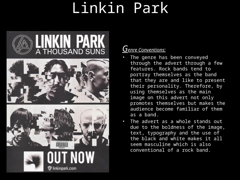
Genre Conventions:• The genre has been conveyed
through the advert through a few features. Rock bands tend to portray themselves as the band that they are and like to present their personality. Therefore, by using themselves as the main image on this advert not only promotes themselves but makes the audience become familiar of them as a band.
• The advert as a whole stands out due to the boldness of the image, text, typography and the use of the black and white makes it all seem masculine which is also conventional of a rock band.
Linkin Park
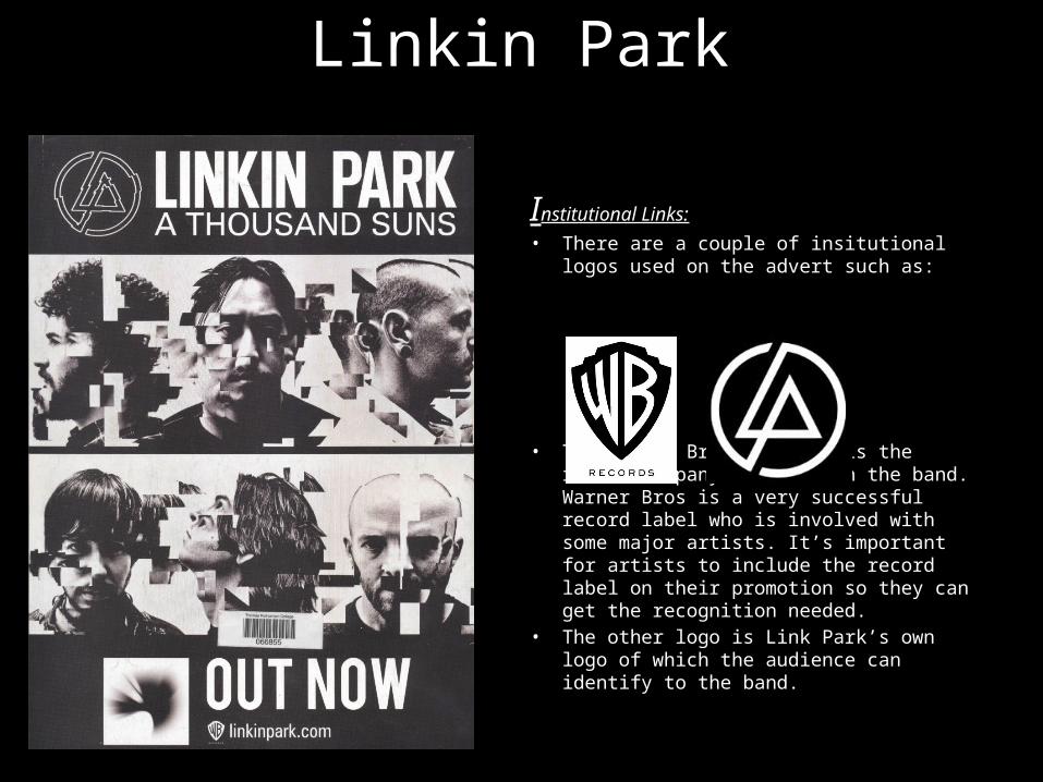
Institutional Links:• There are a couple of insitutional logos
used on the advert such as:
• The Warner Bros. Records is the record company linked with the band. Warner Bros is a very successful record label who is involved with some major artists. It’s important for artists to include the record label on their promotion so they can get the recognition needed.
• The other logo is Link Park’s own logo of which the audience can identify to the band.
Linkin Park
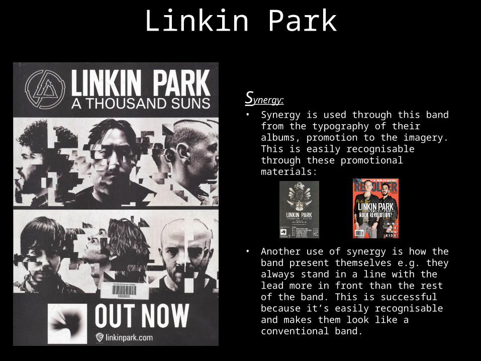
Synergy:• Synergy is used through this band
from the typography of their albums, promotion to the imagery. This is easily recognisable through these promotional materials:
• Another use of synergy is how the band present themselves e.g. they always stand in a line with the lead more in front than the rest of the band. This is successful because it’s easily recognisable and makes them look like a conventional band.