liz diem presentation tips for powerpoint
TRANSCRIPT

Liz Diemwww.chnresources.org
Presentation Tipsfor PowerPoint

2
OverviewContent of presentationSlidesGraphs/TablesAnimationReferences
2www.chnresources.org

3
Content of Presentation
3
IntroductionBodyConclusion
www.chnresources.org

4
IntroductionInforms the
audience about: Why they are here. What they will get out of the presentation.
4
In other words, tells people why the topic is important.
www.chnresources.org

5
Body
S ub p o in t S ub p o in t S ub p o in t
1 s t M a jo r P o in t
5www.chnresources.org

6
Conclusion
6
Summary of the key points that are presented within the body.
www.chnresources.org

7
Picking a Background
7
Avoid busy backgrounds.Avoid clashing colors.
www.chnresources.org

8
8
www.chnresources.org

9
Slides
9
Use point formCreate an outline or notesUse 1-2 slides/minuteAvoid too many picturesUse a picture or chart at least
every second slideRemember to spell check
www.chnresources.org

10
Choosing a slide layout
10
Choices of layoutClick on Home
in toolbarClick on layoutChoose a layout
from those displayed and click on it.
The slide layout for that slide will change
Advantages of different layouts
2 text box layout (this slide) allows you to:display information side
by sidebring in one item in text
box at a time with animation as demonstrated in this slide (see slide 24)
Other layouts combine pictures and text (see slide 4)
www.chnresources.org
11
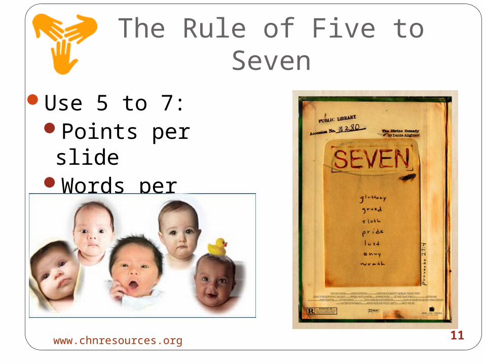
The Rule of Five to SevenUse 5 to 7:
Points per slide
Words per sentence
11www.chnresources.org
12
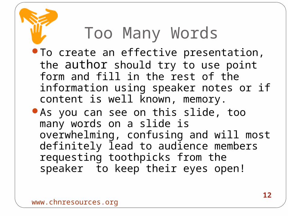
Too Many Words
12
To create an effective presentation, the author should try to use point form and fill in the rest of the information using speaker notes or if content is well known, memory.
As you can see on this slide, too many words on a slide is overwhelming, confusing and will most definitely lead to audience members requesting toothpicks from the speaker to keep their eyes open!
www.chnresources.org

13
Levels of Bullets
13
Only use two levels- this is the highest levelOne- this is the second levelTwo
You get the second level by using the ‘tab’ key.
When you want to move a point back up a level:Click on both the shift and tab key
www.chnresources.org
14
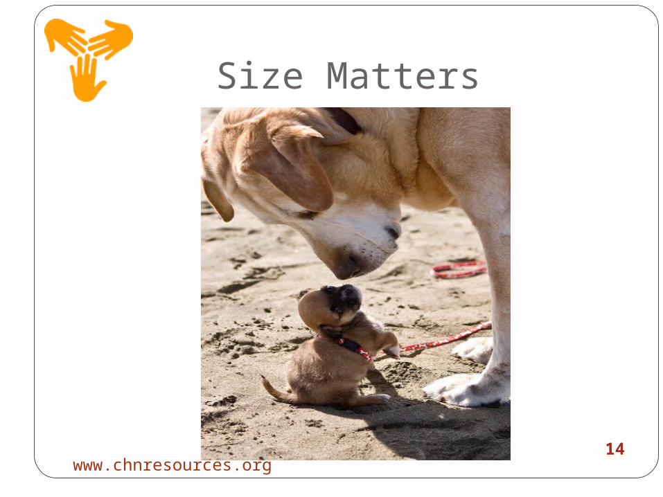
Size Matters
14www.chnresources.org

15
Font Size
15
Should be at least 24 point, this is 32.
Text should be visible from the back of a room.
Use bigger fonts for emphasis, but not too often.
www.chnresources.org

16
Font Type
16
Times New RomanArialThis is too difficult to see even in a
32 pt fontToo chunkyToo funky Just plain bad writing!
www.chnresources.org

17
Font Color
17
Using color can be functionalCan be used to contrast or
compareCan be used to emphasize a word
or pointViolet and yellowOrange and blue
www.chnresources.org
18
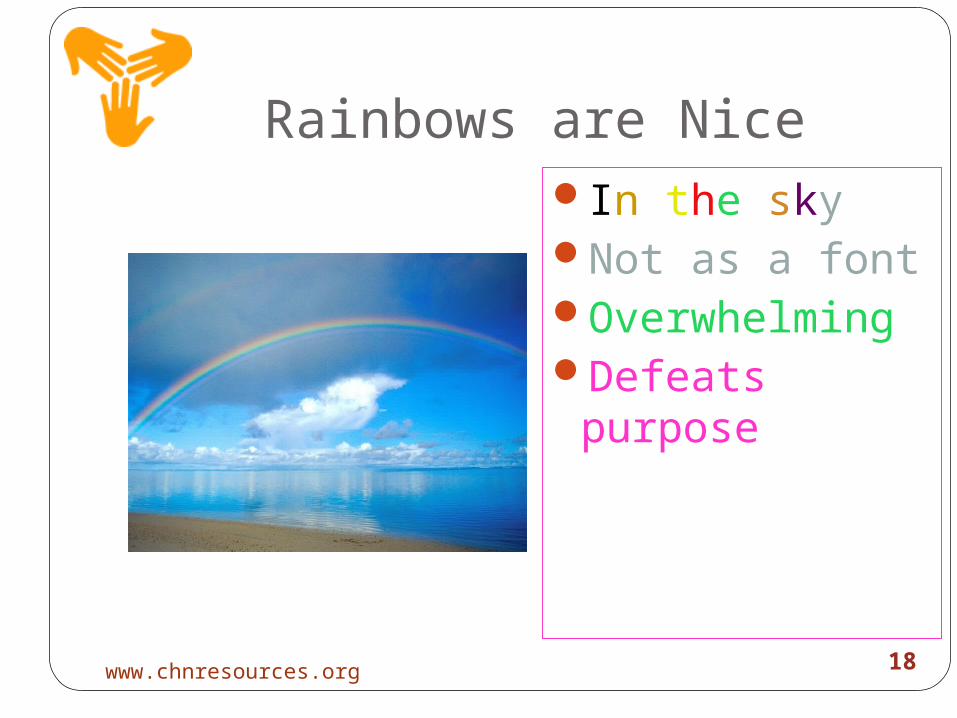
Rainbows are NiceIn the skyNot as a fontOverwhelmingDefeats
purpose
18www.chnresources.org

19
Let’s Talk About
19www.chnresources.org

20
GraphsTemplates for
graphsMake it simpleNot too many
lines
0
10
20
30
40
50
60
70
80
90
TeamA
TeamC
GoalsWinsPenalties
20www.chnresources.org

21
Too Confusing
21
Source: Unknown organization, 2011www.chnresources.org

22
Clear TableVeggies Grains Meat Dairy
Monday 8 6 2 4
Tuesday 7 6 5 4
Wed 6 5 3 5
Thurs 4 6 2 3
Friday 6 7 4 2
Sat 7 8 3 4
22www.chnresources.org

23
Animation
23
Used for emphasisCan be distracting; use like salt
(sparingly)Mainly use same type of animation i.e.
‘appear’. Occasional different type for impact.
Animation can only be viewed by clicking on ‘play’ button or in ‘view slide show’ mode
www.chnresources.org

24
Animation
24
Doyou findthis distracting?I do!
www.chnresources.org

25
Animation
25
Whataboutthis?
www.chnresources.org

26
Clip Art
26
Try to obtain images from copyright free sources
Simply click to enlarge, copy and paste
Use the “clip art” button
www.chnresources.org

27
Referencing
27www.chnresources.org

28
Referencing
28
Reference sources used on the presentation slides: Referencing required similar to documentsParaphrasing, direct quotes, tables
Either at bottom of slide if it applies to all items in slide or after each point
Reference list using correct format at end
www.chnresources.org

29
Arredonto,L. (1994). Business presentations. New York, NY: McGraw
Hill, Inc
Lowe, D. (2007). PowerPoint 2007 for dummies. Indianapolis, Indiana:
Wiley Publishing Company.
Munro, C. (n.d.) Referencing and bibliographies. Retrieved
from www.newcastle.edu.au/service/libraryinfo1010/apaview.ppt
References(font can be smaller than 24 to fit them all on
one slide)
29www.chnresources.org