lms usability evaluation report - tufts universitylms+usability+evaluation+report.pdfalthough this...
TRANSCRIPT

LMS Usability Evaluation Report
Presented to the LMS Core Team Prepared by the LMS Usability Working Group
March 4, 2010

Contents
Executive Summary .........................................................1
Introduction .....................................................................3
Methodology ...................................................................3Charge & Scope of Work Participant Demographics Platform ConfigurationProtocols
Findings ...........................................................................8Faculty - Tier 1: Task by Task Analysis (n=14) Faculty - Tier 2: Task by Task Analysis (n=6) Students (n=1) LMS Admintrator Evaluation (n=3) Accessibility Analysis (n=2)
Considerations For Implementation Phase ....................23
Usability in Future Versions of Moodle and Sakai ...........26Moodle 2.0 Sakai 3.0
Conclusion .....................................................................26
Appendix .........................................................................28

p. 1
Executive Summary The Usability Working Group conducted a series of Moodle and Sakai usability evaluation sessions between January 26 and February 26, 2010. Sessions were conducted on all 3 Tufts University campuses and included participants from all of the Tufts University Schools. The evaluation targeted four user groups: faculty, students, LMS administrators and users with accessibility needs.
The evaluation focused primarily on efficiency and ease of learning of the systems’ default interface, tools, and workflows. The evaluation tasks reflected the most common tasks performed by faculty and student LMS users, as identified by the Community Requirements Gathering Working Group.
As a result of the evaluation, the Usability Working Group identified that both learning management systems elicited positive and negative reactions from the participants.
From the faculty perspective, most participants found the Sakai interface initially easy to use, while most participants found the Moodle interface initially more difficult to use and understand. Sakai scored high marks for basic tasks such as uploading files, creating announcements, and assignments, and received lower marks on complicated tasks such as copying files from one site to another. Conversely, faculty scored lower marks for Moodle when performing basic tasks, citing its interface and heavy reliance on icons as obstacles, yet Moodle earned higher marks for more complex tasks such as moving content from one course site to another. Overall, most faculty participants coming from a Blackboard or TUSK experience felt comfortable with the Sakai interface and workflow. Most participants found the Moodle interface and workflow foreign to how they currently organize and manage their course sites. Nevertheless, a number of participants, including Angel users, expressed an interest or preference in Moodle’s topical or weekly formats and recognized it as a possible alternative to their current course site organization.
From the student perspective, our participant, a Blackboard user, felt that both platforms would be very usable for students and that each would offer advantages over our current LMS. She expressed a preference for having tabs and tools clearly labelled and laid out in the Sakai interface, but also liked having content sequenced by workflow and grouped together as in the Moodle interface.
From the LMS administrator perspective, evaluators found performing basic administrative tasks to be complicated in Sakai, and remained so after the initial learning curve. On the other hand, performing the same tasks in Moodle was found to be much easier.
From the users with accessibility needs perspective, both Moodle and Sakai performed adequately with voice recognition software (keyboardless system interaction), but the participant noted a significant learning curve for both platforms. Accommodations for low-vision users were explored in Moodle only, but the process has helped identify important issues to address during the implementation phase.

p. 2
Results of the usability evaluation make it evident that transitioning from the current LMS systems to a new one will require a significant investment of resources in terms of training, documentation, and content migration assistance, regardless of which platform is selected. Fortunately, we’re confident that the majority of the issues encountered by our participants can be addressed through training and configuration. Sakai and Moodle are both complex platforms with a wide array of functionality and will require a significant number of important configuration and implementation decisions made in a thoughtful and strategic manner to create a system that best meets the needs of users across Tufts University. The evaluation analysis led to a number of important recommendations for future working groups to consider during the implementation phase of the next LMS. These factors are detailed in the “Considerations for Implementation” section below.

p. 3
Introduction The Usability Working Group conducted a series of Moodle and Sakai usability evaluation sessions between January 26 and February 26, 2010. Sessions were conducted on all 3 Tufts University campuses and included participants from all of the Tufts University Schools.The evaluation targeted four user groups: faculty, students, LMS administrators and users with accessibility needs. The structure, procedure and the resulting data from those sessions are described in detail under “Methodology” and “Findings” below.
The evaluation focused primarily on efficiency and ease of learning of the systems’ default interface, tools, and workflows. The evaluation tasks reflected the most common tasks performed by faculty and student LMS users, as identified by the Community Requirements Gathering Working Group. By design, the usability evaluation was limited in scope and participants were given no initial training in either of the learning management systems, however they did have access to the built-in documentation provided by each platform.
As a result of the evaluation, the working group identified positive and negative aspects of each system’s user interface with regard to its intuitive and structural nature. The results led to a number of important recommendations for future working groups to consider during the implementation phase of the LMS, regardless of which system is ultimately chosen. These factors are detailed in the “Considerations for Implementation” section below.
Methodology Charge & Scope of Work The Usability Working Group was charged with setting up a presentation version of each platform with minimal branding and most commonly used features represented, to design the instruments and process for usability testing with community members, to conduct the usability testing, to report findings to the Core Team, and to discuss how these usability findings might influence strategic recommendations for next-generation Tufts LMS service.
The group was comprised of Mark Bailey (tusk/tlhs, co-chair), Sheryl Barnes (uit), Patrick Connell (Friedman School), Neal Hirsig (Arts & Sciences) , Hannah Reeves (uit), Melanie St. James (uit, co-chair), Chris Strauber (Tisch Library).
The usability evaluation departed from a more traditional usability testing approach, where results would directly impact the development of a tool. Instead, this evaluation was designed to get a first impression from participants for Moodle and Sakai, to identify usability challenges in accomplishing basic tasks, to provide recommendations for implementation, documentation, training and support.

p. 4
The evaluation focused primarily on efficiency and ease of learning of the systems’ default interface, tools, and workflows. The evaluation tasks reflected the most common tasks performed by faculty and student LMS users, as identified by the Community Requirements Gathering Working Group.
A top requirement which emerged from the feedback gathered by the Community Requirements Gathering Working Group was “Ease of Use”. With further analysis, the usability working group identified Ease of Learning and Efficiency as usability priorities. As a reference, the 5 dimensions of usability are: Effective, Efficient, Engaging, Error Tolerant, Easy to Learn.
Below are the terms definitions:
Easy to Learn:• How well the product supports both the initial orientation and continued learning throughout the complete lifetime of use. Efficient:• How quickly the work can be completed.
Conducting a full usability evaluation of two different Learning Management Systems (Moodle and Sakai) is a large and complex task, well beyond the time and resources of the LMS Usability working group. Many questions could not be answered by the usability evaluation, including the following:
Reporting tools for university administrators could not be tested as sufficient data was •not available Self-serve course creation: complex functionality, and we don’t know if courses will be •created for instructors, or if instructors will create them themselves. Deep exploration of the gradebooks •Group creation and group management •Scalability of workflow and interface for large enrollment classes. (A participant would •have liked to see how assignment reviewing and grading would scale with 200 students enrolled in a course) Data rich course sites and dashboards •
Participant Demographics Most faculty participants were self-selected, and all had experience with using technology in their teaching.
When evaluating such complex systems, it is important to recognize the different learning styles of participants and comfort level with technology. Some users prefer to explore on their own, while others prefer a workshop first.

p. 5
For the Tier 1 evaluation, faculty participants (n=14) categorized themselves as:
Learn by exploring on their own (6) •Training, workshops (4) •Learn by exploring + Read documentation (3) •Learn by exploring + Training (1) •
Participants who rely on hands-on training and documentation to get started with a new tool were at a disadvantage in our evaluation. We decided not to introduce documentation (other than the built-in help in each platform), as it would become an exercise in evaluating the documentation itself.
Another important factor to consider is previous experience with an LMS. Faculty participating in the evaluation study were in one of the following categories:
BlackBoard (7) •Angel (1) •TUSK (1) •BlackBoard + Angel (2) •BlackBoard + TUSK (2) •
In terms of sample size, Jacob Nielsen - a prominent web usability consultant - recommends “3 users from each category if testing three or more groups of users (at least 3 users to ensure that the diversity of behavior within the group is accounted for).” (http://www.useit.com/alertbox/20000319.html). Although this is a small sample size, Nielsen states that major usability issues can be identified with this method.
Platform ConfigurationThe LMS Usability Working Group worked with Sakai and Moodle “out of the box”. However, a few changes in the default system configuration were implemented. The working group encountered instances where we felt a different tool or setup may best reflect a users typical environment. It should be noted that both platforms are highly configurable and there are many modules or “plug-ins” available to create an optimal user environment. However, we did not strayed too far from the default setup for each platform to better reflect each system’s inherent philosophy and tool approach.
Sakai:
We used Sakai’s default Forum tool during our test runs, but it became apparent that •the tool is difficult to use. We switched to Sakai’s JForum tool. Melete •Enable course sites (only Project sites enabled by default) •
p. 6
Moodle:
MyMoodle •
Enabled Multimedia •
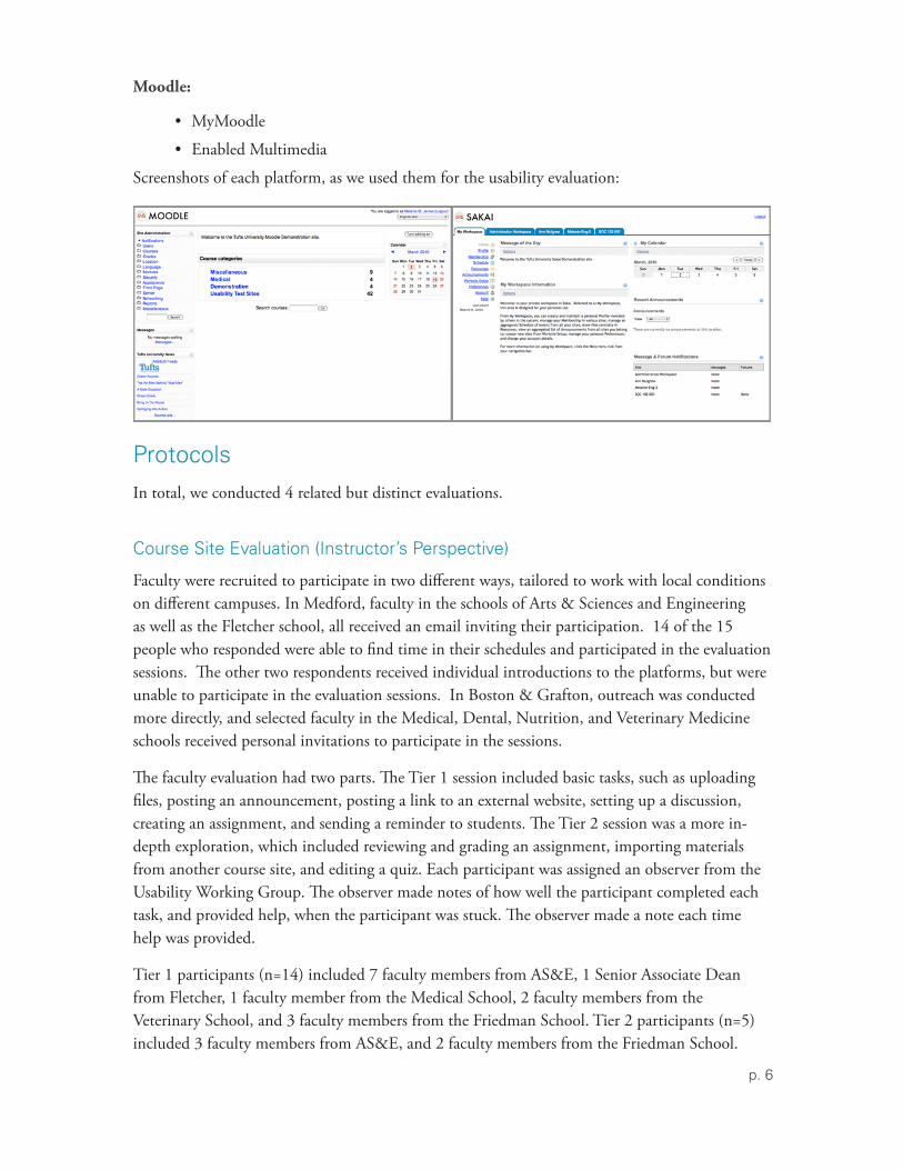
Screenshots of each platform, as we used them for the usability evaluation:
Protocols In total, we conducted 4 related but distinct evaluations.
Course Site Evaluation (Instructor’s Perspective)
Faculty were recruited to participate in two different ways, tailored to work with local conditions on different campuses. In Medford, faculty in the schools of Arts & Sciences and Engineering as well as the Fletcher school, all received an email inviting their participation. 14 of the 15 people who responded were able to find time in their schedules and participated in the evaluation sessions. The other two respondents received individual introductions to the platforms, but were unable to participate in the evaluation sessions. In Boston & Grafton, outreach was conducted more directly, and selected faculty in the Medical, Dental, Nutrition, and Veterinary Medicine schools received personal invitations to participate in the sessions.
The faculty evaluation had two parts. The Tier 1 session included basic tasks, such as uploading files, posting an announcement, posting a link to an external website, setting up a discussion, creating an assignment, and sending a reminder to students. The Tier 2 session was a more in-depth exploration, which included reviewing and grading an assignment, importing materials from another course site, and editing a quiz. Each participant was assigned an observer from the Usability Working Group. The observer made notes of how well the participant completed each task, and provided help, when the participant was stuck. The observer made a note each time help was provided.
Tier 1 participants (n=14) included 7 faculty members from AS&E, 1 Senior Associate Dean from Fletcher, 1 faculty member from the Medical School, 2 faculty members from the Veterinary School, and 3 faculty members from the Friedman School. Tier 2 participants (n=5) included 3 faculty members from AS&E, and 2 faculty members from the Friedman School.

p. 7
Course Site Evaluation (Students’ Perspective)
The Tufts Community Union (TCU) Senate was engaged to recruit undergraduate students to provide additional feedback. In addition to contacting the TCU Senate to both invite them and ask them to solicit other students via TuftsLife and email, we also issued individual invitations to a small group of students known to core members. Despite significant recruitment efforts, only 1 student showed up for the evaluation session on February 25th. A series of tasks, detailed in the “Findings” section below, were assigned to the participant and performed in each system.
Administrative Interface Evaluation
The administrative interface evaluation was conducted by: 1 Blackboard administrator (AS&E), 1 TUSK administrator (Health Sciences) and 1 Angel administrator (Friedman School). The three evaluators were all part of the LMS Usability Working Group. A series of tasks, detailed in the “Findings” section below, were assigned to the participants and performed in each system.
Accessibility Evaluation
One staff member, who is an accessibility specialist, performed Tier 1 tasks in a keyboardless manner, using voice recognition. One faculty participant had a low vision condition and performed Tier 1 and Tier 2 tasks with some accomodations.

p. 8
Findings Analysis of the faculty evaluation data shows that Moodle’s strength is its contextual organization of content, while Sakai’s strength is with its familiar structure and interface.
The main difficulty with Moodle is the initial orientation to the interface’s structure. The majority of participants were able to orient themselves quickly to Sakai’s interface and conventions. It should be noted that nomenclature on both platforms presented significant challenges for participants.
A major usability hurdle in Moodle is the heavy use of icons, which were confusing to a large number of participants. One important functionality missing in Moddle is the ability for instructors to return a graded assignment to students. We discovered that a large number of instructors write comments using Track Changes in MS Word directly on the papers and return the papers to students with their comments. Sakai is able to accommodate this workflow.
Faculty - Tier 1: Task by Task Analysis (n=14) This section is a task-by-task analysis of faculty participants’ performance. We used the following rating system to grade task success:
1= got it quickly 2= got it eventually 3= needed help
1. Add to your course site: Course syllabus (syllabus.doc), and reading materials (reading1.pdf, reading2.pdf )
Moodle Result: 10 out of 14 participants could not start or complete this task on their own, while only 4 participants could start and complete the task on their own. Observation: Because uploading files was the first task given to our participants, the majority struggled with understanding Moodle’s structure. Once they understood they needed to turn editing on and use the “Add a Resource” menu, the majority of participants were fine navigating the file upload structure.
p. 9
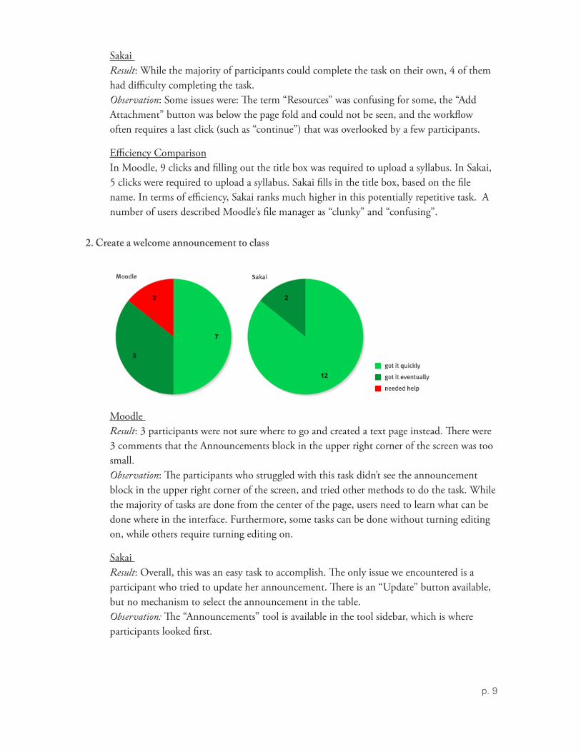
Sakai Result: While the majority of participants could complete the task on their own, 4 of them had difficulty completing the task. Observation: Some issues were: The term “Resources” was confusing for some, the “Add Attachment” button was below the page fold and could not be seen, and the workflow often requires a last click (such as “continue”) that was overlooked by a few participants.
Efficiency ComparisonIn Moodle, 9 clicks and filling out the title box was required to upload a syllabus. In Sakai, 5 clicks were required to upload a syllabus. Sakai fills in the title box, based on the file name. In terms of efficiency, Sakai ranks much higher in this potentially repetitive task. A number of users described Moodle’s file manager as “clunky” and “confusing”.
2. Create a welcome announcement to class
Moodle Result: 3 participants were not sure where to go and created a text page instead. There were 3 comments that the Announcements block in the upper right corner of the screen was too small. Observation: The participants who struggled with this task didn’t see the announcement block in the upper right corner of the screen, and tried other methods to do the task. While the majority of tasks are done from the center of the page, users need to learn what can be done where in the interface. Furthermore, some tasks can be done without turning editing on, while others require turning editing on.
Sakai Result: Overall, this was an easy task to accomplish. The only issue we encountered is a participant who tried to update her announcement. There is an “Update” button available, but no mechanism to select the announcement in the table. Observation: The “Announcements” tool is available in the tool sidebar, which is where participants looked first.

p. 10
3. Task: Set up a discussion forum called “Discussion Questions” and provide this prompt: “Write one question you have from today’s reading”
MoodleResult: 5 participants had trouble locating the Forum tool under “Activity”. Additionally, 2 participants expressed that the name “Forum” is not as clear as “Discussions”.
Sakai Result: 3 participants expressed confusion at the redundancy of the “New Topic” button above and below the table. (“Do they do the same thing, or something different?”).
General Observation: In general, participants have trouble understanding the hierarchy and structure of forums, regardless of which tool used.
4. Post link to external website (http://cnn.com)
Moodle Result: 4 participants expressed confusion as to where to post the link. (Add a Resource menu).
Sakai Result: There were no issues for the majority of participants, but we see a similar problem with some users not seeing the “Add” menu. (Similar issue as adding a file to the Resources area).

p. 11
Observation: A repeated difficulty with an area of the interface could represent a design/usability issue, rather than a learnability issue.
5. Send a reminder to all course students “Just a reminder we will have a guest lecturer next time we meet.”
Moodle Result: Users need to go through the “Participants” tool to send a message to the entire class, which is not apparent at first.
SakaiResult: Participants had no trouble accomplishing this task. One participant commented “It’s nice I can send a link inside the message”.
General Observation: Both Moodle and Sakai offer a WYSISWG text editor to send a message, and both include an icon to click on to add a link inside the message. Moodle’s “add link” tool is much clunkier than Sakai’s.
6. Task: Create an assignment for students · Provide students with assignment instructions: Submit a 500 word response on topic X · Define availability (Make assignment available from today through April 1) and due date (April 1)
* 2 participants ran out of time for this task in Sakai

p. 12
MoodleResult: 2 participants couldn’t find where to create an assignment (Under “Activity” menu). 3 participants had trouble with selecting a type of assignment.
SakaiResult: Overall, positive response to options and settings and integration with gradebook.
General Observation: In Moodle, users must select a type of assignment as a first step (to specify format), while in Sakai, users choose to create an assignment first, then are presented with a menu of options. The latter process seems to make more sense.
Faculty - Tier 2: Task by Task Analysis (n=6)
1. Locate Assignment #1 - Mid-Term Research Paper
Moodle Result: 1 participant had trouble finding the Assignment link.
Sakai Result: No major issues.
2. Locate the Draft Paper Submitted by Student 1

p. 13
Moodle Result:No major issues.
Sakai Result: No major issues.
General Observation: One participant had trouble locating the assignment in Moodle and Sakai
3. Assign a Grade and Comment on the Student’s Submission
Moodle Result: Tasks could be accomplished fairly easily, but some participants expressed frustration at nomenclature and interface.
Observation: Navigation and Interface issues: Button labels adds confusion.
Sakai Result: No major issues. See note below. Observation: One participant wanted to review the comment she wrote to the student. Comments are buried deep on student’s page, not where participant would have looked.
Recommendation: Emphasize location of comments in documentation
Note: 1 participant assigned the grade on the paper itself and not in the gradebook, which is his current workflow.

p. 14
4. Make the Grade Visible to Student
Moodle Result: No participants were able to accomplish this task on their own. Observation: This task highlights some of the biggest shortcomings of Moodle’s interface: Icons are confusing, the interface and terminology are unclear.
Note: Known issues with built-in gradebook. Another gradebook tool is available.
Sakai Result: All participants were able to get started on this task, but many didn’t know how to finish the task or didn’t feel confident of outcome. Observation: When an instructor went back to modify a comment after the grade was released, we noticed a status discrepancy between what was on the Assignment page and in the Gradebook.
5. Reuse “Reading3.pdf ” and “Reading4.pdf ” from your English-1 course in your English-2 course.
Moodle Result: All participants got easily started on this task, but some had trouble completing it. Observation: Participants appreciated that they could select specific documents and quizzes,

p. 15
and bring them into the new course in one swoop. While the link “Import” was clear in the left sidebar, a default red warning message unnecessarily alarmed some participants who backed out of the process. There were also too many useless confirmation screens, but once participants knew to ignore it all, it was fine.
Sakai Result: The process was confusing for the majority of participants. Observation: There are two ways to move content from one course site to another. The first way is through “Resources”. There are significant User Interface and User Interaction challenges with this process, diverging from users’ mental models and experiences. The other method is via “Site Info” > “Import Data”, but participants backed out of it because it was confusing. Recommendations: The label “Site Info” is problematic, because participants were looking for a label that would best describe the function, such as “Course Admin”. In addition, when selecting “Import from Site”, the three choices available, and their explanations, are confusing. Additional concerns we heard were the inability to select specific items, and the lack of confirmation when the task was completed.
6. Reuse “End of Unit Quiz” from your English-1 course in your English-2 course
Moodle Result: The import mechanism was clear after doing it a first time. In addition, some participants had already imported the quiz in the previous task. Observation: The participant who had trouble with this task had to be shown in the previous task how to import it, and the quiz was imported at the same time.
SakaiResult: None of the participants were able to accomplish this task on their own. Observation: Because participants could import readings from one course to another via “Resources”, users expected to be able to do the same under the “Tests and Quizzes” section, but were not able to. The only way was to go through “Site Info”. See previous task for an explanation.

p. 16
7. In the “End of Unit” quiz, remove question #1 and replace it with a new essay question: “Describe the imagery in Sandburg’s “The Fog””.
MoodleResult: This task was problematic for the majority of participants. Observation: The workflow for adding a question is cumbersome. A question type cannot be changed. The question bank and how it relates to the quiz are unclear. The interface and icons are confusing.
SakaiResult: 1 participant failed to see the “Add Question” menu. Observation: To some users, the label “Preview Assessment” and the button “Begin Assessment” are confusing in the context of previewing a quiz.
Students (n=1) The feedback we got from our single student tester was overwhelmingly positive. A fairly experienced Blackboard user, she felt that both platforms would be very usable for students and that each would offer advantages over our current LMS. She expressed a preference for having tabs and tools clearly labelled and laid out in the Sakai interface, but also liked having content sequenced by workflow and grouped together as in the Moodle interface. She felt that Moodle was a little harder to navigate with content on both sides of the screen and no clear visual hierarchy or call to action on the page, but concluded that students could get used to this and that overall the platforms would be fairly equal in terms of helpfulness/efficiency of completing course work and that both offered much greater efficiency in working with course content than Blackboard does. Our tester completed all the tasks without any major difficulty and only stopped to make an observation or verify an action once per platform. (see details below)
As part of the protocol, we invited our tester to explore project site capability in both systems. As a member of PepBand and EcoReps, a new club on campus, she was very excited about the possibility of using an LMS to collaborate with other students and noted repeatedly “that’s so cool, I like the way you can just choose what you want on your site”, and “I could really see using this to encourage other students to join EcoReps.” She felt that Sakai would lend itself to project

p. 17
or club collaboration more readily because of the use of tabs rather than links to represent sites and expressed a preference for Sakai overall, but said she thought either would be pretty easy for students to use and that she was looking forward to seeing the new system rolled out at Tufts.
Results by Task
The following tasks were completed easily by the student in both systems:
Login to system •Look to see when your assignment is due •Review Calendar to look for upcoming deadlines •Check course syllabus •Introduce yourself in Chat •Take Assignment #1 •Take Quiz #1 •Review Grade on Quiz •Completed easily in both systems •
The following tasks were completed with some level of difficulty:
Task: Edit your profile Result: Slight difficulty in locating Profile in Moodle, but completed without assistance
Task: Enter Course Site and Check Course Announcement Result: Slight confusion over where announcements were located in Moodle
Task: View Learning Unit #1 Result: Questioned which folder to look in in Sakai
Task: Respond to Discussion Topic Result: Questioned whether she was replying to reply or replying to topic in Moodle
LMS Admintrator Evaluation (n=3) Participants: Mark Bailey, Patrick Connell, and Neal Hirsig
The Usability Working Group opted for a less formal process for application administration testing of Sakai and Moodle. We were given a series of common LMS Admin tasks to accomplish in both systems (outlined below) and we provided our comments on the Wiki (summarized beneath each task by platform). Our focus was on interface, learn-ability and functionality with the latter being most important and highlighted in red. All participants agree that, while Moodle was a bit easier in most cases, LMS application administrators rely heavily on support, documentation and community engagement to fulfill common administrator tasks, so first impressions and interface concerns are less important for them than for faculty or students.
NB: Some of our observations or concerns can likely be resolved on each platform by modifying the configuration.

p. 18
Moodle Summary
All functionality that can be done in BB Basic can be done here with relative ease. “Login As” feature is nice; categorize/organize courses is nice; Strong reporting on system activity; Great to be able to email all roles system-wide or site-wide; searching/navigating for courses a bit clumsy; vague iconography.
Sakai Summary
Sakai can perform most BB Basic functionality with less ease generally than with Moodle. Some of this may be in part to configuration issues, although the same could be said for Moodle. Multiple steps requiring either a user ID or course ID; apparently weak reporting mechanism (NB: we did see better reporting at the demo, so this might be a configuration thing); no course organization scheme; no contextual help for Admins; Generally non-intuitive for Admins; Learning curve is high and even after learning performing basic steps is annoying.
Tasks, Summary of experiences by Platform, and Functionality Concerns:
1. Add a new user to the system Moodle Result: Easy, but new-user form was too long, required too many unnecessary fields Functionality Drawback: Moodle requires an email address and each user must have a unique email address… this makes it impossible to create multiple test accounts using the same email address.
SakaiResult: Easy, but there was some causes for confusion over rhetoric and what to put in textbox Functionality Drawback: Doesn’t seem to be an option to force users to change their password
2. Change John Doe’s password in the system MoodleResult: Mostly easy, but a bit of confusion in searching for the user
SakaiResult: Easy and search was more efficient than Moodle’s Functionality Drawback: No option to force a password change
3. Create a course MoodleResult: Overall easy, lots of options Functionality Drawback: No course expiration automatic settings; Some of the new course settings don’t seem appropriate for an Admin to make (Topics or Weeks? Grades or no Grades?); No way to assign course tools when creating a course like in Sakai.
p. 19
SakaiResult: Confusing, not intuitive. Terminology issues, not clear what some of the language was getting at, “Site ID’s too long and unclear, etc Functionality Drawback: No way to organize courses (categories, departments, etc…)
4. Attach/remove a student to/from the created course MoodleResult: Fairly straightforward depending on when you “Assign Roles” - right after course is created or through the course. The “Role to Assign User” option was easily overlooked, resulting in user being added as a faculty accidentally. Good search options for finding particular student. Functionality Drawback: No way to notify student via email that they’ve been added to a course; No way to add users when course is being created.
SakaiResult: Easy enough, but the search is limited to username or email address; Non-intuitive in that there was no prompt to add users during course creation process; “Site Info” not an intuitive name for managing users. Functionality Drawback: Limited search options will make it very difficult for faculty to easily add users to their courses.
5. In the new site you have just created, un-publish or make it inactive MoodleResult: Easy enough through the course or in Admin area; searching for the site in admin area was not totally intuitive – have to browse the categories, unclear icons. Functionality Drawback: Can you search all courses on Moodle if they are organized in Categories?
SakaiResult: This is okay either through the Admin workspace (which continues to confuse) or the course. Prominent notice that course is unpublished is a nice feature. Functionality Drawback: Can instructors unpublish their course or is this only an Admin function?
6. Search for the course site named Shakespeare’s Birds. Make sure John Doe has an account on this site. Access the site as John Doe
MoodleResult: Easy to find a course, but entering a course as a particular student involves searching for said student and then “Login As”. Also, not totally intuitive to add students to a course. Functionality Drawback: It would be nice to be able to see a snapshot of a user’s enrollments (what classes they are in)

p. 20
SakaiResult: More intuitive in Sakai to add users after the course is already set up; “Become User” was less intuitive way to “login as a user” than Moodle. Functionality Drawback: To login as a user you have to search for their email address or username, neither of which anyone has on hand
7. Make a duplicate copy of the new site you have created using a different name (For instance, a site copied and used in a different semester):
MoodleResult: This can be accomplished as a Backup/Restore or Importing an old course into a new one. Backup/Restore is not very clear; Backup file gets archived in the course’s file manager w/out notifying Admin; Import method worked fine. Functionality Drawback: Backup file doesn’t appear to be saved in a central Admin area; Presumably though, there is a way to do batch course backups and actually download all the files to disk.
SakaiResult: Easy to duplicate, but does not duplicate user info; Also, not totally clear what is duplicated (everything but users or just content?) Functionality Drawback: When you duplicate a site, it actually creates a new site. Most LMS’s go the copy or import route so users aren’t actually creating new courses, but rather importing old content into an existing new course. Potential for the Admin area to be a mess of courses created by faculty users instead of controlled through SIS or central Administrator
8. Archive the original site MoodleResult: Similar comments to above Functionality Drawback: More likelihood of deleting archive files since they are only stored in courses
SakaiResult: Much less intuitive in Sakai. You have to locate the “Site ID”, a long string of numbers, to create the backup. Once created, it was unclear where the file actually wound up. Functionality Drawback: Not sure where the backup files are and what one can do with them. Can faculty create their own backups? It seems like they can’t.

p. 21
9. Post an information message on the homepage for all users (system-wide announcement) MoodleResult: Not easy to find or figure out. Need to add a “Label” instead of a news feed or edit the topic title. Not intuitive, but easy enough once you learn how to do it.
SakaiResult: Again, not terribly intuitive, but now that we know it’s easy enough. At least it was clearer how to do this once you found it.
Some useful additions for Moodle we’d like to see:
search course sites by instructor’s name •start and end dates for course site availability •administrator’s content repository •universal course site search functionality •mechanism for creating temporary (time-limited) user accounts •handling usergroups through metacourses and subcourses •dissemination of information on a class/usergroup basis (from announcements and •discussion boards, to assignments and scheduling) archiving/creating new courses vs. using time periods (as is currently the case in TUSK) •
Some useful additions for Sakai we’d like to see:
search course sites by instructor’s name •start and end dates for course site availability •universal resource search functionality •course site categorization or catalog •mechanism for creating temporary (time-limited) user accounts •mechanism for placing survey and discussion boards on user’s workspaces •mechanism for e-mailing course site instructors and TA’s •handling usergroups through metacourses and subcourses •dissemination of information on a class/usergroup basis (from announcements and •discussion boards, to assignments and scheduling) archiving/creating new courses vs. using time periods (as is currently the case in TUSK) •
Accessibility Analysis (n=2)
Keyboardless Access
Tier 1 tasks were performed in a keyboardless manner by one expert user, using voice recognition software. The participant was able to accomplish all tasks in Moodle and Sakai, but she noted that a considerable accessibility learning curve would apply to both. Note: The gradebook was not explored.

p. 22
The WYSIWYG text editor is a known accessibility challenge in general. The WYSIWYG text editor in Moodle was difficult to get into at first, but once the participant figured out how to use it, she could format the text and add links easily. The contextual help tool outside the Moodle text editor made it easy to learn the shortcut commands.
On the other hand, Sakai has integrated the CKEditor, which claims to be accessible, but was challenging for this user. The contextual help button, located in the WYSIWYG text editor toolbar, could not be accessed by voice (used the mouse grid to get to it). In fact, none of the toolbar options could not be accessed by voice control. The text editor help button links to the CKEditor’s website homepage. The website itself is not accessible. Furthermore, the accessibility documentation is buried inside the site and is inaccurate. The participant was still able to do basic formatting such as bold, italic and create links via shortcuts commands.
The participant appreciated Moodle’s contextual help tools. The participant expressed concern at the heavy reliance on icons from a visual processing and cognitive disorder perspective. Yet, the icons can be turned off to display the “alt tags” instead. Note: Firefox could not detect the alt tags in many area of the page.
Low Vision Themes
We installed 2 themes (Large Fonts, High Contrast) in Moodle for a low-vision faculty participant. (We did not investigate in Sakai). We changed her course site to these themes. While the fonts were displayed larger, the icons did not scale up. The theme also failed to increase the font in the announcement block, and the tooltip text in general. We also tested the High Contrast theme, which displays white and yellow text against a black background. As a result, black icons were no longer visible. In general, the themes worked well for her, but we realized the students in the course would also inherit the same theme.
In order to accommodate the participant, we also increased the cursor size (which she does on her on computer). The cursor obscured the icons and the tooltip text. It is possible to turn the icons off and display the alt tag instead. Icons in themselves seem to cause another type of obstruction.

p. 23
Considerations For Implementation Phase This section discusses aspects of the project to be addressed during the implementation period.
Issues Common to Sakai and Moodle:
AccessibilityWorking with a low vision participant was an important reminder of taking into account visual disabilities. The participant stressed the importance of high contrast typography. Even among participants with no vision problem, we heard that Moodle was easier to read, because of higher contrast. (Ex: The text on action buttons in Sakai is light blue, and some text is a lighter gray). Recommendation: Create and/or implement a high contrast theme as a default for the LMS. Red flag: We tested a Large Font theme for a professor’s course site, but students inherited the same theme and could not change it. It is not clear in either platform is a user can change the themes only for themselves.
NomenclatureA significant number of participants expressed confusion with the naming of categories, labels and buttons. Recommendation: Conduct review sessions with faculty to better understand their mental models. The outcome will be to emphasize naming conventions with training and documentation, or modify the interface.
Discussion / Forum toolsA number of participants had trouble understanding the structure of a forum tool. They thought they were done after setting up the discussion category, and did not create a topic to respond to. Recommendation: Create a quick tip sheet to explain the overall structure of a discussion or forum tool
Tool IntegrationWhen tools are integrated in a platform, the user interface and user interaction conventions might differ from those of the platform. (Ex: The JForum in Sakai brings in a completely different UI model, which was confusing to a participant). Recommendation: When adding tools to a platform, evaluate the degree to which UI conventions are similar or different. If they are different, additional documentation and training will be required.
Numeric ToleranceA participant mentioned that numeric tolerance in the Quiz/Exam tool is important to the way he works.

p. 24
Recommendation: Assess if the selected platform supports numeric tolerance in the quiz tool and document accordingly.
LearnabilityUsers who learn on their own find Sakai to be the easiest platform to figure out, as it follows a more conventional structure. But issues regarding task completion should be noted (see below). Moodle would require a more widespread initial training because the structure is unfamiliar to almost every user. Recommendation: If implementing Moodle, additional effort will be required to reach out to, and provide training and documentation, to users who normally learn on their own.
Usecase: Art History Department, Teaching with ImagesWe met with Chris Cavalier to discuss the needs of the Art History Department. Chris is looking into a product called MDID, which is also OpenSource. We discussed researching specific tools for Moodle and Sakai. Hannah and Neal talked about Sakai’s “Presentation” tool, and Hannah talked about UC Berkeley’s “Image Gallery” Tool. Recommendation: During the implementation phase, explore with the Art History Department the feasibility of connecting MDID to the LMS, and evaluating available tools for the chosen LMS.
Issues – Sakai:
AccessibilityThe default Sakai theme lacks contrast to accommodate a wider range of users. Recommendation: Explore the different low vision templates and test with visually impaired users.
Task CompletionIt was not clear to many participants if a task was successfully completed, and at times was not. Sakai often requires an additional step of “continue” or “post”. The location of these critical buttons are often below the fold of the page. Recommendation: Highlight required actions to complete a task via training and documentation.
Adding a SyllabusThe “Add Attachments” button is below the page fold, below the WYSIWYG text editior. A large number of participants mentioned it would be more effective to have it higher on the page.
ResourcesAdding a resource (text file, url) was confusing to a large number of participants. The “Add” functionality is inline in the resources table, instead of being in the task bar, where the majority of actions are located. Recommendation: Highlight the location of this button via training and documentation.
p. 25
Forums toolWe used Sakai’s default Forum tool during our test runs, but it became apparent that the tool is difficult to use. We then installed JForum, which is easier to use. The problem is that the original forums tool is integrated with the gradebook, while the JForum is not. Recommendation: Conduct a review session with faculty members weighting the pros and cons of usability vs. functionality and evaluate the advantages and disadvantages of each tool.
View Course as StudentThere is currently a bug where the menu disappears once view has been switched to student. Recommendation: Fix bug, if Sakai is implemented, as faculty commented on the usefulness of the feature.
Issues – Moodle:
AccessibilitySome participants commented on how overwhelming the page looks when all icons are displayed (Edit mode), and how difficult it is to remember the meaning of each icon, especially when conventions are broken. The extensive use of icons might be increasing the cognitive load for some users. Recommendation: There does not seem to be a quick solution to this issue. More time needs to be devoted to researching a solution.
Gradebook toolIt became quickly apparent to the Usability Working Group and participants that the default gradebook in Moodle is difficult to use. But we kept the default gradebook for the evaluation sessions. (We became aware of another gradebook tool during Moodleroom’s presentation on February 18, which was too late for us to change the tool for evaluation purposes). Recommendation: Evaluate the alternate gradebook to decide which one to choose.
Sending a message to all students in a classDuring the test runs, we were using a block called “Messages”, but it didn’t have the functionality we were looking for (like the one in Sakai), so we removed it. Therefore, the only way to send a message to participants was via the “Participants” area, which was not intuitive for a significant number of participants. Recommendation: Research if a better message tool is available.
NavigationA participant noticed the inconsistency of the button at the bottom of pages inside Moodle tools. The button displays at time “Home” or “Course Home”. Recommendation: Do an analysis of this aspect of the interface. Change interface, or document accordingly.
p. 26
Usability in Future Versions of Moodle and SakaiIn undertaking this usability evaluation we were aware that the next release of the Moodle and Sakai platforms were already under development and that these new releases would likely introduce changes to the user interface of these systems.
Moodle 2.0 According to the Moodle 2.0 release notes, a small number of visual changes will be implemented in the next product release, due out in early March. These changes appear to be focused primarily on bringing greater consistency and predictability to pages in Moodle, by implementing a consistent Navbar and navigation block on every page, forcing consistent and predictable layout of blocks on pages, replacing the old html editor, and redesigning themes for greater efficiency and flexibility in rendering. For more detail, see the Moodle 2.0 Roadmap.
Sakai 3.0 In contrast to the Moodle 2.0 release, the Sakai 3.0 release entails a major re-architecting of the software kernel as well as a major changes to user interface and navigation. In terms of changes to the user experience, Sakai 3 seeks to dissolve the site boundary and allow for the creation of interactive learning spaces that can be separately associated with groups; easy page creation, interactive widgets and templating will move the interface away from it’s current overreliance on tool centered workflows and build in customizable, flexible creation of content and the ability to sequence activities and content by embedding these directly on a page. Content will no longer be connected with a site but can be associated with an individual or a group; and individuals or groups can be joined together in an academic network; finally, the new system seeks to provide an expanded user dashboard/portal for managing users’ content and academic or personal contacts, as well as their entry into course and project spaces. For more details, see the Sakai project, Future Directions page.
Conclusion Both learning management systems elicited mixed reactions from the evaluation participants. Generally, most faculty participants found the Sakai interface initially easy to understand and use and most faculty participants found the Moodle interface initially more difficult to understand and use. On the other hand, some of the more complex, administrative tasks appeared to be easier to accomplish in Moodle.
Specifically, Sakai scored high marks when users were performing basic tasks such as uploading files, creating announcements, links and assignments and received lower marks on complicated tasks such as copying files from one site to another, managing the gradebook and performing administrative tasks. Conversely, Moodle scored lower marks on basics tasks yet earned higher marks for more complex tasks and administrative functions.

p. 27
Overall, most faculty and student participants coming from a Blackboard or TUSK experience felt comfortable using the Sakai interface and workflow. Most participants found the Moodle interface and workflow foreign to how they currently organize and manage their course sites. Nevertheless, some participants, including Angel users, expressed an interest in Moodle’s topical or weekly formats and recognized it as a possible alternative to their current course site organization.
Results of the usability evaluation make it evident that transitioning from the current LMS systems to a new one will require a significant investment of resources in terms of training, documentation, and content migration assistance, regardless of which platform is selected. Fortunately, we’re confident that the majority of the issues encountered by our participants can be addressed through training and configuration. Sakai and Moodle are both complex platforms with a wide array of functionality and will require a significant number of important configuration and implementation decisions made in a thoughtful and strategic manner to create a system that best meets the needs of users across Tufts University.

p. 28
Appendix

FACULTY TIER 1 - Tasks (Hand out to participants)
ExplorationTasks:
a. Add to your course site: Course syllabus (syllabus.doc), and reading materials (reading1.pdf, reading2.pdf) Windows > My Documents > Course Materials folder Mac > Desktop > Course Materials folder
b. Create a welcome announcement to class
c. Set up a discussion forum called “Discussion Questions” and provide this prompt: "Write one question you have from today's reading"
d. Post link to external website (http://cnn.com)
e. Send a reminder to all course students “Just a reminder we will have a guest lecturer next time we meet.”
f. Create an assignment for students: • Provide students with assignment instructions: Submit a 500 word response on
topic X • Define availability (Make assignment available from today through April 1)
and due date (April 1)
g. Thought question: Evaluate this platform’s ability to organize your course content and activities in a manner that would allow students to locate and access information.
FACULTY TIER 1 – Participant Info Background info Participant:
a. Which tools have you used for teaching and collaboration?
(circle all that apply)
_ Blackboard _ Angel _ TUSK _ Moodle _ Sakai _ Wikis _ Blogs
Others:
b. What type of learner are you when it comes to learning a new online tool or software?
_ Learn by exploring own my own _ Read help guides/documentation before or while using tool _ Attend a workshop or training session before using tool
Comments:
c. How do you like to organize course materials on your course website?
_ By Week _ By Unit/Module/Topic _ By types of materials
Comments:

FACULTY TIER 1 – Observer Notes Platform: Moodle / Sakai (circle) Participant: Note taker: Rating: 1: got it quickly 2: got it eventually 3: needed help Task Rating Comments
a. Add to your course site: course syllabus and reading materials
b. Welcome announcement
c. Set up a discussion
d. Post link to website
e. Question: how to organize materials

Task Rating Comments
f. Send a reminder
g. Create an assignment
h. View course as student
General Comments:

FACULTY TIER 2 - Protocol
Welcome (greetings),
• First of all, thank you for agreeing to participate in this second round of Usability evaluation. Today, we will take a deeper look at assignments and the gradebook.
• Just a reminder that you are helping us evaluate the platforms, we are NOT testing you! • Focus of Usability evaluation: Ease of Learning, and Efficiency (accomplishing tasks
efficiently). • Goal for today's session is to gather your thoughts and impressions on each platform, keeping in
mind the learnability, and efficiency of each platform
SessionOverview
• Part 1: Moodle (30 minutes) o Hands-on exploration o Discussion
• Part 2: Sakai (30 minutes) o Hands-on exploration o Discussion
• Part 3: Discussion (20 minutes) o Comparing your experience and impressions of Sakai and Moodle
(Ask participants to read the entire scenario before they get started.)
DiscussionQuestions
Part1and2:MoodleandSakaiDiscussion• Can you comment on the Assignment section? • Can you comment on the content management section? • Can you comment on the quiz section? • Can you comment on the gradebook?
OpenDiscussion:• Now that you have experienced Moodle and Sakai for a variety of tasks, what remaining questions
or additional comments do you have?

FACULTY TIER 2 - Tasks (Hand out to participants)
ExplorationTasks: To Start: Locate course "English-2 Spring10_Your Name" I. Assignments
a. Locate Assignment #1 - Mid-Term Research Paper b. Locate the draft paper submitted by Student 1 for this assignment c. Read the submitted assignment (partially) d. Assign a grade and comment on the student submission e. Make the grade visible to the student
II. Content Management You would like to reuse the following materials from your English-1_Fall09 course site in your English-2_Spring10 course. How can you make them available on your English-2 course site?
f. Reading3.pdf, Reading4.pdf
g. "End of Unit #1" Quiz III. Quiz In the ‘End of Unit #1’ quiz that you have just copied from your old ‘English-1’ site to your new English 2 site:
h. Remove question #1 "Who Wrote The Road Not Taken" and replace it with a new question: “Describe the imagery in Sandburg's "The Fog"” (essay question).

FACULTY TIER 2 – Observer Notes Platform: Moodle / Sakai (circle) Participant: Note taker: Rating: 1: got it quickly 2: got it eventually 3: needed help Task Rating Comments
a. Locate Assignment #1 - Mid-Term Research Paper
b. Locate the draft paper submitted by Student 1 for this assignment
c. Read the submitted assignment (partially)
d. Assign a grade and comment on the student submission
e. Make the grade visible to the student.
f. You would like to reuse the following materials from your English-1_Fall09 course site in your English-2_Spring10 course. How can you make them available on your English-2 course site?
Reading3.pdf Reading4.pdf

g. You would like to reuse the following materials from your English-1_Fall09 course site in your English-2_Spring10 course. How can you make them available on your English-2 course site?
"End of Unit #1" Quiz
h. Create a new essay question (Describe the imagery in Carl Sandburg's "The Fog") and replace question #1 "Who Wrote The Road Not Taken" with this new question.
General Comments: