logos and commentary
DESCRIPTION
A body of my logos and subsequent commentary.TRANSCRIPT

Joey Sommers[Logos and Commentary]

Shape. Color. Texture. To combine these three elements harmoniously into a functional mark is as complicated as brain surgery.
In fact, it’s probably not far off. Toying with the building blocks of branding is to play at the ecosystem that surrounds us. Designers beware: You have accepted responsibliy for creating the world of images which around you! Do so with great care and caution.
For those unfamiliar with my work I hope this serves as an example of my commitment to supplying our enviornment with soundly designed images. Each mark is unique – original in both concept and production.
Enjoy.

Some people can’t stand empty space on a page. I love it. To me it gives the
material a fair chance to stand out. Please do not let yourself be offended
by the copious ammount of free space in this document. Let your imagination
swim in it.
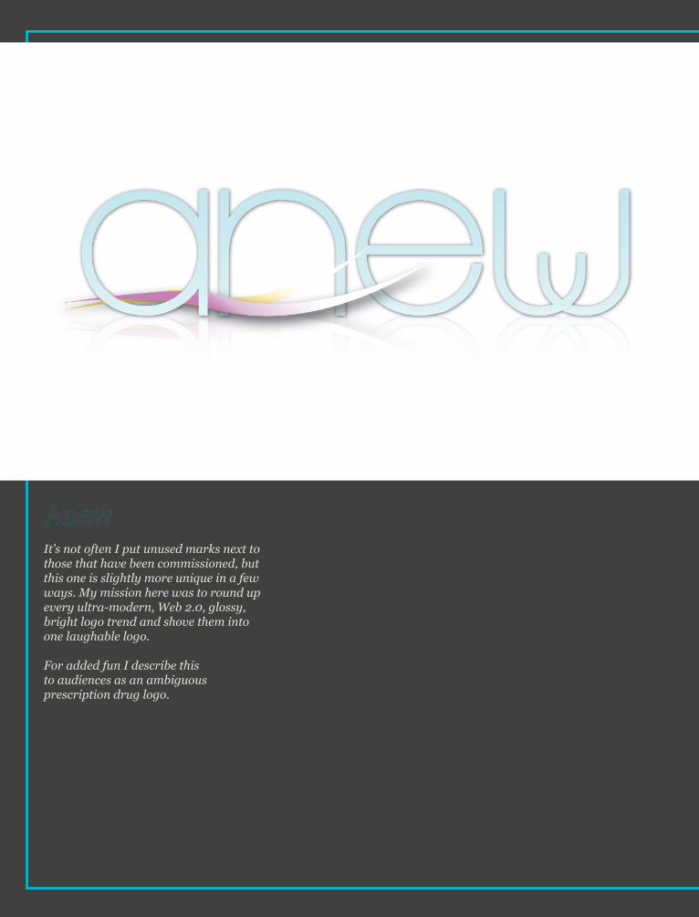
It’s not often I put unused marks next to those that have been commissioned, but this one is slightly more unique in a few ways. My mission here was to round up every ultra-modern, Web 2.0, glossy, bright logo trend and shove them into one laughable logo.
For added fun I describe this to audiences as an ambiguous prescription drug logo.

Not long after a close friend of mine set up shop in California and started
his apparel company I got call to help him sort through logos that had been
designed for him. Out of respect for other artist’s work all I’ll say is this was
a complete redesign from the ground up.
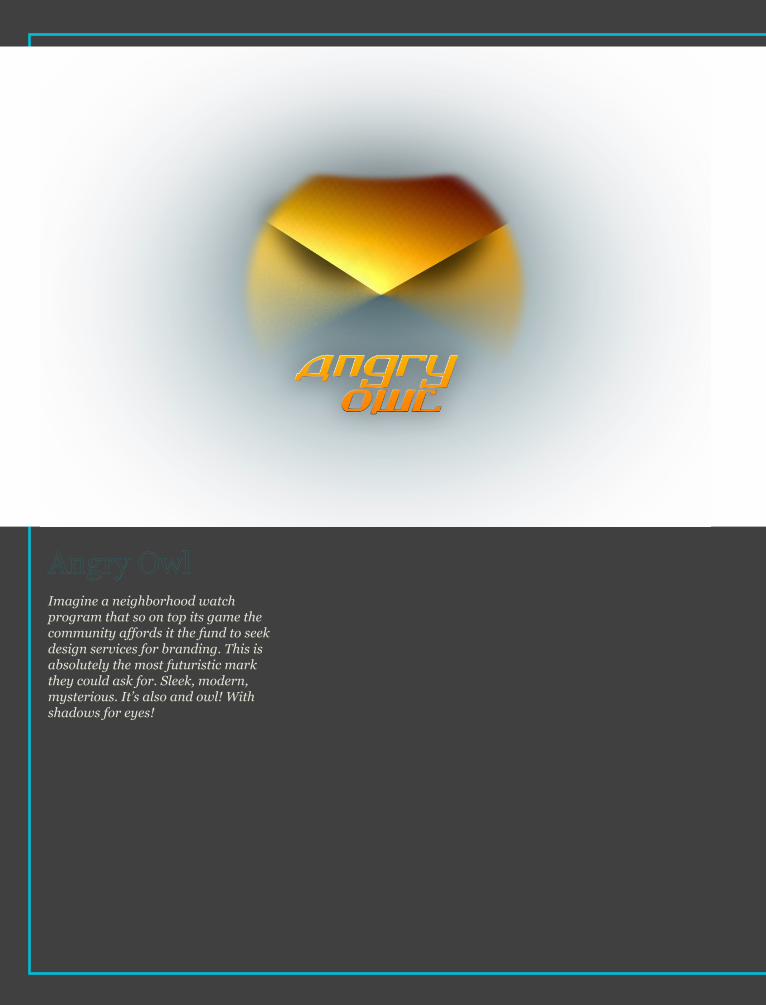
Imagine a neighborhood watch program that so on top its game the community affords it the fund to seek design services for branding. This is absolutely the most futuristic mark they could ask for. Sleek, modern, mysterious. It’s also and owl! With shadows for eyes!
GoingGreenLV.com
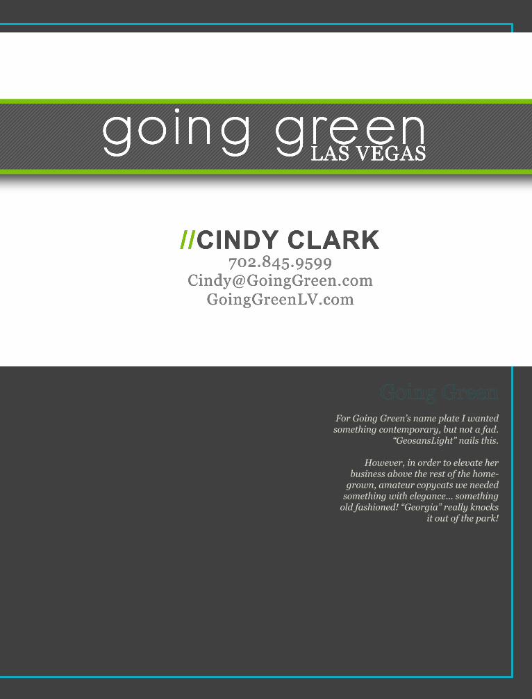
//CINDY CLARK
going greenLAS VEGAS
For Going Green’s name plate I wanted something contemporary, but not a fad.
“GeosansLight” nails this.
However, in order to elevate her business above the rest of the home-
grown, amateur copycats we needed something with elegance... something
old fashioned! “Georgia” really knocks it out of the park!
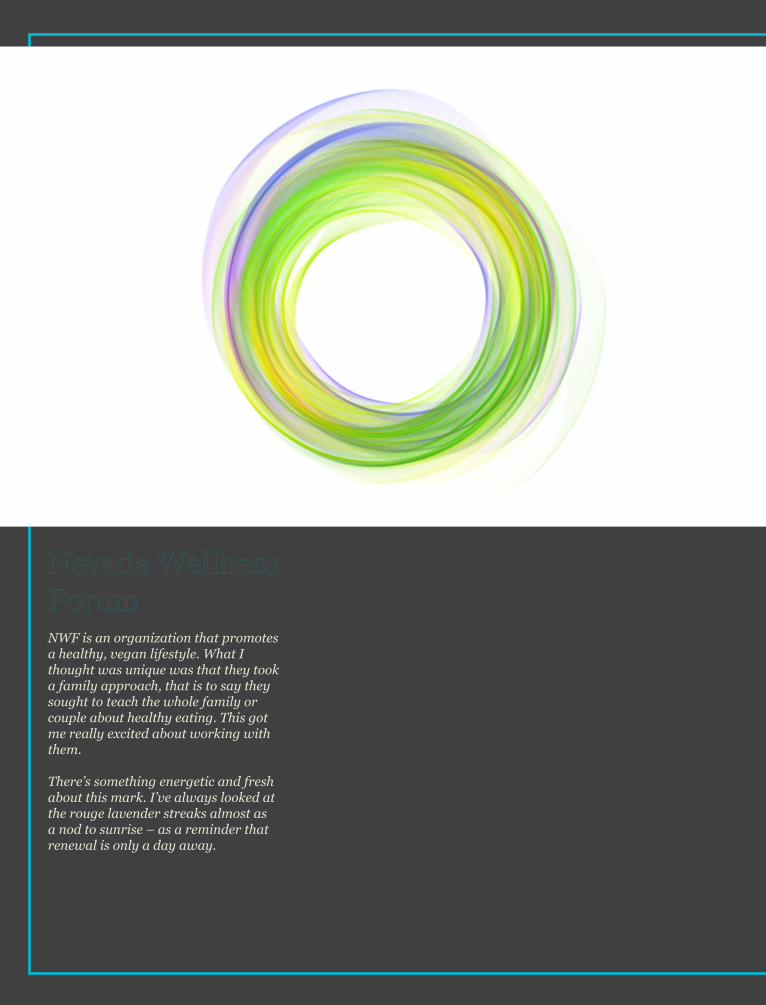
NWF is an organization that promotes a healthy, vegan lifestyle. What I thought was unique was that they took a family approach, that is to say they sought to teach the whole family or couple about healthy eating. This got me really excited about working with them.
There’s something energetic and fresh about this mark. I’ve always looked at the rouge lavender streaks almost as a nod to sunrise – as a reminder that renewal is only a day away.
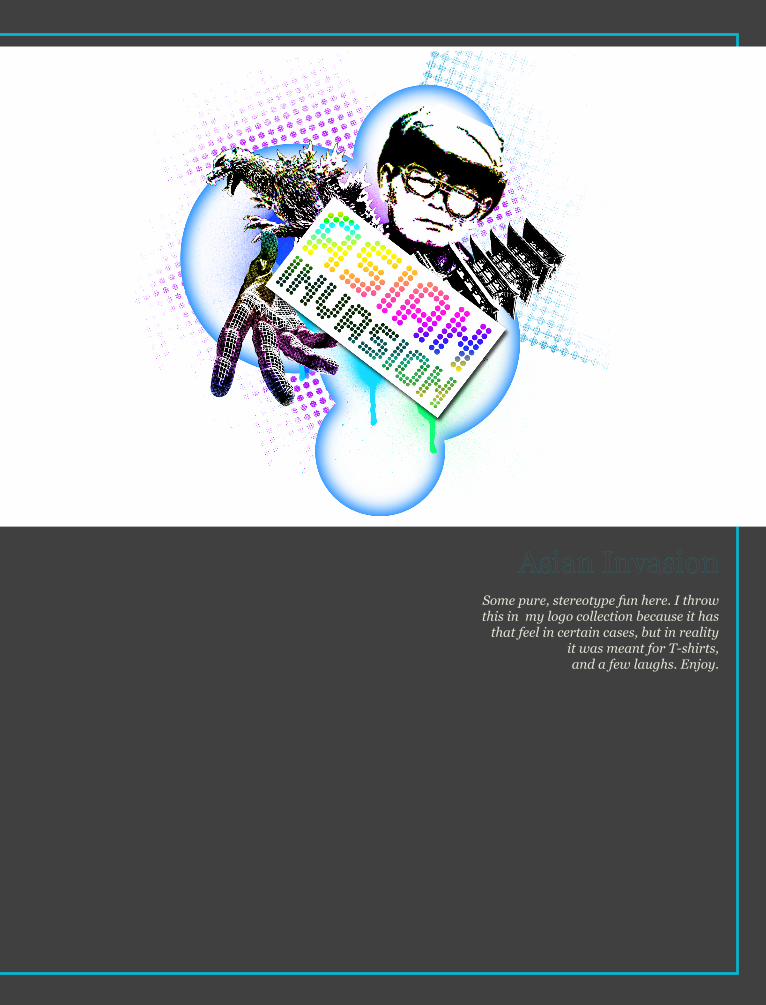
Some pure, stereotype fun here. I throw this in my logo collection because it has
that feel in certain cases, but in reality it was meant for T-shirts, and a few laughs. Enjoy.
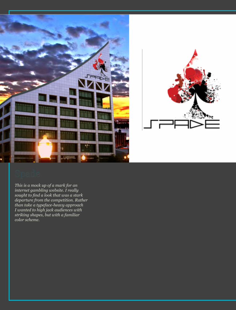
This is a mock up of a mark for an internet gambling website. I really sought to find a look that was a stark departure from the competition. Rather than take a typeface-heavy approach I wanted to high jack audiences with striking shapes, but with a familiar color scheme.

Part of a design class competition, this mark went head to head with close to
twenty others.
I remember specifically getting quite frustrated with every sketch I was
doing because the typefaces always looked half-assed – like I threw it on
at the last second. So I reversed my process and started with developing
a typeface and making that the centerpiece

Here’s a classic challenge. The client wanted something modern, future-safe, and sleek, but also historic and comforting
To achieve this I sought a shape that instilled stability, something ancient, but not out of date. The particular hue of blue used, too, helps achieve an optimistic, and reliable tone.
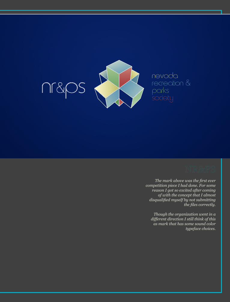
The mark above was the first ever competition piece I had done. For some
reason I got so excited after coming of with the concept that I almost
disqualified myself by not submitting the files correctly.
Though the organization went in a different direction I still think of this
as mark that has some sound color typeface choices.

Having a little bit of fun here. There’s no Swiss Leaf Co. out there, I just really feel in love with this color scheme and needed a vehicle to get it out of my system into some type of branding.
Often times, after several months of work, I’ll start to feel as if I’m neglecting a certain color or color pairing. If I’ve got the time I like to practice working with those specific colors that are lacking in my work. Swiss Leaf Co. is and example of just that.
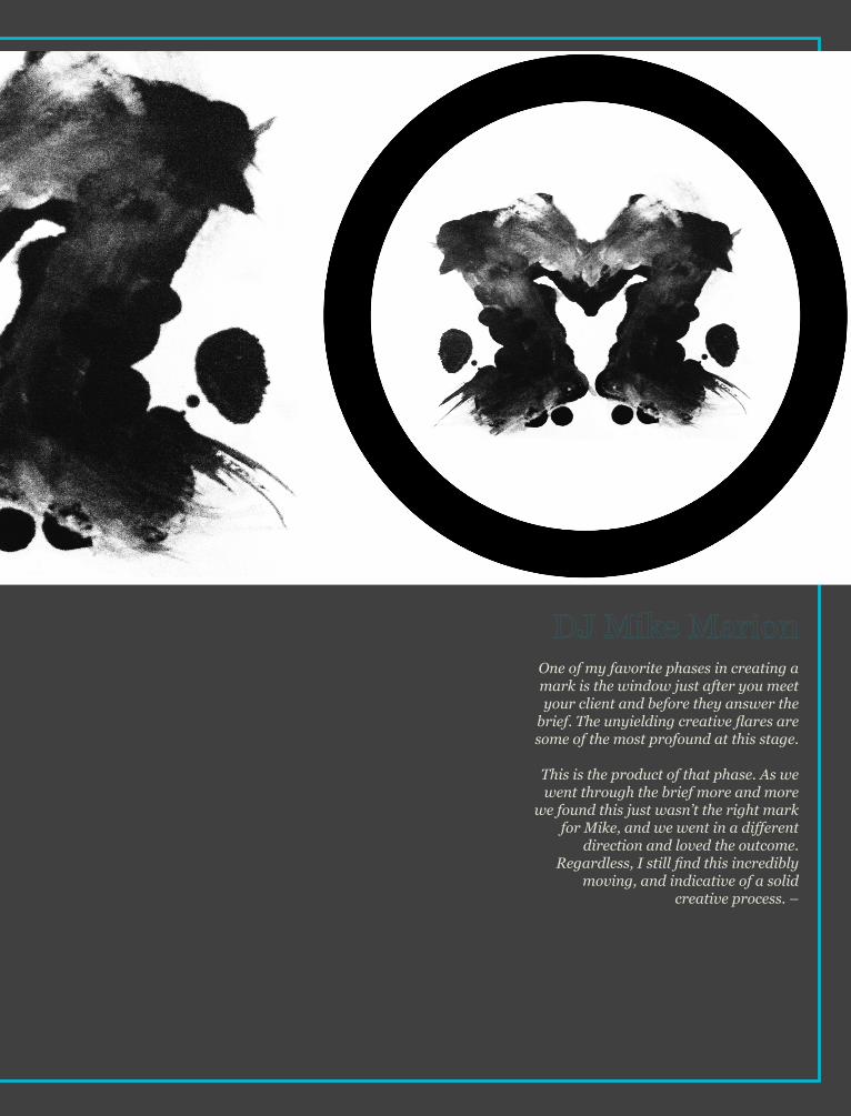
One of my favorite phases in creating a mark is the window just after you meet your client and before they answer the
brief. The unyielding creative flares are some of the most profound at this stage.
This is the product of that phase. As we went through the brief more and more
we found this just wasn’t the right mark for Mike, and we went in a different
direction and loved the outcome. Regardless, I still find this incredibly
moving, and indicative of a solid creative process. –

Ever wonder how those recycling bins and LED lights show up at your favorite events? It’s organizations like GSP that go around the community and do the heavy “green” lifting.
I really got hooked on the idea of incorporating a crest or a shield just to add the feeling of being “official”. However, more often than not those kinds of imagery remind us of the existing establishment. I think what works so well with this piece is you get the feeling of officially, but also of something fresh, new, and forward looking.
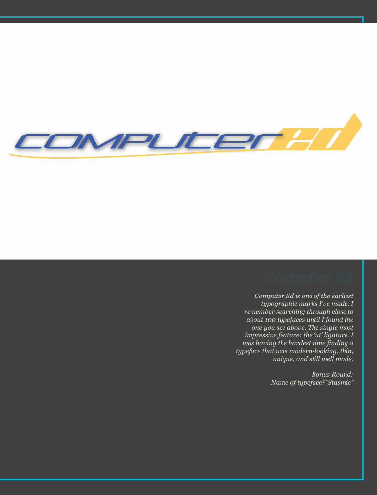
Computer Ed is one of the earliest typographic marks I’ve made. I
remember searching through close to about 100 typefaces until I found the
one you see above. The single most impressive feature: the ‘ut’ ligature. I
was having the hardest time finding a typeface that was modern-looking, thin,
unique, and still well made.
Bonus Round: Name of typeface?”Stasmic”
Logos and Commentary[Goodnight]