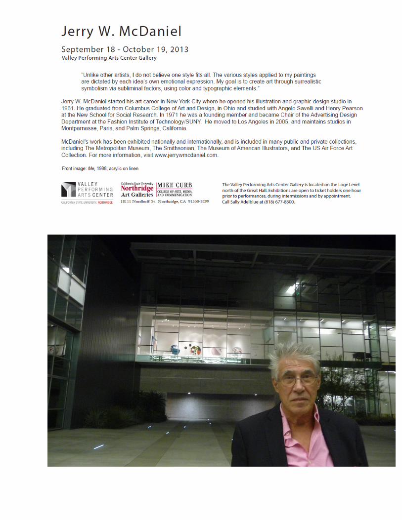
look at me” - jerry mcdaniel · look at me new york artist jerry w. mcdaniel curators ileana...
TRANSCRIPT
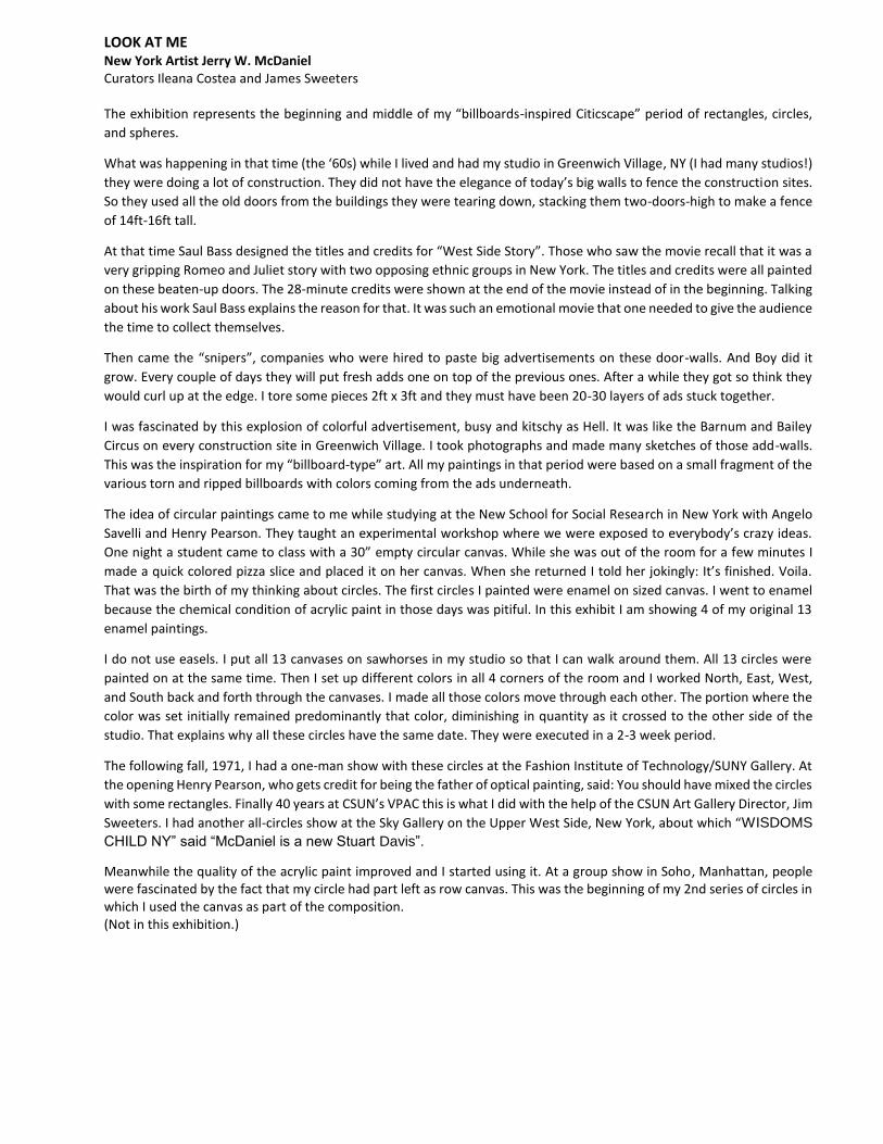
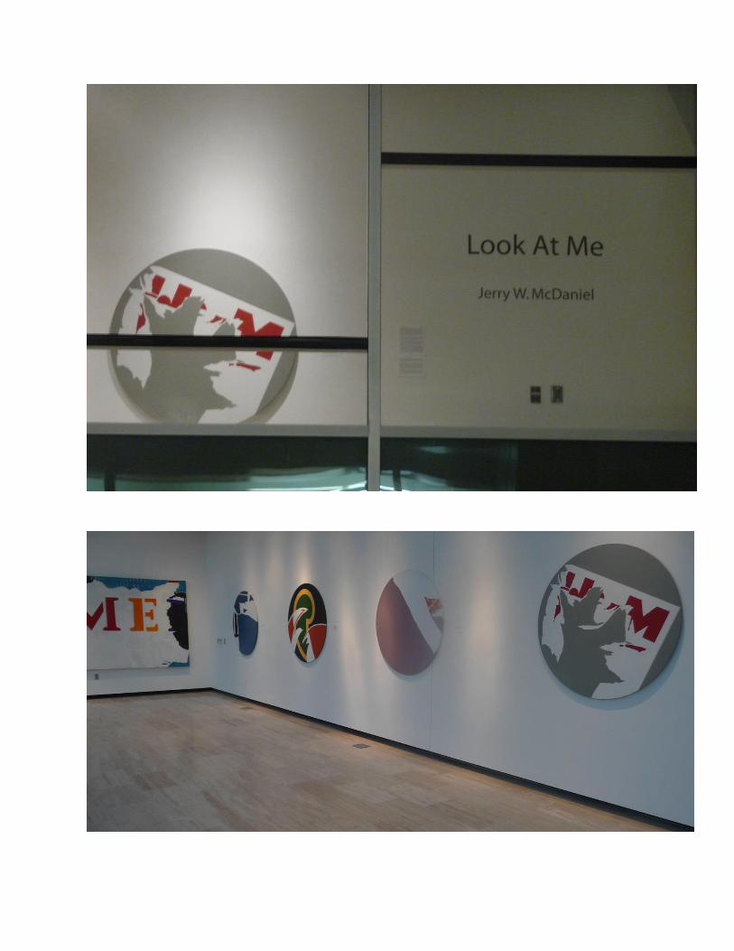
“LOOK AT ME” New York artist Jerry W. McDaniel www.jerrywmcdanielstudios.com
September 18 – October 22, 2013
Curators James Sweeters and Ileana Costea
©JWMcDaniel Studios, All rights reserved.
LOOK AT ME New York Artist Jerry W. McDaniel Curators Ileana Costea and James Sweeters The exhibition represents the beginning and middle of my “billboards-inspired Citicscape” period of rectangles, circles,
and spheres.
What was happening in that time (the ‘60s) while I lived and had my studio in Greenwich Village, NY (I had many studios!)
they were doing a lot of construction. They did not have the elegance of today’s big walls to fence the construction sites.
So they used all the old doors from the buildings they were tearing down, stacking them two-doors-high to make a fence
of 14ft-16ft tall.
At that time Saul Bass designed the titles and credits for “West Side Story”. Those who saw the movie recall that it was a
very gripping Romeo and Juliet story with two opposing ethnic groups in New York. The titles and credits were all painted
on these beaten-up doors. The 28-minute credits were shown at the end of the movie instead of in the beginning. Talking
about his work Saul Bass explains the reason for that. It was such an emotional movie that one needed to give the audience
the time to collect themselves.
Then came the “snipers”, companies who were hired to paste big advertisements on these door-walls. And Boy did it
grow. Every couple of days they will put fresh adds one on top of the previous ones. After a while they got so think they
would curl up at the edge. I tore some pieces 2ft x 3ft and they must have been 20-30 layers of ads stuck together.
I was fascinated by this explosion of colorful advertisement, busy and kitschy as Hell. It was like the Barnum and Bailey
Circus on every construction site in Greenwich Village. I took photographs and made many sketches of those add-walls.
This was the inspiration for my “billboard-type” art. All my paintings in that period were based on a small fragment of the
various torn and ripped billboards with colors coming from the ads underneath.
The idea of circular paintings came to me while studying at the New School for Social Research in New York with Angelo
Savelli and Henry Pearson. They taught an experimental workshop where we were exposed to everybody’s crazy ideas.
One night a student came to class with a 30” empty circular canvas. While she was out of the room for a few minutes I
made a quick colored pizza slice and placed it on her canvas. When she returned I told her jokingly: It’s finished. Voila.
That was the birth of my thinking about circles. The first circles I painted were enamel on sized canvas. I went to enamel
because the chemical condition of acrylic paint in those days was pitiful. In this exhibit I am showing 4 of my original 13
enamel paintings.
I do not use easels. I put all 13 canvases on sawhorses in my studio so that I can walk around them. All 13 circles were
painted on at the same time. Then I set up different colors in all 4 corners of the room and I worked North, East, West,
and South back and forth through the canvases. I made all those colors move through each other. The portion where the
color was set initially remained predominantly that color, diminishing in quantity as it crossed to the other side of the
studio. That explains why all these circles have the same date. They were executed in a 2-3 week period.
The following fall, 1971, I had a one-man show with these circles at the Fashion Institute of Technology/SUNY Gallery. At
the opening Henry Pearson, who gets credit for being the father of optical painting, said: You should have mixed the circles
with some rectangles. Finally 40 years at CSUN’s VPAC this is what I did with the help of the CSUN Art Gallery Director, Jim
Sweeters. I had another all-circles show at the Sky Gallery on the Upper West Side, New York, about which “WISDOMS
CHILD NY” said “McDaniel is a new Stuart Davis”.
Meanwhile the quality of the acrylic paint improved and I started using it. At a group show in Soho, Manhattan, people were fascinated by the fact that my circle had part left as row canvas. This was the beginning of my 2nd series of circles in which I used the canvas as part of the composition. (Not in this exhibition.)
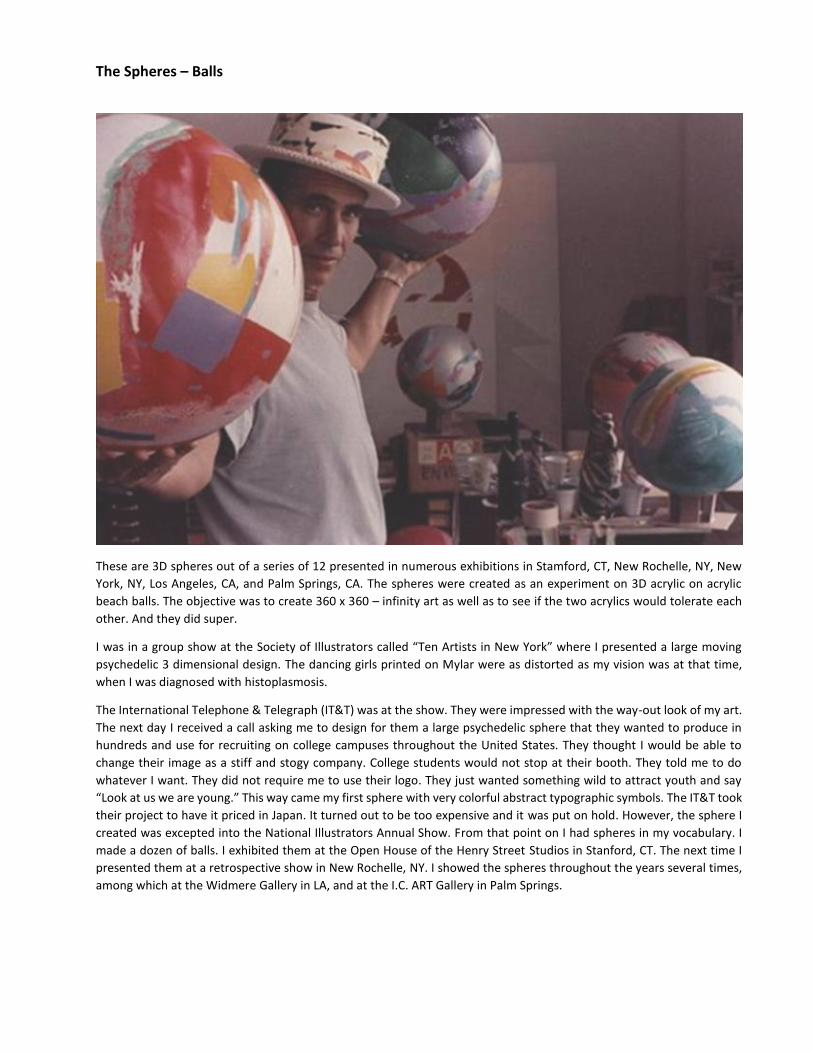
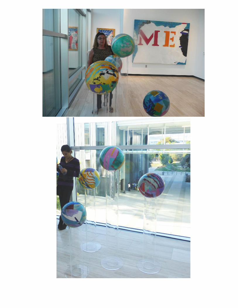
The Spheres – Balls
These are 3D spheres out of a series of 12 presented in numerous exhibitions in Stamford, CT, New Rochelle, NY, New
York, NY, Los Angeles, CA, and Palm Springs, CA. The spheres were created as an experiment on 3D acrylic on acrylic
beach balls. The objective was to create 360 x 360 – infinity art as well as to see if the two acrylics would tolerate each
other. And they did super.
I was in a group show at the Society of Illustrators called “Ten Artists in New York” where I presented a large moving
psychedelic 3 dimensional design. The dancing girls printed on Mylar were as distorted as my vision was at that time,
when I was diagnosed with histoplasmosis.
The International Telephone & Telegraph (IT&T) was at the show. They were impressed with the way-out look of my art.
The next day I received a call asking me to design for them a large psychedelic sphere that they wanted to produce in
hundreds and use for recruiting on college campuses throughout the United States. They thought I would be able to
change their image as a stiff and stogy company. College students would not stop at their booth. They told me to do
whatever I want. They did not require me to use their logo. They just wanted something wild to attract youth and say
“Look at us we are young.” This way came my first sphere with very colorful abstract typographic symbols. The IT&T took
their project to have it priced in Japan. It turned out to be too expensive and it was put on hold. However, the sphere I
created was excepted into the National Illustrators Annual Show. From that point on I had spheres in my vocabulary. I
made a dozen of balls. I exhibited them at the Open House of the Henry Street Studios in Stanford, CT. The next time I
presented them at a retrospective show in New Rochelle, NY. I showed the spheres throughout the years several times,
among which at the Widmere Gallery in LA, and at the I.C. ART Gallery in Palm Springs.
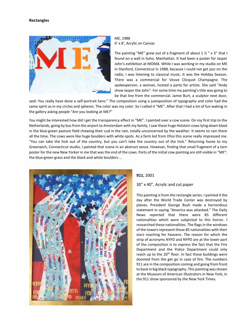
Rectangles
ME, 1988 6’ x 8’, Acrylic on Canvas The painting “ME” grew out of a fragment of about 1 ½ “ x 3” that I
found on a wall in Soho, Manhattan. It had been a poster for Jasper
John’s exhibition at MOMA. While I was working in my studio on ME
in Stanford, Connecticut in 1988, because I could not get jazz on the
radio, I was listening to classical music. It was the Holiday Season.
There was a commercial for Veuve Clicquot Champagne. The
spokesperson, a woman, hosted a party for artists. She said “Andy
show Jasper the John”. For some time my painting’s title was going to
be that line from the commercial. Jamie Burt, a sculptor next door,
said: You really have done a self-portrait here.” The composition using a juxtaposition of typography and color had the
same spirit as in my circles and spheres. The color was my color. So I called it “ME”. After that I had a lot of fun waking in
the gallery asking people “Are you looking at ME?”
You might be interested how did I get the transparency effect in “ME”. I painted over a cow scene. On my first trip to the
Netherlands, going by bus from the airport to Amsterdam with my family, I saw these huge Holstein cows lying down blasé
in the blue-green pasture field chewing their cud in the rain, totally unconcerned by the weather. It seems to rain there
all the time. The cows were like huge boulders with white spots. As a farm kid from Ohio this scene really impressed me.
“You can take the hick out of the country, but you can’t take the country out of the hick.” Returning home to my
Greenwich, Connecticut studio, I painted that scene in an abstract sense. However, finding that small fragment of a torn
poster for the new New Yorker in me that was the end of the cows. Parts of the initial cow painting are still visible in “ME”:
the blue-green grass and the black and white boulders …
911, 2001
30” x 40”, Acrylic and cut paper This painting is from the rectangle series. I painted it the day after the World Trade Center was destroyed by planes. President George Bush made a horrendous statement in saying “America was attacked.” The Daily News reported that there were 85 different nationalities which were subjected to this horror. I researched these nationalities. The flags in the windows of the towers represent those 85 nationalities with their stars reaching for heavens. The reason for which the strip of acronyms NYFD and NYPD are at the lower part of the composition is to express the fact that the Fire Department and the Police Department could only reach up to the 20th floor. In fact these buildings were doomed from the get go in case of fire. The numbers 911 are in the composition coming and going from front to back in big black typography. This painting was shown at the Museum of American Illustrators in New York, in the 911 show sponsored by the New York Times.
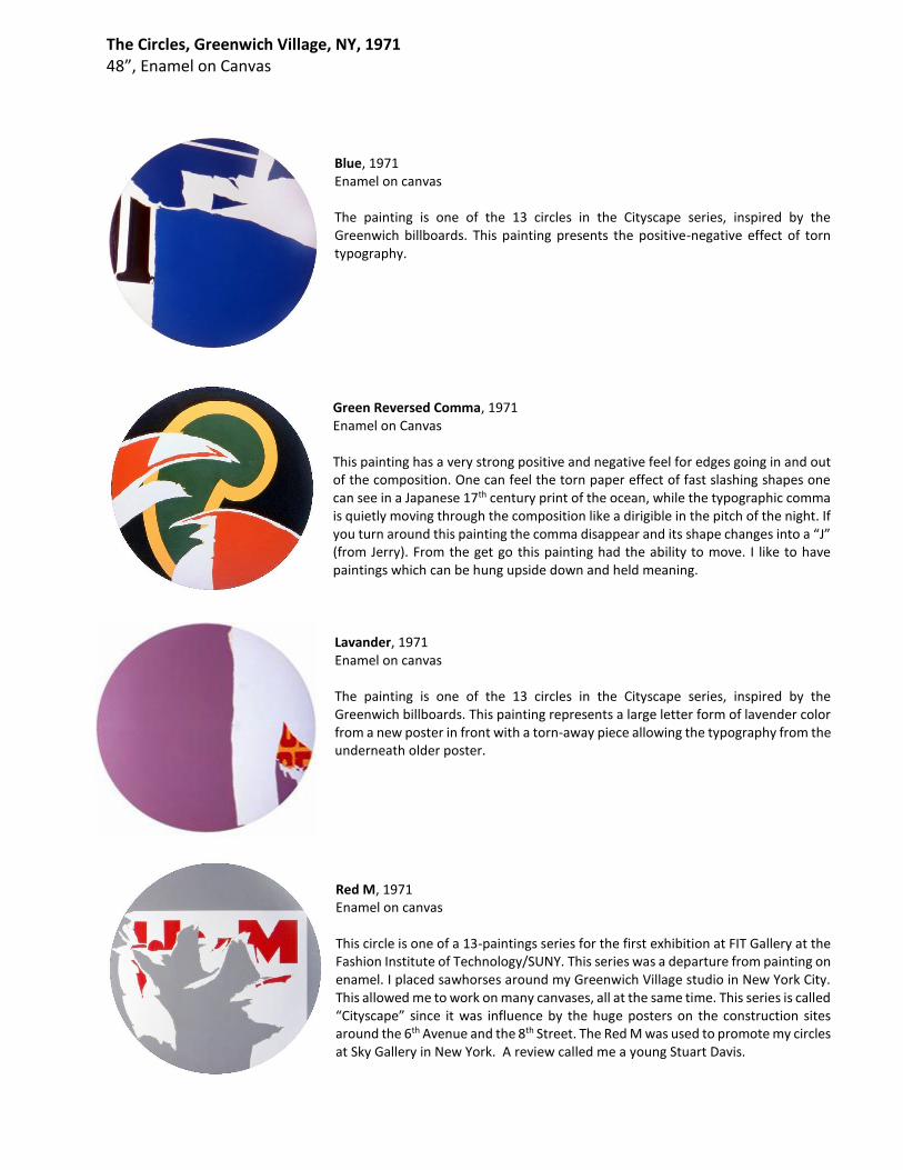
The Circles, Greenwich Village, NY, 1971 48”, Enamel on Canvas
Blue, 1971 Enamel on canvas The painting is one of the 13 circles in the Cityscape series, inspired by the Greenwich billboards. This painting presents the positive-negative effect of torn typography.
Green Reversed Comma, 1971 Enamel on Canvas This painting has a very strong positive and negative feel for edges going in and out of the composition. One can feel the torn paper effect of fast slashing shapes one can see in a Japanese 17th century print of the ocean, while the typographic comma is quietly moving through the composition like a dirigible in the pitch of the night. If you turn around this painting the comma disappear and its shape changes into a “J” (from Jerry). From the get go this painting had the ability to move. I like to have paintings which can be hung upside down and held meaning.
Lavander, 1971 Enamel on canvas The painting is one of the 13 circles in the Cityscape series, inspired by the Greenwich billboards. This painting represents a large letter form of lavender color from a new poster in front with a torn-away piece allowing the typography from the underneath older poster.
Red M, 1971 Enamel on canvas This circle is one of a 13-paintings series for the first exhibition at FIT Gallery at the Fashion Institute of Technology/SUNY. This series was a departure from painting on enamel. I placed sawhorses around my Greenwich Village studio in New York City. This allowed me to work on many canvases, all at the same time. This series is called “Cityscape” since it was influence by the huge posters on the construction sites around the 6th Avenue and the 8th Street. The Red M was used to promote my circles at Sky Gallery in New York. A review called me a young Stuart Davis.
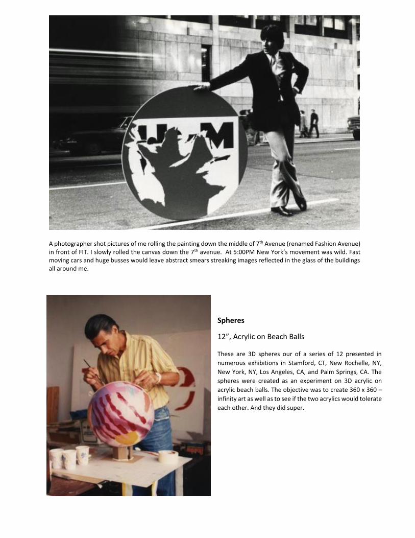
A photographer shot pictures of me rolling the painting down the middle of 7th Avenue (renamed Fashion Avenue) in front of FIT. I slowly rolled the canvas down the 7th avenue. At 5:00PM New York’s movement was wild. Fast moving cars and huge busses would leave abstract smears streaking images reflected in the glass of the buildings all around me.
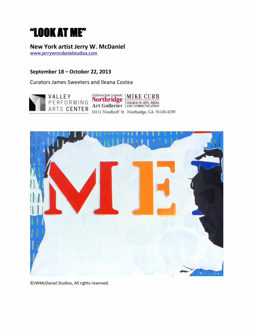
Spheres
12”, Acrylic on Beach Balls These are 3D spheres our of a series of 12 presented in
numerous exhibitions in Stamford, CT, New Rochelle, NY,
New York, NY, Los Angeles, CA, and Palm Springs, CA. The
spheres were created as an experiment on 3D acrylic on
acrylic beach balls. The objective was to create 360 x 360 –
infinity art as well as to see if the two acrylics would tolerate
each other. And they did super.