lost in colors - svea contract furniture abstatic.sveacontract.se/fil/adrenalina_lostincolors_s...la...
TRANSCRIPT

LOST IN COLORS
3
“Non progettiamo oggetti con mero valore estetico e funzionale, ma l’atto che si svolge
intorno a questi oggetti”“We don’t design objects with mere functional
and aesthetic value, but the actions that take place around these objects“
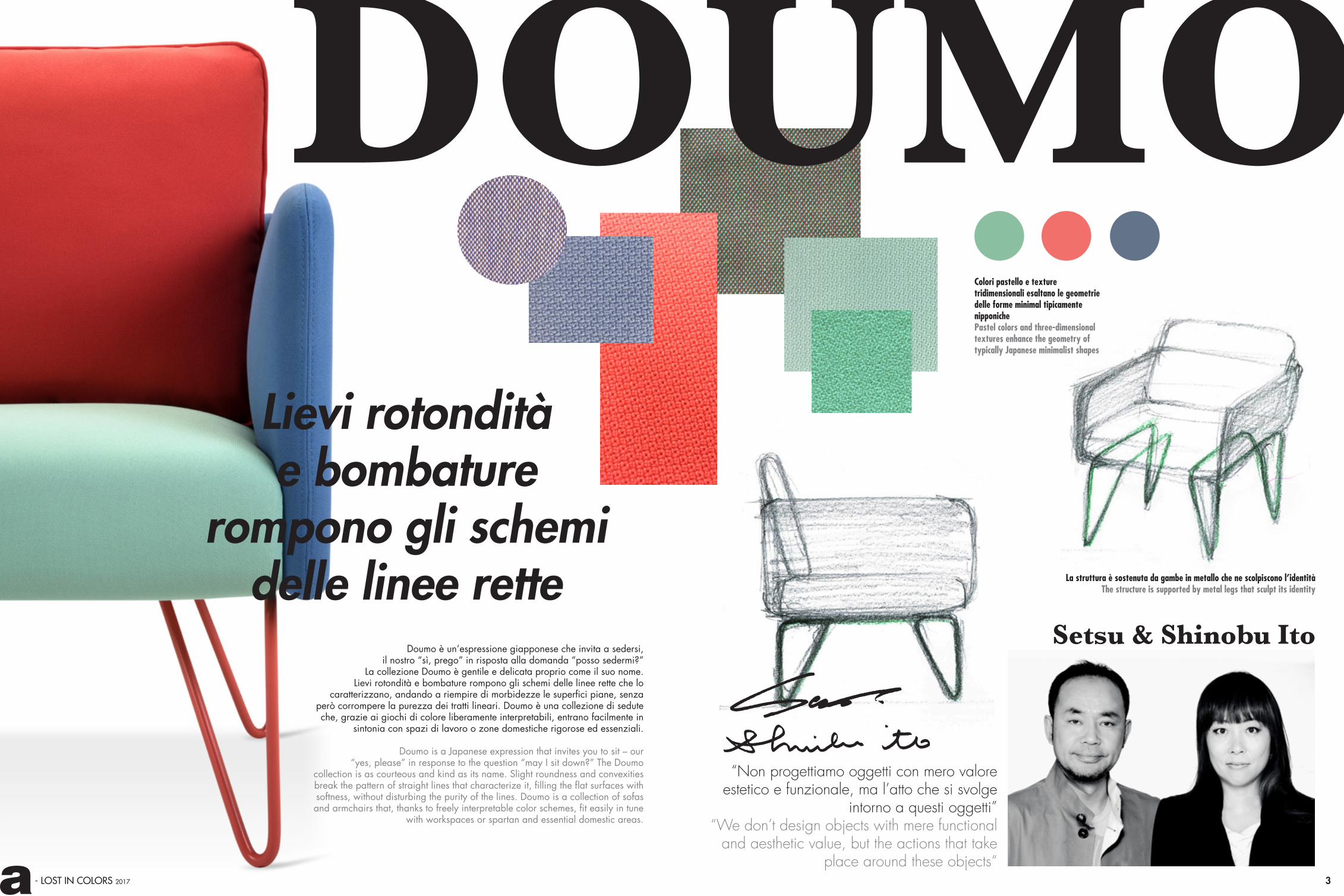
La struttura è sostenuta da gambe in metallo che ne scolpiscono l’identità The structure is supported by metal legs that sculpt its identity
Colori pastello e texture tridimensionali esaltano le geometrie delle forme minimal tipicamente nipponiche Pastel colors and three-dimensional textures enhance the geometry of typically Japanese minimalist shapes
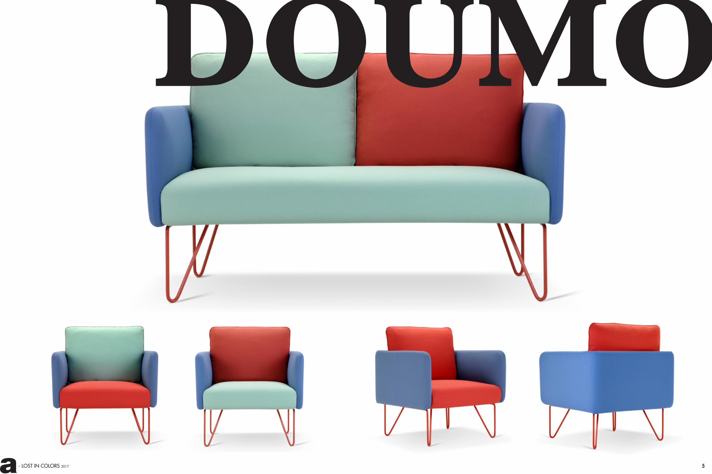
Setsu & Shinobu ItoDoumo è un’espressione giapponese che invita a sedersi,
il nostro “sì, prego” in risposta alla domanda “posso sedermi?”La collezione Doumo è gentile e delicata proprio come il suo nome.
Lievi rotondità e bombature rompono gli schemi delle linee rette che lo caratterizzano, andando a riempire di morbidezze le superfici piane, senza
però corrompere la purezza dei tratti lineari. Doumo è una collezione di sedute che, grazie ai giochi di colore liberamente interpretabili, entrano facilmente in
sintonia con spazi di lavoro o zone domestiche rigorose ed essenziali.
Doumo is a Japanese expression that invites you to sit – our “yes, please” in response to the question “may I sit down?” The Doumo
collection is as courteous and kind as its name. Slight roundness and convexities break the pattern of straight lines that characterize it, filling the flat surfaces with softness, without disturbing the purity of the lines. Doumo is a collection of sofas and armchairs that, thanks to freely interpretable color schemes, fit easily in tune
with workspaces or spartan and essential domestic areas.
DOUMOLievi rotondità e bombature
rompono gli schemi delle linee rette
- LOST IN COLORS 2017
DOUMO
5- LOST IN COLORS 2017

7- LOST IN COLORS 2017
Italo Pertichini
Curve piene e forma avvolgente sono i tratti principali delle sedute Sly. Due le versioni disponibili: con schienale basso o schienale alto, come un guscio che si schiude ad accogliere chi cerca un angolo raccolto o un’oasi di privacy. Entrambe sono caratterizzate da due piccole “finestre magiche” chiuse con corde colorate intrecciate, fessure che si aprono sul mondo esterno, ma che conservano discrezione e riservatezza spezzando con la loro suonisità il rigore degli schienali.
The full curves and wraparound form define the design of the Sly. Sly is available in two versions: with low back or high back, opening like a shell to welcome someone seeking a cozy corner or an oasis of privacy. Both versions are characterized by two small, “magical windows” – cracks that open to the outside world, but that retain discretion and privacy, closed with colored strings that break the severity of the lines with their lacing.
Sapore prettamente nordico nei colori saturi ed intrecci multicromatici, lane e tessuti tecnici che alternano touch soffici a superfici in rilievoPurely Nordic mood in saturated colors and multi coloured braids,wool and technical fabrics combining soft touch and raised surfaces
SLY“Ciò che è bello non sempre funziona e ciò che funziona
solitamente è bello”“What is beautiful does not
always work and what usually works is beautiful”
Possibili sistemi di chiusuradelle fenditure con rete elasticaPossible systems of closure for the magical windows, with elastic webbing
Corde colorate, intrecci e fantasiaColored cords, braids and fantasy
piccole finestre magiche che si aprono sul mondo esterno
9- LOST IN COLORS 2017
SLY

- LOST IN COLORS 2017
Partendo dal Greenery puro, i toni del verde evolvono in nuance contanimate di turchese, esprimono la loro pienezza in tinte unite in filati di mohair, per poi fondersi in mix cromatici cangianti. Il giallo ed il grigio entrano in gioco come elementi di contrasto, di gradevole disturbo Starting from pure Greenery, shades of green evolve in nuances touched with turquoise, expressing their richness in the solid colors of mohair yarn, and then merge into iridescent mixes of color. Yellow and gray come into play as elements of contrast, of satisfying disorder.
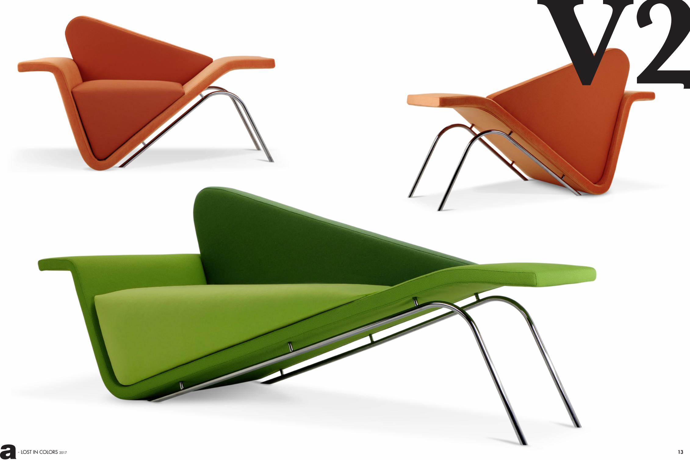
V2 è asimmetrico e s-proporzionato, trova nel dinamismo il suo equilibrio. Una scomposizione geometrica che fa perno su un angolo decentrato. V2 è velocità, energia, movimento, armonia inedita, solo apparentemente disarmonica. Il progetto è ispirato al design lineare e rigoroso del Modernismo “Mid Century Modern”, movimento di architettura e design che caratterizza gli anni ‘50 e ‘60.
V2 is antisymmetric and disproportional. In imbalance it finds its equilibrium, which fits into an angle off the centre.V2 exude speed, energy and movement, innovative harmony, thanks to their asymmetrical design that makes them only superficially discordant. The project is inspired by the linear minimalism of the “Mid-century Modern” architecture and design movement that characterized the ‘50s and ‘60s and, at the same time.
Giovanni Tommaso Garattoni
disarmonico, s-proporzionato, nel dinamismo trova un nuovo equilibrio
Come natura vuole, ai verdi e turchesi si contrappongono le tonalità calde tipiche dei bouquet fioriti,spazio alla gamma dei rossi, che riscalda e rassicuraAs nature intended, green and turquoise contrast with the typical colors of a floral bouquet, opening up to a range of reds that warms and reassures
“Gli oggetti esistono ancora prima di essere disegnati.
Vivono nel limbo delle idee ed attendono solo il momento
della realizzazione”“The objects already exist
before being designed. They live in the limbo of ideas and await only their moment
of realization”
Scocca stampata in vetroresina supportata da gambe in acciaio cromato
Molded fiberglass body supported by chromed steel legs
Strutture asimmetriche, che sfidano le leggi della fisicaAsymmetric structures that defy the laws of physics
11
V2
13- LOST IN COLORS 2017
V2
15- LOST IN COLORS 2017
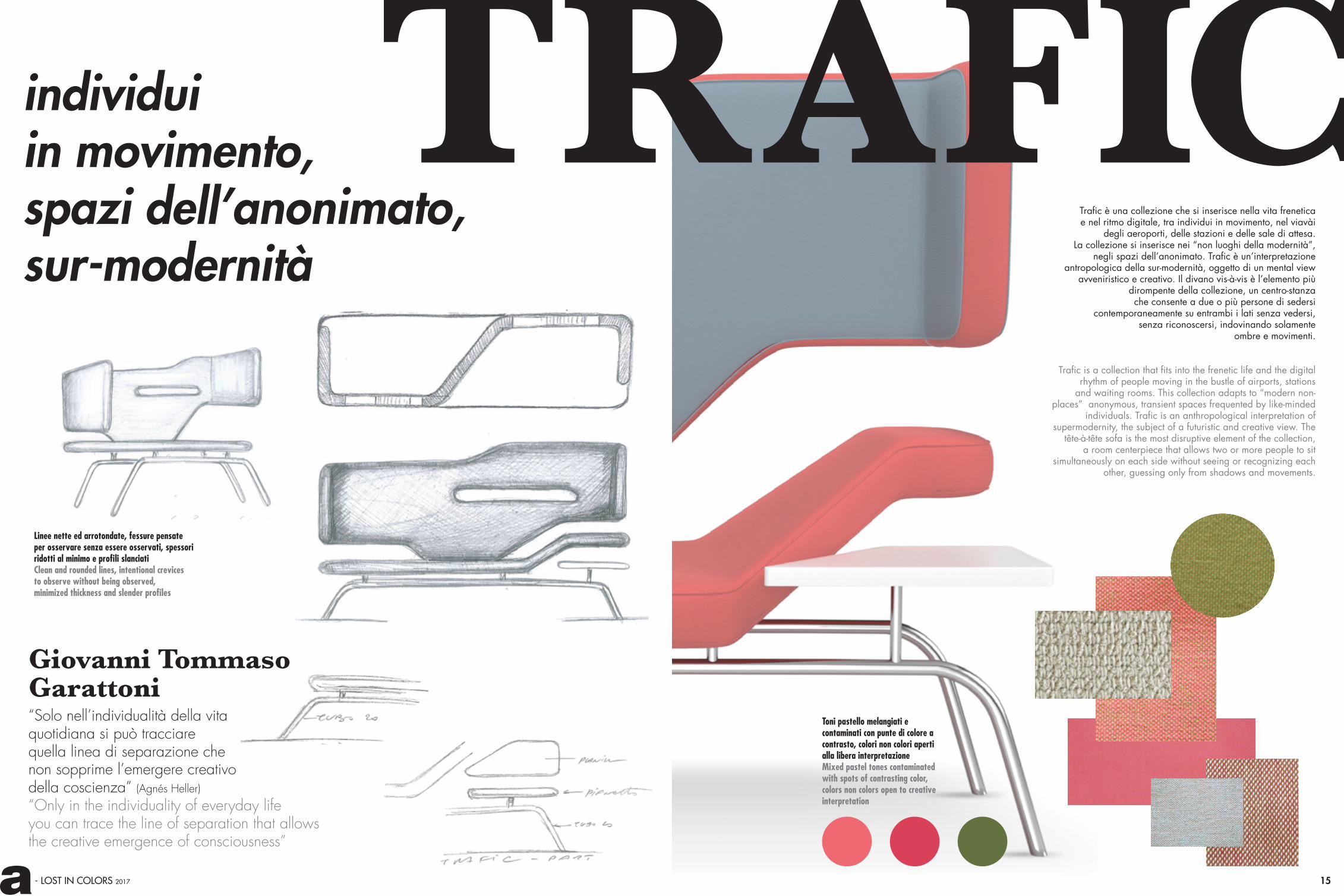
“Solo nell’individualità della vita quotidiana si può tracciare quella linea di separazione che
Linee nette ed arrotondate, fessure pensateper osservare senza essere osservati, spessoriridotti al minimo e profili slanciatiClean and rounded lines, intentional crevices to observe without being observed,minimized thickness and slender profiles
Trafic è una collezione che si inserisce nella vita frenetica e nel ritmo digitale, tra individui in movimento, nel viavài
degli aeroporti, delle stazioni e delle sale di attesa. La collezione si inserisce nei “non luoghi della modernità”,
negli spazi dell’anonimato. Trafic è un’interpretazione antropologica della sur-modernità, oggetto di un mental view
avveniristico e creativo. Il divano vis-à-vis è l’elemento più dirompente della collezione, un centro-stanza che consente a due o più persone di sedersi
contemporaneamente su entrambi i lati senza vedersi, senza riconoscersi, indovinando solamente
ombre e movimenti.
Trafic is a collection that fits into the frenetic life and the digital rhythm of people moving in the bustle of airports, stations
and waiting rooms. This collection adapts to “modern non-places” anonymous, transient spaces frequented by like-minded
individuals. Trafic is an anthropological interpretation of supermodernity, the subject of a futuristic and creative view. The
tête-à-tête sofa is the most disruptive element of the collection, a room centerpiece that allows two or more people to sit
simultaneously on each side without seeing or recognizing each other, guessing only from shadows and movements.
Toni pastello melangiati e contaminati con punte di colore a contrasto, colori non colori aperti alla libera interpretazioneMixed pastel tones contaminated with spots of contrasting color,colors non colors open to creative interpretation
individui in movimento, spazi dell’anonimato,sur-modernità
Giovanni Tommaso Garattoni
non sopprime l’emergere creativo della coscienza” (Agnés Heller) “Only in the individuality of everyday life you can trace the line of separation that allows the creative emergence of consciousness”
TRAFIC

17- LOST IN COLORS 2017
TRAFIC

- LOST IN COLORS 2017
“Il girovagare tra una gamma cromatica e l’altra e l’amore folle per il colore esplodono in un mix pirotecnico di sfumature e texture che raccordano
colori persi e ritrovati”
MACHINE
Giovanni Tommaso Garattoni
Colori caldi e freddi si separano per poi ritrovarsi e fondersi in un mix di sensazioni ed emozioni Warm and cool colors separate and then return together, merging into a mix of feelings and emotions
SOFTTrae il nome dal romanzo dello scrittore americano William Burroughs “The Soft Machine” e dall’omonimo gruppo rock degli anni ‘60, nasce Soft Machine “una morbida macchina dell’abitare che riflette l’amore, tutto italiano, per la velocità. Una cultura delle forme che parte dall’estetica futuristadi Balla e Boccioni per arrivare fino al Bolidismo,ultima avanguardia del Novecento”.
After the novel by the American writer William Burroughs, “The Soft Machine”, and the eponymous rock band of the ‘60s. It is “a soft dwelling machine, born of the Italian lovefor speed. A culture of form that moves through the Futuristic aesthetics of Balla and Boccioni and evolves into Bolidismo, the last vanguard of the twentieth century”. una morbida macchina
dell’abitare che riflettel’amore, tutto italiano,
per la velocità
- LOST IN COLORS 2017
Forme scultoree anti-dinamiche, derivate in parte da citazioni
futuriste dal mondo dei fumettiAnti dynamic sculpture forms, derived in part from Futurism
from the world of comics
“The trip between one range of hues and another and the love of color explode into a
rainbow that reconnect all lost and found colors”
19
- LOST IN COLORS 2017 21
SOFT
MACHINE

Diritti riservati. La produzione anche parziale è consentita solo previa autorizzazione scritta di Adrenalina by Domingo Salotti S.r.l.. All rights reserved. No parts of this catalogue may be reproduced without permission in writing from Adrenalina by Domingo Salotti S.r.l..
DOUMOdesign Setsu & Shinobu Ito
L 82 P 80 H 95 Hs 48 L 152 P 80 H 95 Hs 48 L 222 P 80 H 95 Hs 48
art director Valentina Bigiarini
photo Mauro Foli_Cervia
Aprile 2017
graphic design Francesca Grassi
Adrenalina by Domingo Salotti srl
Strada della Romagna, 285 61121 PESARO (ITALY)
T +39 0721 [email protected]
T +39 0721 209714 Export dept. [email protected]
LOST IN COLORS Colori persi e ritrovati
Sin dalle sue origini il colore è stato e resta il leit-motiv del brand,
leit-motiv che si evolve in mille sfumature e si plasma
sulle forme non convenzionali e inaspettate che di anno in anno nascono dal laboratorio creativo di Adrenalina.
La collezione Adrenalina 2017propone strutture apparentemente simmetriche,
ma che in realtà sfidano le leggi della fisica e riconducono a concetti di destrutturazione avanguardistica,
assottigliando gli spessori o esaltando le curve di prodotti molto diversi tra loro, che dialogano tuttavia
in una lingua comune: IL COLORE.Un viaggio tra una gamma cromatica e l’altra,
l’amore folle per il colore che esplode in un arcobaleno che abbraccia tutte le collezioni.
Dalle tinte piene allo sfumato delle texture pixelate, tinte forti che vanno a spegnersi in toni pastello,
i colori si intersecano richiamandosi da un prodotto all’altroe contaminandosi a vicenda, per esplodere
in un mix pirotecnico che ricconnette tutte le tonalità.LOST IN COLORS: colori persi e ritrovati.
From the beginning, color has been and remains the leitmotif of the brand.
It is a theme that evolves into a thousand shades and molds itself around the unconventional and unexpected forms that year after year grow in the Adrenalina creative departement.
The Adrenalina Collection 2017 raises the stakes with some apparently symmetrical structures that,
upon closer inspection, seem to defy the laws of physics. They recall the concepts of avant-garde deconstruction,
reducing the thickness or enhancing the curves of products that are very diverse but which converse in a common language: COLOR.
A journey between one range of hues and another, Adrenalina’s love of color that explodes into a rainbow
that embraces the entire collections. From the rich saturated colors to the gradient tones of the pixelated
textures, colors criss-cross from one piece to another and a end in the explosive mixture which combines and reconnects
every shade LOST IN COLORS: colors lost and found.
SLYdesign Italo Pertichini
L 85 P 70 H 80 Hs 48.5 L 98 P 78 H 125 Hs 48.5 L 146 P 78 H 125 Hs 48.5L 139 P 70 H 80 Hs 48.5
V2design Giovanni Tommaso Garattoni
L 230 P 91 H 98 Hs 48L 150 P 91 H 95 Hs 48
L 310 P 120 H 94 Hs 47
TRAFICdesign Giovanni Tommaso Garattoni
L 98 P 77 H 119 Hs 44 L 184 P 77 H 132 Hs 44 L 220 P 77 H 119 Hs 44
SOFT MACHINEdesign Giovanni Tommaso Garattoni

www.adrenalina.it