magazine cover analysis
TRANSCRIPT

Magazine Cover Analysis

The Masthead is in red and a recognisable font which is san serrif that people already associate with NME magazine. In the splash image the subject is covering up some of the masthead, this shows how important the character on the front could be and how the magazine is so well established they don’t even have to show the whole title for people to know what it is.
The price of the magazine is shows what sort of class this magazine could be aimed at, as you can see it costs £2.40, which is actually quite cheap for a magazine, which shows that it may be aimed at working/middle class people and maybe younger people as they may not be making so much money they can afford it at this cheap price
As you can see from the language used on the front of the magazine where it says “I don’t give a sh*t about the royal wedding” and “Anarchy hits the UK” this is quite rebellious language with context to what it is talking about as it is the royal wedding, this shows that the subject on the splash image could be quite rebellious. Meaning that his target audience might be to, this tends to be people of the age range 15-25.
The colours predominantly used throughout the magazine are red white and black, connotations with the colour red is danger and bad things, whereas there is a direct contrast with the colours white as the colour white has connotations to purity and angelic things. And black may be used just because it is a good contrast with the white background.
The subject in the splash image is Tyler, The Creator. He is the leader of the hip hop collective that is ODD FUTURE, which is slightly odd that they have got him on the front of this magazine as NME is predominantly a rock magazine. They may have done this to attract a wider audience then just rock fans and tried to et some him hop fans too. The have more ties to hip hop on the cover of this magazine, as they have Kanye West’s name at the bottom, showing that this issue of the magazine will be including things from Kanye West too as well as Tyler, The Creator.
The subject in the splash image was shot in a studio which shows that he may be important. The way they have presented him is in a very unhegamonic masculine view, they have him in a dress carrying flowers. This is because it is the Royal wedding special edition. They may also have him dressed like that to fit a certain character that he may be presenting .
The strap along the top in the gold border is reinforcing the anti authority view that the magazine is trying to produce, as it is going against what they thing people will be saying, they thing people will be wanting to enjoy the royal wedding whereas the people at NME want saving from it and then so should their audiance
A plug for a chance to win free festival tickets and to get a free festival guide are to entice readers to get it so they can win what is on offer.

The masthead that just says Q is in the top left of the magazine so even if stacked people will be able to find it as it is such a recognisable font and colour people will know what it is straight away. It is red and white so it stands out and it has associated itself with this colour so people know what magazine it is because they have established these colours with their brand so it is recognisable.
It has an interesting cover story about the interview with the band “Arctic Monkeys” is included on the front to show the audience what they might expect, this could also be used to entice the reader into wanting to read it. Also the words “Arctic Monkeys” are in white, this could have been done to represent the arctic so you can make connections between words and colours. This has also been done for the words “White Lies” it is written in white also to help you make connection.
In the splash image which has the arctic monkeys as the main focus, the man in the middle of them all at the front is giving a direct address to the audience, this shows that the one giving the direct address may be the most important out of the whole band. But they have been in a photo shoot in a studio which shows that they are all important people.
The price of Q magazine is around £3.50 and it comes out monthly, I think this is a very reasonable price. It also shows that it may be aimed at middle/working class people as it does not cost a lot.
I believe that the audience that this target aims for is for people that like rock, but not hard core rock, more calm rock. The reason I think this is because the arctic monkeys music is very mellow and calm. But it also has references to Nirvana and Green Day, this music is a lot harder rock than Arctic monkeys, which shows that there may be aspects of rock for everyone in the magazine to appeal to a wider audience and please more people with the same magazine.
This magazine uses a banner along the top in reference to the “Manic Street Preachers”. It is talking about a 17 page special on them, and it shows the cover of the special in the top right corner, this could be being used to try and get more people to buy the magazine, for instance people who are fans of the Manic Street Preachers.
Colours predominantly used in this magazine are ones that represent the company that is the Q magazine. The colours used are red, white and grey. Red is a colour that could represents love and compassion and the company may be using the colour red to try and show their readers that they love and are compassionate towards them for buying the magazine, red is also quite a nice warm colour so it could be used to entice the reader. White shows purity and trust and good things, the company may have used the colour white to show the reader that they can trust Q to be good quality and have all the good information.
One of the cover line son the side says “On beards, booze & baking cakes for muse”. These are all very masculine things. This shows that the magazine may be mainly aimed at men rather than women. You can also see it mentioning Richard Branson, who is a very successful businessman. This shows that the magazine may not only be a music magazine but be talking about the music business too.
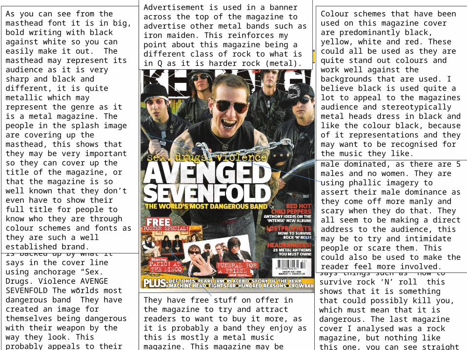
As you can see in the splash image all of the people from the band look like violent people, as they have weapons and are dressed in black, which has connotations to death and just bad things. This point is backed up by what it says in the cover line using anchorage “Sex. Drugs. Violence AVENGE SEVENFOLD The worlds most dangerous band” They have created an image for themselves being dangerous with their weapon by the way they look. This probably appeals to their audience, as they may listen to it because it is rebellious. This says to me that the target audience is probably from ages 15-25 as this can be quite a rebellious stage.
I think that the genre of this this magazine is hard rock. You can see this because it says things such as “how to survive rock ‘N’ roll” this shows that it is something that could possibly kill you, which must mean that it is dangerous. The last magazine cover I analysed was a rock magazine, but nothing like this one, you can see straight off that this magazine is a lot more hard core than the last one, this shows the audience will be a set of very different people.
As you can see from the masthead font it is in big, bold writing with black against white so you can easily make it out. The masthead may represent its audience as it is very sharp and black and different, it is quite metallic which may represent the genre as it is a metal magazine. The people in the splash image are covering up the masthead, this shows that they may be very important so they can cover up the title of the magazine, or that the magazine is so well known that they don’t even have to show their full title for people to know who they are through colour schemes and fonts as they are such a well established brand.
They have free stuff on offer in the magazine to try and attract readers to want to buy it more, as it is probably a band they enjoy as this is mostly a metal music magazine. This magazine may be aimer at middle to working class as it only costs £1.99.
As you can see in the splash image I think that they are tying to assert their dominance. The cover is very male dominated, as there are 5 males and no women. They are using phallic imagery to assert their male dominance as they come off more manly and scary when they do that. They all seem to be making a direct address to the audience, this may be to try and intimidate people or scare them. This could also be used to make the reader feel more involved.
Advertisement is used in a banner across the top of the magazine to advertise other metal bands such as iron maiden. This reinforces my point about this magazine being a different class of rock to what is in Q as it is harder rock (metal).
Colour schemes that have been used on this magazine cover are predominantly black, yellow, white and red. These could all be used as they are quite stand out colours and work well against the backgrounds that are used. I believe black is used quite a lot to appeal to the magazines audience and stereotypically metal heads dress in black and like the colour black, because of it representations and they may want to be recognised for the music they like.