maintainable css architecture in the gutenberg era · writing scalable and maintainable css using...
TRANSCRIPT

Maintainable CSS architecture in the
Gutenberg era

Hi! I’m Sami Keijonen from
FinlandFront-end developer at 10up
Building accessible web@samikeijonen
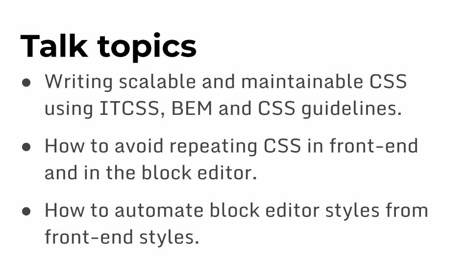
Talk topics● Writing scalable and maintainable CSS
using ITCSS, BEM and CSS guidelines.
● How to avoid repeating CSS in front-end and in the block editor.
● How to automate block editor styles from front-end styles.

Many CSS methodologies● Inverted Triangle CSS (ITCSS)
● Object-Oriented CSS (OOCSS).
● Scalable and Modular architecture for CSS (SMACSS).
● Atomic design.
● Utility-first CSS.

Many CSS methodologies● CSS Modules.● CSS in JS.

High level Goals● No conflicts when updating CSS.
○ How many times we have broke something else when updating one line of CSS.
● Where to add or update CSS.○ More efficient workflow when CSS structure is
clear. Avoid guessing is this the correct place.
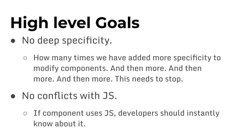
High level Goals● No deep specificity.
○ How many times we have added more specificity to modify components. And then more. And then more. And then more. This needs to stop.
● No conflicts with JS.○ If component uses JS, developers should instantly
know about it.

ITCSS CSS architecture ● Separate main style.css codebase to
several sections (layers).● Every sections add more specificity to CSS
in the right order.

Example layers in ITCSS

SettingsGlobal variables like fonts and colors.
:root {
--font-family-sans: "Roboto", sans-serif;
--font-family-serif: "Playfair Display", serif;
}

ToolsMixins and functions.
@define-mixin button-block {
background-color: var(--color-primary);
...
}

GenericResets, box-sizing etc.
@import "normalize.css";

ElementsUnclassed HTML elements like <h1> and <blockquote>
blockquote {
border-left: var(--spacing-s) solid;
...
}

LayoutsUndecorated design patterns, such as global layouts and wrappers.
.grid {
display: grid;
...
}

BlocksStyles for Core and custom blocks.
Note: I dequeue Core block styles from front-end and editor.
This way we don’t have to fight specificity war with Core styles.
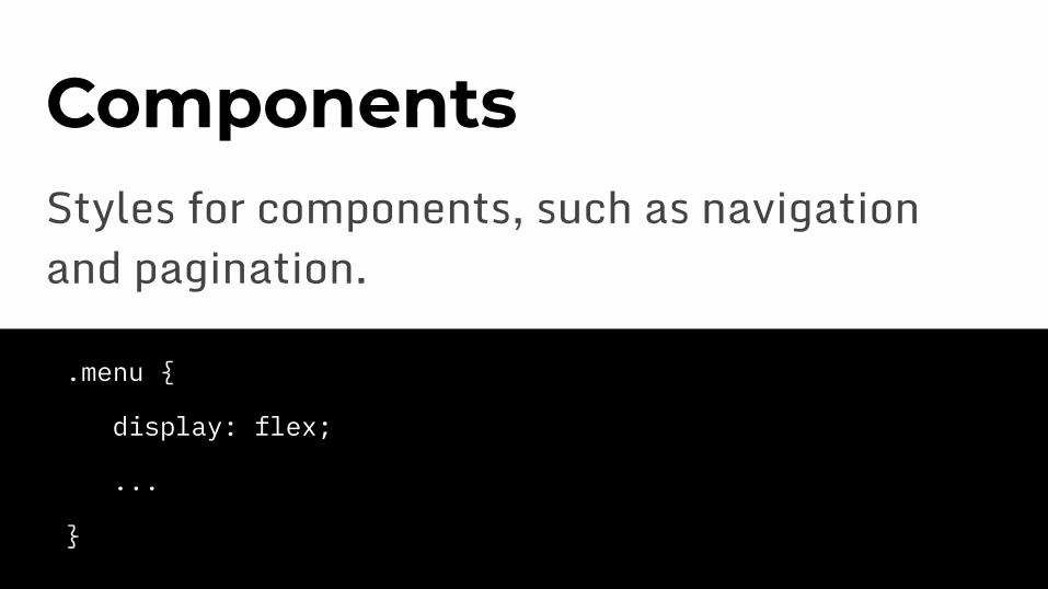
ComponentsStyles for components, such as navigation and pagination.
.menu {
display: flex;
...
}

Custom layerIf there is need for custom layer, feel free to add it. It’s OK to be before blocks and components.

UtilitiesUtility classes like .screen-reader-text and prefers-reduced-motion
.screen-reader-text {
clip-path: inset(50%);
...
}

Class prefixes● When working on large dev team with
different backgrounds, class prefixes can help understanding what job classes are doing.
● And in what layer they belong.

Example class prefixes● .l- for layouts, such as .l-grid● .c- for components, such as .c-menu● .u- for utilities, such as .u-reset-list

Example class prefixes● .is- and .has- for specific states, such as
.is-opened or .has-primary-color● .js- for targeting JavaScript-specific
functionality, such as .js-menu-toggle○ These classes are never used for styling, only for
JS behaviour

CSS guidelines andlinting● Follow (some) CSS guidelines.● Use stylelint to enforce those guidelines.

BEM naming convention● BEM stands for “Block Element Modifier”.● Helps with our goals.

BEM syntax● Block is the primary component block,
such as .menu
● Element is a child of the primary block, such as .menu__item

BEM syntax● Modifier is a variation of a component
style, such as .menu--primary

BEM in HTML<nav class=”menu menu--primary”>
<ul class=”menu__items”>
<li class=”menu__item”><a class=”menu__anchor”>Home</a></li>
<li class=”menu__item”><a class=”menu__anchor”>About</a></li>
</ul>
</nav>

BEM in CSS// CSS.menu {
&--primary {}
&__items {}
&__item {}
&__anchor {}
}
// Compiled CSS.menu {}
.menu--primary {}
.menu__items {}
.menu__item {}
.menu__anchor {}
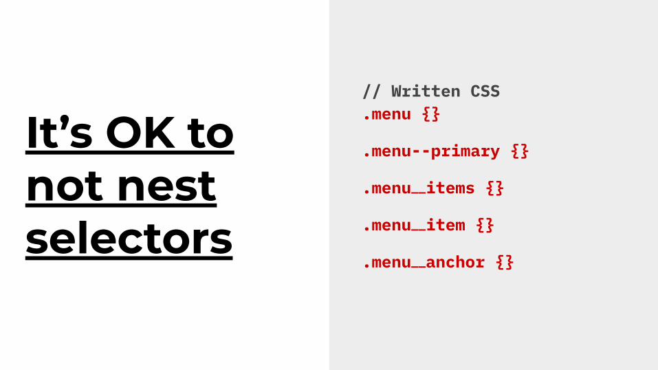
It’s OK to not nest selectors
// Written CSS.menu {}
.menu--primary {}
.menu__items {}
.menu__item {}
.menu__anchor {}

How about block editor styles● Dequeue Core block styles from front-end
and editor.
● Enqueue almost the same stylesheet for editor than in front-end. Not much manual work.

How about block editor styles● Use SASS nesting or PostCSS plugins to
add .editor-styles-wrapper class automatically.

Nesting in SASS@import "settings/variables.css";
@import "tools/mixins.css";
// Editor CSS wrapper..editor-styles-wrapper {
@import "elements/index.css";
@import "blocks/index.css";
}

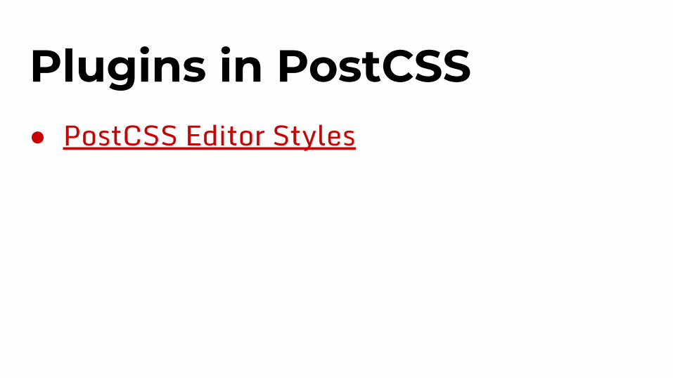
Plugins in PostCSS// Styles for editor almost the same as in front-end.
@import "settings/variables.css";
@import "tools/mixins.css";
// .editor-styles-wrapper prefix class added automatically.
@import "elements/index.css";
@import "blocks/index.css";
...

CSS added manually to editor● Typography.
● Post title.
● Block width, wide, and full widths.
● Search block, code block

