making the contents page
TRANSCRIPT

I started my contents page with the headings which I made by clicking on the box tool in InDesign -> changed the colour to light blue -> put text on top. I placed them where I thought they could go. I really like the white against the blue as it’s bright and noticeable, which is what I would want as it would draw readers in.
I then added article headings on. This was also in bebas, but I did it in blue instead of black as it goes with the colour of the heading and creates continuity which is what the magazines from my research did. I arranged the titles under what heading I thought they would go under.
I then used black for the article teasers/ summary’s as I wanted then to stand out from the headings, but not too much, which is why I went for black ariel as it’s typically used in magazines so everyone would be familiar with it and it’s not too showy, which would mean that it could be un-readable.

I added the page numbers in and some images, which meant that I had to move the titles around a bit. I used bebas for the page numbers because it was something I said I would do in my planning, but I did it in black, not blue as I felt that there’s enough blue on the page. Also, bebas is big and easy to read so the consumer can easily navigate throughout the magazine.
I spaced out the articles a bit more because they were quite random . I also added some festival logos to the bottom of the page to show what was in the magazine. I like the balance of images and text as the images make the page eye-catching and engaging for the consumer. It also reflects the research I did of NME and Q as they do something similar but with more images and as I didn’t take that many photos I had to compromise.
I neatened out the spaces between the articles and tittles as they weren’t in line before and some areas had more space than others, which made the page look unprofessional. This is my nearly finished contents page as I want to ask others what they think of it.
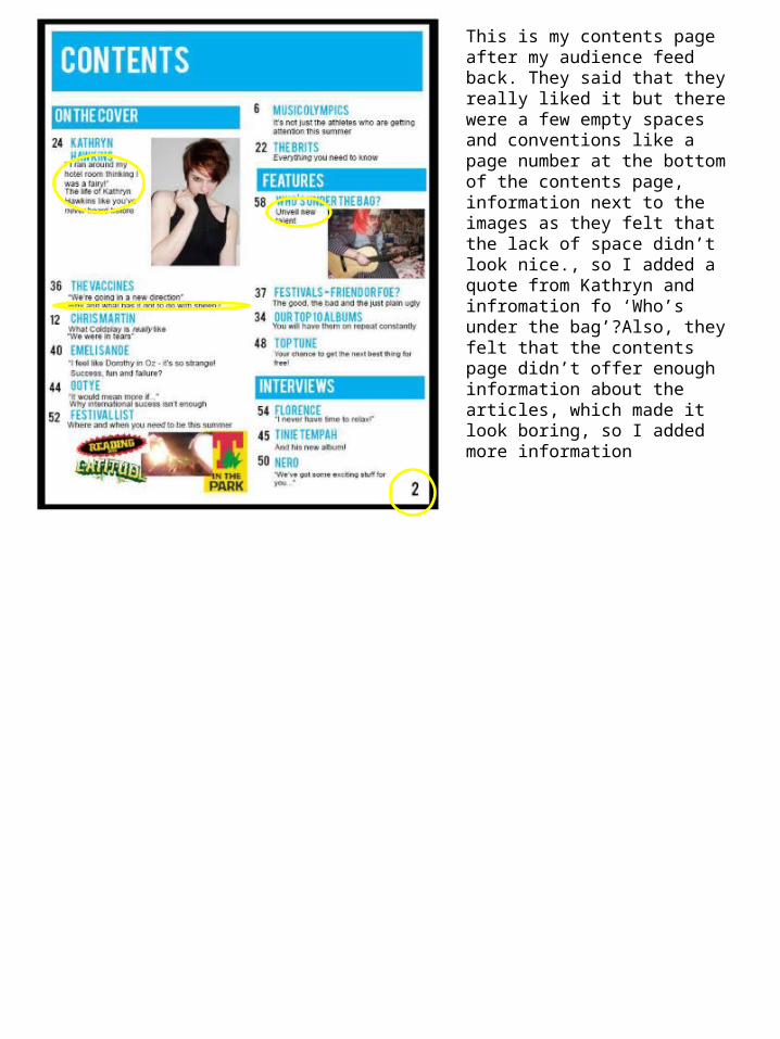
This is my contents page after my audience feed back. They said that they really liked it but there were a few empty spaces and conventions like a page number at the bottom of the contents page, information next to the images as they felt that the lack of space didn’t look nice., so I added a quote from Kathryn and infromation fo ‘Who’s under the bag’?Also, they felt that the contents page didn’t offer enough information about the articles, which made it look boring, so I added more information