making your documents look professional - … and styles cheat sheet walters 1 computer information...
TRANSCRIPT
Themes and Styles Cheat Sheet Walters
1 Computer Information Technology | SGMS
Making your Documents look Professional
With styles and themes
About Styles and Themes One of the great things about Word ’07 is how easy it now is to create truly professional looking documents in the same way Print & Web designers have been doing it for years. The secret lies in using
styles and themes instead of changing fonts, font sizes, font colors, and adding effects (bold, italic, and so on).
The standard practice most of us have used for years is to go directly to the font tools (now located in the Home tab) when we wanted to add some style to our text. Because of the extreme variations possible with this method, that can often render a document unreadable at best and nauseating at worst, this is no longer considered best practice.
Now, much like the professionals, we apply “styles” (also found in the Home
tab).
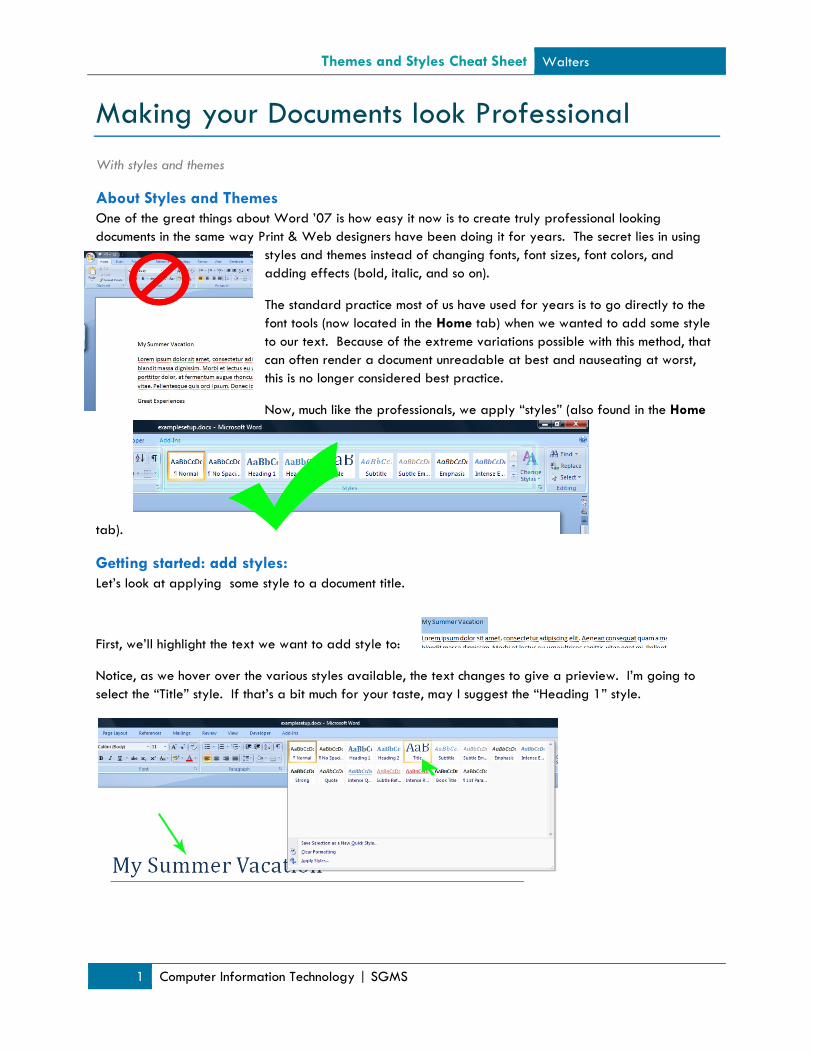
Getting started: add styles: Let’s look at applying some style to a document title.
First, we’ll highlight the text we want to add style to:
Notice, as we hover over the various styles available, the text changes to give a prieview. I’m going to select the “Title” style. If that’s a bit much for your taste, may I suggest the “Heading 1” style.

Themes and Styles Cheat Sheet Walters
2 Computer Information Technology | SGMS
Now, we’ll add some style to the rest of our document. “Heading 1” and “Heading 2” always make great styles for your section headings. Block quotations can easily be set off with the “Intense Quote” style.
Once you’ve applied your styles, we can go over to the Page Layout tab to look at how Themes effect Styles.
Using Themes to bump your Styles up a notch… Under the Page Layout tab, you’ll find Themes on the far left. You may have tried this feature out, only to discover that it didn’t seem to do anything. If you’ve already “micro-managed” the style of your document by changing fonts, font sizes, font colors, and adding effects (bold, italic, and so on), this feature won’t do anything. If you’ve used Styles, on the other hand, you can watch the magic unfold.
Again, as you mouse over each theme, look at how the fonts, colors, and effects applied to your text change.
These theme colors, fonts, and effects will also apply to any further elements you add, including text boxes, headers, footers, and charts.

Themes and Styles Cheat Sheet Walters
3 Computer Information Technology | SGMS
Adding additional page elements
Text Boxes Text Boxes have often been used by print designers to set off interesting quotes or provide related concise pieces of information. Word ’07 has a very intuitive system of inserting great looking text boxes into your design. Under the Insert tab, you’ll find the Text Box icon.
Notice the myriad options available when you click on it.
I selected the “Contrast Quote” text box. Now, I simply need to copy and paste an interesting quote from my document into the box. Notice how it already matches my document colors and fonts.

Themes and Styles Cheat Sheet Walters
4 Computer Information Technology | SGMS
Adding a Header Again, under the Insert tab, you’ll find the header icon.
Clicking on it will reveal a host of options that match you documents theme already! I’m going to choose “Motion (Even Page)” to contrast my text box (it’s positioned on the left while the text box is on the right).
Check out my final product: