media evaluation: part 2
TRANSCRIPT

EVALUATION: PART 2
By Cara Watling

Q, HOW EFFECTIVE IS THE COMBINATION OF YOUR MAIN PRODUCT AND ANCILLARY TEXTS?
For my poster I began with choosing a primary background image. I chose an extreme close up of one of the main character’s eyes which adds a sense of claustrophobia/fear of being trapped to the person who views it. Like the Candyman (1992) poster I superimposed images onto the eye. For my poster I superimposed a pill with “D” for “Delirium” scratched (I used a scratch effect font) onto it. This also shows the viewer the drug influences in the film and adds institutional context to the poster – in the news there has been several cases of teenagers taking faulty drug products.
I then added a “Texturizer” filter to create a CCTV camera effect making it seem like she is being watched which disturbs the audience making it clear that it is a Psychological horror film. I adjusted the brightness and contrast to create dramatic shadows above the eye with the darkness connoting mystery and hatred. The adding of this filter can be seen in Evaluation: Part 3.
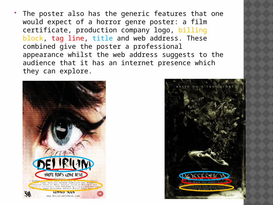
The poster also has the generic features that one would expect of a horror genre poster: a film certificate, production company logo, billing block, tag line, title and web address. These combined give the poster a professional appearance whilst the web address suggests to the audience that it has an internet presence which they can explore.

My group decided to call the production company “Sophannara” which is a combination of all of our names. We added horror features to the logo with a blood splatter and knife to further clarify that it is a horror film and add a slight sense of danger to the poster over all.
Although many of its audience may not pay attention to the production company who made the film, horror critics and those who follow auteur theory will probably find this feature important, following the example of such real-life companies as “Twisted Pictures” who created Saw as well as many other horror films.

Secondly, for my magazine cover’s background image I constructed an image using layers and effects on Photoshop which has Anna in the centre of the page in a medium close up shot looking quizzical. There are blood spatters hovering above her head with Delirium, Sophie and myself superimposed onto them to suggest to the reader that she is thinking about them. This is similar to an issue of “Scream” magazine where a man is thinking deeply with images of characters/people in the background.
I thought this was appropriate as it introduces all of the characters to the reader and also tells them that Anna is the main character whilst the blood splatters suggest gore and body horror in the film. The magazine “Fangoria” also uses a lot of body horror and has a similar audience to the “Scream” magazine.
As with the “Fangoria” cover, Anna is not directly looking at the camera, suggesting an air of mystery. I also darkened the image of Anna using the contrast settings to make the image darker and more dramatic. Also, the blood splatters are a dark red which connote danger while the background of the main image connotes dirt/grunge which makes the audience feel gritty.
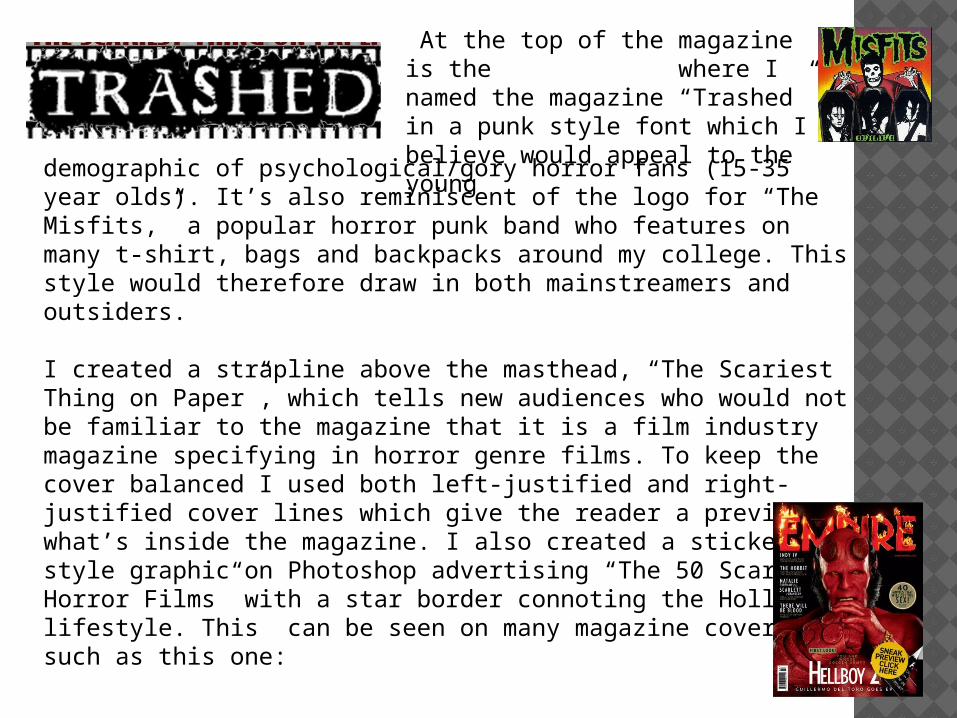
At the top of the magazine is the where I named the magazine “Trashed” in a punk style font which I believe would appeal to the youngdemographic of psychological/gory horror fans (15-35 year olds).
It’s also reminiscent of the logo for “The Misfits,” a popular horror punk band who features on many t-shirt, bags and backpacks around my college. This style would therefore draw in both mainstreamers and outsiders.
I created a strapline above the masthead, “The Scariest Thing on Paper”, which tells new audiences who would not be familiar to the magazine that it is a film industry magazine specifying in horror genre films. To keep the cover balanced I used both left-justified and right-justified cover lines which give the reader a preview of what’s inside the magazine. I also created a sticker-style graphic on Photoshop advertising “The 50 Scariest Horror Films” with a star border connoting the Hollywood lifestyle. This can be seen on many magazine covers such as this one:
Other generic features I included are: a barcode, price, issue date,and main cover line/main film title (Delirium).
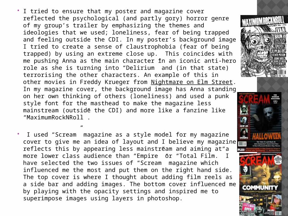
I tried to ensure that my poster and magazine cover reflected the psychological (and partly gory) horror genre of my group’s trailer by emphasizing the themes and ideologies that we used; loneliness, fear of being trapped and feeling outside the CDI. In my poster’s background image I tried to create a sense of claustrophobia (fear of being trapped) by using an extreme close up. This coincides with me pushing Anna as the main character in an iconic anti-hero role as she is turning into “Delirium” and (in that state) terrorising the other characters. An example of this in other movies in Freddy Krueger from Nightmare on Elm Street. In my magazine cover, the background image has Anna standing on her own thinking of others (loneliness) and used a punk style font for the masthead to make the magazine less mainstream (outside the CDI) and more like a fanzine like “MaximumRockNRoll”.
I used “Scream” magazine as a style model for my magazine cover to give me an idea of layout and I believe my magazine reflects this by appearing less mainstream and aiming at a more lower class audience than “Empire” or “Total Film.” I have selected the two issues of “Scream” magazine which influenced me the most and put them on the right hand side. The top cover is where I thought about adding film reels as a side bar and adding images. The bottom cover influenced me by playing with the opacity settings and inspired me to superimpose images using layers in photoshop.

I aimed both the magazine and the poster at the psychological horror audience due to that being the genre of the trailer my group created. The demographic of this is 55% women and 45% men between 15 and 35 years old. To reflect this there is only some influence of body horror to keep the poster to keep it classier and more women friendly (gore is more favoured by men than women). However, the trailer is also a 15 certificate for an 18 certificate film (psychological films are usually rated 15), so the magazine’s cover blood splats broadens out the audience to fans of gory, low budget horror befitting the horror fanzine style of my magazine.