medicare advantage: history, current status and future
TRANSCRIPT

Medicare Advantage: History, Current Status and Future Expectations
May 17, 2013
Presentation to the National Health Policy Forum Meeting: “Getting the Price Right: Ensuring Access and Promoting
Efficiency in Medicare Advantage” Reserve Officers Association, Washington, DC
Marsha Gold, Sc.D., Senior Fellow
Under the MMA, Medicare Advantage (MA) grew rapidly and is now larger than ever (28% penetration)
Despite restrictions in MIPPA and payment cuts under the ACA, MA enrollment continues to grow in all payment quartiles
ACA’s payment changes provide more incentive to manage and become more efficient—if plans don’t game or circumvent them
Evolving budget policy may ultimately have more effect than the ACA on Medicare—and MA
Key Points
1
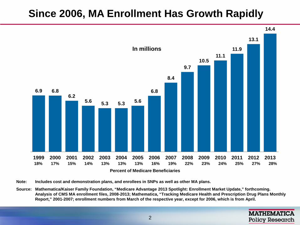
6.9 6.8 6.2
5.6 5.3 5.3 5.6
6.8
8.4
9.7 10.5
11.1 11.9
13.1
14.4
1999 2000 2001 2002 2003 2004 2005 2006 2007 2008 2009 2010 2011 2012 2013
Note: Includes cost and demonstration plans, and enrollees in SNPs as well as other MA plans.
Source: Mathematica/Kaiser Family Foundation, “Medicare Advantage 2013 Spotlight: Enrollment Market Update,” forthcoming. Analysis of CMS MA enrollment files, 2008-2013; Mathematica, “Tracking Medicare Health and Prescription Drug Plans Monthly Report,” 2001-2007; enrollment numbers from March of the respective year, except for 2006, which is from April.
Since 2006, MA Enrollment Has Growth Rapidly
In millions
18% 17% 15% 14% 13% 13% 13% 16% 19% 22% 23% 24% 25% 27% 28%
2
Percent of Medicare Beneficiaries

Note: Includes cost and demonstration plans, and enrollees in SNPs as well as other MA plans.
Source: Mathematica/Kaiser Family Foundation, “Medicare Advantage 2013 Spotlight: Enrollment Market Update,” forthcoming. Analysis of CMS State/County Market Penetration Files, 2013.
Share of Medicare Beneficiaries Enrolled in MA Plans, by State, 2013
National average, 2013 = 28%
< 10% 10% - 19% 20% - 29% ≥30% (6 states) (14 states + DC) (15 states) (15 states)
DC 10%
35%
22%
0%
38% 17%
37% 35%
23%
7%
36%
25%
46%
30%
11% 21%
14%
12% 22%
26%
17%
8%
18%49%
12%
24%
15%
12%32%
5%
16%
29%
33%
20%
12%
37%
16%
42%
39%
20%
13%
29%
27%
33%
7%
15%
28%
21%
3%33%
27%
3

Traditional fee-for-service
Medicare 72%
HMO 65%
Local PPO 22%
Regional PPO 7% PFFS 3% Other 3%
MA 28%
Note: PFFS is private fee-for-service plans, PPOs are preferred provider organizations, and HMOs are health maintenance organizations. “Other” covers cost and demonstration plans, including enrollees in SNPs as well as other MA plans.
Source: Mathematica/Kaiser Family Foundation, “Medicare Advantage 2013 Spotlight: Enrollment Market Update,” forthcoming. Analysis of CMS MA Enrollment Files, 2013.
MA Enrollment, by Plan Type, 2013
Total MA enrollment, 2013 = 14.4 million
4
Individual coverage (no subsidized supplement)
Groups: retiree plans
SNPs (particularly for dual eligibles)
Presentation focuses mainly on “plain vanilla individual MA,” in which most enrollment is concentrated
MA Markets
5
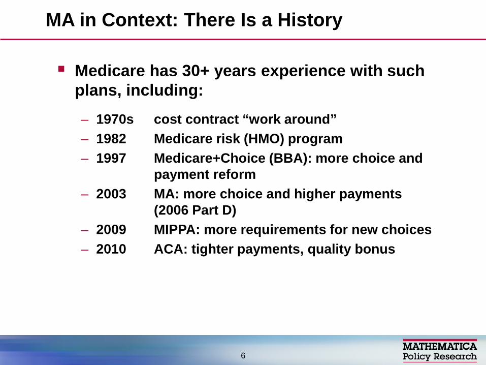
Medicare has 30+ years experience with such plans, including:
– 1970s cost contract “work around” – 1982 Medicare risk (HMO) program – 1997 Medicare+Choice (BBA): more choice and
payment reform – 2003 MA: more choice and higher payments
(2006 Part D) – 2009 MIPPA: more requirements for new choices – 2010 ACA: tighter payments, quality bonus
MA in Context: There Is a History
6

Network requirements for (most) PFFS plans (2011) – Some shrinkage in firms participating (starting in 2010) – Others hedged their bets: network PFFS (opt out) plus
new coordinated care plans
SNP requirements tightened
CMS reviewed bids to eliminate low enrollment or nondistinct plans and to encourage greater financial protection for heavy users
Recent Critical Influences on the Market, Pre-ACA
7

2011 rate freeze with 2012+ phase in of changes to shrink overpayments over time (by 2017) – Counties divided into four FFS cost quartiles for
payment purposes – After phase in, benchmark will range from 95% of
traditional Medicare (highest cost quartile) to 115% of traditional Medicare (lowest cost counties)
– Quality ratings (stars) effect bonuses, rebates more prominent under CMS demonstration
Medical loss ratio (85%+) starting in 2014
Traditional Medicare benefits improved (donut hole, preventive services)
ACA Provisions with Direct Effects on MA
8
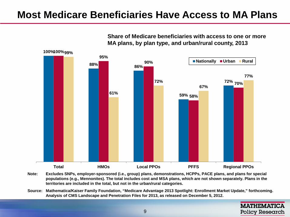
100%
88% 86%
59%
72%
100% 95%
90%
58%
70%
99%
61%
72% 67%
77%
Total HMOs Local PPOs PFFS Regional PPOs
Nationally Urban Rural
Most Medicare Beneficiaries Have Access to MA Plans
9
Share of Medicare beneficiaries with access to one or more MA plans, by plan type, and urban/rural county, 2013
Note: Excludes SNPs, employer-sponsored (i.e., group) plans, demonstrations, HCPPs, PACE plans, and plans for special populations (e.g., Mennonites). The total includes cost and MSA plans, which are not shown separately. Plans in the territories are included in the total, but not in the urban/rural categories.
Source: Mathematica/Kaiser Family Foundation, “Medicare Advantage 2013 Spotlight: Enrollment Market Update,” forthcoming. Analysis of CMS Landscape and Penetration Files for 2013, as released on December 5, 2012.

Firms develop benefit packages taking into account payments and expected costs by county
Appeal of benefit package influenced by payment level, since there is little evidence that most plan types are more efficient than Medicare
Limited payment growth under M+C led to benefit reductions and disruptive plan withdrawals but context a bit different now.
Since the mid 1980s, out of pocket cost sharing has grown well beyond original “nominal” levels (risk to beneficiaries), though CMS tries to limit ability to discriminate against the sick
Payment Levels Are Important to Firms’ Ability to Provide Attractive Benefits
10
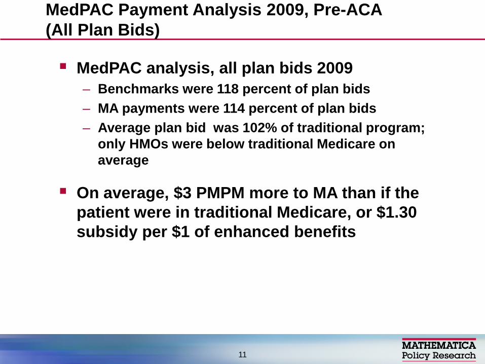
MedPAC analysis, all plan bids 2009 – Benchmarks were 118 percent of plan bids – MA payments were 114 percent of plan bids – Average plan bid was 102% of traditional program;
only HMOs were below traditional Medicare on average
On average, $3 PMPM more to MA than if the patient were in traditional Medicare, or $1.30 subsidy per $1 of enhanced benefits
MedPAC Payment Analysis 2009, Pre-ACA (All Plan Bids)
11
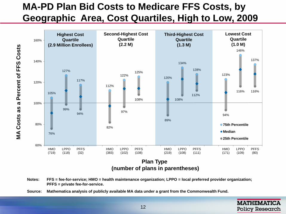
MA-PD Plan Bid Costs to Medicare FFS Costs, by Geographic Area, Cost Quartiles, High to Low, 2009
105%
127%
117%
112%
122% 125%
120%
134%
128% 123%
146%
137%
76%
99% 94%
82%
97%
108%
89%
108% 112%
94%
116% 116%
60%
80%
100%
120%
140%
160%
HMO(719)
LPPO(118)
PFFS(32)
HMO(383)
LPPO(102)
PFFS(108)
HMO(219)
LPPO(108)
PFFS(111)
HMO(171)
LPPO(109)
PFFS(80)
75th Percentile
Median
25th Percentile
Highest Cost Quartile
(2.9 Million Enrollees)
Third-Highest Cost Quartile (1.3 M)
Second-Highest Cost Quartile (2.2 M)
Lowest Cost Quartile (1.0 M)
Plan Type (number of plans in parentheses)
MA
Cos
ts a
s a
Perc
ent o
f FFS
Cos
ts
Notes: FFS = fee-for-service; HMO = health maintenance organization; LPPO = local preferred provider organization; PFFS = private fee-for-service.
Source: Mathematica analysis of publicly available MA data under a grant from the Commonwealth Fund.
12
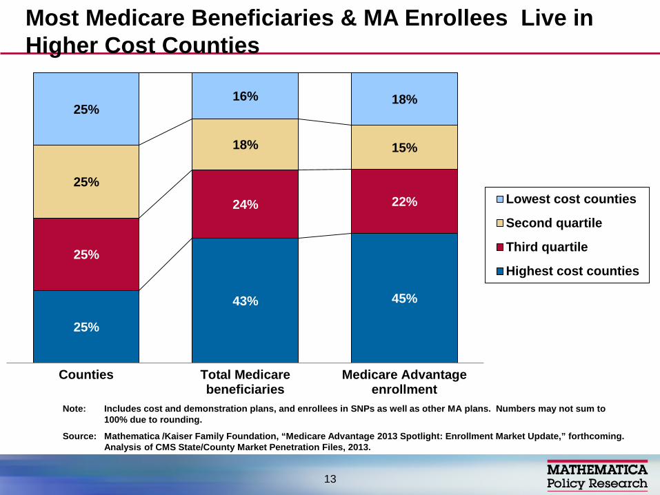
25%
43% 45%
25%
24% 22% 25%
18% 15%
25% 16% 18%
Counties Total Medicarebeneficiaries
Medicare Advantageenrollment
Lowest cost counties
Second quartile
Third quartile
Highest cost counties
Note: Includes cost and demonstration plans, and enrollees in SNPs as well as other MA plans. Numbers may not sum to 100% due to rounding.
Source: Mathematica /Kaiser Family Foundation, “Medicare Advantage 2013 Spotlight: Enrollment Market Update,” forthcoming. Analysis of CMS State/County Market Penetration Files, 2013.
Most Medicare Beneficiaries & MA Enrollees Live in Higher Cost Counties
13
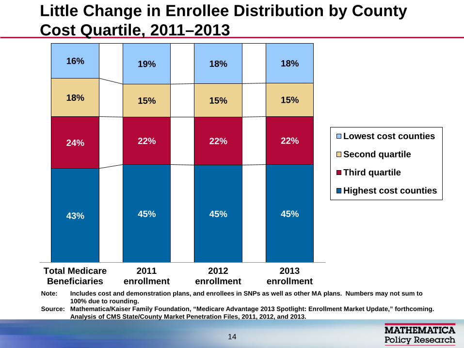
43% 45% 45% 45%
24% 22% 22% 22%
18% 15% 15% 15%
16% 19% 18% 18%
Total MedicareBeneficiaries
2011enrollment
2012enrollment
2013enrollment
Lowest cost counties
Second quartile
Third quartile
Highest cost counties
Note: Includes cost and demonstration plans, and enrollees in SNPs as well as other MA plans. Numbers may not sum to 100% due to rounding.
Source: Mathematica/Kaiser Family Foundation, “Medicare Advantage 2013 Spotlight: Enrollment Market Update,” forthcoming. Analysis of CMS State/County Market Penetration Files, 2011, 2012, and 2013.
Little Change in Enrollee Distribution by County Cost Quartile, 2011–2013
14

MA Enrollment and Penetration Rates in HMOs and Other Plan Types, by Counties’ Costs, 2011-2013
15
2011 2012 2013 % change enrollment, 2011-2013
% change penetration, 2013-2013 Penetration Penetration Penetration
Total
Highest cost counties 26% 27% 29% 21% 3%
Third quartile 23% 25% 26% 21% 3%
Second quartile 21% 23% 24% 23% 3%
Lowest cost counties 29% 31% 32% 17% 3%
HMOs
Highest cost counties 20% 21% 22% 17% 2%
Third quartile 14% 14% 16% 22% 2%
Second quartile 10% 11% 12% 33% 2%
Lowest cost counties 16% 17% 18% 22% 2%
non-HMOs
Highest cost counties 6% 7% 7% 14% 1%
Third quartile 9% 10% 11% 12% 1%
Second quartile 11% 12% 12% 7% 1%
Lowest cost counties 13% 13% 14% 3% 1%
Source: Mathematica/Kaiser Family Foundation, “Medicare Advantage 2013 Spotlight: Enrollment Market Update,” forthcoming. Analysis of CMS MA Enrollment and Landscape Files, 2011-2013.
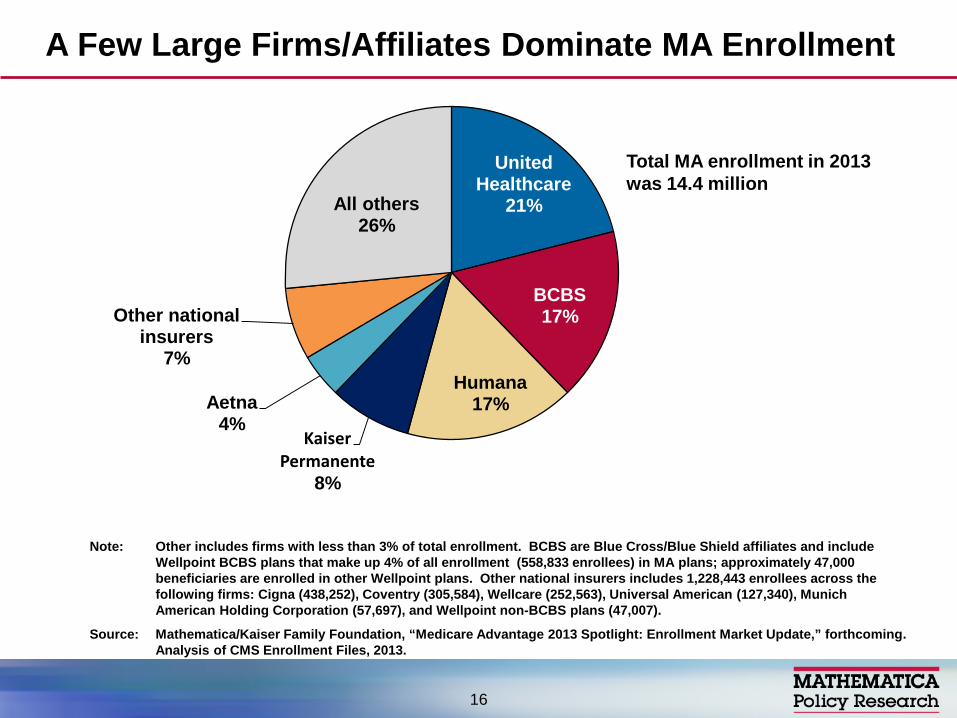
United Healthcare
21%
BCBS 17%
Humana 17%
Kaiser Permanente
8%
Aetna 4%
Other national insurers
7%
All others 26%
A Few Large Firms/Affiliates Dominate MA Enrollment
Note: Other includes firms with less than 3% of total enrollment. BCBS are Blue Cross/Blue Shield affiliates and include Wellpoint BCBS plans that make up 4% of all enrollment (558,833 enrollees) in MA plans; approximately 47,000 beneficiaries are enrolled in other Wellpoint plans. Other national insurers includes 1,228,443 enrollees across the following firms: Cigna (438,252), Coventry (305,584), Wellcare (252,563), Universal American (127,340), Munich American Holding Corporation (57,697), and Wellpoint non-BCBS plans (47,007).
Source: Mathematica/Kaiser Family Foundation, “Medicare Advantage 2013 Spotlight: Enrollment Market Update,” forthcoming. Analysis of CMS Enrollment Files, 2013.
Total MA enrollment in 2013 was 14.4 million
16
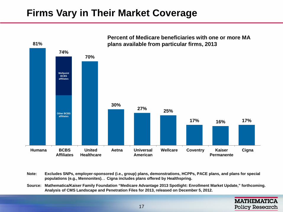
Firms Vary in Their Market Coverage
17
81%
74% 70%
30% 27% 25%
17% 16% 17%
Humana BCBSAffiliates
UnitedHealthcare
Aetna UniversalAmerican
Wellcare Coventry KaiserPermanente
Cigna
Wellpoint BCBS
affiliates
Other BCBS affiliates
Percent of Medicare beneficiaries with one or more MA plans available from particular firms, 2013
Note: Excludes SNPs, employer-sponsored (i.e., group) plans, demonstrations, HCPPs, PACE plans, and plans for special populations (e.g., Mennonites). . Cigna includes plans offered by Healthspring.
Source: Mathematica/Kaiser Family Foundation “Medicare Advantage 2013 Spotlight: Enrollment Market Update,” forthcoming. Analysis of CMS Landscape and Penetration Files for 2013, released on December 5, 2012.
Source: Mathematica/Kaiser Family Foundation, “Medicare Advantage 2013 Spotlight: Enrollment Market Update,” forthcoming. Analysis of CMS State/County Market Penetration Files, 2013.
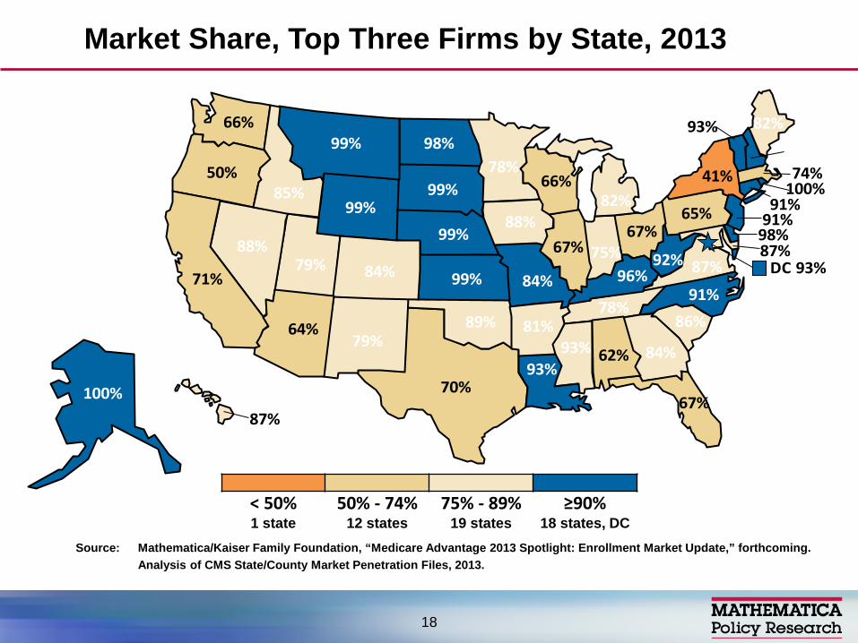
Market Share, Top Three Firms by State, 2013
< 50% 50% - 74% 75% - 89% ≥90% 1 state 12 states 19 states 18 states, DC
DC 93%
100%
62%
100%
64% 81%
71% 84%
91%
98%
67%
84%
87%
85%
67% 75%
88%
99% 96%
93%
82%
87%
74%78%
93%
84%
99%
99%88%
91%
91%
79%
41%
91%
98%
67%
89%
50%
65%
86%
99%
78%
70%
79%
93%
87%
66%
92%
99%66%
82%
18
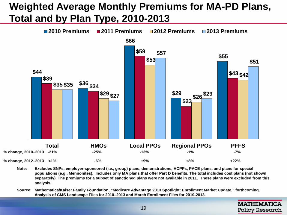
$44
$36
$66
$29
$55
$39 $34
$59
$23
$43
$35 $29
$53
$26
$42
$35
$27
$57
$29
$51
Total HMOs Local PPOs Regional PPOs PFFS
2010 Premiums 2011 Premiums 2012 Premiums 2013 Premiums
Note: Excludes SNPs, employer-sponsored (i.e., group) plans, demonstrations, HCPPs, PACE plans, and plans for special populations (e.g., Mennonites). Includes only MA plans that offer Part D benefits. The total includes cost plans (not shown separately). The premiums for a subset of sanctioned plans were not available in 2011. These plans were excluded from this analysis.
Source: Mathematica/Kaiser Family Foundation, “Medicare Advantage 2013 Spotlight: Enrollment Market Update,” forthcoming. Analysis of CMS Landscape Files for 2010–2013 and March Enrollment Files for 2010-2013.
Weighted Average Monthly Premiums for MA-PD Plans, Total and by Plan Type, 2010-2013
19
% change, 2012–2013 <1%
% change, 2010–2013 -21% -13% -25% -1% -7%
-6% +9% +8% +22%
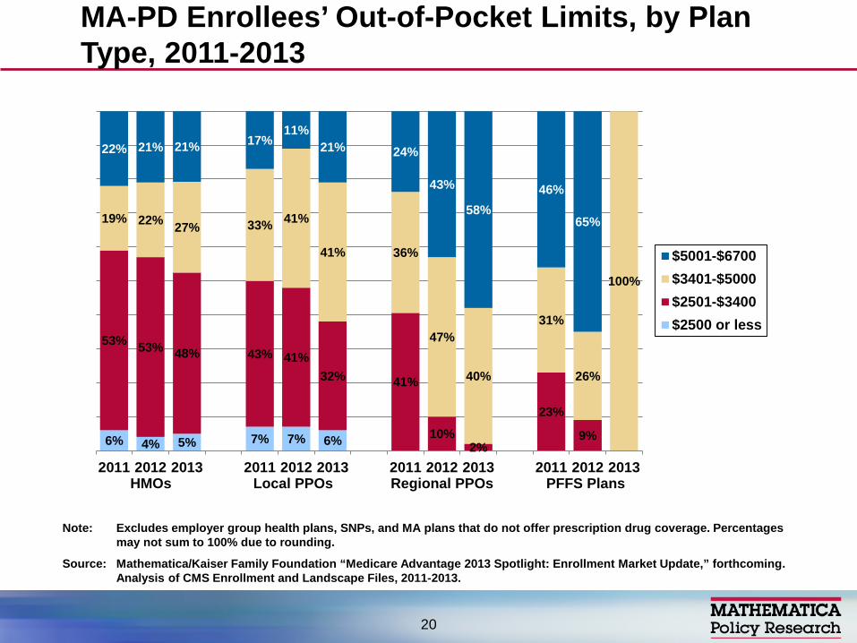
MA-PD Enrollees’ Out-of-Pocket Limits, by Plan Type, 2011-2013
20
6% 4% 5% 7% 7% 6%
53% 53% 48% 43% 41% 32% 41%
10% 2%
23%
9%
19% 22% 27% 33% 41%
41% 36%
47%
40%
31%
26%
100%
22% 21% 21% 17% 11%
21% 24%
43%
58% 46%
65%
2011 2012 2013 2011 2012 2013 2011 2012 2013 2011 2012 2013
$5001-$6700$3401-$5000$2501-$3400$2500 or less
HMOs Local PPOs Regional PPOs PFFS Plans
Note: Excludes employer group health plans, SNPs, and MA plans that do not offer prescription drug coverage. Percentages may not sum to 100% due to rounding.
Source: Mathematica/Kaiser Family Foundation “Medicare Advantage 2013 Spotlight: Enrollment Market Update,” forthcoming. Analysis of CMS Enrollment and Landscape Files, 2011-2013.
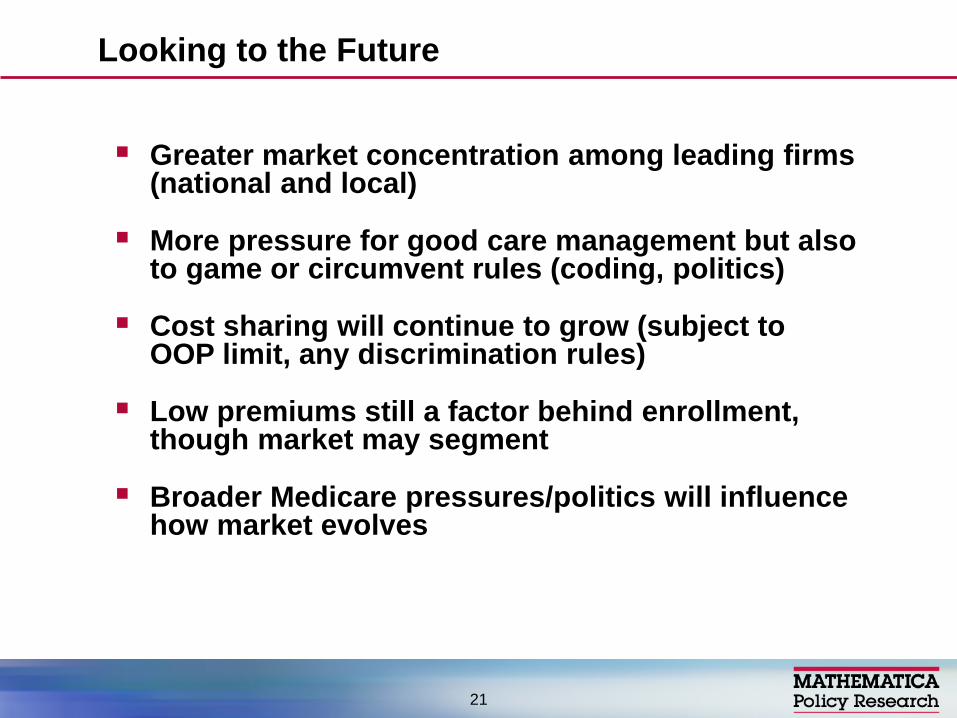
Greater market concentration among leading firms (national and local)
More pressure for good care management but also to game or circumvent rules (coding, politics)
Cost sharing will continue to grow (subject to OOP limit, any discrimination rules)
Low premiums still a factor behind enrollment, though market may segment
Broader Medicare pressures/politics will influence how market evolves
Looking to the Future
21

Contact: [email protected] or 202-484-4227
Links to available analyses – www.mathematica-mpr.com (Search
Publications, Gold, Health-Medicare) – www.Kaiser Family Foundation.org (MA
Spotlights, MA Tracker) – www.healthaffairs.org (November 24, 2010,
articles on MA by Gold and others)
For More Information
22