memorable chart junk visualization design
TRANSCRIPT

Visualization Design & Memorable Chart Junk

Announcements
• Lecture videos will be posted to the YouTube playlist listed on the course page
• Slides will be available before lecture• Paper discussions will require A/V if possible.• My contact info will soon be updated on the
course site
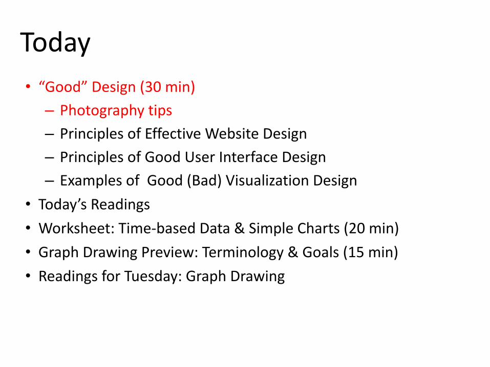
Today
• “Good” Design (30 min)
– Photography tips
– Principles of Effective Website Design
– Principles of Good User Interface Design
– Examples of Good (Bad) Visualization Design
• Today’s Readings
• Worksheet: Time-based Data & Simple Charts (20 min)
• Graph Drawing Preview: Terminology & Goals (15 min)
• Readings for Tuesday: Graph Drawing


“Canonical” Viewpoints
• From Dictionary.com:– authorized; recognized; accepted
– the body of rules, principles, or standards accepted as axiomatic and universally binding in a field of study or art: the neoclassical canon
– a fundamental principle or general rule: the canons of good behavior
– a standard; criterion: the canons of taste
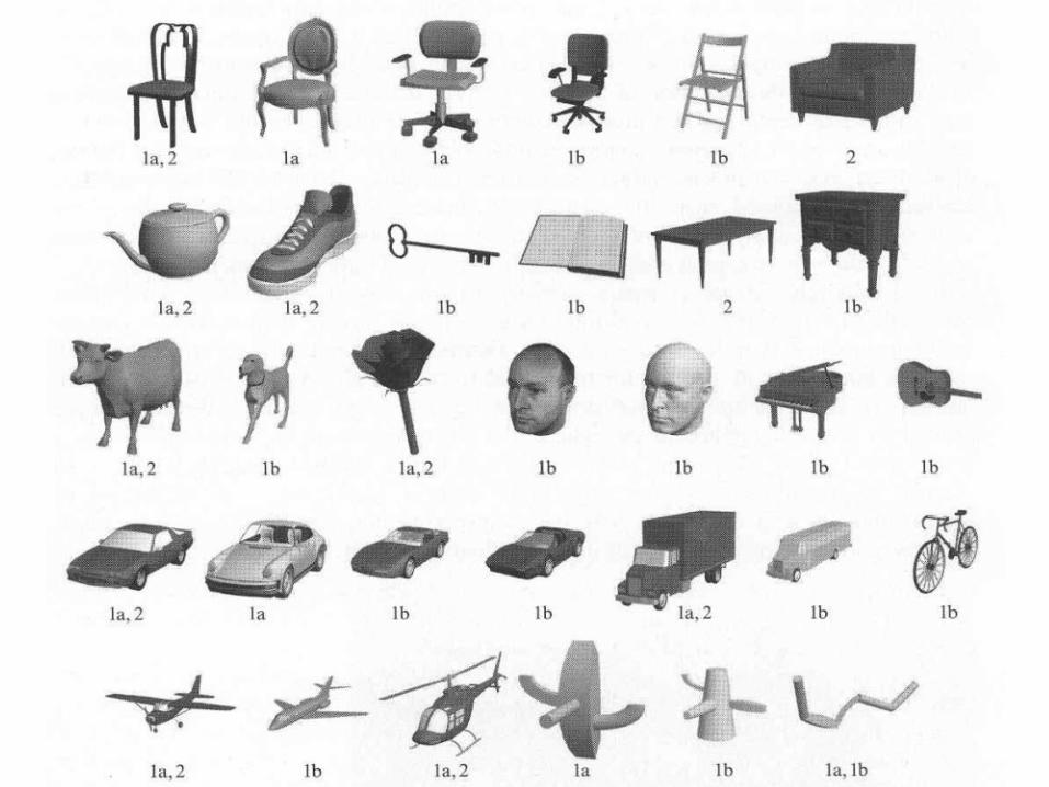
“What object attributes determine canonical views?” Blanz, Tarr, & Bulthoff, Perception 1999
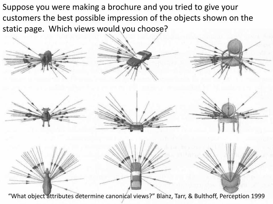
“What object attributes determine canonical views?” Blanz, Tarr, & Bulthoff, Perception 1999
Suppose you were making a brochure and you tried to give your customers the best possible impression of the objects shown on the static page. Which views would you choose?

• Salience and significance of the features
• Stability of viewpoint to small transformations
• Minimize number of occluded features
• Familiarity, Functionality, Aesthetic criteria
“What object attributes determine canonical views?” Blanz, Tarr, & Bulthoff, Perception 1999
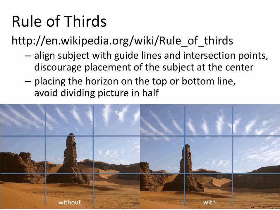
Rule of Thirdshttp://en.wikipedia.org/wiki/Rule_of_thirds
– align subject with guide lines and intersection points,discourage placement of the subject at the center
– placing the horizon on the top or bottom line,avoid dividing picture in half
without with

Today
• “Good” Design (30 min)
– Photography tips
– Principles of Effective Website Design
– Principles of Good User Interface Design
– Examples of Good (Bad) Visualization Design
• Today’s Readings (30 min)
• Worksheet: Time-based Data & Simple Charts (20 min)
• Graph Drawing Preview: Terminology & Goals (15 min)
• Readings for Tuesday: Graph Drawing

Principles of Effective Website Design
• Guiding the eye (position, color, contrast, size, design elements)
• Spacing, padding, white/empty space, reduce cognitive load
• Navigation/orientation
• Typography (font, size, color, paragraphs)
• Usability/standards/conventions, be obvious, “Don’t make users think”
• Consistency
• Alignment, polished, simplicity
• Effective writing
• Clarity, sharpness, contrast, exaggeration
http://psd.tutsplus.com/tutorials/designing-tutorials/9-essential-principles-for-good-web-design/http://uxdesign.smashingmagazine.com/2008/01/31/10-principles-of-effective-web-design/

Principles of Good User Interface Design
• Consistency and standards– Match real world: words, phrases and concepts familiar to the user,
real-world conventions, natural and logical order, coherency• Flexibility and efficiency of use: cater/tailor to both inexperienced and experienced users
– Know your user, user testing, listen to the user• User control and freedom: a clearly marked "emergency exit" to leave the unwanted,
support undo and redo• Aesthetic and minimalist design: every extra unit of information competes with
and diminishes visibility of relevant information– System status: keep users informed
• Recognize, diagnose, and recover from errors– Error prevention: good error messages, eliminate error-prone conditions,
confirmation option• Help and documentation
– Recognition rather than recall: information/instructions should be visible or easily retrievable
http://www.sylvantech.com/~talin/projects/ui_design.html
http://www.useit.com/papers/heuristic/heuristic_list.html

Today
• “Good” Design (30 min)
– Photography tips
– Principles of Effective Website Design
– Principles of Good User Interface Design
– Examples of Good (Bad) Visualization Design
• Today’s Reading (30 min): “Useful Junk? The Effects of Visual Embellishment on Comprehension and Memorability of Charts”
• Worksheet: Time-based Data & Simple Charts (20 min)
• Graph Drawing Preview: Terminology & Goals (15 min)
• Readings for Tuesday: Graph Drawing

Worst pie chart ever?

Excellent use-case For on-chart imagery

Unbiased reportingGood data-ink ratio

Over-simplication?Manipulative visualization?
Confusing / unneccessary colors/gradient

Simple, intuitive, effectiveEducational for all ages

http://cahaber.me/#/basketball Compare players within teamCompare players on different teams
Different team choices/strategies

Effective non-pie shaped pie chart!
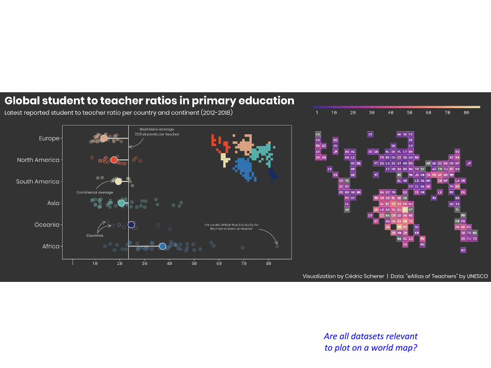
Are all datasets relevant to plot on a world map?

Allows us to clearly see significant variations in distributions of riversAND use (overuse?) of technology to control nature

http://www3.gehealthcare.com/en/Products/Categories/Healthcare_IT/Quality_Management#tabs/tab1900328377C74CAC8AD7E8D4A2072591
Stereotypical Infographic

https://cdn1.sph.harvard.edu/wp-content/uploads/sites/30/2012/09/HEPJan2015.jpg
Vast improvement on original food pyramid
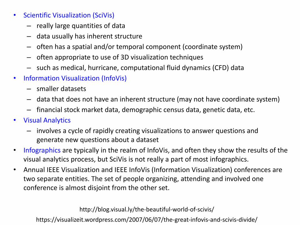
• Scientific Visualization (SciVis)
– really large quantities of data
– data usually has inherent structure
– often has a spatial and/or temporal component (coordinate system)
– often appropriate to use of 3D visualization techniques
– such as medical, hurricane, computational fluid dynamics (CFD) data
• Information Visualization (InfoVis)
– smaller datasets
– data that does not have an inherent structure (may not have coordinate system)
– financial stock market data, demographic census data, genetic data, etc.
• Visual Analytics
– involves a cycle of rapidly creating visualizations to answer questions and generate new questions about a dataset
• Infographics are typically in the realm of InfoVis, and often they show the results of the visual analytics process, but SciVis is not really a part of most infographics.
• Annual IEEE Visualization and IEEE InfoVis (Information Visualization) conferences are two separate entities. The set of people organizing, attending and involved one conference is almost disjoint from the other set.
http://blog.visual.ly/the-beautiful-world-of-scivis/
https://visualizeit.wordpress.com/2007/06/07/the-great-infovis-and-scivis-divide/

An Interactive Visualization!(interactive data collection)

Visualization Challenge: very large datasets

https://xkcd.com/radiation/
Visualization Challenge: representing different scales
http://www.ptable.com/
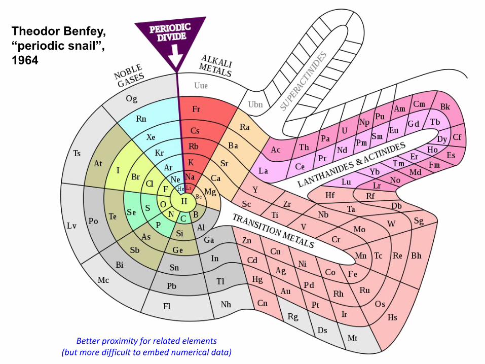
Theodor Benfey,“periodic snail”, 1964
Better proximity for related elements(but more difficult to embed numerical data)


Figurative Map of the successive losses in men of the French Army in the Russian campaign 1812-1813.
Charles Joseph Minard, 1869.
The numbers of men present are represented by the widths of the colored zones at a rate of one millimeter for every ten thousand men;
they are further written across the zones. The red designates the men who enter Russia, the black those who leave it. — The information
which has served to draw up the map has been extracted from the works of M.M. Thiers, de Ségur, de Fezensac, de Chambray and the
unpublished diary of Jacob, the pharmacist of the Army since October 28th.
In order to better judge with the eye the diminution of the army, I have assumed that the troops of Prince Jérôme and of Marshal Davout,
who had been detached at Minsk and Mogilev and have rejoined near Orsha and Vitebsk, had always marched with the army.
Edward Tufte says it "may well be the best statistical graphic ever drawn"

http://imgs.xkcd.com/comics/movie_narrative_charts_large.png

Today
• “Good” Design (30 min)
• Today’s Readings:
– How To
– “Eenie, Meenie, Minie, Moe: Selecting the Right Graph for Your Message”, Stephen Few, Intelligent Enterprise, 2004”
– “Useful Junk? The Effects of Visual Embellishment on Comprehension and Memorability of Charts”
• Worksheet: Time-based Data & Simple Charts (20 min)
• Graph Drawing Preview: Terminology & Goals (15 min)
• Readings for Tuesday: Graph Drawing

"Eenie, Meenie, Minie, Moe: Selecting the Right Graph for Your Message”, Stephen Few, Intelligent Enterprise, 2004
• Learn conventions/patterns, applies to almost all business data (not necessarily all scientific data)
• Avoid viewer confusion / mis-information• Definition: Categorical vs. quantitative• Definition: Nominal (order free),
ordinal (ordered), interval (e.g. histogram)• Available visual attributes for encoding data:
location, size, shape, orientation, colorchoose wisely!!

"Eenie, Meenie, Minie, Moe: Selecting the
Right Graph for Your Message”, Stephen Few,
Intelligent Enterprise,
2004
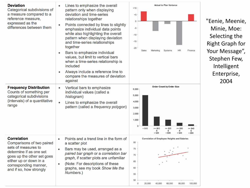
"Eenie, Meenie, Minie, Moe: Selecting the
Right Graph for Your Message”, Stephen Few,
Intelligent Enterprise,
2004

Reading for Today
• “Useful Junk? The Effects of Visual Embellishment on Comprehension and Memorability of Charts” Bateman et al., CHI 2010.
• Article discussed here:http://eagereyes.org/criticism/chart-junk-considered-useful-after-all
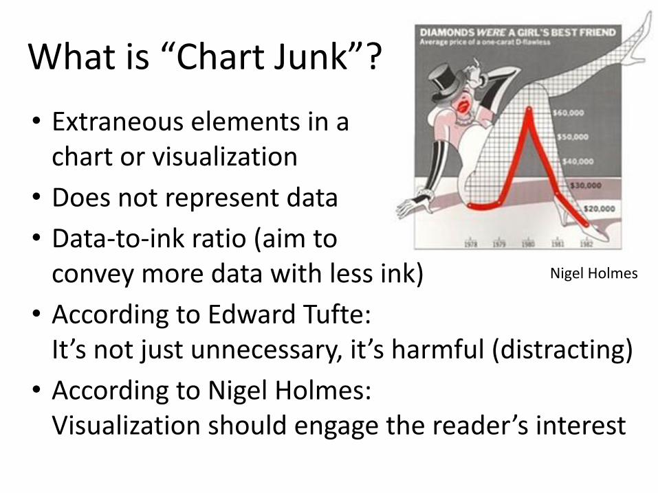
What is “Chart Junk”?
• Extraneous elements in a chart or visualization
• Does not represent data
• Data-to-ink ratio (aim to convey more data with less ink)
• According to Edward Tufte: It’s not just unnecessary, it’s harmful (distracting)
• According to Nigel Holmes: Visualization should engage the reader’s interest
Nigel Holmes

Study Design• Compare embellished charts to plain ones• Measured:
– interpretation accuracy was no worse for embellished charts
– long-term recall (2-3 weeks later)was better for embellished charts,topic & details of the chart were more memorable
• Prior work:– Higher data-to-ink ➔ faster response & greater accuracy
[Gilan & Richman]– Other work shows a somewhat weak correlation between
data-to-ink and interpretability or aesthetics • Author’s caution:
– Not an endorsement of chart junk– Embellishments can lead to bias!
“Useful Junk? The Effects of Visual Embellishment on Comprehension and Memorability of Charts” Bateman, Mandryk, Gutwin, Genest, McDine, & Brooks, CHI 2010

• Relatively small sample pool– 10 tested with ~5 min recall– 10 tested with 2-3 week recall
• Found no difference in time to read & describe embellished vs. non-embellished
• Participants preferred the embellished charts and found them more attractive
eye tracker
data
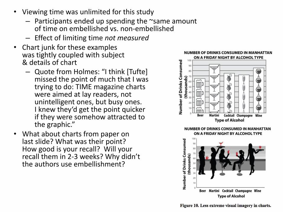
• Viewing time was unlimited for this study– Participants ended up spending the ~same amount
of time on embellished vs. non-embellished– Effect of limiting time not measured
• Chart junk for these examples was tightly coupled with subject & details of chart– Quote from Holmes: “I think [Tufte]
missed the point of much that I was trying to do: TIME magazine charts were aimed at lay readers, not unintelligent ones, but busy ones. I knew they‘d get the point quicker if they were somehow attracted to the graphic.”
• What about charts from paper on last slide? What was their point? How good is your recall? Will your recall them in 2-3 weeks? Why didn’t the authors use embellishment?

http://nigelholmes.com/graphic/data-dump/

Homework Assignment 2: Time-Based Datasets
• Team of 2 or 3• Obtain an interesting time-based dataset
– Should be collectable* from online sources, and– Require a modest effort to prepare*
* = you’ll submit your scripts/code to document• Use Excel or Google Sheets
– Create a variety (one of each?!) of the charts following the guidelines from "Eenie, Meenie, Minie, Moe: Selecting the Right Graph for Your Message”
– Excellent labels and captions for each.• Upload your assignment to Submitty by 11:59pm on
Thursday. And post one of the images on the forum...

Pair Worksheet (~20 minutes)
• Meet new people– Work with someone you did not know
before this class– Work with a different partner every time
• 1 worksheet per team of 3– Sketch & brainstorm on the page– Submit on Submitty
• Use color! Be creative!

Tools for scraping data from the web
• copy-paste• wget• grep / sed / awk / sort / uniq• Favorite programming language to parse/strip out
unnecessary html formatting• Save as .csv (comma separated value) files to upload to
Excel / Google Sheets• Python has lots of packages for parsing (e.g., json format)• Selenium for automated browsing of websites

Today
• “Good” Design (30 min)
– Photography tips
– Principles of Effective Website Design
– Principles of Good User Interface Design
– Examples of Good (Bad) Visualization Design
• Today’s Reading (30 min): “Useful Junk? The Effects of Visual Embellishment on Comprehension and Memorability of Charts”
• Worksheet: Time-based Data & Simple Charts (20 min)
• Graph Drawing Preview: Terminology & Goals (15 min)
• Readings for Tuesday: Graph Drawing

Justin J. (from Spring ‘12)

Graph Terminology I
• Directed / Undirected Edges• Tree (no cycles) vs. Graph (cycles allowed)
– Cycle: A path along edges through the graph where only starting & ending vertices are repeated.
– Walk: A sequence of vertices and edges• closed walk, simple cycle, directed cycle,
…• Valence (a.k.a. Degree) of a Vertex:
# of edges incident on the vertex• Regular: Each vertex has same valence,
a 3-regular graph is also called cubic

IOGraphica http://iographica.com

Graph Terminology II
• Polygon: 2D flat or on a sphere, with straight or great circle edges
• Polyhedron: 3D solid formed by flat faces• Polytope: flat sides in any dimension
• Bipartite: vertices can be split into two groups, A & B. No edge connects a vertex in A to another vertex in A. Same for B.
• Clique – subset of vertices in an undirected graph with an edge connecting every pair of vertices in the subset.

Stefaner, Moritz. "Citation Patterns." Wellformed Eigenfactor. N.p., 2008. Web.

Graph Terminology III
• Upward Drawing (of a tree) – no child is drawn with vertically above (higher y value than) its parent.
• Plane Graph – A 2D drawing of the graph where no edges cross (touching at the endpoint vertices they share is ok)
• Planar Graph – A graph for which a Plane Graph exists.
• Euler’s Theorem for planar graphs: For a plane graph with n vertices, m edges and f faces, we have n − m + f = 2.

Benjamin B. (from Spring ‘12)
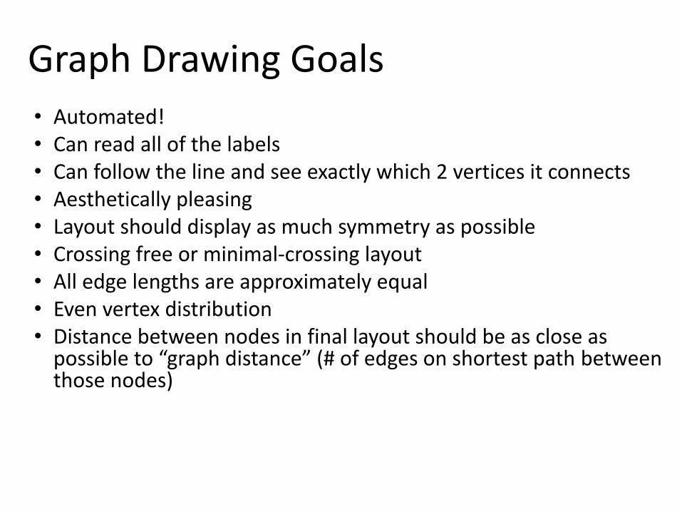
Graph Drawing Goals• Automated!• Can read all of the labels• Can follow the line and see exactly which 2 vertices it connects• Aesthetically pleasing• Layout should display as much symmetry as possible• Crossing free or minimal-crossing layout• All edge lengths are approximately equal• Even vertex distribution• Distance between nodes in final layout should be as close as
possible to “graph distance” (# of edges on shortest path between those nodes)

• Animal graph picture!

Graph Drawing Questions
• What is the metric of success for each of our goals?• Can we guarantee to find a solution? The optimal or
best solution?• Can we use randomness? Does it help?• How expensive/slow are the different algorithms to
draw graphs? • How does it scale with more nodes/edges?
– Does it lose effectiveness in meeting our goals?– How is the running time affected?
• How do we label the nodes/edges with color/words/images?

Today
• “Good” Design (30 min)
– Photography tips
– Principles of Effective Website Design
– Principles of Good User Interface Design
– Examples of Good (Bad) Visualization Design
• Today’s Reading (30 min): “Useful Junk? The Effects of Visual Embellishment on Comprehension and Memorability of Charts”
• Worksheet: Time-based Data & Simple Charts (20 min)
• Graph Drawing Preview: Terminology & Goals (15 min)
• Readings for Tuesday: Graph Drawing

Reading for Tuesday (pick one)
“Improved force-directed layouts”, Gansner and North, Graph Drawing, 1999.

Reading for Tuesday (pick one)
“A Technique for Drawing Directed Graphs” Gansner, Koutsofios, North, & Vo, IEEE Trans. on Software Engineering, 1993.