midterm arch 2011 fall
DESCRIPTION
my midterm!TRANSCRIPT

ARCH 101: Architectural Design Studio I - Midterm
Section 002: CRN 2: 73879 / Fall 2011 Instructor Jerry W. Lum
Peter Middleton

Iterations 1 + 2
A few days after this exercise was assigned I was showing some friends from out of town one of the many views of the city. A short walk from my
house in the upper Haight is Randall Museum @ Corona Heights Park. It is the furthest east of the rock formations making up Twin Peaks. As the late August fog rolled over the edge of the bowl which makes up twin peaks, it
softened but the most extreme angles which cut through the fog.
My initial desire was to recreate these ridges and the massive over hanging ominous bodies. The clay allowed me to explore quickly and continually
change the shapes but would not allow the light volumes I wished to achieve
Through working with the wire I struggled immensely with a with a very high metal memory and low ductility. The black ended up being much more
dominant then I intended as well. The high strength wire allowed me to build a sturdy base easily but with held me from assembling my “ominous body” in
a way I wanted to.
Lessons learned:Buy lots more wire of many different varieties, work much sooner and faster,
quit worrying about mistakes as much, Patience. Keep pushing.

Iteration 3
This was Another piece that I was very happy with while working on but became very distraught after finishing. I ran into opposite problems with these new wires. My new larger, what I thought
structural wire, was far too soft + lacking enough memory to act as my base/mast. The smaller copper wire that I weaved through the
waxed paper was also not strong enough to control the paper.
I continued to attempt to push through these problems. I did not feel that that I was dominating enough will over my materials but
also that I did not have the ability to at this stage of the iteration. My major failure’s here outside of not spending enough time on the
construction through time wasted with failures and annoying wire, was that I only worked on it up close and personal. I never stood back to look at it from a distance. I still stand by that I think it is an elegant interesting shape, the problem is you can only view it as
such if you are under neath of it. Do not forget how people will be viewing your piece!
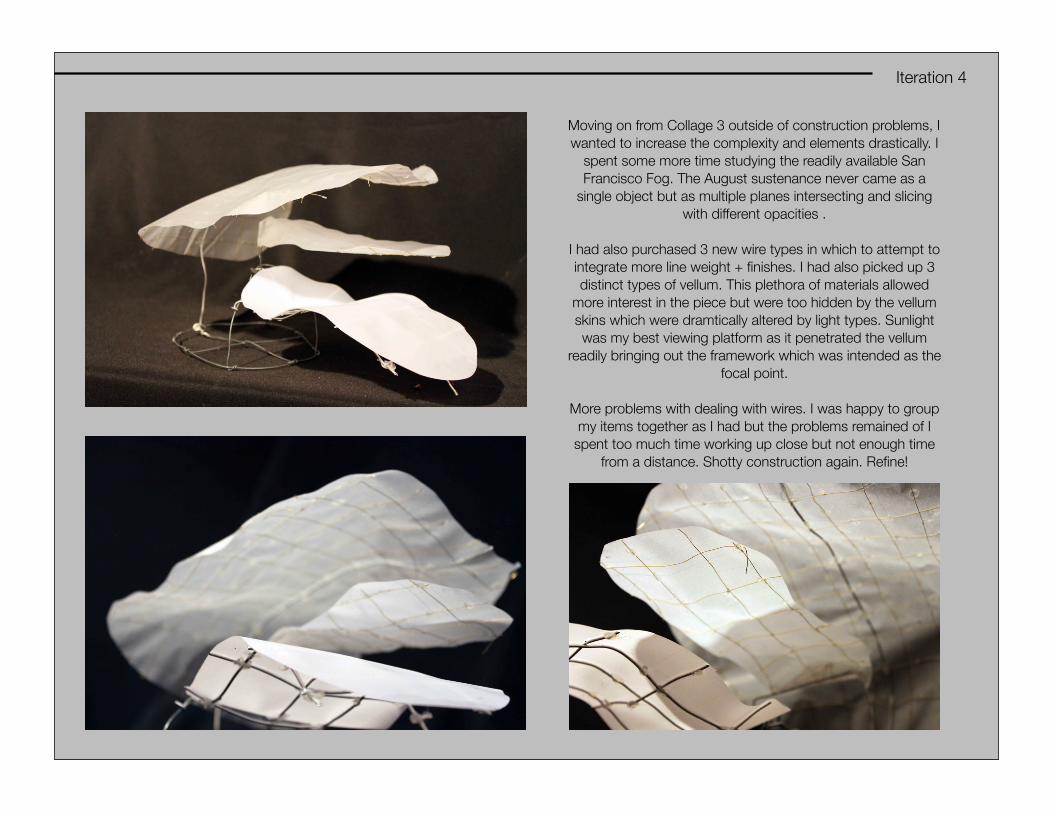
Iteration 4
Moving on from Collage 3 outside of construction problems, I wanted to increase the complexity and elements drastically. I
spent some more time studying the readily available San Francisco Fog. The August sustenance never came as a
single object but as multiple planes intersecting and slicing with different opacities .
I had also purchased 3 new wire types in which to attempt to integrate more line weight + finishes. I had also picked up 3 distinct types of vellum. This plethora of materials allowed
more interest in the piece but were too hidden by the vellum skins which were dramtically altered by light types. Sunlight was my best viewing platform as it penetrated the vellum
readily bringing out the framework which was intended as the focal point.
More problems with dealing with wires. I was happy to group my items together as I had but the problems remained of I
spent too much time working up close but not enough time from a distance. Shotty construction again. Refine!

Iteration 5
Iteration 5 was a direct response to the lack of volume created in iteration 4. I wanted them to play with each other more and to fold over each other in dramatic fashion creating intimate interesting spaces. Problems arose when viewed from the front, the piece
became boring. The vellum’s I had chosen to use for my skins were too thick and did not allow the interior frame to be viewed from the front. Again, I had not demonstrated enough will over my materials and was left to deal with them how I may.
Good ways to improve this would be simply to add complexity and more transparency, more delicacy into the construction. Its failures at joints sucked a lot of energy out of the piece. How can you make delicate wire dominant things so structural? Why do you
insist on using full sheets of paper? Could smaller segmented pieces work? Viewed from the back I feel it is much more inviting bringing attention as intended but the massive boring shapes on the front wall hinder all movement. Not pretty enough in its
construction
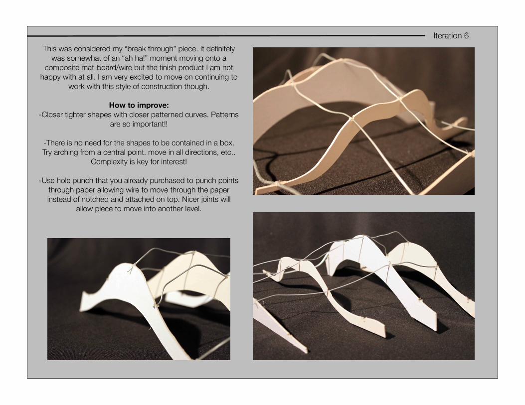
Iteration 6
This was considered my “break through” piece. It definitely was somewhat of an “ah ha!” moment moving onto a
composite mat-board/wire but the finish product I am not happy with at all. I am very excited to move on continuing to
work with this style of construction though.
How to improve:-Closer tighter shapes with closer patterned curves. Patterns
are so important!!
-There is no need for the shapes to be contained in a box. Try arching from a central point. move in all directions, etc..
Complexity is key for interest!
-Use hole punch that you already purchased to punch points through paper allowing wire to move through the paper instead of notched and attached on top. Nicer joints will
allow piece to move into another level.
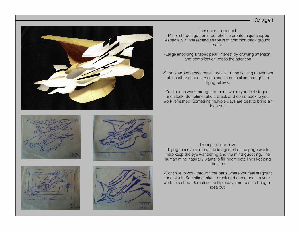
Collage 1
Lessons Learned-Minor shapes gather in bunches to create major shapes
especially if intersecting shape is of common back ground color.
-Large imposing shapes peak interest by drawing attention, and complication keeps the attention
-Short sharp objects create “breaks” in the flowing movement of the other shapes. Also since seem to slice through the
flying pillows.
-Continue to work through the parts where you feel stagnant and stuck. Sometime take a break and come back to your
work refreshed. Sometime multiple days are best to bring an idea out.
Things to improve-Trying to move some of the images off of the page would help keep the eye wandering and the mind guessing. The human mind naturally wants to fill incomplete lines keeping
attention.
-Continue to work through the parts where you feel stagnant and stuck. Sometime take a break and come back to your
work refreshed. Sometime multiple days are best to bring an idea out.

Collage 2
Use patterns and deconstruction of individual sections to bring attention to those areas. Keep the deconstruction flowing and moving all over the page! Make sure the
deconstruction is intentional for that specific section as this will become one of the focal points of the composition.
Small similar shapes grouped can create movement, use this to your advantage. Try and set an internal ratio of contrast parts. If you start to over do it with too equal of
contrast parts ex. 50% BLK 50% WHT it will mess with the visual balance of the piece making it heavy in certain directions and creating odd shapes. Every piece you lay
matters! Pay close attention.
How to Improve:Move piece off of frame. There is zero reason why the entire piece needs to be seen. This actually makes the piece boring by allowing all of it to be seen with no wondering
of “what goes on over there”. Remember, you are no longer working in IDS and you are not just trying to explain how light works on the objects.
work in more patterns breaking down parts more methodically. Deconstruct in specific patterns that relate to the patterns of the shape. Maybe try random deconstructions. Squares morphing into circles. Challenge people to look at specific areas by doing
unexpected things. Do not be predictable!
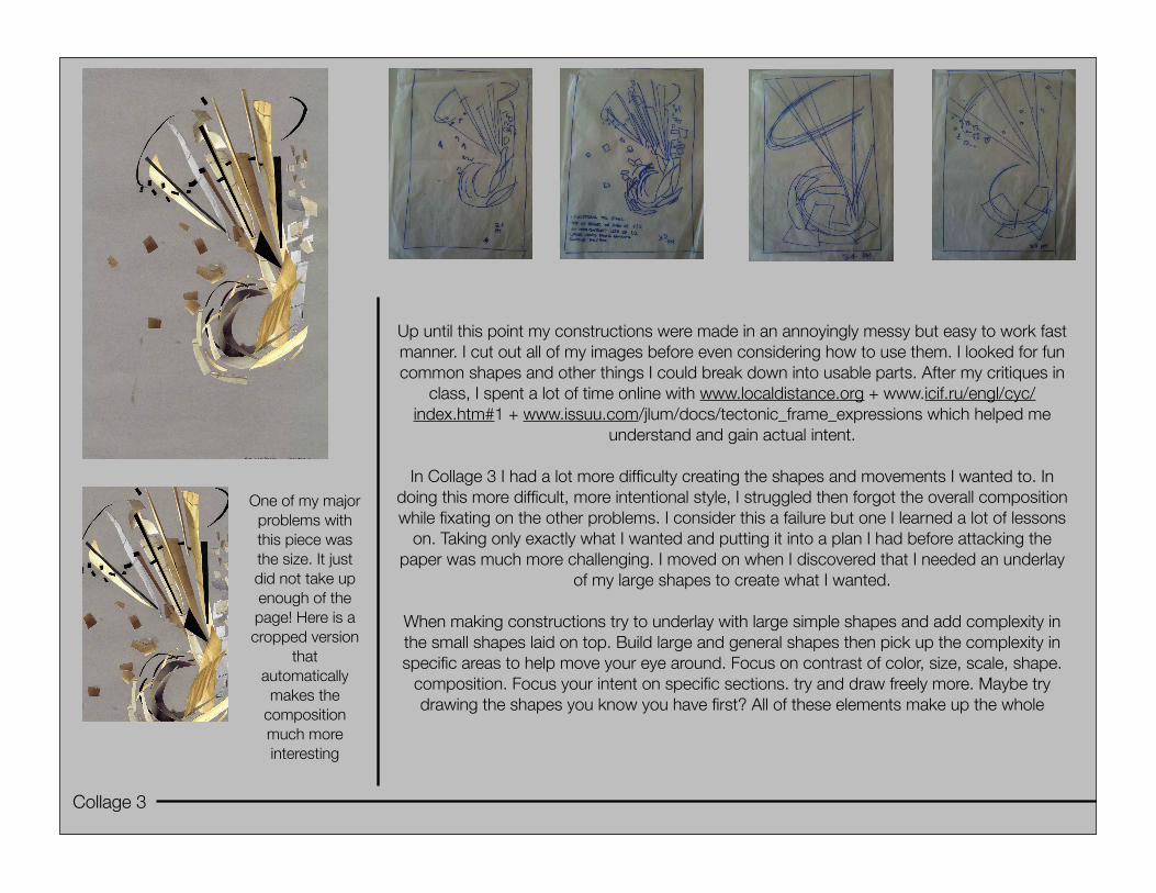
Collage 3
Up until this point my constructions were made in an annoyingly messy but easy to work fast manner. I cut out all of my images before even considering how to use them. I looked for fun common shapes and other things I could break down into usable parts. After my critiques in
class, I spent a lot of time online with www.localdistance.org + www.icif.ru/engl/cyc/index.htm#1 + www.issuu.com/jlum/docs/tectonic_frame_expressions which helped me
understand and gain actual intent.
In Collage 3 I had a lot more difficulty creating the shapes and movements I wanted to. In doing this more difficult, more intentional style, I struggled then forgot the overall composition while fixating on the other problems. I consider this a failure but one I learned a lot of lessons
on. Taking only exactly what I wanted and putting it into a plan I had before attacking the paper was much more challenging. I moved on when I discovered that I needed an underlay
of my large shapes to create what I wanted.
When making constructions try to underlay with large simple shapes and add complexity in the small shapes laid on top. Build large and general shapes then pick up the complexity in specific areas to help move your eye around. Focus on contrast of color, size, scale, shape.
composition. Focus your intent on specific sections. try and draw freely more. Maybe try drawing the shapes you know you have first? All of these elements make up the whole
One of my major problems with this piece was the size. It just did not take up enough of the page! Here is a cropped version
that automatically
makes the composition much more interesting

Collage 4
While well received I still am struggling with this piece. The more I look at I enjoy it more but I remain frustrated. I think I remain disappointed as it is not necessarily where I wanted it
to go. I tried a hybrid construction between the style in Collage 1, Collage 2, + Collage 3. Some shapes were cut out arbitrarily as in 1 + 2 but others were done with pure intent as
in Collage 3. This juxtaposition is a much better move in concentration from all Collage’s but I am not quite at the point of complete control. While it feels mine Some of the shapes
were naturally found. It was much more nice to do the work as I attempted to organize
Working with the white background was as challenging as I initially expected which is why I forced myself to use it. One
major component missing compared to the other Collages are the background color matching, short sharp shapes that
penetrate and cut through the piece. An example of these are the equivalent described black shapes in Collage 1. These pieces break up and ground the shape to the foreground
incredibly strongly. Use this technique again!

Play!
Far left: The larger sketch on the far left are shapes and
movements taken from all of my iterations but with a push in the “off the page” composition.
Top right and bottom right:While in class discussing
trace the urge to see some of the other shapes people
were having emerge in their collages emerged. I snagged two quickly and did my work which I was happy to see. I enjoyed playing on top of
someone else’s line weights and curves for a change of pace. The directions these students were able to pull shapes around the page compared to mine were much sharper and less
cluttered.

Play!...2
Top right and bottom right: Quick studies for shape identification and
ideation.
Far left: sketch is a study to help
understand shapes found in that object and its construction which I hope to tie back into
my constructions.