mock ups and finals
TRANSCRIPT

How My Mock Ups Differ From My Final
ProductsPoster, Trailer & Magazine

Poster

Poster● One of the main changes is that I had originally
planned to have one main image on my poster whereas on my final one I used two main images divided by a blood stain. This was to add more visuals to the poster as so that the characters images could match up with their names displayed on the header.

Poster● The second major difference is that the tagline and the
statement “from the directors of…” have been switched around. I did this as I thought by mentioning who the directors are is a key selling point, especially for the fans of the film they had previously directed. It also seemed right that the strapline flowed directly underneath the title of the film to add suspense and almost a sense of fear.
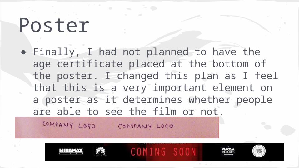
Poster● Finally, I had not planned to have the age
certificate placed at the bottom of the poster. I changed this plan as I feel that this is a very important element on a poster as it determines whether people are able to see the film or not.

Magazine

Magazine● The most visible change that I have made is that the line of four
images that I planned to be underneath the main image near the top of the cover is now overlapping the image closer to the footer. I did this as by being at the top, it may have taken attention off of the main image and removed the sense of fear that the main image gives the magazine. It was also meant to be in the form of a negative strip but I felt this was too much detail for a simplistic cover like this one.
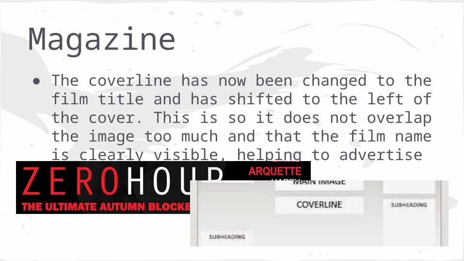
Magazine● The coverline has now been changed to the film
title and has shifted to the left of the cover. This is so it does not overlap the image too much and that the film name is clearly visible, helping to advertise it.
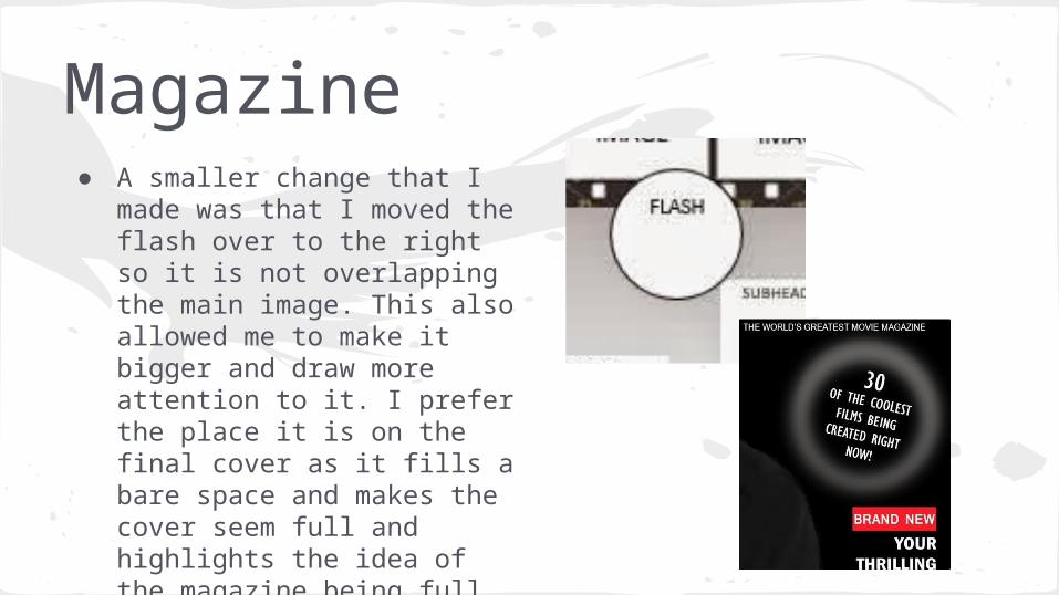
Magazine● A smaller change that I made
was that I moved the flash over to the right so it is not overlapping the main image. This also allowed me to make it bigger and draw more attention to it. I prefer the place it is on the final cover as it fills a bare space and makes the cover seem full and highlights the idea of the magazine being full of information.

Trailer

Trailer● Before I created my trailer I created a hand
drawn story board to show the order of my shots and what I wanted the full trailer to look like. Although not a major change, one of the most noticeable is the fact that I originally planned to do an extreme close up of the main character locking the front door. Although I did film this shot, I left it out as I felt it confused the trailer and made it seem out of sequence. The brightness of the shot being filmed indoors also clashed with the dark, outside light.

Trailer● In my story board, I did not plan to
insert the company logos at the beginning of the trailer. When pulling all of my shots together in Premiere, I realised how important these were as they credit the producers and directors and also make the trailer and full film seem much more professional.

Trailer● I also didn’t plan for as many fades that I
actually used. Initially, I didn’t feel that the fades were going to be as effective as they actually were and when it came to producing my trailer I realised this. After production it is clear that fades are very important within thriller trailers as it adds to the drama and tension, making us want to know more. They also highlight the passing of time which is important in a trailer as the clips are from different scenes in the film.