modern web design - cloud object storage | store ... fluid, adaptive, responsive, what's the...
TRANSCRIPT

Lesson 4
Modern Web Design
Presented by:
Bryan Hurley Web Design Educator
Diploma in Web Design – Part I
Lesson 3 Summary
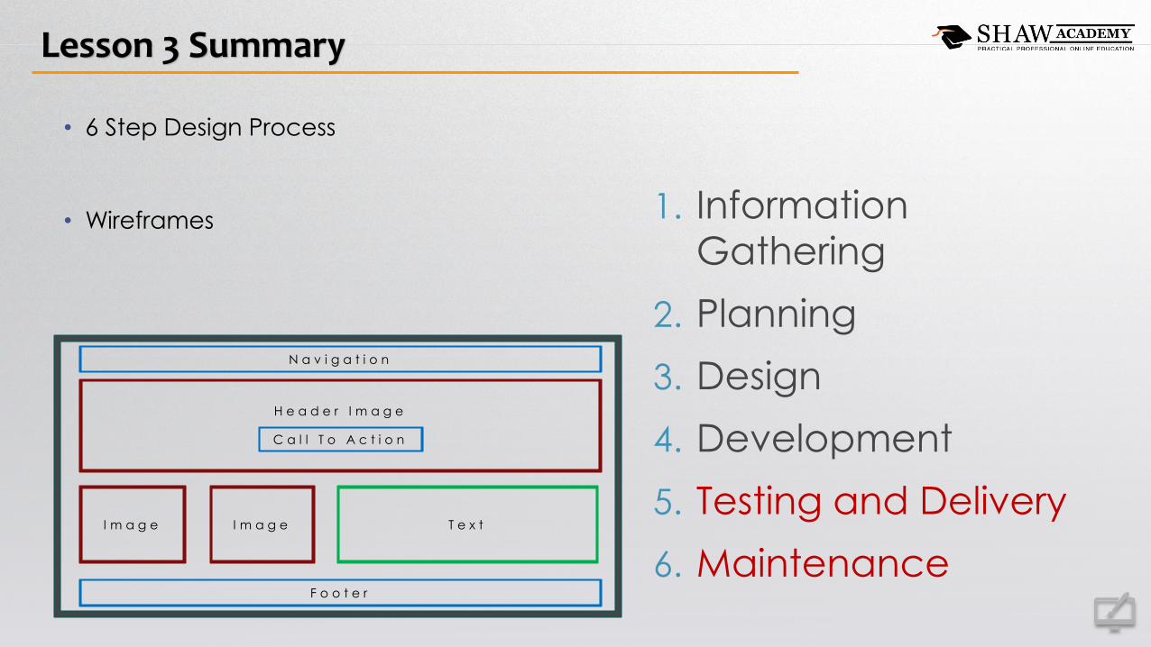
• 6 Step Design Process
• Wireframes 1. Information
Gathering
2. Planning
3. Design
4. Development
5. Testing and Delivery
6. Maintenance
N a v i g a t i o n
H e a d e r I m a g e
I m a g e I m a g e T e x t
C a l l T o A c t i o n
F o o t e r

Lesson 3 Summary
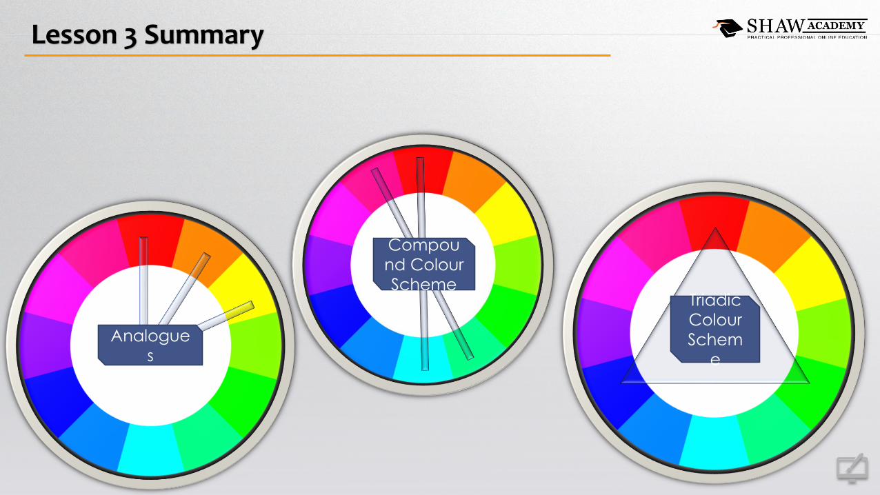
Lesson 3 Summary
Triadic
Colour
Schem
e
Compou
nd Colour
Scheme
Analogue
s
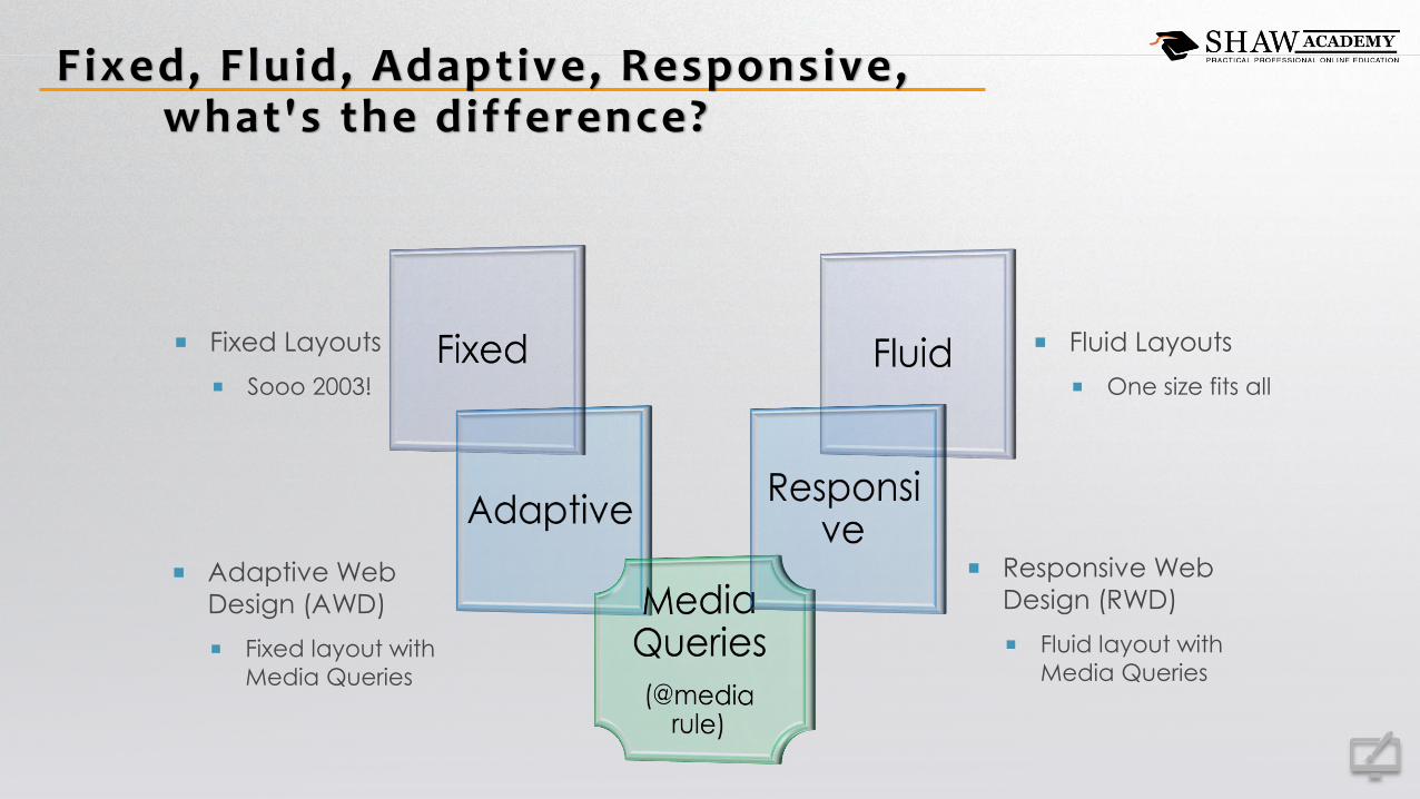
Fixed, Fluid, Adaptive, Responsive,what's the difference?
Fluid Layouts
One size fits all
Adaptive Web
Design (AWD)
Fixed layout with
Media Queries
Fixed Layouts
Sooo 2003!
Responsive Web
Design (RWD)
Fluid layout with
Media Queries

Fixed Layouts ,Sooo 2003!
• Fixed Width’s and Heights
• Websites designed to fit to a width
between 800px to 900px.
• They were simpler times.
1000px
800px
800px
400px 400px
100%
80%
80%
40% 40%
1000px
800px
800px
400px 400px
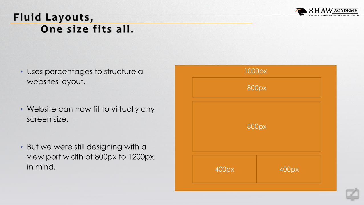
Fluid Layouts ,One s ize f i ts a l l .
• Uses percentages to structure a
websites layout.
• Website can now fit to virtually any
screen size.
• But we were still designing with a
view port width of 800px to 1200px
in mind.
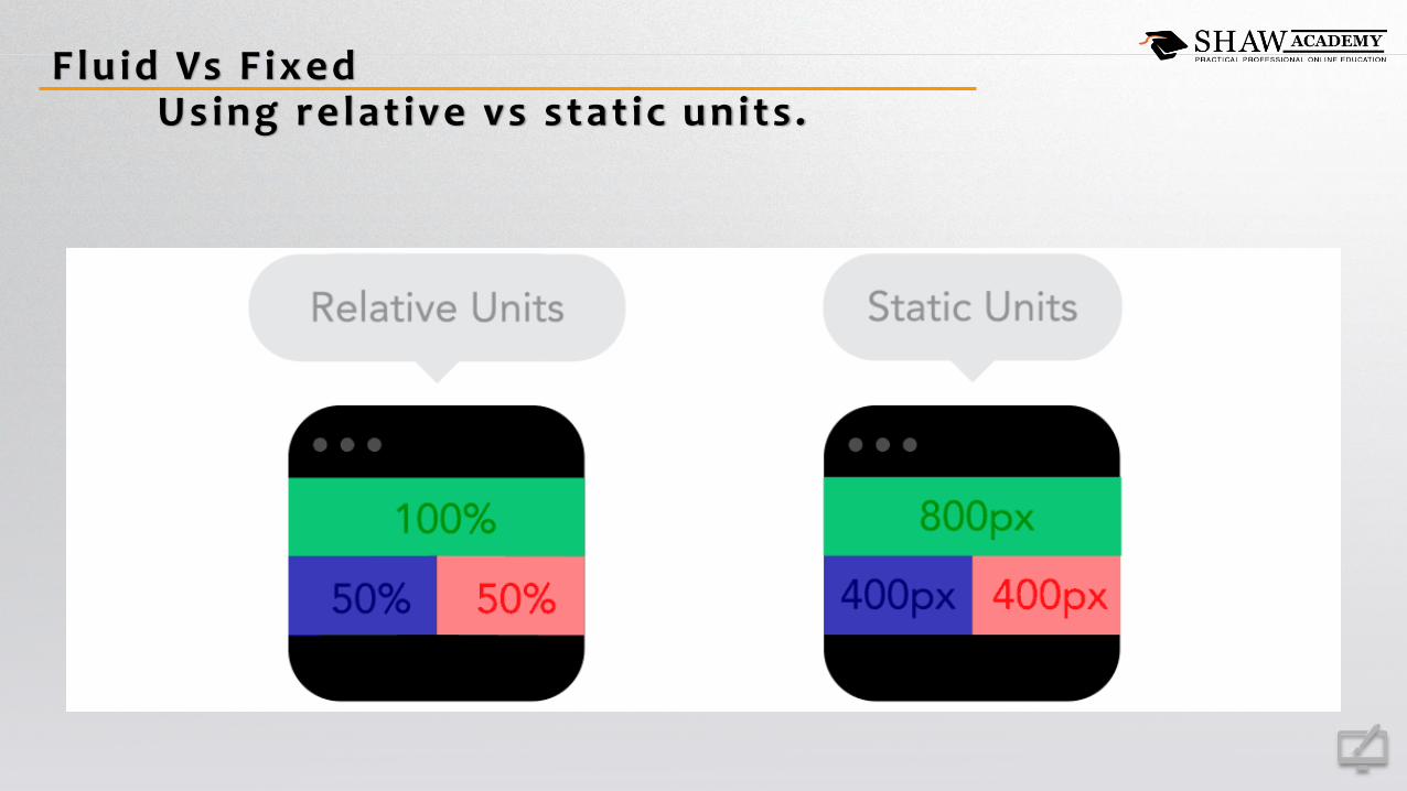
Fluid Vs F ixedUsing relat ive vs stat ic units .

Adaptive Web Design,F ixed layouts with media queries .
• Uses media queries to check screen size and applies fixed layouts to adapt to the screen.
• Gives the designer more control over the end result of the design.
• When done well; sites load times can be faster, but the development will take longer.
• Adaptive design is not really future proof.
1000px
800px
800px
400px 400px
600px
480px
480px
480px
480px

Responsive Web Design,F luid layout with media queries .
• Uses media queries to check screen size
and applies fluid layouts to adapt to the
screen.
• Google recommends a RWD approach
to web development.
• Responsive Design is future proof.
100%
80%
80%
40% 40%
100%
100%
100%
50% 50%
100%
100%
100%
100%
100%

Responsive Vs AdaptiveMedia Queries + (F luid or F ixed)
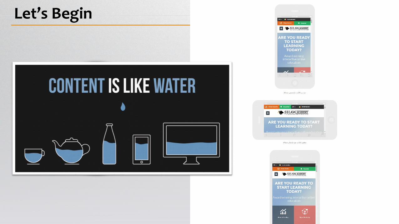
Let’s Begin

Media Queries ,Q u e r y m e t h i s , t h e n s t y l e i t t h a t .
The @media rule is used to define
different style rules for different media
types and devices.
Media Types are: All, Screen, Print, and/or
Speech.
There are loads of Media Features like
screen size, orientation, resolution, colour
capibilities, etc.…

Media Queries ,Q u e r y m e t h i s , t h e n s t y l e i t t h a t .
@media not|only mediatype and (media feature ) {
CSS-Code ;
}
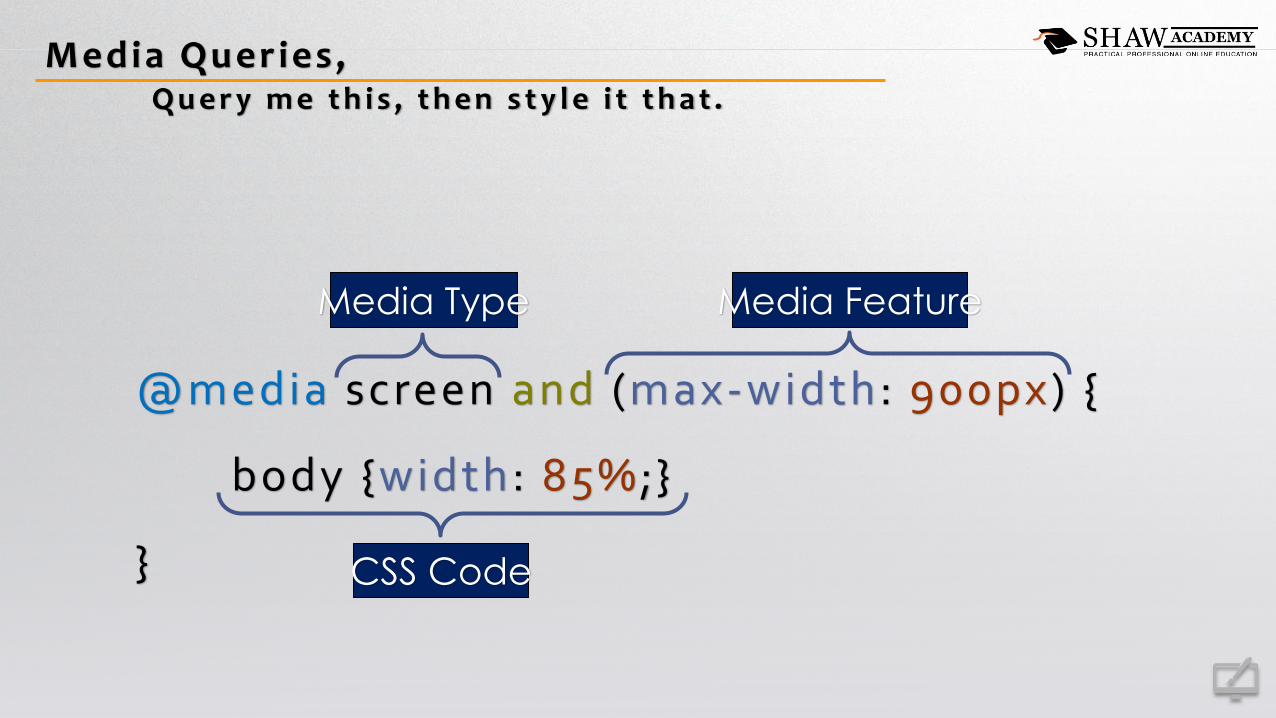
Media Queries ,Q u e r y m e t h i s , t h e n s t y l e i t t h a t .
@media screen and (max-width: 900px) {
body {width: 85%;}
} CSS Code
Media Type Media Feature
Progress ive Enhancement VS Graceful Degradat ion
• Progressive Enhancement
• Developing from a basic level of user experience that all browsers are able to provide.
• You then add in advanced functionally that becomes available to browsers that can
use it, i.e. progressively enhance the UX.
• Graceful Degradation
• Developing from a level of user experience that only modern browsers can implement
• You then add in fixes to degrade gracefully the user experience in older browsers.
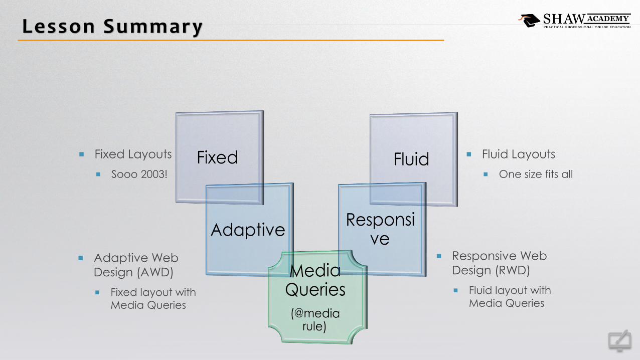
Lesson Summary
Fluid Layouts
One size fits all
Adaptive Web
Design (AWD)
Fixed layout with
Media Queries
Fixed Layouts
Sooo 2003!
Responsive Web
Design (RWD)
Fluid layout with
Media Queries