moodle report
TRANSCRIPT
Moodle re-design report Br ief : Undertake a re-design of the current Blackburn Col lege/Univers ity intranet service – Moodle. Do so specif ical ly from a student user perspect ive (for now), tak ing certa in key factors into account – the exist ing problems that are faced by students us ing Moodle, from a funct ional i ty and aesthet ic perspect ive, a longside improving the service with regards to usabi l i ty and modernity in general . I want to create a new surge of excitement and enthusiasm with the re-vamp of moodle, a l lowing users to want to feel involved and proud of the interact iv i ty and usage of their new-look Moodle. Research: In terms of researching relevant mater ia l to successful ly a id the re-vamp, I looked into Jesse James Garrett ’s e lements of user exper ience (specif ical ly the 5-t ier model ‘skeleton’ of web design) , a longside Jakob Nie lsen’s breadth of informat ion on usabi l i ty . I a lso looked into web design trends – general aesthet ic trends and the evolut ion of interface design over the last few years (e .g. f lat design, min imal ism, paral lax etc. ) . Another aspect I d ivulged in was the most used websites by the student demographic , across the U.K (e .g . Facebook, Instagram, Amazon, Tumblr etc . ) , contemplat ing and incorporat ing the factors that are enjoyed by many on these s ites – that they choose to v is i t out of choice, not by being obl iged to. However, the most important area of research was the direct feedback from students - oral feedback, but pr imar i ly quest ionnaire responses. Design content : I have created visual mock-ups to give a feel of what the overal l descr ibed aesthet ic would look l ike, as wel l as to descr ibe certa in detai ls v isual ly . However, the major i ty of the proposed changes wi l l be detai led in a wr itten format v ia th is report , and i f the proposed re-vamp is to take place in accordance with th is proposal , and thus further v isuals need to be created for, I would be wi l l ing to comply. Proposed elements of the re-vamp: In terms of a l l the changes proposed, they wi l l inc lude addit ions, delet ions and improvements of the current Moodle. Everything proposed is a ided by the intent ion of keeping the users in mind, and creat ing added ease to the compulsory and addit ional funct ions that Moodle should essent ia l ly provide. Some of th is wi l l inc lude technical specif ics , which would be undertaken by web-design professionals .

Aesthet ics From analys ing the quest ionnaire results , I decided to g ive Moodle a radical aesthet ic transformat ion as there was s ignif icant negat iv i ty surrounding the c luttered (47% said needs to look less c luttered) and mundane look. (50% said one of Moodle’s worst aspects was i ts look. ) I in i t ia l ly decided whether a change of logo would be relevant and decided in favour, as the current logo is synchronised with Moodle’s present theme, and an overhaul in l ine with the new simpl ic i ty and min imal ism intended was a key decis ion. As the logo is the heart of Moodle’s branding, I fe lt i t would v isual ly ref lect and re-invigorate user ’s v iews of the s ite . I decided on the font ‘Maven Pro’ ( font used to write th is report) , as not only is i t s imi lar to the Blackburn Col lege logo, but a lso personif ies the key qual i t ies I have previously ment ioned. I a lso stuck with ‘Basic t i t le font ’ for the logo’s strapl ine. I then contemplated whether I should use ‘Joe Hand 2’ for the ‘my’ in the logo, to v isual ise a largely customised and personal feel to the s ite .

I in i t ia l ly decided to keep the f i rst logo shown, as i t is min imal ist ic and showcases s impl ic i ty , and thus my visual mock-ups inc luded th is as the logo, however I recent ly changed to the last logo (above) , as the f inal choice, again, due to the personal ised aspect to i t . I consciously wanted to keep the font in b lack/white and considered i ts scalabi l i ty for the versat i le appl icabi l i ty of i t on a range of mediums (web, pr int , etc . ) . I completed th is re-design in order of use, natural ly a l luding to the homepage that users would f i rst encounter . I not iced from personal exper ience, and mainly the quest ionnaire results (predominant ly comments/answers regarding confusion and need to de-clutter) , that a) most of the l isted features of Moodle pre-login (emai l , l ibrary, etc . ) were present yet required a login from the user , and b) that students d id not want to use any excess mater ia l and just log in to access course-specif ic features. This a lso a ided the s imple and photographic look I wanted to achieve for the homepage; enthusing users with the fresh and excit ing ‘ f i rst impress ion’ .

The basic theme of a l l of my homepage mock-ups carr ies the fol lowing compulsory funct ions – the logo in i ts convent ional top-left p lace, funct ioning as a ‘back to homepage’ l ink (again, convent ional , and would serve as th is after login and throughout, as i t reconci les user fami l iar i ty with modern web convent ions) , addit ional pre-login l inks in the top-r ight – courses/s ite news) , and the central login feature, with a l ink to help with forgotten passwords. Upon inspect ion and analys is , these are the only used and needed elements to the login funct ion, and the l inks are al l that may be used before login – courses whether someone would l ike to v iew the course l ist (no log-in needed, stra ight to course l ist > module l ist . ) An addit ional point to bear in mind is the overal l use of lowercase typography (even on f i rst letters) to converge towards trends, but more important ly exempl i fy informal i ty and comfortabi l i ty . I have created 3 var iat ions of the homepage i tself . The f i rst is as shown above, with the photographic background of the col lege bui ld ing. Al l of the homepages have photographic content intended to be changed dai ly/weekly, further adding to the customised and evolved nature of the s ite, adding personal s ignif icance to i t . This f i rst var iat ion would inc lude different snapshots of the col lege/univers ity bui ld ings, external ly as wel l as internal ly . An example of an alternate col lege image is shown below:

The second var iat ion would exclude the ‘s i te news’ feature being integrated into the homepage. Current ly , the v isual ised homepage shows 4:5 rat io of homepage to s ite news, with just part of the s ite news being v is ib le to then scrol l down and view it fu l ly :

As shown above, the s i te news would be presented in a gr id format ( in accordance with modern ‘ f lat ’ web design, and consist ing of a very recent trend in web design – monochromatic design) . This would consist of b lue hues, complement ing the col lege’s branding. Also, th is eradicates a user-based issue with Moodle, in that i t is current ly perceived as too vert ical , with endless scrol l ing downwards, rather than quick and obtainable informat ion, as the young demographic is used to with many other s i tes. Each gr id would d isplay just a snippet of a news poster/art ic le/bul let in (again compl iment ing the fact that users have the choice to v iew which they wish in further detai l , as quest ionnaire comments showed an annoyance with too much emphasis on al l s i te news.) The s ite news feature would funct ion in a ‘hover-above’ manner, whereby users would hover above the news topic of their interest , enlarg ing i t to d isplay the fu l l v isual/text (as shown in the second news s ite v isual ) , to the s ize of 4/6/8 squares as depicted, depending on the s ize of the content . The other news gr ids would become transparent and just the chosen content would be opaque. Upon enlarg ing the chosen new item, the major i ty of i t (a l l i f i t is smal l enough) would be displayed, but upon c l ick ing, the fu l l content would open up in i ts own window. The f inal var iat ion would be without the s ite news being present/scrol lable, and would instead be displayed as an opt ional pre-login l ink (however would be displayed in the manner expla ined above but post-login, with the same style, and 1/5th of the screen showing i t part ia l ly a lso. ) This var iat ion also inc ludes more versat i l i ty in the photographic content d isplayed as the page background – a var iety of industry/topic re lated images, or preferably students’ work (or for non-art based students, photos of them in their study environment) , interchangeably v isual ised. This then created an ever-changing homepage, with a very personal and customised feel , with potent ia l for a ‘submit your work for Moodle’s cover ’ type of theme – creat ing a sense of pr ide and enthusiasm upon viewing work on the cover . Students could also send images in (whether academia re lated, or seasonal , scenery-based etc. , g iv ing a sense of involvement/personal isat ion, as wel l as broadening the potent ia l scope of the ever-changing aesthet ic of the Moodle homepage massively . (Could have an opt ion to have your own work as the background to the Moodle homepage upon submiss ion) , Below are examples of the col lege bui ld ing, text i les and engineer ing work/study environments as the Moodle homepage, with the s ite news as an opt ional l ink :


Upon login, the user would navigate h is/her way through al l of the features by a s imple set of 7 icons. I wanted to further exempl i fy min imal ism and s impl ic i ty with these, to a id ease of use. I a lso introduced certa in key features, to remain consistent throughout the major i ty of the pages from this point onwards – colour , s impl ic i ty (the icon symbols, font sty le, layout, etc . ) and sol id , f lat c i rc le l inks – moving away from the convent ional rectangular hyper l inks (specif ic quest ionnaire answer’s showed a distaste for th is , but I a lso did th is to introduce a radical transformat ion and associat ion with a more smoother, fr iendl ier user- interface) . Also, the ‘ logout’ funct ion would be consistent ly p laced as a l ink at the top r ight of the screen, grant ing further ease v ia a one-cl ick , quick and easy exit . The user would be met with the fol lowing page direct ly after login :

The icons are designed to character ise min imal ism, a l l shar ing key qual i t ies – l ine vectors, with d ist inct ive spacing with in each, g iv ing a fresh var iance rather than the exist ing c l iché symbols . The white background/black wr it ing over la id with the br ight icons a ids the youthful , d iverse and excit ing new look of Moodle, as wel l as a l lowing potent ia l for d ist inct colour co-ordinat ion, which would become second nature to users . The look is a lso reminiscent of key modern trends e.g . 2-d/f lat interface design, s imi lar to that of windows (8) , etc .

Upon hover ing above each symbol , i ts name would be displayed, g iv ing further c lar i ty to each category. Alongside doing so, a drop-down menu would appear, a l lowing instant access to each sub-category, and highl ight ing each one as i t is hovered above, with a c l ick required to access the area.
Each sub-category would be placed in order of pr ior i ty , i .e . in correlat ion with what is used the most (only part ia l ly evident from the quest ionnaire results – needs to be assessed through usage stat ist ics) . EDIT: Upon revis ing/reviewing the s ite looks/goals , etc . I have decided to inc lude a default ‘search’ feature on every page post-

log in , a l lowing users to search any word with in a l l pages of Moodle, and displaying results in a search-engine type fashion. The search results would preferably be shown in the same t i led fashion as shown above, with hover-above and further c l ick opt ions (as I want th is to be the key funct ional access to mass informat ion on Moodle) , however i f i t is too hard/unviable to do so, then convent ional search-engine format would do.
The above visual ises the most used category (76% of quest ionnaire part ic ipants put ‘my courses’ as their most used category on the whole of Moodle) , and what i t would look l ike .

Also, under the ‘courses’ tab, there are two sub-categor ies, ‘a l l courses’ , and (now revised) ‘my course’ , as opposed to the plural . A couple of issues specif ic to the ‘my course’ page that are revised inc lude, the delet ion of a central module l ist with repeated module l inks on the left of the screen, a lso the delet ion of ‘col lege l ibrary’ , ‘Moodle student induct ion’ ‘student voice, ‘computer helpdesk’ and ‘student tutor ia l resources’ as part of the ‘my course’ module l ist , but would be organised and categor ised where relevant (e .g . under the ‘more’ , tab) . This would not only increase informat ion placement/relevance, but a lso g ive a more categor ical ly organised exposure to th is misplaced informat ion. A lot of the ‘my course’ pages’ v isual isat ion carr ies forth to the major i ty of the sub-category pages, with th is serv ing as a v isual template for most pages to be v is i ted. The monochromatic theme would carry on into each page (colour coded strongly around each category icon colour) , however due to accessib i l i ty (see more on accessib i l i ty further on) issues, th is could easi ly be changed to monochromatic colours of the users’ choice, or t i les a l l the same (one) b lock colour for s impl ic i ty and ease. Any icons on pages would have the same hover above feature, whereby the wr itten t i t le would be displayed with the out l ined c irc le , (e .g . ‘ t imetable’ , ‘attendance’ and ‘assessment’ on the example v isual ised above) .
…………………REST NEEDS COMPLETING…………………… I wi l l inc lude some further v isuals that are needed specif ical ly to exempl i fy certa in points .
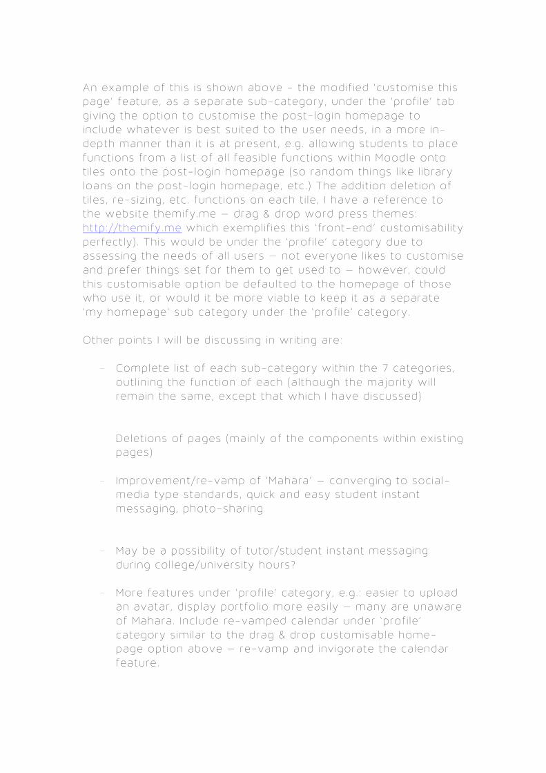
An example of th is is shown above - the modif ied ‘customise th is page’ feature, as a separate sub-category, under the ‘prof i le ’ tab g iv ing the opt ion to customise the post-login homepage to inc lude whatever is best suited to the user needs, in a more in-depth manner than i t is at present, e .g . a l lowing students to place funct ions from a l ist of a l l feasib le funct ions with in Moodle onto t i les onto the post-login homepage (so random things l ike l ibrary loans on the post-login homepage, etc . ) The addit ion delet ion of t i les , re-s iz ing, etc . funct ions on each t i le , I have a reference to the website themify.me – drag & drop word press themes: http://themify.me which exempl i f ies th is ‘ f ront-end’ customisabi l i ty perfect ly) . This would be under the ‘prof i le ’ category due to assessing the needs of a l l users – not everyone l ikes to customise and prefer th ings set for them to get used to – however, could th is customisable opt ion be defaulted to the homepage of those who use i t , or would i t be more v iable to keep i t as a separate ‘my homepage’ sub category under the ‘prof i le ’ category. Other points I wi l l be discuss ing in wr it ing are:
- Complete l ist of each sub-category with in the 7 categor ies, out l in ing the funct ion of each (a lthough the major i ty wi l l remain the same, except that which I have discussed)
- Delet ions of pages (main ly of the components with in exist ing pages)
- Improvement/re-vamp of ‘Mahara’ – converging to socia l-media type standards, quick and easy student instant messaging, photo-shar ing
- May be a possib i l i ty of tutor/student instant messaging dur ing col lege/univers ity hours?
- More features under ‘prof i le ’ category, e .g . : eas ier to upload an avatar , d isplay portfol io more easi ly – many are unaware of Mahara. Inc lude re-vamped calendar under ‘prof i le ’ category s imi lar to the drag & drop customisable home-page opt ion above – re-vamp and invigorate the calendar feature.
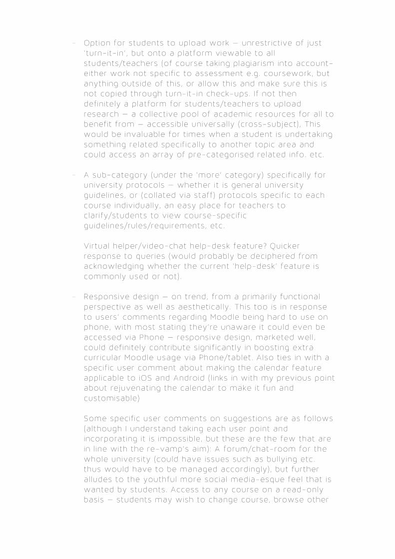
- Option for students to upload work – unrestr ict ive of just ‘ turn-it- in ’ , but onto a platform viewable to al l students/teachers (of course tak ing plagiar ism into account- e ither work not specif ic to assessment e.g . coursework, but anything outs ide of th is , or a l low th is and make sure th is is not copied through turn-it- in check-ups. I f not then def in i te ly a platform for students/teachers to upload research – a col lect ive pool of academic resources for a l l to benef it from – accessib le universal ly (cross-subject) , This would be invaluable for t imes when a student is undertak ing something related specif ical ly to another topic area and could access an array of pre-categor ised related info. etc .
- A sub-category (under the ‘more’ category) specif ica l ly for
univers ity protocols – whether i t is general univers ity guidel ines, or (col lated v ia staff ) protocols specif ic to each course indiv idual ly , an easy place for teachers to c lar i fy/students to v iew course-specif ic guidel ines/rules/requirements, etc .
- Virtual helper/v ideo-chat help-desk feature? Quicker
response to quer ies (would probably be deciphered from acknowledging whether the current ‘help-desk’ feature is commonly used or not) .
- Responsive design – on trend, from a pr imar i ly funct ional
perspect ive as wel l as aesthet ical ly . This too is in response to users’ comments regarding Moodle being hard to use on phone, with most stat ing they’re unaware i t could even be accessed via Phone – responsive design, marketed wel l , could def in i te ly contr ibute s ignif icant ly in boost ing extra curr icular Moodle usage via Phone/tablet . Also t ies in with a specif ic user comment about making the calendar feature appl icable to iOS and Android ( l inks in with my previous point about rejuvenat ing the calendar to make i t fun and customisable)
- Some specif ic user comments on suggest ions are as fol lows
(a lthough I understand tak ing each user point and incorporat ing i t is impossib le , but these are the few that are in l ine with the re-vamp’s a im) : A forum/chat-room for the whole univers ity (could have issues such as bul ly ing etc . thus would have to be managed accordingly) , but further a l ludes to the youthful more socia l media-esque feel that is wanted by students. Access to any course on a read-only basis – students may wish to change course, browse other

courses, etc . which is why the ‘a l l courses’ sub-category is v isual ised where re levant above, The al lowance of us ing one’s own emai l address seems to be a b ig want from students – further making the Moodle journey a more personal one and giv ing students a unique showcase rather than being v iewed as a number! Al lowing users to update contact detai ls through Moodle – probably to get away from forms to do so every semester (could be a part of the protocol/ ’more’ category) . Also, comments have been made regarding teachers not us ing Moodle yet pushing students to, not regular ly updat ing Moodle (v ita l for consistent student trust in i t/usage) , or even being adequate in i ts usage – Again, P interest sty le f i rst-t ime instruct ions, a longside internal meet ings and a k ick up the…in the r ight d irect ion. . .might help!
- Final ly , a point that was ra ised by users, has been personal ly
exper ienced by me, and also t ies in with the re-vamp – is one that is out of my forte – some k ind of technical improvement/upgrade. Most common problems l ie with:
Turn-it- in crashing near deadl ines (res istance to h igher level of usage?) , Repeated emai l logins needed, or not logging people in consistent ly . Moodle not being logged in but st i l l d isplaying logout (may not be technical but delet ion of the drop –down l ink before login is needed) , attendance sometimes not being specif ic to the users’ course, overal l crashes when high volume of users, e .g . deadl ine t imes, and a specif ic comment about i t being down on weekends too – a solut ion needs to be created ( important ly) as i f students are want ing to use i t extra-curr icular but cant then i t loses conf idence towards Moodle. Conclus ion I wi l l go into the detai ls of some of the above more pract ical ly , and try to v isual ise certa in aspects i f necessary. Overal l , I feel the report has consistent ly dealt with the two proposed issues (from the or ig inal br ief ) – the look of Moodle, and the funct ion ( informat ional organisat ion, pr ior i t isat ion, and even addit ion/delet ion, etc . ) in the best manner I could do. I feel that adding new things just for the sake of i t is point less as the usage is confusing for users as i t is , so the s impl i f icat ion of exist ing features, a longside

addit ions that are specif ica l ly for user enhancement/enjoyment were made. I a lso feel nothing was deleted (couple more specif ics about what should be deleted) apart from what was necessary, e .g . repeated l ists of l inks when not needed, misplacement of l inks, delet ing pre-login excess l inks when login is required for them anyway, etc . In a l l honest ly , everything that is needed for Moodle to be perfect ly re-designed probably isn’t present, but I feel that there is a sat isfactory amount to inst igate a sense of d irect ion and act ion towards the path of doing so. Nabeel Mahmood 20229338