multivariate data peter shaw. apposite quotes “i would always start an analysis by running a pca...
TRANSCRIPT

Multivariate dataPeter Shaw

Apposite quotes
“I would always start an analysis by running a PCA ordination” (Prof John Jeffers).
“Multivariate statistics tell you what you already know” (Prof. Michael Usher).
Most ecologists use multivariate techniques, but will admit that they don’t really understand what they are doing (Peter Shaw).
“Multivariate statistics are the last resort of the scoundrel” (Forestry Commission statistician).

Introduction So far we have dealt with cases where we have 1
response variable – height, yield, etc. Typically the dataset will contain a 2nd variable which classifies the response variable (treatment, plot, sex etc), and in the case of bivariate correlation/regression the 2 variables are analysed together.
In ecology, 2 variable datasets are the exception. Start including species + habitat data and chances are you’ll have 40 variables of raw data. And that’s before you include metadata, log-transformed variables etc.
Metadata
site, date, plot etc
Raw site datapH, elevation etc
Raw speciesdata
Log-transdata etc
6ish4-10ish 10-100 10-100

Ecological data:
It is of course possible and valid to handle each of these variables independently – but very tedious.
You have 40 species – you run 40 anovas. 10 come out significant – good. But this took 40 pages of output – and you still have to present this lot!
Multivariate techniques exist to simplify this sort of situation. Instead of running 40 analyses on 1 species, you run 1 analysis on all 40 species at the same time. Much more elegant!
The catch is that the algorithms are messy – usually PC only, and the maths scare people.

Univariate Bivariate Multivariate
Descriptive Statistics
mean, standard deviation,etc
Equation of best fit line
Most multivariate techniques come here
Inferential Statistics
t test, anova etc
r value Monte-Carlo permutation tests
A summary of the types of statistical analyses, showing where multivariate techniques fit in.

In the next 2 lectures:
I will introduce you to a few of the more commonly used approaches to simplifying multivariate ecological data.
Not all the techniques I will cover are strictly multivariate: technically a multivariate analysis gives a multivariate output. You enter N equally important variables, and derive N new variables, sorted into order of decreasing importance.
Today I will mention 2 approaches which don’t do this: diversity indices, and multiple linear regression. They ARE useful for ecologists and DO take multivariate data, so I feel justified in slotting them here.

Diversity indices Diversity is a deceptive concept. Magurran (1991) likens the
concept of diversity to an optical illusion; the more it is examined, the less clear it becomes.
Ecologists recognise that the diversity of an ecological system has 2 facets: species number (=richness) evenness of distribution
Sp. A10
Sp. B10
Sp. C10
Sp. A1
Sp. B1
Sp. C28
Both these systems have 30 individuals and 3 species. Which is more diverse?
A10
B2
C3
D1
E1
F1
And how about this?

This vagueness leads to a multiplicity of indices.. The simplest and commonest is simply
species richness – too easy to need explaining. But do remember that species boundaries are often blurred, and that the total is consequently not clear.
Today I only intend to cover 2 indices (my favourites!). Be aware that there are many more.
These are: The Simpson index The Shannon index

The Simpsons index: D
This is an intuitively simple, appealing index.
It involves sampling individuals from a population one at a time (like pulling balls out of a hat).
What is the probability of sampling the same species twice in 2 consecutive samples? Call this p. If there is only 1 species, p = 1.0 If all samples find different species, p =
0.0

Formally:
The probability of sampling species i = pi. Hence p(sampling species 1 twice) = pi * pi. Hence p(sampling any species twice)
= p(sp1) + p(sp2)… +p(spN) Hence the simplest version of this index = i pi * pi
This has the counter-intuitive property that 0 = infinite diversity, 1 = no diversity
Hence the usual formulation is: D = 1 - i pi * pi

Sp. A10p = 1/3
Sp. B10p=1/3
Sp. C10p = 1/3
Sp. A1p=1/30
Sp. B1p = 1/30
Sp. C28p = 28/30
D = 1-(1/9 + 1/9 + 1/9) = 0.667
D = 1-(1/900 + 1/900 + 784/900) = 14/900 = 0.0156
Applied to the demo communities given previously, this tells what was already obvious: the first community had a higher diversity (measured as evenness of species distribution)
Applying the Simpson index to the communities listed previously:

The Shannon index
Very often mis-named as the Shannon-Weaver index, this widely used index comes out of some very obscure mathematics in information theory. It dates back to work by Claude Shannon in the Bell telephone company labs in the 1940s.
It is the most commonly used, and least understood (!) diversity index

To calculate:
H = -i[pi*log(pi)] Note that you have the choice of
logarithm base. Really you should use base 2,when H defines the information content of the dataset in bits.
To do this use log2(x) = log10(x) / log10(2)

One of the oddities of the Shannon index..
Is that the index varies with number of species, as well as their evenness.
The maximum possible score for a community with N species is log(N) – this occurs when all species are equally frequent.
Because of this (and log-base problems, and the difficulty of working out what the score actually means) I prefer to convert H into an evenness index; H as a proportion of what it could be if all species were equally frequent. This is E, the evenness.
E = H / log(N). E = 1 implies total evenness, E 0 implies the opposite. This index is independent of log base and of species number.

Sp. A10p = 1/3
Sp. B10p=1/3
Sp. C10p = 1/3
Sp. A1p=1/30
Sp. B1p = 1/30
Sp. C28p = 28/30
H10 = -3*(log10(1/3)*1/3)= -3*(log10(1/3)*1/3)= 0.477
E = H / log(3) = 1,ie this community is as even as it could be
H10 = 1/30*log10(1/30)+ 1/30*log10(1/30)+ 28/30*log10(28/30)= 0.126
E = H / log(3) = 0.265
Applying the Shannon index to the communities listed previously:

Multiple Linear Regression
MLR is just like bivariate regression, except that you have multiple independent (“explanatory”) variables.
Model: Y = A + B*X1 + C*X2 (+ D*X3….) Very often the explanatory variables are co-correlated, hence
the dislike of the term “independents” The goodness of fit is indicated by the R2 value, where R2 =
proportion of total variance in Y which is explained by the regression. This is just like bivariate regression, except that we don’t used a signed (+/-) r value. (Why no r? Because with 2 variables the line either goes up or
down. With 3 variables the line can go +ve wrt X1 and -ve wrt X2)

MLR is powerful and dangerous:
MLR is widely used in research,
especially for “data dredging”. It gives accurate R2 values, and valid
least-squares estimates of parameters – intercept, gradients wrt X1, X2 etc.
Sometimes its power can seem almost magical – I have a neat little dataset in which MLR can derive parameters of the polynomial function
xX = A + B*X + C*X2 + D*X3…

But beware! There is a serious pitfall when the explanatory variables are co-correlated
(which is frequent, almost routine). In this case the gradients should be more-or-less ignored! They may be
accurate, but are utterly misleading. An illustration: Y correlates +vely with X1 and with X2. Enter Y, X1 and X2 into an MLR Y = A + B*X1 + C*X2 But if B >0, C may well be < 0! On the face of it this suggests that Y is –vely
correlated with X2. In fact this correlation is with the residual information content in X2 after its
correlation with X1 is removed. At least one multivariate package (CANOCO) instructs that prior to analysis
you must ensure all explanatory variables are uncorrelated, by excluding offenders from the analysis.
This caveat is widely ignored, indeed widely unknown.
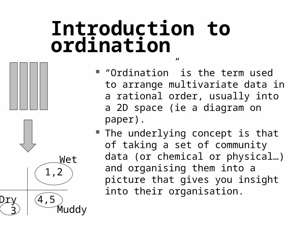
Introduction to ordination
“Ordination” is the term used to arrange multivariate data in a rational order, usually into a 2D space (ie a diagram on paper).
The underlying concept is that of taking a set of community data (or chemical or physical…) and organising them into a picture that gives you insight into their organisation.
1,2
34,5
Wet
MuddyDry

Elevation, m193189183177
Bare sand stabilised by Marram grass
0 350 600 850 1100 3500 10,000 Years stable
Cottonwood. Populus deltoides
Black oak Quercus velutina
Pines, Pinus spp
A direct ordination, projecting communities onto time: The sand dune succession at the southern end of lake Michegan (re-drawn from Olsen 1958)

Annual grasslandValley-foothill hardwood
Chaparral
Montanehardwood
Ponserosa pine
Montanehardwood
Mixed conifers
Red fir Jeffreypine pi
nyon
Lodgepolepine
Subalpineconifer
Alpine dwarf scrubW
et m
eado
ws
Moist….…………………Dry
Ele
vati
on, m
hard
woo
ds
1000
2000
3000
4000
A 2-D direct ordination, also called a mosaic diagram, in this case showing the distribution of vegetation types in relation to elevation and moisture in the Sequoia national park. This is an example of a direct ordination, laying out communities in relation to two well-understood axes of variation. Redrawn from Vankat (1982) with kind permission of the California botanical society.
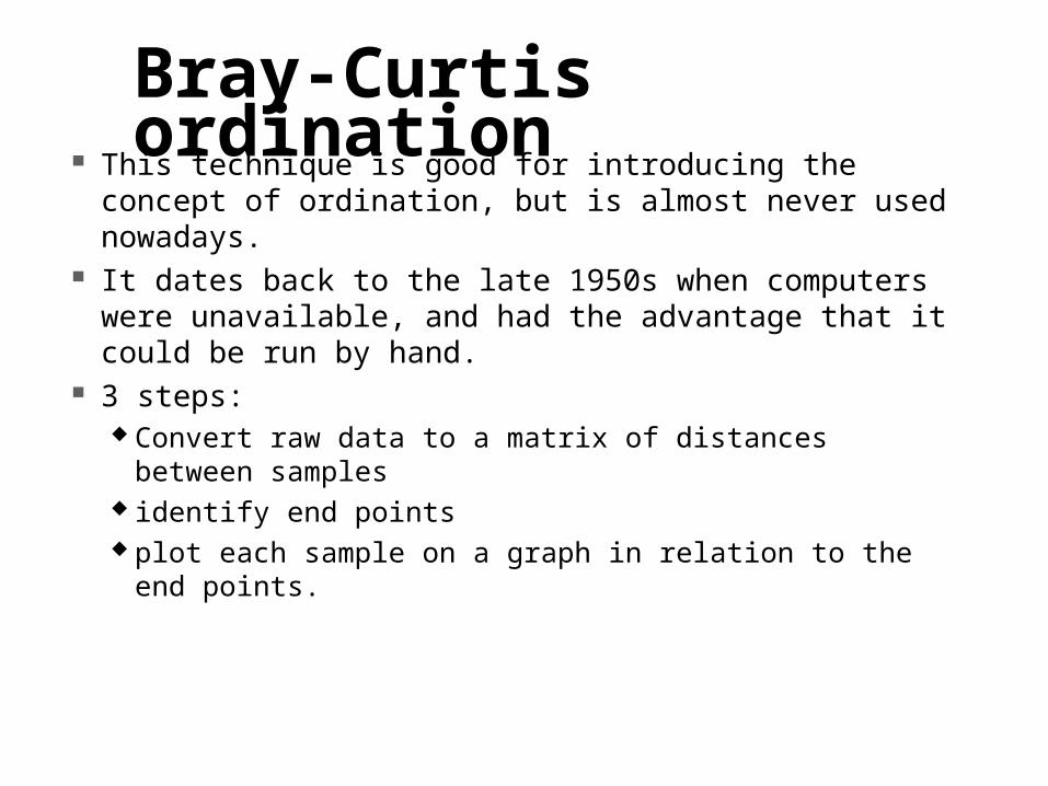
Bray-Curtis ordination This technique is good for introducing the concept of
ordination, but is almost never used nowadays. It dates back to the late 1950s when computers were
unavailable, and had the advantage that it could be run by hand.
3 steps: Convert raw data to a matrix of distances between
samples identify end points plot each sample on a graph in relation to the end points.

Sample data - a succession: Year A B C1 100 0 02 90 10 03 80 20 54 60 35 105 50 50 206 40 60 307 20 30 408 5 20 609 0 10 7510 0 0 90
Choose a measure of distance between years:The usual one is the Bray-Curtis index (the Czekanowski index).
Between year 1 & 2:
A B C Y1 100 0 0
Y2 90 10 0Minimum 90 0 0 = 90Sum 190 10 0 =200
distance = 1-2*90/200 = 0.1
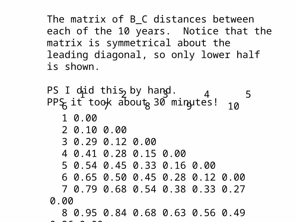
1 2 3 4 5 6 7 8 9 10 1 0.00 2 0.10 0.00 3 0.29 0.12 0.00 4 0.41 0.28 0.15 0.00 5 0.54 0.45 0.33 0.16 0.00 6 0.65 0.50 0.45 0.28 0.12 0.00 7 0.79 0.68 0.54 0.38 0.33 0.27 0.00 8 0.95 0.84 0.68 0.63 0.56 0.49 0.26 0.00 9 1.00 0.89 0.74 0.79 0.71 0.63 0.43 0.18 0.0010 1.00 1.00 0.95 0.90 0.81 0.73 0.56 0.33 0.14 0.00
The matrix of B_C distances between each of the 10 years. Notice that the matrix is symmetrical about the leading diagonal, so only lower half is shown.
PS I did this by hand.PPS it took about 30 minutes!

Now establish the end points - this is a subjective choice, I choose years 1 and 10 as being extreme values.
Now draw a line with 1 at one end, 10 at the other.
The length of this line = a distance of 1.0, based on the matrix above.
1 10
Distance = 1.0

Now locate obs 2, 1.0 from year 10 and 0.1 from year 1. This can be done by circles.
1 10
Distance 1<-> 2 = 0.1 units, distance 2<->10 = 1.0 units, so draw 2 circles:
Year2 locates here:
Radius = 1.0
Radius = 0.1

1 10
23 4 5 6
7 89
The final ordination of the points (by hand

Principal ComponentsAnalysis, PCA This is our first true multivariate
technique, and is one of my favourites.
It is fairly close to multiple linear regression, with one big conceptual difference (and a hugely different output).

The difference lies in fitting of residuals: MLR fits them vertically to one
special variable (Y, the dependent). PCA fits them orthogonally - all
variables are equally important, there is no dependent.
Y
X1X2
V1V2
V3

Conceptually the intentions are very different:
MLR seeks to find the best hyper-plane through the data. PCA [can be thought of as] starting off by fitting one best
LINE through the cloud of datapoints, like shining a laser beam through an array of tethered balloons. This line passes through the middle of the dataset (defined as the mean of each variable), and runs along the axis which explains the greatest amount of variation within the data.
This first line is known as the first principal axis – it is the most useful single line that can be fitted through the data (formally the linear combination of variables with the greatest variance).

The 1st principal axis of a dataset – shown as a laser in a room oftethered balloons!
Overall mean of the dataset

Often the first axis of a dataset will be an obvious simple source of variation: overall size (body/catchment size etc) for allometric data, experimental treatment in a well designed experiment.
A good indicator of the importance of a principal axis is the % variance it explains. This will tend to decrease as the number of variables = number of axes in the dataspace increases. For half-decent data with 10-20 variables you expect c. 30% of variation on the 1st principal axis.
Having fitted one principal axis, you can fit a 2nd. It will explain less variance than the 1st axis.
This 2nd axis explains the maximum possible variation, subject to 2 constraints:
1: is orthogonal (at 90 degrees to) the 1st
principal axis2: it runs through the mean of the dataset.

The 2nd principal axis of a dataset,– shown in blueThis diagram shows a 3D dataspace (axes being V1, V2 and V3).
Overall mean of the dataset
V11.00.30.51.31.52.52.53.4
V20.11.02.00.81.52.22.83.4
V30.32.12.01.01.22.52.53.5

We can now cast a shadow..
The first 2 principal axes define a 2D plane, on which the positions of all the datapoints can be projected.
Note that this is exactly the same as casting a shadow.
Thus PCA allows us to examine the shadow of a hig-dimensional object, say a 30 dimensional dataspace (defined by 30 variables such as species density).
Such a projection is a basic ordination diagram.
I always use such diagrams when exploring data – the scattergraph of the 1st 2 principal axes of a dataset is the most genuinely informative description of the entire data.

More axes:
A PCA can generate as many principal axes as there are axes in the original dataspace, but each one is progressively less important than the one preceeding it.
In my experience the first axis is usually intelligible (often blindingly obvious), the second often useful, the third rarely useful, 4th and above always seem to be random noise.

To understand a PCA output.. Inspecting the scattergraph is
useful,but you need to know the importance of each variable with respect to each axis. This is the gradient of the axis with respect to that variable.
This is given as a standard in PCA output, but you need to know how the numbers are arrived at to know what the gibberish means!

How it’s done..
1: derive the matrix of all correlation coefficients – the correlation matrix. Note the similarity to Bray-Curtis ordination: we start with N columns of data, then derive an N*N matrix informing us about the relationship between each pair of columns.
2: Derive the eigenvectors and eigenvalues of this matrix. It turns out that MOST multivariate techniques involve eigenvector analysis, so you may as well get used to the term!

Eigenvectors: Are intimately linked with matrix multiplication. You don’t need to
know this bit! Take an [N*N] matrix M, and use it to multiply a [1*N] vector of 1’s. This gives you a new [1*N] vector, of different numbers. Call this
V1 Multiply V1 by M, to get V2. Multiply V2 * M to get V3, etc. After infinite repetitions the elements of V will settle down to a
steady pattern – this is the dominant eigenvector of the matrix M 1.
Each time 1 is multiplied by M it grows by a constant multiple, which is the first eigenvalue of M E1.

* 1
1
1
V1
* V3V2
* V2V1
After a while, each successive multiplicationpreserves the shape (the eigenvector) while increasing values by a constant amount (the eigenvalue

The projections are made:
by multiplying the source data by the corresponding eigenvector elements, then adding these together.
Thus the projection of site A on the first principal axis is based on the calculation:
(spp1A*V11 + spp2A*V21+spp3A*V31…) Where spp1A = number of species 1 at site A, etc V21 = 1st eigenvector element for species 2 Luckily the PC does this for you. There is one added complication: you do not usually use raw data in the above
calculation. It is possible to do so, but the resulting scores are very dominated by the commonest species.
Instead all species data is first converted to Z scores, so that mean = 0.00 and sd = 1.00
This means that principal axes are always centred on the origin 0,0,0,0,… It also means that typically half the numbers in a PCA output are negative, and
all are apparently unintelligible!

The important part of a PCA..
Is interpreting the output! DON’T PANIC!! Stage 1: look at the variances
Stage 2: examine scatter plots
Stage 3 – interpret scatterplots by examination of eigenvector elements

Stage 1: look at the variances The first principal axis will have explain a portion of the total variance in the data. The amount explained is usually given by the package, but can in any case be derived as 100*1st Eigenvalue/Nvar [Nvar = number of variables]. From this you can deduce that the eigenvalues always sum together to Nvar.
Values above 50% on the 1st axis are hopeful, values in the 20s suggest a poor or noisy dataset, but this varies systematically with Nvar.
There is no inferential test here since no null hypothesis is being tested. It is possible to ask how your 1st eigenvalue compares with that found in Nvar columns of random noise, though actually surprisingly contentious how best to go about this.
I suggest you compare your eigenvalues against those predicted under the broken stick model

Nvar Axis 1 Axis 2 Axis 33 61.1 27.7 11.14 52 27 14.55 45.6 25.6 15.66 40.8 24.1 15.87 37 22.7 15.68 33.9 21.4 15.29 31.4 20.3 14.710 29.2 19.2 14.211 27.4 18.3 13.812 25.8 17.5 13.313 24.4 16.7 12.914 23.2 16 12.515 22.1 15.4 12.1
Expected values for the percentage variance accounted for by the first five principal axes of a PCA under the broken stick model. Axes found to account for less variance than the values tabulated here may be disregarded as random noise.
This model suggests that for random data with N variables, the pth axis should have an eigenvalue λp as
follows: i=pλp = Σ (1/i)
i=n

And higher axes..You can continue examining axes up to Nvar – but you hope that only the 1st 2-4 have much useful information in. When to stop? The usual default is the ‘Eigenvalues > 1’ rule (which could be called the %variance >100/Nvar’ rule, but is actually called the Kaiser-Guttman criterion!), but this tends to give you several useless small axes. Again I suggest you compare with the broken stick distribution.
Generally I only bother looking at the 1st 2-3 axes: the PCA usually tells you something blindingly obvious on the 1st axis, subtler on the second, then degenerates into random noise. In theory highly structured data could continue giving interpretable signal into the 4th axis or higher.
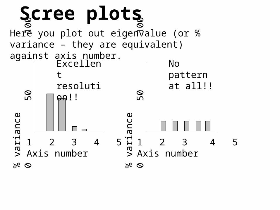
Scree plotsHere you plot out eigenvalue (or % variance – they are equivalent) against axis number.
1 2 3 4 5Axis number
% v
aria
nce
0
50
10
0
Excellent resolution!!
1 2 3 4 5Axis number
% v
aria
nce
0
50
10
0
No pattern at all!!

Plot the scattergraph of the ordination, starting with Axis 1 against Axis 2, and have a look.
This is the shadow of the dataset. Look for clusters, outliers, gradients. Each point is one
observation, so you can identify odd points and check the values in them. (Good way to pick up typing errors).
Overlay the graph with various markers – often this picks out important trends.
Stage 2: inspect the ordination diagrams

Data on Collembola of industrial waste sites.
The 1st axis of a PCA ordination detected habitat type: woodland vs open lagoon, while the second detected succession within the Tilbury trial plots.
PCA ordination of Collembola
succession on PFA sites
First principal axis
43210-1-2-3
Sec
ond
prin
cipa
l axi
s
5
4
3
2
1
0
-1
-2
-3
Habitat
Scrub woods
Open lagoon
PCA ordination, re-plotted to highlight
succession in the Tilbury trials
First principal axis
4.03.02.01.00.0-1.0-2.0-3.0
Sec
ond
prin
cipa
l axi
s
5
4
3
2
1
0
-1
-2
-3
site age, years
7.00
6.00
5.00
4.00

Stage 3: Look at the eigenvector elements to interpret the scattergraphs
which species / variables have large loadings (positive or negative). Do some variables have opposed loadings (one very +ve, one very –ve) suggesting a gradient between the two extremes?
The actual values of the eigenvector elements are meaningless – it is their pattern which matters. In fact the sign of elements will sometimes differ between packages if they use different algorithms! It’s OK! The diagrams will look the same, it’s just that the pattern of the points will be reversed.

Biplots
Since there is an intimate connection between eigenvector loadings and axis scores, it is helpful to inspect them together.
There is an elegant solution here, known as a biplot.
You plot the site scores as points on a graph, and put eigenvector elements on the same graph (usually as arrows).

REGR factor score 1 for analysis 1
1.51.0.50.0-.5-1.0-1.5
RE
GR
fact
or
sco
re
2 fo
r a
na
lysi
s
1
2.0
1.5
1.0
.5
0.0
-.5
-1.0
-1.5
WATER
1.00
.00
Pond community handout data – site scores plotted by SPSS
These are the new variables which appear after PCA: FAC1 and FAC2. Note aquatic sites at left hand side.

AX1
1.0.50.0-.5-1.0
AX
2
.8
.7
.6
.5
.4
.3
.2
.1
0.0
potentil
potamoge
epilob
ranuscle
phragaus
Factor scores (=eigenvector elements) for each speciesin pond dataset. Note aquatic species at left hand side.

REGR factor score 1 for analysis 1
1.51.0.50.0-.5-1.0-1.5
RE
GR
fact
or
sco
re
2 fo
r a
na
lysi
s
1
2.0
1.5
1.0
.5
0.0
-.5
-1.0
-1.5
WATER
1.00
.00
Pond community handout data – the biplot.
Note aquatic sites and species at left hand side. Note also that this is only a description of the data – no hypotheses are stated and no significance values can be calculated.
Potamog
Phrag.
Epilobium
Ranunc
Potent.