music magazine research
TRANSCRIPT
Music magazine research

Front cover analysis
Vibe is published Len Burnett
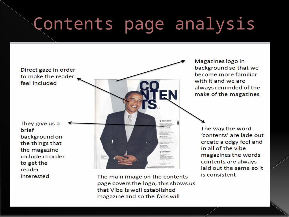
Contents page analysis
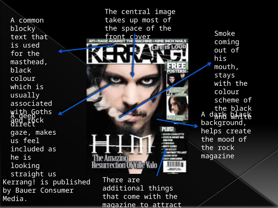
A deep direct gaze, makes us feel included as he is looking straight us
A common blocky text that is used for the masthead, black colour which is usually associated with Goths and rock
A dark black background, helps create the mood of the rock magazine
Smoke coming out of his mouth, stays with the colour scheme of the black and white
The central image takes up most of the space of the front cover
There are additional things that come with the magazine to attract a specific type of audience
Kerrang! is published by Bauer Consumer Media.
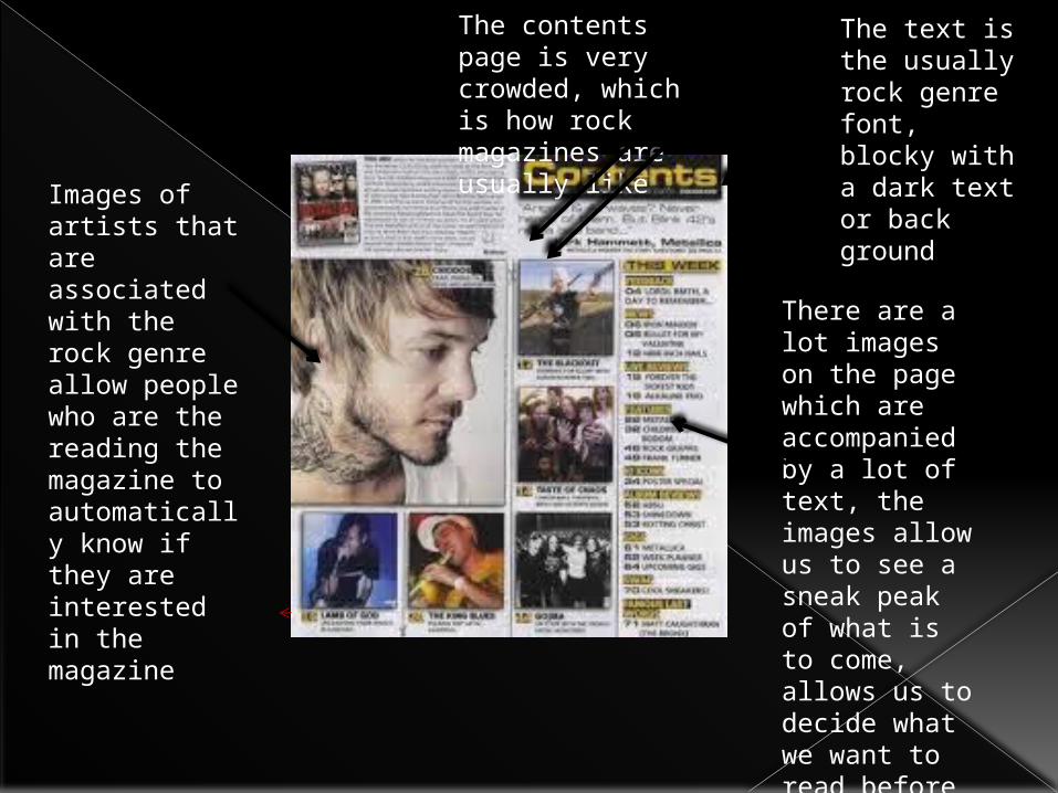
Images of artists that are associated with the rock genre allow people who are the reading the magazine to automatically know if they are interested in the magazine
The contents page is very crowded, which is how rock magazines are usually like
There are a lot images on the page which are accompanied by a lot of text, the images allow us to see a sneak peak of what is to come, allows us to decide what we want to read before purchasing the magazine properly
The text is the usually rock genre font, blocky with a dark text or back ground
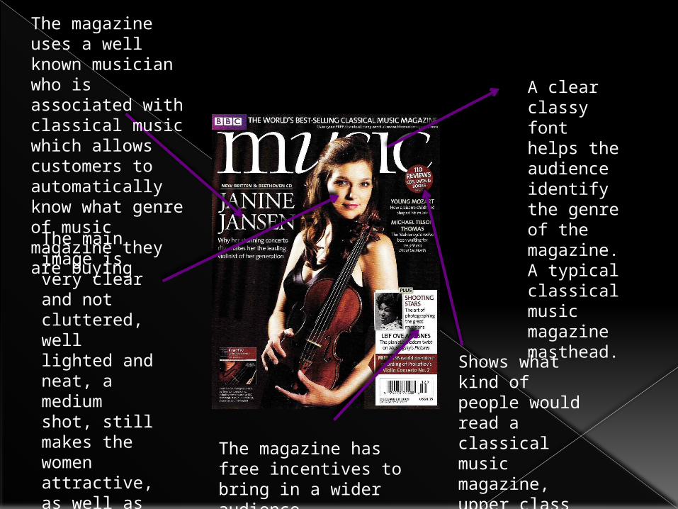
A clear classy font helps the audience identify the genre of the magazine. A typical classical music magazine masthead.
The main image is very clear and not cluttered, well lighted and neat, a medium shot, still makes the women attractive, as well as classy
Shows what kind of people would read a classical music magazine, upper class
The magazine has free incentives to bring in a wider audience.
The magazine uses a well known musician who is associated with classical music which allows customers to automatically know what genre of music magazine they are buying
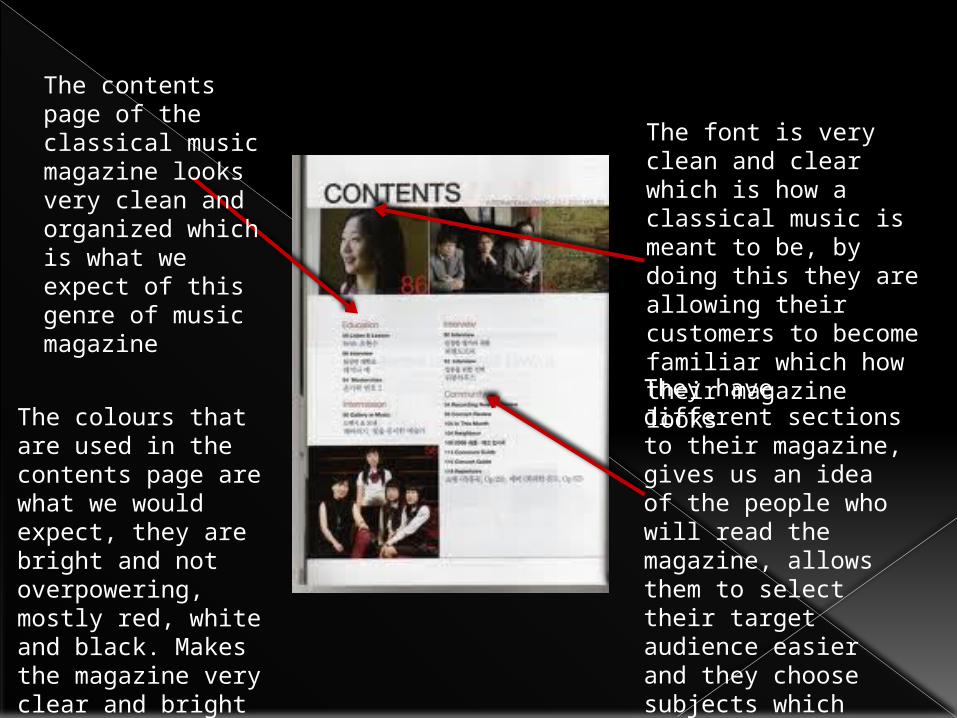
The contents page of the classical music magazine looks very clean and organized which is what we expect of this genre of music magazine
The font is very clean and clear which is how a classical music is meant to be, by doing this they are allowing their customers to become familiar which how their magazine looksThey have different sections to their magazine, gives us an idea of the people who will read the magazine, allows them to select their target audience easier and they choose subjects which they know a specific amount of people will be interested in
The colours that are used in the contents page are what we would expect, they are bright and not overpowering, mostly red, white and black. Makes the magazine very clear and bright

The double page spread usually has a picture that takes up a whole a page or can ‘bleed’ onto the next page
The second page usually has a lot of writing explaining the person in the picture on the other side, The text will start with a drop cap in order for the reader to know where the text starts
The writing on his face gives us and insight to his personality, while the text gives us a deeper explanation into who he is
The picture used shows us that he is happy with the ‘life of a shooting star’ Shows him smiling, the picture also allows us to see his interest in body art as in the picture he is covered in words and pictures

The picture is bleeding onto the next page
The word wild is written in ‘wild’ text as the world child I written in a more standard bold text
A clear colour scheme of black white and pink, they use these colours as pink is associated with girls
There is a lot of writing on the second page which is what is expected from a double page spread
The women is wearing black leather clothes which contrasts her blonde hair, sticks to the colour scheme of light and dark
Dark eye make up, seems mysterious
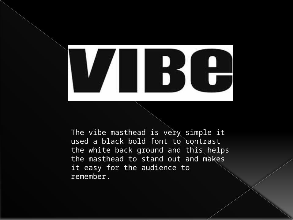
The vibe masthead is very simple it used a black bold font to contrast the white back ground and this helps the masthead to stand out and makes it easy for the audience to remember.

The Kerrang! masthead is very unique as it has a effect that creates a smashed glass effect, this allows it to be very unique and because of this it is very identifiable by their audience. This is good as then they are easily recognisable and it sets them apart from the other magazines that are doing the same genre of music. Also the ! Connotes that there is something special about this magazine.
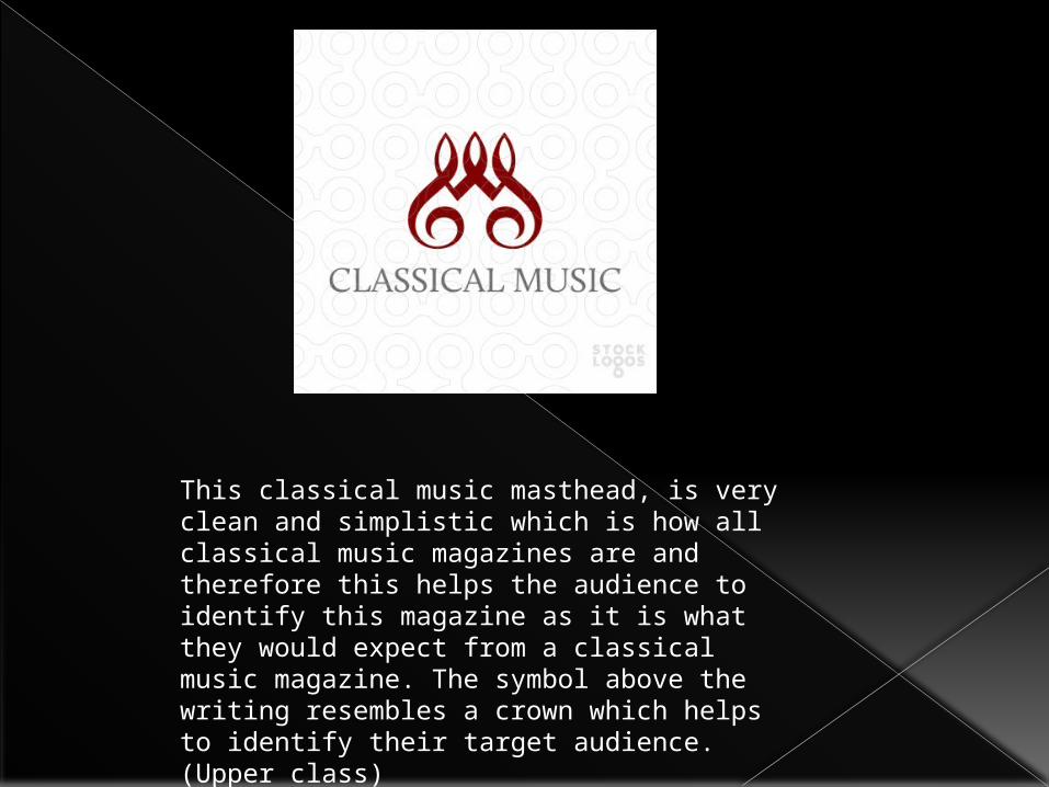
This classical music masthead, is very clean and simplistic which is how all classical music magazines are and therefore this helps the audience to identify this magazine as it is what they would expect from a classical music magazine. The symbol above the writing resembles a crown which helps to identify their target audience. (Upper class)