my helping hands criterzize
TRANSCRIPT
My Helping hands poster
Flatten Magic wand Gradient Color fill Color picker Remove layer Add layer
Skills
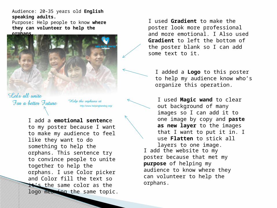
Audience: 20-35 years old English speaking adults.Purpose: Help people to know where they can volunteer to help the orphans.
I used Gradient to make the poster look more professional and more emotional. I Also used Gradient to left the bottom of the poster blank so I can add some text to it.
I added a Logo to this poster to help my audience know who’s organize this operation.
I used Magic wand to clear out background of many images so I can add it to one image by copy and paste as new layer to the images that I want to put it in. I use Flatten to stick all layers to one image.
I add the website to my poster because that met my purpose of helping my audience to know where they can volunteer to help the orphans.
I add a emotional sentence to my poster because I want to make my audience to feel like they want to do something to help the orphans. This sentence try to convince people to unite together to help the orphans. I use Color picker and Color fill the text so it’s the same color as the logo meaning the same topic.
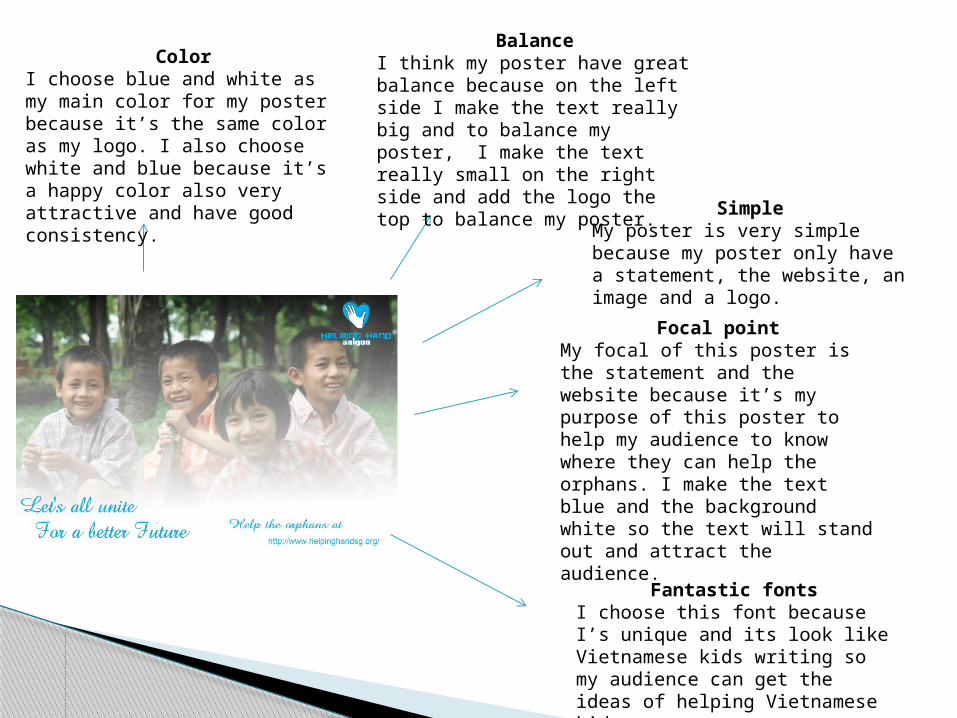
ColorI choose blue and white as my main color for my poster because it’s the same color as my logo. I also choose white and blue because it’s a happy color also very attractive and have good consistency.
BalanceI think my poster have great balance because on the left side I make the text really big and to balance my poster, I make the text really small on the right side and add the logo the top to balance my poster.
SimpleMy poster is very simple because my poster only have a statement, the website, an image and a logo.
Focal pointMy focal of this poster is the statement and the website because it’s my purpose of this poster to help my audience to know where they can help the orphans. I make the text blue and the background white so the text will stand out and attract the audience.
Fantastic fontsI choose this font because I’s unique and its look like Vietnamese kids writing so my audience can get the ideas of helping Vietnamese kids.