my mag..compressed (3)
TRANSCRIPT
Benjamin Chadwick.
My Portfolio.
2
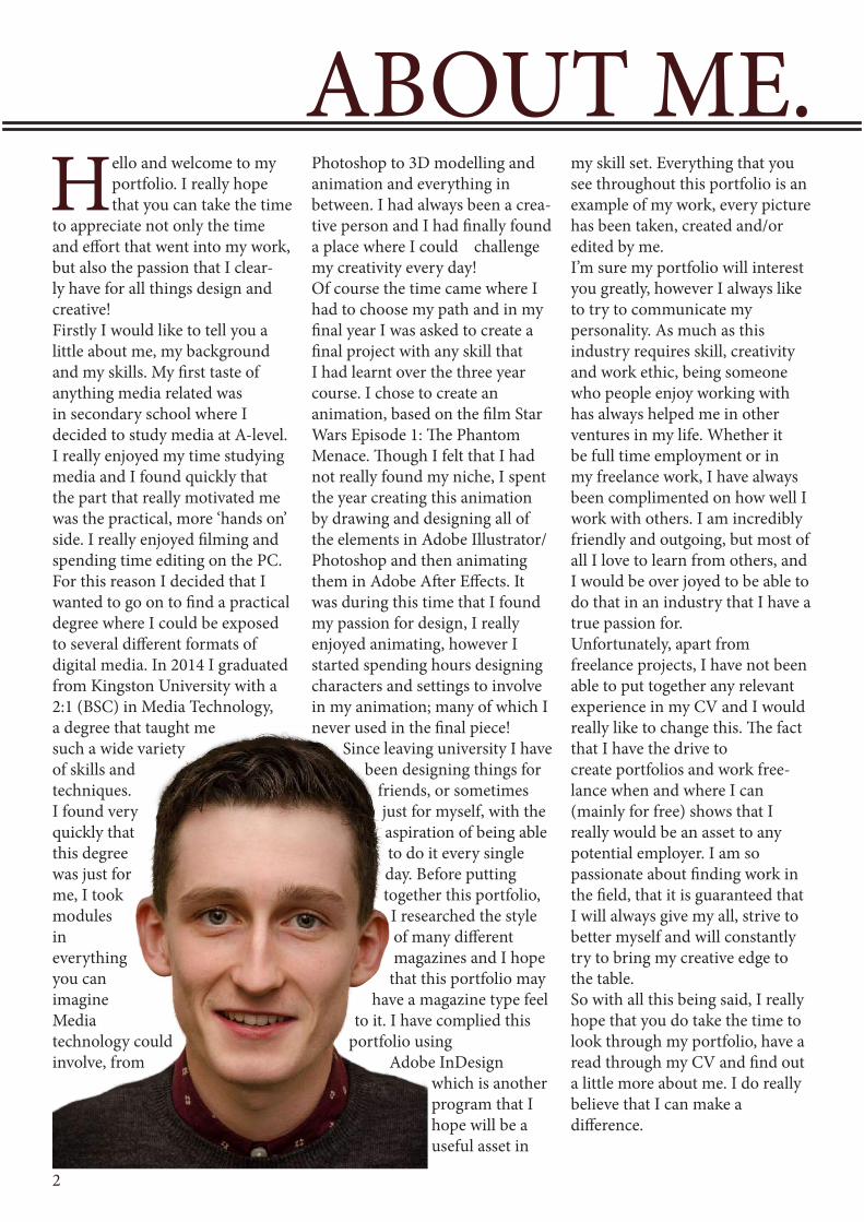
ABOUT ME. Hello and welcome to my
portfolio. I really hope that you can take the time
to appreciate not only the time and effort that went into my work, but also the passion that I clear-ly have for all things design and creative!Firstly I would like to tell you a little about me, my background and my skills. My first taste of anything media related was in secondary school where I decided to study media at A-level. I really enjoyed my time studying media and I found quickly that the part that really motivated me was the practical, more ‘hands on’ side. I really enjoyed filming and spending time editing on the PC. For this reason I decided that I wanted to go on to find a practical degree where I could be exposed to several different formats of digital media. In 2014 I graduated from Kingston University with a 2:1 (BSC) in Media Technology, a degree that taught me such a wide variety of skills and techniques. I found very quickly that this degree was just for me, I took modules in everything you can imagine Media technology could involve, from
Photoshop to 3D modelling and animation and everything in between. I had always been a crea-tive person and I had finally found a place where I could challenge my creativity every day! Of course the time came where I had to choose my path and in my final year I was asked to create a final project with any skill that I had learnt over the three year course. I chose to create an animation, based on the film Star Wars Episode 1: The Phantom Menace. Though I felt that I had not really found my niche, I spent the year creating this animation by drawing and designing all of the elements in Adobe Illustrator/Photoshop and then animating them in Adobe After Effects. It was during this time that I found my passion for design, I really enjoyed animating, however I started spending hours designing characters and settings to involve in my animation; many of which I never used in the final piece!
Since leaving university I have been designing things for
friends, or sometimes just for myself, with the aspiration of being able to do it every single day. Before putting together this portfolio, I researched the style of many different magazines and I hope
that this portfolio may have a magazine type feel
to it. I have complied this portfolio using
Adobe InDesign which is another program that I hope will be a useful asset in
my skill set. Everything that you see throughout this portfolio is an example of my work, every picture has been taken, created and/or edited by me. I’m sure my portfolio will interest you greatly, however I always like to try to communicate my personality. As much as this industry requires skill, creativity and work ethic, being someone who people enjoy working with has always helped me in other ventures in my life. Whether it be full time employment or in my freelance work, I have always been complimented on how well I work with others. I am incredibly friendly and outgoing, but most of all I love to learn from others, and I would be over joyed to be able to do that in an industry that I have a true passion for. Unfortunately, apart from freelance projects, I have not been able to put together any relevant experience in my CV and I would really like to change this. The fact that I have the drive to create portfolios and work free-lance when and where I can (mainly for free) shows that I really would be an asset to any potential employer. I am so passionate about finding work in the field, that it is guaranteed that I will always give my all, strive to better myself and will constantly try to bring my creative edge to the table.So with all this being said, I really hope that you do take the time to look through my portfolio, have a read through my CV and find out a little more about me. I do really believe that I can make a difference.
3
ABOUT ME. “Most of all I love to learn from others and I would be over joyed to be able to do that in an industry that I have a true passion for.”
4
CONTENTS.
5
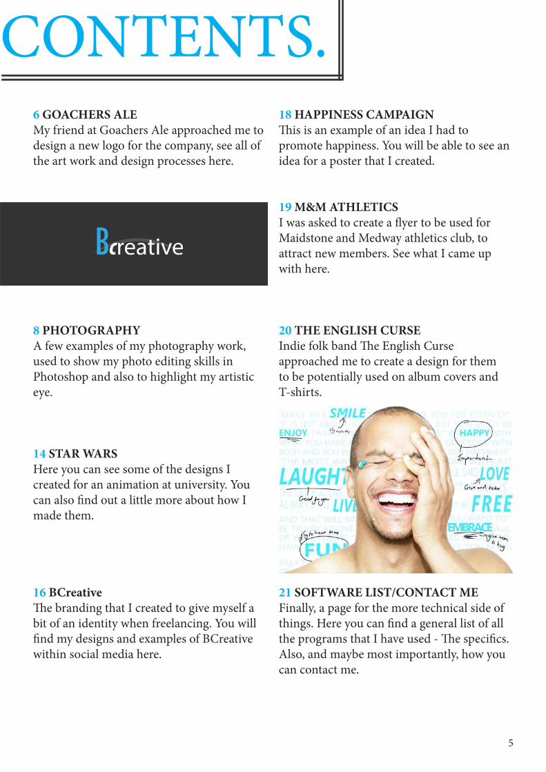
CONTENTS.6 GOACHERS ALEMy friend at Goachers Ale approached me to design a new logo for the company, see all of the art work and design processes here.
8 PHOTOGRAPHYA few examples of my photography work, used to show my photo editing skills in Photoshop and also to highlight my artistic eye.
14 STAR WARSHere you can see some of the designs I created for an animation at university. You can also find out a little more about how I made them.
16 BCreativeThe branding that I created to give myself a bit of an identity when freelancing. You will find my designs and examples of BCreative within social media here.
18 HAPPINESS CAMPAIGNThis is an example of an idea I had to promote happiness. You will be able to see an idea for a poster that I created.
19 M&M ATHLETICSI was asked to create a flyer to be used for Maidstone and Medway athletics club, to attract new members. See what I came up with here.
20 THE ENGLISH CURSEIndie folk band The English Curse approached me to create a design for them to be potentially used on album covers and T-shirts.
21 SOFTWARE LIST/CONTACT MEFinally, a page for the more technical side of things. Here you can find a general list of all the programs that I have used - The specifics. Also, and maybe most importantly, how you can contact me.
6
7
GOACHERS.
Goachers is a local Ale company who specialise in brewing and distribut-ing their ale all over Kent.
Established in 1983, Goachers has never had a branding update since, and although this suits there rustic aesthetic and tradition, the company will be looking to update their look in the near future.
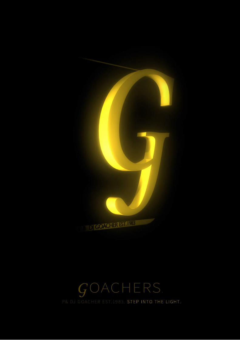
I have designed them two logos and it seems to be the square version that they are favouring. As you can see on the previous page, I couldn’t help but explore some other concept ideas with this project. I designed this poster to advertise Goachers’ new logo, I used Illustrator, Maya and Photoshop to create a 3D logo and to give the effect of it appearing from the dark.
As for the logo’s themselves, they have been designed in Adobe Illustrator using the Goachers colour scheme, I tried to design them something that would keep some of their traditions, but that also had a fresh edge. I feel that I did this in both of these designs, the Classic Goachers ‘G’ and the established date keeps that tradition, but the new shape and slick design gives a new lease of life.
Goachers will be planning to use these logos when the time is right financially, I am then hoping to be involved in the printing process as I would be really interested in seeing how the process works; from the design, all the way through to placing the first new logo onto a pump face. There are now new plans in the pipeline to create a new pump face for one of their existing ales, so there will be even more work to add to the Goachers portfolio. Overall I think the project was a nice success.
8
PHOTOGRAPHY.
9
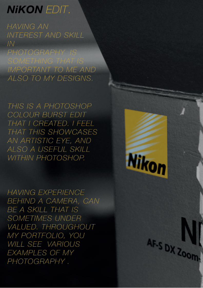
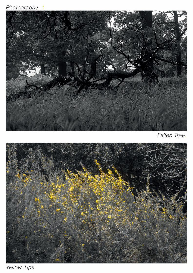
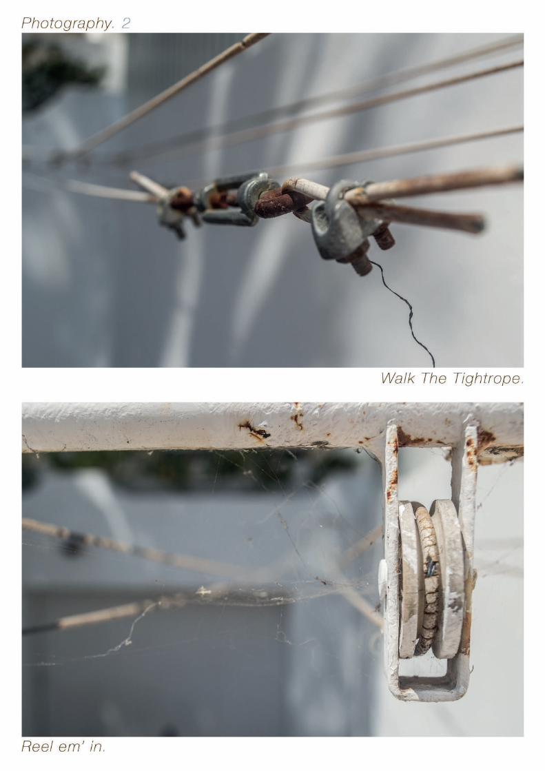
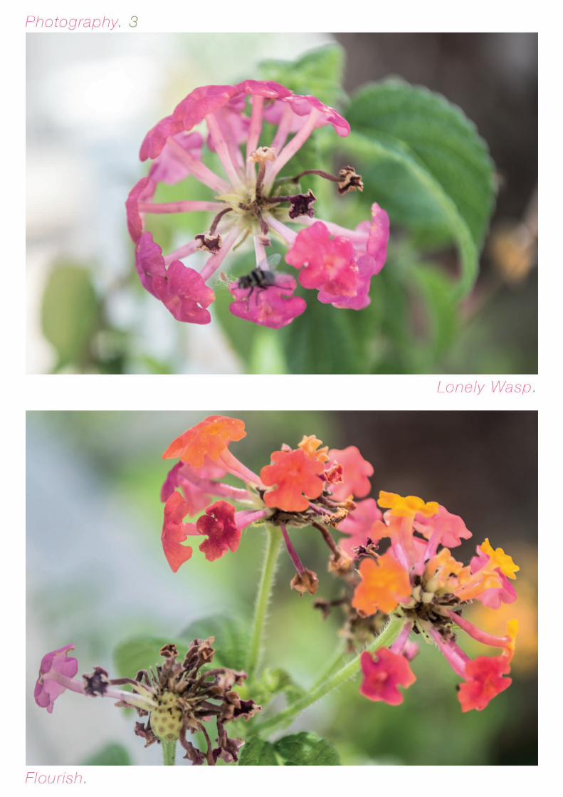
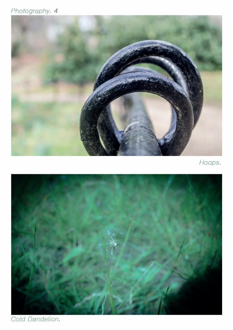
The following pages are examples of my photography work. As already mentioned I feel that having experience with a camera, and being skilled with one, is an underrated quality to have when it comes to design. I hope that the following pictures will demonstrate my artistic eye and my ability to use Photoshop.
10
11
12
13
14
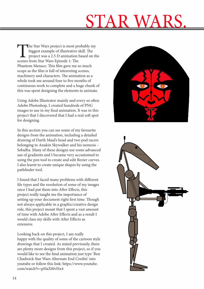
STAR WARS.
The Star Wars project is most probably my biggest example of illustrative skill. The project was a 2.5 D animation based on the
scenes from Star Wars Episode 1: The Phantom Menace. This film gave me so much scope as the film is full of interesting scenes, machinery and characters. The animation as a whole took me around four to five months of continuous work to complete and a huge chunk of this was spent designing the elements to animate.
Using Adobe Illustrator mainly and every so often Adobe Photoshop, I created hundreds of PNG images to use in my final animation. It was in this project that I discovered that I had a real soft spot for designing.
In this section you can see some of my favourite designs from the animation, including a detailed drawing of Darth Maul’s head and two pod racers belonging to Anakin Skywalker and his nemesis – Sebulba. Many of these designs use some advanced use of gradients and I became very accustomed to using the pen tool to create and edit Bezier curves. I also learnt to create unique shapes by using the pathfinder tool.
I found that I faced many problems with different file types and the resolution of some of my images once I had put them into After Effects, this project really taught me the importance of setting up your document right first time. Though not always applicable in a graphic/creative design role, this project meant that I spent a vast amount of time with Adobe After Effects and as a result I would class my skills with After Effects as extensive.
Looking back on this project, I am really happy with the quality of some of the cartoon style drawings that I created. As stated previously, there are plenty more designs from this project, so if you would like to see the final animation just type ‘Ben Chadwick Star Wars Alternate End Credits’ into youtube or follow this link: https://www.youtube.com/watch?v=pHaX8fvISx4
15
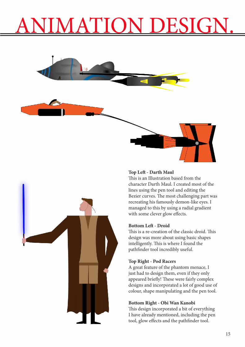
ANIMATION DESIGN.
Top Left - Darth MaulThis is an Illustration based from the character Darth Maul. I created most of the lines using the pen tool and editing the Bezier curves. The most challenging part was recreating his famously demon-like eyes. I managed to this by using a radial gradient with some clever glow effects.
Bottom Left - DroidThis is a re-creation of the classic droid. This design was more about using basic shapes intelligently. This is where I found the pathfinder tool incredibly useful.
Top Right - Pod RacersA great feature of the phantom menace, I just had to design them, even if they only appeared briefly! These were fairly complex designs and incorporated a lot of good use of colour, shape manipulating and the pen tool.
Bottom Right - Obi Wan KanobiThis design incorporated a bit of everything I have already mentioned, including the pen tool, glow effects and the pathfinder tool.
16
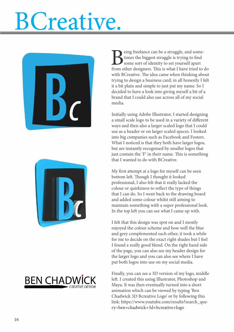
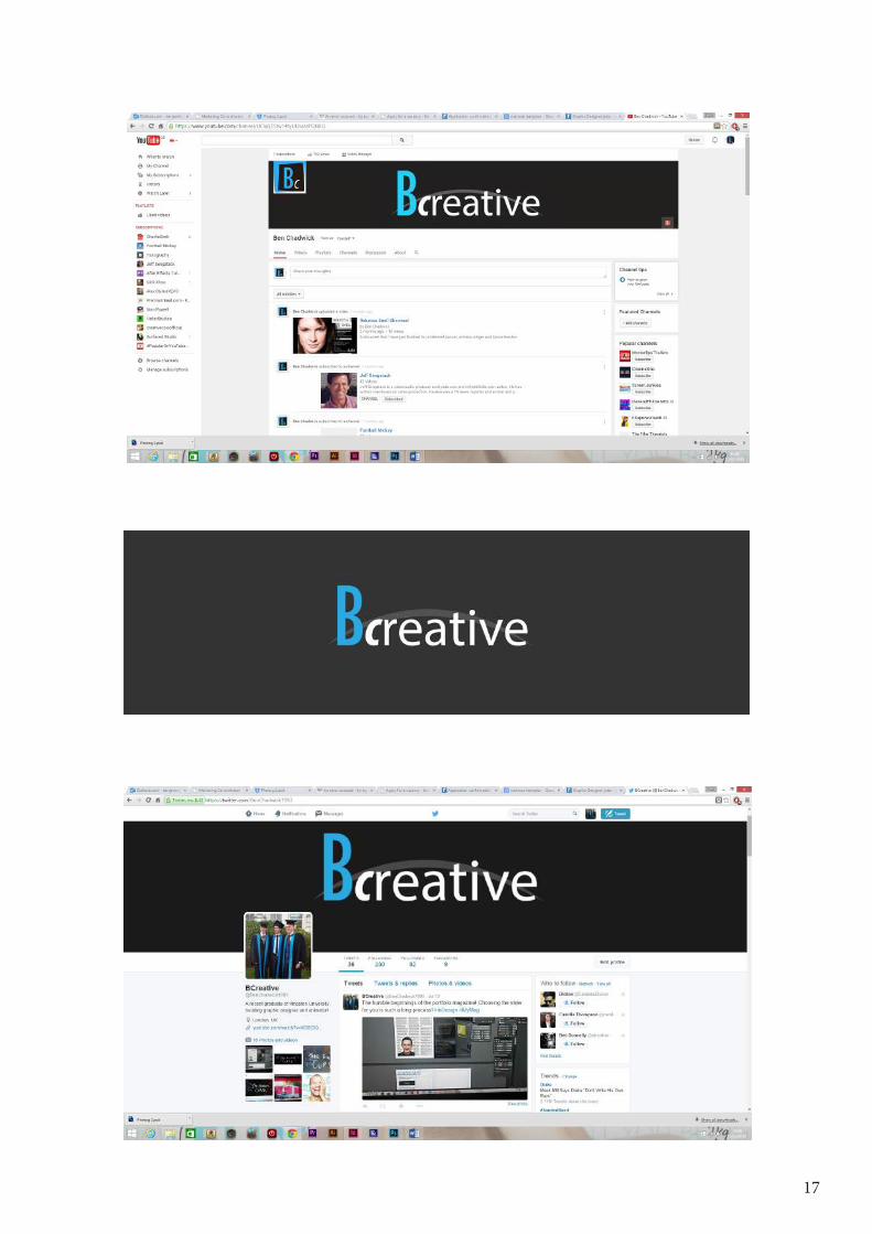
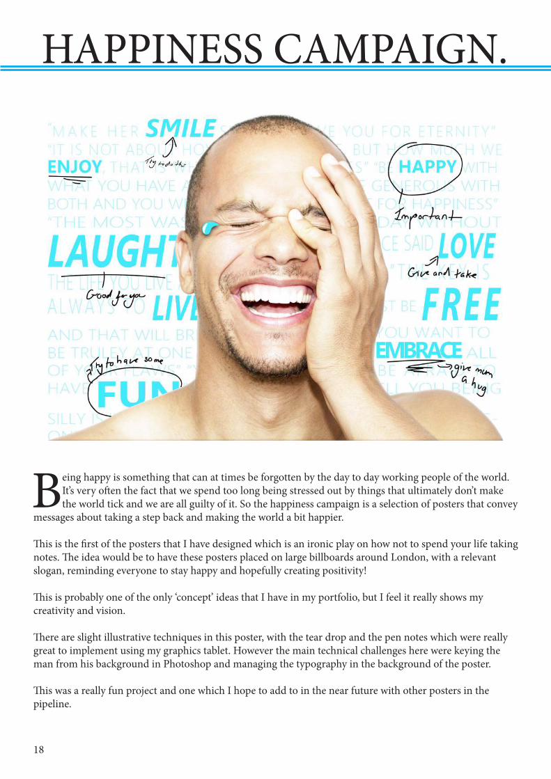
BCreative.Being freelance can be a struggle, and some-
times the biggest struggle is trying to find some sort of identity to set yourself apart
from other designers. This is what I have tried to do with BCreative. The idea came when thinking about trying to design a business card; in all honestly I felt it a bit plain and simple to just put my name. So I decided to have a look into giving myself a bit of a brand that I could also use across all of my social media.
Initially using Adobe Illustrator, I started designing a small scale logo to be used in a variety of different ways and then also a larger scaled logo that I could use as a header or on larger scaled spaces. I looked into big companies such as Facebook and Fosters. What I noticed is that they both have larger logos, but are instantly recognised by smaller logos that just contain the ‘F’ in their name. This is something that I wanted to do with BCreative.
My first attempt at a logo for myself can be seen bottom left. Though I thought it looked professional, I also felt that it really lacked the colour or quirkiness to reflect the type of things that I can do. So I went back to the drawing board and added some colour whilst still aiming to maintain something with a super professional look. In the top left you can see what I came up with.
I felt that this design was spot on and I mostly enjoyed the colour scheme and how well the blue and grey complemented each other, it took a while for me to decide on the exact right shades but I feel I found a really good blend. On the right hand side of the page, you can also see my header design for the larger logo and you can also see where I have put both logos into use on my social media.
Finally, you can see a 3D version of my logo, middle left. I created this using Illustrator, Photoshop and Maya. It was then eventually turned into a short animation which can be viewed by typing ‘Ben Chadwick 3D Bcreative Logo’ or by following this link: https://www.youtube.com/results?search_que-ry=ben+chadwick+3d+bcreative+logo
17
18
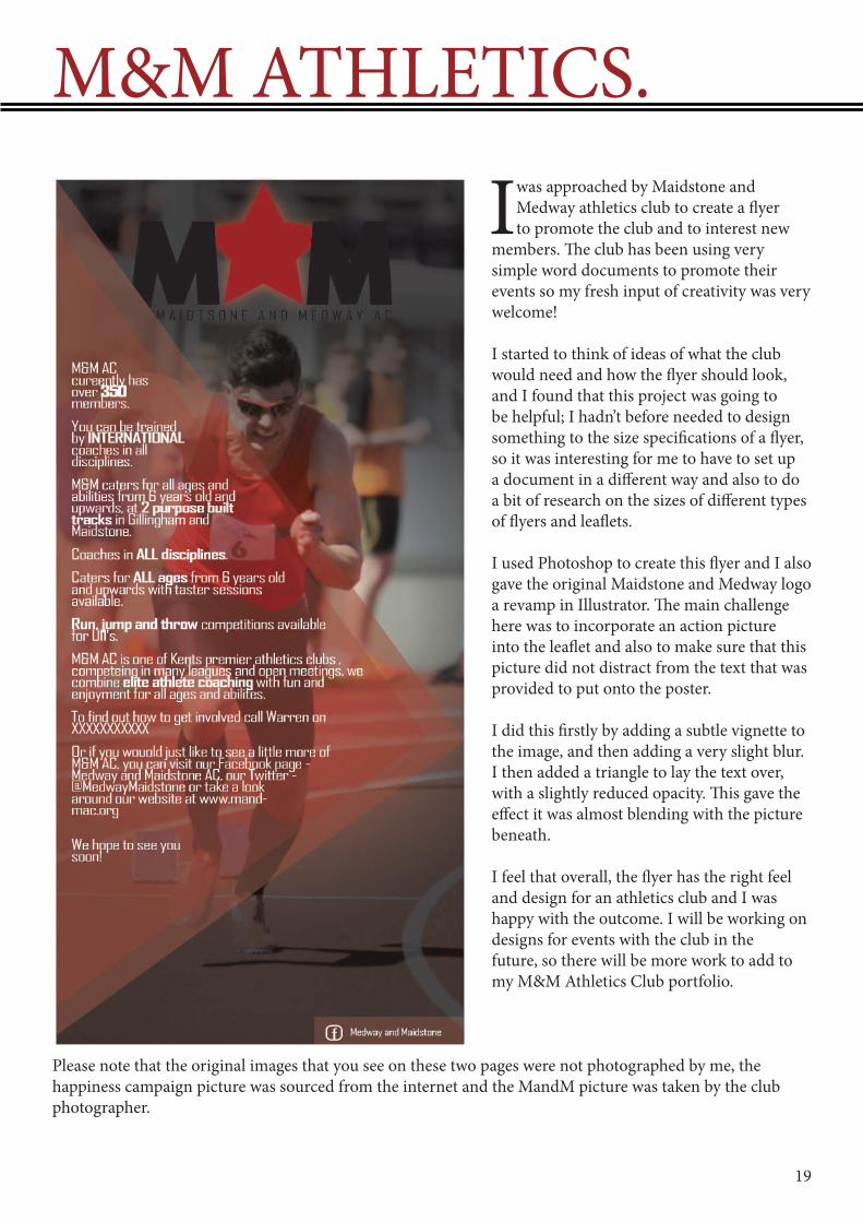
HAPPINESS CAMPAIGN.
Being happy is something that can at times be forgotten by the day to day working people of the world. It’s very often the fact that we spend too long being stressed out by things that ultimately don’t make the world tick and we are all guilty of it. So the happiness campaign is a selection of posters that convey
messages about taking a step back and making the world a bit happier.
This is the first of the posters that I have designed which is an ironic play on how not to spend your life taking notes. The idea would be to have these posters placed on large billboards around London, with a relevant slogan, reminding everyone to stay happy and hopefully creating positivity!
This is probably one of the only ‘concept’ ideas that I have in my portfolio, but I feel it really shows my creativity and vision.
There are slight illustrative techniques in this poster, with the tear drop and the pen notes which were really great to implement using my graphics tablet. However the main technical challenges here were keying the man from his background in Photoshop and managing the typography in the background of the poster.
This was a really fun project and one which I hope to add to in the near future with other posters in the pipeline.
19
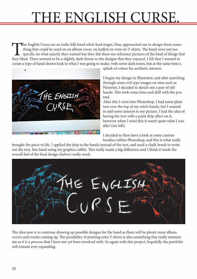
M&M ATHLETICS.
I was approached by Maidstone and Medway athletics club to create a flyer to promote the club and to interest new
members. The club has been using very simple word documents to promote their events so my fresh input of creativity was very welcome!
I started to think of ideas of what the club would need and how the flyer should look, and I found that this project was going to be helpful; I hadn’t before needed to design something to the size specifications of a flyer, so it was interesting for me to have to set up a document in a different way and also to do a bit of research on the sizes of different types of flyers and leaflets.
I used Photoshop to create this flyer and I also gave the original Maidstone and Medway logo a revamp in Illustrator. The main challenge here was to incorporate an action picture into the leaflet and also to make sure that this picture did not distract from the text that was provided to put onto the poster.
I did this firstly by adding a subtle vignette to the image, and then adding a very slight blur. I then added a triangle to lay the text over, with a slightly reduced opacity. This gave the effect it was almost blending with the picture beneath.
I feel that overall, the flyer has the right feel and design for an athletics club and I was happy with the outcome. I will be working on designs for events with the club in the future, so there will be more work to add to my M&M Athletics Club portfolio.
Please note that the original images that you see on these two pages were not photographed by me, the happiness campaign picture was sourced from the internet and the MandM picture was taken by the club photographer.
20
THE ENGLISH CURSE.
The English Curse are an indie folk band who’s lead singer, Dan, approached me to design them some-thing that could be used on an album cover, on leaflets or even on T-shirts. The band were not too specific on what exactly they wanted but they did show me reference pictures of the kind of things that
they liked. There seemed to be a slightly dark theme to the designs that they enjoyed. I felt that I wanted to create a type of hand drawn look to what I was going to make, with some dark tones, but at the same time a
splash of colour for aesthetic interest.
I began my design in Illustrator, and after searching through some evil type images on sites such as Pinterest, I decided to sketch out a pair of old hands. This took some time and skill with the pen tool. After this I went into Photoshop. I had some plain text over the top of my witch hands, but I wanted to add some interest to my picture. I had the idea of having the text with a paint drip effect on it, however when I tried this it wasn’t quite what I was after (see left).
I decided to then have a look at some custom brushes within Photoshop, and this is what really
brought the piece to life. I applied the drip to the hands instead of the text, and used a chalk brush to write out the text, free hand using my graphics tablet. This really made a big difference and I think it made the overall feel of the final design (below) really work.
The idea now is to continue drawing up possible designs for the band as there will be plenty more album covers and events coming up. The possibility of printing onto T-shirts is also something that really interests me as it is a process that I have not yet been involved with. So again with this project, hopefully the portfolio will remain ever expanding.
21
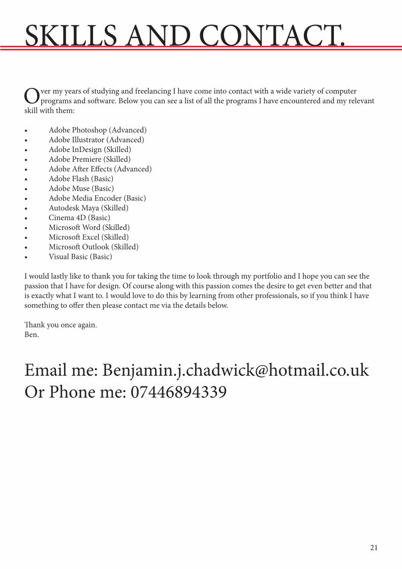
SKILLS AND CONTACT.
Over my years of studying and freelancing I have come into contact with a wide variety of computer programs and software. Below you can see a list of all the programs I have encountered and my relevant
skill with them:
• Adobe Photoshop (Advanced)• Adobe Illustrator (Advanced)• Adobe InDesign (Skilled)• Adobe Premiere (Skilled)• Adobe After Effects (Advanced)• Adobe Flash (Basic)• Adobe Muse (Basic)• Adobe Media Encoder (Basic)• Autodesk Maya (Skilled)• Cinema 4D (Basic)• Microsoft Word (Skilled)• Microsoft Excel (Skilled)• Microsoft Outlook (Skilled)• Visual Basic (Basic)
I would lastly like to thank you for taking the time to look through my portfolio and I hope you can see the passion that I have for design. Of course along with this passion comes the desire to get even better and that is exactly what I want to. I would love to do this by learning from other professionals, so if you think I have something to offer then please contact me via the details below.
Thank you once again. Ben.
Email me: [email protected] Phone me: 07446894339