nathan davenport portfolio
TRANSCRIPT
PortfolioPortfolioNathan DavenportNathan Davenport

Nathan Davenport707 s 5 w apt 2902Rexburg ID 83440
Behance.net/Nathandvnprt
503.840.5886
ContentContent

Montage pg4Logos pg6Letterhead pg8Tryout Flier pg10Business Card pg12Brochure pg14Flier pg16Event Poster pg18Webpage pg20Imaging pg22
Table of ContentTable of Content

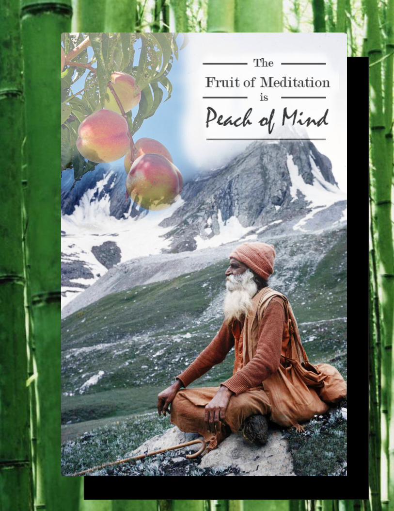
Description:Make an inspirational poster in photoshop using masks, photoshop edits and Typography.
Process:
I chose my background imageadd the peach tree branchPut a mask on the peach tree and used 100% opacity to get rid of edgesChanged the image’s opacity to 54%Made my background image more vibrant and adjusted the reds and yellows to better match the fruit.Created some typography message and masked and made on opacityPrograms/Tools Used: Adobe PhotoshopMessage:I wanted to create a mix of fun and inspirational. Something like its message that shows peace and seriousness are not the same.Audience: Anyone that enjoys a pun.Colorized/Filter applied and where: The yogi, sky and grass were changed to better match the tree.Color scheme : Tetradic and color names: Green, Red, Orange and BlueTop thing learned: Typography just as important as imageFont #1 Name & Category: Title: Modern NO. 20 – Modern
Font #2 Name & Category: Copy: Mistral – Script
image sources: http://thenothingnessofpersonality.tumblr.com/post/10288650705/yogi-simply-labelled-asia-india-himalayas-in
http://www.morguefile.com/archive
MontageMontage
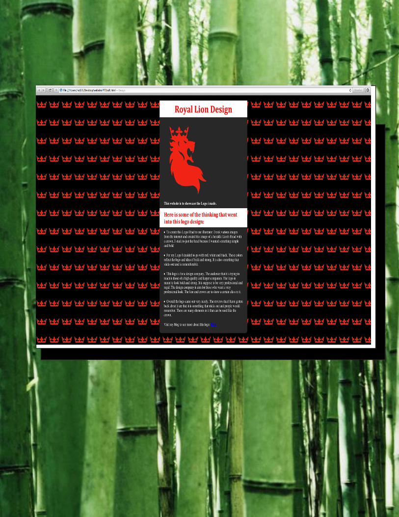
Description:Create Three different logos for one company.Process:This was a great project i already knew some about illustrator but this assignment really helped me get comfortable with it. I used the pen tool a lot more then i normally would now that i know how to manipulate shapes better.
Programs/Tools Used: Adobe Illustrator
Message: Japanese Soap made from Bamboo
Audience: People interested in Japan and good soap
Top Thing Learned: Creating and moving anchor points.Color scheme: top logo: monochromatic; middle logo: complementary; bottom logo: Analagous and color names: top logo: Blue; middle logo: red and Green bottom logo: Yellow and limeTop Logo – Font #1 Name & Category: Ariel rounded MT Bold (Slab Serif)Top Logo – Font #2 Name & Category: Japanese Brush (decorative)
Middle Logo – Font #1 Name & Category: None
Middle Logo – Font #2 Name & Category: NA (Only one font)
Bottom Logo – Font #1 Name & Category: (only one font)Bottom Logo – Font #2 Name & Category: NA no font
How the logo represents the company
My favorite logo was the bottom logo
LogosLogos

Description:Make a stationery using letterhead and business card in illustrator and indesign.
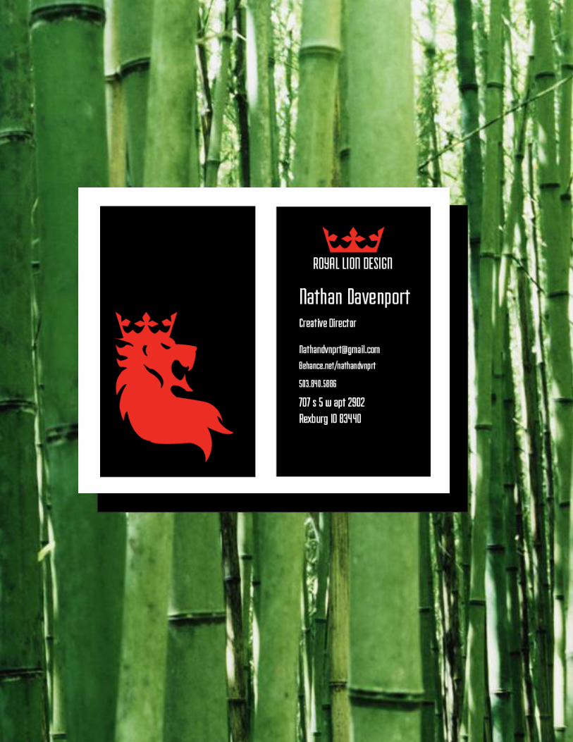
Process (Programs, Tools, Skills):I created the logo in illustrator using the pen tool I played around with having a stroke or not. I wanted to make something simple but bold. i think the colors and placement of the logo make the happen. I decided to use black on both sides of my business card so they would be distinct from other cards. I used the crown on the other side to add some red to it and unity all three pieces.
The Letter head i kept simple and used the same font as my business card. I also incorporated the Lion’s Head to make it unified with the business card. I also made it larger and in the corner so it would stick out and be bold.
The theme i was going for here is bold and simple. Which i think fits a design company well.
Programs/Tools Used: Adobe Illustrator & InDesign
Message: The color is suppose to be bold and the lion and crown show that it is serious, classy work. The simplicity of it is to make it be clear and stick out.
Audience: Design company for prestigious companies.
Top things learned: How much you need to make a water mark transparent.
Color scheme: light on Dark and color names: Red, White and Black
Title Font Name & Category: Fairview – Sans Serif
Copy Font Name & Category: Same
LetterheadLetterhead


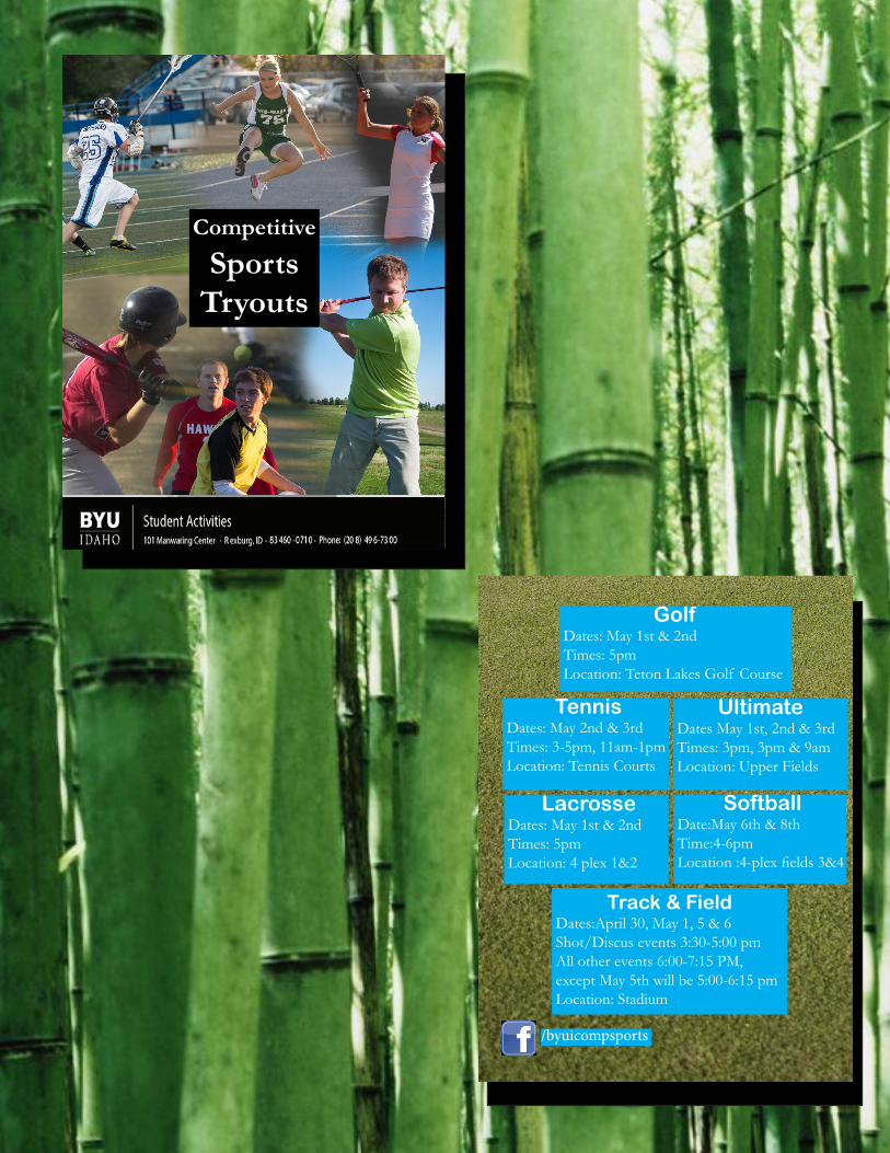
Tryout FlierTryout FlierDescription: This is an event flier covering multiple events.
Process; I started this project with thinking what i wanted to convey and to who. I decided I wanted to convey what sports were being offered the students at BYU Idaho during the Spring semester. I took some photos of each sport and placed them into a photoshop file and masked them so they would fit together in a montage. I decided to make the flier double sided with the information on the back. I then created an InDesign document to place the image and work with the information i had. I divided up the page to make sure the text wasn’t to close to the edge and that the sports and info would not be cut off when the smaller fliers were made. I made the document color but printed in black and white to see who it would work whether in color or black and white.
Programs used: Adobe Photoshop and Adobe Indesign.
Message: These six sports are avaliable and you should try out for them.
Audience: College students at BYU Idaho.
Top thing learned: Links in InDesign make for quick adjustments to documents.
Competitive Sports
Tryouts
Competitive Sports
Tryouts
Competitive Sports
Tryouts
Competitive Sports
Tryouts
Golf Dates: May 1st & 2nd Times: 5pm Location: Teton Lakes Golf Course
Golf Dates: May 1st & 2nd Times: 5pm Location: Teton Lakes Golf Course
Golf Dates: May 1st & 2nd Times: 5pm Location: Teton Lakes Golf Course
Golf Dates: May 1st & 2nd Times: 5pm Location: Teton Lakes Golf Course
Softball Date:May 6th & 8th Time:4-6pm Location :4-plex fi elds 3&4
Softball Date:May 6th & 8th Time:4-6pm Location :4-plex fi elds 3&4
Softball Date:May 6th & 8th Time:4-6pm Location :4-plex fi elds 3&4
Softball Date:May 6th & 8th Time:4-6pm Location :4-plex fi elds 3&4
Ultimate Dates May 1st,2nd & 3rd Times: 3pm, 3pm & 9am Location: Upper Fields
Ultimate Dates May 1st, 2nd & 3rd Times: 3pm, 3pm & 9am Location: Upper Fields
Ultimate Dates May 1st,2nd & 3rd Times: 3pm, 3pm & 9am Location: Upper Fields
Ultimate Dates May 1st,2nd & 3rd Times: 3pm, 3pm & 9am Location: Upper Fields
Track & Field Dates:April 30-May 1, 5 & 6 Shot/Discus events 3:30-5:00 pm All other events 6:00-7:15pm, except May 5th will be 5:00-6:15 pm Location: Stadium
Track & Field Dates:April 30, May 1, 5 & 6 Shot/Discus events 3:30-5:00 pm All other events 6:00-7:15 PM, except May 5th will be 5:00-6:15 pm Location: Stadium
Track & Field Dates:April 30, May 1, 5 & 6 Shot/Discus events 3:30-5:00 pm All other events 6:00-7:15 pm, except May 5th will be 5:00-6:15 pm Location: Stadium
Track & Field Dates:April 30-May 1, 5 & 6. Shot/Discus events 3:30-5:00 PM All other events 6:00-7:15 PM, except May 5th will be 5:00-6:15pm Location: Stadium
Tennis Dates: May 2nd & 3rd Times: 3-5pm, 11am-1pm Location: Tennis Courts
Tennis Dates: May 2nd & 3rd Times: 3-5pm, 11am-1pm Location: Tennis Courts
Tennis Dates: May 2nd & 3rd Times: 3-5pm, 11am-1pm Location: Tennis Courts
Tennis Dates: May 2nd & 3rd Times: 3-5pm, 11am-1pm Location: Tennis Courts
Lacrosse Dates: May 1st & 2nd Times: 5pm Location: 4 plex 1&2
Lacrosse Dates: May 1st & 2nd Times: 5pm Location: 4 plex 1&2
Lacrosse Dates: May 1st & 2nd Times: 5pm Location: 4 plex 1&2
Lacrosse Dates: May 1st & 2nd Times: 5pm Location: 4 plex 1&2
/byuicompsports
/byuicompsports /byuicompsports
/byuicompsports
Business CardBusiness CardDescription:Make a stationery using letterhead and business card in illustrator and indesign.
Process (Programs, Tools, Skills):I created the logo in illustrator using the pen tool I played around with having a stroke or not. I wanted to make something simple but bold. i think the colors and placement of the logo make the happen. I decided to use black on both sides of my business card so they would be distinct from other cards. I used the crown on the other side to add some red to it and unity all three pieces.
The Letter head i kept simple and used the same font as my business card. I also incorporated the Lion’s Head to make it unified with the business card. I also made it larger and in the corner so it would stick out and be bold.
The theme i was going for here is bold and simple. Which i think fits a design company well.
Programs/Tools Used: Adobe Illustrator & InDesign
Message: The color is suppose to be bold and the lion and crown show that it is serious, classy work. The simplicity of it is to make it be clear and stick out.
Audience: Design company for prestigious companies.
Top things learned: How much you need to make a water mark transparent.
Color scheme: light on Dark and color names: Red, White and Black
Title Font Name & Category: Fairview – Sans Serif
Copy Font Name & Category: Same

Description:Create a brochure.Process (Programs, Tools, Skills):I started out with creating a simple layout in Indesign. I then tried to think of an organization that i would like to make a brochure for. I thought about Charity: Water. It is an organization that helps provide water to people in need. I found some images that i liked and used them to show a before and after of charity: Water’s effect. In creating something i wanted to stand out i made a pull out for my brochure. I like the idea of revealing the information. I put an image of dirty water over a glass of clean water that had the text in it. I also put it in the section of what can i do because that is what you can do. Making dirty water Clean. I did some research on the charity and decided to show who they are, how you can help and then talk about the two of them together. I really enjoyed working on this project.Programs/Tools Used: Adobe InDesign/Adobe Illustrator/Adobe PhotoshopMessage: The message is to create awareness about poor water conditions around the world and to encourage people to get involved.Audience: People willing to donate to a good cause.Top Thing Learned: I learned how to use the rulers in InDesign to make a layout.Color scheme and color names: Monochromatic, YellowTitle Font Name & Category: Bangla/ Sans serifCopy Font Name & Category: Palatino Linotype / Old Styleclean-dirty-drinking-glassCharityWaterPic3charity_water_photo03-lo-resCharityWater-Featurecharity-water-photo1images from Charitywater.orghttp://childrensprize.org/2013/08/26/clean-water-vs-dirty-water-which-one-would-you-choose/
BrochureBrochure

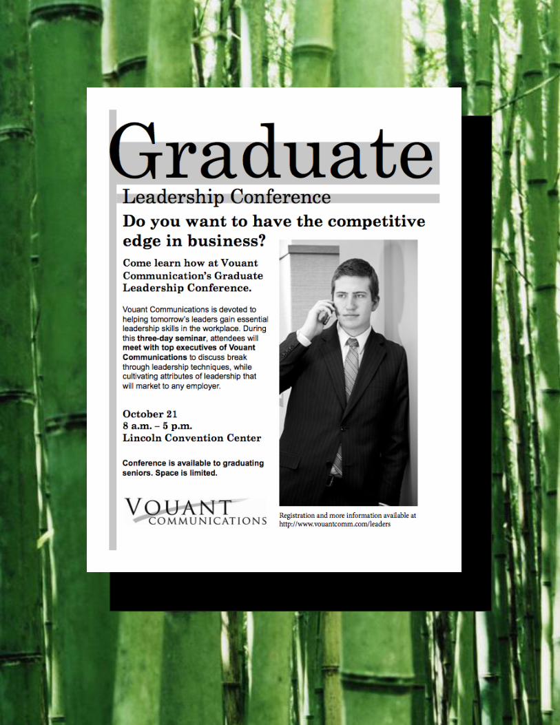
Description:Promotional Flier for Vouant Communications’ Graduate Leadership Conference.
Process:I started out sketching a few different looks for the flier. I decided on one that I felt used the principles of design the best. I took that design to the Indesign program and set it up. Seeing it on the computer i was able again to readjust it to better emphasis my message. I printed off a draft and took it to be reviewed by my peers. After getting their opinions and suggestions i went back to Indesign to touch up my flier until I felt that it conveyed the message the best. To do all this i made sure that my flier had good alignment, 2 contrasting fonts, and an appealing visual hierarchy.
Message:My message is to Graduating students who want want to get the competitive edge in business, learn leadership skills and are serious about getting ahead.
Audience:Graduating students from college.
Top thing learned:I learned that if alignment is off a little it will make the whole thing look unprofessional.
Title Font Name & Category:Century Schoolbook-Oldstyle
Copy Font Name & Category:Ariel-Slab Serif
FlierFlier

Description:Event Poster for a fundraiser of our choosing using Microsoft Word.
Process:I started out by looking for an image that i thought was interesting. I found an image of Lewis Hamilton F1 racer and thought that racing made for a good charity. I did some research on Lewis Hamilton and charities he has been involved with. I found that he had been associated with The Honeypot Children Charity so i used that. I made a design that i thought was good. I found that i was following “rules” that didn’t exist. So for my final project i decided to change it and be more creative by using arrows to lead the reader as well as principles of design.
Message:My message is to fans of Formula One Racing who would want to race against a F1 racing star and their donations would go to a good cause making it a win win situation.
Audience:Fans of F1 racing 18 yrs and older.
Top thing learned:I learned that I was limiting myself by not including different ideas and shapes to my flier.
Title Font Name & Category:Abadi MT Condensed Extra Bold – Slab Serif
Copy Font Name & Category:
Event PosterEvent Poster


Description:A web page showcasing my logo.
Process (Programs, Tools, Skills):I used Textwrangler and some dreamweaver to make this webpage. I started just using the Textwrangler but as i asked for help someone showed me dreamweaver and how it worked.
This is the most i have used html and the first time i have used css. The programs i used and the help i got really got things going. I used the css from our activate as a base but changed it up to make it my own. I started with the body and adding a logo and then i worked on the background. I decided to use the crown to best tie in the logo with the webpage. I played around with different backgrounds until i settled on the crowns.
Programs/Tools Used: TextWrangler, Dreamweaver, Illustrator, & Photoshop
Message: That my design company is interested in making an image for you and your business.
Audience: Large corporations .
Top Thing Learned: How to use CSS
Color scheme and color hex: Analogous: Red #ffd000 white #fff; black #282828;
Title Font Families & Category: (all names) Cambria, “Hoefler Text”, “Liberation Serif”, Times, “Times New Roman”, serif;
Copy Font Families & Category: (all names) ”Lucida Grande”, “Lucida Sans Unicode”, “Lucida Sans”,
“DejaVu Sans”
Changes made to the CSS: I changed the fonts, the colors, made a new background, made it fixed, got rid of the border and add to the headers.
Web PageWeb Page

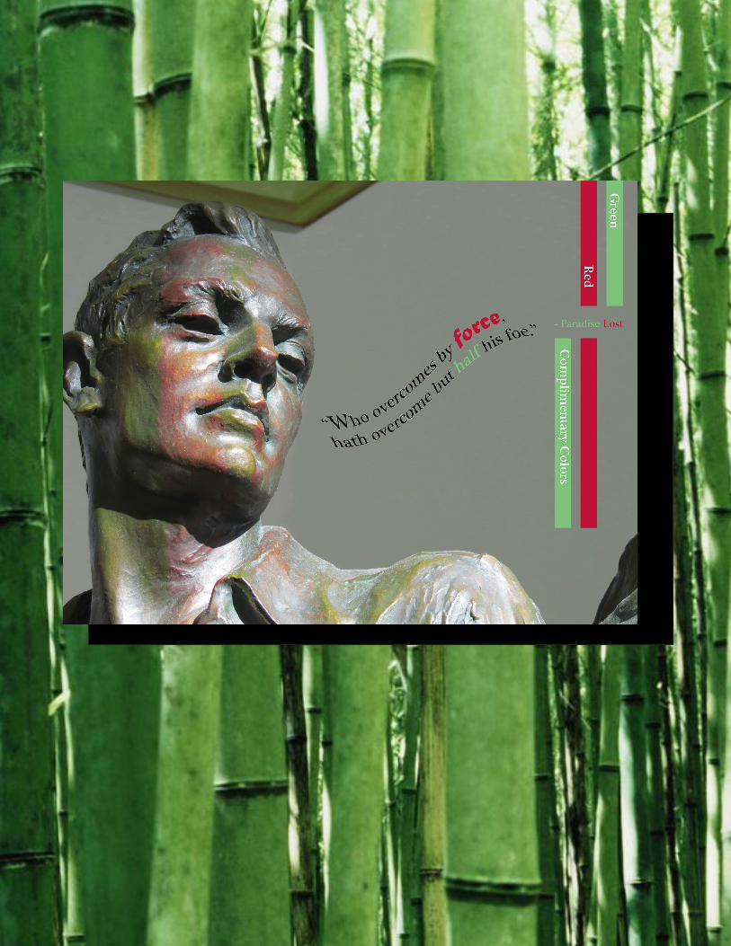
Description: Show good Photography and editing skill. Add a color scheme.
Process (Programs, Tools, Skills: I started with using a digital camera and searched for a good image. I then used photoshop change the colors around. In photoshop used clipping mask to get the multicolored affect. I used the smug tool to make the red match up better with his facial curves. I used the color wheel to find a complimentary color scheme.
Message: I wanted to show an understanding of photoshop ability and go out of my comfort zone and try to do something new and interesting.
Audience: Those how like interesting images and like poetry.Top Thing Learned: I learned that it is important to go through the steps and to push yourself to try new things and not just things that you know would be easy.
Color scheme: Complimentary color names: Red and Green
Title Font Name & Category: Matura Mt Script: Decorative, Plantagenet Cherokee : Oldstyle
Copy Font Name & Category: Plantagenet Cherokee :
Oldstyle
ImagingImaging