nme cover analysis 22222222
TRANSCRIPT
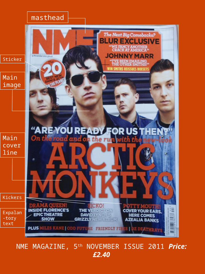
NME MAGAZINE, 5th NOVEMBER ISSUE 2011 Price: £2.40
masthead
Mainimage
Maincoverline
Sticker
Kickers
Expalan-tory text
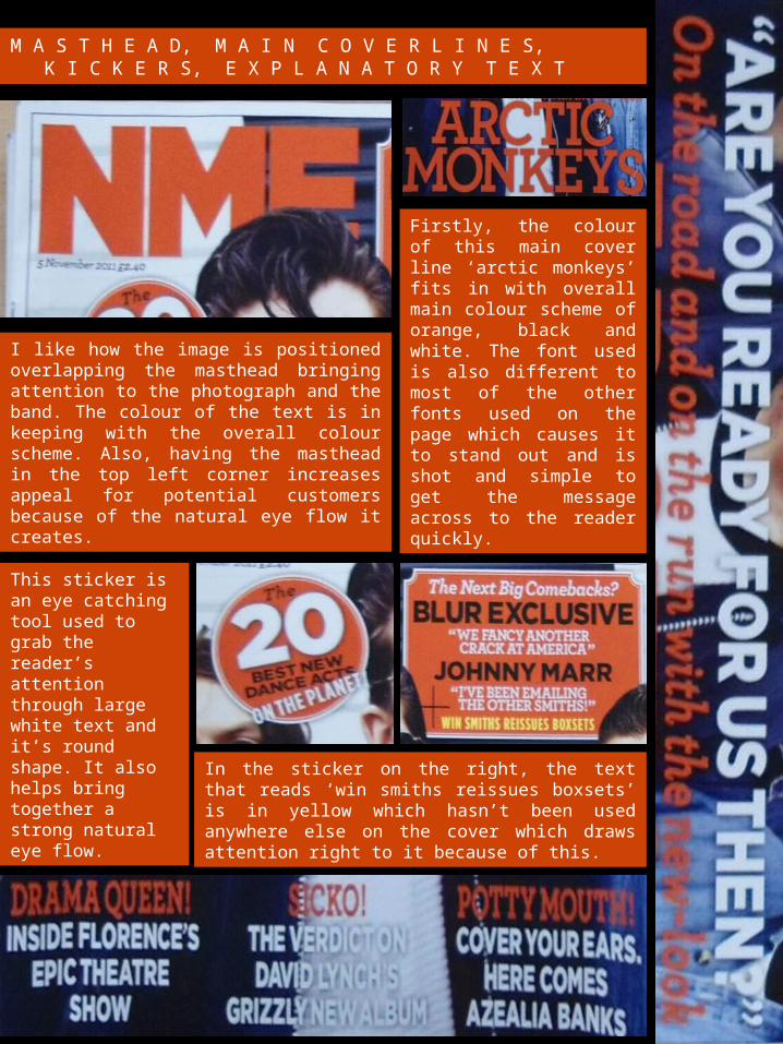
M A S T H E A D, M A I N C O V E R L I N E S, K I C K E R S, E X P L A N A T O R Y T E X T
I like how the image is positioned overlapping the masthead bringing attention to the photograph and the band. The colour of the text is in keeping with the overall colour scheme. Also, having the masthead in the top left corner increases appeal for potential customers because of the natural eye flow it creates.
Firstly, the colour of this main cover line ‘arctic monkeys’ fits in with overall main colour scheme of orange, black and white. The font used is also different to most of the other fonts used on the page which causes it to stand out and is shot and simple to get the message across to the reader quickly.
This sticker is an eye catching tool used to grab the reader’s attention through large white text and it’s round shape. It also helps bring together a strong natural eye flow.
In the sticker on the right, the text that reads ‘win smiths reissues boxsets’ is in yellow which hasn’t been used anywhere else on the cover which draws attention right to it because of this.
L A N G U A G E
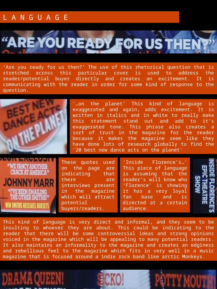
‘Are you ready for us then?’ The use of this rhetorical question that is stretched across this particular cover is used to address the reader/potential buyer directly and creates an excitement. It is communicating with the reader in order for some kind of response to the question.
‘…on the planet’ This kind of language is exaggerated and again, adds excitement. It is written in italics and in white to really make this statement stand out and add to it’s exaggerated tone. This phrase also creates a sort of trust in the magazine for the reader because it makes the magazine seem like they have done lots of research globally to find the ’20 best new dance acts on the planet’
This kind of language is very direct and informal, and they seem to be insulting to whoever they are about. This could be indicating to the reader that there will be some controversial ideas and strong opinions voiced in the magazine which will be appealing to many potential readers. It also maintains an informality to the magazine and creates an edginess and rebellious feel to the magazine which fits in very well in a music magazine that is focused around a indie rock band like arctic Monkeys.
‘Inside Florence’s…’ This piece of language is assuming that the reader’s will know who ‘Florence’ is showing it has a very loyal fan base and is directed at a certain audience.
These quotes used on the page are indicating that there are interviews present in the magazine which will attract potential buyers/readers.
C O L O U R S C H E M E
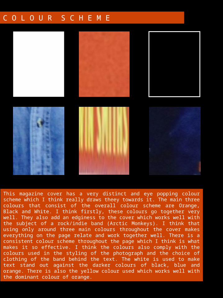
This magazine cover has a very distinct and eye popping colour scheme which I think really draws theey towards it. The main three colours that consist of the overall colour scheme are Orange, Black and White. I think firstly, these colours go together very well. They also add an edginess to the cover which works well with the subject of a rock/indie band (Arctic Monkeys). I think that using only around three main colours throughout the cover makes everything on the page relate and work together well. There is a consistent colour scheme throughout the page which I think is what makes it so effective. I think the colours also comply with the colours used in the styling of the photograph and the choice of clothing of the band behind the text. The white is used to make text stand out against the darker colours of black, blue and orange. There is also the yellow colour used which works well with the dominant colour of orange.
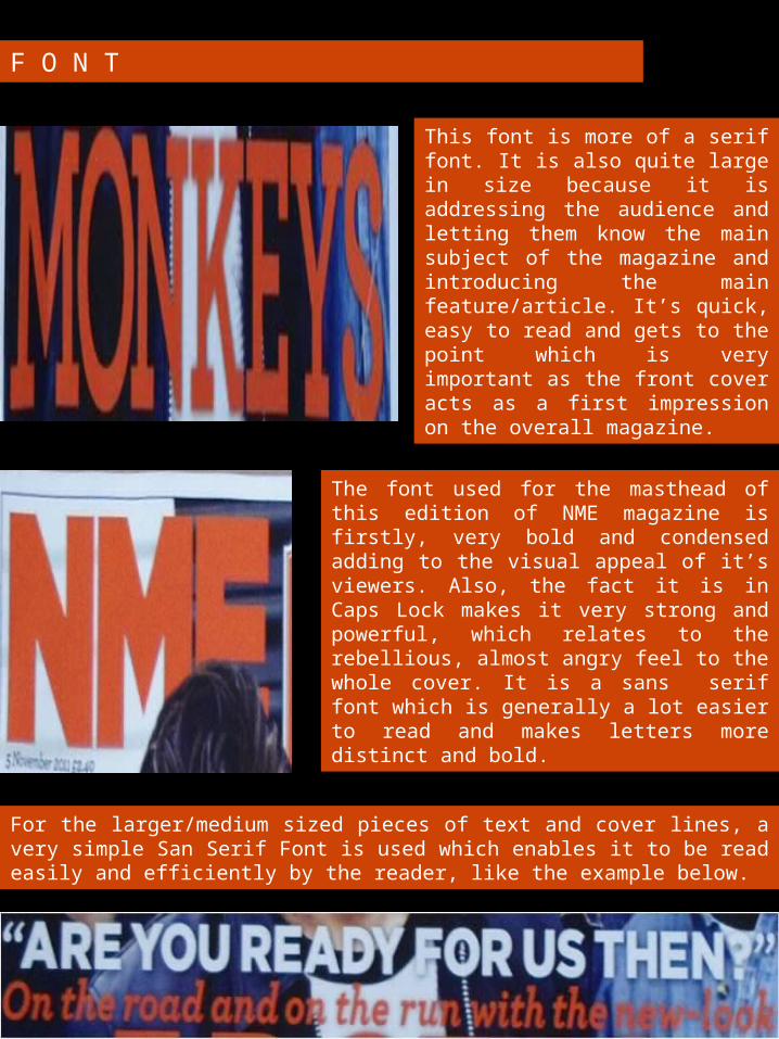
F O N T
The font used for the masthead of this edition of NME magazine is firstly, very bold and condensed adding to the visual appeal of it’s viewers. Also, the fact it is in Caps Lock makes it very strong and powerful, which relates to the rebellious, almost angry feel to the whole cover. It is a sans serif font which is generally a lot easier to read and makes letters more distinct and bold.
This font is more of a serif font. It is also quite large in size because it is addressing the audience and letting them know the main subject of the magazine and introducing the main feature/article. It’s quick, easy to read and gets to the point which is very important as the front cover acts as a first impression on the overall magazine.
For the larger/medium sized pieces of text and cover lines, a very simple San Serif Font is used which enables it to be read easily and efficiently by the reader, like the example below.