not more than you can chew bite-sized tactics to make sense of your metrics #13ntcbite
DESCRIPTION
Not More than You Can Chew Bite-sized tactics to make sense of your metrics #13NTCbite. Jo Miles Food & Water Watch @ josmiles. The Problem. Sometimes working with data feels like biting off more than you can chew. The Solution. - PowerPoint PPT PresentationTRANSCRIPT
Not More than You Can ChewBite-sized tactics to make sense of your metrics
#13NTCbite
Jo MilesFood & Water Watch@josmiles

The ProblemSometimes working with data feels like biting off more than you can chew

The SolutionBreak your great big data needs into delicious, bite-sized pieces.

Today, we’ll talk about:
• The right way to think about data• Data analysis, without a lot of math• Working more efficiently with data• Making time for data in your busy day• Using your data for better decision-making
• How to be a Data Analysis Honey Badger!

We will NOT talk about:
• Technical ways to collect your data• What metrics to collect• Statistics• Data modeling• Advanced analysis software

1. Why analyze?

Data should be useful
Data Information Insight
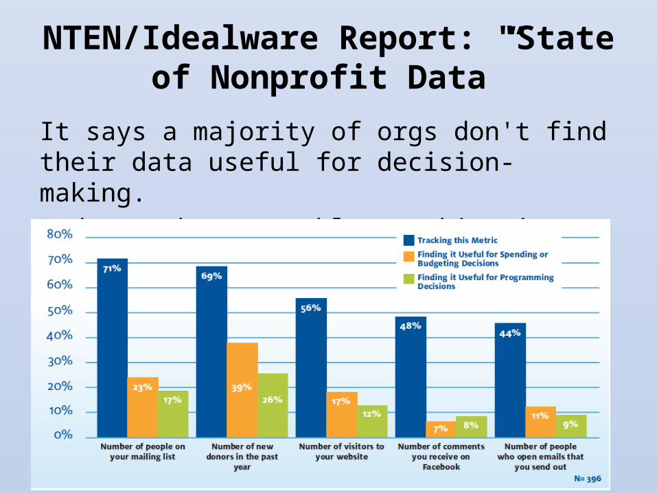
NTEN/Idealware Report: "State of Nonprofit Data”
It says a majority of orgs don't find their data useful for decision-making. And many have trouble tracking it.

Challenges in using data effectively
• Data collection/quality• Expertise• Technology• Prioritization/time

Challenges in using data effectively
• Data collection/quality• Expertise• Technology• Prioritization/time

What does it take to be a data analysis honey badger?
Not as much as you’d think…
Wikimedia: Matej Batha

2. Set yourself up for success

Only track data that's useful
• If it’s not useful… Don't spend time on it!
• Ask yourself:– Is this data likely to change much
over time?– Will I go back and look at it?– What will I do differently if this
data looks good or bad?

Know what to track
• Every system is different• Every organization is different
Important and Easy
Important and Hard
Unimportant and Easy
Unimportant and Hard
Track th
is stuff!

Track on a timeframe that's useful to you
Daily, weekly, monthly, quarterly, yearly…

Measure regularly
1. Create an easy format to track metrics:• Email response rates
• Action rates
• Donation counts
2. Update it diligently • In 30 minutes or less
• Schedule reports if you can
3. Summarize with charts4. Look for trends and surprises
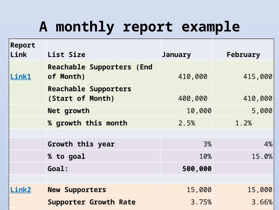
A monthly report exampleReport Link List Size January February
Link1 Reachable Supporters (End of Month) 410,000 415,000
Reachable Supporters (Start of Month) 400,000 410,000
Net growth 10,000 5,000
% growth this month 2.5% 1.2%
Growth this year 3% 4%
% to goal 10% 15.0%
Goal: 500,000
Link2 New Supporters 15,000 15,000
Supporter Growth Rate 3.75% 3.66%
Link3 Unsubscribes 5,000 10,000
Unsubscribe Rate 1.25% 2.44%
Analyze as needed
• Measuring won’t tell you everything• Use analysis to answer specific
questions…• …but only when you need to.

Analysis = Big Questions
• Are our activists more likely to donate?• What sources give us the most engaged
supporters?• Who should we target for a second gift? To
become sustainers?• Who is unsubscribing, when, and why?

Analysis = Exploration
When you see something strange, dig in:
• Who?• What?• When?• Where?
…and look for evidence of why.Flickr: DG Jones
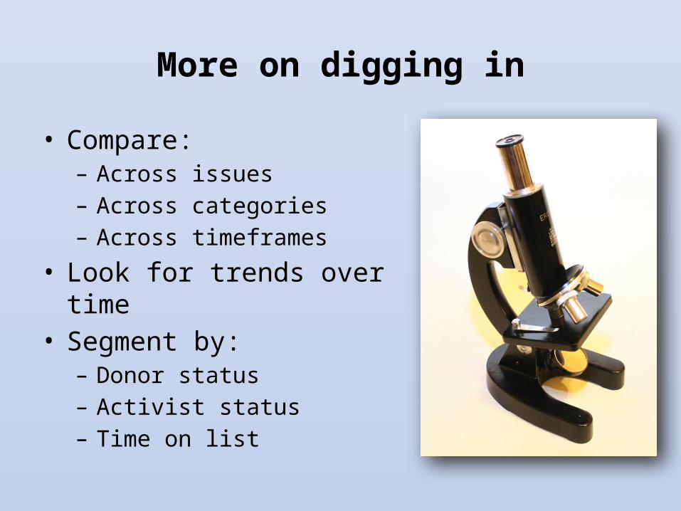
More on digging in
• Compare:– Across issues– Across categories– Across timeframes
• Look for trends over time• Segment by:
– Donor status– Activist status– Time on list
Learn Excel!
• Sort and filter• Charts• Formulas• Pivot tables
Yes, seriously!
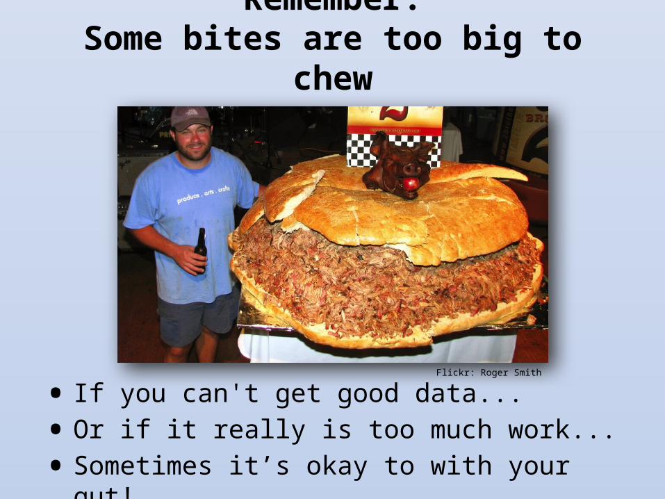
Remember:Some bites are too big to chew
• If you can't get good data...
• Or if it really is too much work...
• Sometimes it’s okay to with your gut!
Flickr: Roger Smith

Building a data-driven culture
• When making decisions, ask: – Is there data that can help us?– Are we making big
assumptions that data could prove?
• Do what the data says – or have a good reason not to!

Building a data-driven culture
• Sharing is caring!• Share both your data and your results!• Better yet, show others how you draw
insight from your data
Flickr: 1225design

3. Developing your number sense
You don't need statistics

Get cozy with numbers
• Listen to the stories they tell you
• Know how to – Compare them– Manipulate them– Explain them

What’s “normal”?
• It looks something like this:
• Without using statistics:– Get familiar with your typical ranges– Learn to eyeball what “normal” is
These are “normal” values, at a glance

Benchmark against yourself
• Benchmark reports tell how you're doing compared to others.
• That can be useful.• But others aren't you!

Do-it-yourself benchmarking (email performance)
1. Report on ALL your emails from past year:a. # deliveredb. # of opensc. # of clicksd. # of actions/donations
(if possible)e. # of unsubscribes
Flickr: Samantha Chapnick

Do-it-yourself benchmarking (email performance)
2. Calculate average rates for all messages. E.g. for average open rate:
a. Take sum of all opensb. Divide by sum of all delivered
This is your benchmark open rate.
3. Do the same for other metrics.

Do-it-yourself benchmarking (email performance)
4. For bonus points, group messages by type:
• Advocacy• Fundraising• National• Local• Etc.
...and calculate those benchmarks rates.

Using your do-it-yourself benchmarks
• Compare each new message against benchmark rates.
• Update periodically with recent data.
• Watch how benchmarks change over time.

4. Lies, damned lies…
…and the lying liars who tell them

Lying with data:The path to the Dark Side
“Come to the Dark Side.We have cookies.”
Flickr: Antony Hell

Don't compare apples to orangesCompare-able Not compare-able!
Flickr: b1ue5ky

Don't compare apples to oranges
What you can do: Compare things that are as similar as you can make them. Remove oddballs.
Email to full list Email to food activists0%
5%
10%
15%
20%
25%
10%
20%
Open rate

Don't make too much of a small difference
What you can do: Calculate lift. Pay attention to significant differences. Ignore the others.
Email 1 Email 20%2%4%6%8%
10%12%14%16%18%
15.00% 15.30%
Open Rate in Subject Line Test

Calculating lift• "Lift" shows how different two rates are.• Rate X1 is your baseline. How much
better/worse is rate X2?
• Positive means X2 is better.• Look for lifts of at least 5%. • Anything over 10% is pretty good.
X1
X1 - X2 Lift %

Graphs can lie, too
What Excel actually gave me by default:
But the lift is only 2%!Email 1 Email 2
14.85%14.90%14.95%15.00%15.05%15.10%15.15%15.20%15.25%15.30%15.35%
15.00%
15.30%
Open Rate in Subject Line Test

What’s happening here?Should we panic?
$0
$1,000
$2,000
$3,000
$4,000
$5,000
$6,000
$7,000
Donations
What you can do: Check your graphs. Are they clear? Are they truthful?

Don't draw conclusions from tiny numbers
• Rule of thumb: to know anything about your data, you need:– At least 100 data points. – Preferably 500 data
points.– More is better.
What you can do: Say "we think this might be a trend, but we need more data."

This has a name: Statistical Significance
• Yes, it’s statistics…
• But it's important!
• Look for online tools that calculate this for you

Don't draw careless conclusions
Remember: correlation does not imply causation.
xkcd.com

Don't draw careless conclusions
• Data tells you WHAT, not WHY• Have you heard this one?
– "80% of our activists have taken action on food issues.
– Therefore, they must like food issues best, so we should send more food alerts."
What you can do: Always give caveats when guessing the "why" behind the numbers. Second-guess your assumptions.

Don’t lie… even to yourself
It’s so tempting to lie with your data!
You must resist the temptation.Don’t go to the dark side!

6. Sharing with decision makers
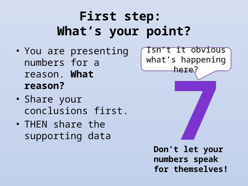
First step: What’s your point?
• You are presenting numbers for a reason. What reason?
• Share your conclusions first.
• THEN share the supporting data 7
Isn’t it obvious what’s happening
here?
Don’t let your numbers speak for themselves!

Who is your audience?
• Some people “get” numbers• Others do not• Present your data in the way that speaks
to them
?

The number one rule of talking about data
Don’t be boring!Flickr: Triplexpresso

Use visuals

Use visuals

Use rates, not raw numbers
• Single, raw numbers mean nothing.
• Instead look at rates – Open rate– Click rate– Donation rate
• Not 5,000 actions, but a 7% action rate.
Hey, we got 5,000 signatures on that
petition!...Is that good?

Give context
• You probably know why the numbers look the way they do.
• The people you’re presenting to may not.
• So tell them!
That’s all we raised last month?What went wrong?
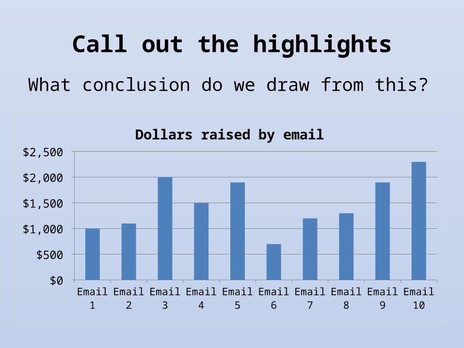
Call out the highlights
What conclusion do we draw from this?
Email 1 Email 2 Email 3 Email 4 Email 5 Email 6 Email 7 Email 8 Email 9 Email 10
$0
$500
$1,000
$1,500
$2,000
$2,500
Dollars raised by email

Call out the highlights
Use arrows, colors to draw attention!
Email 1 Email 2 Email 3 Email 4 Email 5 Email 6 Email 7 Email 8 Email 9 Email 10
$0
$500
$1,000
$1,500
$2,000
$2,500
Dollars raised by email

Data doesn’t have to be more than you can chew

Your path to data honey-badgerdom
1. Don’t waste time on things that don’t matter.
2. Track regularly, with minimal effort.3. Dig in to answer the big questions.4. Be truthful to yourself.5. Share what you learn.

Questions?

Evaluate This Session!Enter for a chance to win an NTEN engraved mini iPad!
Search by session title at www.nten.org/ntc/eval