not this one
TRANSCRIPT

In what ways does your media product use, develop or challenge forms and conventions of real media products?

MAGAZINE COVER

We decided to create an Empire cover for our magazine print work. After me and my group researched magazine covers and magazines as a whole, we found that Empire was the most suitable for promoting our film. We solely based the magazine cover on Empire’s The Dark Knight, collector’s cover because we had more freedom to experiment with colour schemes because it was a special edition and the use of colours vary from the original colours that are used for their covers. Linked to this our colour scheme is black, white and red and therefore it went well with Empire as the masthead is usually red. Another reason we choose The Dark Knight cover was because of the main image, as we saw that the main image went well along side our film as we wanted to focus on the possession aspect of the film which we showed through the use of black contact lenses and thrilling make up.
MAGAZINE COVER
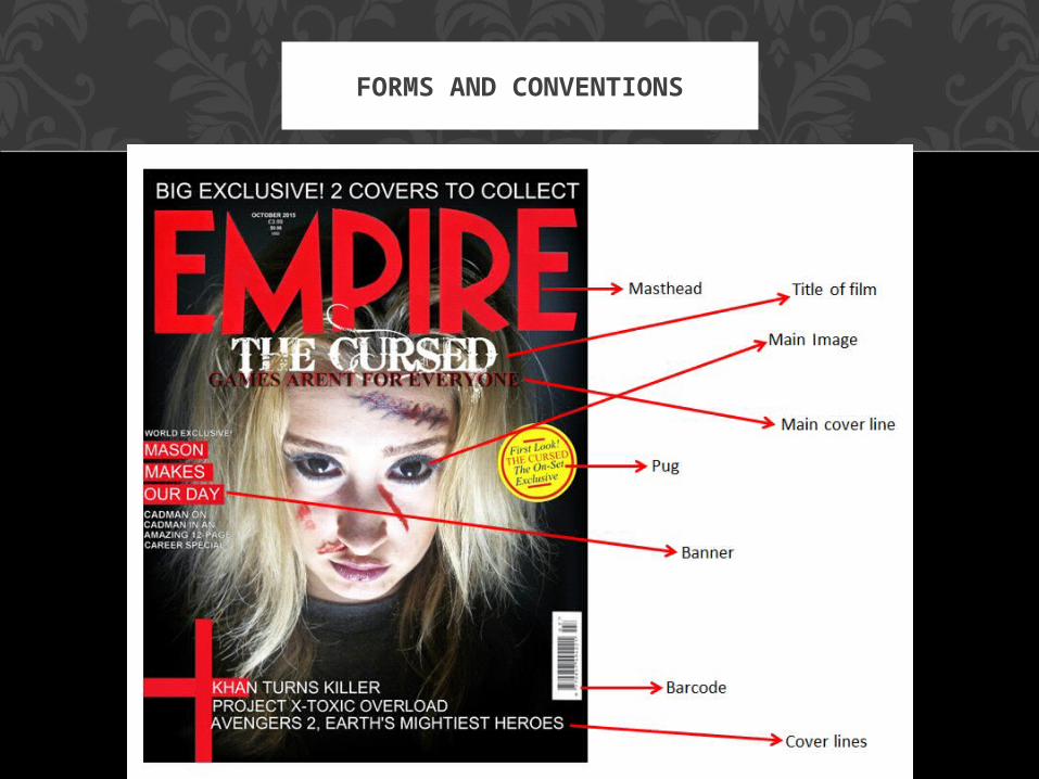
FORMS AND CONVENTIONS

RULE OF THIRDS
The rule of thirds is used when designing a magazine cover to create clarity and ensure that the cover looks professional and maintains the audiences interest. We followed the rule of thirds so that our magazine looked professional and realistic, replicating an actual Empire magazine cover. For example we placed the masthead in the conventional top third, the main image in the middle third, and the pugs and cover lines in the outer thirds.

THE DECISION PROCESS
After researching Empire, Sight and Sound and Total Film magazine covers, we decided
to do an Empire cover and use The Dark Knight special edition as a template. So we sketched a cover to receive feedback that it was a good and effective idea and then we progressed from there to create our final
cover.
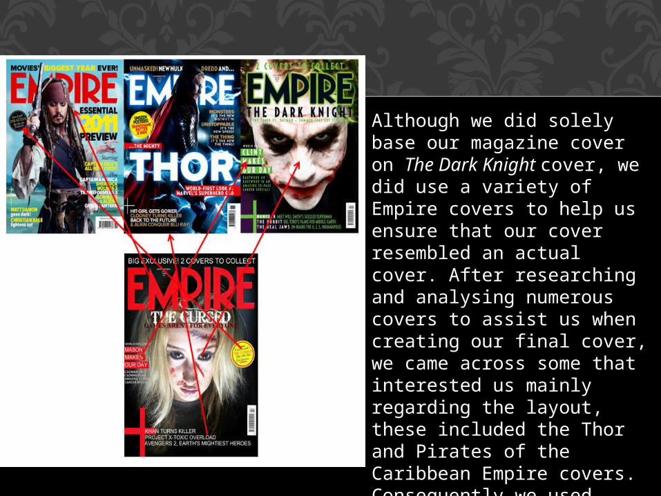
Although we did solely base our magazine cover on The Dark Knight cover, we did use a variety of Empire covers to help us ensure that our cover resembled an actual cover. After researching and analysing numerous covers to assist us when creating our final cover, we came across some that interested us mainly regarding the layout, these included the Thor and Pirates of the Caribbean Empire covers. Consequently we used these as templates as well as the Dark Knight one. As you can see we used aspects of all of the covers to make our unique one.

We used the original Empire masthead which is in big red writing and although we based our cover on a special edition, we thought that the original red masthead created more authenticity as well as continuity as it fitted in well with our black, white and red colour scheme. We followed the forms and conventions of a Empire cover and placed the masthead in the top third of the cover (abiding by the rule of thirds).As we used a special edition cover we did contemplate whether or not to change our masthead’s colour, to make our cover more unique. However, after playing about with covers and getting audience feedback we found that the original masthead was best suited for our cover. Furthermore our main image is very dark and the majority of the image is black, including the background and we saw that this emphasised the original masthead and therefore meant if the magazine was on a shelf in a shop, a viewing audience would be more entitled to pick it up.Another conventional aspect of an Empire magazine that we followed was the date of the edition and price in both pounds and dollars, that is always placed in the middle of the ‘M’ and therefore we placed ours in the middle of the ‘M’ too, but making it our own and making the date ‘OCTOBER 2015’ as how trailer is advertised to be realised around Halloween 2015. We mimicked the prices in both pounds and dollars.
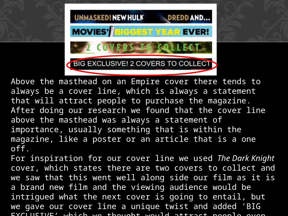
Above the masthead on an Empire cover there tends to always be a cover line, which is always a statement that will attract people to purchase the magazine. After doing our research we found that the cover line above the masthead was always a statement of importance, usually something that is within the magazine, like a poster or an article that is a one off.For inspiration for our cover line we used The Dark Knight cover, which states there are two covers to collect and we saw that this went well along side our film as it is a brand new film and the viewing audience would be intrigued what the next cover is going to entail, but we gave our cover line a unique twist and added ‘BIG EXCLUSIVE’ which we thought would attract people even more. Similarly to Empire covers, we used the usual font which is ‘Times New Roman’ , we used this font for the majority of the cover and this creates continuity like an actual cover. We also put the whole statement in capital letters like all Empire covers, again following the forms and conventions.

This is an aspect of The Dark Knight cover that we mimicked yet made it our own at the same time. All Empire covers have a main cover line which is either a short sentence or one word sentence that has the purpose to entice people to pick up and purchase the magazine. The main cover line is there to inform the viewing audience of what the main article is going to be about.We chose to add the title of our film ‘THE CURSED’ similar to The Dark Knight edition, we added the title in the font (bleeding cowboys) that we used for the films title on the teaser poster and in the trailer, this created continuity and adds the idea of our work being a film campaign. We made the title white so that it sticks out on the cover and we thought that the white showed the titles importance as it is emphasised on the dark background. Underneath the films title we added the main cover line which links to the films tagline ‘DON’T PLAY GAMES’ but we put ‘GAMES AREN’T FOR EVERYONE’ which will draw in and intrigue people to pick up the magazine. We used Times New Roman font to continue with continuity, Empire covers always tend to do this and use the same font for everything apart from something significant like the title of the film and we also followed the forms and conventions of Empire covers by the use of capital letters as they do this for a professional look. When we were creating the cover line we faced the issue of what colour to make the font as we wanted to stick with our colour scheme however both red and black wasn’t very visible as the main image is very dark. So after experimenting we decided that it looked best when the black text was shadowed by red text, and in result we thought it looked very effective as the red connotes danger and links in with the idea that our film is a paranormal thriller.

The main image is used intentionally to attract audiences to buy the magazine and regarding Empire covers the main image is always in the middle of the page. We followed this convention (the rule of thirds) and placed our image in the middle third. We based our main image on The Dark Knight’s main image as when we were researching and analysing covers we found that the main image of The Dark Knight was creepy and felt we could use it as a base image to work from. We took the photo for our cover, based on The Dark Knight image, because we wanted to use a close up, which typically isn’t used very often on Empire covers, and this makes our cover slightly unique. The effect of using the close up meant we could focus on the make up we were using to show our film involves violence but is not gory and we also wanted to show the possession aspect of our film and the close up entitles us to do this and focus on the black contact lenses that we used, which connote possession or the supernatural.

The pug is a convention of a magazine cover that adds extra information. A pug tends to be a bright colour that differs from the
colours used on the cover, so therefore we used a bright yellow, circle pug which we based on two separate pugs from two different Empire
magazine covers. We used yellow as it stuck out from our cover because we used only dark colours. The pug is also the only part of the cover that the font
differed from the rest, we chose to put ‘First Look! THE CURSED The On-Set Exclusive’ as it linked well with our film and we all agreed it
was one of the most interesting pugs that we found after reaching and analysing Empire covers.
We did base our cover on The Dark Knight’s, which doesn’t have a pug. However, the pug was the last thing we added and we added it because the right half of the cover looked almost empty and we felt that adding a pug showed we understood all of the forms and conventions if thriller
films.
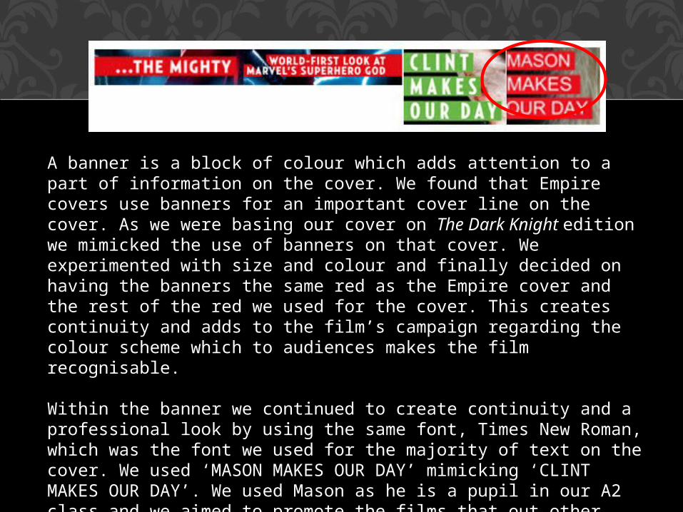
A banner is a block of colour which adds attention to a part of information on the cover. We found that Empire covers use banners for an important cover line on the cover. As we were basing our cover on The Dark Knight edition we mimicked the use of banners on that cover. We experimented with size and colour and finally decided on having the banners the same red as the Empire cover and the rest of the red we used for the cover. This creates continuity and adds to the film’s campaign regarding the colour scheme which to audiences makes the film recognisable.
Within the banner we continued to create continuity and a professional look by using the same font, Times New Roman, which was the font we used for the majority of text on the cover. We used ‘MASON MAKES OUR DAY’ mimicking ‘CLINT MAKES OUR DAY’. We used Mason as he is a pupil in our A2 class and we aimed to promote the films that out other class members are promoting to add an individual touch as well as their trailers for their films being released around the same time as ours and therefore they would have been on the cover of Empire realistically.

Cover lines are very similar to main cover lines however they are slightly longer statements that sum up the editions articles, and there aim is to attract audiences to buy the magazine. The cover lines were one of the hardest conventions to the cover to create as they had to be solely unique yet match the way Empire word and set out the cover lines. We spent a lot of time going through Empire covers, analysing how they set out and worded their cover lines. We first and foremost found every cover used a plus sign above or next to the text. The plus sign matched the colour scheme used on the cover and therefore we made our own pus sign for our edition. We made the colours of the sign, the same red as the masthead, banner and some of the text, again following the films colour scheme as well as creating a professional look for the cover. We mirrored the use of the sign on The Dark Knights edition which is next to the cover lines, we liked this as we thought it fitted in better with the layout of the cover and the text almost flows off of the sign.When we were creating the actual cover lines we based to way we wrote them after analysing Empire covers, the covers that helped us create them were the Thor and Pirates Of The Caribbean covers and their cover lines. Our cover lines are ‘KHAN TURNS KILLER, PROJECT-X TOXIC OVER LOAD, AVENGERS 2, EARTHS MIGHTEST HEROES’. We chose these as suitable cover lines as the two first cover lines link to the work that other students had made in our class and they are both thrillers like ours which adds continuity and adds to the thriller aspect of our cover. The other cover line we made was linked to a film which will be released at the same time as our film. We ensured our cover lines were sweet, simple and straight to the point which is a convention of Empire magazine cover lines.

TEASER POSTER

As you can see we used two previous posters to ensure we reached a final product that represented an actual teaser poster. By using two other teaser posters to help us, we could ensure that we weren’t revealing too little or too much information. We closely followed the forms and conventions of these two posters, yet making ours completely our own and unique to our vision and our film that is being promoted. We mimicked the forms and conventions that these posters used yet we revealed a lot less than Blood Red but around the same as The Possession.

THE DECISION PROCESS
To create our teaser poster we researched and analysed multiple thriller teaser posters, we narrowed the analysis to paranormal thriller posters as our trailer is promoting a paranormal thriller.
We used Blood Red and The Possession teaser posters to assist us when creating our print work. We found that teaser posters tend to reveal the least possible amount of information on the film so
that it hints/teases the audience, leaving enigmas and a reason for the to pursue in watching the film being promoted. After we found
the two paranormal teaser posters that we liked the most, we sketched a rough copy of what the poster will eventually look like,
and for feedback reasons, so that we could our target audience their advice and opinions. Along the process we changed aspects of the poster and eventually produced our final teaser poster for
‘The Cursed’.

FORMS AND CONVENTIONS

We based the layout of our teaser poster solely on the layout of the teaser poster for Blood Red. The layout is a portrait layout which consists of limited information about the film that it is promoting. As you can see our teaser poster
closely mirrors the Blood Red poster as we decided we would reveal the bare minimum to our viewing audience. Teaser posters tend to not reveal an exact release date, or all of the starring actors and only show a brief main image which only hints to the audience what the film will consist of or be about, and we strictly followed these forms and conventions when creating our print work.

THE PROCESS TO MAKE THE MAIN IMAGE

For our main image we began with a photo taken by us as a group with a character whose eyes are all black (by the use of contact lenses) with hands all over her face which are covered in blood. We used this image as when we were researching teaser posters and came across Blood Red, we found that we could effectively work with the image but change it, making it unique to our film. We wanted to focus on the character’s eyes being all black as this connotes possession and that is the one of the main themes in our film trailer, and we wanted to establish that there are four characters in the film and this image allowed us to show this. We used paint shop pro to achieve our final image and for effect we wanted to add a Ouija board behind our photo. After taking the photo we uploaded a photo of an Ouija board onto paint shop pro and we then cropped the photo out of the back ground and placed it on top of the Ouija board. This shows the viewing audience that the film will have a paranormal sub-genre and after analysing you could tell that the film will consist of four characters. Teaser posters only reveal the bare minimum to the audience regarding the main image and we followed this convention. To add effect to our final main image we edited each hand separately, making them slightly blue. This made each hand have a ‘deceased’ look, adding affect as well as enigma, which teaser trailers always tend to do. Other editing we also did for effect was merging both photos of the Ouija board and the characters and again this added effect and enigmas as the Ouija boars is visible but still very unclear and this therefore keep the viewing audience wondering why is it there, etc.
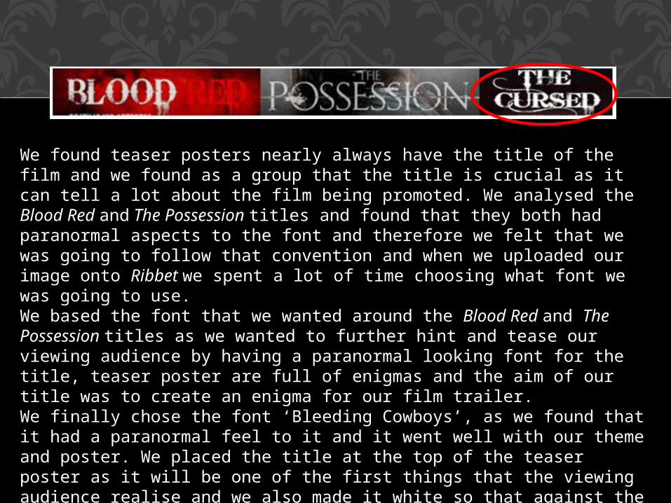
We found teaser posters nearly always have the title of the film and we found as a group that the title is crucial as it can tell a lot about the film being promoted. We analysed the Blood Red and The Possession titles and found that they both had paranormal aspects to the font and therefore we felt that we was going to follow that convention and when we uploaded our image onto Ribbet we spent a lot of time choosing what font we was going to use. We based the font that we wanted around the Blood Red and The Possession titles as we wanted to further hint and tease our viewing audience by having a paranormal looking font for the title, teaser poster are full of enigmas and the aim of our title was to create an enigma for our film trailer. We finally chose the font ‘Bleeding Cowboys’, as we found that it had a paranormal feel to it and it went well with our theme and poster. We placed the title at the top of the teaser poster as it will be one of the first things that the viewing audience realise and we also made it white so that against the dark background it was emphasised.
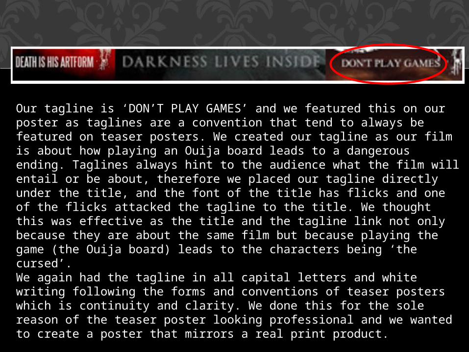
Our tagline is ‘DON’T PLAY GAMES’ and we featured this on our poster as taglines are a convention that tend to always be featured on teaser posters. We created our tagline as our film is about how playing an Ouija board leads to a dangerous ending. Taglines always hint to the audience what the film will entail or be about, therefore we placed our tagline directly under the title, and the font of the title has flicks and one of the flicks attacked the tagline to the title. We thought this was effective as the title and the tagline link not only because they are about the same film but because playing the game (the Ouija board) leads to the characters being ‘the cursed’. We again had the tagline in all capital letters and white writing following the forms and conventions of teaser posters which is continuity and clarity. We done this for the sole reason of the teaser poster looking professional and we wanted to create a poster that mirrors a real print product.

We added a sub title, ‘BASED ON A TRUE STORY’ to our poster and we placed it above the title of the film, we added this as we thought it gave our poster more of a professional look, we also got the idea from The Possession's teaser poster, as we found
that the majority of paranormal thrillers had that exact sub-title.We had the sub-title in white and all capital letters, to create clarity and a professional look to the teaser poster, we found
that posters nearly always tend to use the same font and letter size throughout the teaser poster and we therefore mimicked this convention because we wanted to achieve a final product
that resembled a real print work product.

A release date is when the film being promoted will finally be released into cinemas etc. Teaser posters tend to summarise when the film will be released, again hinting and teasing the audience, leaving them to continue wondering and waiting to know further details about the film. We revealed to our viewing audience that our film will be realised ‘IN THEATRES THIS HALLOWEEN’. We followed the convention of hinting and teasing the audience as we revealed a rough idea of when the film will be realised. By saying ‘HALLOWEEN’ it is clear that the film will be realised in October and again we had the text in white and capital letters to follow the continuity throughout.Teaser posters tend to have the release date on its own and separated from the rest of the information on the poster. This is so that it is immediately noticed by the viewing audience and therefore we placed ours at the very bottom in the centre, making it noticeable and detached from the rest of the text on the poster.

At the bottom left and right of our poster we added production and distribution companies, ‘Ghost House’ and ‘Lionsgate’.We added these icons to the poster as we saw that film posters tend to include the production or distribution companies, either as an icon similar to ours, or in the billing block. We found though that teaser posters rarely include these, however we wanted to include the distribution and production companies as we felt it added a sense of realism to our teaser poster and it makes ours slightly unique to others as we have included it. We chose these two companies as they are popular for producing paranormal thrillers, which is the sub-genre of our film and they also produced and distributed ‘The Possession’ which was a film that we used to help us when we was creating our coursework .

TEASER TRAILER

Our trailer is 1.04 minutes long and the length is a typical convention of a teaser trailer. Teaser trailers tend to always be under 1 minute and this
is because there aim is to only tease and hint, so therefore 1 minute is long enough. We followed this convention so that we ensured we had the right amount of shots, as well as not revealing too little or too much. Our trailer conventionally follows the three part structure and therefore we added two extra shots for the third part of the structure to create more enigmas, and this adds a few more seconds onto the end of the trailer,
resulting in the trailer being slightly longer than an average teaser trailer. However we did this as we thought it was more effective than
ending the trailer just on the title of the film.

THREE PART STRUCTURE
THREE PART STRUCTURE
The three part structure is a structure that a teaser trailer follows, it begins where characters are established then the peak where the trailer consists of multiple effective shots and lastly the end where the trailer ends on a resolution or enigma. We followed this three part structure convention, by beginning the trailer establishing the four main characters that are in the film, we established the characters and their traits, though their mannerisms and body language, we carefully choose the way they acted and spoke to show their traits to the audience. For example the first character pushes the camera immediately away from herself, this shows that she is slightly shady and awkward, one of the other character insists on having the camera on her face which shows her to be confident. The second part of the structure is the part of the trailer that consists of the most action packed and effective shots. The peak is full of several shots, that are edited at fast pace. We used loads of shots that emphasised the possession aspect of the film and the injury shots. Lastly the third part is where the trailer slows down and finishes on an enigma. We finished our trailer on two shots that were on of the characters looking on at herself in a mirror followed by a black screen and then the character looking into the mirror possessed and covered in blood. This leaves the trailer open to questioning by the audience and wanting them to proceed to watch the film when it is released. We found that teaser trailers do this for great effect on the audience and we therefore wanted to mimic this convention.

CHARACTERS
The three part structure states that the first part of a trailer should establish the characters that are going to be in the film and to represent their significant traits. We closely mirrored this structure and therefore we began our trailer with a home video which we felt was the easiest way to represent our characters traits, as because it is home video the characters are in a relaxed, informal situation where they are being themselves, only surrounded by one another. We established each character separately, by having one character on screen, through the home video, at one time. The first character shown to the viewing audience immediately pushes the camera away from her face and doesn’t want to be on film, through doing this we show the character to obtain a shady/uneasy trait. She is automatically shown to the audience to be untrustworthy. We wanted every character to be different and to achieve this we ensured every one of the characters had different mannerisms, for example the second character established is loud and openly drinking a bottle of wine, this shows her to be confident and very different to the first character. Her loud and confident traits are represented through her body assertive body language and unruly behaviour. The third character established is shown immediately holding the camera on herself and it becomes obvious that she has been the one filing the home video. This is significant when representing her traits as she is shown is be very confident but dominating as well, therefore making her different to the two previous characters and therefore the viewing audience will begin to realise that all of the featuring characters are so dissimilar, connoting that it may cause a conflict. The last character established is shown to be reserved as she is almost in the corner and is hiding her face behind her hands. While she is being filmed/on screen, one of the other characters jumps into the shot resulting in her moving her hands and beginning to laugh, this connotes she is easily influenced by other people.

CHARACTER 1 AIMEE BROWN
The first character established is Aimee Brown is immediately represented as
uneasy and suspicious. Throughout the trailer we continued this idea of a
suspicious persona by rarely revealing her face, the aim of this was to create enigma’s attached to this character, so that the viewing audience feel on edge
about her. We continued to represent this
characters shady traits throughout the whole trailer by creating shots of her
doing a ritual covered in blood, grabbing a knife, being severely injured
and also being attacked. By doing this the character alone gives an eerie, on edge fee to the trailer, the
on edge aspect connotes the thriller genre, as well as the character alone,
as thriller films always have a character which shakes things up ad builds
enigmas.

CHARACTER 2 HOLLY MARVELL
We established this character as immediately confident and rebellious, and we therefore continued this throughout the duration of the trailer by the shots we created with her in them.Dissimilar to the previous character, Holly is featured in shots that shows her face such as close ups and shots that include dialect, following the confident trait that we established for her. By doing this we aimed for the viewing audience to almost trust this character, and see her more as a victim than a suspect and by representing the traits we did for her we was able to achieve this. Holly was shown to be confident throughout the trailer by confronting the problem the group are facing through the close up shot where she says ‘who are you?’, she is rarely shown to be possessed in any shots dissimilar to a character that we aimed to be the viewing audiences suspect.
CHARACTER 3FRANKIE FILTNESS
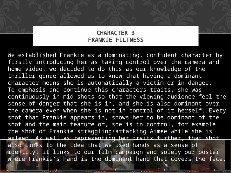
We established Frankie as a dominating, confident character by firstly introducing her as taking control over the camera and home video, we decided to do this as our knowledge of the thriller genre allowed us to know that having a dominant character means she is automatically a victim or in danger. To emphasis and continue this characters traits, she was continuously in mid shots so that the viewing audience feel the sense of danger that she is in, and she is also dominant over the camera even when she is not in control of it herself. Every shot that Frankie appears in, shows her to be dominant of the shot and the main feature or, she is in control, for example the shot of Frankie straggling/attacking Aimee while she is asleep. As well as representing her traits further, that shot also links to the idea that we used hands as a sense of identity, it links to our film campaign and solely our poster where Frankie’s hand is the dominant hand that covers the face.
CHARACTER 4JAMIELEE KIFF
We established Jamielee as originally reserved, quiet and held-back from everybody else. We decided that we would play on that and make Jamielee the main character, because of her being eerie and slightly freaky the viewing audience would straight away expect her to be an extreme victim. We continued the idea of Jamielee isolating herself as every shot she was in, we placed her by herself and doing something creepy that puts the audience on edge and creates enigmas, such as, ‘why is she rocking back and forth’. Only at the end of the trailer we show Jamielee in a shot which has dialect, this shot emphasises that she has been effected/possessed and therefore the audience see her as a danger to the other characters and therefore they assume her as the biggest danger, allowing us to shock the audience as well as create more and more enigmas.

THE TITLE
The title of the film, that is being promoted through the trailer, is the same title that we used for the magazine cover and teaser poster. The title is ‘The Cursed’ we chose this title as our film is about possession and the characters being ‘cursed’ due to a mistake that they had made previously. We chose the title as it links to possession and the idea that the characters become haunted due to them playing a Ouija board. We used the same font and colour for the title, as we used for the teaser poster and magazine cover, to create a brand for the film that we are promoting and in effect viewing audiences can immediately recognise the film by, for example the title. The title appears in the trailer at 0.49. We chose to add the title of the film at the end of the trailer, the third part of the structure, so that the viewing audience see what the film is about then the title appears, resulting in the audience remembering and distinctively seeing title, oppose to it being at the very beginning. The title appears as almost a sting, like a shot, this is effective to the viewing audience as it sticks out and is specifically noticeable.

CAPTIONS AND INTERTITLES

CAPTIONS AND INTERTITLES
When me and my group researched and analysed thriller teaser trailers we found that captions and intertitles have a huge effect on the trailer, they create enigmas, add emphasis on shots and emphasis on important information. We mimicked the desired effect of captions and intertitle our first aim of having captions was to add important information, which is the actors names, we added each caption of the starring actors names, after they are established to the audience. The effect of this is that the viewing audience are aware of who is starring in the promoted film. We faded each shot of the characters to a black screen, where we added in the captions, this emphasises the captions importance to the audience. We then used intertitles for effect, first and foremost the intertitles, ‘1 GAME…’ and ‘2 MISTAKES…’ were created to make audience enigmas. The intertitles are not clear and like all intertitles and captions, are only very short sentences, our intertitles also connote the use of a Ouija board as we used the number figure for effect as that is how numbers appear on a Ouija board, these intertitles get the audience thinking about what the film will be about and abiding by the forms and conventions of a teaser trailer, which is to tease. Other intertitles which we used to create enigmas, are questions, ‘WHO WILL PAY?’ and ‘WHAT WOULD YOU DO’ these intertitles engage the audience and in result the aim is that the audience pay ore attention to the trailer as they feel almost involved (engaged). Lastly we added an intertitles which say ‘THIS HALLOWEEN’ this is used to inform the viewing audience when the film will be being released, although still abiding by teaser trailer guidelines and not revealing an actual exact date, keeping the audience waiting and wondering when it will finally be in cinema’s etc.

PROPS
The props we used when filming was a ‘home video’, a Ouija board, candles, fake blood, liquid latex, black contact lenses, knives and theatrical make-up.Our film is about possession and to show/create this we used props such as black contact lenses, fake blood and theatrical make-up. The black contact lenses shows the audience that a character is possessed, and the use of the contact lenses emphasises the thriller aspect which is to have the audience on the edge of their seats, as the lenses add a sting/shock to the shots they are used in, in result adding suspense to the trailer, meaning the audience are eager to watch more. We also used fake blood and theatrical make up to create the theme of possession, through making injuries on the characters, both wounds and bruises. Another aim of using fake blood and make-up was to intrigue the audience and keep them interested in the trailer, resulting in the viewing audience proceeding to watch the film when it is released. The use of blood also connotes danger which is a typical thriller theme and therefore our trailer fits into the paranormal thriller sub-genre we intended it to. As one of the main themes in our film is possession, we used props that connoted it, such as a Ouija board. The Ouija board is a big part in our film, because the characters play it and that then results in the chaos they begin to face. As we only show the Ouija board once and the characters playing it, it hints and teases to audience what the film will be about, which teaser trailers are supposed to do.

PROPS
Furthermore we used candles to create an eerie feel to the shots used. The candles also connote paranormal activity which again teases the audience regarding what the film will be about, which is a main convention of teaser trailers, which is to aim to tease the audience. We also found when we was analysing thriller teaser trailers, they tend to have an eerie and on edge feel to them and therefore we aimed to mimic this by our use of props.We again used a prop typical to the thriller genre, which was a knife. The use of a knife also connotes danger and that the film will entail dangerous aspects, we also believed this would build suspense, encouraging the viewing audience even further to want to watch the film that is being promoted through our teaser trailer. Lastly the beginning of our trailer is a home video, we achieved this by using the same camera as we used for the rest of the shots, however we hand held the camera and used it how we would realistically use a home camera. To create the home video effect we added the features so that it appears like a camera screen, we did this so that the trailer has a innocent, laid back feel to the beginning of it so that the audience are relaxed when the peak starts, shocking them even more. This fits in with the thriller genre as thriller films and thriller teaser trailers, relax the audience so that the peak and stings shock the audience, emphasising on the suspense aspect.

SPECIAL EFFECTS
FADES Fades are a convention typically used in teaser trailers, we wanted to use fades in our trailer because the use of fades are very effective if used correctly. We used fades when we went from a shot to a intertitle or caption, we used fades so the caption or intertitle is seen as significant to the viewing audience which they are. A fade was firstly used when the starring actors names appear, after the shot of them being established, we used fading into a black screen so that caption appears by itself and isn’t disregarded because of what else is going in the shot. Other intertitles such as ‘THIS HALLOWEEN’ is very significant as it teasing (like a teaser trailer should) to the audience when the final film will be being realised and therefore the use of a fade to a black screen emphasises the importance of the intertitle/release date.

FAST PACE EDITING
Fast pace editing is a crucial and typical convention that belongs in teaser trailers. The peak is the second part of the three part structure that consists of fast pace editing as it is full up of several action packed, effective shots. So not only did we use fast pace editing to place all of the shots we wanted together in the peak, the fast pace editing is where all of the shots go from one to another very quick, keeping the audience entertained and intrigued into the trailer.Not only did we use fast pace editing for the peak where each shot went from one to another, we used fast pace for shots that we added into the peak anyway. We fastened up shots to make them look more paranormal and scary, for example a shot of one of the characters flying into bed, because we fastened it up it looked as though the character is being dragged by something or someone that isn’t there. Another shot we fastened up was of one of the characters doing what looks like a ritual surrounded by candles, and reaching up to the camera covered in blood and possessed, by fastening up this shot it meant that the character looked like she had been taken over by a paranormal being and the effect of this is that bother the shots went well along side of all the other short shots in the peak, however having an professional, realistic paranormal look to them.

VOICE EDITING
Another special effect that we added into our trailer was one that isn’t exactly typical of teaser trailers, but for our teaser trailer it made a
great impact. The effect we added was on the very last shot where ne of the characters is clearly possessed and we changed her voice in
order to show this to our viewing audience. Although our use of props, such as the black contact lenses, she is wearing and the use of
theatrical make-up which already connotes the theme of possession, we edited her voice making it deeper and echoed so that it looks as
though she has been completely taken over.
CAMERA SHOTS

CLOSE-UPS
Close-ups are a typical teaser trailer shot as the shot reveal only a limited amount of what is happening, arguably it also reveals more as the viewing audience get to see the shot is more detail. After we discovered that close-up shots were a typical convention of teaser trailer, we found that we could work with close-ups in our teaser trailer product. We initially used close-ups when we was establishing the characters, we used close-ups so that the audience get to closely see the characters and a close-up shot also limits the amount of background setting that the viewing audience can see and this follows the teasing aspect of a what a teaser trailer aims to do. Furthermore we used close-ups so that we revealed the bare minimum to the viewing audience, however another reason we used close-ups, was so that we could focus on certain aspects in the shot, for example we used close-up shots when we was showing injuries on the characters, and therefore the use of the close-up emphasises the injury to the audience making it a lot more noticeable. We also used close-up shots for shots that we showed possession in, this was so we could focus and emphasis on the use of the black contact lenses that we uses and the use of theatrical make-up, to again create the injuries, and connote possession.

HANDHELD CAMERA SHOTS
We used handheld camera shots for the beginning of our trailer as we wanted the beginning of the trailer to be a home video and therefore the use of handheld camera meant it created a sense of realism, as if we had used a steady shot it wouldn’t have looked realistic.We also used handheld camera for a sense of disorientation on the viewing audiences behalf, as the peak of our trailer is full of intense shots of possession, there is one shot where one of the characters is frantically running away from someone or somewhere and the handheld camera emphasises this panic and it is almost a point of view shot as well which involves the audience into the trailer making them feel like are almost involved.

LOW ANGLE
We used low angle shots in our trailer to emphasis a bigger power within the film, which is the theme of possession. We used low angle
shot to emphasis the loss of control that characters have over themselves for example a low angle shot of one of the characters standing disorientated in the dark, the use of the shot shows the
character to be under somebody else's control, although the shot shows the character to be bigger and almost have more authority, it highlights the opposing idea of her loss of control over her own body. Another low
angle shot that we used was when the characters are running away from something, the low angle shot emphasises their vulnerability and desperation to escape whatever is chasing or following them. By using these shots it teases the audience about who is in control in the film and
the opposing acting to the shot means the viewing audience are left confused and wondering how to piece the shots together, meaning the
pursue in either purchasing or viewing the promoted film.

HIGH ANGLE
High angle shots were used in our trailer so that we could emphasis the actions that are taking place in the shot, for example the significant shot of the Ouija board and the characters playing it, the high angle shot allowed us to fully show the Ouija board and the eerie feeling of the candles around it as well as showing every character to be playing it. Another reason we used high angle shots was so that we could show an authority/power over the characters, for example the shots of characters who have clearly lost control over their own bodies, such as one of them rocking back and forth and another one shaking holding a knife, this emphasises the theme of possession and the shot gives the connotation that somebody is watching over them. Lastly we used high angle shots for effect as there is a shot of one of the characters reaching up towards the camera, this connotes that she is reaching up to something or somebody who has some kind of power over her, the shot also highlights that the characters eyes are all black and this shows that she is obviously possessed.

OVER THE SHOULDER
A shot type that we used only for a few shots, was an over the shoulder shot. This shot type was only used for the impact that we wanted the audience to feel that the characters were being watched and this then led to an eerie, paranormal feeling to the teaser trailer. One of the shots that we used the over the shoulder shot type for was when she was hurting herself with a knife and her hand is severely bleeding, the use of the shot type connotes that she is being watched and not helped or stopped, giving the trailer a hair raising feel. Secondly we used an over the shoulder shot when one of the characters is looking into the mirror and that shot is followed by a close up of her possessed, therefore the over the shoulder shot gives the feeling she is being watched by whoever or whatever is possessing the characters and making them harm each other and one another.